Our staircase railing was not on our list of projects to tackle right now but because we're doing our floors, which involve the wood on our staircases, we also need to address the railings and fast. Because once they take off our existing railings to lay the new floors, it's not a safe place for anyone--especially children--and we don't want that lingering too long. This is a perfect example of project creep. Projects that creep into other projects because they're connected. It's like home version of the charming song from Mister Rogers, "Because we're all one piece"
Everything grows together
Because you're all one piece.
Your arms grow
As your ears grow
As your nose grows
As the rest of you grows
Because you're all one piece.
Deciding on a railing took looking at a LOT of inspiration photos, and deciphering what we liked and equally important--what we didn't like. We also had to work with our contractor closely because railings have so. many. codes.
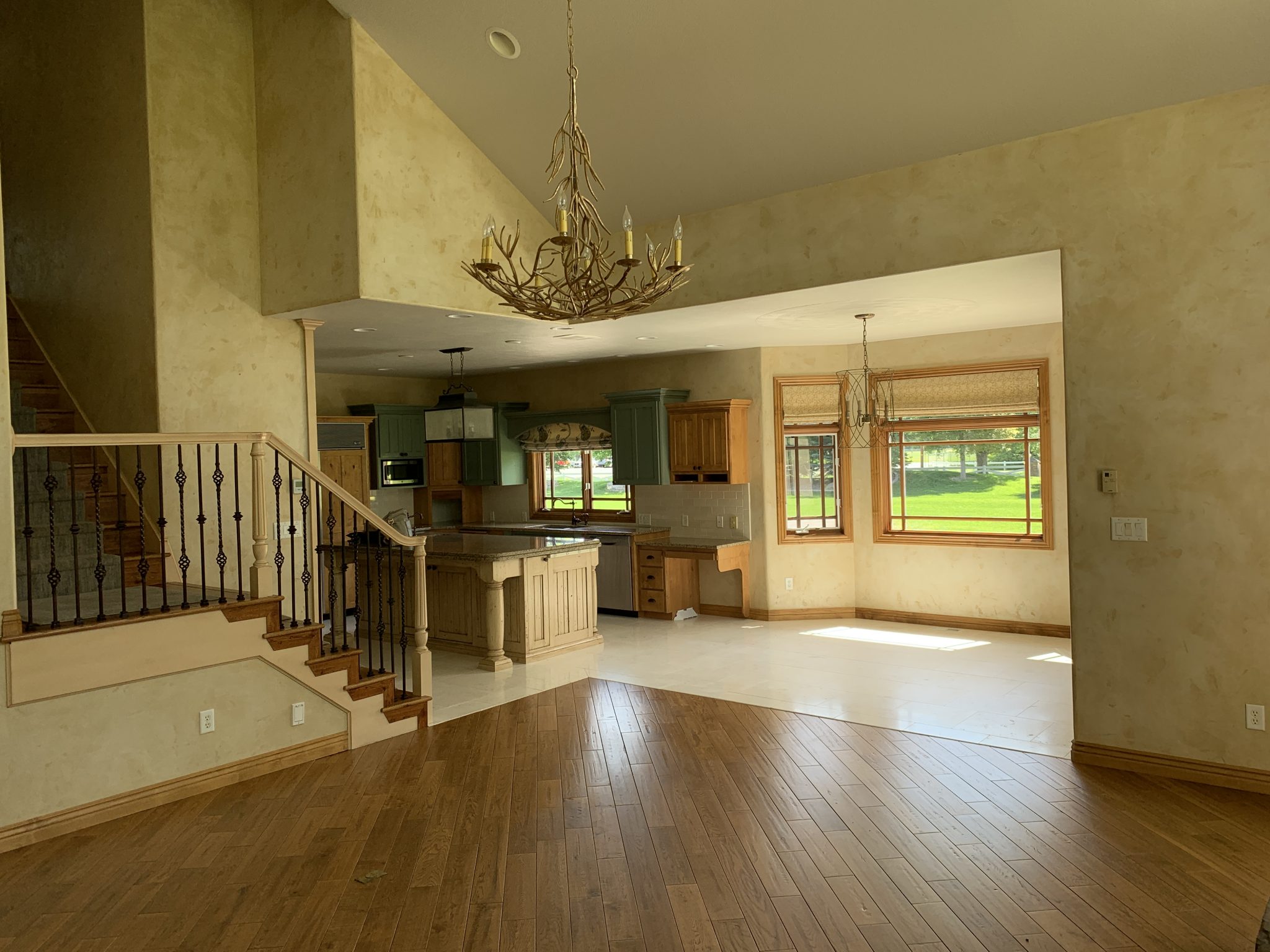
Here are our current railings (and staircases) We have a main staircase that is in our front entry right when you walk in the house and we have a back staircase that leads into the living room/kitchen.
The stairs that lead into the living room/kitchen have a smaller railing that carries a lot of weight because it will be the backdrop to a major sitting area. In fact, we are going to have a couch floating a few feet in front of it which was definitely something that weighed heavily in our planning process.
Here are a few of the railing inspiration images that we mulled over.
1. This very traditional railing from one of my favorites, Katie Hackworth, (source) was the very first one I ever pinned and I was sure it was the direction I wanted to go. To be honest, every time I see it, my heart still skips a beat. I love mixing traditional elements with modern fixtures and furnishings so this traditional shape in a chic black finish was immediately a top contender. My only worry: it would feel too heavy and take center stage (especially in the living room).
2. So I started looking at other lighter traditional railings like this one (source). The white tapered spindles have clean lines and the I loved the darker handrail. I know looking at this, you might be thinking--I can't imagine how you'd mix in modern pieces with this.
3. Boom! Very similar in a more modern setting. I love how quiet these railings are. But actually seeing them in this setting made me realize I wanted something with a little more warmth. (Source)
4. It always helps to see inspiration that feels like you and this one with the white balusters and walnut handrail (and the brass detail on top does NOT go unnoticed) mixed with brass finishes and black windows. Like, I could LIVE here for sure. It feels warm and modern with traditional touches. Check, check, check. (Source)
5. There was a brief time I tried to convince Chris that the railing leading into the living room should be more of a wall (Okay, I still kind of love this idea) so the background of a sofa would be a little more quiet/intentional. But I don't really want the same thing as our main staircase and I don't know if that would be weird or work and Chris isn't a huge fan of the idea but JUST LOOK AT THIS MAGIC! (Source)
6. This brass handrail didn't make it to our short list, but I had to share it because--brass handrail. In the end, we wanted something that incorporated wood. (Source)
7. Next we started looking at railings with black balusters and wood railings are started feeling more at home with those. This railing (both photos from here. ) stopped us in our tracks. The flooring color is very similar to what we're doing so it was very easy to imagine a similar railing in our home. For a couple days THIS WAS IT. But the longer we looked at it, the more we felt like we were craving some softness. Some curves. (But seriously, I LOVE this one)
8. File this under "perfect railings: a study." I love how Courtney Nye (source) mixed in traditional lines in such a simplistic way. Having those black rod balusters with no feet (SO often you'll see little caps on the base of every rod going into the stairs and it was the one thing that was a deal breaker for me. I know I don't want those! If you want to know what I'm talking about, scroll up and look at our current ones). This one is on our short list. Our floors are significantly lighter than these dark ones, but I think this newel style works best in a darker shade. I'm not opposed to mixing wood tones though.
9. This railing. I mean, this WHOLE situation! It works because it's not the star and it's not trying to be. The simplistic railing is supporting the beautiful trimmed out entry. It's letting the furnishings be the star. It's about the view outside. With a more ornate railing--would you miss all that? This one is also on our short list because restraint an exercise in restraint, with the perfect amount of wood tone, might be just what we need. (source)
10. This one, nearly identical, works for all the same reasons. (Source) This is when I also started noticed risers and we started asking ourselves--white or wood? The white looks so clean and crisp so we're leaning that way.
11. And then we come across a perfect example with wood risers that we can't ignore. The lighter floors and lighter, rounded wood handrail--we found our ideal in this inspiration! (I mean, I'll take that runner, too, please!) (Source) I also thought it was interesting how the wood floors and the stairs don't match in this example. These are the kinds of things I like to take note of--rules that can be broken.
So as you can see, we were all over the map when it came to deciding a railing. I love all of these examples but would say 11 is closest to what I'm envisioning with maybe white risers and a little bit of 5 thrown in for the back staircase. ;) Kidding, Chris!
Which is your favorite?
Leave a Reply

WE'RE CHRIS + JULIA
Portfolio
Projects









That arch pocket door ????
I think 5 would be awesome for the back stairway and I really love 11 for the front. I’m obsessed with that runner now.
Such an incredible blog. want to know more about this carpet which is set on the staircase.
Girl, reconsider the wall instead of railing for the living room, heck if I was you I would extend the wall all the way up with maybe a window up high. My house is open like yours and it kills me not having a blank wall behind the couch. It’s hard to decorate, hard to photograph, just hard ????
Okay Julia, not sure if this or Greta's bathroom is harder! For the front staircase #11 is my favorite. #4 with the contrasting darker walnut handrail/treads is also stunning. I vote for white risers (with a runner) for this staircase.
For the back stairs, the wall #5 or the clean lines of #9 or #10 would bestow a more subdued backdrop for the living area. I know it will look great whatever you choose! BTW, have you considered reconfiguring to a wide-bottom landing, so that you can enter from/exit to the living areas without walking around the post first? Not sure if that's an issue for you, but now would be the time to do it with the new floors going in. (Sorry, I know you have decision fatigue!)
test
Another vote for #5 for the back staircase. When there is furniture going in front of the stair railings I find the balusters just look too busy. The wall with the mounding details seems just right for a situation like that.
My favorite Railing is from Emily Hendersons Portland project. https://www.pinterest.com/pin/172684966947451874/
And I love how Lauren Liess' old railings attached to the outside of the stair, giving you the full width of wood tread. https://www.pinterest.com/pin/172684966946712879/
All great options but I just love #3 so so much. Perhaps you could bring in warmth with other elements?
You almost can't go wrong, they are all pretty.
Are the existing ones being donated or reused? Does Habitat Restore take stuff like this?
I really love 7 and 9, but I just saw another good option on Instagram blushingboho account. Good mix between modern (black + wood + iron) and classic (white pôles)
NUMBER 5 IS AN INCREDIBLE SPACE BUT I FEEL THAT WAY WHENEVER I SEE WHITE WALLS WITH LIGHT HITTING IT. IT LOOKS LIKE QUITE A BIT OF LIGHT IS COMING FROM UPPER WINDOWS OPPOSITE THE CASE. WHAT STAIR CASE? LOVE THE TEXTURE CREATED BY THE FLOOR TO CEILING MOLDING AND WHAT ABOUT THAT THICK SCROLL? I WILL GUESS NUMBER 11 WITH WHITE WALLS AND GRID MOLDING.
I love your inspi pics, but I guess I’m getting old because I have the hardest time reading the text. We’re talking serious eye strain here. If the font were a little larger or darker or “chunkier” my eyes would be ever so grateful.
Just increase the zoom on your computer when reading the site. When done you can revert?
I loved #8!! The sleek black metal, but the wood carved newell post with the delicate details were just perfect!! A great blend!!
3, 8, 11 all are so classic. Something you could tie any type of furniture into, even decades from now. I think of railings I’ve seen at Art museums when I see these 3.
Kinda like #5 it’s different and makes a simple statement for the entry way. Maybe that area only. Black iron railing is a bit over done . But there all beautiful choices .
#7 is so pretty. Remember, you will have softness/curves on your doorways. Look at the picture on # 7...see the arched/ curved doorway? Both look sooo good together.
I love the wall idea for the back stairs - it kind of reminds me of Sarah Sherman Samuels newly published remodels staircase - such a fun a sculptural moment that plays with scale and drama in a subtle way (i could only find online it in this roundup) : https://www.domino.com/content/round-skylights/. I realize #5 is a more traditional styled example - but I think the walled staircase can be so dramatic and modern when done with the right scale and details.
How fun for us that you get to tackle the railings!
Would you consider arching the stairwell ceiling going up to the second story? Just staring at the photo you posted with the removed arched window and wondering if that would be so beautiful to repeat all the arches and reflect light from the window up to the upstairs in a modern & intriguing way.
LOVE #9. Almost makes me sad I have a single story home.
I ????5 & 9!
I personally love the white and wood look/more traditional banisters, but seriously all of these options look amazing and I can't wait to see what the finished railing looks like. I didn't give much thought to or know what to call "base caps" before today, but now I have an opinion haha! #themoreyouknow
Here is a beautiful banister similar to #4 but with a lighter wood railing on top. Drool. https://www.instagram.com/p/B53GkZiJxgZ/?utm_source=ig_web_button_share_sheet
I’m intrigued by the wall for the back stairs. Seems like it would be so busy otherwise. And I love the black turned balusters in #1. So dramatic!
Where do you find such gorgeous inspiration images? We’re planning a master bathroom redo and I feel very old asking this, but I’m a bit lost on how to find top notch inspiration images. Any tips?
it takes some patience and hunting.
#10 or #11 :)
I love 5 for the back stairs, great choice. All the rest are beautiful. Agree about the “feet”. Can’t wait to see what you chose.
Overall I like 11 best, but I’d like the taper of 3 (only in black, with wood treads and white risers. I don’t have stairs or steps, so it’s fun to see choices. My floors are almost identical and I LOVE them. I know whatever you choose will be lovely.
#5 for the back stairs would be great, I think!
And then #9 is my favorite, overall!
This is SO exciting!
In LOVE with #1. I know the railing wouldn’t be adjacent to your dining room, but I think the vibe is similar and would help carry the “look” throughout the house. Also... it’s gorgeous.
I am all for #5 for the back stairs. There will be so much going on in that space a wall would help visually calm things down and not draw the eye up the stairs.
So fun to get a glimpse into your thinking on this. I have to say I am a team 7 all the way, that is for my house. I can see how that is not ideal for what you have going on. I am sure it will be beyond stunning. Good luck!
11! Look how tall the railing looks. It’s modern, but with the curved edges it also seems home-y. It’s my favorite because I don’t think it will ever go out of style.
I like the style of #8 best - but done with light wood to match your floors and a runner.
I love the traditional railing of #1. Your house is so large and grand I feel like it can definitely handle a heavier railing. Plus, it has soooooo much character and would instantly add a charming historic touch.
I love most of them but think number 9 is my favorite!!
I think 4 would look amazing as well! 4 and 11 are my top votes :) Whatever you choose and love will be perfect though, of course!
I love when you round up options and lead us through your decision making. With your touch I know it will be gorgeous!!! I like white risers too but personally would never do them. FAR too much upkeep. Those risers get kicked far more than you think - until you see the continual scuff marks and dirt. Maybe white risers with a runner?
I definitely want to do a runner--I wonder if that would help keep down the scuffs!
The runner will really help with the scuffs.
They are especially bad for people with bigger feet. My husband wears a 12 and kicks the steps and leaves marks ALL the time. I wear a 7 and don't have the same issue.
I love number 10!
FYI, we did a little remodel before selling my parent's home and the realtor painted the risers on their wooden stairs white. Then every time we walked upstairs we got black marks on them. Maybe there is a specific way to paint them that won't make that happen, or if you have a runner that will solve that problem.
I don't know exactly-- but I've heard that stairs for wooden stairs are a different depth than for carpeted stairs-- thus, maybe that's why the treads got marked up??? Julia, do you know why???
Can I move into the number 11 house? Is it for sale?! The stress of this decision is one I would gladly welcome into my life. Can't wait to see what you choose!!
What a beautiful inspiration post!! Thanks for gathering them all in one place! Stairs are so hard for me and big factor in the “feel” of a space , so I’ve lived with our (not-to-code) original 1960s metal railings for too long! They’re cool, don’t get me wrong, but a toddler head fits through every.single.opening. And now they have netting on them. #notcool
I lean towards 9, but just can’t pick!!
Also, you’re going to get this alllll day. But I have to paint my risers quarterly. And if I actually wanted them to be white all the time, it would be monthly... it’d not a terrible job, but just to know before making that call!
So many beautiful options! My staircase is “wall” on one side and “railing” on the other. It’s made me realize how much I would like the open railing for both light and sight lines. The wall blocks so much - including visibility into what the kids are up to in the other room. I’m excited to learn about this project through your experience so I can tackle updating our own!
I couldn’t help but think of an image from Tim Cuppett architecture the whole time I was reading this post, the railing in their Urban Homestead project seems like exactly what you may have been looking for in the inspiration.
https://cuppettarchitects.com/projects/urban-homestead
stop stop stop omg. heaven!
Love 11! I can’t wait to see a blog post from you about carpet ideas. I just hate traditional carpet, but am so confused with all the choices of patterned carpet.
Love 11! We will be carpeting our bedrooms after Christmas and we can’t wait to see a blog post from you about carpet ideas. I just hate traditional carpet, but am so confused with all the choices of patterned carpet.
I like #10, with the white riser. If you add a stair runner, the color and texture will pop outwith the white.
One thing I noticed was the edge of the stair. # 10 looks very clean with no overhang and a delicate half-round finish under the stair so everything is flush. But the ones I like also have wood trimming details on the walls to break up the huge space. Good luck on deciding!
Loooove 5, seems like art in itself.. 9 is beautiful so is 10 and 11! It will be amazing whatever you guys choose!
I do not envy your decisions. They’re literally ALL soooooo good. I can’t pick a favourite because I feel like they’re all perfect in their own way and for their own spaces. Gosh I love grand staircases. So much. This post is making me want to update my own.
I feel so strongly that you should do #5 on your back staircase. It’s gorgeous, functional, and totally different than what I see from most influencers lately.
I actually favor #3 for your front staircase. The thin metal balusters look great in more minimalist homes but I think the architecture of your home wants for a bit more. I like the idea of the architectural touches skewing more traditional but colors, fixtures, and finishings being the more modern touch.
9 and 11 are probably my fav. Great choices though..
There’s so many beautiful ones to pick from! The last few are my fav! We just did our railing and it took forever for me to find someone that would do it because our rails don’t have the caps either. We did an iron rain king with white risers and wood end caps and a black plaid runner. I love it so much! Can’t wait to see what you do!!
I love the brass rail but for my house I’d pick #7. For your house I think #11 is so beautiful. I’d have to go light wood vs white. Every shoe scuff shows on white.
Wow number one is so gorgeous! How can I get that in my house ????
7 is kind of just UNREAL. Saving that one for our home????????????
Definitely #3 and #4 .. simple but with enough warmth... not a big fan of the iron rods. But I’m sure what ever you guys decide will be beautiful. I can’t wait to see them ????
Oh I love #8 - that mixed with the traditional elements of #1 would be incredible for the main staircase along with a modern-ish chandelier. I think the contrasting trim really adds to #8 as well. And I am with you on the wall idea for the living room stairs too - quiet it down and let all those other beautiful elements (new arch window, fireplace, couches) really shine. Excited to see this all come together!
Okay, LOVING 8 (even for my own home staircase make over! Like, already sent to the Hubbs and friends), but also loving 11 for your home! When I saw 11, I truly thought, “that looks like a CLJ staircase.” It’s probably the wood tone risers and steps combo? Mainly because *most* people do white, which feels like the safer, classic option, but in true CLJ fashion, I’m leaning all wood tone with a gorgeous runner! Loving following along, thanks for sharing all the steps! Ba-dum-chee! :)
I love them all but 8 is my favorite!
I love love love 8, 9 & 11. Any of these would be stunning in your home. I especially like the mix of a wood railing cap with black balusters & black frames on the windows. It’s a very crisp clean classic look.
Following your reno has been so much fun!! Very excited to see the finish line! I can already envision parts and it’s beautiful.
I am really hoping you are leaning to something more traditional and curvy. I love the black, simple iron balusters, but I see it everywhere and feels more boho to me. I am loving the idea of a "wall" for a back staircase. It would be so different. The only time you see a "wall" is in a production home where the builder didn't upgrade to a railing. So, I think it would be a majorly cool challenge to see what you do with that and make it look "chosen" and gorgeous. Cant want to see how it ends up. I am just really crossing my fingers for something unique
I love love love 3!! And I do appreciate the clean lines of 7.
I love 11. It’s just perfect. And I love how you laid these all out in your thought-order, chronologically, because by the last one, you can see bits of inspiration taken from each of the previous contenders, mixed together to achieve the perfect look. I just love it.
11 definitely feels like your M.O. Your style is beautiful and keeps me coming back for more. I loved the softness of the first four but the wall in #5 would be a dream for this Anglophile. Classic.
Five for the back staircase has me ???????????? so unique, and I’m with you on 11 as well.
#4 — My 2 cents worth: wood balusters and rail for warmth, no matter what color, since you are using a lot of stone (fireplace, etc.) and want a cottage feel. Sorry, but the thin metal balusters look like prison cells to me, very cold no matter what color.
okay... wow!!!! I like #5 for the living area for sure!!! Also are you doing each treads/step with a rounded edge like #11 and pretty much all of them or squared off like #10?? I can't wait to see what you guys land on. As a follower, I really like these posts, to see what you think may/may not work based on the look you are trying to achieve for your own space! Thanks for sharing!!
Wow, never knew there was so many decisions to be made for stairs and banisters. I like the wall idea for the living room stairs. Just looking at all the pictures makes me want to redo ours when we change out the flooring on our stairs.
Hope the hotel arrangements is going well for the time being. Happy Monday.
The wall for the back staircase and classic, little heavier wood balusters, white with black banister or all black would be most conform and not so ”stickey”. The metal balusters all look like the standard issue you get when you buy a builders grade staircase in Sweden, so maybe I’m in negative bias for those. You’ll make it work whatever you choose, I’m sure. //Jessica
all SO beautiful but I thin #10 has my heart... 11 is a close 2nd!
Totally agree that white risers are really nice- BUT, be warned. I'm not sure if you're a no-shoes-in-the-house family, but small children scuff the heck out of those risers realllllly quickly. Maybe not a deal breaker but it's constantly bothering me looking at the black marks all over them!
I will second this! We have white risers and they got very scuffed in a short amount of time. Luckily, a runner has solved most of the problem.
I agree! Scuff city!
LOVE the idea of 11 with white risers!!! I’m super excited to see what you do! (And number 5 is stunning and jaw dropping!)
I’m with you Julia! 11 for the front and 5 for the back. Sorry Chris! Following your renovation has been so much fun!
Ditto. Let's all pressure Chris.
Well, so many similar banisters. Love your studies of the details. I think I love 8 (got a little confused with the numbering-I just woke up to ????) Love the wall one too. I like a painted riser. There’s plenty of wood on the floor. I would keep it traditionally modern ????
#9 or the wall!
I think the back staircase would look amazing as a wall!!
I agree...even if the landing portion is just a wall and the actual stair portion mimics the front stairs.
The first four are my favorite. You can never go wrong with a classic wood baluster and handrail. Really, they tie in with any period and design preference.