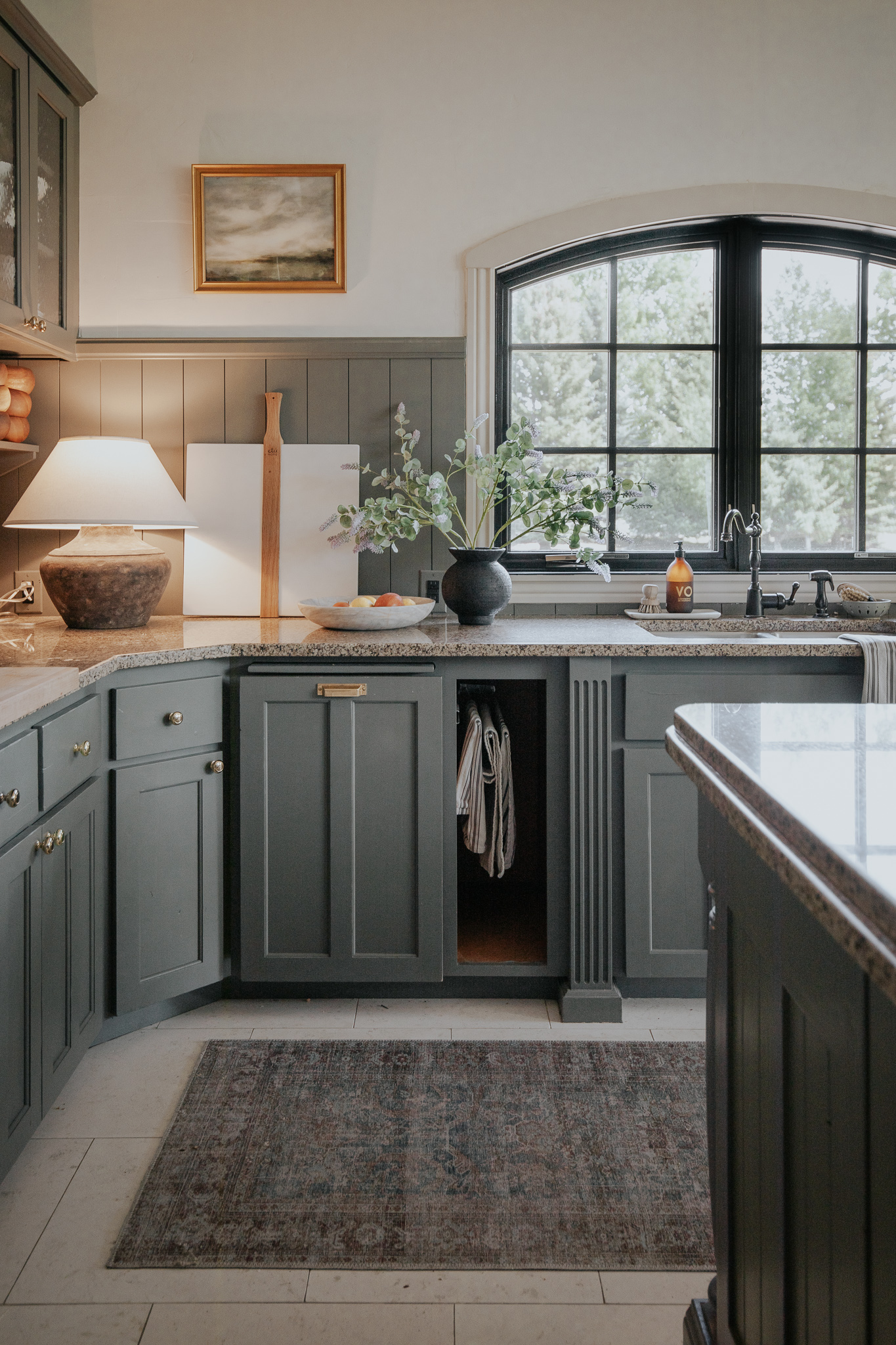
Cabinet Color: Thunderous by Sherwin Williams
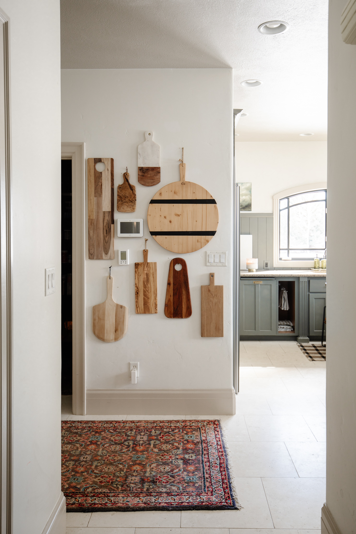
Runner, Lamp, Cutting Board, Bowl, Vase, Art, Soap
I debated whether or not to share our kitchen plans for our current Idaho home, because they aren't happening and the new owners have already came in and measured for new cabinets and everyone has different needs and wants so I didn't want them to feel influenced to do something different than they had planned. However, so many of you are curious and who knows if they even READ here, so I thought sharing these high level plans would be a nice way to wrap up this house and this large project that we so desperately wanted to do, but never got to.
We did a budget kitchen renovation not even two years ago. Our goal was simple–to spend only $1000 to bring our kitchen to a place that we could live with for a couple years or so until we had more time to live in the space and figure out how we want it to function. So we've been living with the pain points and have had many conversations about how we could optimize the space for a functional kitchen that works for us.
CURRENT COTTAGE KITCHEN:
If we were staying in this house, THIS was going to be the new kitchen layout.
COTTAGE KITCHEN RENOVATION PLANS:

You probably noticed right away, the pantry is GONE and we gained a lot more space. When we thought about it, most of the space in the pantry was just walking space. No need. No need! Moving the pantry over the nook where the range currently is, made more efficient use of the storage. Plenty of cabinetry and drawers to store all of the food. We were excited about giving up the walk-in pantry (that we had to walk around the corner to get into), in order to give us more space, both in the kitchen and the mudroom.
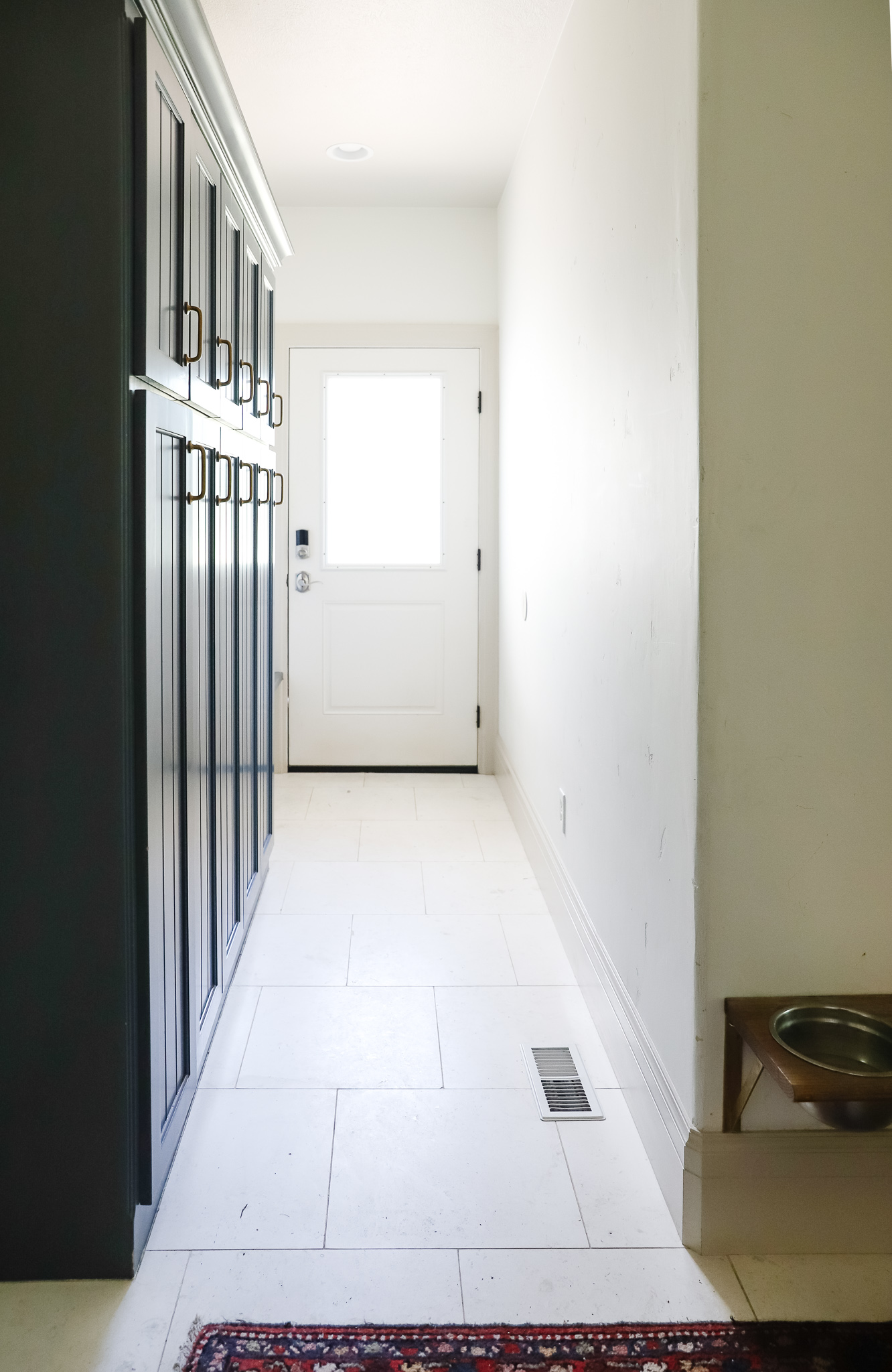
Which brings me to the flow reconfiguration of the mudroom in general. One of our biggest pain points was when we walk in or out of the side entrance to the house, you have to bypass the tight mudroom (more like mud hall) every time--which is often tighter when there's lockers open or shoes didn't make it into where they belonged. Normal mudroom stuff.
There are MANY times, we don't need to access the lockers AT all when leaving or coming in the house so it made more sense to us to make goin pass the storage an optional activity. We were planning on moving the entrance into the mudroom to over by the side door. And arch it while you're at it. ;)
The mudroom also gains some square footage thanks to lending some space from where the pantry is. Now if you want to go outside or hang something up, you won't have to walk through all the mudroom junk to do that.
Taking the pantry out also would allow us to extend the kitchen and give us more workspace. Right now when you look down the hallway leading to the kitchen, you're looking directly at the cutting board wall and to the right is the kitchen. With these plans you would actually walk directly into the kitchen and be looking across the kitchen at the sink, window, and cabinetry.
via Elizabeth Garrett Interiors
We planned to take the one window out and put in 2 windows–under the one on the left is the sink, and under the second is the range. (Yes! A window in front of the range!) A sconce in the center and on either side of the windows would be upper glass-front cabinets that extend all the way down and sit on the counter. A 48" range would be balanced by a large sink under the other window.
Other big changes were the 2 cabinet-front refrigerators, both with freezers on the bottom, and a pebble ice machine with a drink cabinet above it.
Now let's talk about the island. I've been really loving the look of an island being more of a furniture piece than a built-in, so our island was going to have legs, room for stools along the pantry side and drawers on the prep other side.
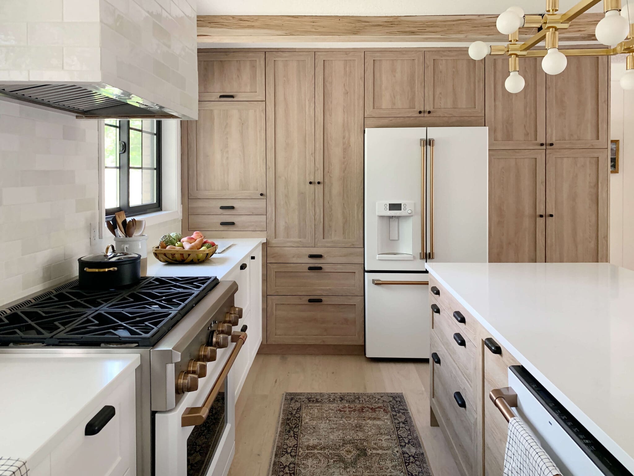
Even though we never got to see these plans come to fruition, they really solved all of our pain points and gave us a lot of clarity for what we want out of a kitchen. Even though we're not renovating this kitchen, our NC kitchen is totally ripped up right now. We're actually taking some of our design plans and inspiration (read colors and finishes!!) and seeing how they might translate there. So stay tuned!
Leave a Reply

WE'RE CHRIS + JULIA
Portfolio
Projects











Thank you for sharing these plans! Really great and well thought out changes. Can't wait to see what you will do in your new home!
Love the layout you would have gone with had you stayed. One thing confuses me - the three doors in the mudroom. The top one opens to the outside and the one on the left wall opens to the garage, right? What is the third door on the bottom wall of the mudroom/where does it go? (Isn't that kinda behind the powder room going towards the girls's study?)
It just goes to a little closet full of cleaning supplies!
Beautiful inspiration images! The one thing though that I picture this in real life, is one person putting plates away in the dishwasher, and another one putting food away in the fridge, and kids trying to fight their way either to or from the mudroom. The opening would make more sense and help it flow better if it were at the bottom, in line with the door to the garage. But I suppose we'll never know! It would be so fun to get an update from the buyers in a year or two on how they redid the kitchen!
I would have loved to seen that and I know it would have been beautiful. I have one question. By closing off the hallway is the only way into the house from the garage through the arched opening in the kitchen? I see how bypassing the lockers would be convenient, but it seems like if everyone coming in through the garage has to walk through the kitchen to get in the house would cause quite a traffic jam especially in front of the sink. But maybe I’m not reading the plans right.
You would probably just go down the hall, not past the sink
Oh, then I must have read the plans wrong. It looked to me like you closed off the hall with the bigger mud room. I can’t wait to see your new kitchen. I’m sure it will be amazing!
I can see your vision for this space and it would have been amazing. Still surprised about the results you got on your budget makeover, so great. I didn't realize until you did your last video how small the cooktop is compared to the dual ranges at your last house-I bet Chris is really looking forward to your upgraded kitchen and appliances in your new home. Would love to hear how you, as a designer and Chris, as a chef work out a space like this together. His and hers must-haves and how that all gets worked into a beautiful and functional design. It would be fun to be a fly on the wall during that design brainstorm design sesh!
Love the layout you were going to do. So much better use of space. Loving what you are doing so far in your new NC kitchen. Thank you for the updates on the process. Before and afters are great but watching the whole process (well as much as possible 😉) is the most fun 😊
Thank you for sharing! I am so happy for Chris getting his dream kitchen in the new house ( as the first thing you do!) and I am sure you are more confident in making decisions because of planning the kitchen for this house. Now you know what you‘ll need in Raleigh, and you don‘t need to tackle two kitchen renovations in super short time ( just imagine leaving after you did this kitchen!). Maybe it was all meant to be? Like maybe you wouldn’t have bought a house with the primary bedroom on the first floor two years ago, but now that the kids are older, it makes much more sense. As hard as it must be to leave this place, I am sure everything will be just fine. You absolutely can do this!
Gorgeous! That kitchen with the French oven, marble & warm cabinets is so gorgeous! We bought our current house for the Icemaker. You’ll never ever go back. Love the would’ve been new layout. Interior design is such an art that also takes such a technical mind. You all are amazing!
Do you have a photo of this ice maker?
I'd consider haven a second entrance to the kitchen where the ice machine is - it would reduce the flow of kids and stuff throughout the kitchen.
Ahhh, the pantry deletion and putting it where the range was makes SO much sense!
I agree, Julie. No work triangle!!! Julia's design is so much better.
These plans are perfect! Love the range in front of a large window and I’ve see this before but how do you address the hood? I’ve never seen it from the other side/outside - thinking the hood would be finished on all sides and be sort of free standing or would there be no windows on the back side of the hood? Make sense?
Hi! I love what you would’ve done with the kitchen! Just wondering, do you happen to know where the rug that’s in the hallway from the mud room to the kitchen in front of the pantry is from? Thanks!
Hi! That one is vintage from ebay!
I imagine you had finishes all picked out too, based on earlier stories. Why promote this point and then only share a floor plan if you’ve already expressed your new home will be a different aesthetic to suit the home’s style and history?
I mentioned in the last paragraph we may be using a lot of the same finishes. :)
Would you mind sharing the source of your mudroom locker hardware? I love them!!
They're so nice! They were here when we moved in but I think they are from Rocky Mountain Hardware, since all the other hardware in the house was.
People have been asking to see what their plans were for their kitchen for a while. I find this really interesting. Julia wasn’t sure she wanted to even share… that’s one of the things I love about this account. So many interesting details are shared and not just a before and after photo.
So fun to see the layouts and imagine how it would look while reading along! No doubt it would be exquisite and can’t wait to see what you guys do with the new place! As far as the pebble ice machine and drink cabinet above- would it have been a refrigerated space for drinks?
no, just mixes and glasses :)
No dishwasher currently?
It's to the right of the sink
Houses I can leave, it's the friends you've made that are the hardest part of leaving. I didn't move far so no problem with friends, but I must admit I miss our basement laundry/craft room with lots of space to make creative messes. And a garden with places to sit and read and flowers to cut and bring indoors.
Otherwise I'm thrilled with our downsized condo.
I love the range in front of the window. Does the window have to be treated with anything to make cleaning easier?
Yes, I believe it does for heat
I love the idea of a window behind the range and would love to incorporate this into our kitchen reno to take advantage of our beautiful view.....but how do you keep the window clean behind the hood??? And what will this look like from outside, will it look odd to see a large obstruction right in front of the window (our kitchen is at the front of our house). I would love to see a photo from outside looking in this window. We've considered the new vent hoods that sit higher in the ceiling or a small bulkhead but will this have too much of an effect on the power of the exhaust sitting that much higher? I am convincing myself that it is worth the cost of the diminished power of an extraction hood but at the same time worry that I'll be kicking myself in the future!
There's lots of inspiration out there. Some have hoods in the ceiling. Some have downdrafts. Lots of ways to do it!
I love the range in from to the window idea, and I tried to do it in my current house, but sadly, our zoning code does not allow it!
Jenn, We opted to do counter-to-ceiling windows along the entire 23' run of cabinets and appliances that very much mirrors the "new" layout of the Marcums' kitchen -- cabinetry that includes range and sink, that ends/adjoins to open eating/dining area. We installed a retractable downdraft system that you raise when you want to use it and lowers out of sight when finished -- typically used in islands. It allows unobstructed views and we couldn't love it more. Since there is no backsplash along that entire run, it also acts as a backsplash when raised that makes cleaning up very easy (the "backsplash" panel of the downdraft removes for cleaning and even can be put in the dishwasher -- I know this was a concern of Deb's below, I'm only 5'4" myself!). While there are several options, we used the "best" brand because it had the ventilation set-up (the "guts") that minimally impacted our cabinet space -- you definitely have to take that into account when configuring. This makes the total depth from window to front edge of cabinets 4" deeper than standard, so take that into account when laying out your kitchen to make sure you still have enough walking room.
An added benefit: Because we had to mount the cabinets 4" from the wall to line up flush with the front of the stove/oven, we used that "extra" 4" behind all the cabinets to install continuous industrial plug molds that run the entire length of cabinetry (but not behind stove nor sink), recessed about an inch below counter height. This solved the problem of not being able to install outlets in a backsplash (needed for code purposes) since we don't have a backsplash. Win-win because I'm not a fan of the very visible outlets that are required in backsplashes and we now have so many more places people can plug things in. The bottom edge of the windows were installed the same inch below counter height so when looking out, it looks like there is no separation between interior and exterior space.
Last, we are a family of six so opted for two dishwashers during the renovation - one on either side of the sink. That has been such a sanity-saver over the past year when we've all been homebound for 14 months straight cooking multiple times a day. I would highly recommend for those who use their kitchen as much as we do!
A note of caution: All of this was detailed (in written and schematic/elevation form) in our plans submitted to the county for our building permit. Certainly make sure anything out of the ordinary is permitted and will pass code before installing. We did have to make some minor adjustments from our original "vision" to make the county happy but it turned out beautifully. Neither our architect nor GC had done anything like this before so they were extra careful we had crossed all our "t"s up front. Happy planning!
This layout makes so much more sense! Especially closing off the original entrance to the mudroom/garage, so that you're looking at beautiful cabinetry vs. all of the doors; as well as the window view from the entrance hallway. Love the idea of the two big windows and the wall of pantry. Thanks for sharing Julia. It's so helpful to see how functionality can be improved from the original footprint. Can't wait to see the kitchen design for the new house!
Ohhhh!! This was fun to see! My fav is that arched added doorway! But now I’m wondering, do I need a pebble ice machine too?!
Loved the new layout! Glad you shared!
Interesting. Thank you for sharing.
This was so fun to see / read about!! Thank you for sharing! xo
A window over the range...hmmm. As a 5’3” person, cleaning that window after ever meal would involve a step ladder. So that would not work for me but I like the concept of seeing lush landscape as you cook. Looking forward to your new adventures.
It would have been fabulous! But also great that the new owners get to instal their ow perfect kitchen. Hope you’re not getting overwhelmed by the emotion of leaving - it’s easier when you arrive at your destination, especially with that amazingly beautiful landscaping waiting for you.