One of the very first lessons I had while studying art in college was about color theory, a primary element of design. And let me tell you, having a deeper knowledge of color theory can boost your confidence to make decisions about color in your own home! For some of you, this might be the beginning of your journey into the world of color theory. Some of you might be more seasoned color experts, but I always find it beneficial to go back to the basics. In this lesson, we'll introduce the color wheel as an essential design tool, and in the subsequent lesson, we will delve even deeper into color theory. Let's get started!
This lesson is a part of our Color School series. In case you missed it, start from the beginning:
Lesson 1: Are you Afraid of Color?
You can still sign up if you want to follow along and receive exclusive bonus content and tips directly to your inbox!
What is color theory?

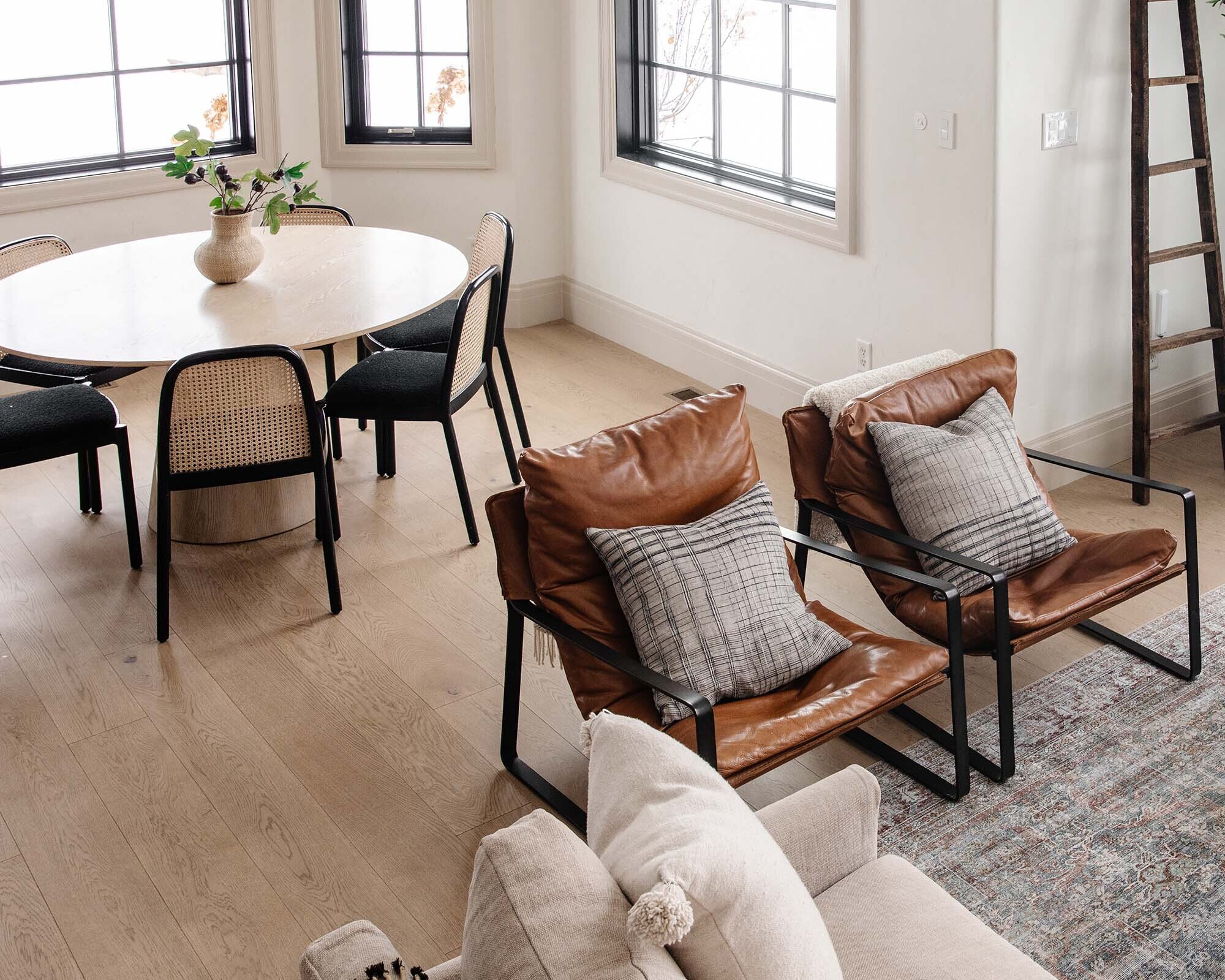
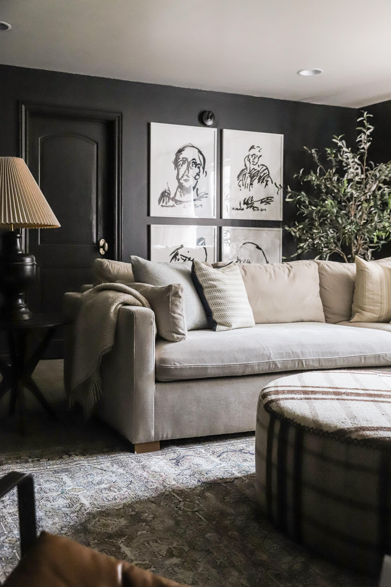
Shop the study
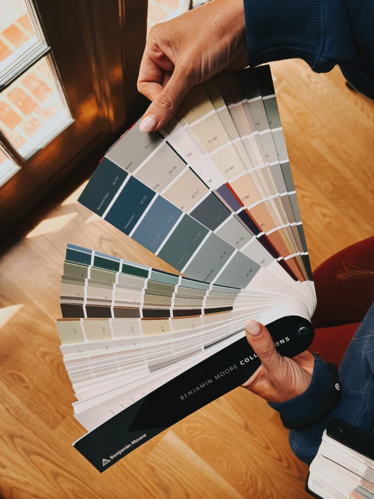
At the simplest level, color theory is the art and science of how humans perceive color and how colors interact with each other. From the home design perfective, color theory can inform how a room looks and feels, and it should be used as a friend rather than foe. Raise your hand if you generally choose paint or furnishing colors based on trial and error or a gut feeling. Hi, 👋 it's me. We painted our study three times before I finally felt satisfied, which is sometimes unavoidable. But color theory can help! Let's take a look at our good friend, the color wheel, to help us out.
What is the color wheel?
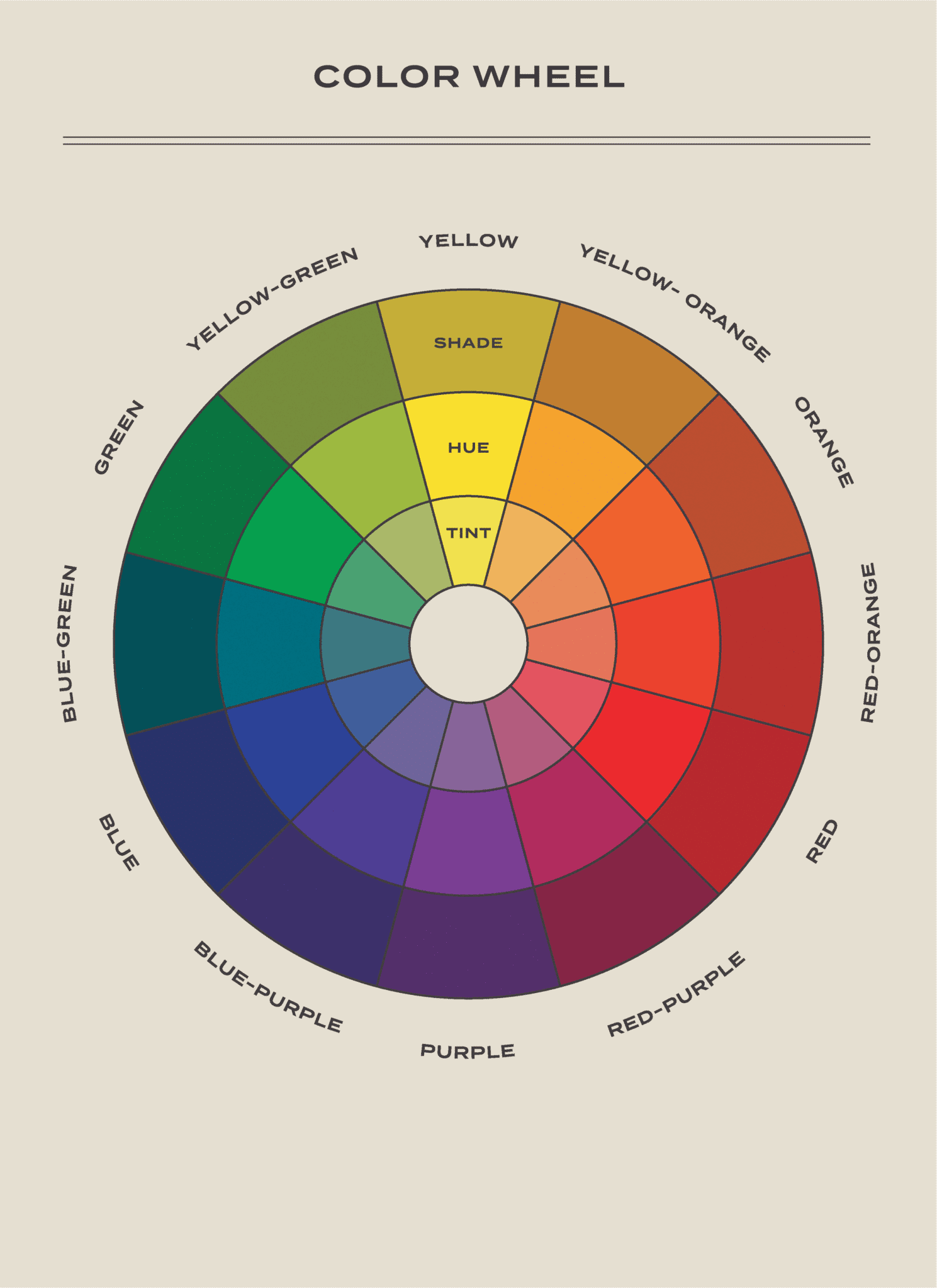
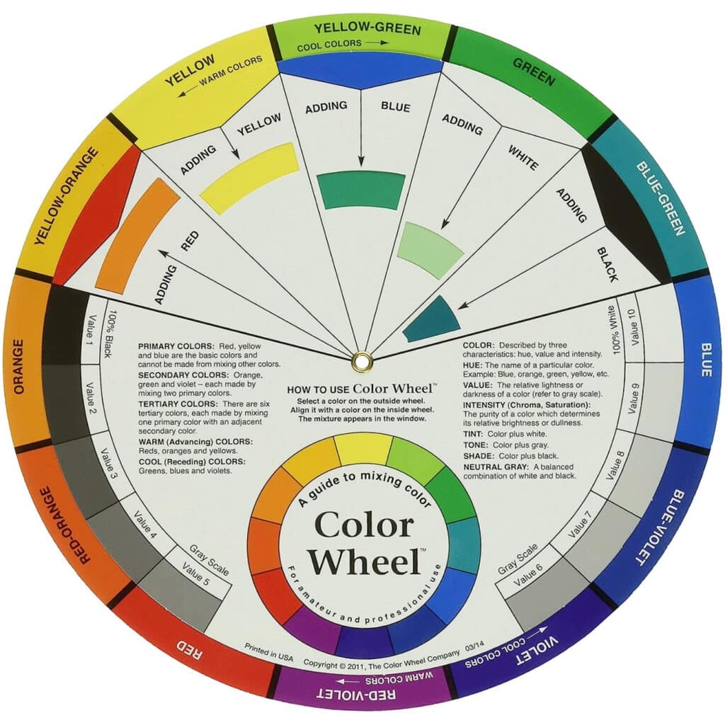
Surely we've all seen the color wheel, or at least some iteration of it before. The color wheel is made up of the three primary colors (red, yellow, and blue), three secondary colors (orange, green, and purple), and six tertiary colors (mixes of secondary and primary colors). Obviously, the color possibilities are seemingly endless as you begin mixing tertiary colors with secondary colors, and so on, but you get the idea! Here are some other important definitions to add to your vocabulary.
Hue: This is what we actually mean when we say "color."
Tint: Any hue with white added.
Shade: Any hue mixed with black.
Tone: Any hue mixed with gray.
Value: How much lightness or darkness a color has.
Chroma (saturation): How dull or bright a color is.
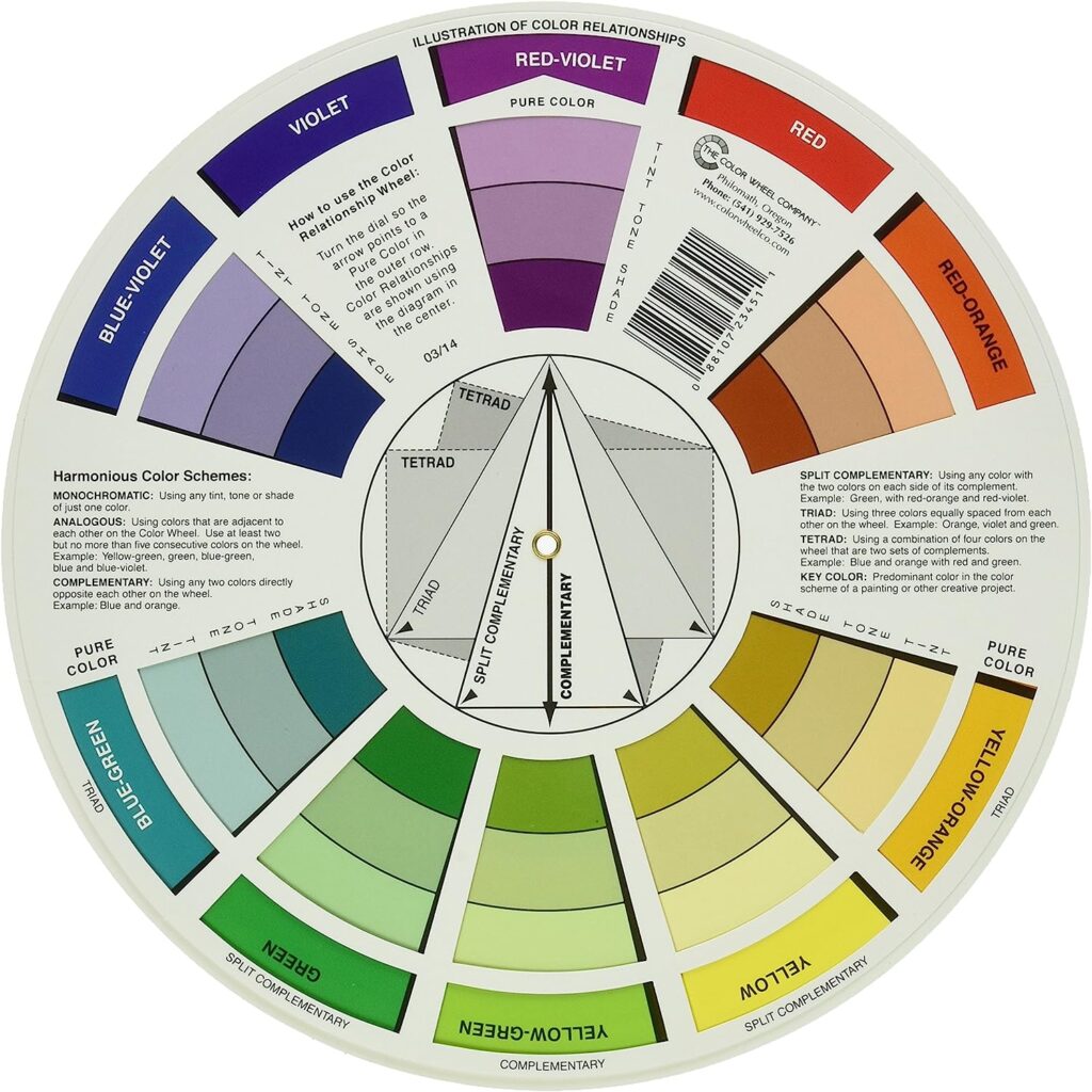
If you're a visual learner, I highly recommend spending $7 for this interactive color wheel. There's no better way to understand all of this terminology than to spin the wheel and see the effects of colors interacting with other colors, whites, blacks, and grays! On the flip side, you can see color composition at play, which we'll get into.
Another way to become more color literate is to make it fun! One of our favorite board games, Hues & Cues, will put your perception of color and your communication to the test, plus it's perfect for game night. This I Love Hue app is mesmerizing and addicting, and they have a newer I Love Hue Too version. In both games, you drag and drop color tiles on a spectrum of color into the proper placement–really satisfying and will train your eyes to see even the slightest variation in color.
Color Temperature (Warm vs. Cool)
You can cut the color wheel in half to separate warm colors from cool colors. Reds, oranges, and yellows are warm. Greens, blues, and purples are cool.

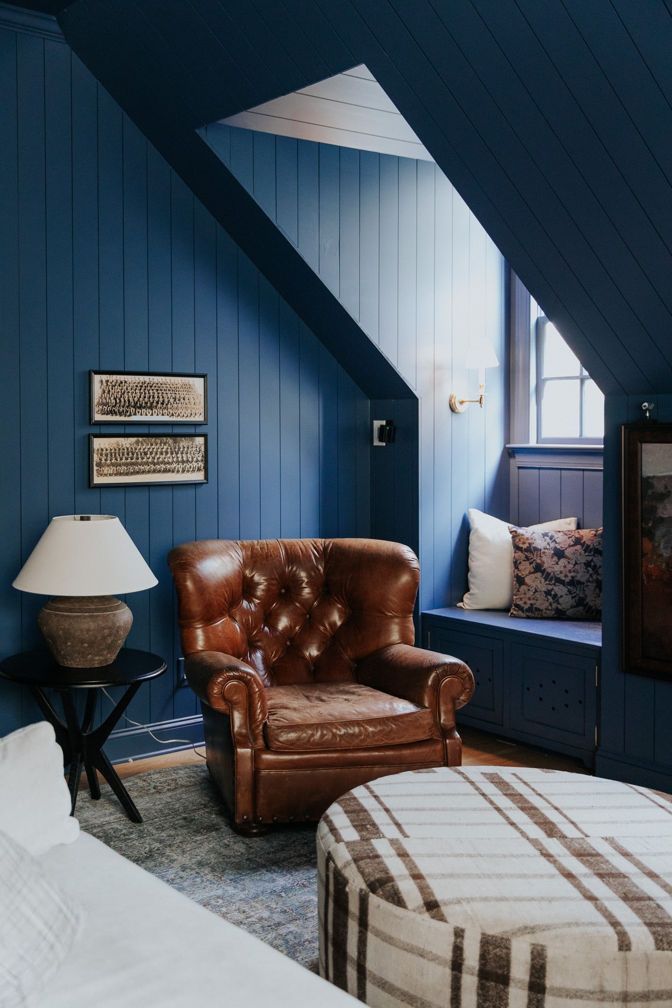
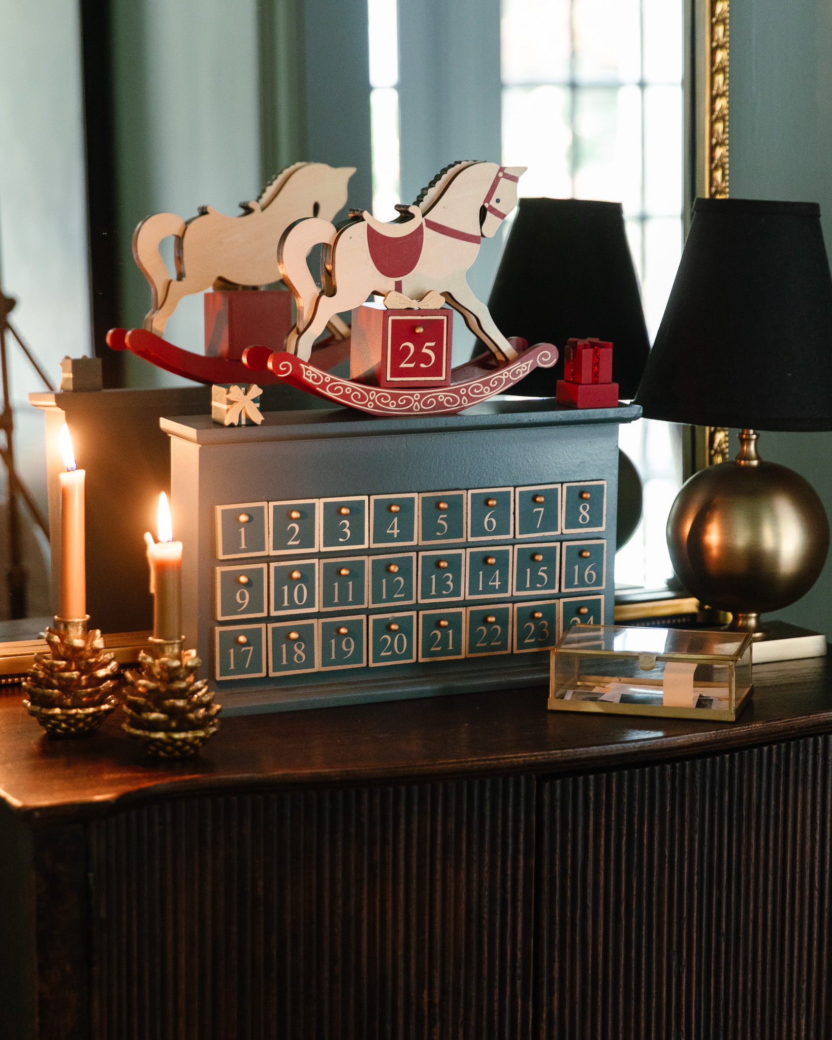
Shop the music room
But of course, it gets more complex than just that because you can take a warm color like red, mix a bit of blue in, and suddenly it's a cooler red. Technically it's still considered a warm color, but it has some cool undertones. Now if you keep mixing in blue to the point that it's more blue than red, then it would be considered a cool color with warm undertones. Clear as mud? We'll cover this more in-depth in the next lesson!
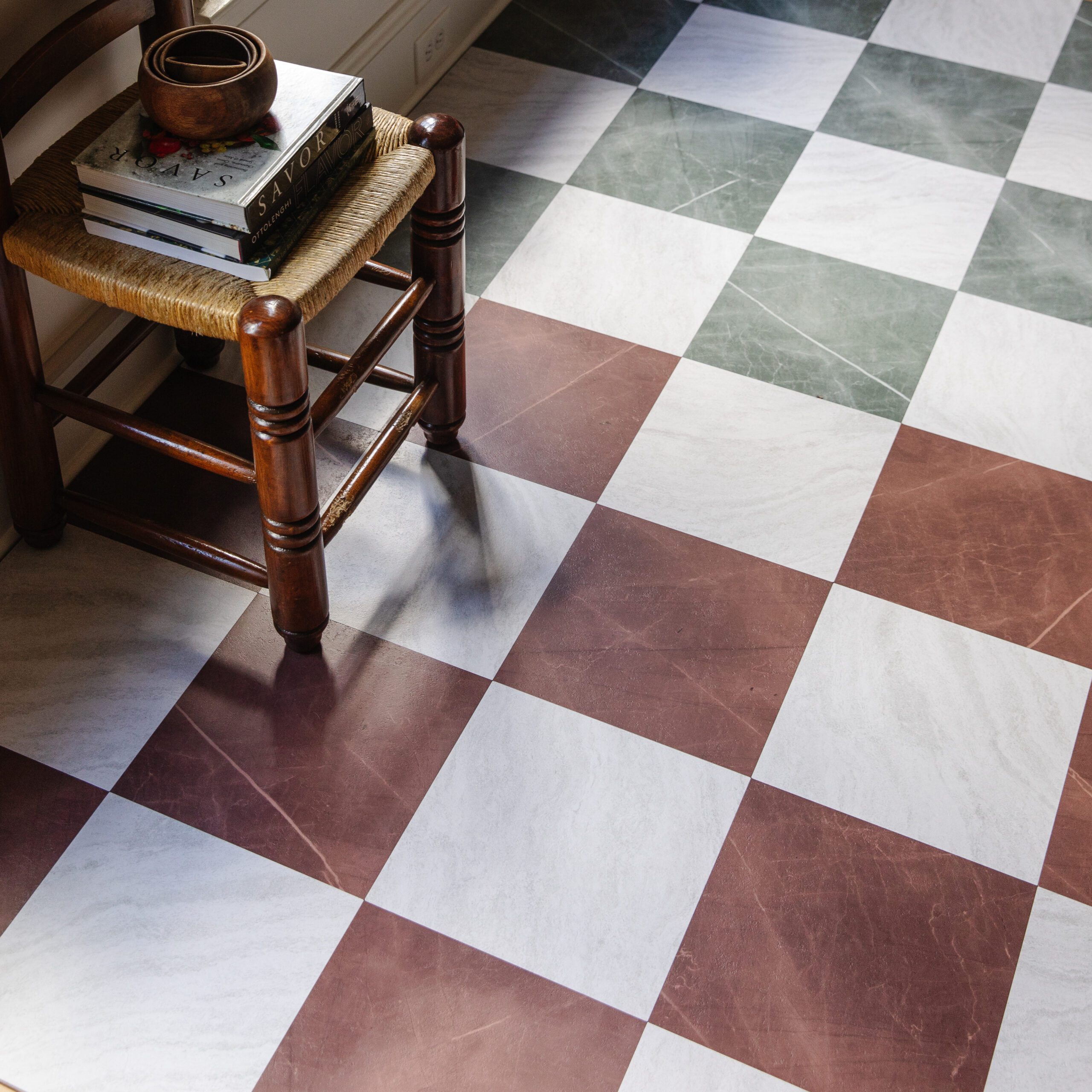
Shop the bonus room
As the names indicate, warm colors remind us of heat and sunshine, and they can invoke coziness and passion into a space. As for cool colors, we tend to associate them with the sky and water, and they can make us feel calm and refreshed. Can't wait to go more in-depth on the psychology of each color in upcoming lessons!
Color Harmony
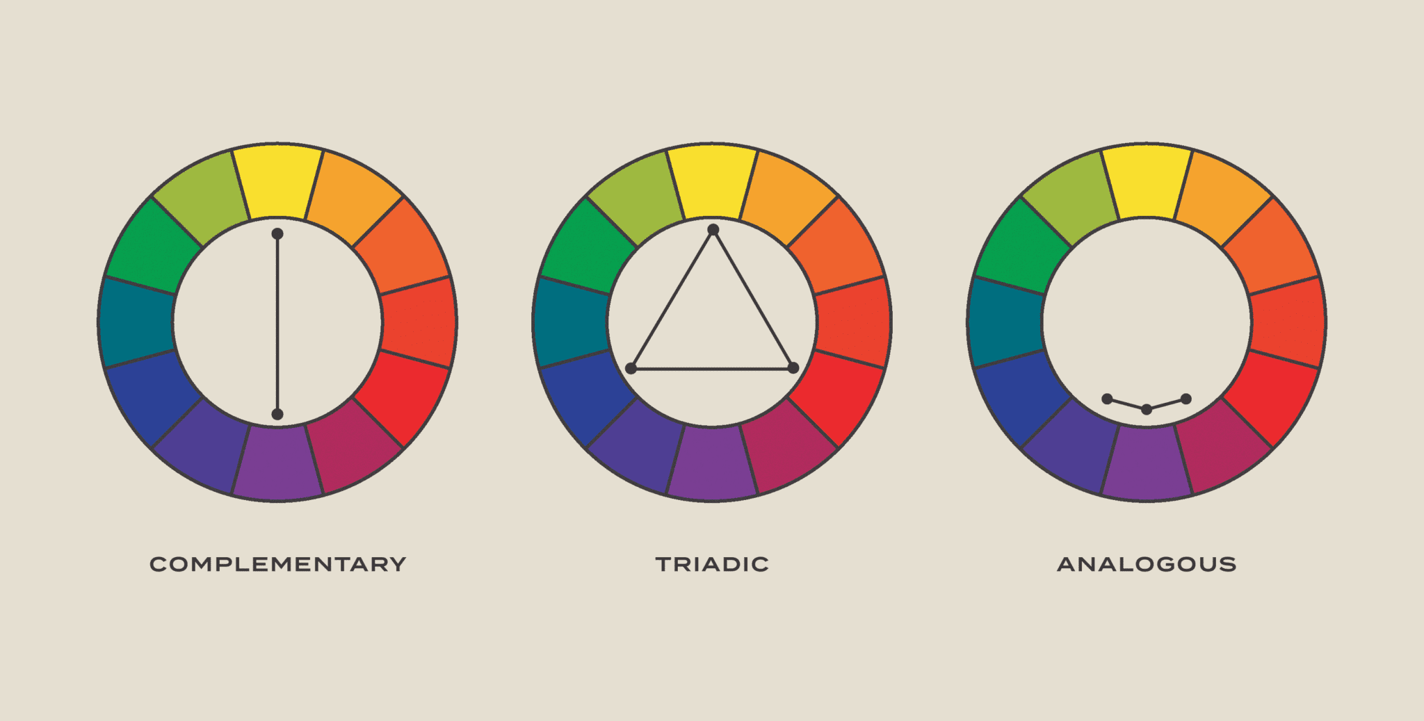
This is usually the question I get asked the most when it comes to using color in your home! "How do I make sure the colors in my home feel cohesive and balanced rather than clashing?" Luckily, there are already some tried and true color compositions you can and SHOULD rely on to bring harmony into your home. The $7 color wheel I mentioned above can help you identify color schemes that just feel right. Here are some of the more common ones:
Complementary: combining opposites on the color wheel.
Triadic: three colors evenly spaced on the color wheel.
Analogous: happy little neighbors.
Monochromatic: a single hue in varying shades and tints.
If you want to dive in more thoroughly and explore even more color harmonies, I found this blog post to be helpful.
I tend to gravitate toward complementary and monochromatic color palettes in my own home. To me, they feel the most balanced and simple and allow me to focus on other design elements like texture, pattern, shape, etc. So you have my permission to stop overthinking it! Also, after this information overload, I hope it doesn't defeat you too much for me to say, there really are no strict rules when it comes to home design. You should feel free to explore color in a way that resonates with you and your personal style and preferences. What is it say about rules? They're important to learn so you know when to break them.
Be sure to get on the email list if you're looking for more actionable steps and bonus content!
Leave a Reply

WE'RE CHRIS + JULIA
Portfolio

Projects


















This information is so helpful! Cannot wait to learn more. ....And the color wheel is already in my Amazon cart.
Finally catching up with color school and this was great! Thank you!
This makes me miss your podcast.
What do you mean by “white undertone?” Never heard that before.
This is WONDERFUL! I was a printing major in college and did lots with color theory, but this is such a good base foundation of where to start. Thank you!