The first day of fall is tomorrow (!!!), so today I am excited to share with you a few seasonal (and not seasonal) changes we've made in our living room over the past few weeks. For a long time, there was a bare section to the left of our sofa--see below. We've tried numerous end tables over the years but none filled the area or provided the extra storage we wanted.
And since there's a bump out in the dining area where the laundry room is on the other side of the wall, the living room is kind of forced over so everything stays in alignment with the dining room and kitchen. You can see that bump out in the old photo below of when we still had the fauxdenza on that wall. And, yes! I finally figured out what I want to hang there--coming soon.
But back to the extra space next to the sofa, because I found the perfect something to fill it!

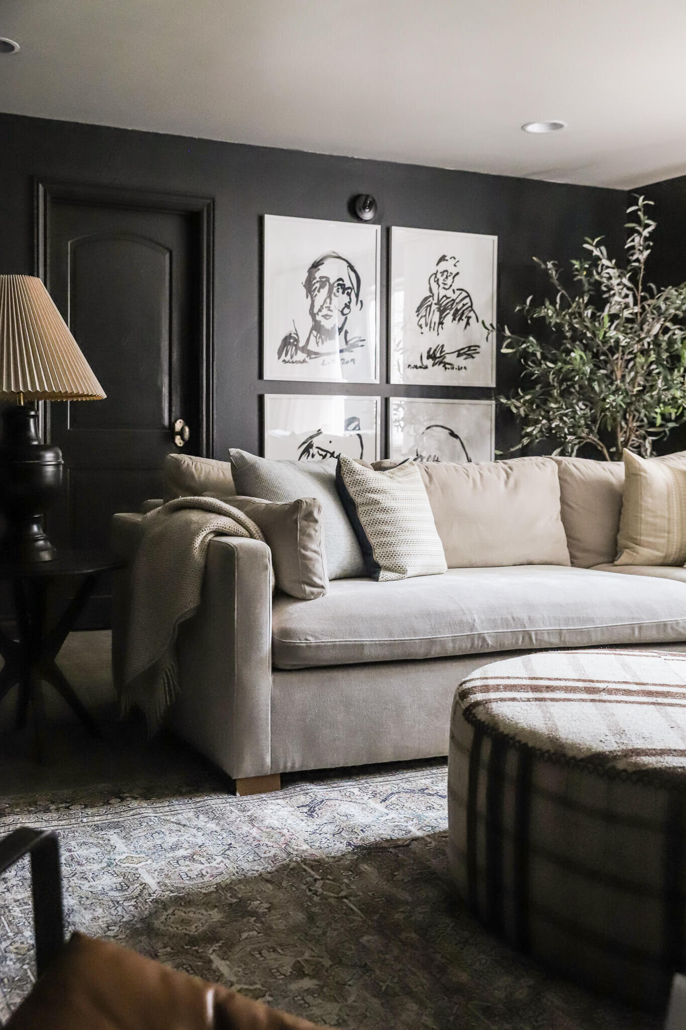
I looked at everything from bookcases to end tables and even nightstands, before we landed on this small black sideboard that I'm completely head over heels for. Part of our criteria for this space was whatever we were going to put there had to 1. Fill in the space from the couch to the corner (the neighboring slanted wall will remain blank.) 2. Provide storage 3. Be sturdy and safe enough to withstand lots of little hands.
This sideboard is actually designed for a dining room in mind (it's deep enough for large dishes and trays!) but it has proven to be the perfect addition to our living room. It stores our magazine subscriptions--two rows deep!--baskets for extra throws and my fall candle collection. And the big bonus is the modern shape is so slick (I love the raised base), but it's such a practical piece of furniture, too. I can imagine it as shoe storage, the perfect display for a collection, a small library, a mini bar, or definitely a place to show off your favorite dishware, too. As the weather gets colder, the extra storage is perfect for hats and gloves.
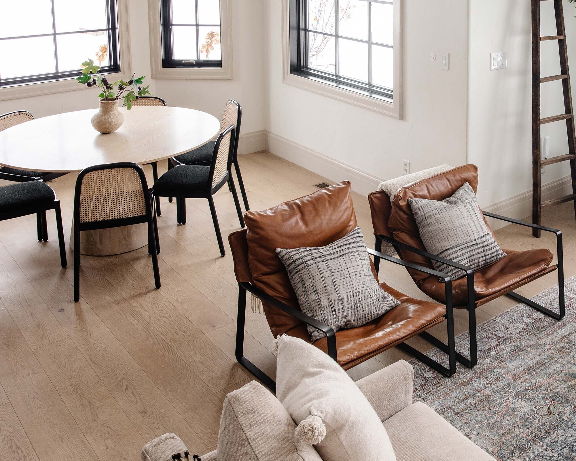
We've had our Lounge sofa for over four years now, and it's still the comfiest seat in the house. But for fall, I love switching up pillows for an easy refresh. Layering in a warm leather pillow with a nubby textured throw and neutral accent pillows. I'm all about the seasonal touches that feel like autumn (branches, acorns, leaves) but don't scream it. So today, I'm sharing my 5 tips to naturally transition your space for the fall season on Crate & Barrel's blog! You can check out all the tips, and more photos, right here.
SOURCES (click right or left arrows to see more):
Leave a Reply

WE'RE CHRIS + JULIA
Portfolio
Projects







Where are the branches/leaves in the white vase from?
I picked those up from our local craft store.
Thanks for the feedback! I also bought the Lulu & Georgia light brown moroccan pouf you have in your living room, and after a few weeks it still has that bad leather smell it arrived with. Do you have any tips on getting rid of it? I love the pouf but it smells like a camel in my living room.
Ew! Ours didn't have a smell at all. I would email them and see if you can exchange it.
I've been thinking of using a similar picture ledge over my sofa, in place of the one large print or mirror I've typically hung over it for years. It seems more versatile than hanging a gallery wall, and I like the look of the solid horizontal line grounding the arrangement as well as the ability to overlap items.
My concern is safety when my grandchildren are here. Since you have young children, do you do anything to secure the frames at the top so they are not easy to knock off the ledge?
The ledge is deep enough that all the frames lean really well. We haven't had any accidents with frames falling our anything.
where is the ledge from? any recommendations?
love the look! just a unique way to do a gallery wall
We DIYed it! Check out this post for the easy tutorial.
Gorgeous but screaming for some pads to shimmy it up to sit flush with the side on the rug!! :)
That knubby throw! Be still my heart!
Love your house! Love your podcast, too! I listen to it while I'm at work. I'm an interior architectural designer. You guys are so creative!
As far as the rug issue, perhaps you could pull it forward enough so that it's in front of the console, but the front feet of the sofa are still on it. That's a trick a lot of designers use. The rule of thumb is that the front feet of all the pieces of furniture should be on the rug. But only if it bothers you, of course.
The rug is gorgeous, too! Where is it from?
Can you say where it's from. Can't look at rstyle links here at the office. :-(
the sideboard? Crate & Barrel.
It looks great! Now I wish I had a spot for it in my own home!
Where did you get the flowers/branches on the coffee table?
Just the local craft store. :)
Thank you, What are they?
Oh I do love this! Now, if you could just come on over to my house & help me find the right side table/lamp combo to fill my awkward "bedside the sofa" spot :)
Amazing! Yet another perfectly curated seasonal collection without being all up in your face. I just love your style. Anyway, this is a random question but it popped in my mind given the couch and decorative pillows in the post. With the Lounge II sofa being as deep as it is, do you find you can actually keep the pillows on the sofa behind your back while you sit on it, or do you still find yourself having to toss them in a basket, on the floor, etc to actually get comfy on the couch? I, along with 90% of the population, adore decorative pillows but admittedly get annoyed when my kids (or even myself!) whip them off the couch since usually with a standard depth couch you don't have enough space to fit your body + the pillows. Sorry for the strange question! ;) I've been eyeing up the Lounge II for a while and probably should just go sit on one in-store, but figured you might have a thought or two. Thanks!!
I think the sideboard being half on the rug and half off is odd. Felt pad will help it be level but I still think the rug needs to be under all of it or none of it. It looks a little crowded there with the picture rail over it and the spacing around it being pretty tight on either side. Sorry, I think this is not the right piece for you there...
To each their own, right?
I agree. Not really my cup of tea but if it works for them..
I agree.. I usually love everything they choose. But I think it looks too cluttered with that piece there. I would think a smaller end table or a belly basket would look better.
I agree. The whole thing looks odd and crowded. But if it works for them, that's what matters I suppose.
LOVE the subtle fall hint you have in the room ! Just enough so it's in harmony with the temperature, but at the same time not in-your-face-autumn that if you let them sit there in December it'll feel weird.
Love multipurpose furniture, especially anything with glass doors! Is your couch still 18" away from the wall? If so, I imagine the new cabinet might help to transition and bridge that space. Also, do you think you'll put levelers underneath the sideboard since it's spanning the edge of the carpet?
I'm always changing and updating rooms over the years, so it's been great to see that you guys do the same. Thanks for all the inspiration/motivation!
The couch is only about 5 inches from the wall (although when you add on the back cushion, it more than doubles how far one would actually sit from the wall) and the sideboard is about 4. It's looks like a natural gap. And yes! As I mentioned in the above comment, I think I'll put some felt pads under the left side.
Ok that makes sense now - I've combed through tons of your photos trying to figure out how such a large gap doesn't look awkward! And felt pads seem like a perfect solution to your sideboard - you can always use a Sharpie to darken the edges if they stand out.
I was going to write in the same thing but see multiple people have! :-) good thought coloring the edges black.
Your home is beautiful and I love the natural elements you bring into your home. You are both so talented! I was wondering if there was a way you could elevate the left side of the console slightly to keep it level with the carpet. We've run into the same issue here and I'm always looking for a way to solve it while keeping the design of the piece pure.
Strange you say that, because while in person it's undetectable, in the pictures I definitely see how it's skewed. I think I'll add some felt pads under the left side. :)