It feels like we’ve been tweaking our entry forever. But I am happy to report, the plan we set out to execute a couple months ago is all in place and we couldn’t be happier with the outcome. This is how our entry looked when we first moved in:

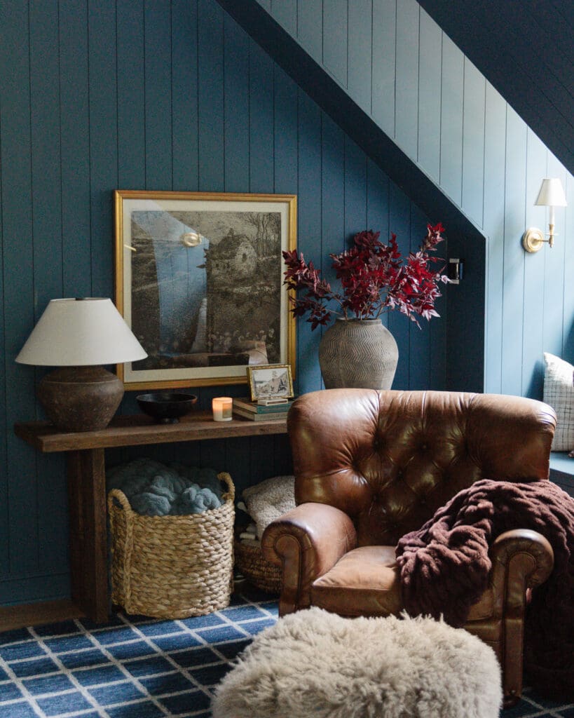
I know it is sometimes hard to understand how everything is laid out from photos. This photo was taken from the reading room. The front door is to the left right outside the room and the living room to the right. Here’s the mood board we came up with after our failed entry:

And here’s how it looks all in place!

The last thing we were waiting on was our Edward Hopper painting. We got it from Arts Heaven which is a great place to get real oil painting reproductions for a reasonable price. Nighthawks is definitely Hopper’s most famous work and one I studied in depth in college. We really want to expose our girls to all kinds of art. We have lots of Etsy artists represented in our home, my own work hanging, and we hope to mix in some more prints and reproductions of famous works to expose our girls to a variety of art in the home–which is exactly what my parents did.

A poster felt a little “young” for us in this home so we went with a reproduction. The quality and colors and texture are so beautiful. We couldn’t be happier. It arrived painted on unstretched canvas and for our 6th anniversary earlier this month, we decided to splurge and have it framed rather than going the DIY route. A local shop was having a 60% custom framing sale and they threw in stretching the piece, too! Even after 60% off, it was over $400 to frame, but for something this size (32×48)–that is a steal. We picked this greeny-gold frame that ties in well with our floors and the adjacent rooms and fixtures and felt appropriate for the painting, too.


It looks like it is hung high in these photos, but I assure you the top of the painting is lined up with the top of the mirror which puts it at perfect eye height with the bottom falling just below my hips.

Here’s a shot from the front porch just outside the front door so you can get an idea of how things look as you walk in our home:

While we initially thought the bench and hooks on the wall that now holds the Hopper would be best, we quickly learned it not only crammed the area, but it wasn’t something we enjoyed opening up the door to see. Now, it’s a welcoming entry and the hooks off to the side are perfect for guests. We’ll eventually have our personal coats in the future mudroom off the garage entrance.


We’ll end on Charly–is this becoming a theme?! She follows me around all day and plopped down right here as I was photographing the space. What a sweatheart. We’ve talked about getting a proper art light for above the frame but we haven’t found the right one yet. We were searching for a battery operated one initially so we wouldn’t have to hard-wire it, but they all seem so small with bad reviews so we might just have to hard wire one after all. Besides that, the entry 2.0 is done just in time for the holidays. Sources and links below!
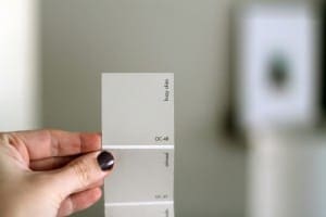
Sources || Wall color: Benjamin Moore Hazy Skies / Edward Hopper Nighthawks reproduction: Arts Heaven / Stones Throw Away wallpaper: Hygge & West / Boulevard Hooks: Pottery Barn / Mirror: Ikea (painted gold) / Blue tufted bench: Target / Canvas and leather shoe bin: TJ Maxx / Carpet Runner: Suit Yourself in Linen Flor tiles / Banister paint color: Clark+Kensington Tomcat


It looks so elegant without being fussy. I love it! I liked your “failed” entry too but this is definitely the entry 2.0 edition. I feel like a lot of our decorating is still “young” even though we’re probably older than you guys :P It’s a good reminder that if you want a grown up look sometimes you hafta fork over the grown up bucks. Great original design, guys!
I agree, it looks fab! I wasn’t sold on the wallpaper but it’s definitively growing on me. :-)
I too think something is needed below the painting, but I’d be tempted to go with a shallow but chunky-ish floating shelf; maybe in weathered wood to echo the painting’s frame? A console would be too much I think. It probably looks completely different in person but to me the painting looks a bit lost alone on that wall.
And talking about the painting, any worries with fading due to the sunlight streaming in? I realise it’s a repro but you went to the expense of getting an actual oil instead of a poster (good call for something so important!) and I’d hate to see it get damaged by sunshine. :-(
Love it! I have to disagree with adding a console table underneath, I say leave as is. Love the direction this has taken after your initial entry (which I admittedly didn’t hate, but this is SO MUCH better!)
Love everything about your entry!!
The first picture with that nasty green bathroom…shutter!
Happy Thanksgiving!!
Oh man, that painting. I love it. Makes me want to get a big oil reproduction of my own favorite painting!