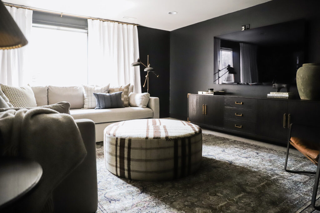
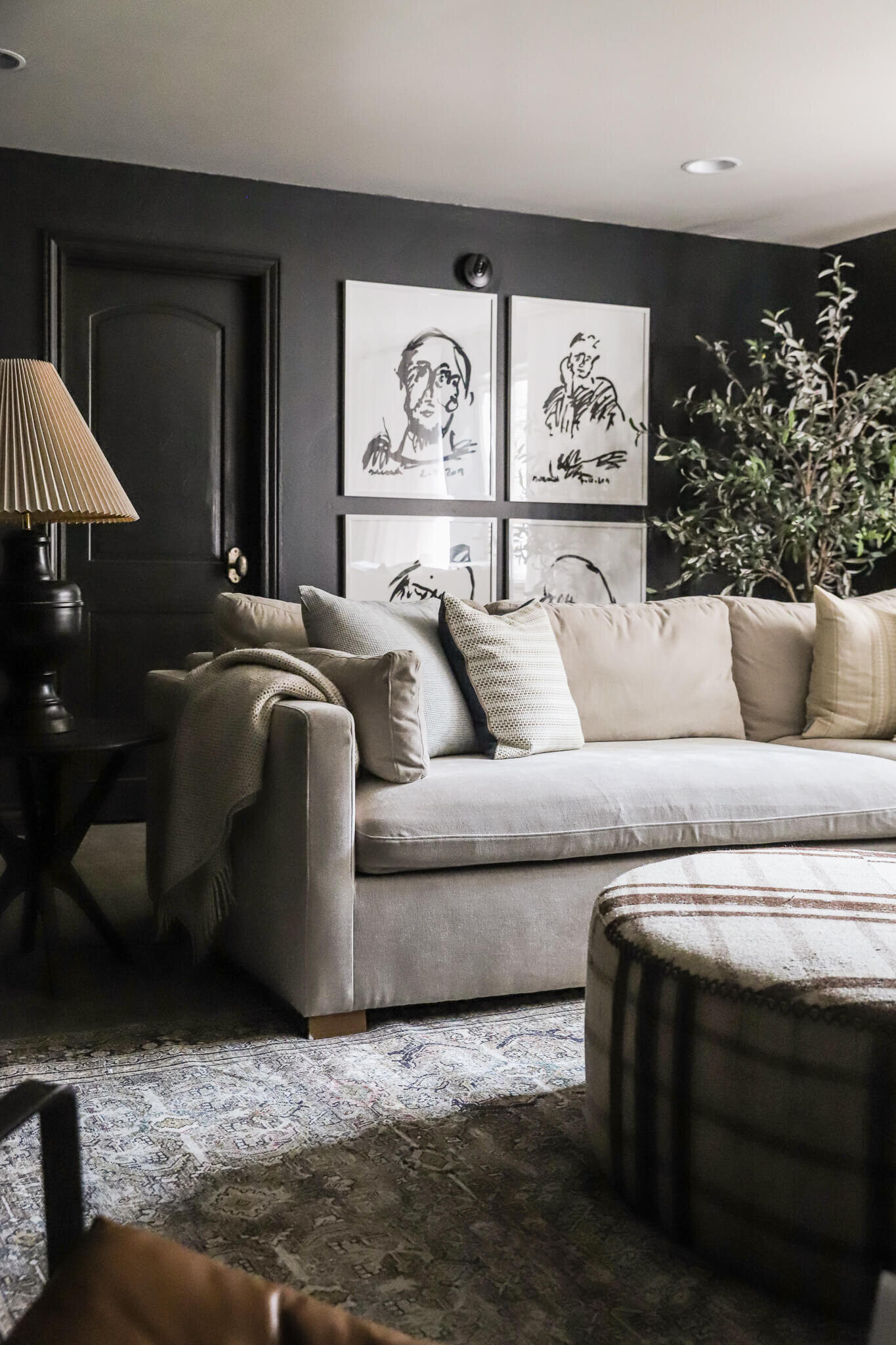
The bonus room has already evolved from the playroom since we moved in. I quickly realized that it was far too central to have toys emptied on the floor, so we swapped the girls playroom where the theatre room was going to be. Funny how much has changed since we first pictured our family living in this house. Now that our Charly sectional and Frame TV have a home, we've been spending all of our time in there as a family–hanging out, watching shows, and chatting before the day is over. In fact, we spend more time in this space than any other room in the house! It's shocking in a good way. I never expected it and we love the light and natural gathering space. We even tucked the girls computers in the corner. It's so central and an awesome room for our family.
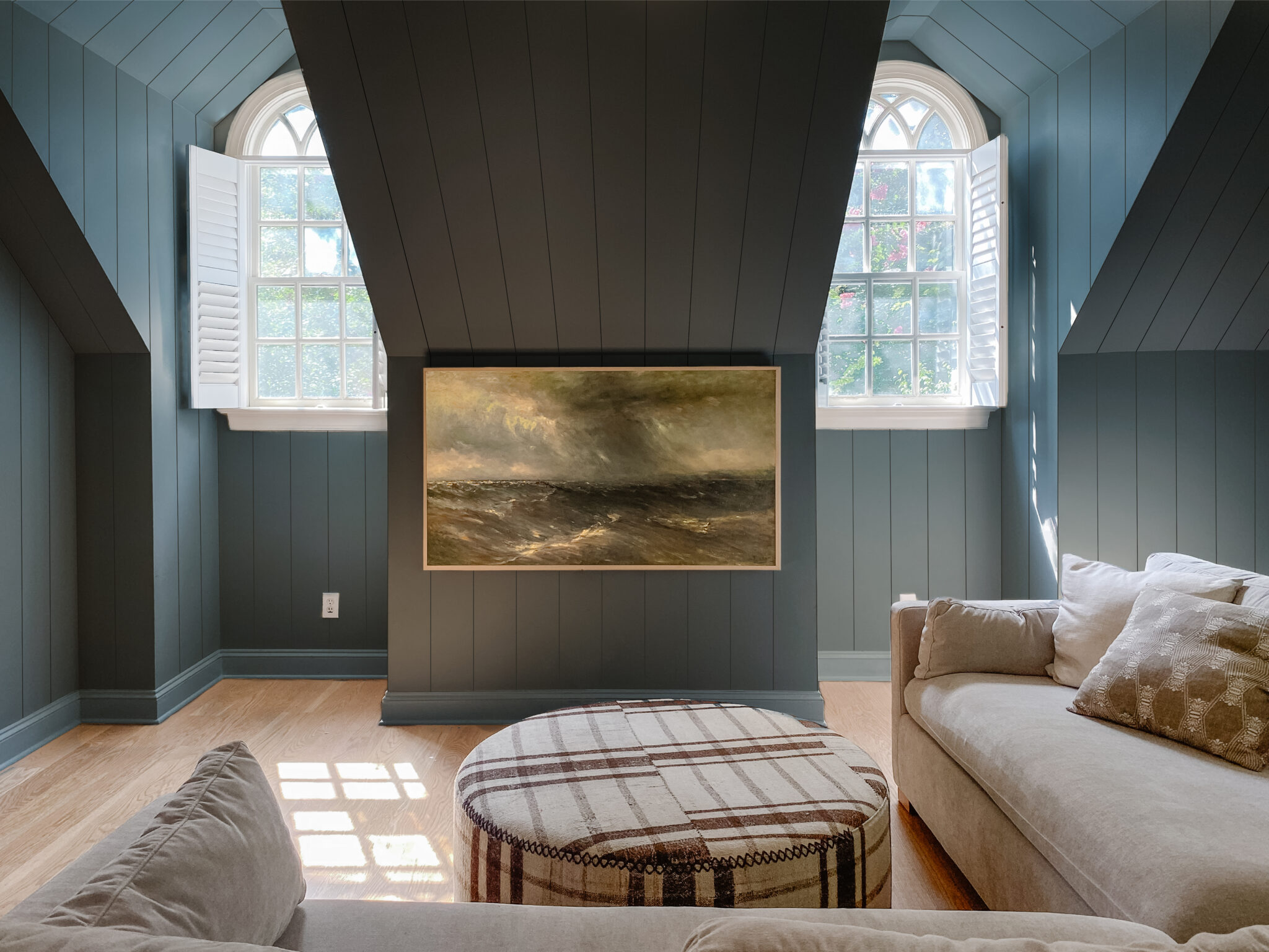
I've been envisioning installing paneling and trim on the floors and ceiling, all painted in a mid-toned, dusty blue and I'm itching to get things rolling (pun anyone?). But before I can get my hands on a paint brush though, we're tackling a small project that in my opinion, is non-optional if you're mounting a TV to a wall.
My honest thoughts? Unless you're setting your TV on a media console, hiding your cords is a MUST. Come at me! Okay but in all seriousness, messy cords dangling below a beautiful big screen, are an eye sore, and distracting. We all agreed the best place to hang our TV in this room was the little box-of-a-wall in between the two windows. It's a little lower than where we would typically hang it, but it's actually working really well and honestly I'm already thinking it needs to be a tad lower--perfectly at eye level. The cords need to go though and we've been brainstorming all the ways we to do that. The good news is, there's options and we thought we might share a few of them.
1. Move the outlet to behind the tv.
When we moved into our last house, I think this is what they were trying to do in our family room except the plug was too high. *face palm* But it can be really effective when done correctly!
This is the trickiest option, and might even require you to hire it out to an electrician but outlets can be moved! Relatively easily if they are straight up and down and don't have to go through any studs. If you move the outlet so that your cord can plug in right behind where the tv is mounted, then everything gets hidden behind the tv. For our case, we will be moving the plug completely so that the tv will be the only visible thing on this wall and look even more like art.
2. Channel the cords to a different outlet
Perfect for any beginning DIYer, channeling the cords by cutting a hole behind the TV and down to an outlet below is an easy option if you have a nearby outlet you can thread your cords to. This is the route to go if you have an outlet already existing below your tv and you will have something in front of that outlet hiding it. But it does require some simple tools! This is how we did it in our last bedroom (really easy!)
We actually did a video tutorial of this in our Modern Cottage house that you can watch here!
3. Paintable channeling
Where are my renters at? This is the solution for you! If you weren't aware, you can buy channeling that you thread your cords through, stick it on the wall, and you can even paint over it to match the color of the wall. We used this option in our first apartment!
4. Don't mount it at all.
Not all TVs need to be mounted on the wall. There's nothing wrong with setting a TV on a media cabinet, especially if you don't have the time or know how to hide those sneaky cords. In fact--I dare say if you aren't going to hide the cords, I wouldn't mount it.
Because we're going to be removing the plug entirely here (and it's daisy-chained--or connected to all of the other outlets in the room)--we'll bring in an electrician for the job. In the meantime we took to photoshop to see what it would look like... Let's just say we got a little carried away.
Dreamy, right?!
Leave a Reply

WE'RE CHRIS + JULIA
Portfolio
Projects
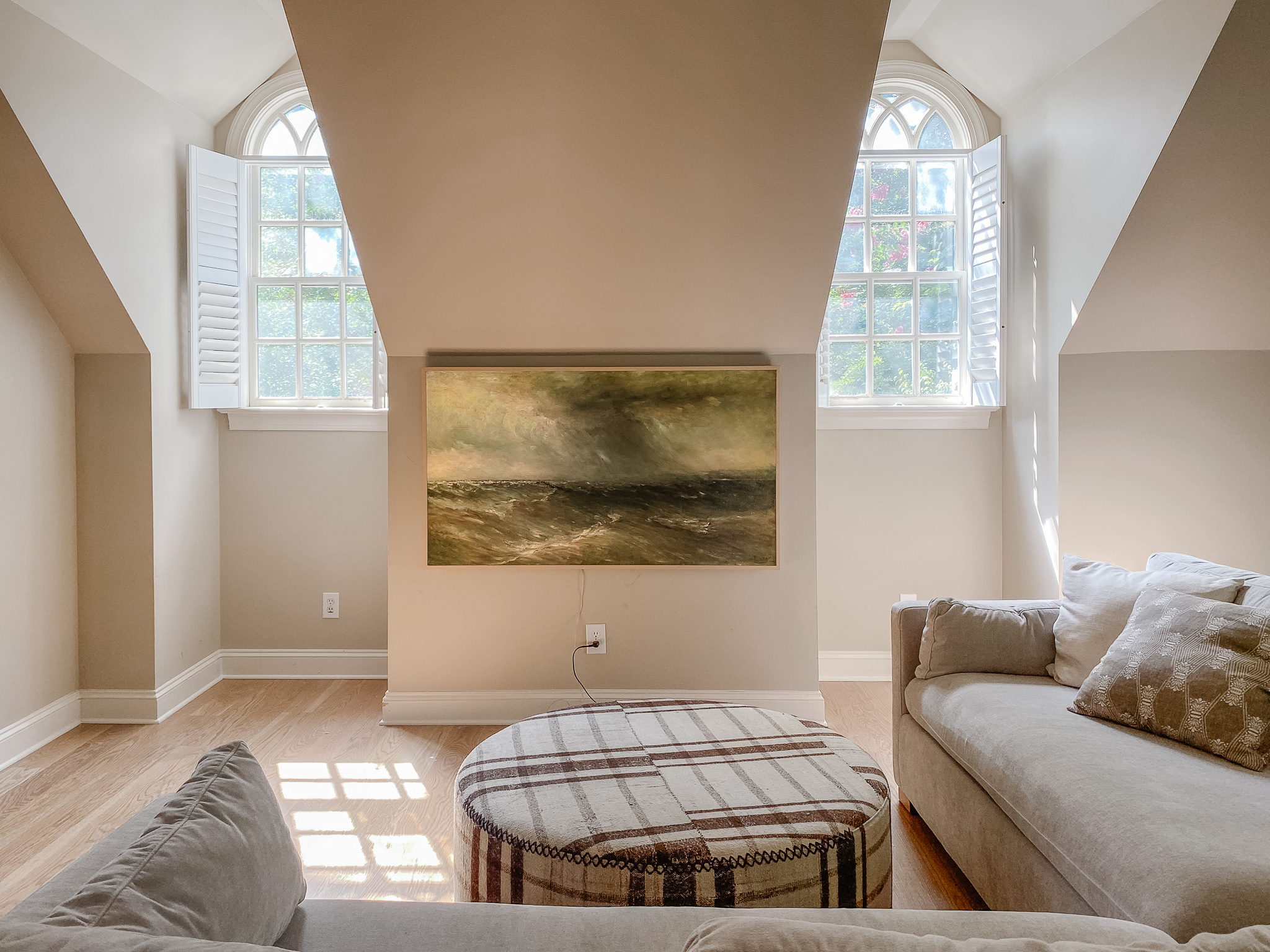













I love the blue walls juxtaposed to the cream and brown plaid ottoman.
Please keep sharing information.Always love to read your post.Thanks for sharing your thoughts.
This is the absolute best "getting carried away" possible
I agree! TV needs to be lowered a tad! Putting a bit of space between the TV and the ceiling pitch will frame it nicely.
Its adorable, cant wait to see it when you do it!
What’s the name of the blue in the mock up
We based it off of Inchyra Blue by Farrow & Ball
Love that color, wish I knew what the name is.
New color is very dreamy!
I always thought the advise to live on ones house a while before changing things made a lot of sense. As you swapping out the playroom & media/gamily room flip, illustrates.
So will you be waiting to see how other spaces play out too?
Always!
So beautiful! And I love that you mention the tv at eye level. I need advice on where to hang my tv in a new home where the outlet was placed above the living room fireplace. I know it’s common to hang a tv above the fireplace but it’s too high! Problem is the living room is open on two sides (to kitchen and foyer), the third is windowed (and would require a couch placed opposite it to cut off flow to kitchen). It’s been rattling in my head! Help!
Love the low mounted TV. Many put the TV too high.
Hiding the cord is such an upgrade! Now I just need to convince my husband to switch to a frame TV! P.S. My brother is an electrician and it is awesome!
Here to say I love low, eye level TVs! My neck is a little wonky and gets stiff if I have to keep my head tipped looking slightly up, but even my husband and his normal neck are converted to the eye level tv :)
Love this design! Just curious, how will you make the paneling transition seamless from the walls to the slanted ceiling. We have something similar in our house and I have always been curious!
Can't wait to see this come together!
We'll definitely do a full post on it!
For those of us who can’t wait, is this tongue and groove like the ceiling in the Modern Cottage master closet?
Yes!
We have an upstairs media room VERY similar in terms of the ceilings and window nooks. I’m completely inspired now for paneling and painting. Can’t wait to see it when it is all finished!
Beautiful! I’d love a tutorial on how you changed the wall color (with shadows) in Photoshop, if you haven’t done one already.
Check out this post! https://chrislovesjulia.com/4-photoshop-lightroom-tricks-when-design-has-you-stumped/
Where do you put the black box that comes with the art tv when you hide the cord?
I don't want anything under the TV, so we are going to run the cord through the wall off to the side.
Oooooooh my word that mock-up!!! Looks so dreamy! (And I was worried at first when you said you wanted to put trim on the floors and ceilings but I figured you meant walls haha) I cannot wait to watch this process unfold!
Thanks for the tips! The mock-up looks amazing. The color looks like DeNimes by Farrow and Ball? It’s a beautiful muted mid-toned blue. Just used it as we transitioned our college seniors’ room transition from teen mess to inviting guest room.
Oops typo.
The blue is toooooooo good!!