Our new large dining room is completely boarded up and dark, so I don't have a lot of photos of the actual space right now, but the insulation is scheduled to be sprayed this Friday, which means the electrical WILL be done by then. (I love a good hard deadline). The electrical has been turned off in the living room, music room, up the stairs, down the hall and in our bedroom for a little while so we are all very eager to have that done--you know how much emphasis I put on lighting.
(Photo from before the room was completely demo'd followed by an early rendering of the finished space)
In terms of natural light, we're getting close to getting that back, too. The five doors in the dining room are all framed in and will be arriving next week (yes, our big arched window in the living room will be coming in at the same time! eeee!) so we are going to move to a hotel for 2 weeks starting next Monday so we can stay warm and out of the way a bit while the living room, breakfast nook, new dining room, our bedroom and closet all get new windows/doors. That's going to change everything and we can't believe the time is almost here to see that all in place.
The other reason we'll be moving out for a couple weeks is we scheduled our floors to be replaced at the same time. With a lot of encouragement from pretty much everyone that there would be no easier time, we're taking the plunge and while we're out, we scheduled new carpet to be installed in the girls' rooms and wood flooring in the rest of the house. I'll share more about that in a future post, but back to the dining room! Because we made some big decisions this weekend!
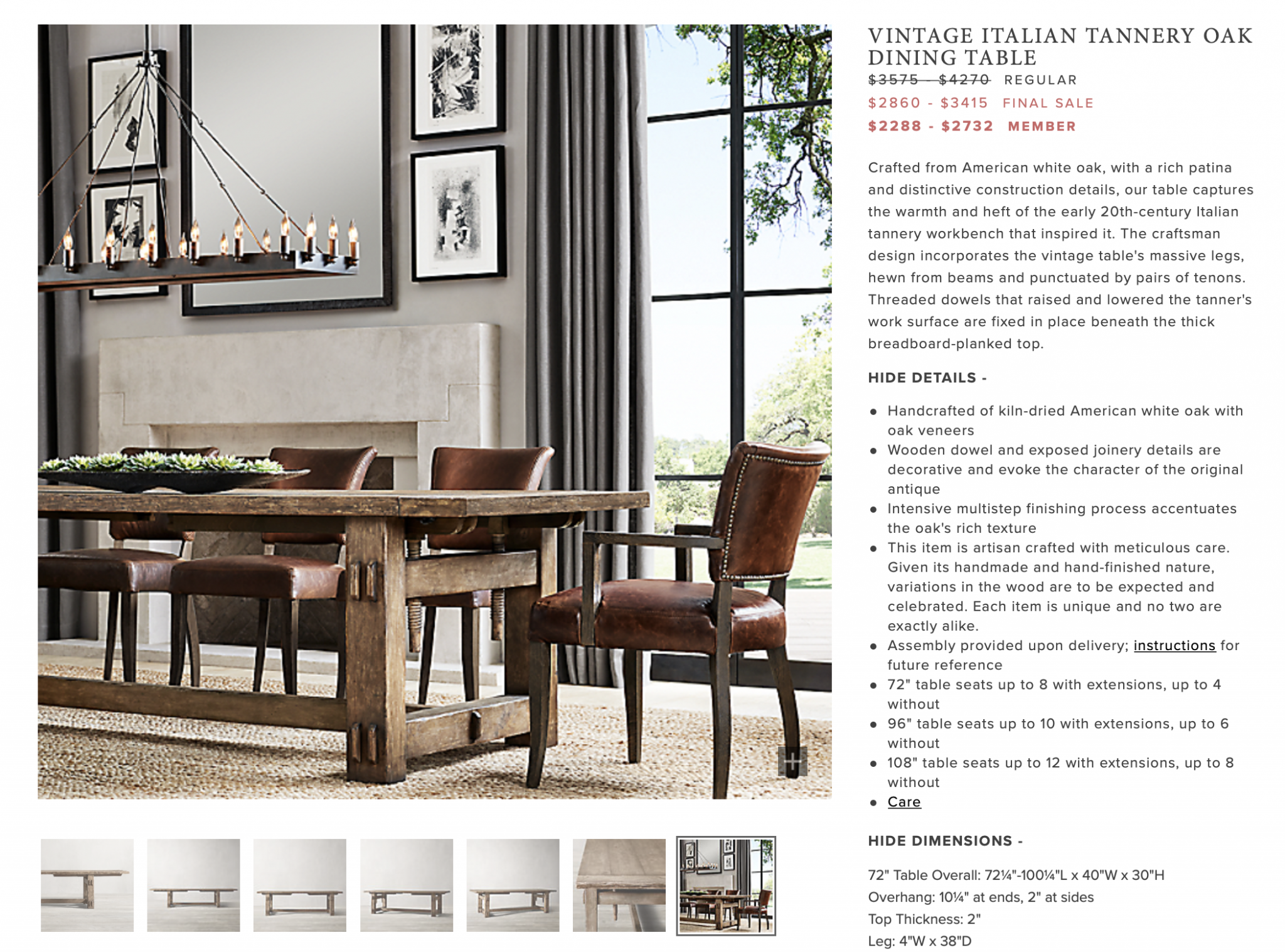
The plan was always to have Chris build a big 22 person table for the dining room, but with that not happening until the spring at least, we started poking around to see if there were any other good options out there. We taped off a proportional table in the space and landed on 240 inches. That's how long the table needed to be. Now--no one sells a 240 inch table (weird) but we were open to putting two together if they were the right one. We were looking for something at least 120 inches long. Even 120 inches was slim pickings, but all the best were from Restoration Hardware. They have all the most beautiful long tables that extend even on top of that length but they were always way out of our budget. But! They are were having a huge sale right now. And! Last year at this time, Chris had bought their $100/year membership when we were going to buy something for the cabin which grants you an additional 25% off, which suddenly put several dream tables in our price range. We ordered two 96" tables (that extend up to 132"!!) ) for the price of one from Restoration Hardware this weekend.
Specifically their VINTAGE ITALIAN TANNERY OAK DINING TABLE. We really wanted something with a lot of warmth and character to offset the black and white tiled floors we're laying (more on that in a minute) and fell in love with this one for all of its vintage, more rustic charm.
We calculated dimensions for hours trying to figure out which length would be best (since a few extended to at least 120"). We determined the 96" would allow the chairs to be around 6" apart with no weird spacing for the table legs or where the table comes together. Was it scary ordering a lot of money worth of table on the internet?! YES! Very scary. But we stayed in an Airbnb a couple months ago with a very similar Restoration Hardware table (although not the same one) and loved the character so our hopes are high! I think the worn, warm wood will bring so much to the space. (Update since it may not have been clear: There are no plans for Chris to build a table to replace these.)
Once we nailed down the table(s), we were ready to focus on chairs. This took DAYS and I wish I was exaggerating. We needed 20 chairs, gulp, and the dollar signs were already adding up in my head. We started with a list of what we wanted: Something under 20" wide. Something with no arm rests so we could easily get in and out of them when we're at full capacity in here. Something wipeable. We were open to leather or wood, but were leaning toward leather so that we wouldn't have to worry about woods clashing with the table.
Finding a leather chair around the $200 mark that didn't look bright orange was a task. But I'm really happy with the one that we landed on. It's the Laredo Brown Leather Dining Chair from Crate & Barrel. I really LOVE that the color is more burgundy and the shape is simple. The reviews say the chair is VERY comfortable but Chris was still worried, although he loved the look (so we ordered them with the caveat that if they aren't comfortable, they'll get returned. Fingers crossed the reviews aren't lying!)
They normally retail for $269 each, but Crate & Barrel is having a sale that you can save up to 20% off with code SAVEMORE, so we got an additional $1076 off, bringing each chair down to $215 before taxes and shipping (those are always a bear). We went for it!
We have two of these dining armchairs from World Market already that we'll put on the ends of the table. They are marked down 40% off to $137 right now (!!!!) and they roll and are so comfortable! We love them!
With the chairs and table decided, we moved onto lighting and went in a direction we didn't expect in the initial planning months ago but couldn't be happier about now thanks to some inspiration. I thought I wanted some sort of round chandelier with glass globes hanging three across down the whole room. But, last month, we were down in Utah for Chris's birthday and sitting at restaurant for dinner one night and we kept commenting on how it felt so cozy. We figured out the feeling was coming from these oversized linen shade pendants hanging over the tables. It added so much softness, both in texture and light, to the whole space. With so many hard edges and surfaces in the dining room, and no window coverings in the plans, since the room has only doors, we knew that some softness was exactly what we needed.
These Conical pendants from Rejuvenation come in a whopping 30" diameter (as well as two smaller sizes) and after mocking them up to scale with the table and chairs, we knew that they were the ones! (this oversized drum pendant is a good option on a tighter budget) I think they are going to be such a key piece to making this large space feel more intimate and home-y.
 There will be 3 pendants hanging over the entire table (the tables and pendant lights are to scale above) and 4 sconces on the wall, in between each door, and that we haven't nailed down. We're still asking ourselves is a shaded pendant with a shaded sconce too much? Do we go brass on the sconces? Nickel? Candle? From left to right, sources are 1, 2, 3, 4.
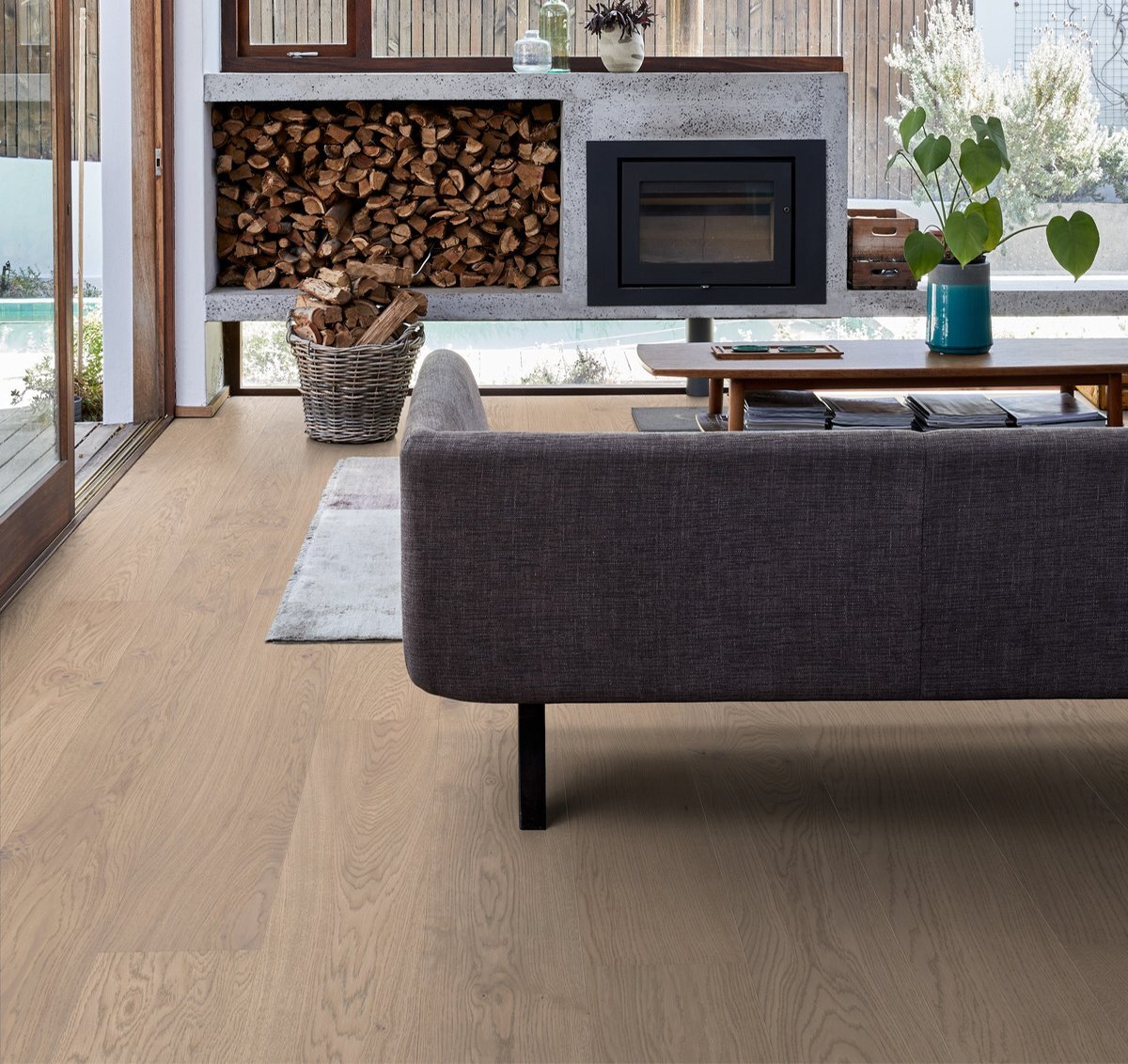
That's the last big decision we have to make, until I try to figure out a buffet and lamps for the other side of the room, but I'll probably wait until everything is in place to see what the space could use. You see the floors mocked up above. The tile arrived and the darker nero is STUNNING, but we accidentally received the wrong lighter tile. So they are sending a slightly darker, creamier Carrara Oro and I can barely wait. Sorry to keep you hanging, trust--we feel the same.
So now, without ever even seeing the dining room, you're all caught up! Hopefully more actual photos in the near future!
Leave a Reply

WE'RE CHRIS + JULIA
Portfolio
Projects










Hey! Can you give us links to the floor tile? Deciding on Mudroom/Laundry Room tile now and I love what you've chosen. Please TY :)
I love, love, love the size of this table! As someone who also has a big family - this is perfect. Question: Are you having a buffet counter or place to put food in the dining room?
Yes! We'd love to put a buffet of sorts on the right wall but I'm not sure what that will look like just yet
Have you thought about a glass ‘internal window’ to match door, on other side of fireplace in dining room? This could have glass shelves and it would open the dining room up more to the kitchen/ living space.
Also for you bedroom have you considered a false wall 3 ft away from and parallel to bathroom wall so you can face your bed out to the windows and still get access to bathroom both sides of bed ?- doesn’t even need to be full height. Keep up your lovely work!
Can’t wait to see this all come together. Love the pieces you’ve chosen thus far and I think sconce choice 1 would be perfect! I’m sure they all would but I love the idea of the candle juxtaposed with the large textured hanging table lights. And you still have the buffet if you want to add in more shades. It’s all coming together :)
A large comfortable dining space is very important with a large family. I vote for sconces 1 or 2. I love your choices for this space. Good luck!!
Love, love, love the table! This is going to be so beautiful! I think for the sconces I would go with 1 or 3. My first choice was 3 because of the black shade and the flooring and I still think that would be beautiful. But then because you said it might be too much with the shades on the pendants, I looked at 1 and it seemed to be perfect with the chairs. Whatever you choose it will be gorgeous!
The selections you have made are lovely and I can hardly wait to see more progress. I really like option #1 for the scones. I love how simple they are and that they really keep the pendants as the focus! Some big changes are coming, excited for you all!
#1 sconce first sure! Won’t compete with the shaded fixtures and looks elegant and rustic.
I spotted this sconce while looking for a client the other day and think it might work well for you too. The black would work well with your flooring and the iron echos your chair frames. There's no shade to conflict with your pendants and their substantial size would be a good scale for that room. I know whatever you choose will be lovely! https://www.amazon.com/dp/B01MUUS9B7/
I LOVE how original yet classic this is! I agree with several comments that the candle sconces would look beautiful in a matte black, UNLESS, aren't the door frames going to be black as well? If that's the case, the brass would be a lovely, warm complement to the leather chairs. Eek, just so excited to see everything come together.
This will be stunning. I LOVE option #1 for the sconces. I am so happy for you - so exciting!
Man don’t you just love it when a plan comes together? And is there a bigger rush than a good sale price on what you want? I think not!!
This design threw me for a loop! Just as I begin to think I understand your style, you change it (btw- love it all!).
Can you please help me absorb how the tulip table in your nook (Scandinavian), entryway credenza (modern), and kitchen (cottage/devol) pair with your dining room (rustic cabin-y)? Also, my vote is for #3!!! I am obsessed with Rejuvenation lighting and hardware!
No.1 sconce... it is going to be beautiful, can’t wait for when it is done????????
Oh my goodness I love this direction you are going with the dining room Julia! The style table you picked out is what I have always envisioned when you post about this space! I love the timeless feeling of the candlestick sconce, not that you asked- I’m sure whatever you choose will look stunning!
Love it all! You rev Italian so of course you should have an Italian table!! Are you worried that the shape of the pendant shades will give more of a spot light effect over the table and create too many dark spots and shadows in the room vs having every corner bathed in soft light? OR is that what you are going for?
I think they are big enough with shades that the light will be filtered, but I suppose time will tell!
Dining room will be" interesting" I am sure - a bit far from the kitchen, but given that it will be use occasionally, I am sure you will work it out and it will be lovely! Wondering why you have not made more use of the basement rooms for family space during the renovation? Seems like that area would be a great "get away from it all" for the family to hang out - I believe it has a full bath? Just curious why you have not made use of all of the auxiliary spaces during the renovation - you mentioned a few months ago that the girls were so happy just to have the couch you bought for that party (that seems kind os sad) - also you had a very large TV in you previous basement - wondering why you have not bought one for this house until now (appear to be one in your newly redone office on instagram) just for the girls to have place to hang out all these last 6 months?
Up until very recently, our basement guest room has been occupied since we have lived here. Also the weather has been really nice and we've been spending time outside as a family. The outdoors of this house is really magical and we have been thoroughly enjoying it. We're working on getting storage systems in our garage so that we have a place to put all the holiday/msc storage that is currently in the basement. Definitely one of those things where everything is connected for sure. Hopefully before winter sets in for good!
Definitely number 1, candles sconces! They echo your chosen chairs in a very lovely way. I can imagine the great ambience they will create as well!
I think the number #2 is the best for first option. The second for me would be the number #3
1 for sure!!! love that it's uncovered and I think it would add an additional touch of COZY VIBES!
2!
Can't wait to hear more about the carpet you picked. We are ready to replace our carpet but I've been waiting for your picks so I can be inspired by your choices. You always have such great taste!
Ok I was going to comment and vote for option 2, but after reading all the comments, I am confidently voting for option 1!!! I totally see the Beauty and the Beast vibes and the candle sconce will make the large room feel super cozy. Also, I just wanted to say that I really love how different your design is in this home. I love seeing the choices you are making. If I wanted to follow a designer or blogger who did the same thing every time...well that'd be pretty boring. It's been so fun to follow along, and very inspiring too. Thanks for sharing all these details!
You sound so much more excited and so much less stressed now about the renovations (thanks for all of your honesty on that front). So glad you've made the decision to just get out for a couple of weeks and go for the floors while you're at it so you can come back to some really major, exciting improvements. This room is going to be amazing!!
I would pay to have dinner in this room! It’s going to be spectacular. Can’t wait to see a future dining table setting for 20! But most of all! New carpet!!!
I've loved following your blog and instagram for years, and this space is one of the ones I'm most excited to watch unfold. My husband and I have 12 siblings between us and although we don't live near any of our family, I'm vicariously enjoying this room so much...nothing better than being able to have everyone together.
That room is going to be amazing! I would go with the candle sconces as I think they really go well with the rustic character of the table, and I like the softer contrast of the three pendants over the table to bring in a touch of modern.
You should do the baton sconce from lulu & georgia ;)
Otherwise, I think #3 goes the best!
I love those candle sconces! This is going to be so beautiful, I can't wait!
Hi Chris and Julia! I am so excited to see this space all come together! I love the lighting. My favorite is the globe sconce. Also, if the first picture in this room isn’t just you two at opposite ends of the table it will be a missed opportunity ????.
Beautiful! I love the shaded lighting! It will definitely add warmth and texture to a very large space!
Candle sconce! It will really make it more cozy and the shade sconces would be too much with the pendants.
I have that linen pendant and I just love it! I accidentally ordered a size too big (rookie mistake) but it’s so pretty that it doesn’t drive me too crazy ???? I’m on team candle sconce... it’s like your space was made for them. They would add so much character and coziness during a meal! Plus the fireplace going?! Get out, it’s too perfect!
Normally candle scones aren’t my jam, but those look so perfect in here!
Same! When I read candle scone I thought “oh no” but when I saw the image I said “oh yes.” Team candle sconce all the way!
I ran out of time reading the comments, but I love most of your choices in this room and I just want to say that your graciousness and classiness shine through when you have such wounded responders who feel the need to attack or correct every single thing you say and do. Keep up the good example.
Number 1 sconce (candles is my first choice)- all other items appear 'heavy' including the beautiful doors. I think they would both be stars in their own right as well as nice supporting characters. Also, they would leave some room for any future artwork or holiday decorations. Number 3 sconce is my close second choice. Cannot ever go wrong with that black tying in your other little black accents.
It just occurred to me that you should consider adding some more soft surfaces to this room, or it will be very loud, especially with 22 people. Curtains, upholstered chairs, rugs, tablecloths will all help keep it from having too much reverberation off the tiles and the glass. How high is the ceiling? You could add some fabric-wrapped fiberglass acoustic panels if it ends up being a problem.
Yes!! This is a big problem for us in our current dining room -kitchen, even though it isn't this big
Exciting post! Can’t wait to see it all come together.
I’m wondering if you’ll be able to get 22 people at that table. The RH description says the 96” holds up to 10 people with extensions, and when you put two tables together you lose two end seats, so doesn’t that give you 10+10-2=18?
We mapped it out with the chairs we bought and there was plenty of room. I think they are very conservative with their seating suggestions? Hope our math is right
That makes sense. They probably made a very conservative calculation with larger chairs. Sounds like you guys have analyzed it thoroughly.
It’s going to be stunning! I can’t even begin to tell you how much I’ve enjoyed following along with this renovation. Thank you for bringing us along!! I’ve seen a few comments mentioning the finishes of the RH tables. I have some chairs in black wood that are still beautiful and sturdy as can be! But I did have to return some weathered oak island stools, the finish is supposed to “smooth” over time, but literally the first time my kids ate sitting on them, it looked liked they were covered in grease stains. I will say customer service was amazing and even came and picked them for a refund! They are stunning, I hope they are what dreams are made of! :-)
Love what you've chosen as far as a table chairs and lighting goes. I am so inspired by all you do! You're the expert and whatever you choose will be great as far as sconces go. But... If I were you I'd go with the roundish brass sconces. Too many shades and straight lines in this space for the shades or candles.
Looks beautiful! However for the sconces I would stick with ones with a matte black piece to it to go with the black part of the chairs and pendants. I looked at lights a lot last year and found some through Rejuvenation, Crate and Barrel, and Pottery Barn.
I’ve seen those chairs in person at C&B and they look cool in person. They’re not comfortable like an upholstered chair is but they give a little so better than wood.
You must now have someone helping you do house cleaning? How do you host large groups twice a week plus manage kids and a full time business?
It's our family and friends! Just having my 3 sisters over for dinner that live close and my parents would be 22 people, so I don't really get stressed about it.
I didn't say you would get stressed. I asked how you handle keeping it all clean now that it's so much more? That's dishes for 20 people, bathroom use for that many, foot traffic in and out etc. I am the only sibling with a house so I host a lot.
Hi Chris and Julia! Every time I saw the rendering, it screamed boardroom and I couldn’t quite understand the appeal, but I knew your execution would not disappoint! So happy to see it go in a warm & cozy direction for family and not stuffy CEOs. May have missed a post on it, but curious where you drew inspiration from? The now mood board reminds me a bit of a wine cellar grand dining room from one of my favorite vineyards in napa. Best of luck with the rest of the work on this room, what a huge undertaking from where it started - very excited to see the finished space!
We did NOT choose the finishes in that rendering. The draftsman put those in. Helpful to see how it would be laid out though!
I visually like the candle sconce the best. Anything you choose will be stunning. I just like the contrast the lines of the candles provide. It complements rather than competes. Plus is just adds to the beautiful old-world vibe of the checkered floor. Makes me think “beauty and the beast castle” haha
Sconce number one. So so beautiful and I love the slim lines juxtaposed with your cozy pendants! It's going to be fabulous I'm just as excited for you as if it were mine! Also I'm not sure if you've thought about sealing your tables (I think they come raw with a powder sort of finish maybe I don't know what I'm talking about) mine did anyway and somewhere on Houzz years ago I found a thread for keeping that matte look but protecting the table. General Finishes in Matte a few coats and final coats with General Finishes Flat Out Flat.
I want to start off by saying I’m a huge fan and I love following along as you work on your new house. Because I’m a big fan I feel it would be wrong if I didn’t give you a heads up. I'm an interior designer and worked for RH a couple of years ago for a few months when I made the switch from working in commercial design to residential. I only lasted six months because I could no longer work for a company I couldn't stand behind. The number of calls I received in a day from clients who had just received their new expensive furniture and already had issues with it broke my heart. Customer service would send new items to clients that complained enough but for the majority, the issues continued to happen even to the replacements. While I do love their light fixtures and some furniture, I will never source any tables from RH. They are almost all made of wood veneer unless it's made of pine, a super soft wood that will dent and scratches relentlessly. The tables chip constantly and RH will play it off as the character of the furniture but its really just poorly made furniture. With their beautiful stores and sourcebooks they have a following and people seem to push asides their poorly made furniture for the look but as a blogger who is highly respected, I'd hate for you deal with this issue and also recommend the furniture to your readers. You just spoke on stories the other day about wanting to invest in long term furniture for your family and if you're going to be hosting as often as you say I only see the disappointment in your future with the quality of this table. I see a comment about the Amish building you a table of that length or may I recommend looking up a local shop who could work with you to build something custom and get the best quality out there and for probably much less than RH. I know as a designer my clients come to me for my expert knowledge and as a designer who respects you and how you offer your knowledge to so many of your readers I can't just sit back. Your table is not a custom item for RH but I can't remember their return or cancellation policy on sale items since they don't do sales often but I would definitely look into their return policy before you are stuck with a table that falls apart. Sorry for the lengthy comment I just really love following along and want to see your family enjoying this space for a long time rather than have you struggle and be sad with a table that is supposed to be special to your family on top of the stress of a renovation. I'd also be happy to share anything further on my experience if you'd like to hear.
Thanks for the head's up! We've gotten so many photos and reviews from people today on both sides. Some with an RH table they've had for 7-10 years that they have loved so much and a couple in your boat too. I guess we'll cross our fingers it goes our way. Buying one that looks rustic to begin with will hopefully help!
We bought from RH when we renovated, and the fixtures in the master bath have not held up - the brass has brown splotches all over the place, on both sink faucets and the tub wall-mount faucet (which does not get a lot of use, esp compared to the sinks). They were not cheap and I will N-E-V-E-R buy from RH again. The light fixtures in the living areas have done better, so I guess it really is a mixed bag with what you get, quality-wise. I definitely hope your furniture experience is a good one. If it doesn't work out, and Chris doesn't have time, perhaps you could source a local woodworker/furniture maker for the task, that could be fun. Our contractor made our coffee table, and I had a blast choosing the wood species - kind of like slabs at the stoneyard, but a totally different - yet natural - material.
I agree I like the first sconce but with so many square things in the room I think it will look too angular and too Harry Potter :P The shaded pendants would break up the lines but still mimic the pendants over the tables?
Cheers from CT! I know the finished product will be stunning but I have a idea about the chandeliers...... in the event you separate the two tables ( say for a kids table and an adults table), the chandeliers wouldn’t be symmetrical or you could bonk your head passing between the tables- would it make sense to consider an even number?
Hi Chris & Julia! I’m excited about your RH dining tables, hoping the chairs at comfy, love the 3 pendants! I think #1 sconce will beautifully accent the walls. The shades of the others and the globe seem to compete with the 3 pendants. I can’t wait to see how it look oks with the floors!
This is lovely. Are you planning to ever pull the tables apart? If so, are you concerned that you’ll end up with a (potentially) low hanging light in the middle?
I can’t think of an instance where we would do that
I can't be the only one who thinks NONE of this goes together?! Those chairs, with that table & with those floors.. seriously? This attempt at having an elegant old world mansion in what is so evidently a cheaply built mc mansion seems so try hard. Nothing Jules is doing feels like it is actually her style.. Sorry but a huge miss for me, just like the rest of this Frankenstein house.
You’re kindly invited to read a different blog.
Life is too short to waste your time reading something you don’t enjoy. In the words of my sons 1st grade teacher, “kindness is a choice even when you disagree” and as an adult you’re still responsible for the footprint you leave on the internet. Why a blog would cause you to have such strong feelings is beyond me. Hope more kindness comes your way and you do more things you enjoy.
Your son's first grade teacher sounds amazing!
I love that Chris and Julia are bold and brave enough to put their lives, creativity, and ideas out on the internet for all to see. Even if something isn’t 100% what I would do, I’m continuously inspired and have loved every second of this renovation. I live in a 1000sq ft modern condo so often times it’s hard to extrapolate the designs to my living space, but regardless I savor and indulge in every post. I learn something new each time and it’s just so fun to follow along!! Chris and Julia, your bravery and vulnerability is inspiring! Keep it up!
Wow, wow, wow Sarah! Haven’t you heard the phrase “If you don't have something nice to say, don't say anything at all." You’re words were uncalled for and flat out rude! Shame on you!
Yikes! Why so harsh? If you don't like it, you don't like it but this seems like you are trying to hurt more than stating an opinion. Maybe you want to say something mean about the kids, go kick the family dog while you are at it? Seriously, someone's home has too much heart and soul in it and should make it off limits for this type of public criticism.
Wow, I am always floored by the incredible spaces you create. On our honeymoon we rented an Airbnb on a vineyard in Bordeaux, France. We ate cheese and baguette for breakfast in silly mr and mrs pajamas in an open kitchen with these black and white floors and big farm table and this is giving me all those vibes.
I tried those leather chairs. I like the shape, materials, and price. However, I found the front bar of the seat a bit uncomfortable. The same for one at pottery barn that is similar. I can’t wait to hear what you guys think.
We have those rejuvenation pendant lights in the kid's rooms in our house and they are GORGEOUS. Even prettier in person and they set off the loveliest diffused light. The rest of your design is just as nice!!
Love seeing your new home come together!! So beautiful! I don’t think you asked for a vote, but the candles sconces (op 1) were absolutely MADE for this dream dining room you two have designed! They’re perfect ✨
Candle sconce all the way! I think it would look great in a polished nickel, but you couldn’t go wrong with the brass either.
Gah! It's going to be so beautiful! So it pains me to be a Debbie downer, but the timing is ironic as I literally spent half of Saturday reading forums and blogs on how to deal with ruined Restoration Hardware table finishes. We were in a similar situation to you 4 years ago - sold first house partially furnished, massive renovation on the second - and I decided I was going to splurge and order the RH table I had seen in someone's house in a magazine and had not stopped thinking about. It never occurred to me that such a pricey table couldn't be used without the finish coming off, no matter how quickly I wiped something up or how many placemats I put down. Hell, I even put one of those hideous vinyl tablecloths under a linen one and somehow it still got ruined under those.... Anyway, I digress. The finish you ordered looks more forgiving than mine but it would break my heart to watch you host your first party in this room only to clear the table and be disappointed. I have marble counters and unlacquered brass doorknobs so I'm on board with the living finishes, but from my weekend reading, it is a common Restoration Hardware problem.
I feel like I should end this on something positive... oooh! Thank you for the guys gift guide, there were at least three add to carts off it :)
I like sconce 2 or 3. Sconce 1 makes the room look alittle medieval to me. Excited to see how it all comes together!
Love, love, love the vibe you guys have going in here - can't wait to see the finished product! I'm digging the candle wall sconces with the linen pendants.
OMG This is going to be amazing! Personally, with regard to sconces, I would do the candle-looking one or the black shaded one. (though that wouldn't add all that much light out into the room.
Have fun in the hotel, I think it was a great decision!
FYI... you can get beautiful super long table's made by the Amish people ???? a few of our friends have them. They seat 22 or 24 I think.
We have a table that seats 22 but it was made here in Australia
Wow, this is looking both stunning and cozy! I like the shape of sconce 1, but maybe spray painted in black to pull in the black from the tiles and chairs?
Every time I click on your story I’m hoping for an exciting update just like this one!!
This space is going to be so beautiful!
I must admit, I was looking forward to seeing (hopefully followed along) Chris build a table for 22, but I think y’all made a good decision just ordering one. With so many projects going on, it will bring you peace having one less thing to do.
Keep the updates coming! I’m hooked!
You two are THE.BEST!
I vote sconces #2
The more we thought about it, the more we agreed. Chris has done some building, but never a table so a table for 22 seemed REALLY daunting to start with. We still have plenty of DIY and building in our future!
I love everything about this and I’m so excited for you guys!! My vote is for the candle stick sconces, I think they’re perfect for the space.
Amazing room! I vote for candle sconces but would love to see them in matte black. I think that would be more modern and the pendants seem to have black on top. it would pick up black from the tile, as well. I am sure whatever you pick will be great.
After seeing your design board (before finishing up reading) I thought, man, that’s a bold decision to do all 4 different sconces ???? Love the candle sconce for this space!
Hahahaha!
I love where you are going here. Did you decide where you are going with a colour? I know you were originally thinking something darker? I love the dark shaded sconce and it would pull the dark from the chairs and floor tile. I also like the candles, and the round brass option but may read too stark and too much light?!
I think I'm leaning white or a warm gray now! I'm all over the place though
I’m curious, if you’d bought the house but it didn’t have the ‘dining room’ room already in it-but the space to add it-would you have done the same layout? That’s not a leading question that I don’t like it-I think it’s going to look great! Just curious since you ended up building from scratch but to nearly identical spec-whether that was just easier, or because you saw it, it made the most sense or...? I wondered whether you contemplated other plans or it just wasn’t even a decision. Or whether because originally it was supposed to be renovation and not rebuild it just started happening!
Brass candle sconce vote btw! I can’t remember what your doors are going to be but I’m thinking black frames are probably on tithe cards, which will add some modernity which I know someone mentioned might be missing. So excited to see it coming together to replace the hotel conference room vibe coming off the rendering! ;) it’s going to look lush.
When we saw the house, we absolutely fell in love with this particular space and immediately saw a big long table filled with family and friends. It was a huge selling point for us. The plan evolved once we moved in and our contractor suggested making the roof a usable balcony too which required new footings and the whole 9 yards. But the space itself, besides a few stone columns, was just about perfect for us. We did change the dimensions a little bit, but on the other side of the screen it's a little undetectable, but we didn't feel the need to change much!
You say you "received the wrong color tile" but in your instagram comments you admit you ordered the wrong color. I wish you could be transparent across all platforms. Very interested to see how this all turns out, I vote for candle sconce.
I don't think there was any malicious intent here - Jules posted this, and I'm the one who first said in Instagram that I ordered the wrong tile. Jules wasn't being dishonest, she was being a good wife and not wanting to throw me under the bus and point out my mistake. I know you don't personally know Jules but she really is great, so if you start from always assuming the best of her, chances are you'll be right.
???????????????? The sweetest answer ever.
Ohhhhh geeeze! You all are as kind and transparent as anyone out there
I wish comments had “like” buttons. ❤️
But Chris, she threw the company under the bus instead. I know you adore Julia, but surely you can see how that might come across as quite unfair to the company, who did nothing wrong!
I don’t know if that’s true. If one assumes the best, then reading her words it’s clear she didn’t put blame on anyone. She simply stated the situation. There’s no deviousness in it, I assure you.
I love your reply Chris. While I don’t personally know Julia....I’ve been following you two for a long time and my guess would be that you are absolutely correct.
(I’m also wondering why some people feel the need to be rude)
I ‘m excited for this project....will love following it ...I know you didn’t ask, but my vote is for the candle sconce!
Keep doin’ what you do....many, many of us love you guys!!
THIS! Sitting at my computer with tears in my eyes. If only the world would always see the best first. Happy Thanksgiving to you and your family.
Have you guys considered Rockwool instead of spray foam insulation? The benefits of Rockwool are huge!
Vote #1, candle sconce.
Gorgeous gorgeous gorgeous! Please invite us over for dinner at least 20 times so i can sit in that space from every angle. It’s. So. Good.
MUSICAL CHAIRS!
I love love love the candle sconces paired with all of your other choices!! This room is going to be stunning!! I cannot wait for the final reveal!
OK, I am trying to do the same and between the Kasar and Parsons at RH…my question is-
since Parsons has legs without overhang wouldn’t it fit more people than Kasar? How did you decide how many chairs you would buy….take the measurement between legs or do you seat outside the leg on sides?
Our situation is a little unique because we’re putting two tables together so we WANTED space on either side so there wouldn’t be a space of 10” where legs are together that no on could sit. I think it’s best for just one table to fit side seats in between legs and an end seat on the other side if possible. This isn’t universal or a rule, just what I think generally looks best.
Thank you :)
On that note-
If you had 53” between legs for an 84” table how do you decide how many chairs? Or is 6” between each how you start and narrow down chair widths from there?
6” is spacious!!! You could do 3” and be good!
The candle lights! I think they have a great cottage feel and would make it feel more intimate in such a large space.
Awesome! My hubby loved those chairs when we were looking - surprisingly comfortable! We went with a different one but only needed 6! Can’t wait to see it all! We went through a reno last year, estimated 6-8 weeks and took them 5 months Mainly b/c they didn’t show up SO MANY DAYS! We pulled some stuff off the list, like built in’s, just to get them out of our house! Still working on getting the built ins done! ;) Hang in there - I am sure it is hard on the fam but keeping you in my prayers. We are all soooo grateful we can even update our homes but that doesn’t make it easy! Love all your inspiration, also that you do not choose what is all over instagram! Helps us all have our own vision! Happy Thanksgiving to you all!
I love all of this!!! The candle sconces are where it's at. I love the new entry sconces too, but in this room, I think the vibe of the candles will be SO GOOD!
So pretty! It’s going to be beautiful! I love option 1 with the two candle sticks!
So Perfect. For sconces, my vote is #1
pardon me while I pick my chin off the floor! absolutely stunning. Remember that post you did for the kitchen measurements? the one that was built as a guide on measurements of cabinet height, island measurements literally everything. I'm wondering if y'all have an appetite for something similar on building a dining room? I.E. how do you come up with the number that 6 inches is going to be the ideal space between each chair for your layout? Also tips on chair to table height would be super helpful. As a primarily online shopper for my home I am always struggling on what to measure and look for when pairing furniture/rug placement etc. Any tips would be amazing!! thank you.
What a great idea! We use graph paper or grids in illustrator a LOT to map out proportions and see how things will work together. We still make mistakes but a lot less than we use to for sure!
So exciting! I'd say sconce 1 or 2. I'm not thrilled with how #3 and #4 have the same basic shape of the pendants but with different angles. I think having a completely different shape is the way to go. Good luck with your choice!!!
Sconce 2 or 4! IMO, this room is going really rustic/old-world and needs something modern to edge it up a bit!
I also love the entry sconces - I agree that the candlestick sconces will give a Beauty and the Beast vibe, but I guess I don't see that as a good thing!
Those tables will be GORGEOUS with the floors. Plus all your other picks...so good. My first instinct was the candle sconces, but all of them are beautiful. Can’t wait for it all - and the WINDOWS! So excited!
Love what you guys are doing, as usual! Thank you for the daily inspiration as well! Not that you asked, but candle sconces for sure :)
Lovely! It is just lovely. I love the two middle options for the sconces! Number two (from Left) is unexpected and fun but also has an old word feeling (????)...the third (from Left) is seeming a natural choice and a good finishing piece! Can’t go wrong!!!
Absolute the candlestick scones, so beautiful and perfect in combination with the pendants. Can't wait to see updates (those are so much fun to watch, especially we're renovating ourself and it's motivating to see you go through it also;-)) and the final result.
#3 for the sconces!
I love everything! May favorite sconce is #2. :) <3
Gorgeous! I like the candle sconce because it picks up on the spindly-ness of the chair legs - pulling the whole room together!
Me too! Love the candle one
Everything looks lovely.
I would be interested to know if the leather chairs you picked are comfortable to sit in. 20 in wide seems pretty small to me and leather slung between two bars will likely stretch/sag with time. But maybe you only host small people? I've heard people from both camps, those that want the most comfy seating so guests can linger over meals or less comfortable options to "stimulate" guests into mingling.
Would you consider using the sconces your have in your entryway in that room? They’re so classic, but fresh.
I love them!!! Well they are in the running too I guess. I just always considered them more of the lamp for the space.
Would you consider using the same sconces you just installed in your entry way? Those are so beautiful and don’t have a fabric shade to compete with the pendants.
While I love the candle sconces, I say go with the second one. The brass one with the round glass shade. It balances out the traditional and modern vibe best, and the round shape gives some needed contrast. I'm loving the vision you're crafting with the space, such a great fit for your lifestyle.
Wow, Julia! Those linen pendants are EVERYTHING (goose bumps!). They will add intimacy, warmth and simplicity to the space. I love how the candle sconces echo the geometry of the leather chairs. They will look striking along a wall of doors. I think either brass or bronze will work. If you're using any type of metal on the fireplace surround, that may inform the continuity of materials elsewhere. This may be too far in the weeds, but will the pendents fall in front of three of the five doors along the wall? It would be stunning to see them from the outside looking in as well.
I would definitely choose the candle sconce on the far left, but think that number 3 with the black shade, could also work. I like the shade + shadeless pairing better, and I think the candle-look goes really nicely with the rustic table!
i vote sconce number two but i think i would hang it so the white globe is on the bottom. it’s going to be a gorgeous room!
YES. That is all.
My vote are the two left-most options for the sconces, they both have that old-world modern vibe that you've got going on with the rest of the choices. I can't wait to see it all put together!
Agree
I really like the first shaded sconce as its shape appears to mimic the large pendants and I like mixing the black & white shades to mimic your flooring. It's going to be a wonderful room!
It’s going to be a stunning backdrop for Chris’ wonderful food! Looking forward to seeing your final plans, and the new windows and doors.
May I suggest that sconce number 2 will work best in the space - the partial globe shape echoes the arches, will complement the large pendants beautifully, and will look good even when switched off.
The candles are attractive but may be too slender and angular for this particular space?
Anyway, some thoughts from the UK.
Candle sconce definitely! Can't wait to see the fireplace build.
CANDLE SCONCES ALL THE WAY! I mean this in the BEST way possible, so do not take it the wrong way (!), but the candle sconces will totally give this the Beauty and the Beast dining hall vibe. That plus the fireplace. ON POINT. :) Not that your dining room looks like a Disney movie, just that the room is totally giving me Beauty and the Beast vibes and I'd LOVE to warm up by the fire and have an extravagant meal in this grand dining hall! Someone mentioned a dining cart and I seriously cannot unsee the dining hall in Beauty and the Beast now! I adore it! This will be the perfect mix of cozy, warm, and elegant at the same time. I'm here for it.
Okay. You convinced me.
I'm glad she did because I am team candle all the way. With the candle look you can do fancy and cozy at the same time.
May I join Team Candle as well? I love all of the sconces, but the candle sconces would add such incredible charm to the room - to an already charming room. This dining room is gonna be amazing. I've loved black and white tile on the bias every since I toured the Hearst Castle with my parents as a little girl. Not saying how long ago that was. ;-)
I like your dining room mood board a lot, and would actually really like if you put 4 different sconces, like you did in the mock-up. Quirky and fun! And they still all work together!
Respectfully, it seems awfully wasteful to spend $5,000+ on a dining table(s) that you only plan to use for a few months, especially putting it into perspective that y'all spent $1,000 on an entire kitchen refresh that you plan to use for a few years. I would have loved to see y'all DIY something temporary - which could have been great solution for people who need a big table for a special occasional dinner/party but don't have room for a huge table year round. Or mixing and matching secondhand tables until Chris has time to build he final table. I guess I'm just missing your DIY projects, instead of the constant push to just buy, buy, buy.
Maybe you misunderstood--these will be our tables forever.
Your post says: "The plan was always to have Chris build a big 22 person table for the dining room, but with that not happening until the spring at least, we started poking around to see if there were any other good options out there."
I didn't read anything else that indicated he's no longer building a custom table, that's why I assumed these tables were just temporary.
Hope y'all enjoy them!
I also inferred that these tables were temporary based on the blog post stating that "[t]he plan was always to have Chris build a big 22 person table for the dining room, *but with that not happening until the spring at least*..."
I also read it as Chris would still be building the tables in the spring.. While I'm sad Chris won't be doing a build tutorial, I am glad that your "temporary" solution(costing 5k!) is actually your forever plan.. Was questioning your relatability if that were the case
Totally can see that! Hahaha. I updated the post!
Just curious on the rush here? Seems like things won't be finished in time for the holidays this year, so why not just wait for the spring to furnish the room and have Chris build the table?
We are actually hoping to have Christmas dinner here. :) And if not Christmas dinner--then new years! We usually have friends and family over twice a week for dinner and it's been MONTHS since we've done it so we're eager.
Good grief people. Why in the world are you questioning them about this? It's a personal decision that makes complete sense.
Everything looks incredible and I admire your decisiveness. I ADORE the idea of the first option for wall scones—-the appearance of candlesticks will not compete with the gorgeous shades over the tables! But of course, you’ll know best when you see the other elements. It’s so fun to watch:)
Oooh! Love! We are getting the same lights for our kitchen remodel! Waiting until Black Friday, and hoping for a sale! What color did you go with? The white or the linen color?
We did the sand with black
Yes! The best. After naked bulbs for so long, so excited to have shades!!!!
I'm so excited to see all of this come together! I'm sure it'll be nice to get out of the construction zone for a few weeks, and come home to this beauty! And if you're opening sconces up to a poll, #2 is my favorite with everything else going on.
I suggest you add a wheeled cart to the mix so you can bus the table easily and efficiently. Maybe add a big gray plastic pan for holding dirty dishes so you can corral food and liquids into one container, and deal with them later.
The cart could also be used for setting the table -- taking all the necessary dishes, silverware, plates, etc. out in one go and wheeling it about the table as you set it.
This was common housekeeping advice in the early 20th century when many middle class homes were transitioning from having a maid to the "new housekeeping" of using labor saving appliances instead. I find it hilarious to think that the average household would necessitate a cart to set and clear the table because can't everyone clear their own place to the kitchen? But I know that wasn't common practice in 1915. All this to say that I think a cart would be decidedly helpful for meals at a table that seats 22 people. I remember that there were steps between the dining room but it looks like the floor has been raised now to be flush with the living room. Either way a cart would be helpful, and could be used as additional side storage for drinks or dishes during a meal.
The inspiration is gorgeous! And I love all the sconce options. My fave is the candle but you really can't go wrong with any of them. They are so beautiful...can't wait for more progress pics!
Looks great, especially the floor! Assume you'll talk more about how/where you selected it in a future post? Thanks!
Yes!!! As soon as the correct tile gets here!
Super into where this is going! I always love a leather, wood, linen mix! :) Sconce 1 is the obvious choice to me, in brass! I LOVE IT! Can't wait to see how it all turns out!
Love that you are going with the large shade pendants. It will definitely soften up all the hard corners in the floor tiles, table, chairs, etc.
And my vote for the sconces is 1 or 2 and steer clear of the two with shades. I like the candelabra look because it gives an old world vibe (which you’ll definitely have going on with that checkerboard floor), but the second ones would be a modern WHAM to spice it up. I don’t think you can go wrong with either. And I’m sure if you choose either of the sconces with shades they’ll be pretty, too. And dang, dining rooms are more expensive than they seem, right?! Why do chairs have to be so much ????
Looking good, guys! This reno has turned into a wooly mammoth of a bully, but it seems you're on the downhill slope now (yay!!) My 2 cents, I like all the sconces except the black shaded one. The left two seem a little better for contrasting style, but hey, it's exclusively a dining room and loads of softly shaded lights seem exactly right, so maybe #4 is actually best? lol. Thanks for keeping us up to date!
100% candle sconce in brass to pair with the oversized conical pendants! Heart eyes!
I’m HERE for the candle sconces!
And I love the direction you’re going with the chairs - recently picked out those same upholstered ones and a very similar leather chair from World Market for our own dining room! Love that boost of confidence knowing y’all have the same idea!
Can’t wait to see the finished room ????????
Love love loving it all!! The pendants are perfect! I vote candle sconces!
It's going to be a show stopper! Can't wait to see it all come together. (Also, I love the candle sconces - they bring a daintiness that I think is a nice contrast to the thick table and large pendants.)
Love it all! Those candle sconces are gorgeous. That’s my vote.
I love sconce 1 & 2. I think candles would really set the mood in this gorgeous room!
Wait, what about the floors??! :)
Did you guys by any chance use Young House Love's tips of calling the company and asking for an extra discount since you're making large purchases? Can't wait to see more of this dining room! How exciting!!
We should have!
eek, i am so excited for this and can't wait to see you bring your vision to life!!! I'm obsessed with the candle sconces but I know whatever you ended up choosing will be incredible!
Yes, Melody! I'm totally on board with the candle sconces, too!
Me too! Can’t wait to see it all come together, Julia!
I really appreciate how you are thinking long term with the quality and type of materials you choose. I find myself doing the same right now with our project.... I am doing our dining room next year, so thank you for so much inspiration!!!