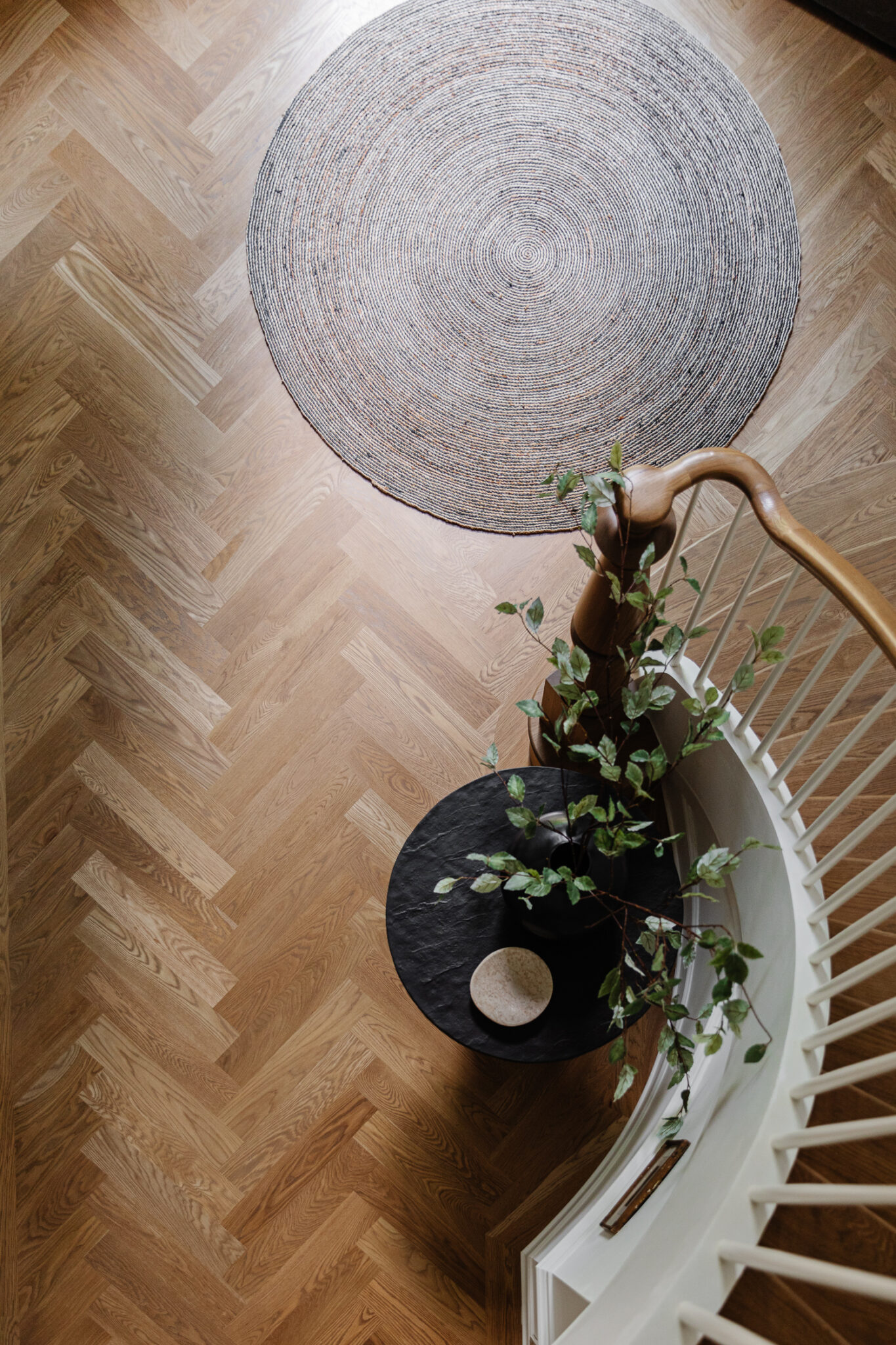
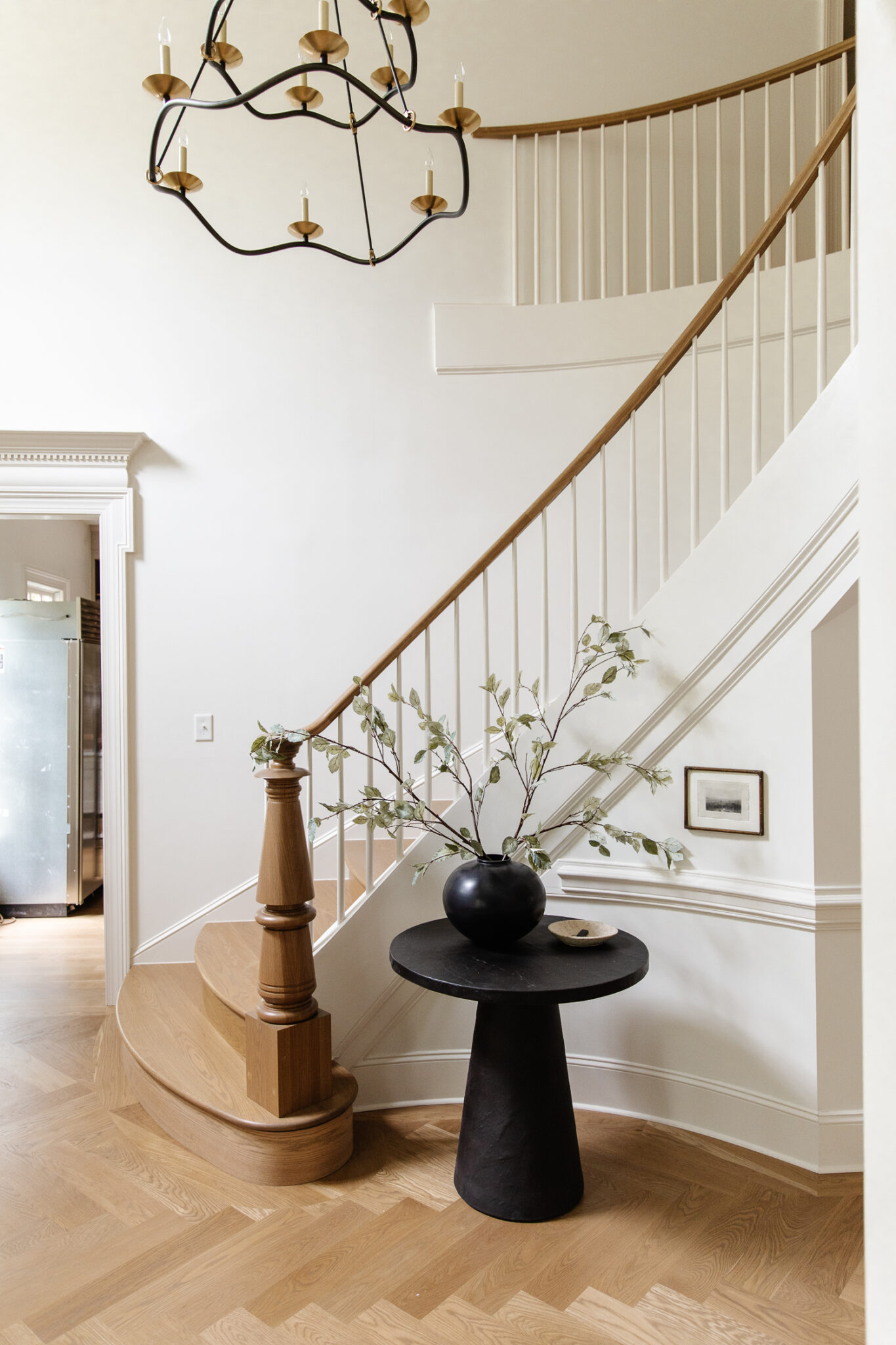
I've been shopping my house to outfit the entry since we moved here. At one point the media console was placed in the hallway which was great for storage but it felt so heavy. I've had several things in the little stair nook, including a vintage table around Christmas time and most recently, this pedestal. Despite those looking great, I wanted a small round table to mimic that curve. Plus I wanted more surface area to act as a catchall for keys, mail, a little dish and of course some greenery.
So I found this Crate & Barrel table which is perfect for the little stair nook. I love the stone-like texture and of course the black contrast against the white walls. As part of a campaign with Crate & Barrel, they sent us this rug and I put it at the bottom of the stairs and I kind of love it. I think what works is the round shapes mixed with the geometric herringbone floors. I would still like to put a vintage runner on the stairs some day, and with me things are always bound to change.
Round Rug | Pedestal Table | Vase | Faux Stems | Marble Plate | Art | Chandelier
Can't wait for our new fridge and freezer to arrive so we can get rid of this monstrosity blocking the view to the kitchen.
Before
After
This is the hallway that used to have the media console! Now that I think about it, the console doubled as dish and utensil storage during the peak of our kitchen renovation. Some day I'd really love to built a fauxdenza in this hall (which we've done in every one of our houses) – something really slim, possibly using our Semihandmade cabinet fronts with a marble top. It would be a chance to keep the storage but still show off the floors. Also maybe I'd hang a huge mirror above it and some sconces on either side. The hallway could definitely use some extra lighting to make the space all glowy.
I've also thought about keeping it completely simple--"simple" meaning not much furniture or art at all--with just a bunch of trim and sconces. Time will tell! If you subscribe to Love Letter, you know I have some regrets about how much I paid for these front stairs, but this is a view I won't ever get tired of. Am I saying it was worth the price? No, but you live and you learn from your expensive mistakes, even when the consequences are beautiful.
Shop The Entry
Leave a Reply

WE'RE CHRIS + JULIA
Portfolio
Projects











Love the simplicity of the round table and minimal accessories including the small framed photo on the wall. Lovely balance. I noticed what looks like a new HVAC grate in the wall that doesn't appear in the before photo. Was your system upgraded?
We actually had to move it from the kitchen to the front entrance when we renovated the kitchen for cabinetry purposes but we still need to get a prettier grate for sure.
Looks lovely! Very open without the console. AM wondering if you added electricity when you did that Hughe staircase remodel? A lamp there would be great!
Gorgeous! Can you please tell us how many stems you used in the round Crate and Barrel vase? I'd love to copy what you've done. Thanks!
Two!
I missed the post on the regret of floors. Was the cost above the estimated .
It was in our Love Letter.
At the risk of gilding the lily, maybe you should try black spindles...cover a few with black paper or tape just to see the look. As they are, the entry and view into the office are stunning. I loved the previous version of your primary bedroom, but I've gotten to love the current, darker edition even more! You have great vision, energy and courage. I can hardly wait to see your next tweak or project!
your entryway is absolute perfection!!
that was a giant ouch! But I've had missteps too. I installed cream colored carpet in the library/TV room next to the back door. Constant battle to keep it 'clean-ish'. My husband finally suggested we removed all the ground floor cream (dirty beige) carpet and refinish our oak floors. We did and we were so happy.
You have an absolutely beautiful home and a wonderful talent for making its beauty shine even brighter, but I was wondering about your AC return. It is such a beautiful space but my eye kept going back to the unattractive grate. With your attention to detail, I’m guessing it’s probably on your list of things to get to, so I apologize if this seems like an all out criticism. It’s not! I just wanted to say your wonderfully elegant entry is so deserving of a gorgeous decorative return grille!
Totally agree! We actually had to move it to this space during the kitchen renovation and when we tackle the entry--we are DEFINITELY going to come up with something more discreet.
A row of framed sconces along the length of that wall would be lovely. A floating cabinet would work, or perhaps an antique armoire or chest that would fit in the front corner nook. One thing you haven't mentioned is the front door. Do you have any plans on replacing it in future? That change in your previous house made such a huge difference!
On one hand, I'd love something that let's more light in the house and something we could see out of easily, on the other--the door is so huge and substantial and pretty gorgeous and fitting for the house. So it's not a priority.
it’s a really beautiful space. have you considered putting in some wall trim down the hall and in the foyer? i think that depth could really allow the stairs to shine, especially that pretty trim detail around curve of steps and you might feel a little better about your investment! :)
Yes! I really want to remove the thick chair rail that's ONLY in this hall and add some trim throughout the whole entry. I just have to think of what that looks like.