We bought the template from Blog Milk and then Chris customized the heck out of it until it fit our needs and wants. The truth is, things are still pretty rough around the edges and there are a lot of elements that we still want to add over the next couple days, but there is one thing we subtracted--the Disqus commenting system. In our poll we took a little while ago, a lot of you said you had trouble finding the comments section and some of you flat out didn't like Disqus. We weren't attached to that system, so we took time to convert all of our comments back over to blogger (although the threads are still a little wonky) and you can now access the commenting widget at the top of every post by clicking the number in the circle and/or a text link at the bottom of every post. We aim to please.
Update: If you would like to leave a comment with your name linking back to your blog or site's page, choose the "Name/URL" option in the commenting form dropdown menu.
Happy New Year, e'erbody. I feel like this is the fresh start I have been needing and can't wait to dive back into blogging after an extended break visiting family. It's good to be back.
How was your holiday!?
Leave a Reply
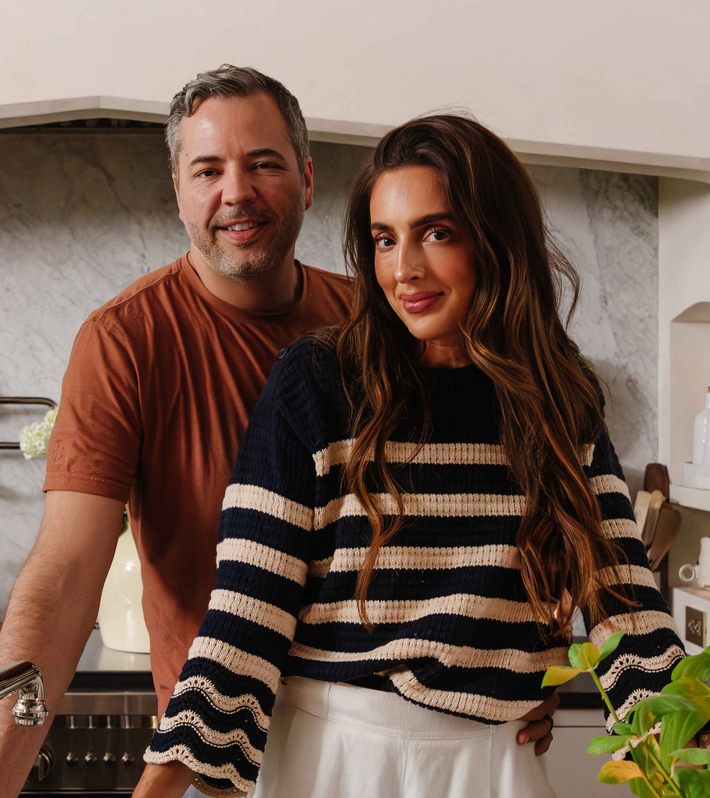
WE'RE CHRIS + JULIA
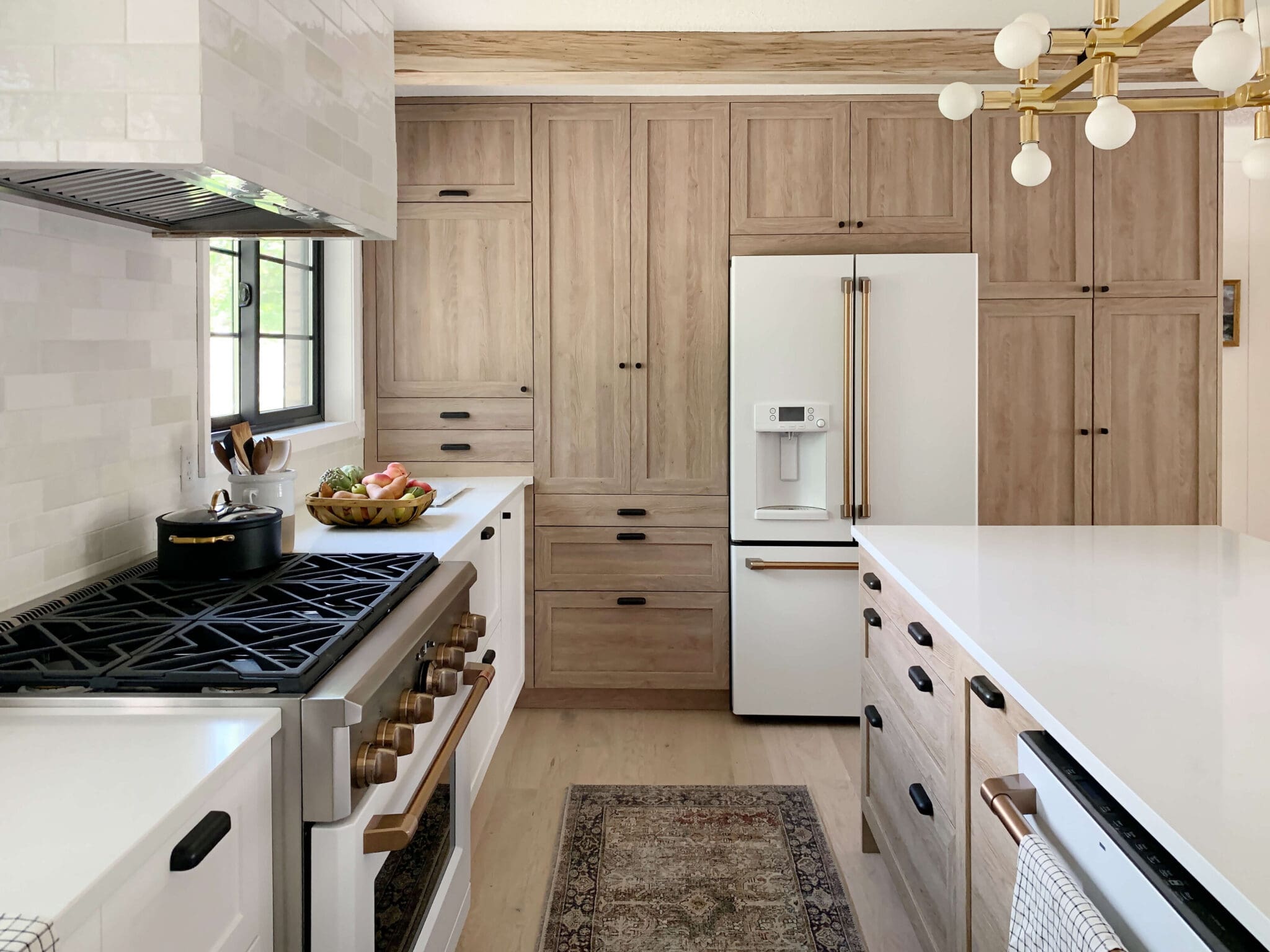
Portfolio
Projects
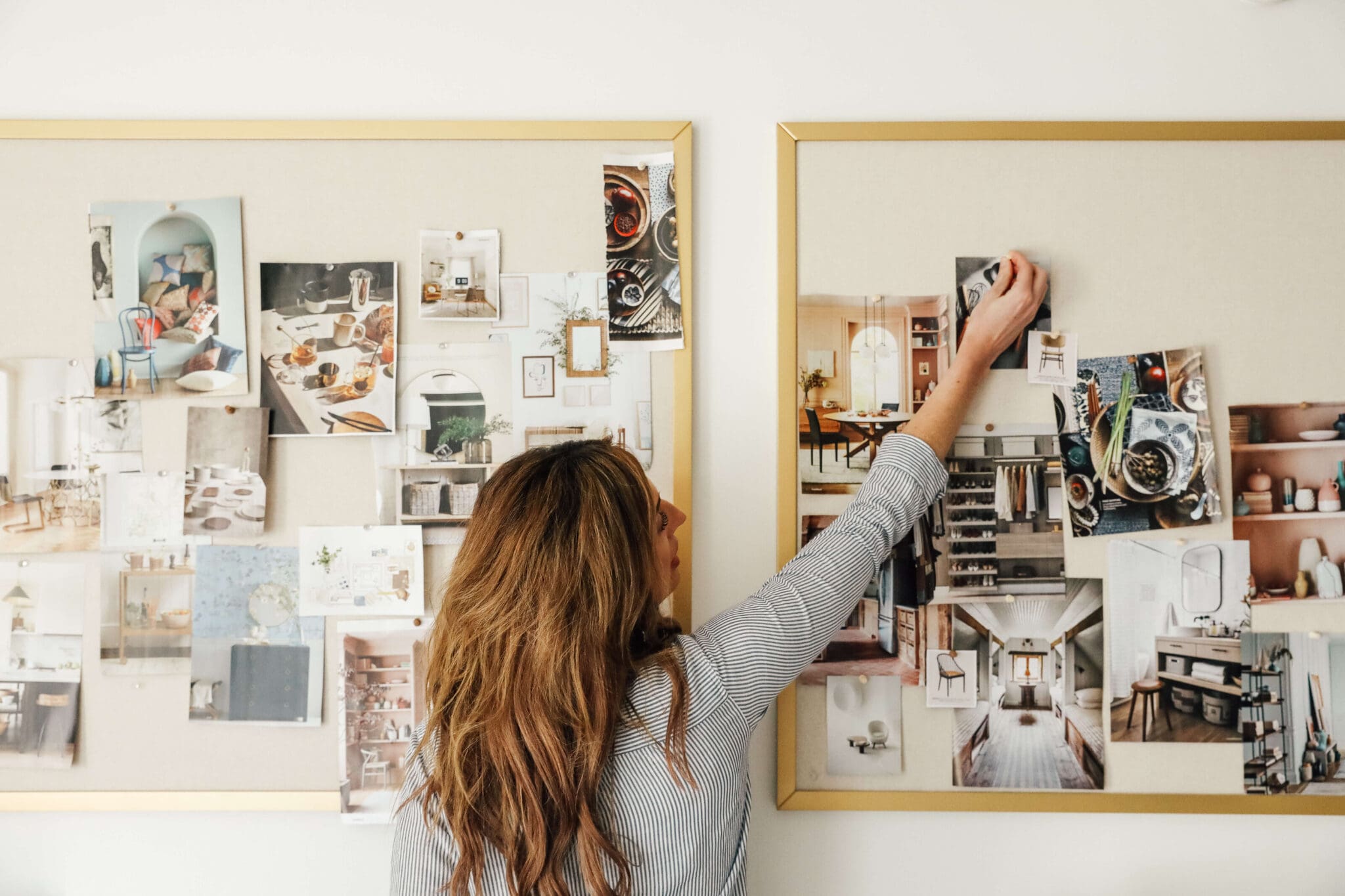





Love love love!
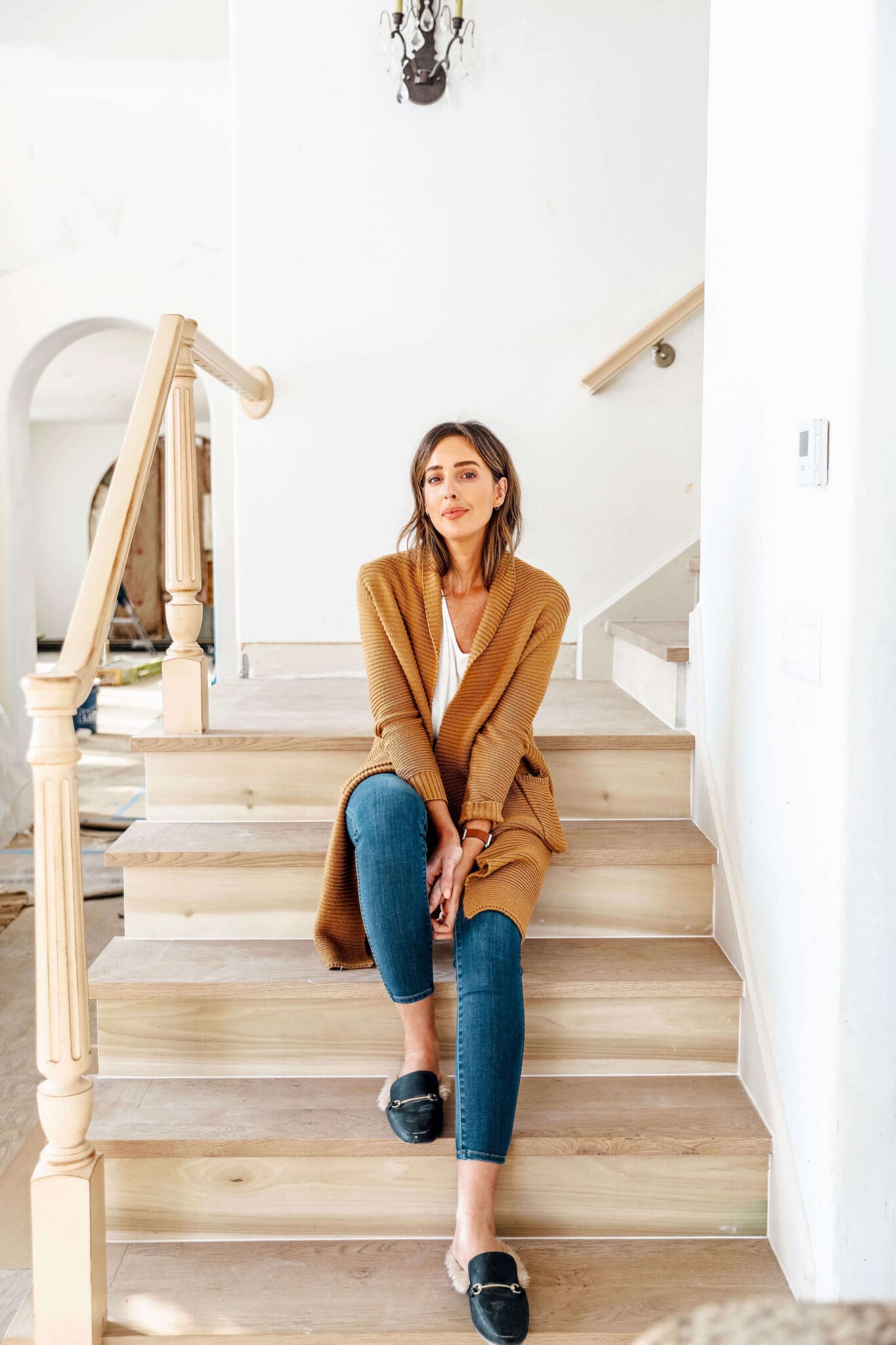
Looks great. I love the new pic of you and Chris on the sidebar. Also so glad you did away with Discus, so much easier to comment now.
LOVE the new site! It's gorgeous. The header is too cute.
I love it!!! It definitely seems more representative of who you guys are. And I have to say, I'm glad that the Discus commenting is turfed too... I always seemed to have trouble with it! Yay, love your fresh new look :)
Love it all! Everything looks great :)
Love the new look and the new photos of you guys! Can't wait to see what inspiration this year will bring...
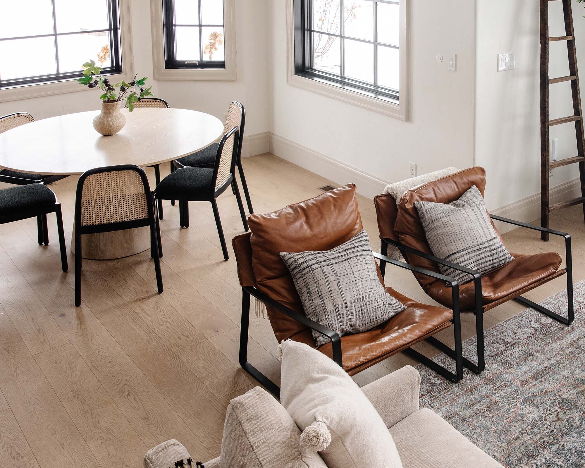
I always wondered about the pillows . . . never knew if there was a significance I had missed hearing about. Love the new look!! And am SO happy comments are back in the blogger format. SO much easier to say "hey" now.
Yay! About the pillows. We just threw a bunch of our throw pillows on or living room couch, took a picture and a header was born. No real significance. But you live and learn over time what you love....er don't love. ;)
Love the new look!
It looks fantastic! The profile pic is awesome.
Thanks so much!
New year new look, love it!!
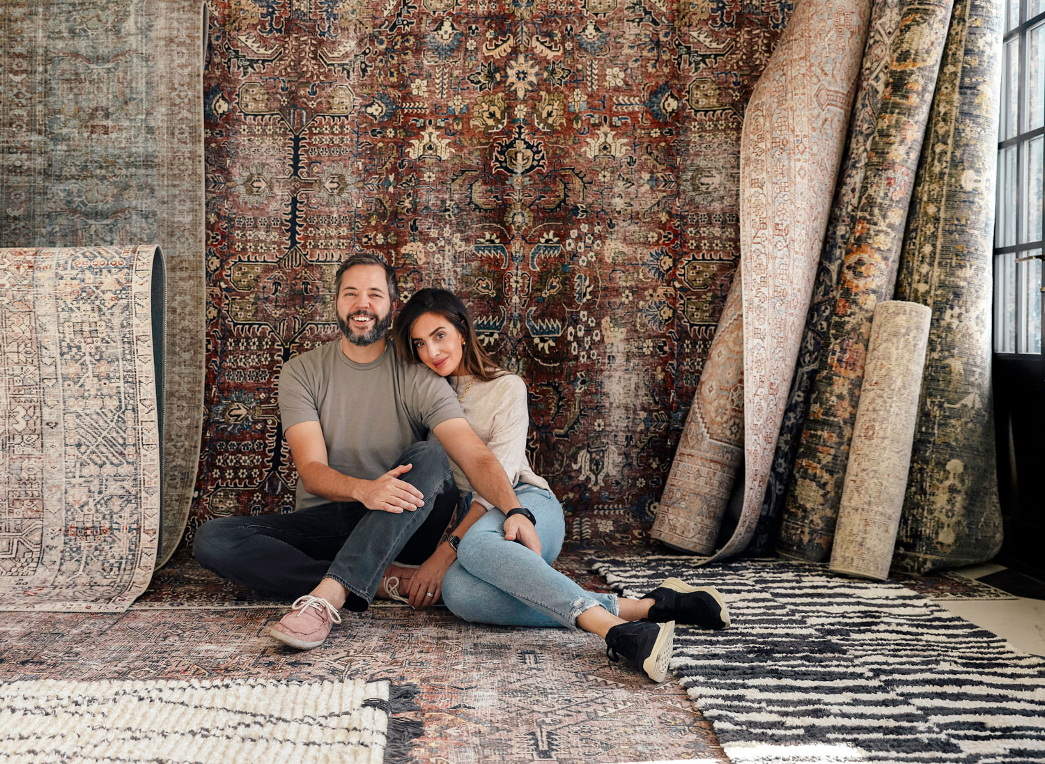
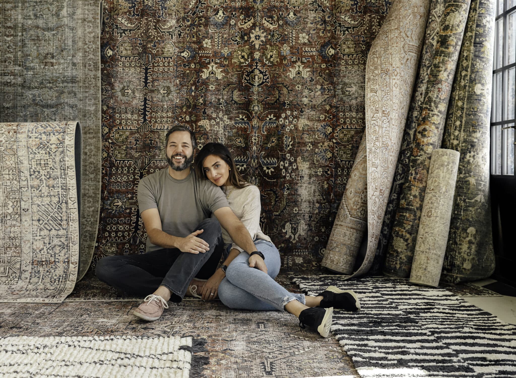
i loove the new look! good work! a fresh way to start the new year. and that pic of you two is GREAT!
Love that picture Andi captured of you two!!!
There are some seriously funny outtakes I'll have to share. She did a great job.
It looks so clean and pretty! Love the photo of you guys. LOVE.
Thanks Kim!
Love this new layout. This is more "you", not that I know you or anything. Look forward to more posts!
It FEEEEELS more us.
This looks so nice! I love the photo on the top right :)
Thanks Heather! That photo was taken by my sister, the photographer behind Doublclik