This post has been a long time in the making and a long time coming and for me, at least, it was worth the wait and the patience for that--this is it--feeling. With every project we tackle, I start with what I know and then add to it until it feels right and then it usually comes together pretty quickly.
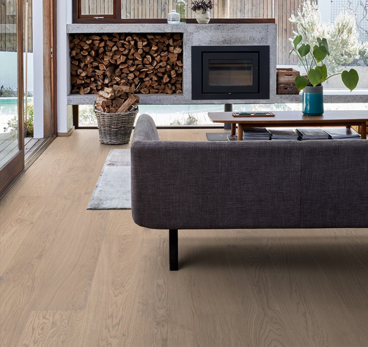
With the cabin kitchen, the things we knew were 1. We were going to use our own cabinet line (that's coming out in January!) from Semihandmade. 2. While we were in Atlanta earlier this year, we bought an island from etuHome (at Market price--so a great deal) that's made from 100 year old reclaimed wood. It's gorgeous and belongs in the cabin kitchen. The last thing we knew were the light white oak floors that we already installed (more about that here.)
With those three things in mind, wood, wood and more wood--I went to look for inspiration and came across three kitchens that really stuck with me.
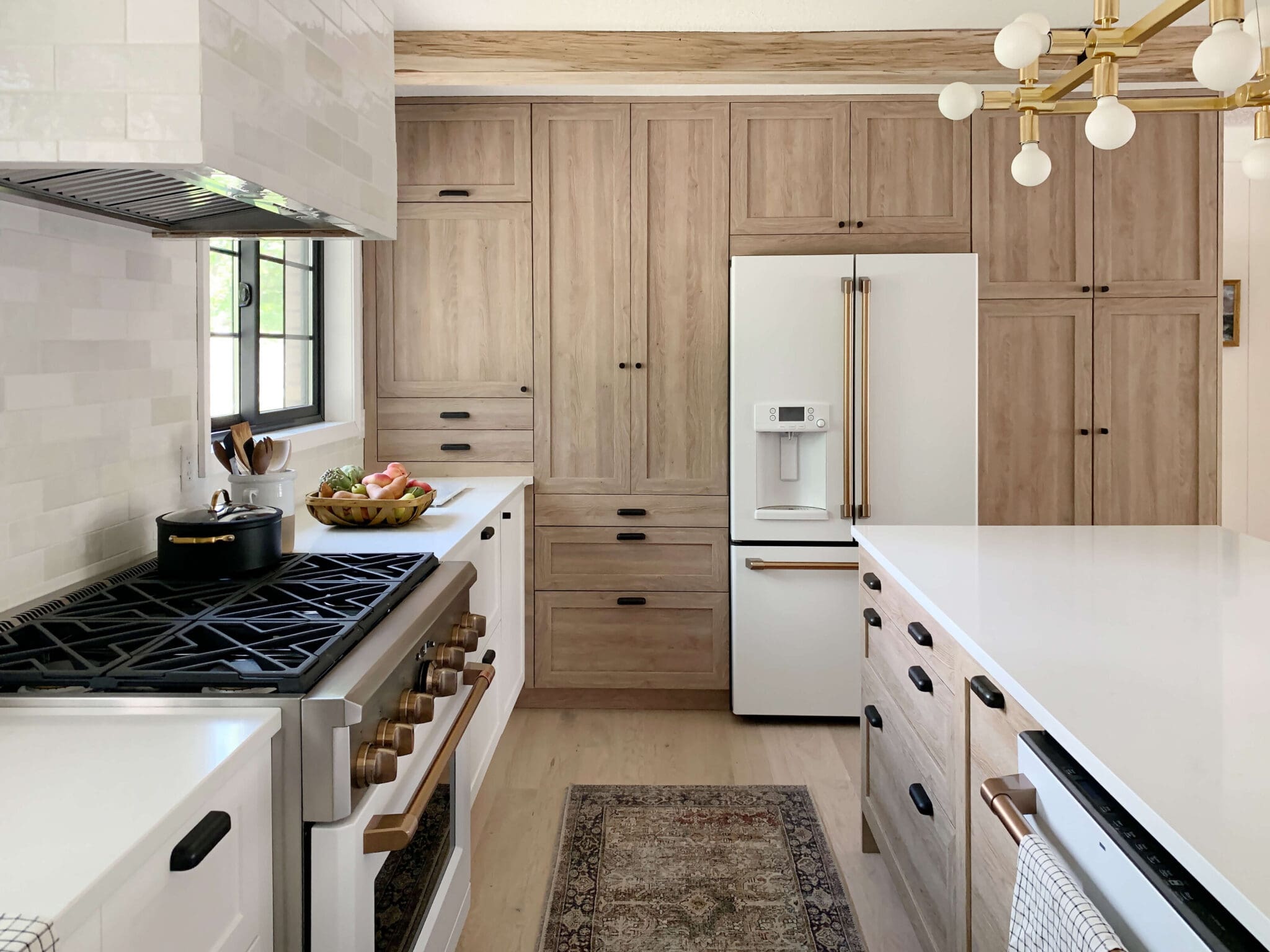
The first was this kitchen by deVol Kitchens. The simple utilitarian style, shaker doors, textured backsplash, black countertops and apron front sink all felt well-loved.
We're launching our cabinet line with three wood tones (more to come!) and at this point we were going full speed ahead on the lightest wood tone, but this deVol kitchen really gave me pause and had me looking twice at our more-gray driftwood option (in the middle in the photo below).

Shortly after, I came across this inspiration by Veranda Estate Homes and I was on board with our mid-toned gray doors more than ever. Chris was still pining for a darker backsplash but this is also the photo that changed his mind. The style felt a little more reminiscent to our own modern, traditional (and now we're throwing rustic in there, too for cabin sake) which helped.
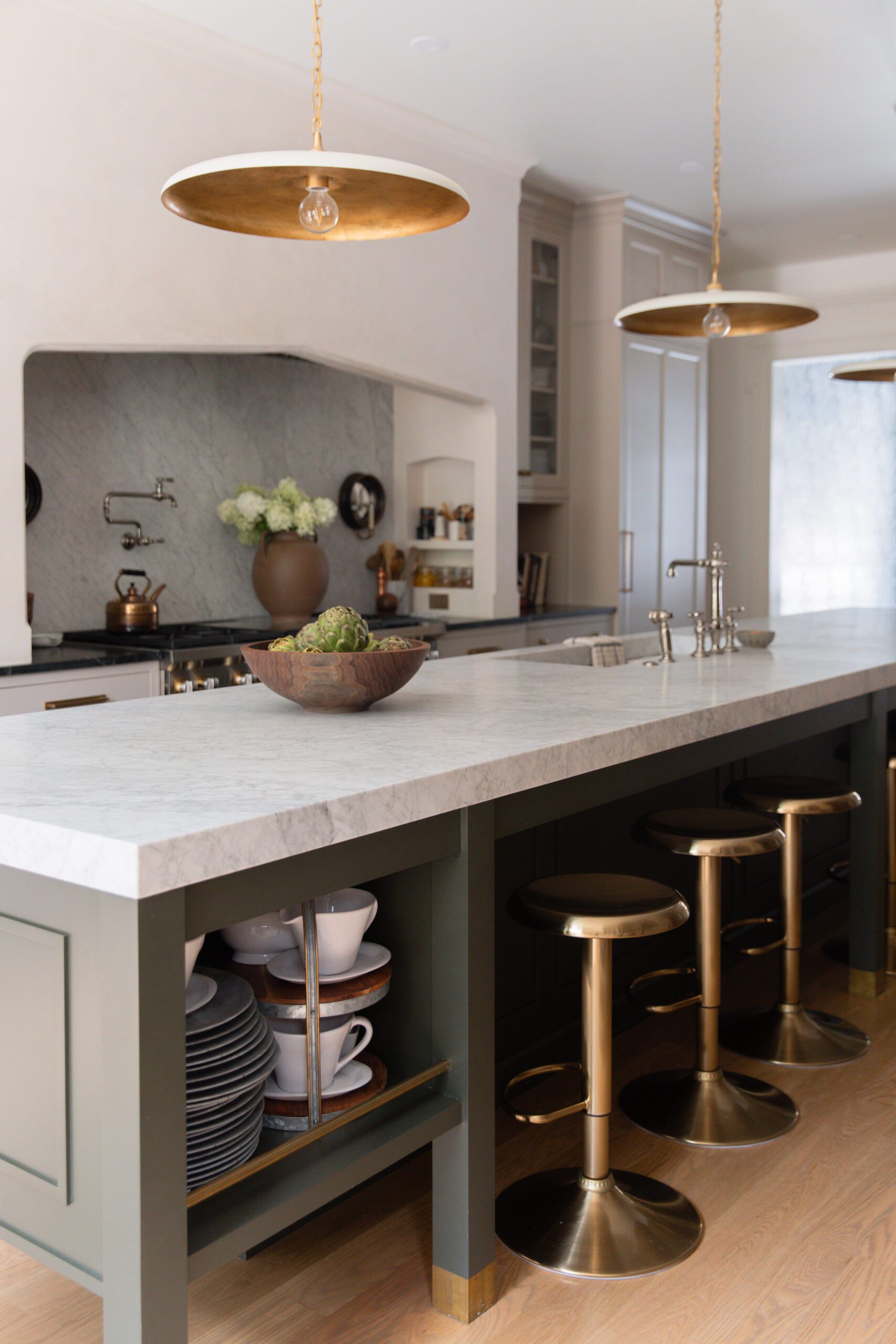
The last inspiration picture I saved from the Pearson Design Group helped me when I was trying to decide on lighting. There are so many examples of out-of-this-world statement lighting over an island and I was searching and searching to find the statement lighting that felt right. And then I found this photo and realized--simple is stunning. And I ran with very similar saucer-like pendants.
Here's how the kitchen looked when we started (orange cabinets, floors and furniture will not-surprisingly make your whole kitchen look orange):

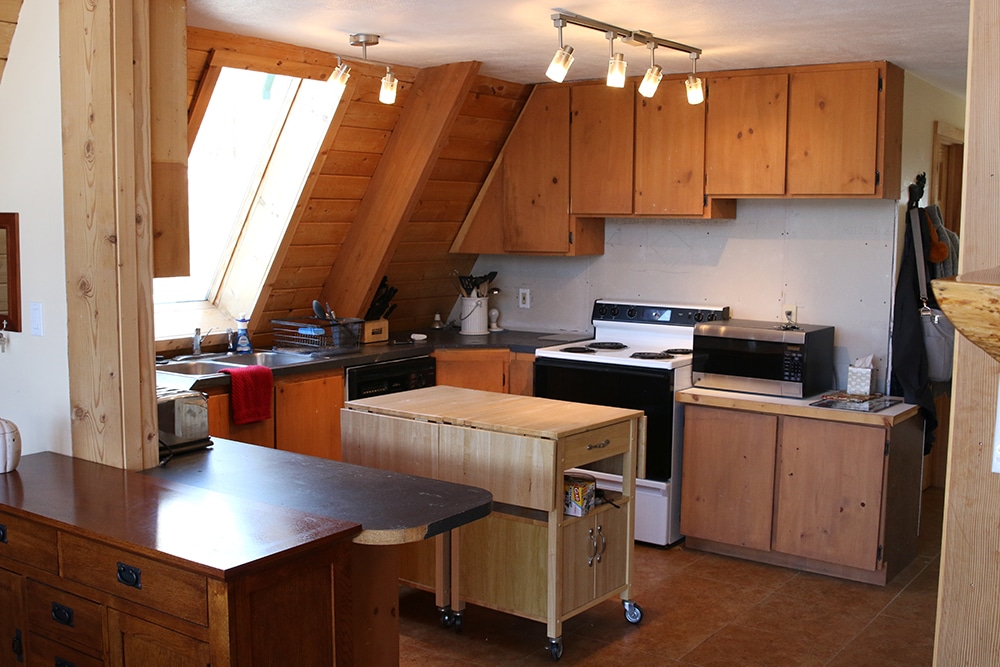
And here's how it looks now:


There's been a lot of progress, from demo-ing out the old kitchen (which was not even attached to any wall or surface. The cabinets were free-standing!), to tearing out the divider wall so we could expand the kitchen a bit. Adding new electrical, heating and plumbing and installing new floors. And then, just last week, Chris put together all the cabinet boxes from Ikea (Semihandmade door fronts work with Ikea boxes) and we documented the process in a fun video. Because of the a-frame walls, he had to make bases for all the boxes and we even caught on film the moment that we decided which cabinet front to go with. Watch it all below or here on our YouTube channel.
And now for the fun part. Here are our plans to put it all back together--

1. Accent Lighting for either side of the range hood. We're still undecided whether or not we will add any shelves, but lighting over a counter is never a bad idea.
2. All that varied white, textured tile really got to us and we ordered this tile for the backsplash wall. Only one wall will have tile, but we have thought about wrapping the range hood in it, too!
3. Our winning cabinet front! We are working overtime to have this kitchen done by our soft launch at the end of December so you all can see the cabinet line in action (and we're working with a few other influencers so you can our other Semihandmade doors in real spaces, too!).
4. We spent so much time trying to find the right hardware before landing on these ledge pulls. I think it will keep the design really clean.
5. Very cabin-y kitchen linens
6. I found these pendants on Etsy and plan to add a big round light bulb to each, like inspiration photo 3.
7. Way back when we were shopping for countertops for our bathroom, we came across this raw, honed black granite and I snapped a photo of it because I loved it so much and thought it would be great for the cabin. We called the stoneyard this week to see if it was still an option and they said, "yes!" It was the easiest countertop buying experience ever.
8. Here's the etuHome island we bought a few months ago, although ours won't be quite this long.
9. A couple years ago, before he stopped selling prints, I bought this 24x32 Defender print from my favorite artist Kai Samuels Davis. I am currently getting it framed to hang on the wall next to the fridge.
10. Because the island is open, I love the idea of putting a couple large baskets on the storage shelf to serve as a make-shift pantry.
11. & 12. Seeing these Cafe Appliances on Instagram was love at first site--for both Chris and I. We were always leaning toward black stainless for the cabin (it just felt right) but I loved that you could customize the handles (black and brass forever!) and Chris loved the double oven induction range.
13. Here's our light oak flooring from Stuga Studio.
We've already ordered almost everything and can't wait to see this vision come to life, with hopefully very few hiccups. It feels very much like us, but the cabin version of us--would you agree?

Like I said, our hard deadline for the kitchen is January when our cabinet line launches, but we're working hard to get it usable by Christmas--which feels suddenly right around the corner!
Leave a Reply
WE'RE CHRIS + JULIA
Portfolio
Projects





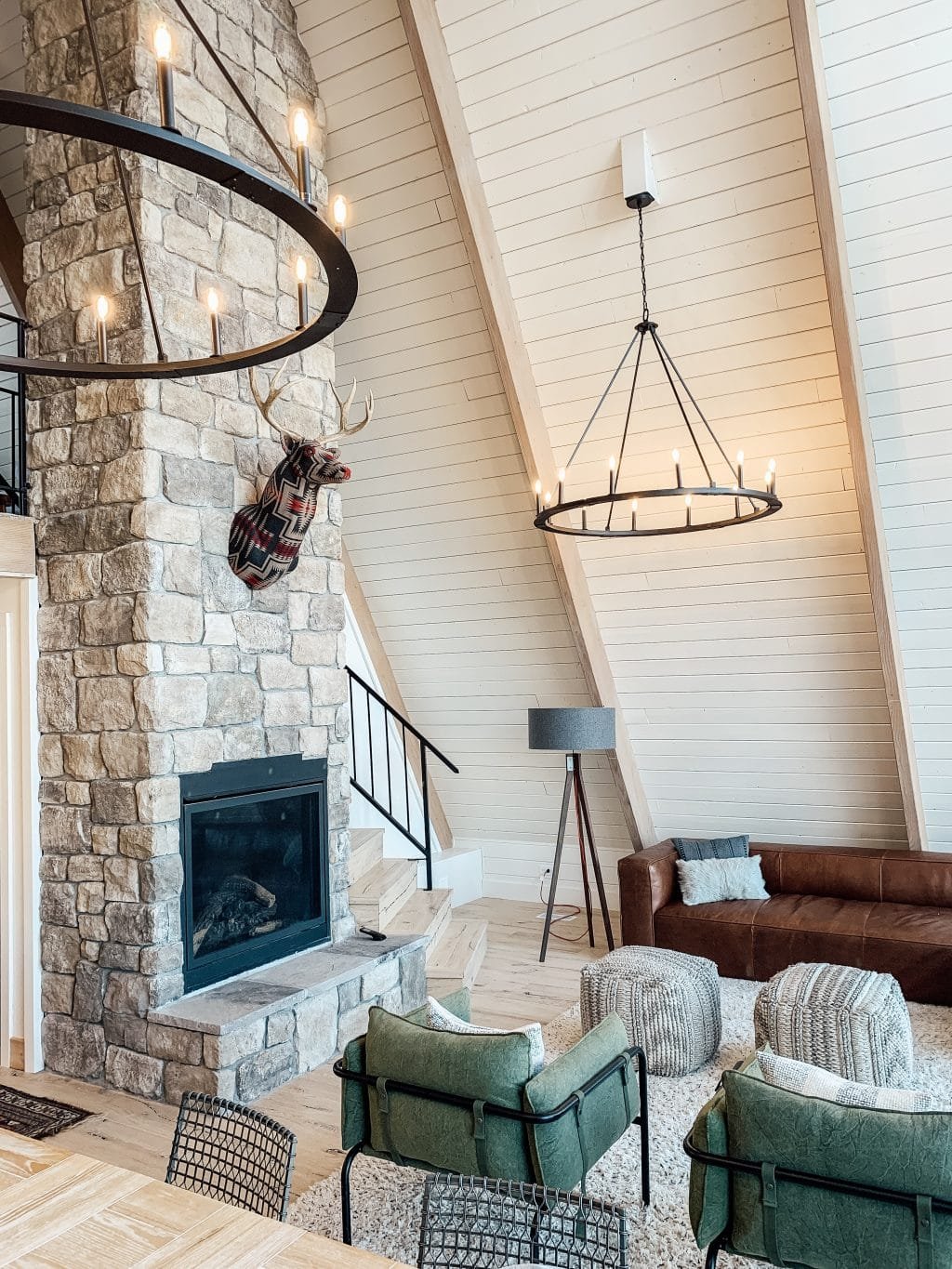

I love it, can’t wait To see it finished fireplace is beautiful. You have another picture above, the cabin feel What color of those cabinets what type of wood is it they beautiful! One day when I decide to do my kitchen over I think I mix them maybe with a colored island like a blue gray I would be so pretty. Oh your photo of the cabinets I love is by Veranda Estate homes
I cannot wait to see how this turns out!! Those appliances are drool worthy! I was wondering if you could help me with the link for the island. It is a stunner, and I wanted to look into it, but every time I click on the link it says "Access Denied!" I've tried it on multiple desktops, as well as my iPhone and the same notice keeps blocking me from the site.
It's a piece that we bought from a wholesaler, but if a link pops up for it we'll update you!
oh man - i LOVE this!!!
Beautiful! Can't wait to see the end.
Looks really really beautiful. I think the grey is going to be really stunning and pull from grey in the fireplace stone. It will all tie together beautifully.
Very much looking forward to the final result! The mood board is excellent. Definitely a cabin kitchen I would want to cook in.
This looks beautiful. I'm wondering about the pony wall situation that hides the new ductwork. Did you guys ever consider doing a built-in banquette style bench (perhaps the same depth as the kitchen counters) to hide it, instead of a wall to the height of the intersection with the sloped roof? I'd be very curious to hear more about that decision-making process.
We did, but the angle of the roof would make it an awkward place to sit and bringing it out as far as the kitchen cabinets would have made the bench about 48in deep, which we felt would look really strange. A wall is much less intrusive and gives us some other options for painting etc. should we choose to do that.
Love it and can't wait to see it! You and Chris are my biggest design inspiration and my favourite blog to follow. And I love following your family. I have 3 kids as well with my daughter being only a couple weeks older than Polly, my 4 year old son is a couple months older than Faye, and a 7 year old son. So I understand how busy can be at times! Keep doing what you're doing!
That's so nice of you to say, Rebecca. Thanks so much!
Hi Chris and Julia! Looks amazing. I was JUST looking for reasonably priced 2.5x8 white tile for our kitchen and voila! You posted this!! Do you know yet how you will lay it - horizontal or vertical, stack or offset, etc? And I hope you wrap the hood because that's what I want to do and would love your tutorial, please and thank you ???? Have a great holiday!
Those appliances are amazing and fit your style so well. It's like they were designed with you guys in mind!
This looks AMAZING! Cannot wait to see the finished result!!
Looks amazing! Can’t wait to see it come together! I feel so inspired! How do the cabinet fronts work with the white IKEA side panels of the cabinets? Will the white show on the ends or does that get covered with the same material as the fronts?
You get cover panels that match the doors, just like Ikea offers, so everything is seamless.
It’s not my home and shouldn’t affect my life YET I AM SO HAPPY YOU DECIDED ON THE GRAY! Made my day for no real reason :D
Gasp! It’s beautiful!! Can’t wait to see it... in person... someday!! ????
Wow. This kitchen is going to look A - MAZING! C thank you for letting us follow you on the journey.
100% like you guys but the cabin version of you guys. And I am here for it!!!!!
Your mood board is so dreamy. I love every single bit of it!
It’s going to be so pretty!!!!
Just installed the GE cafe double oven gas range in my kitchen and I’m OBSESSED. Did you know it’s Bluetooth compatable and can be turned on/off from your phone?! I swear, this thing does everything but my taxes
What?!
Can you share some good more affordable alternatives to some of these? Your kitchen is gonna be a stunner, but $700 for one wall sconce, $30 for one ledge pull, $185 for one basket, and almost $7000 just for a fridge and range seems like it might be out of reach for a lot of people. I'm just guessing, but I would imagine a lot of CLJ readers don't have that kind of income to spend and would appreciate some more budget options if they want to do something similar to your style.
And this isn't me criticizing for wanting and buying nice things. It would maybe just be nice to have some options for people on a budget. You work hard for that coin, so you deserve to spend it how you want.
I'm sure they'll do a "get the look for less" type of post down the line. They almost always do. But of course this mood board is a great starting point to look for your own dupes this black friday weekend
The island is shorter than an standard kitchen countertop height....especially since you are both tall...do you have plans to add casters or ?
I may have linked the wrong one. In person, it felt good but we are not opposed to adjusting it when it gets here if need be.
You have propane there and Chris is OK cooking on an induction stove top? I'm moving to a house with no gas/propane and my husband, the chef, is so desperate for it! If I can convince him induction is next best I'd be very happy!
He's happy with induction.
my husband is a chef (but tbh I do most of the cooking at home..) and we love our induction cooktop. make sure to use the right pans and you're all set!
Thank you both!
SO SO glad you guys went with the gray. That light color wood has looked pink ever since I first saw it, especially against your yellow-tan floors. Pink + yellow woods = wince, for me. I'm so glad you changed your minds! Gonna be a beautiful kitchen!
In other news, how is it prepping/working against that sloped roof?? It sure doesn't seem to leave much headroom but sometimes scale is hard to tell in a photo :)
We actually moved the cabinets out to help with that (although the counters will extend all the way to the wall) and we're excited about having the additional island in the new design, too!
I admit at first, when you previewed your cabinet fronts, I thought: So many wood tones! The floor, the walls, the cabinets, there didn't seem to be enough variation in tone. But your mood board is amazing, and I just know you know what you are doing, and can pull it all together into something unexpected and cozy and wonderful. I love those appliances, and they seem just perfect for this space. I can't wait to see it all come together. Keep up going with your gut, you know what you're doing.
Things are happening! LOVE!
Cannot wait to see this come together ????????
It’s so beautiful and makes me wish I had some dark and moody instead of all white in my just finished kitchen. Can’t wait to see it!
Wow! Its spectacular. Cannot wait to see it come to life!
This is going to be GORGE-OUS!
Your mood board made me gasp- it’s so perfect! I also really enjoy your videos. You guys are killing it.
I think the gray will neutralize the orange toned walls.
Unsolicited opinion... I really dislike those lights. I've seen YHL use them in their beach house and every time I think it takes away from the design.
I just had to go look at their beach house pics because I didn't remember that! These are a similar style but I think will look completely different in a darker toned environment. However, we do have a backup pendant if it ends up not looking right. Haha
Mara - same here! I know to each their own, but I didn't love those pendants for YHL either. I think it's because they remind me of a diner or chain restaurant like Applebee's. However I love love love the rest of the mood board!!
I'm with Mara on this. I'd love to see you do something a bit more interesting either in a black or metal finish like the inspo photo.
Staahp! Gorgeous as usual. Getting to watch this unfold feels like a Christmas present! Keep up the good work! ????
Oh. My. Goodness!!! I cannot wait to see this come to life. SO EXCITED!!!!!!!!!!!!!!!! [insert all the dancing, cheers, smiling emojis]
As stunning as I would have expected from you guys and then some. It's such a joy to follow along and watch your creativity come to life.
Gah! I am way to excited about your cabin! Every project you do I think, how are they going to apply their style to the cabin? This kitchen is going to be gorgeous and perfectly CLJ! Can’t wait to see the reveal.
It's going to be beautiful! I love watching your home(s) come to life through your posts. I can't wait to see the progress/the final reveal! You guys can do no wrong :)
Love this look! I like that you're going with the lighter cabinet fronts, you'll definitely appreciate that in warmer months, and the granite countertops will help bring in that rich feel.
Too funny, I went countertop shopping two weeks ago w/ my sister for her kitchen, and I saw and fell in love with a slab of pink/gray/white dolomite, perfect for my girls' bathroom. We're planning that reno in TWO years, but I think I'm going to pull the trigger on the slab! If I change my mind by then, we can use it in the laundry room.
I love that you guys are always putting the same brands in your homes. What a glowing review! When I see other people put IKEA cabinets in their home, often times, they get asked, would you do it again? And they say, of course! But then they don't... do it again. Because they got sponsored from a different brand. I don't begrudge the sponsorship, but at the same time, it doesn't seem very genuine.
Anyway, this is looking amazing. Like the best mix of moody traditional mountain home.
So pretty! I was a little skeptical about the gray but it makes complete sense in the space. Love the island of reclaimed wood. Excited to see it all come together!!!