Believe or not, the time has come for the #CLJtotheRescue makeover! We leave tomorrow for Long Island where we'll see the Freeman's space for the first time in person. We only have a brief time period, so we'll work our tails off all day on Saturday implementing the makeover with a few Lowe's volunteers, and then take photos Sunday morning and fly out. We're excited, pumped, anxious, stressed and nervous.
It may seem like this creeped up quickly (it has!), but we've also been working on designing this space behind the scenes since we chose the dated entry/sitting room to makeover back in February, so in many ways we feel so ready to just get in there and make this space sing:
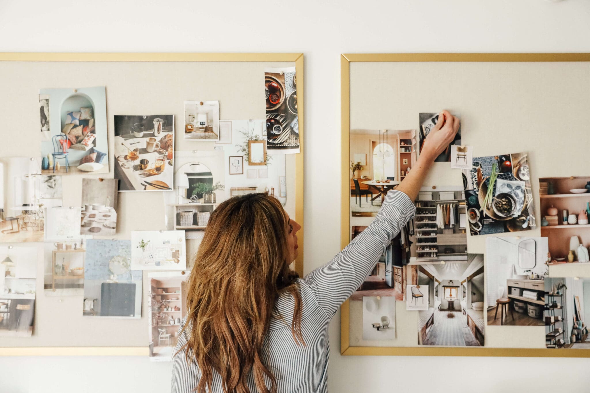
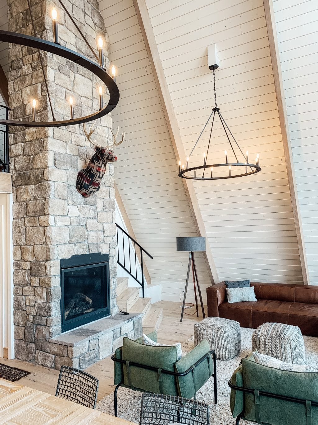
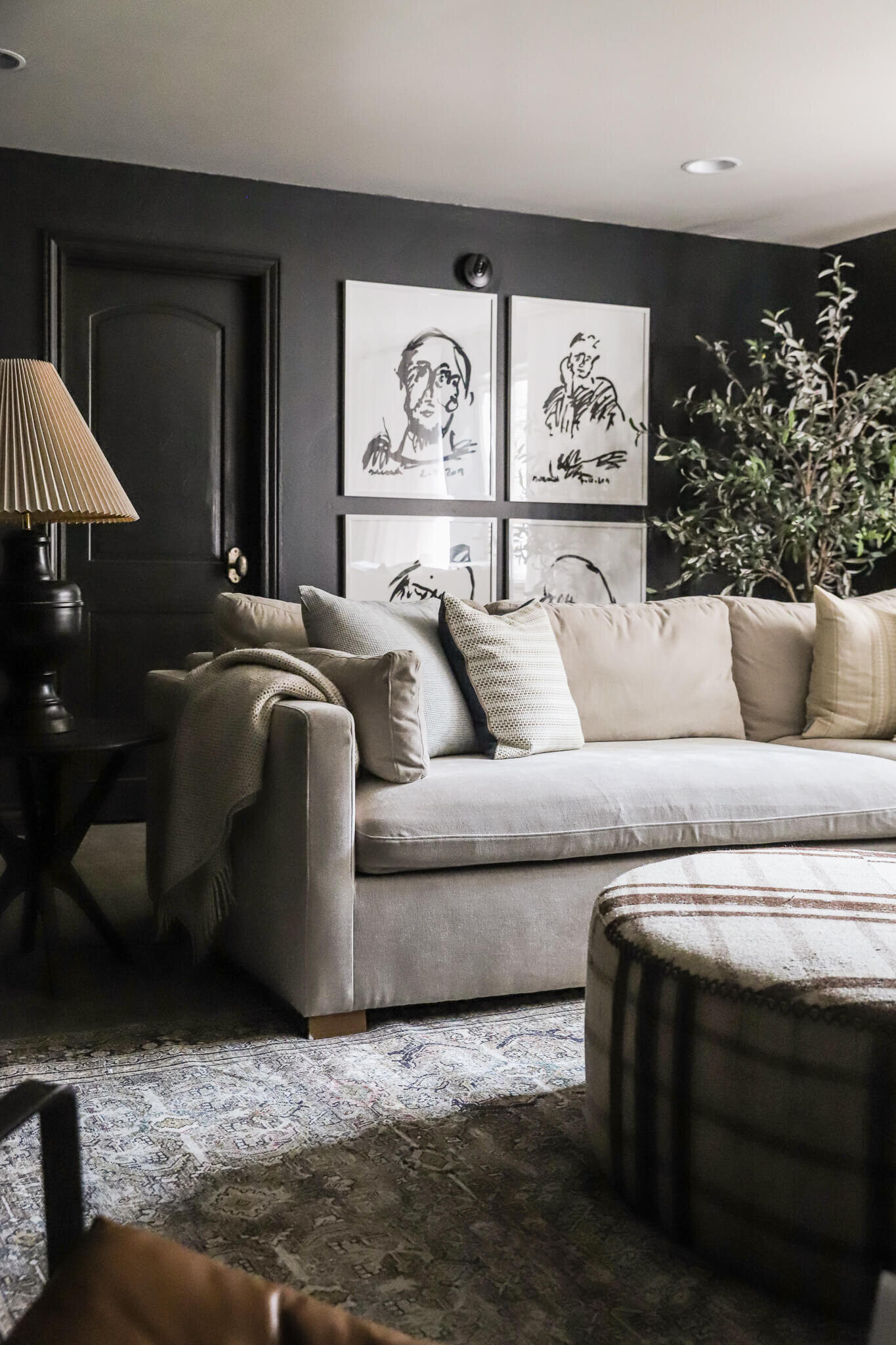
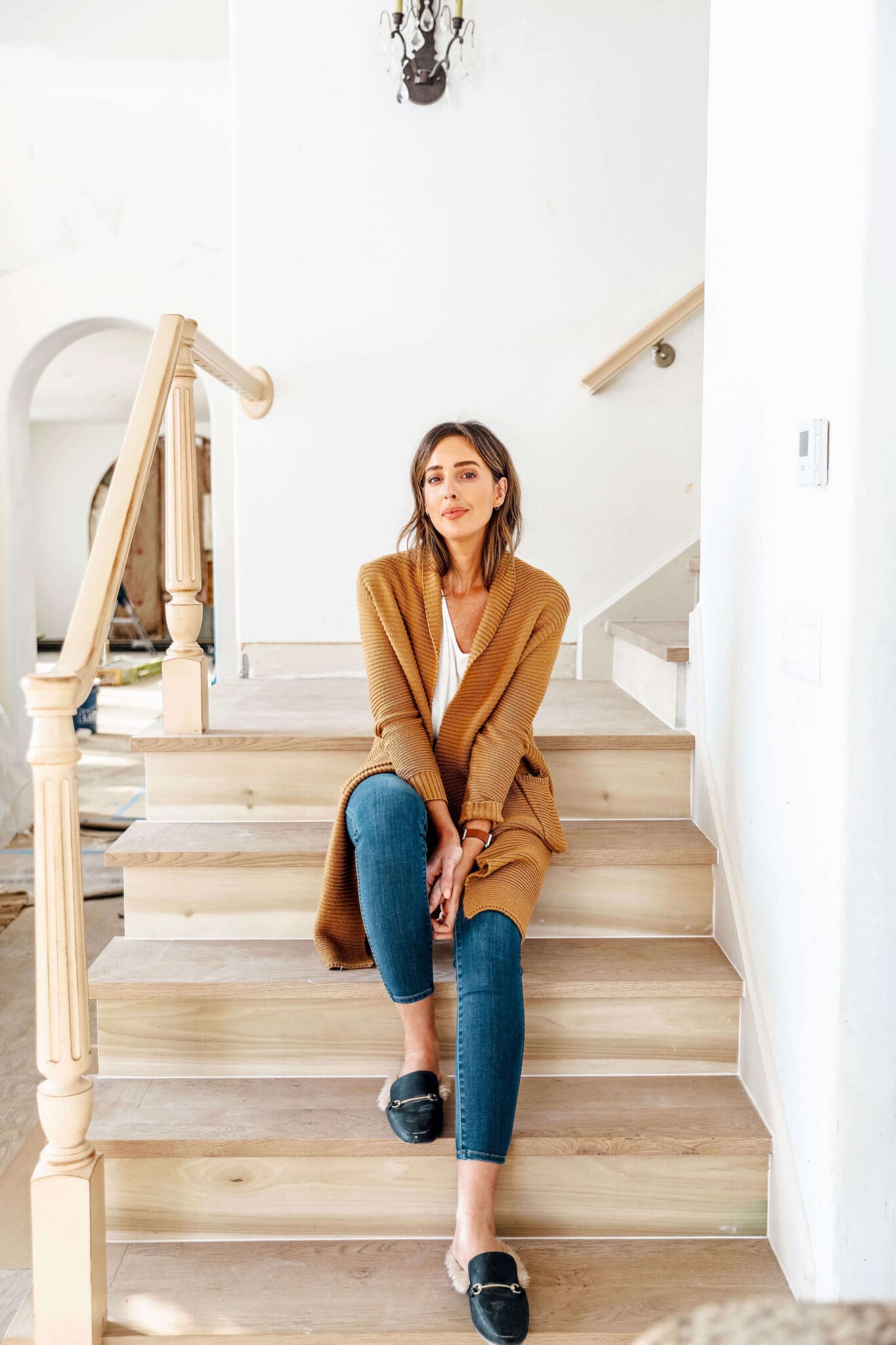
I thought it would be fun to take you behind the scenes with how the planning process went over the past couple months. There were some things that we knew we wanted to do right away, like paint the paneling, refresh the floors, add baseboards and plants. But, i'll admit, initially I struggled making sense of the space. We made a joint Pinterest board that we all added to so we could virtually bounce ideas off of each other, and so we could also get a better idea of what their home style was. Best news: It's basically our style! Here are a few stand out inspiration photos that really spoke to this space:
But even after a few weeks of gathering inspiration, it wasn't completely clicking: Was it a sitting area? Was it purely an entry? So I made a list of questions and set up a facetime call with the Freemans. This was a turn around point of the planning period. We were able to have them zoom in on things that weren't clear in photos and were also able to get immediate answers to our questions and a feel of what they wanted out of the space. They were so fun and nice and it made us even more excited to meet them and their house.
Some of the questions we asked were: Do you have a place to hang coats, etc? Would it make sense for your family to incorporate hooks? What is the distance from the fireplace to the front door? Do you see a conversation area in front of the fireplace or in the more open area the left? Can we move/add a chandelier to the center? Are you envisioning white or a warmer color?
We ended up talking for about 45 minutes and then over the next week, I put together an initial mood board for them around what we talked about. Since Lowe's is sponsoring this makeover, we needed to stick with Lowe's items, but could incorporate pieces from their sister site, atgstores.com.
Rug | Chairs | Chest | Mirror | Sconce | Chandelier | Footstool | Baskets | Art | Throw | Plaid Pillows | Striped Pillows | Navy Pillow | Green Pillow | Taupe Pillows
The Freemans live practically on the water, I really wanted their space to reflect that, so I went for a modern lakehouse vibe. We'd paint the paneling a warm, light neutral. The doors black. The trim white and the fireplace and built-ins we have planned (woot!) a deep greenish-gray. They loved it, but Lowe's wanted to see if we could swap out the rug, light fixture and mirror for one from Lowe's. So I went back to the drawing board to make a few tweaks.
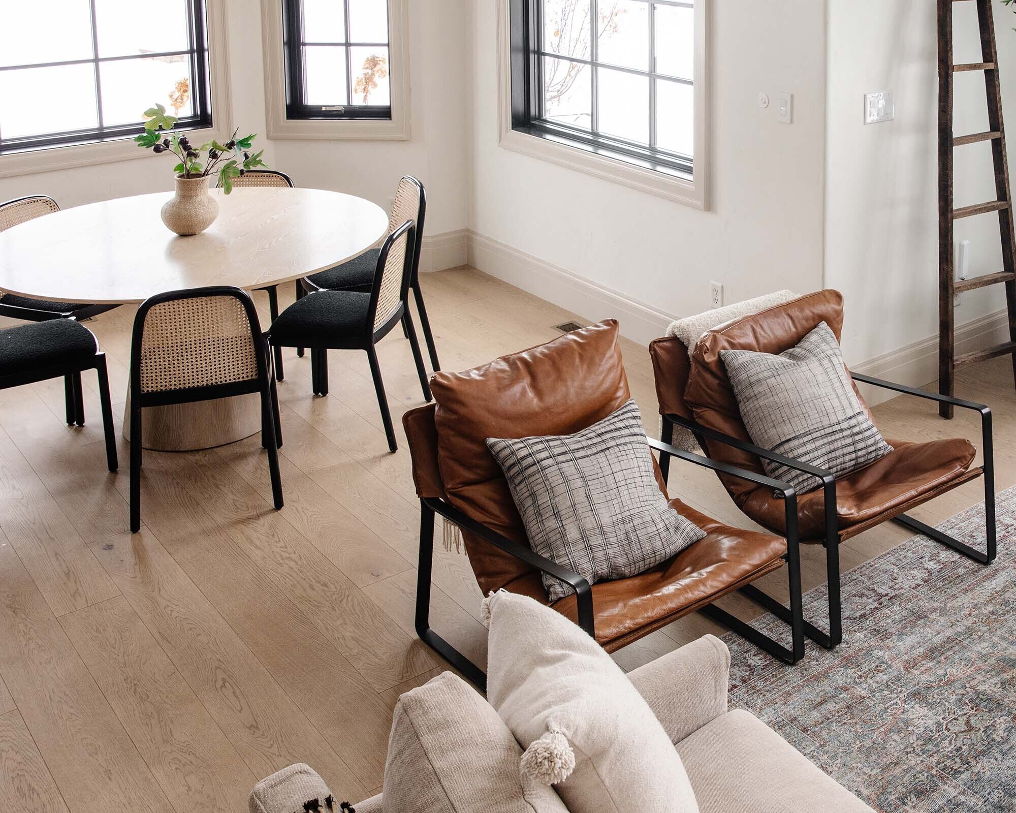
I found a nearly identical light fixture and a round mirror that will work. I actually found a really similar rug (here), but unfortunately the size we needed was out of stock. However, this Mohawk one was so gorgeous I'm not even mad about it. I originally envisioned a round rug in the space, but we ordered a round wicker coffee table last minute to still play into that shape.
Now the only wildcard is will we be able to get it all done in 24 hours? I'll be live-instagramming the whole time @chrislovesjulia and sharing some very real moments (I'm sure!) on snapchat, too: juliamarcum. Can't wait to share the finished space with you!
Leave a Reply
WE'RE CHRIS + JULIA
Portfolio
Projects









Hi! Thanks for sharing my bedroom photo with the round mirror - the second inspiration photo. Could you please credit me. Studio McGee had so kindly shared the photo and did credit me correctly. Thank you.
I'd be happy to! Do you have a specific post you'd like me to link to?
Do you know the original site for the first idea pic? The vertical paneling?
Love the chandelier in the inspiration pic. Do you know the brand?
Darn, I don't. Sorry!
Those chairs!
It looks lovely! Both of the moodboards, actually. The round mirror actually reminds me of a porthole, next to the water print! :) It looks very cozy and practical, too, which is great!
http://danielleandco.com/blog/2016/amazon-pendant-light-roundup
Friendly alert that there's a typo in your title hashtag. Sounds exciting, good luck!
Oh dear. Thank you! All fixed.
Will you be sharing the paint colors? I LOVE that dark green!
I'm waiting until we get on location to confirm the exact shade, but the one in the mood board that were leaning toward is Benjamin Moore Quarry Rock--so, so pretty!
I can't wait to see how it turns out! I LOVE that water print