Designing an office space for our team was somewhat of a challenge because we had never designed a commercial space before! Something about me: I love a challenge. And picking a cohesive color palette is a great starting point before making other big major design decisions. And so, I grabbed my trusty paint deck and spent time in each space envisioning how I want them to look and feel before making any decisions. Although this is an office space, here are some tips that can apply to creating a cohesive color palette in your own home!
Start with white

Shop The Team Room
Start with choosing the "right" white. There are so many great interior white paints available to choose from, and we've done all sorts of whites in our homes. It really comes down to personal preference and what kind of natural lighting each room gets. The amount of natural light our office gets varies from bright direct to almost none at all. So we went with Sherwin Williams Pure White, which is known for being a super clean, neutral white. In other words, it doesn't lean toward any particular tone but is also not too stark and sterile. In our home, we chose Benjamin Moore White Flour for its' creamier tones, but we've also done Alabaster, which has slightly greener undertones.
Set the mood

Shop My Office
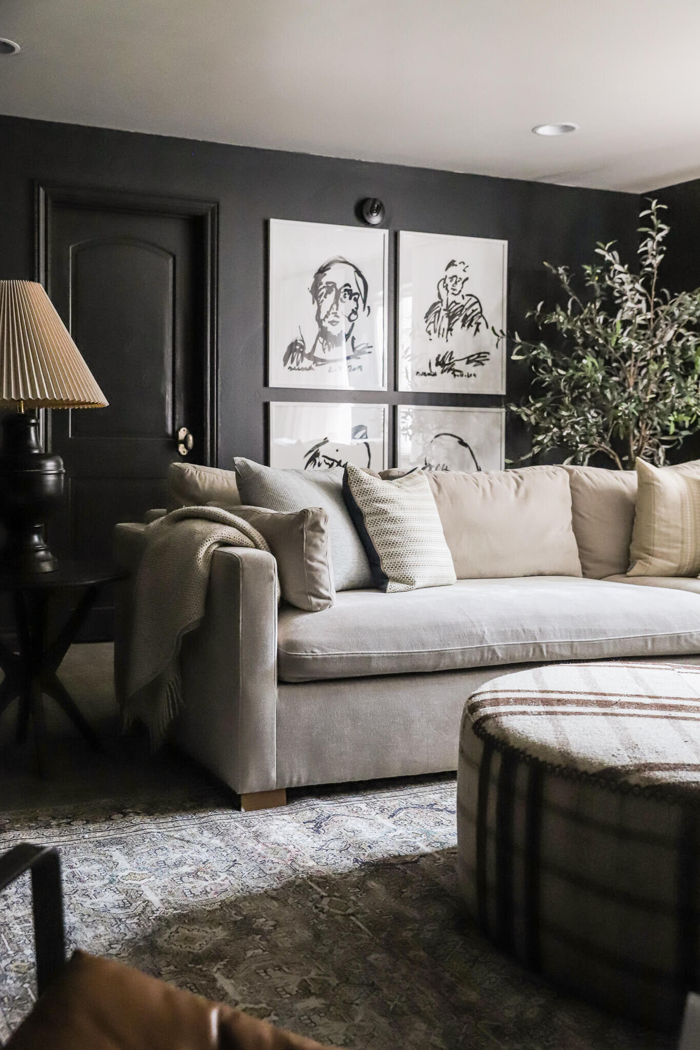
Consider the mood you want to create in your home, and choose colors that will make an impact! Each room in this office serves a slightly different function, but overall I wanted the whole office to feel fresh, invigorating, and inspiring. But overall, I wanted it to feel like a more modern extension of the CLJ style. For my office, I went with a darker gray blue. My office space gets a lot of sunlight, especially in the afternoon, so I went with a color that would look good "lit up." I also love how it feels moody yet serene and peaceful. This is my first time ever having an office space of my own separate from the team, and although I'm still navigating, I feel very at home here. Plus, I love how it compliments the flooring so beautifully.
Add some contrast

Shop The Conference Room
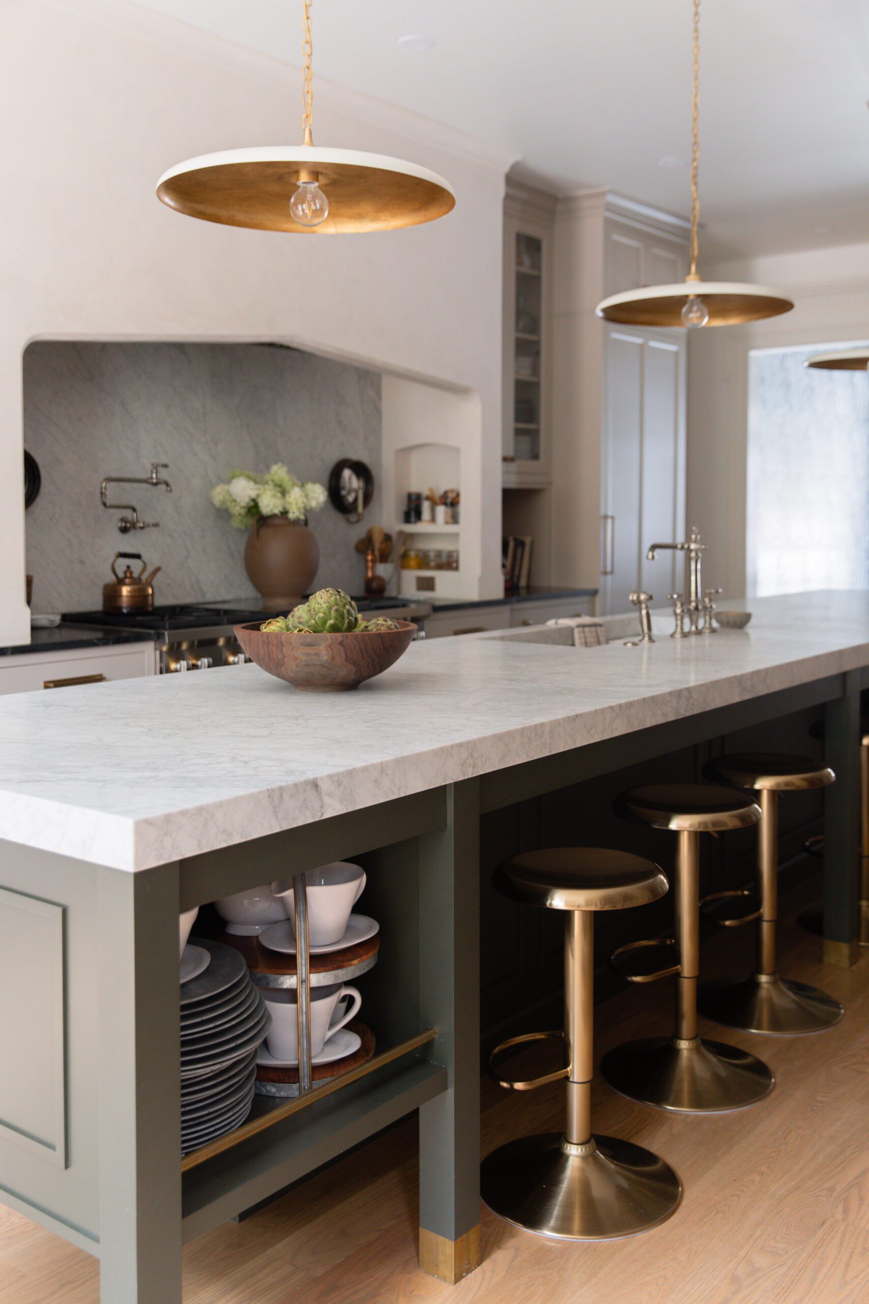
Your house is going to feel a bit stale and overdone if everything is monochromatic. I love my blues. Dark blues, lighter blues, blue-grays... but the magic happens when there's some interest and contrast in color. We painted the conference room Sherwin Williams Fairfax Brown, and I love how rich and dramatic it feels. We hold weekly meetings here, but it's also available to use whenever you need a change of scenery, and it really is exactly that–a change of scenery. But the reason it works so well is because it's supported by all of the other warmer tones in the office, like the flooring and furniture. Also, peep the taupe-colored kitchen cabinetry in the kitchen!
Tie it all together

Shop The Breakroom
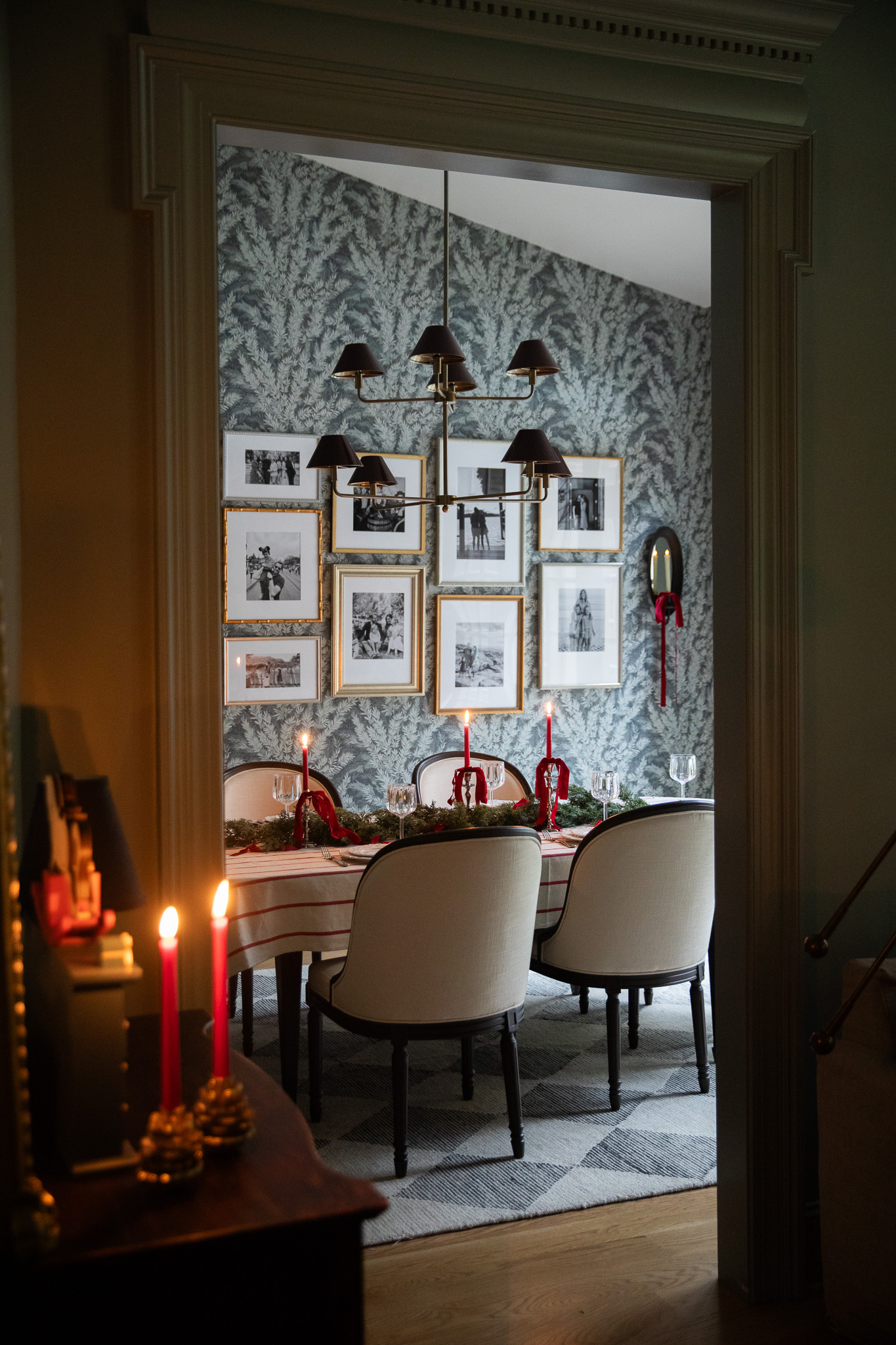
In our breakroom, we had this beautiful, patterned wallpaper installed, and it does such a good job of marrying all of the colors together. There are varying tones of blues and browns, and together they make every paint color in the entire office flow together like it was all intentional, which it was ;).
Creating a cohesive color palette in your home can take some time and effort, but in the end, it will make everything feel more polished and put together. Hopefully, you found these tips to be helpful, and I can't wait to share more of the office as we finish furnishing and styling it.
Leave a Reply

WE'RE CHRIS + JULIA
Portfolio

Projects

















I had this exact question in my mind yesterday. Thank you!!