I mentioned last week in this blog post that we came up with a lighting plan for the whole house, and this week we have an electrician here, wiring for all the lighting and outlets and switch plates. It's about time we had some efficient lighting in our lives, and I'm also excited to be mixing metals in our home through our lighting! Give me all the polished chrome, aged brass, and matte black sconces and light plates and knobs and faucets...
A common misconception is that your metals need to be all be the same within a room, or even in your entire home. Not true. I hate to tell you — there are no "rules" for which metals go together. But there are lots inspiring rooms from which to take note! Today's post is all about mixing metals: Design School edition. You *can* and should mix metals. Here's how:
Cast Your Metals as a Main Character, a Supporting Actor, and an Extra
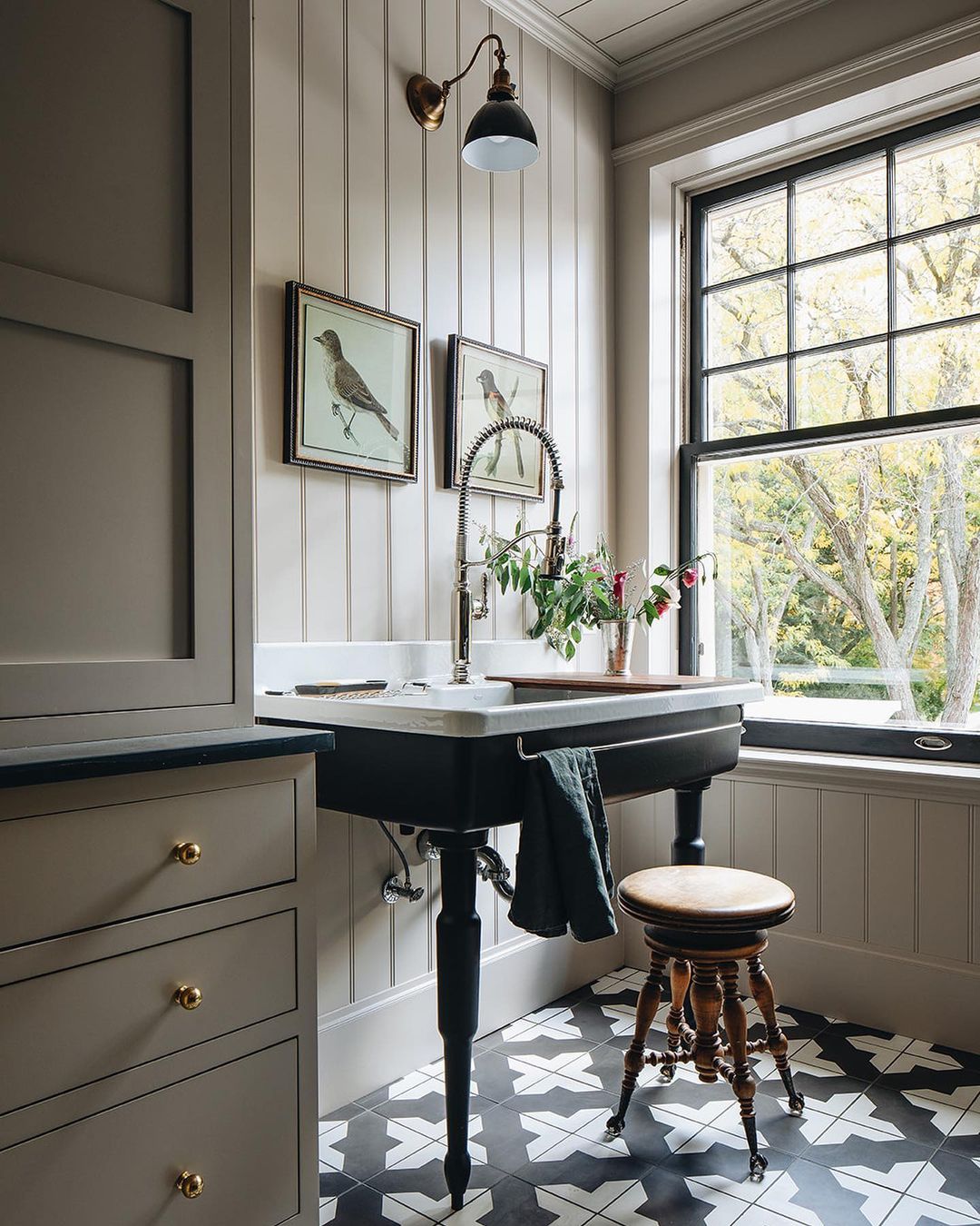
The best analogy I can think of is to incorporate your metals as if you were casting for a film, and you're in search of a main character, a supporting actor, and an extra. One metal needs to sing louder and brighter than all the others. In the photo above, I'm seeing matte black as the lead. Hello, gorgeous pedestal sink! Black windows, black sconce, and even a touch of black in the picture frames! The supporting metal here is polished chrome, seen in the window hardware, the plumbing fixtures, and that delicate towel bar. Just a touch of aged brass in the drawer knobs, the sconce mount, and a little detail in the picture frames. See how it just flows and ties together?
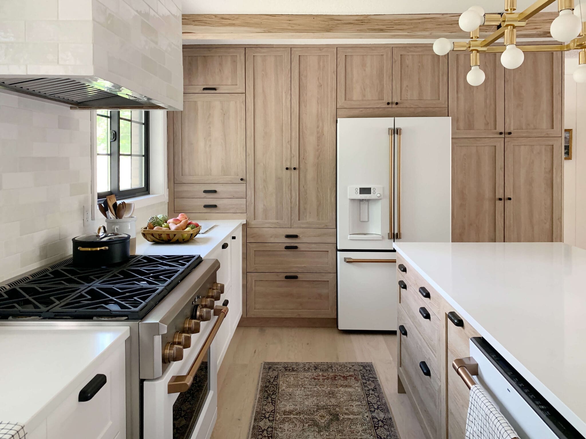
Here's an example in a kitchen. Lauren could be the spokesperson of mixing metals. The most obvious places to include a metal finish is going to be a kitchen or bathroom. Typically metal is used in the plumbing fixtures, cabinet hardware, light fixtures, and appliances. Don't forget the little details though. Picture frames are a great way to add an accent metal. How many metals do you see in the above photo?
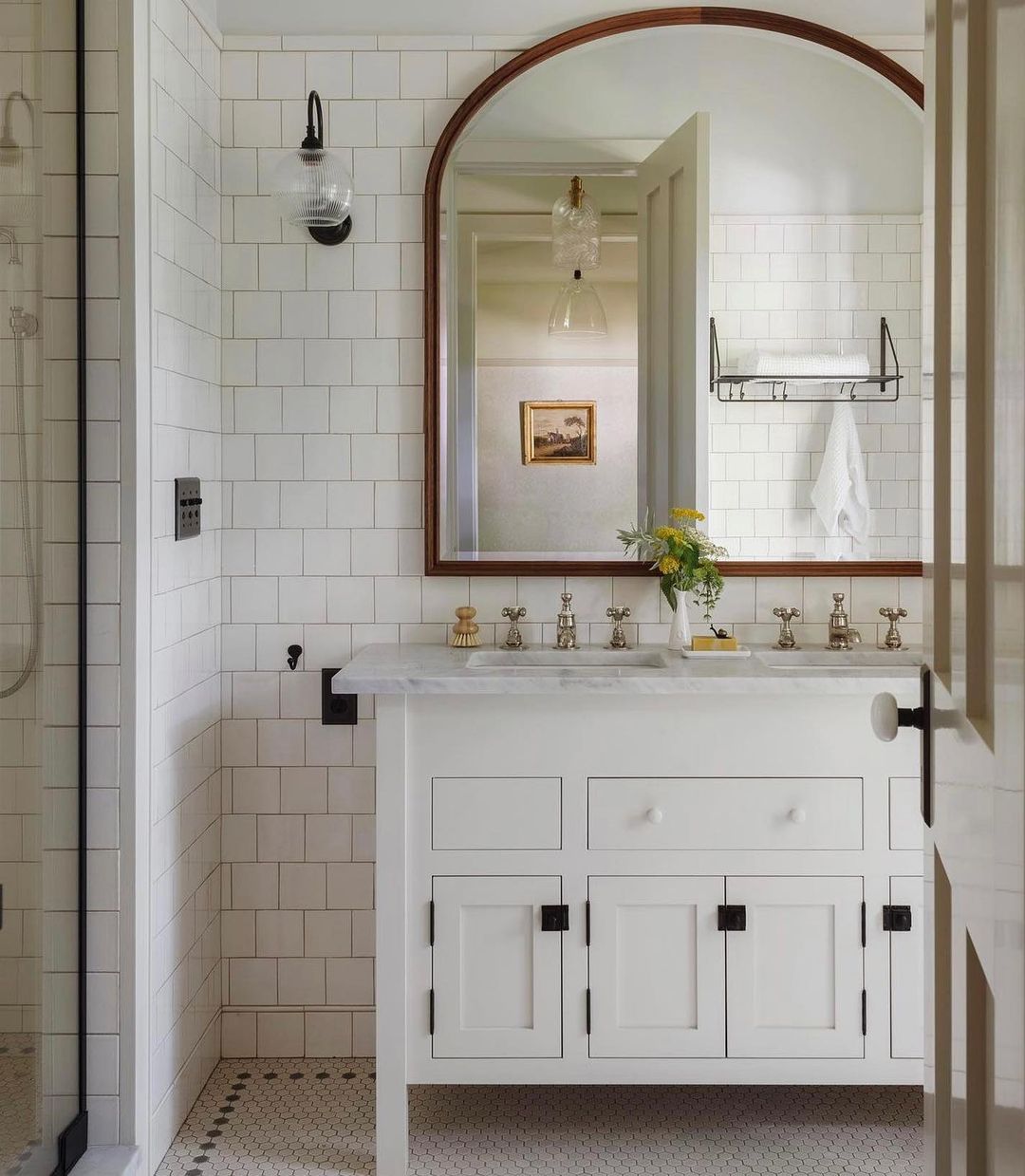
Here, Jessica used metal in some shelving, hooks, and is that a matte black switch plate cover I see? Note the warm nickel of the faucet, bridging the gap for the warmer gold frame.
Use Your Imagination
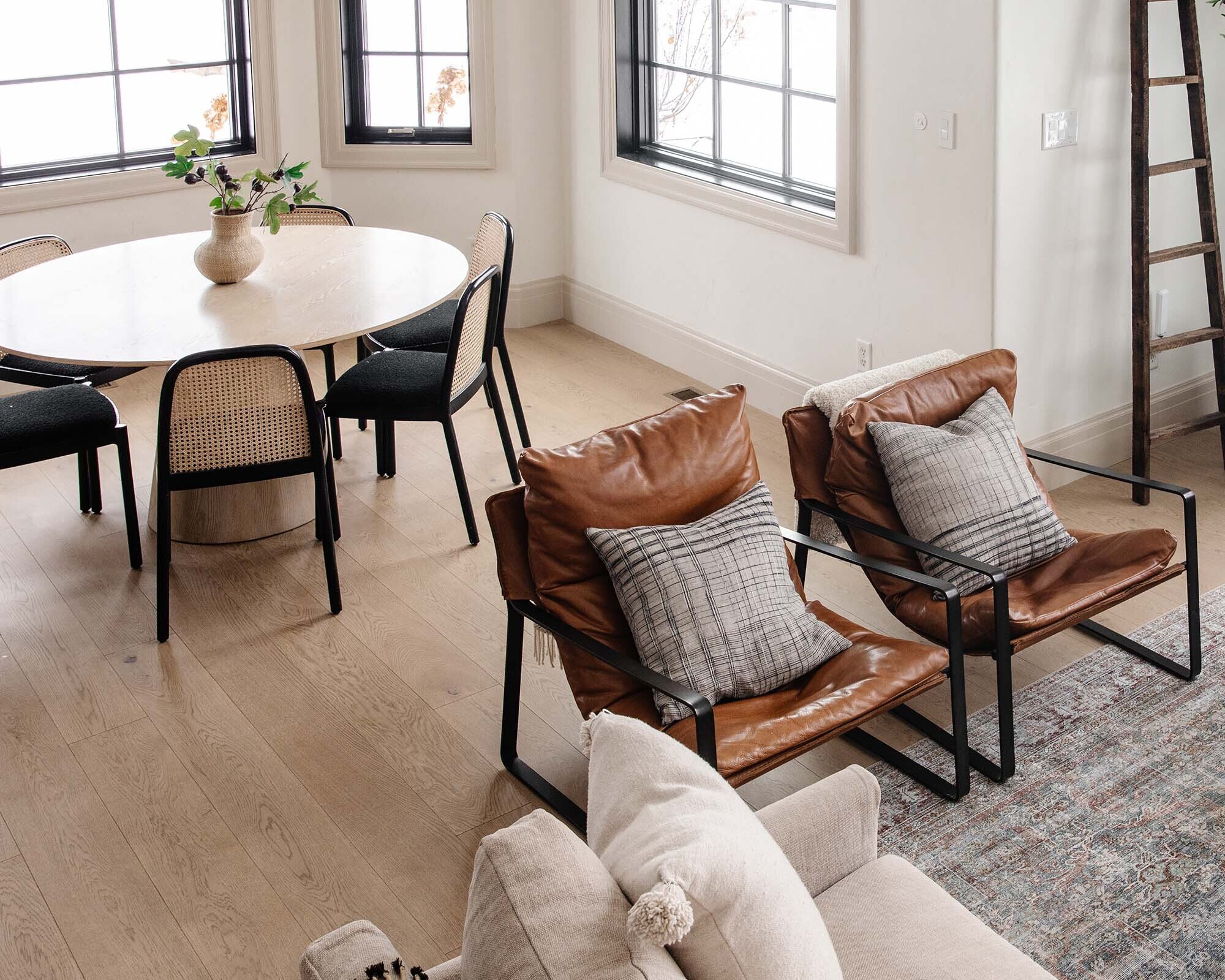
Try imagining if the finishes in the image above were all the same metal – maybe all black. Can you picture how it might suddenly feel flat and heavy? It's the collection of metals that keeps the eyes moving. I'm intrigued by the contrast of black and brass, but the chrome keeps me grounded.
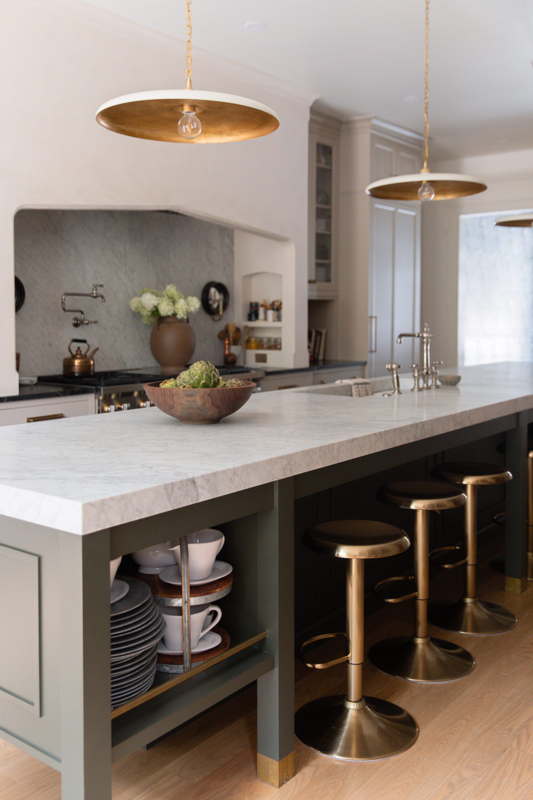
I also love how Jean used three different light fixtures in this kitchen, and they're all aged brass. There's uniformity and variety. Stunning.
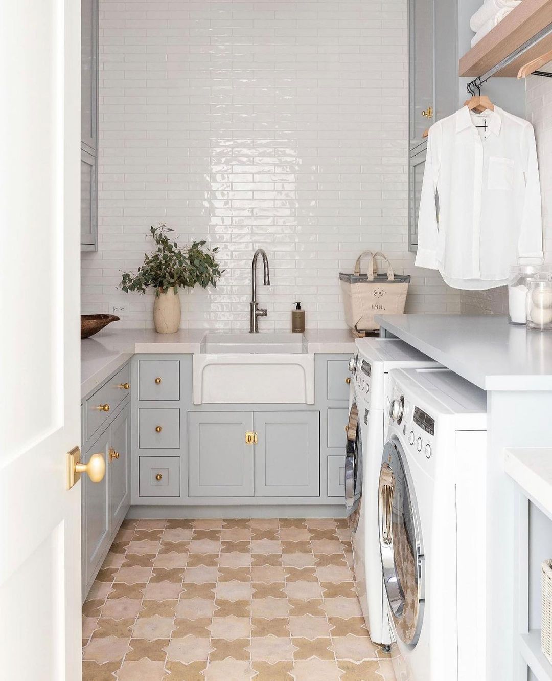
In this laundry room from Studio McGee, brass knobs bring up the warmth from the floor tiles while elegant chrome mimics the polish of the high gloss tile. The faucet is muted — an "extra" on pointe.
How do you *decide* which metal is playing the leading role? By choosing a favorite piece and going from there! If you LOVE a pair of brass sconces, enough to design a bathroom around them, starting looking at those sconces next to a complementary metal — like the polished nickel in the bathroom above.
Sometimes All You Need is Two
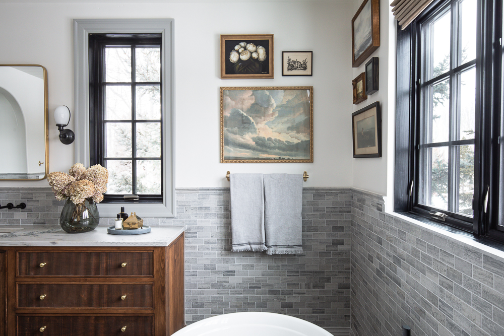
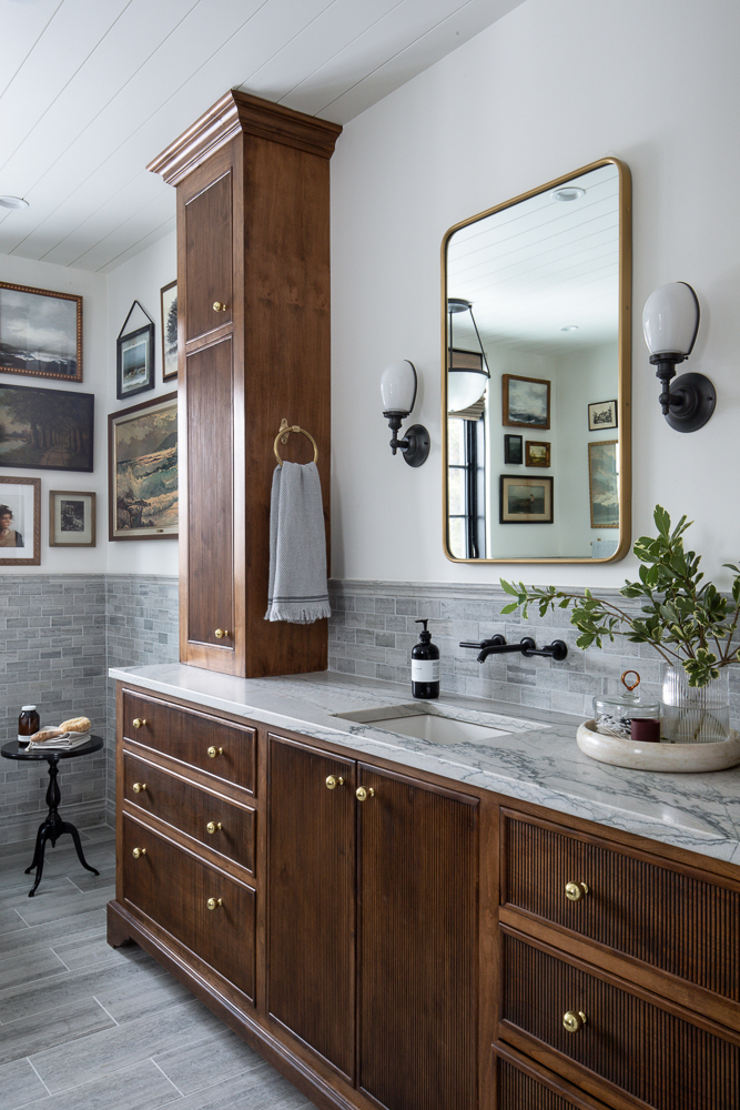
This little bathroom vignette is the perfect example of how two metals can be the perfect amount in a space. See all the warm wood tones and natural stone here? Adding just a touch of polished chrome and brass feels so balanced here. Typically a bathroom is a more common place to find just two metals because of the size. (You can mix in more in a kitchen, for example.)
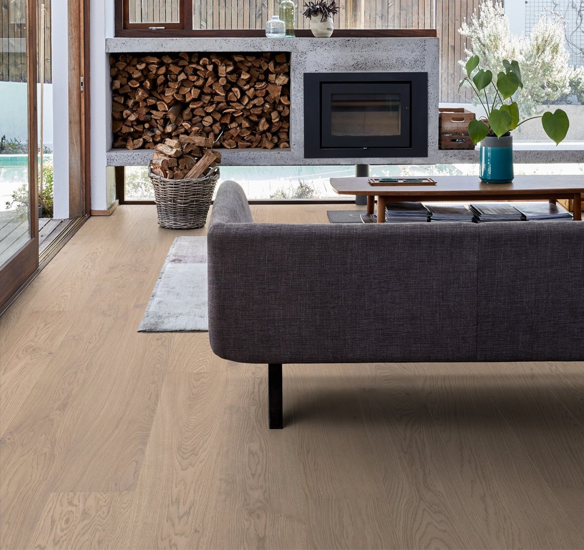
Another tip: Let wood tone choose your metals. You might be looking to complement or warm woods with aged brass. Likewise, polished chrome could blend in subtly with cool marble. Once you choose your focal point, you can decide which role your metals need to play.

Look for opportunities to match the metal to your tone. The fridge and the sink in the photo above work well together because, though they're different colors, they're similar tones. Most of the metals in this room are also of a similar tone — with the exception of the polished nickel. It pops!
Is that bronze I see in the chandelier? Try using the same metal in different finishes. Here, the brass goes to bronze in various degrees of aging, making it all *work*. Silver and gold are a classic combination for a reason. The chrome plays a subtle, supporting role.
Don't Overthink Mixing Metals
Use what you're naturally drawn to! I really tapped into this when I designed our Modern Cottage Bathroom. I knew there would be a lot of cooler tile and stone and so naturally I wanted to warm it up with brass. Plus I'm just a believer that a pop of black should be in every space, and metal is a great place to start.
The pedestal sink was really the only place I used chrome, and I love that it was kind of a hidden surprise behind the pocket door. Keep it simple, but be creative. If *you* like the look of two (or three! or four!) metals together, then that space will look like YOU. And it'll make you happy.
(Psst — Read this blog post to read how we mixed metals many bathrooms ago.)
Leave a Reply

WE'RE CHRIS + JULIA
Portfolio
Projects


















What do you think about mixing oil rubbed bronze, brass and matte black in the same bathroom?
I say go for it!
Great design school lesson! I often hear designers say "pay attention to metals," without giving any more details or guidance. I love that you gave specific examples with pictures and a description of what exactly to pay attention to when choosing metals for a space. This post was really helpful - thanks!
I mixed metals in my newly remodeled bath (waterworks unlaquered brass and rejuvenation matte black) and really wish I would have kept to all brass. I have mixed metals all over my house but I think it would have felt more upscale to keep it all cohesive.
The previous owner of our house left us with mixed metals in every room - and not necessarily done well. Every interior door has shiny brass hinges and antique brass door knobs. Most lighting fixtures are chrome or satin nickel but plumbing fixtures run from "gold" to chrome to brushed nickel. It appears that "on sale"" and available right now" were the most important factors when making a purchase rather than a plan for a cohesive look in the rooms they updated and remodeled.
Slowly but surely we're updating to match our preferences but if things aren't broken or butt-ugly we often have to look past them until phase two. Posts like this allow me to dream and help me plan for a more cohesive future - thanks!