Ah, the magic of paint strikes again. Greta's bathroom has always had good bones--the classically tiled shower, wood dresser vanity with great curves. I even loved the beadboard. A couple months ago, we tiled the floor and gave everything a fresh coat of paint (Alabaster on top and painted the beadboard Revere Pewter). And then it sat. I got questions from a lot of you and our team, "Why aren't you posting Greta's bathroom?" And I knew it was because it wasn't there. Something was off. I knew I didn't take my own advice I tell people ALL THE TIME--don't paint a windowless room white. I did just that and it look drab. But! Since this blog is all about learning, I posted all about what I didn't think was working right here and over 700 comments came pouring in. You guys like it when I share our mistakes. But I'm glad we did, because we made it! We're so happy with the bathroom now!
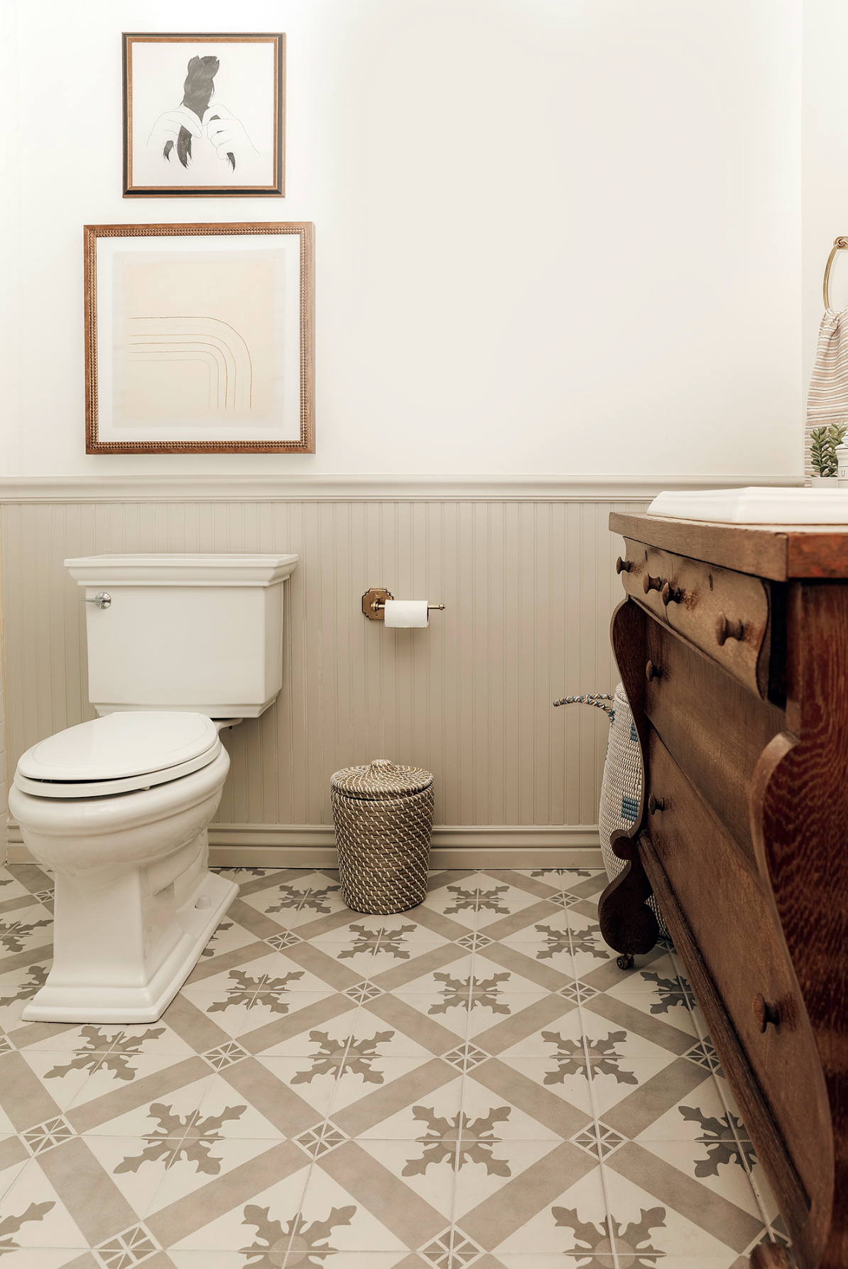
As a reminder, here's how it looked after round one:
And here's how it looked when we started:
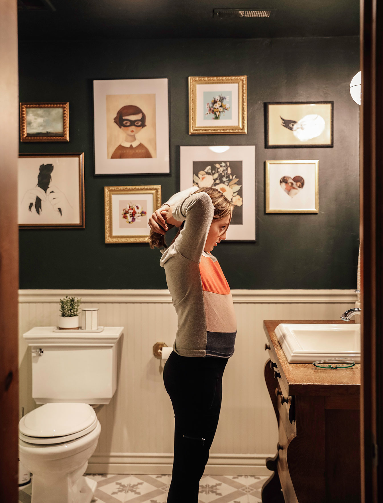
Because we had already picked out blush towels, I knew a dark green would sing in the space! We landed on Sherwin Williams' Jasper (the deepest green that I've never seen look bad) and then a funny thing happened. We were trying to decide whether to paint just the beadboard, or the upper wall and beadboard and decided just to go for painting EVERYTHING since I love when trim and walls are all one color. But as soon as I saw Jasper on top next to Revere Pewter on the beadboard, I startled Chris when I screamed, "Wait!!! This!!!" It wasn't even an option I had considered but it was definitely the right option. I loved the way Revere Pewter blended with the floor tile and Jasper on the walls eliminated the dull white paint. To me, it was a match made in heaven.
The only problem? Chris had already started painting the beadboard--OOPS! Luckily, we still had some of the pewter left and it was easy to paint over it again.
We also decided to paint the entire ceiling Jasper as well. It really extends the walls up and the room feels so much larger! It's incredible. It also makes the darker paint color look less like a thick stripe in between bead board and a previously white ceiling. The shower is fully tiled in white subway tile with mosaic floors and it really shines in the contrast. (Why did I try to steer away from my norm again?)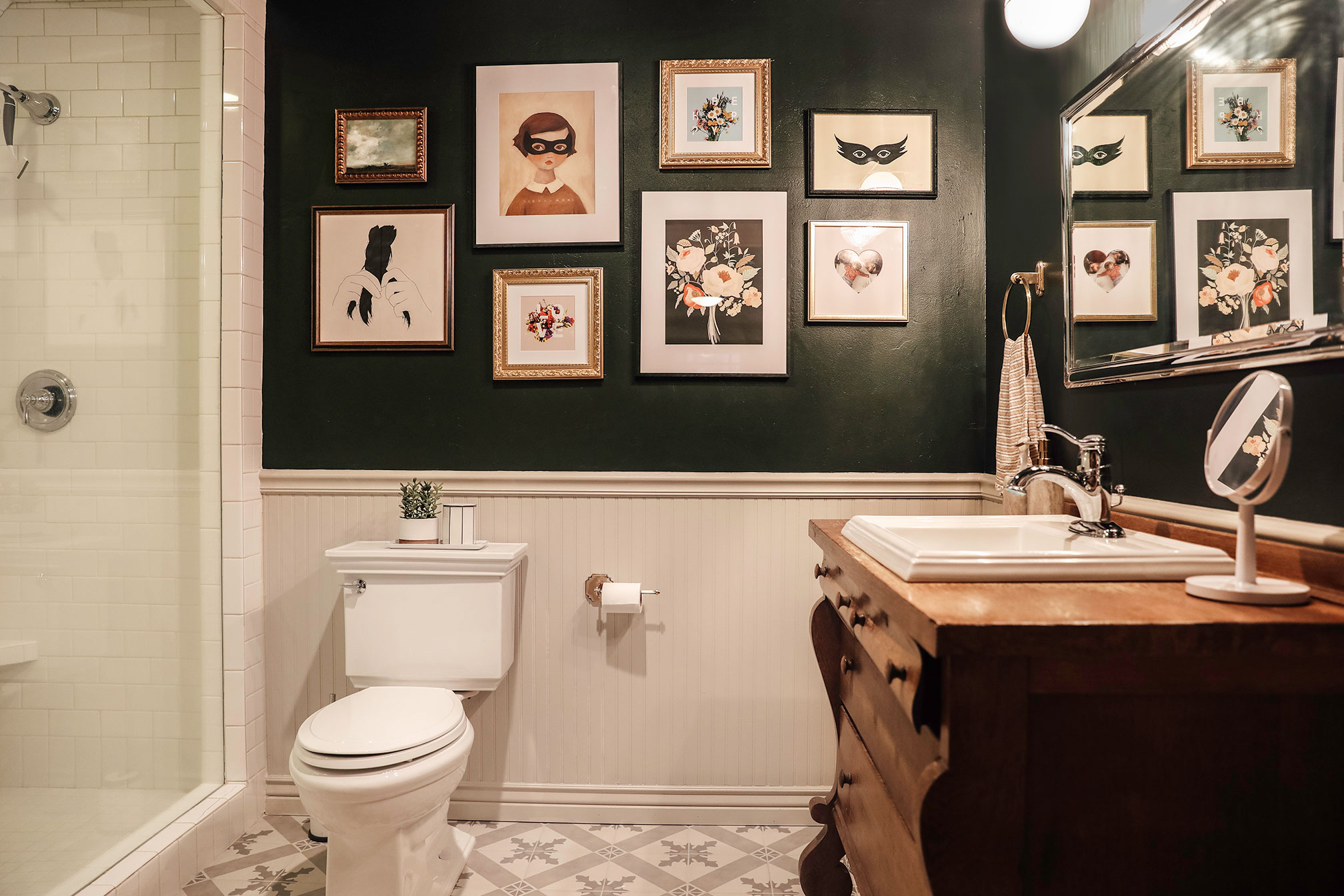

The other tweaks we made were we extended art along the entire back wall for a fun gallery wall which MADE THE SPACE. If I could pass on a tip for gallery walls, it would be to lay it all on the ground first and move and move and move pieces until you can find some good balanced asymmetry. I repeated two of the same frame, but hung them opposite each other for balance and then on either side of the center 4, I hung a wider black and neutral picture diagonal with a brass smaller frame also on the diagonal. It's all about guiding the eye to the next piece through subconscious hints.
We actually put the original mirror that was here when we moved in BACK in here. The beveled mirror edges are really so pretty, tie in well to the faucet and I'm not lying, this mirror weighs 75 POUNDS so I felt compelled to use it somewhere.
Greta loved her bathroom before but she said she feels like a teenager now (great). I think that's code for cool. Haha. And I feel excited about the space. I couldn't wait to share it with you which told me everything I needed to know. I'm so happy we worked through it.
You know the old adage, If at first you don't succeed, try, try again? "Succeeding" in home projects is solely baed on YOUR happiness with the outcome. There will always be people that like (or don't like) how something looks, but it only matters how you feel. If you're not happy with an element of your home, and it's something you can change--take action on that dissatisfaction! Whether it's a new paint color or rearranging furniture or tearing up the carpet on your stairs--there's so much success in finding joy in your home.
SOURCES
Wall Color : Sherwin Williams Jasper in Low Lustre (Emerald Line)
Beadboard Color: Benjamin Moore Revere Pewter in Satin
Tile
Towel Hooks
Toilet Paper Holder
Towel Ring
Vanity Light
Blush Towel
Striped Hand Towel
Bath Mat
Soap dispenser
Toothbrush holder
Art (from top to bottom, left to right)
Time Stands Still (small landscape)
Braid
Masked Girl
Love & Be Happy framed prints (come in pair)
Floral Bouquet
Mask- Jennifer Ament
Leave a Reply

WE'RE CHRIS + JULIA
Portfolio
Projects















Love this look! I recently painted my windowless bathroom Hunter Green and installed sconce lighting on either side of the large round mirror over the vanity. The issue I'm facing is that I only have the sconce lights and an overhead light in the shower (that turns on with the fan). The sconces give a candlelight effect (60watts), that is very flattering, but I'm not sure if it is too dark for a bathroom. Should I add another ceiling light in the bathroom? Or any other ideas to brighten up the room?
Is your “braided hair” print an 8 x 8 or 16 x 16”? I want to do this in my bathroom and can’t decide which size. Curious what the scale is on your wall. Thank you! I love this space, and really every space you do.
16x16!
Thank you for reminding us to NOT paint a windowless bathroom white. We are designing our new build home and my husband wants his office bathroom (in a basement, no windows) to be light and bright and airy, and I keep trying to tell him we need to embrace the windowless room and go a bit moodier. White with no windows = drab. I'm going to show him this. :)
Our bathrooms have no windows and I'm so inspired by this! It looks great. I painted one feature wall dark in our master bath, but now I'm ready to do all of them! And the ceilings too! Woohoo!
Beautiful!!! My favorite room in our home is a tiny powder room with light colored travertine (ugh) on the bottom half of the walls and floor with a black upper wall and ceiling. Despite the tile that I don’t love, the black makes the space.
Yes! You got it 100%. And it is fun to try to find what’s not working along with you
I LOVE THIS. What’s your take on how this would do in a nearly windowless basement? I want moody and bold, my husband wants light and airy. Help me tell him he’s wrong.
Beautiful, as always! But what we really need to know is... how is Casper adjusting to the change? :)
We haven't had any major spirit encounters since we had the two energy workers here. No lights turning on or off no doors opening or slamming. (Just a faucet turning on) ha!
It looks amazing! But I’m a little confused why you suggest on no white walls in a windowless room?
It's so funny but it actually looks brighter now!
I love it! So glad you found the answer! I was wondering if the moisture ruining the art is a concern? I’m always afraid to hang art in a humid space, but would be delighted if my concerns are unfounded!
With a dark ceiling, what did you do about with the exhaust fan? What color is it? Also, what paint sheen did you use? I’m painting the tiniest of powder rooms navy and stuck about what to do with the ceiling and exhaust fan!
The bathroom looks beautiful!!
It is gorgeous and perfect! Painting the ceiling was genius. I have seen that stripe problem before. I’m so glad you left the lovely vanity alone.
I love the bathroom and love that it demonstrates the power of a "statement" color. The moody green vibe with the cool gallery wall and great bones in the room is utter perfection! Thank you for sharing the process.
Yessss it looks awesome and I love the art from the book! What a smart idea.
Hiya! The only note I would add, and this is to the public generally, especially for women, is you have to be really careful about putting on makeup in a dark bathroom. I had a college friend who painted her rental bath. red and she said she came out looking like a hooker every time she put her makeup on because it was so dark in the (windowless) bathroom that she'd always put on too much makeup! HA! And I find that to be true of any windowless bathroom, really. It's a bummer not to have natural light, just go light on the makeup application! ;)
Oh that's funny!
I imagine you will help the girls set up a really fabulous sit down vanity situation in front of a window when they get to that age. How great would that be?!
I don't see a link to the actual bathroom vanity, any chance you can link that and the sink please? Or point me in that direction
It was here when we moved in! Looks like an old dresser they converted
The dark green looks great! You have a gift for color theory and how different colors complement each other. The room is chic yet whimsical. Love the gallery wall. It's always helpful to hear how you approach a space and the creative process When you redo a room, how do you decide to tweak vs. more full redo? Some rooms like this seem to evolve instead. The paint choices worked out well. How much of design is spontaneous compared to planned for you? Our girls would love that bathroom!
The paint and the gallery wall are gorgeous!
Yes!!! I had commented on your previous post about how it felt “bottom-heavy” to me. The dark color on top helps it feel much more balanced! Love the gallery wall too!!
What a transformation! Great job. I’m still not in love with the tile my parents kitchen in the 70s. However, have you thought of getting a rug in there? Not something too busy but it could cover up a bit of the tile and add a little pizzazz. Just a thought. The pictures are absolutely adorable.
The tile is the pizzazz, why would one get a rug to cover up the new tile they picked themselves and just laid a couple months ago?
I LOVE IT! It has a chic old hotel vibe and I like that you weren't afraid to put that mirror back into the bathroom. I thought that the fixtures would pop if you painted the bead board dark, but now they pop and so does the art (which I love too!) My oldest is turning 11 soon and they way your are decorating Greta's space has me thinking about updating her space to fell "more like a teenager."
Love the dark paint with the lighter floors, and the gallery wall. I remember in the original first run I couldn't help but keep staring at the blank space like this doesn't feel right. Think the dark paint almost enhances the gallery wall as it feels like there is more visual depth there. Great job!
Also - loved Greta's comment! I remember being around her age - would agree she either meant its cool or mature looking. A lot of my classmates were starting to try to act more like teenagers around that same age. Granted, 75% of the class had siblings that were middleschoolers and early high schoolers as influence for that behavior. Can recall my brother-in-law (he's 12 and 11 years younger than my husband and I) being right around that age and behaving the exact same way a decade later. While she's not a teenager yet, think this is a wonderful bathroom that will age well with her over these next several years. :)
Love your design! I'm currently in a planning stage for a bathroom addition at my home and may have to borrow from your color scheme :) I'm choosing fixtures and was looking at yours. Do you have a mix of metal finishes? Chromes and polished nickel maybe? Or is that just how it appears in the photo? I love the warm tones in the polished nickel, but it opens a whole can of worms... do I search for every bit polished nickel (no easy task) or stick to all chrome, or would it look ok to mix?
So so beautiful!
This is exactly what I’ve been wanting to do to our bathroom for months! We have wainscoting on the bottom and I want dark green up top with the ceiling green as well, but... I’m worried about it looking funny since there’s a bathroom exhaust light that I feel like will stick out like a sore thumb if I paint the ceiling dark. Any suggestions?
Nailed it!
I think I would have preferred pink. The green screams “billiards” to me.
You should DEFINITELY paint your bathroom pink then.
That's right Julia :)
This is the best response :)
I love it! It's beautiful! Made me smile...because this is so YOU!
As an aside, I'm trying to work with White Dove on my new Art Studio/Office walls. Had to go back and add black accent walls. It felt like primer. Very unfinished. Also, as an experiment, added a pink/coral wall for fun and it makes me so happy! Who knew?
Love this!! Feels much more your style and that gallery wall fills the space so much better than the old art!
Absolutely beautiful! You nailed it! I love the collection of art for the gallery wall.
All hail Julia, our Queen of Dark Green! :-P
SOOOO much better! It looks fantastic. I admit I was pretty confused when you went light in there with no window. I thought I had remembered you saying that would rarely work. One tiny thing - my mild OCD bell is ringing when I look at the vertical frame pairing on the far right. Their left edges are aligned when all the other pairings have the small frame centered to the large one. I loooove what you chose, and I think my daughter needs the girl in the mask. Off to order it right now!
Are you worried about the moisture ruining your the artwork? I’ve always wanted to adds piece of art in my bathroom but never did because I thought the moisture would ruin it
I wouldn't be original art in a bathroom, but these are all framed prints and I haven't had issue in the past so fingers crossed!
I’ve had framed prints in my bathroom for years and other than the hardware on the back of the frame rusting a bit, I’ve never had an issue with moisture damage. My bathroom does not have great ventilation either. Like Julia said, I wouldn’t do anything original or expensive just in case, and I also use frames with glass instead of acrylic (Target has some great affordable options) which might help protect the prints better. You should give it a try!
Nailed it!!!
Beautiful!
So lovely! If you paint the walls dark and there isn't beadboard, do you still recommend painting the ceiling the same dark color? Or should it be left white? We have a small bathroom with small north facing windows. White walls and white tiles with a wood vanity. Would it still create the stripe effect if left white?
Can you enlarge your font and have smaller paragraphs for readability? It's so hard to read because the font is tiny and light. (By the by that's good for rpm).
And WOW IT'S EPIC, great choice in the paint!
We are working on a big site overhaul and definitely taking notes!
Ooh, as far as site overhaul, I also have a note. I always have the hardest time with your page loading inconsistently and jumping around as it loads. Like I’ll try to click a post and end up somewhere totally different because the page shifts while I’m clicking because of the random loading, usually of ads and banners. I don’t have that with any other website l. Maybe it’s just me but if it’s not it’s something to look into. It drives me nuts!!!
Same!
Same here too!
annoyingly THE SAME!
Same!
I have this problem as well!
I la la love it! Did the vanity come with the faucet, or do you have a source for that pretty piece?
We have a hardworking full bath in the hallway that serves guests and our two young daughters, is only 5x7, one narrow window up high over the tub surround/under the roof overhang that is nearly useless as far as natural light goes, so I seriously considered going dark as I planned its refresh. I changed my mind when I realized standing at the mirror, our medium-to-dark hair disappears against a dark background and I HATE not seeing my hair when I look in a mirror! That floating pale face surrounded by dimness is like halloween every day lol. But you are making me reconsider... because yeah, our bathroom looks a little blah just like your first effort did.
It's still in process - most of the pieces are purchased, half installed, with some tweaks still possible as far as paint colors. We're putting in dove gray wainscoting soon and I have painted the walls with a dirty grayed ivory which the plan is to remain above the dove wainscoting, because it minimizes the old yellowy cream tub/shower surround. We have a medium wood vanity and cream and gray floor, so all these elements are very similar to this room... I'm not ruling out the possibility of repainting the upper half when everything is in place.
This looks great, very rich and refined! Curious - why don't you recommend painting windowless rooms white? Trying to learn new tips while we redo our house. Thanks!
You cannnnnn if there is multiple sources of light. But it will never feel white and bright. To me, it always feels a little dingy.
YES! Our master bath has one small window and we painted it the same white as the rest of the house. It looks nothing like it and it’s kind of dirty and yellow. Back to the drawing board, it looks great everywhere else.
Interesting! We just painted our windowless bathroom white (despite being hesitant due to this advice) and it really does look fresh, clean, and bright. But, every space is so different—we do have overhead lighting in addition to sconces so perhaps that helps? Our floor is darker than yours too (gray), as is our walnut vanity. The white helps everything pop. In any case, your bathroom looks fantastic with the dark paint! Love the changes you made. :)
It looks wonderful with the new color on the walls and ceiling. Love all of the artwork, especially of the girl in mask and the mask.
I've noticed that your tastes are changing a bit by going for the darker colors in the kitchen and pantry areas. Perhaps Greta's tastes are changing with yours? Some kids rebel from the tastes & ideas of their parents and others don't.
Someone asked about real plants that do well in interior rooms - just do a search with "indoor plants for low light areas" and there are lots of them in a variety of sizes. But, one may end up losing the plant to lack of water before it dies off due to low light.
In your stories it definitely looked gree, but it totally looks black here- either way I love it!
It's a really dark green, sorry that's not coming through!
Hey Julia, Good call with the darker green paint. Looks fantastic.
I love the clean white tiles in the shower, may I ask what shade of grout you selected please?
That was actually there!
Love where you landed!! So happy team "paint it dark" won!
Love that mask girl print so much! I just bought it for my daughter's playroom. I tracked it down last night but waited to buy it until this morning so you all could get the affiliate link. Thank you for such great finds. I know how much work goes into tracking down awesome products like that!
You're so sweet. Thank you!
Beautiful! Could you share your frame sources? I always struggle with frames!
Mostly Target! Some of them came framed from Artfully Walls or with the print I purchased.
I LOVE!!!! Definitely nailed the sophisticated look to flow with the rest of your house!
I think your auto photo corrector may have done the same thing to this post as it did in the kitchen. In Instagram the paint looks green. Here it is really too dark to tell. Just a thought. LOVE the change!!!
Hey Julia. I'm local. Any chance you can figure out where the vanity came from?
No clue.
Search for an “empire dresser” to find similar vintage ones. Here’s a link to just one I found quickly: https://www.etsy.com/listing/237363365/restored-antique-tiger-oak-dresser?ga_order=most_relevant&ga_search_type=all&ga_view_type=gallery&ga_search_query=empire+dresser&ref=sr_gallery-1-31&cns=1
it was missing a pop of color to ground it! such a beautiful small space, so much character too!
::Slow claps:: That galley wall is amazing. I can't wait to see how the bathroom and the bedroom flow together. It's going to be so fun having that awesome light wallpaper and looking through to the ultra moody and sophisticated bathroom.
Love it!! Thanks for sharing the process, super interesting and helpful.
PERFECT. I especially love how the prints/mats in the gallery now tie in the colors of the rainbow rug, which seemed out of place before. I'm so glad you're happy with it!
Yeeeeeessss! Fabulous. I'd feel like a sophisticated lady in that bathroom so no wonder Greta feels like a teenager.
It was nice before but BEIGE. Everything blended in together. Once you started painting it dark, I couldn't wait for the reveal.
drooling over here!!! Knocked it out of the park again!!!
Bravo! This. Is. It. ???????????????? Thanks for taking us along the ride on this one. It’s very helpful and interesting to hear about the process as it plays out in real time. Excellent job!
I love this bathroom!! I mostly love that you share that it took a little time to figure out what wasn't quite right. One time, when everyone was going with a tuscan look in their homes in our area, I painted my dining room deep red and the adjoining living room/entry in a deep gold. Oh, My Goodness! I hated it, felt uncomfortable in my own home! Christmas was in two weeks, so we kept the red in the dining room and enjoyed the, but on December 26, a new silver sage color went up and ahhhh, I felt myself again!
P.S. Brilliant call on painting the ceiling too! Your tip about why on Instagram (otherwise the wall would look like a dark stripe) was so smart, and I never would have thought to do that.
Ok, I was someone with LOTS of "helpful" feedback before and hated the floor, too. And now I love everything even though you did nothing I suggested!! It's so fun to have puzzled this through and now see how right you were about your instincts to go dark!! Even the floor looks dynamic and fun here, while before I thought it looked dingy. *Hangs head in shame* *Stands and applauds*
The original vanity really brings a warm touch to this space, I love it here. Did you do anything to treat the wood and prevent water stains/damage?
I haven’t! It’s been here for quite Some time and could definitely use some waterlox
Beautiful! Thanks for taking us along for the journey. It was such an interesting lesson in color and light.
Love it! The changes make this bathroom sing now like the rest of your house does! Question from another windowless bathroom owner...is the little plant real or faux? Would love to know of any real plants that may do well in low light.
Faux
Howdy! Your friendly neighborhood low-light apartment plant lover here :) My go-to's for plants that won't die in the dark spaces of my apartment are snake plants, zz plants, cast iron plants, pothos, and Hoyas. I have multiples of all of these and they've all been surviving really well. Keep in mind that (I believe) all of these except cast iron plants and Hoyas are toxic to pets so keep them out of reach if you've got fur babies. :)
ummm, 100% awesome!