Basically, it currently isn't in the best condition, but it does look way better than when we first bought the house 19 months ago. Now that Greta has officially outgrown her crib-turned-toddler-bed and the rest of the room is in shambles (see above description) and we're ready to start a new project, giving Greta's nursery a facelift into a big girl room seems like the next natural step. A couple weeks ago we shared inspiration photos for the direction we wanted to go here.
Here's a refresher photo (found here):
And you know what the greatest thing about an inspiration photo is? Making it your own. And that is just what we have done. We took elements and colors we loved and combined it with what made the most sense for Greta's room and what would fit in best with our home. So, without further adieu--Greta's big girl room mood board:
1. We debated. We even surveyed you. But in the end, we have decided to go with grasscloth wallpaper on the wall behind Greta's headboard. It's what I loved most about our inspiration picture and Chris was surprisingly enthusiastic about it.
2. Paint colors are one of those things that we can't be sure of until there is a swatch on the wall, but as much as we loved the cheery yellow walls in our inspiration pic, we weren't feeling it in our house. Our paint colors are more neutral and a little moody, so I swapped the yellow with a light, warm greige--here, Ben's Gray Owl, and we think it will play nice with the other things we are implementing.
3. Obsessed. This green "cub print" fabric will make the best window treatments. We are thinking roman shade at this point with a black-out liner. Now, to figure out how to make that....
4. On either side of the window in Greta's room, there will be thin Billy bookcases. We plan on adding the extender pieces and trimming them out for the built-in look we love so much. Doors or no doors? Still up in the air on that.
5. A bed. Fingers crossed, it is this bed. And no, I am not giving you the link to the online classified so you can snatch it up before us. We are still waiting to hear back about this vintage twin for a deal (!!) so we'll keep you posted.
6. As for the bedding, we have this same duvet (ours is obviously larger) cover from Ikea on our bed and love it. OFELIA VASS duvets for everyone!!
7. For the sheet set, I must have these. Errr....Greta must. The gold (which is playing the part of yellow in this room) polka-dots are toooo sweet. They aren't cheap, so I'm still on the hunt for a budget version, but until then--I'll be dreaming of these ones.
8. Mimicking our inspiration photo with a bright pink throw at the bottom of the bed is as cute as it is girly. I love this one that dons pom-poms.
9. Fun art!! This one pictured is sadly not in the budget, but I wouldn't mind trying to create something similar. The colors tie in perfectly to the room I am envisioning but it also has a young, playful feel.
10. A new light fixture. This one is cheap, but chic. Am I right?!
And there you have it--Greta's big girl room all planned out. Are you excited as I am?! Ah, I do love the sound of a fresh project. Join us for the ride?
P.S. Good morning! How do you feel about our new posting time? We hope it is a better fit for everyone.
Leave a Reply
WE'RE CHRIS + JULIA
Portfolio
Projects








This is my first time pay a quick visit at here and i am really happy to read everthing att single place.
Its such as you learn my thoughts! You seem to understand
so much approximately this, such as you wrote the e book in
it or something. I feel that you simply could do with some p.
c. to pressure the message home a bit, but instead
of that, that is great blog. A great read. I'll certainly be back.
Have a look at my blog ... Akribos Xxiv Watches For Women
I simply could not go away your site before suggesting that I really enjoyed the usual info
an individual supply in your visitors? Is gonna be again frequently in order to check
out new posts
Feel free to visit my homepage; http://www.kruiznik.ru
Hi there, You have done a great job. I'll certainly digg it and personally recommend to my friends. I'm
confident they will be benefited from this site.
My web blog - remote control truck
Hi there colleagues, how is everything, and what you want to say about this post, in my
view its genuinely awesome in support of me.
my site: armitron Watches for women
Great delivery. Great arguments. Keep up the great work.
Feel free to visit my web site; online business
Thanks for the marvelous posting! I seriously enjoyed reading it, you happen
to be a great author.I will ensure that I bookmark
your blog and may come back someday. I want to encourage you to definitely continue your great job,
have a nice afternoon!
My webpage - affiliate marketing on the web
Asking questions are truly nice thing if you are not understanding something
fully, except this piece of writing presents pleasant understanding even.
My blog :: wiki.td.co.at
Keep on writing, great job!
Here is my blog ... women's armitron watches
What you posted made a great deal of sense. However, what about
this? suppose you composed a catchier post title?
I mean, I don't wish to tell you how to run your website, but suppose you added something that makes people desire more? I mean "Greta's Big Girl Room Mood Board" is a little boring. You ought to peek at Yahoo's front page and note how they create news titles to get viewers to click. You might add a related video or a related pic or two to grab readers excited about what you've written. In my opinion, it would bring your posts a little livelier.
my page; dahphd.ie
Those gold polka-dot sheets reminded me of a tutorial I just came across- http://www.howwemontessori.com/how-we-montessori/2012/09/diy-confetti-tablecloth.html
You could just buy white sheets and gold (Do they sell gold?) fabric paint.
It looks awesome, I just ordered the light fixture for my entrance.
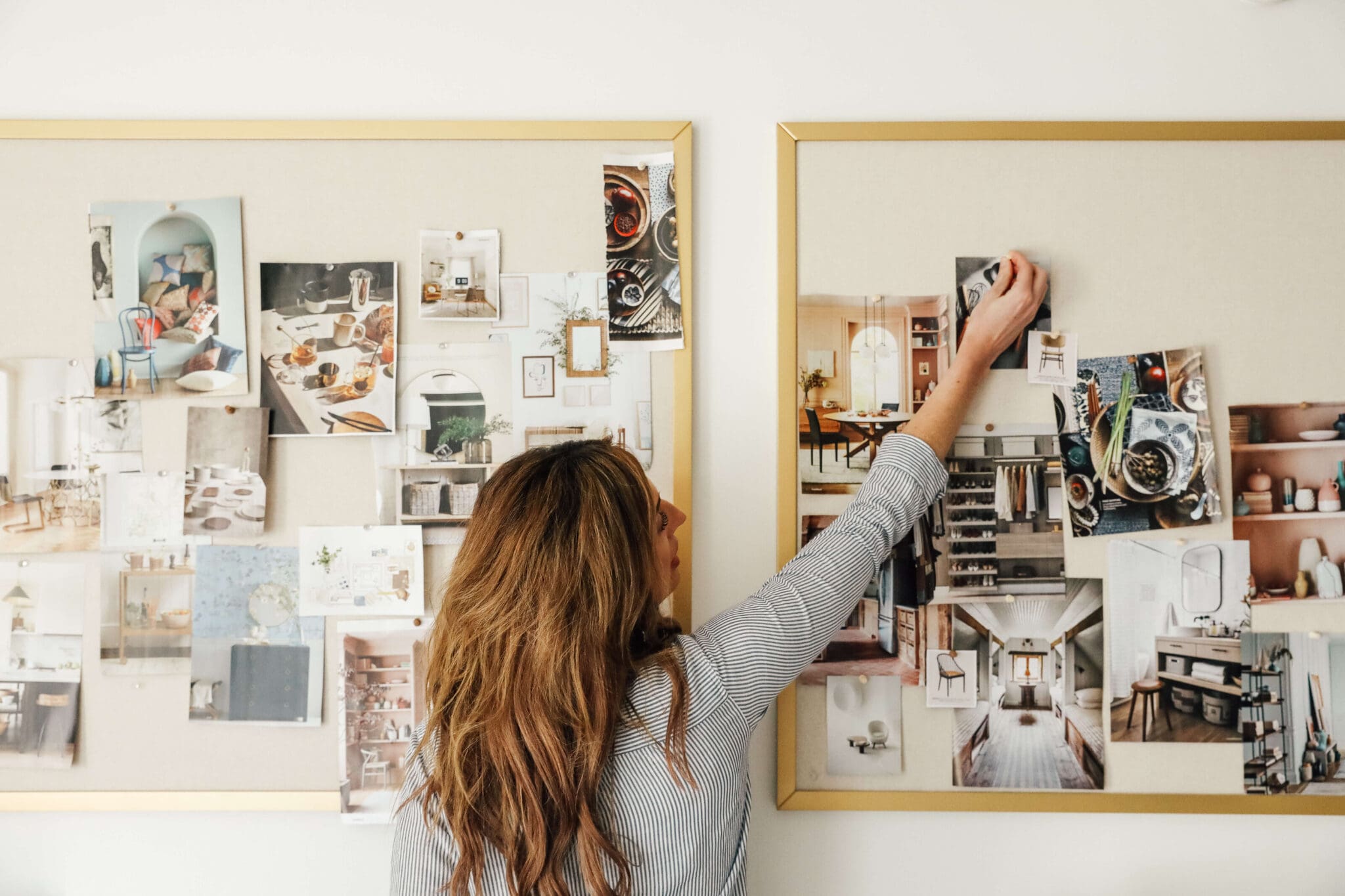
Not a stupid question. Everyone makes mood boards differently, but I use photoshop and illustrator.
This may be a stupid question...but when you make your mood boards, are you just putting pictures onto a word document or are you using photoshop or something fancy? I've been in the mood to make a few and don't really know where to begin.
Nice. Hahaha.
We think so/hope so! Can't wait to dive in!
Kate Spade-esque indeed!
I love it! My daughter had primary color polka dot sheets, and I loved them. I think the grasscloth will look great, too! It's going to be beautiful!
I watched Gossip Girl last night and totally thought of you and your ideas for Greta's room!
i love this room inspiration and can't wait to see you put it all together. i love those polka dot sheets with that pink pom pom blanket.
I agree with this Amanda! My first thought was "I should update my master to look like this."
Cuuuuute! Those gold polka dot sheets are very Kate Spade-esque - I want them for my own bed! Can't wait to see how the room comes together!
If it's bad, I don't want to be good. ;) It can quickly transform into a master bedroom! Go for it, Amanda! :)
Got here from your comment on YHL... it looks like a beautiful plan! It is bad that I kind of want to do this for our master bedroom? Maybe minus the pink blanket, to appease my husband, but I really do love the colors you chose.
I must say you guys are amazing! Love the ideas and thoughts on Greta's big girl room!
Thank you for the tips, Jennifer. You are really making me think I can do this! I made one roman shade prior, but it was non-working--purely for looks. This one has got to function AND look good. .... preferably. Hehe.
I made all of the curtains and shades for our home last year (we have totally odd size windows so this was much much more affordable) and the black out roman shades I made are my favorite! I went to the library and got out a few books with visual instructions - One of the best books was by Sunset, Curtains, Draperies and Shades - but there are lots of tutorials out there! It's not too hard but learn from my mistakes - put some dowels inside to help it hold the lines straight when it's lifted. The books I read listed this as optional, saying you could 'train' your fabric - and over a year later, it's mostly trained, but the very ends tend to bunch when you pull the shade up. Easy to straighten out - but I'll be retrofitting them with dowels this winter. You can do it and you'll be so happy when they're up!
PS. Roc-lon blackout fabric is phenomenal. Easy and forgiving to work with and makes things truly dark. As a bonus - I think it helps with energy bills too and it's pretty much always on sale at Joann's around here. :)
Yes!!! Thank you so much for the link. I'll definitely be checking it out, Sonia.
Don't feel bad at all. I am still writing the posts at my normal time (in the afternoon) but I scheduled it to go live in the morning...while I am still sleeping. It works out beautifully. :)
SURPRISE!!! It was a nice surprise to wake up to comments to respond to too. :)
Thanks Kristi! I'll have to check out Pinterest for a good tutorial. I did see YHL's, but we need this one to be functional. It sounds like yours is so there is hope for me. :) Glad you enjoy the new time.
Rebecca, I really would love to still do something like the butterflies in Serena's room, but with this bed we have our eyes on, I think it would feel too tight to try and place them within the posts. BUT, we could always put them on the opposite wall! Still figuring out details like that, but we'd love to work it in if the evolving room accomodates them.
We did too! Hopefully this fixture will work out perfectly. And good luck to you with the transition into a twin bed. I'm nervous! ...But excited.
I made 3 roman sades for my bedroom this summer and used http://www.make-roman-shades.com/ because, quite frankly it came up on google first. BUT the instructions they make for you (free if you buy something from them or $3 if you don't) are AMAZING. They give you all the numbers you need, spell out the cuts for the different fabrics/tools and just break things down into do-able parts. I can sew, but not that well, and this made it super easy.
I researched a bunch of ways to make shades before I settled on that website, but I am so glad I chose it. Honestly the best $3 you can spend if you're making them.
Love the new posting time since i can read it at work before I start my day but I do feel bad for you having to do it so early :-)
Those sheets are so stinking cute! And I agree with you, that twin bed is a must. I'm glad we went straight to a twin bed instead of buying a toddler bed like a lot of ppl do. It is fun too when we cuddle with her and the bed is more comfortable than OUR bed!! Love the color scheme. So feminine and big girl-esque!
I forgot about the early morning post and so it was a big surprise for me!! Woooo!!
Well now I like this! The room will be so cute! I've been planning my daughters big girl room as well! I should show you mine since you showed me yours. I made my own roman shade from a pinterest tutorial using those cheap white blinds and YHL just posted a really easy way on their site. It's not hard to do up a roman shade. I wanted to add Billies to each side of her windows too but of course we have baseboard heating so I'm trying to figure out a new plan of action. Can't wait to see it come together. Oh and if you don't get that bed ikea has a nice alternative: the Minnen- totally different style but so cute! That's what we are getting if I don't find a Jenny Lind. Love the new time!
Try Centsational Girl's blog! She has an ingenious way to get around those baseboard heaters. She did something similar for a window seat.
Such a fun and colorful room! I especially like the sheets, pom-pom throw, and the art. I know you shared one art piece in the mood board - and I love it- but any thoughts on doing a similar art piece to the one above Serena's bed, too?
P.S. I've always enjoyed looking forward to your blog post as an afternoon pick-me-up, but I do like the convenience of this early morning post.
That's a fun plan. We're about to move our 3 year old out of the toddler bed and into a twin and I completely understand not linking to that bed, it's worth sniping. Also that light is GREAT! I have had the hardest time finding a cheap ceiling light with more than one bulb that wasn't ugly or depressing.