Years ago, we were over one of our friends' homes (we had visited several hundred times, I'm sure) and I noticed that there was a light missing in their ceiling! I pointed it out and said, "What happened to your light!?" And they responded, "We've never had one there since renovating, we should probably patch that." And then we proceeded to laugh and talk about how many times I had been in their house and somehow missed that. And then we wondered, Does anyone really look at ceilings anyway?!
This was in 2015-ish and I think a few things have changed. First of all, if your ceiling isn't unusual in any way--chances are, people probably won't look up. There is a huge chance that you have a missing light fixture and I might miss it. But the other change I have seen over the past nearly 5 years is--ceilings are getting attention and it makes a HUGE difference in a room.
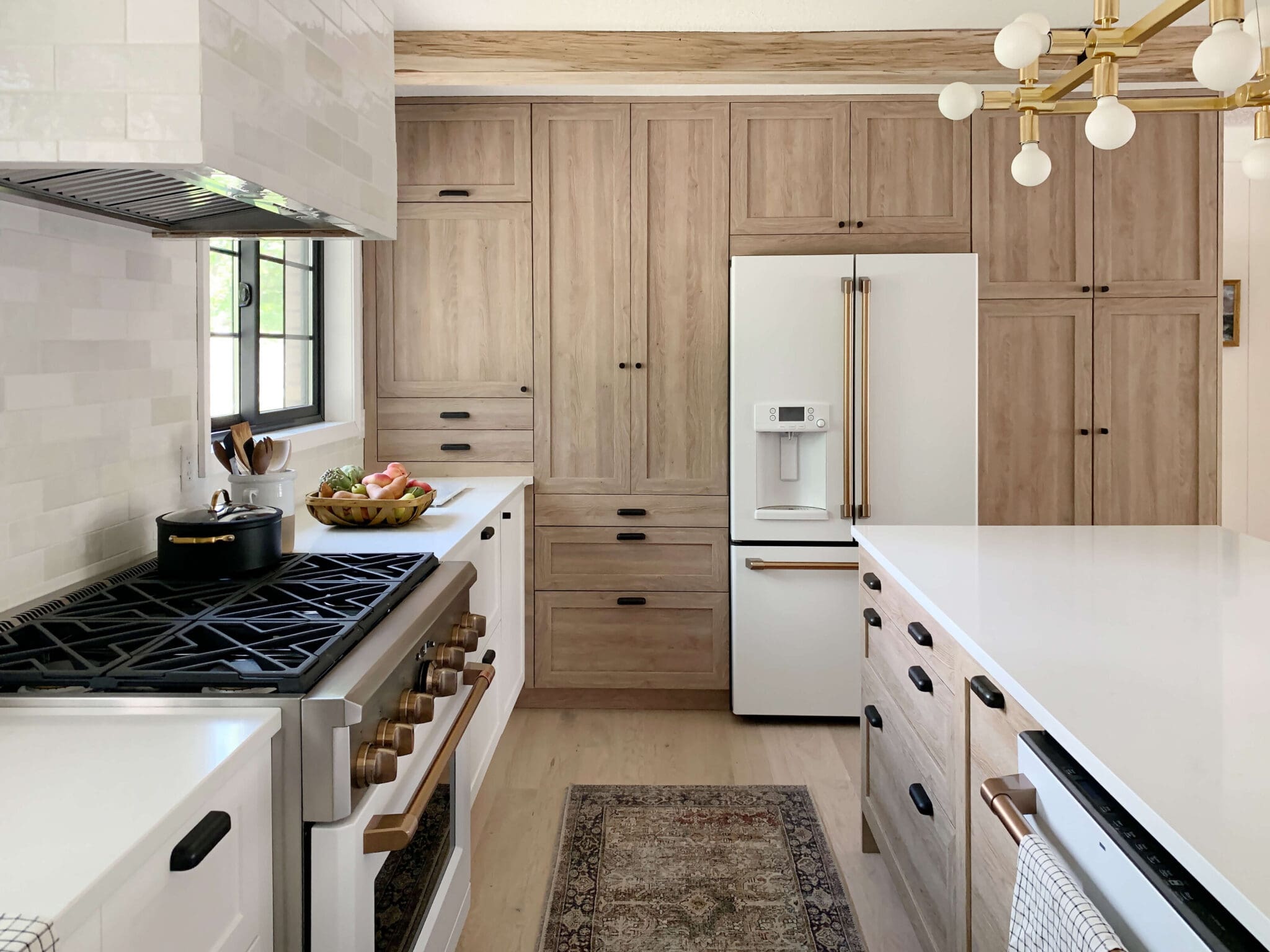
We recently added beams to the Fullmer's kitchen/living space (tutorial coming!) and their ceilings are standard 8' and I can't begin to tell you the character and depth it added. It did the OPPOSITE of making the room look smaller.
All this to say, in our new house one of my goals is to treat the ceilings with thought. I want to make intentional design decisions on the ceiling just as I would on the wall or choosing flooring. It's an entire plane of a room and I want to do better at acknowledging and designing that. Maybe it's in phase 1, maybe it's in phase 4! But I'm feeling so inspired to get there because I truly thing it is what sets a great and extraordinary room apart.
I looked back through my Pinterest board I made to inspire our cottage and was surprised to see how many images already included stand-out ceilings. I may have pinned each one for a variety of reasons, but subconsciously, the ceiling absolutely added to that. Now when I look at theses spaces and try to imagine them with a plain white ceiling, the room falls flat, right?
Here are a few favorites and the lessons I took away from each!
1. Jersey Ice Cream Co. looks as though they removed the ceiling in this shot and exposed the floor joists. Note the ceiling wood and floor wood do not have to match! When I'm mixing wood tones, I shoot to have a medium, light and dark tone.
2. Jessica Helgerson - JH Interior Design added small and simple beams to this bedroom and painted them a warm gray. You can achieve the same look, inexpensively, with squared off 2x4s!
3. Another one from the amazing Jessica Helgerson - JH Interior Design that happens to be my favorite kitchen of all time. The rest of the kitchen is so perfect, I'm not sure I would have even thought to add beams, but it really polishes off the look here. It looks like they coordinate very well with that gorgeous island and tie everything together.
4. Amber Interiors Design Studio | Photo by Tessa Neustadt This ceiling nearly broke my jaw and I can't even grasp what it took to do this. Whether an addition or subtraction or maybe both. It's so bold, but warm and organic and layered.
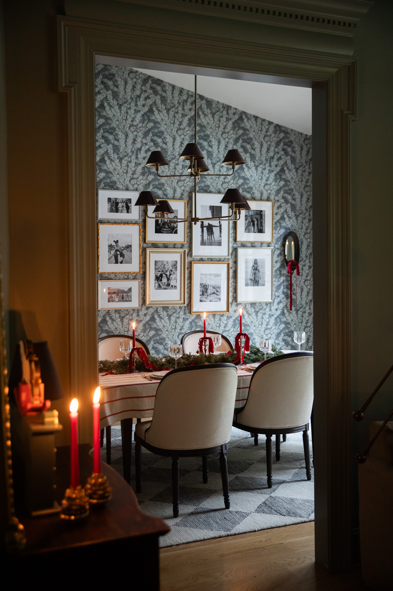
5. Steven Gambrel reminds us to carry that paneling right to the ceiling! We are taking a lot of inspiration from this space for our new dining room, paneled ceiling and all.
6. The Fox Group | Scott Davis Photo And add crown molding! And make it all one color! Done and done! The ceiling is definitely playing a supporting role here but try imagining it white? I can't! It can't be!
7. Jake Alexander Arnold My takeaway from this photo, besides break all the art rules and I want to live here, is coffered ceilings can be beautifully understated. I think it takes a lot of boldness and humility, in a way, to add so much beautiful molding to a room and then paint it all the same color. But, wow! It allows everything to sing in harmony.

8. Amber Interiors | Photo by Jess Isaac I remember when Amber released these photos of the Emily + Merrit kitchen and my eyes circled the entire room. It flowed. Everything flowed. And then I wondered, would I have the know how or courage to place those beams in the corner like that. It's so tricky and so spot on! I keep coming back to this picture to study it more. Also note the balance of woods. Light in the floors, medium in the breakfast nook chairs and dark in the island and beams.
9. Atelier AM I keep coming back to this photo while designing our living room. The large arched window and all of those exposed rafters would translate so beautifully in our home. We're meeting with an architect today to go over plans and I know there's a good 5-6 feet of space between our ceiling and the roof and I want to explore what's up there and what we can expose.
10. Pappas Miron Design | Photo by David A. Land Lastly, a wallpapered ceiling is always a good idea. Wallpaper, plus trim!? Why choose one!
During our home design process, I really want to share more of these posts where I share what I'm studying. Where I'm getting ideas. Who I'm learning from. There are so many talented people out there pushing boundaries in all the right places and it's giving me the courage to do so in our home, too.
Leave a Reply

WE'RE CHRIS + JULIA
Portfolio
Projects














I love this type of post too and can't wait to see more of what you're studying and learning from!
Hey Julia, Quick question - where do you go for this kind of inspiration? How do you search? Do you have favorite designers and look through their books, websites or instagram to do a deep-dive on ceilings? Do you do a search on pinterest and instagram for ceilings? Any info you can give on your process?
Mostly instagram and Pinterest. And surprisingly, these all came to me when I wasn't specifically looking for ceilings but were a detail I noticed that was similar when I looked back.
I like this. Always interesting to see how people come to their final design decisions.
I LOVE this post!!!! I have wanted to do a fun ceiling in my walk-in closet - I think those paneled & moody cottage ceilings would be perfect.
I have a bright orange ceiling in my kitchen, and honestly, people don't even always notice it right off the bat. Sometimes it will take them a few mins and then they'll be like "whoa, that ceiling is so cool!"
#8 that whole kitchen is amazing! I love how the island being open on the bottom makes it seem so much more airy, and those beams feel abstract but also so intentional ????
Love this post and a peek into your process!
#3! That kitchen could fit very nicely in your house. Everything about it. Love it.
I love these types of homes. I am currently going through the process of designing our home, one room at a time and I love understanding your thought process because it helps with mine.
J never would of thought to put effort into the ceilings but these ideas are giving me so much inspiration for our home. Those squared moldings are going in our basement entertainment room. We are definitely doing beams when we take out the wall between the living room and kitchen. My oh my!
Crazy gorgeous, right?? You're getting very grand :) Just leave yourself enough room between the roof and the false ceiling/beams for ceiling insulation so the house stays comfortable temperatures for reasonable prices.
Love these types of posts - so inspiring. Looking forward to seeing your progress with designing your new home! Thanks for sharing.
I love this idea to share your process! It helps us to learn how designers dissect a room and to see how to make things work in our own space. Thanks for taking us along for the ride!
I love this idea! I've been looking for ways to enhance the ceilings in our home, but I feel like I have a sticky situation...vaulted ceilings. I know, #firstworldproblems. But my home is a tri-level and the main floor is vaulted but its an open space between the kitchen and living room. Our master bedroom also has gorgeous vaulted ceilings....but both floors have ceiling fans and our living room has skylights! If you ever come across a lot of really good vaulted ceiling inspiration, I'd LOVE to see a blog post on it!! Just an idea for the future :)
Noticing a significant absence of tray ceilings here.... lol. Such a great roundup and it's giving me so many ideas! Thanks for sharing the detail again that Fullmers' kitchen is only 8' high. That makes it seem so accessible for the rest of our lowly (heh) ceilings.
I've got 99 problems and tray ceilings are 2 in my house!
Turn them into a coffered ceiling!
That's our plan for our bedroom
I hear ya, not only do I have a tray ceiling in my master, but it is octagon shaped. What do you do with that? Can you coffer an octagon tray?
Hahaha hmmmm
Love these types of posts--what's inspiring you, what specifically draws you to a photo/project/idea, and what you are taking away from that inspiration and putting into your design (like the Atelier AM one and your ceiling/roof--can't wait to hear what you can do there!. Thanks for sharing your design process, and along the way, sharing others' great work, too!
Totally agree with this! Yes!
Would you touch a textured ceiling? Is this something for people who are blessed with dreamy, normal, smooth drywall ceilings? I want to get at my ceilings in the worst way but we have an orange peel-like texture that I’m unsure that I can paint/add architectural details to. Untextured ceilings are like my number one feature in my dream home.
Every ceiling here has some sort of texture. And it's throughout the entire house. It's not popcorn, it's just texture. I'm still deciding what to do with it. One way to minimize it is to make sure the paint is completely flat. Also, adding paneling would make it disappear too!
Thank you for your input! Our wet spaces are painted with full blown semi-gloss paint need to be repainted with a flat paint stat. I look forward to following along with what you do in each room of your home. Thank you for so generously sharing!
Number 9 is timeless! So much interest on the ceiling but it is kept very light and so the focus is still on the window!
So many people in our area over the years have ripped out ceiling treatments or painted them white. Keep it light and timeless.
Have you considered carrying the stone inside on the floors? A white oak floor would be beautiful too.
Currently building a new home and I really look forward to these sorts of posts; your insight and approach is so helpful - thank you!
I have a whole pinterest board full of interesting ceilings but where we live (The Bahamas) dictates that each of our rooms will have to have a series of HVAC return & supply vents as our walls are concrete block. Now I'm scouring the internet, desperately trying to minimise their presence.
I just started listening to your old podcast but can’t find it in the Apple Podcast app. Is it still there? I can listen on your website.
Both from professional and personal experience, I know removing the gypsum ceiling and exposing the floor or roof structure can present sound-transfer problems so approach with caution! And when exposing roof structures, insulation adds a layer of complexity as well.
Two things to discuss with pros before moving forward on exposed structure.
Thanks for sharing your thought processes! I learned a few things from today's post. We are renovating our CA modern Mediterranean and now you have me thinking of ceiling treatments and molding trim.
When you answered the question in your stories about “why not use white trim if darker trim might go out of style” I thought “you go girl. Way to make bold choices and worry less about what people think”. Your journey in this home is going to be fun to watch.
I do think we make design choices sometimes that compromise functionality. I cringe a little when I think about removing layers in a ceiling and exposing upper joists and what you lose in sound and heat insulation. I’m all in favor of adding faux beams though!
Our house had popcorn ceilings in every room when we moved in 3 years ago, and it’s been a painstaking effort to get them back to normal with a flat white surface. Once I have some separation from that massive effort, I would definitely consider re-integrating some character with a statement ceiling. Great post! Got me thinking...????
Natalie - Did you remove the popcorn ceiling yourself, or hire a pro? I currently have popcorn ceilings in my home and have often thought of removing them. Julie's post reminded me of how much I dislike my popcorn ceilings...just curious how you went about it and if you went through it all over again, would you do it the same or differently?
Love this post!
I love these!! They add so much character! Do you think you need high ceilings for beams to look good? I’m working with 8 ft ceilings and always wonder if they’re too short for beams...
Can’t wait to see what you choose for your house!
The Fullmers had 8 foot ceilings and we added beams and it added so much depth! Definitely don't need super tall ceilings to get the look.
Question regarding online Wallpaper sources? If you have any suggestions, it would be greatly appreciated.
I'll have to do a roundup!
What color do you think Steven Gambrel used on the walls of that photo. It almost looks like a greenish/gray