We have been mulling over kitchen plans for 6 months. Six. Because this will be one of the largest projects we take on in this house, we want to make sure we get it right. Originally, way back in January, we shared with you our first layout idea:
It involved taking out half of the wall between the kitchen and living room and making a peninsula. We ultimately decided this wouldn't be the best because of the lack of usable counter space.
Later, we presented the idea of taking the wall completely down and putting a big island in place.
We loved both of these ideas for us. Really. We are big entertainers and love having people over, so the idea of a completely open first floor appeals to us. But then reality set in. Our plan isn't to stay in this house forever. We are thinking more like...five years. So although the big, open living room, dining room, kitchen appeals to us--opening the front door and seeing the entire kitchen does not appeal to everyone. In fact, as it turns out, it doesn't even sit well with the majority. Dirty dishes are best left hidden, I suppose.
We have gone back to the drawing board with the plans to keep the wall up and are back with what we feel like could be the one that gets the final rose. We will still be removing the corner pantry and the peninsula to maximize the space and minimize the claustrophobia.
The sink side of things has a few upgrades too, mainly the window is getting larger. A lot larger, but there will still be room for smaller open shelves to house our plates and glasses and a few other daily-use items. We just love the convenience of our open shelving--no way we're giving it up.
In the center, we envision a small work surface, like this one from West Elm, with a stainless steel or granite top. We are even toying with the idea of DIYing one ourselves.
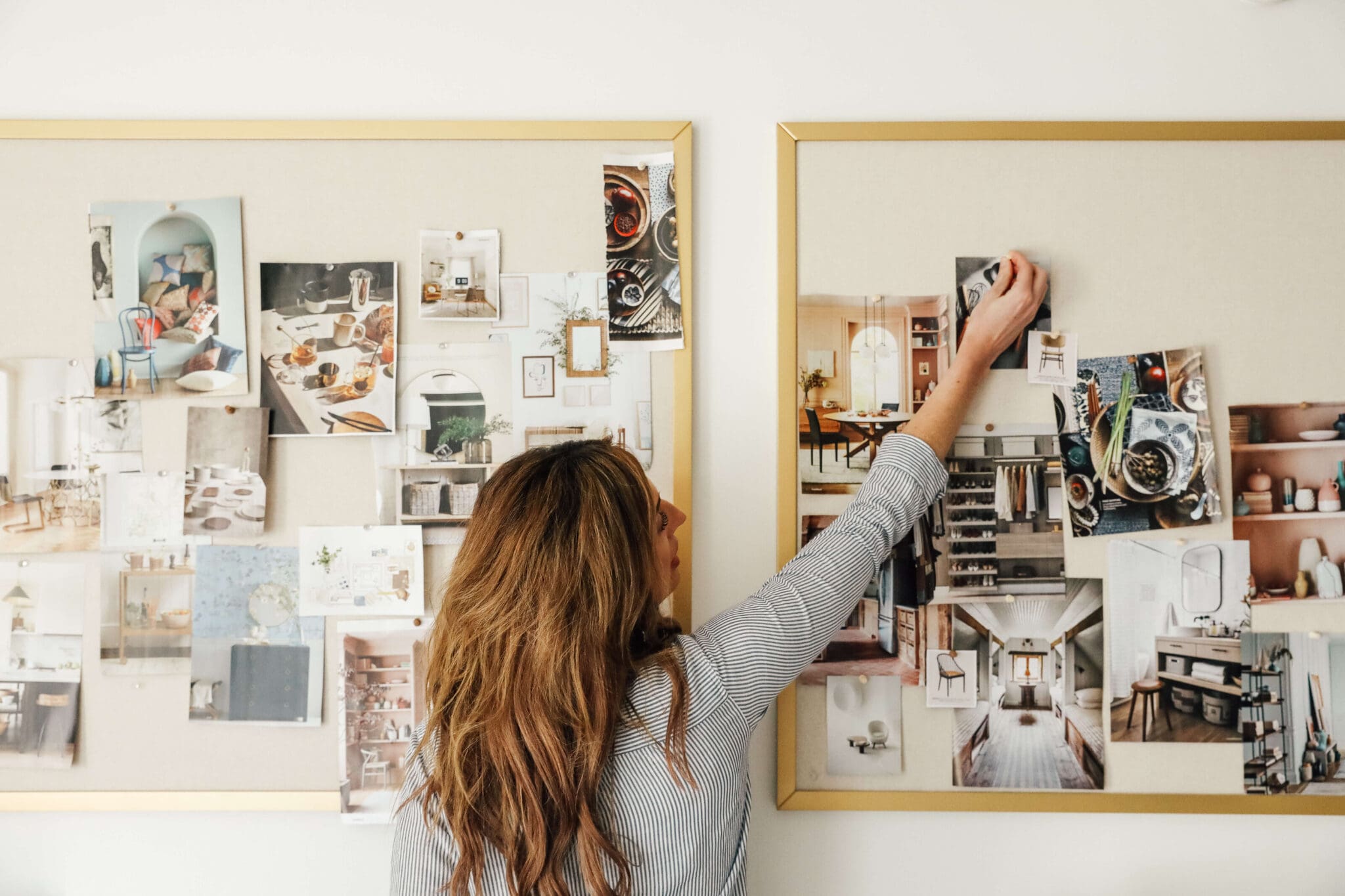
Even after six months into the process, we still have kinks to work out before we bite the bullet, like backsplash, flooring and lighting--thank goodness all of our favorite inspirations are collected in one place on our "Kitchen Reno"pinboard and we can sit down drool and decide what will be best for this house. Gah! Tell me we can work in some carrera marble!
And although it is not as exciting as tearing down a wall, we feel like this may be the right design for our house, but as always, don't hesitate to weigh in!
Leave a Reply

WE'RE CHRIS + JULIA
Portfolio
Projects








I must say I'm not a fan of this latest lay out. It looks cramped and feels clostraphobic. Even future buyers want a big open space. You are not alone.
Exciting!! I'm curious, how did you find out that the majority of people don't like the connected kitchen? I love the trend of newer homes having more open layouts - but then I like to keep my kitchen as clean as possible anyway, whether it is hidden or not =)
It looks more cramped in the mock-ups than in real life, but it won't be as open as the previous plans. I think everyone wants a big-open kitchen, but does everyone want to open up the front door and see it? We have learned that isn't the case.
We are the same way Callioca! I think the issue isn't an open layout (it's true, people LOVE those) it is seeing the full kitchen right when you open the front door. We didn't do an official survey (although I am thinking we should!), but we have studied it and it is actually bad feng shui. Hmmm.
So exciting!!!
I do love the idea of an open floor plan, but I don't think this is the right house floor plan to make that happen. I like having the living room be kind of separate, but have the family/kitchen room area completely open. It's like the family and living room need to flop or something because the family room, with the stairs going down, separates it a bit.
Loving the butcher block countertop idea! I think you guys have done SO much to that house already that with the kitchen being done and the flooring, you should see a return on your house purchase when you sell it.
Ahh that makes sense, about seeing the full kitchen from the front door. Excellent point, and always v. good to think about resale value.
Love the design with the huge island...but understand if that sort of layout isn't best for a long term solution. We finished our kitchen reno earlier this year and are loving our Ikea cabinets. I think classic white subway tile is always a good bet too...we did a backsplash and full wall of it! Here are a few pics: http://anexcellentadventure.blogspot.com/2012/04/kitchen-source-list.html
Good luck! I'm sure whatever you choose will end up looking awesome!
i'm definitely one of those, the-more-open-the-better people, but i definitely understand that not everyone feels the same way. you guys have such great style that anything you choose for a layout is going to look amazing to a future buyer!
I love the look of an open kitchen...but it definitely isn't always the best option. My parents have a big open kitchen with dining area and family room. It's next to impossible to have a conversation or watch tv because kitchen noise is always a distraction, tv interrupts folks trying to socialize at the table or in the kitchen, etc. Just a few cons to think about! (but visually, it's gorgeous!)
By the way I totally just realized I could optimize my Disqus profile better thanks to seeing that you had done it - thanks! ;) (That's why my name just changed slightly - haha)
we recently updated our kitchen and opted not to make it an open floor plan. And I don't regret it. The window (and lighting) in your space will do a lot!
Cool! I love seeing who I am "talking" to. :)
Great idea! And yes, we don't mind kitchen planning at all.
Aw, Thanks Lyndsay!
Dreamy! Your kitchen turned out wonderful. We have our eyes on the same cabinets!
From one Julia to another, thanks girl!
I can't wait to see what you guys do with the kitchen!
Looking fantastic! It's so much work, but isn't it fun planning the new kitchen?
A DIY of that prep island shouldn't be too hard, or even easier, an IKEA island hack?