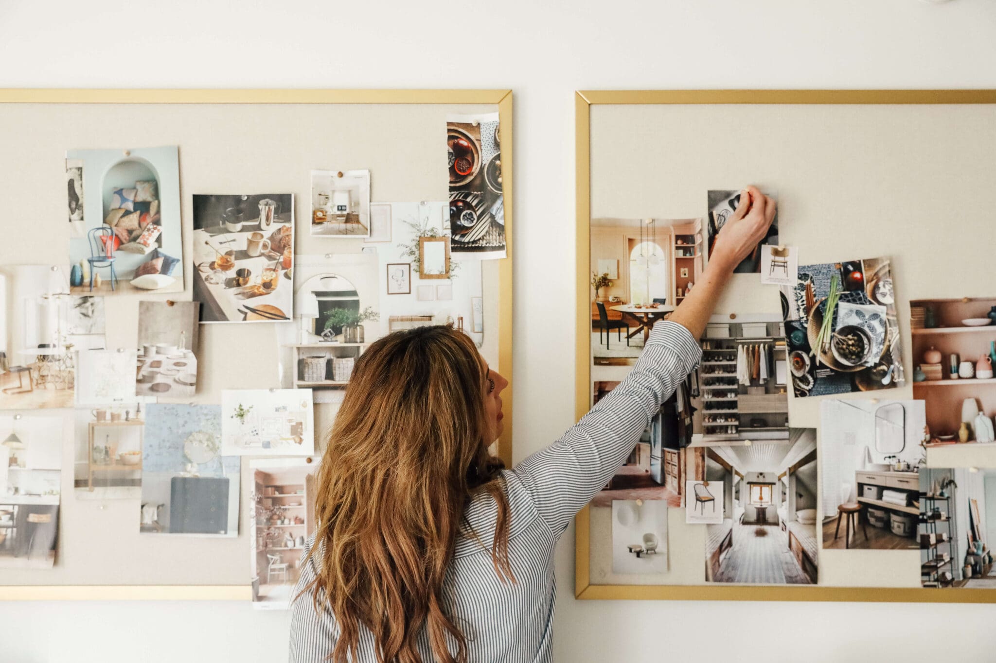
This morning, before Chris's alarm even went off, I nudged him awake and said, "Wouldn't it be fun to get the readers involved in designing the studio?" Even half asleep, he seemed enthusiastic about the idea. It's not that I couldn't whip up a mood board and do, yet another, before and after of a room easily--it's that we have done that with every space in our home so far. We decide, and work and then you spectate. Eh, let's switch it up. You decide (with our guided options) and we'll put the winning vote into action and then everyone is invested in the space. I think it will be exciting, don't you?
And so, here is your first big decision and it has to happen before you (yup, y-o-u) can even decide on a specific paint color:
Option A--White walls and a white ceiling:
 |
| Source |
Option B--Light blue walls and a white ceiling:
 |
| source |
 |
| source |
Option C--White walls, painted ceiling in a bluish tone:
 |
| source |
 |
| source |
I whipped up a quick poll for you to cast your vote. Feel free to add additional commentary, questions, concerns or ideas in the comments sections. We have a lineup of things for you all to decide on and can't wait to get this studio renovated with your input.
What do you think?
Leave a Reply
Previous Post
Next Post
all the latest

WE'RE CHRIS + JULIA
We believe we should all love where we live.
We’re a couple of homebodies, working to uncover the home our home wants to be. And we’re so happy to have you here.
read morePopular Posts
Top Categories
01
Portfolio
Befores, afters, mood boards, plans, failures, wins. We’ve done a lot of projects, and they’re all here.
browse all
02
Projects
We have a long-standing relationship with DIY, and love rolling our sleeves up and making it happen.
browse all
03
Design
Even when you don’t want to rip down a wall, you can make that space in your home better. Right now.
browse all









loooove that bold ceiling! I think it's the perfect balance between inspiring/creative and neutral.
I personally would do the blue walls with white ceiling, but I'm not a risk taker. For you guys I think you should do the bold ceiling! You can definitely pull it off!
I LOVE the painted ceiling more, but voted white and white because I remember you mentioning you wanted to use this space to take product photos. I'm not sure if a colored ceiling would add a tint. BUT... after saying that, my porch for photo taking will be getting a super light green ceiling soon. I guess we'll see what happens.
Woot!
Love your enthusiasm! You are definitely up to this task.
Hands down, no contest, no hesitation, must do. White walls...blue ceiling, I was so sure about my vote and so psyched to see 101 others think the same!
how exciting! I was torn between A and C but went with C - the coloured ceiling would be inspiring :)
Ok - I voted for the white walls and bold blue ceiling. I LOVE white on white, and you could get some great photos with that lighting, but the colored ceiling is SO fun. This is such a great idea! I'm so happy to help! :)
Couldn't agree more, Glasska. Brainstorming is in the works on that.
What are your thoughts for the floor? I voted for C but I think it needs some kind of wood over carpet!
Every room in the house has knock down ceilings. I don't think we could get a straight line on the ceilings for a striped effect.
I love a colored ceiling, but am wondering if a bold color might highlight the knock down ceiling? From the pictures I think that's what in the room. A striped ceiling - go really bold?
this is so fun! i voted for C, but I am with Ashley, i love the teal vibrant blue ceiling, not the lighter blue ones.
I think C is the perfect solution to how you were saying that you want it to be cool, inspiring, and interesting, but also not too bold for photographing your work...well here you have the interesting/inspiring on the ceiling which typically wouldn't affect your photography!
What a fun idea! I'll be voting, for sure, even though I've only been subscribed for like a week ;)
White walls with a colored ceiling for a studio sounds soooo perfect to me. Love the idea! Totally going to apply this to my studio now.
I'm definitely a fan of the bold color on the ceiling/white walls. Gives it a crisp, clean look but with a pop of color that adds life. Can't wait to 'help' with your room. :) what a fab. idea!!!
I would love to see wide horizontal stripes on the walls, but I guess the cheese stands alone. LOL
I get it. I get it. Builder (or renter) beige and actually choosing a white to paint your walls are two very different things. We are fans of every option (like I said, these polls are guided---lol) and are confident any would work well. But yes, I am excited for you to be able to paint one day!
You're right you're right you're right. Renter beige is tooootally different than white. Okay then, my second fave is the white with blue ceiling. Would you do recessed lights in there? Can't wait to seethis room evolve!!
Where does all the "stuff" that was in there go? The bedroom downstairs??? Lol the other ugly step sister room? Lol
Thanks Ashley. If Option C is the winner, we'll have you vote for a paint color, too. I'll be sure to throw in a bold option. ;)
I like the idea of having a color on the walls. Maybe that is after living in a rental for 4 yrs and not having ANY color on the wall. But you did say you were going to photograph a lot in that room, and having a nice backdrop color that is warm, but not white, sounds so nice! Buuuuut that's just me. Lol.
I love love love the studio with the bold ceiling. (The one with the light blue ceiling isn't nearly as exciting...) Just wanted to clarify my vote!
The colored ceiling could shorten the height of the room, but long curtains (which are found all throughout your home!) could help remedy that, along with some other lengthy things, like a tall lamp or a mirror, high shelving, maybe a large easel (for decor and use??), etc.
I can't wait to see those horses and curtain things gone.
[url=http://xxxfreeporn.ru/][img]http://xxxfreeporn.ru/pt/2460ca4431.jpg [/img][/url] [url=http://xxxfreeporn.ru/][img]http://xxxfreeporn.ru/pt/26d41f4b6d.jpg [/img][/url]
[b]порно порнуха бесплатно [/b] - [url=http://xxxfreeporn.ru/]порнуху посмотреть +без регистрации бесплатно [/url]