Painted green
Painted blue
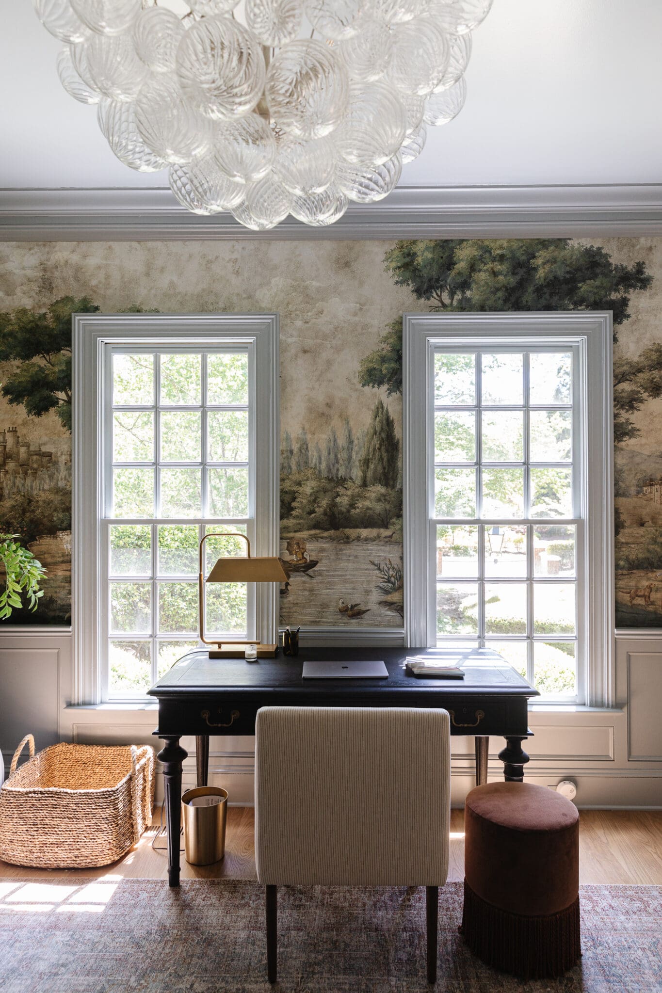
Mural | Chandelier | Desk | Chair | Fringe Stool | Vase | Peonies | Table Lamp | Credenza (similar) | Mirror | Buffet Lamps | Floor Lamp | Planter | Faux Tree
We went with Benjamin Moore Boothbay Gray. I held up a paint deck to the mural and focused on the light bluish gray that I originally wanted to color match to. Then I found a swatch that was a little more gray because I knew once it was on the wall, the saturation of it will look more colorful on the walls.
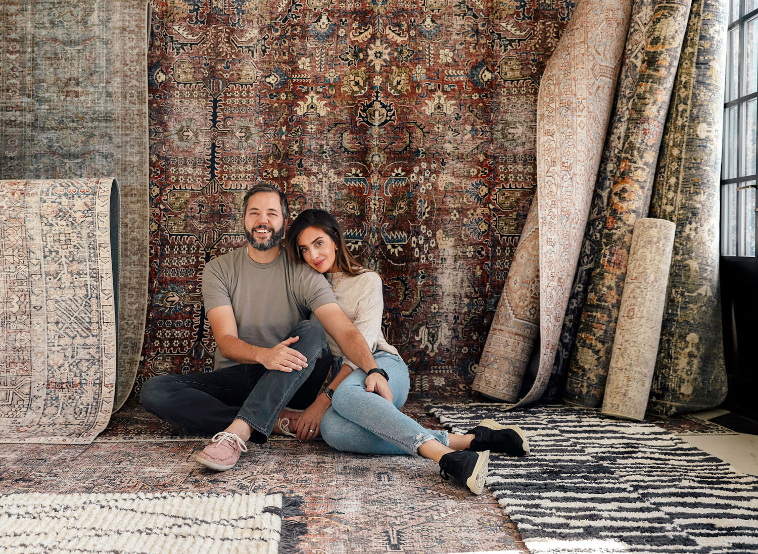
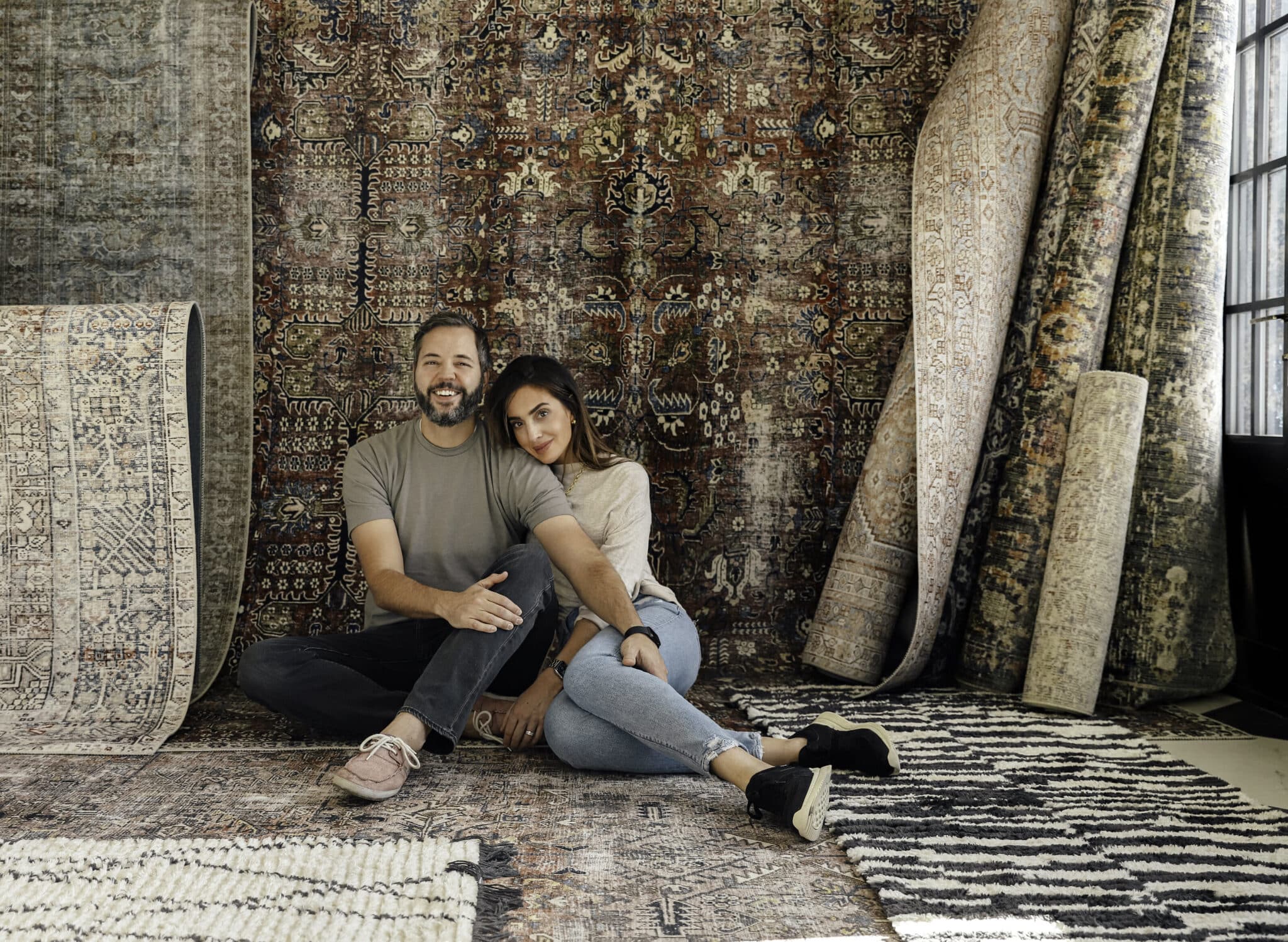
While we were at High Point, I got this one of a kind, vintage rug from Loloi you see in the photo above. Truthfully, I secretly want to move it to the dining room. The logical side of me is worried it's going to get stuff dropped on it. Because it will. But it's also a perfect pattern to hide that. I've been feeling like I want to add some color and pattern to the dining room, but wallpaper wasn't sitting right... right now. So a rug makes a lot more sense! You know when you have that one really great piece that will work anywhere so you want to try it everywhere. I think it is this rug. And I think the dining room would be a really great spot for it.
As for a rug for the study--now that I've gone through my inventory--I do think this room would benefit from a light, neutral, solid color, textured pattern rug. You know the kind where the pattern is in the texture. Subtle. Classy.
As for everything else, it's still not clicking for me, and I'm not forcing it because the function is there. And I think I know a few key issues. 1. There isn't anything modern to balance out the super traditional. 2. Everything is kind of the same height as the chair rail--minus the mirror, which is why the mirror is there.
Desk | Chair | Rug | Fringe Stool | Chandelier | Lamp | Basket
Function wise, we know this is a great landing spot for an office because we use it daily. Like we can't imagine not having it. But we desperately need more storage, like filing cabinets and bookcases for the stacks of books and papers that are always in here if this is going to be the permanent study. This would also help with adding more height to the space. I've thought about doing built-in bookcases and even identified a spot where we wouldn't be covering any people in the mural--but I haven't moved forward with it yet because I think I'm scared. And then it dawned on me that I've been treating this mural as art in my head, and I need to treat it more like wallpaper. It's a printed wallpaper. It wouldn't be a big deal to cover some of it with bookcases--It would help! (I'm convincing myself, here)
I definitely do want to do sconces on the walls and also window treatments will help. Will this particular desk stay or go? No one knows. Will we add french doors? That would be nice! In my lull of creativity, I'm trying not to make any huge decisions and instead be patient with myself. The room is being used. I'm in the next phase of "this feels better to me."
Recently, I came across an image of a beautiful room, engulfed in a mural, much like this room--but it was a formal dining room. It appealed to me so much. It was beautiful. And I thought THIS COULD BE A FORMAL DINING ROOM. But, then I came back down to reality and the truth of the matter is--in a pinch, this could ABSOLUTELY be a formal dining room. For one special night, sure. Let's move the furniture and go all out. But day to day, I really love our spaces to be spaces that function for the way that we live and the study as a study is a space we use every day while a formal dining room---it would be so rare. It would be a showroom. And I don't want to live in a showroom.
Some spaces are before and afters easily, and some spaces continue to evolve and evolve and evolve and I think this will likely be one of those spaces. I'm not looking for advice. I'm just sharing the design process and some rooms come together easily some start with a have to have (the mural), and continue to evolve. Both are just fine.
Shop The Study
Leave a Reply

WE'RE CHRIS + JULIA
Portfolio
Projects












I appreciate your candor and honesty. I love the blue juxtaposed with the wall paper. It just feels as if there are too many different textures in the room in terms of the furnishings.
I love letting a space evolve. My gut is telling me the mural will be deleted from your final choices❤️ It’s just a lot.
The issue is-the room is too busy!!!!
To me the room is very historical looking and as beautiful as the light fixture is, I wonder if it’s throwing off the vibe of the room even though you want more modern touches. Since the room doesn’t feel right to you yet, the house is definitely sending you a little message.
This was such a refreshing read, loved it! Thanks for sharing this.
This room just doesn’t sit right with my brain. I understand where you’re coming from.
Honestly? It feels like a bunch of random items were placed in here because they had nowhere else to go.
It just doesn’t feel cohesive.
The blue is better than the green in this space, but it still doesn’t feel right.
I feel like you need to take everything out and start again with fresh eyes.
Not to say that some items won’t go back in, but something is definitely off.
It’s interesting, I like both versions but the furniture seems not quite right yet. Thanks for sharing. I also recently repainted a room I’d just painted and it’s now sitting empty because I’m just not inspired right now. The wheel will turn!
It’s a beautiful room! I will say that when you mentioned modern element, I agree. I can see replacing the large leather chair with a very modern chair, maybe higher back. It would be a nice juxtaposition!
Hmmm-the room looks lovely, but I can see that it will be hard for it to functions as a traditional study with bookshelves or anything that it taller than mid-wall, due to the mural. I actually think that the mural itself acts to add height to the space since the trees draw the eye up, so I don't think that part is "off" at all! I think this probably why this style mural is so often used for dining rooms as opposed to other rooms. In a dining room, most or all of the furniture will be mid height (chairs, table, credenza or serving buffet), which lets the mural shine without competition.
It looked great in green as well, but the blue is more peaceful. Have you tried removing all the furniture from the room, and putting back in only what you'll use? Desk, chair, and maybe mirror? I think one of the issues this room has is that you don't know where to look, there are too many pieces of furniture.
I love it when you share your thought process, it is so relatable! I agree that this room could use something modern. Where is your Eames chair located right now? I think that would add a great modern juxtaposition and a nice pop of black. Can't wait to see what you do.
What about a round or oval table in the middle to break up all the hard lines? Could be used as a desk (or a dumping ground). Then a rectangular table/shelves elsewhere would be a-ok for books and such.
May I suggest trying a round rug under your round DR table? It will look great in that space. Trust me. A round rug under a round table will change your life. Just need the right size...
Yes! I appreciate you sharing that it still doesn’t feel right and that it’s okay for now. It will come to you when it’s ready to reveal itself! Perhaps your brain is purposely keeping it under the surface until some of the bigger things can be completed, moving out of the way to clear the air for new ideas. I can totally see a big, built-ins desk on the wall where the credenza is and the windows being a sitting area.
I really appreciate your honesty about your process and the thoughts behind all of your design decisions. I constantly stop myself from moving forward on decorating and remodeling because I’m worried I won’t like it in the end, but you’re right, it can always be changed or tweaked. Our homes evolve with us!
Thank you!
I love that you struggle with things too. I know you probably don’t want to hear that, but everything you post is so beautiful and seems like absolute perfection, that it’s nice to see the evolution and process of that perfection. I’ve followed you for a few years and it’s been beautiful to watch your style mature and grow with your family because as you get older, so do we and I love watching your space transform to fit different aspects of each time and place. Love them all.
a neutral, light solid rug is a great idea! and maybe switch the desk and tufted chair where they were before. neutrals, black and white might look great with the mural, I'd leave the blue ceiling and paint the rest white.
This was a fun read! The only comment I have to make is to point out I think the ceiling light is entirely modern. Just if that helps you conceptualize the balance in the space. That said, I agree the space could use a bit more modern, because the chandelier maybe needs a modern buddy in SUCH a traditional space. Just thoughts to add! Enjoyed reading something that was almost like a stream of consciousness. We all need to write those down from time to time!
I think etageres would be a perfect solution for shelving
I love the gray/blue, especially because it extends to the ceiling so nicely. I would have never said so, unless you said it first, but to my eye, the green crown had a stripe effect that made the ceilings seem lower. This is just such a beautiful, VERY inspirational room.
Our formal dining room is used for most meals, but also to work, study, play, create... all the things your office is doing. So keeping it an office where you can occasionally eat sounds like the way to go! Especially because then it's easier to tidy away the stuff of living - the dishes already have a home. :)
I need about a thousand of those baskets.
I love following you along in your process, & seeing where you land! My fantasy use for that room (as an office!) would be to see it with a round table in the center of the room with upholstered arm chairs around it. My work preference is at a table w/ laptop anyways, & more than one person can work together. Then, the multi-purpose of the room can REALLY be a formal dining on rare ovations, without a major furniture re-arrange. Can’t wait to see how you tweak it!
Hey Julia!
I know you aren’t looking for advice, but I can’t stop thinking your burl desk/table from the last office might be a great shape/accent? I don’t know if I’m crazy to think that, but the orange tone of it would compliment the pale blue/grey nicely. Just a thought, shop your home right? 💛
Your glass bookcase that has been featured in past kitchen and living space may give you the added height, storage and the reflective open feel you are looking for and that touch of modern
100% what I was thinking. Perhaps in the back right hand corner?
I'm also thinking that part of what's missing is art? Which is obviously because the mural is the art, but maybe some small frames on the desk of the girls?
I also agree that chaging out the rug for something simpler will help make the blue fit better.
... Sorry. For a blog asking for no advice, I've sure thown a lot of suggestions in there :-/
I thought I liked the green (I mean, I did/still do), until you went blue! I absolutely love that you were able to continue it onto the ceiling. I chuckled to myself when I read the line "there isn't anything modern to balance out the super traditional" because I totally thought the bubble fixture, side board, and tall minimal lamps were bringing in a lot of modern! I personally love where your current dining room is and hope you can make this into the study of your dreams!
I can't remember the timeline, but did you start this project before moving the CLJ office? Maybe that's why it started off so much about "form" and now needs more "function"? Have you ever done a "good looking ugly stuff" post for office items, filing cabinets, etc? We really could use a filing cabinet, but I refuse to buy an ugly metal one!
Love hearing about your process, it gives me permission to slow down and not beat myself up for simply changing my mind. Oh and I love the ‘I’m not looking for advice’ part, haha I feel like I need that tattooed on my forehead 😂
This is a brave post because although you don’t want/need advice, you’re gonna get a ton of it. ;)
So helpful to hear you think through the process when it feels stuck. I’m taking notes on your patience. We are living in our first home and my goal is to embrace, appreciate, and enjoy it how it is while we work toward what we are envisioning.
I live in an area where there are a lot of historic homes and have thought a lot about wallpaper in the last two years. I think showstopper wallpaper (and yours is gorgeous) that tells a story needs to be given lots of room to breathe. That lends itself to a dining room, or an office where you have a central piece of furniture anchoring the middle of the room. Your office is gorgeous and I love the blue but the blue has made the wallpaper feel even more like art/a feature and I think it's now competing with a lot of other elements. You asked us not to give advice - and I won't! You will figure this out and I love that you're giving us the gift of watching you do that.
I am noticing the same thing about grand mural wallpapers - I mainly recall them in spaces without much furniture on the walls, like foyers and dining rooms. You can't lose your function over a thing like hiding or not hiding the wall(paper), but maybe things would have gone a little differently for this room if you had been able to see the future!
Thanks for sharing! I have a similar tricky room in my house, and it’s encouraging to know that it sometimes just takes awhile to get it right. I enjoy the process and always like different things about each iteration…you seem to, as well!
One thing that I notice about the room is the two long walls without any architectural focal point. It leaves you the option of either having a lot of furniture to fill in the spaces, or leaving a wall feel somewhat empty - both feel a little awkward to me. I wonder if another bank of windows or a fireplace on the wall opposite the entry would make furniture arrangement easier and simpler? Just a thought. But thanks for sharing the process with us!
I love this room with both colors of paint! what if you replaced the brown leather chair with a tall wingback chair? that might bring some height to the room.
I mean this in the best possible way - it’s nice to see that talented professionals struggle too. I really appreciate you sharing this side of the coin, and showing how you deal with it. It’s so tempting to force a space to completion to get to the “after” and it was a great reminder to pause, breathe and just let things evolve naturally.
There must be a lot of pressure to have your "afters" be the "final after". Which is why I really appreciated this post that this is not just your vocation, but this is your HOME. And homes evolve and evolve and get tweaked and shifted based on our needs and preferences-which change! I really appreciated this post and getting the thoughts behind what works for you and what you hope to tweak in the future. I also appreciate that you aren't rushing yourself because it's a highly functional room for your family-and if it works for your family that's a perfect place to wait. :) (Oh and the room is beautiful, I love the mural and chandelier-my favorites of this space).
I love the blue! As an observation, I think part of the reason people liked the green better is that the furnishings of the room blended in more with the green. With the lighter blue walls, the furnishings stand out more and therefore, compete more with the mural. I looked back through the inspiration post with the murals and I noticed that many of the rooms you shared either have very little furniture or the furnishings are more tonal. I can't wait to see what you do! It's looking great!
I agree with this! And the living room on the first floor almost always looks like it’s in the blue family, so now the living room, this room, and the family room upstairs all are blue. The green was gorgeous (just like these blue tones all are too), and I hope they find a way to use it somewhere else in the home! :)
I should clarify! I like the blue best. You talked about doing built in bookshelves. That would definitely solve the problem of the storage furniture feeling too heavy/competitive. I always love what you do!
I agree it’s not working, but you DO have modern touches- the credenza has clean, modern lines to my eye, and the lighting is too. I think it’s a combination of the furniture being too bulky and there’s too much of it. Also agree you need some height- maybe freestanding bookshelves instead of built ins so they aren’t so heavy.
Love the blue! And always a fan of built in bookcases in a study.
While aesthetically very different, functionally, this room sounds very similar to what Emily Henderson is trying to achieve in her new sunroom - work space most of the time, but dining / entertaining space for special occasions. It makes so much sense because it makes practical use of neglected formal dining rooms.
Looking forward to seeing this room slowly evolve!
On my computer the green in first pic is showing a sunwashed glow with golden hues from the sun…looks so nice. I think the glow showcases the wallpaper an furniture an makes it cosier. Maybe a washed gold that matches wallpaper?
How do you feel about corner cabinets? They are definitely classic colonial and I bet you could do a modern take and make them look awesome along that back wall. Looking forward to seeing the room evolve, however you choose!
I say you embrace the formal dining room but multiply its purpose by getting a modern china cabinet for display across from windows that has hidden storage for games, art supplies, office stuff, etc. Balance the colors on the other side with similar shades of window treatment. Then the dining table could function more like a conference table/work station. You could even get roller mod chairs that are pretty to make it more practical. That room seems kinda boxy and odd so I can see why its so difficult to try to plan as an office space. I absolutely love the colors and the wallpaper!
PS I also selfishly would love to see you have the ability to dress up the formal dining with table setting for occasions because I think it would be so good!
First off I love the room! Thanks for taking us along. I recently picked up a book that had revolutionary war period colonial houses and I was shocked to see so many mural wallpapers (Or paintings!). And just like you mentioned they were all in the dining room. It feels more natural in there to not have high furniture and let the mural be the star, give people something to study while they eat :) Would it be crazy to do a swap with the mural wallpaper in your current dining room? Then paint the study solid color and let the built-ins be the star?
Again, thanks for taking us through the process! I love seeing y'all's creativity unfold.
Thank you for this post! I moved into a 1760's farmhouse over a year ago and I still have a room that I can't decide how to furnish - so instead of being impatient and putting SOMETHING in there, I have let it sit, mostly empty. I believe that one day inspiration will strike, or I will find a piece that would fit perfectly and allow the direction of the room to evolve! "Patience obtains all things."
I love and have missed posts like this, Julia! There isn't advice to give - it's your space and your feelings and whole *experience* of the room. I just really appreciate you sharing. What a great read to start this Tuesday morning.
I love that it's not all coming together perfectly the first time around or even the second. That's how real design is. I know you're not asking for advice, but I keep envisioning the bottom of the room a deep slate blue to ground the space. The furniture is dark in there and the light blue color makes it all stand out rather than seamlessly blend in. I love the light blue ceiling though!
Yea i love the idea of the wainscoting and trim even being a darkened version of this color like a slate blue to ground everything.
I love this post! It rings so true to my experience decorating our own home, and I love that you peel back the curtain on your thought process, even if it's messy (for now).
Excellent post and peek inside the wobbles and uh-ohs and hope you experience as a designer. Thank you for that candid glimpse. Best wishes.
Seems like you went light on trim because you were treating the mural as art instead of wall paper but now the space doesn't feel grounded. The mural pops out at you when you look at the room rather than being integrated. Seems like the base of room needs to be more grounded, which was more the case when the trim was green.
I like being able to see design problems being worked through on the blog in a real way. It's relatable.
My eye wants a rich wood base below the mural rather than a color.
I really appreciate that you're taking your time - that's the real world! You live with things, and they change, and that's how it goes. It makes me happy to see you working through this. And every time I peek the study in your stories I'm always looking to see what's moved or made it's way there!
One thought - could you do built in cabinetry either side of the cased opening? It's hard to tell how much room this is, but I imagine it's wide enough for filing cabinet width.
Every time I see photos of the study, I have the same thought: I think the walls below the mural would look GREAT in a darker green, to match the dark green of the trees. Then I'd paint the crown molding in cream, to match the background of the wallpaper, which is most prevalent at that height. And I'd leave the ceiling light blue--looks dreamy! What do you think?
That’s a good suggestion. The green cap with the moulding in the original plan was what was bothering me. So pulling green in the bottom half of the room will draw the mural to the ground and having the upper blend into the sky will highlight the nature scene from top to bottom