Can you believe the end of summer school is here?! What a great ride! I loved sharing my tips for styling entries, bedrooms, living rooms, and kitchens to create rooms that you can enjoy season after season.
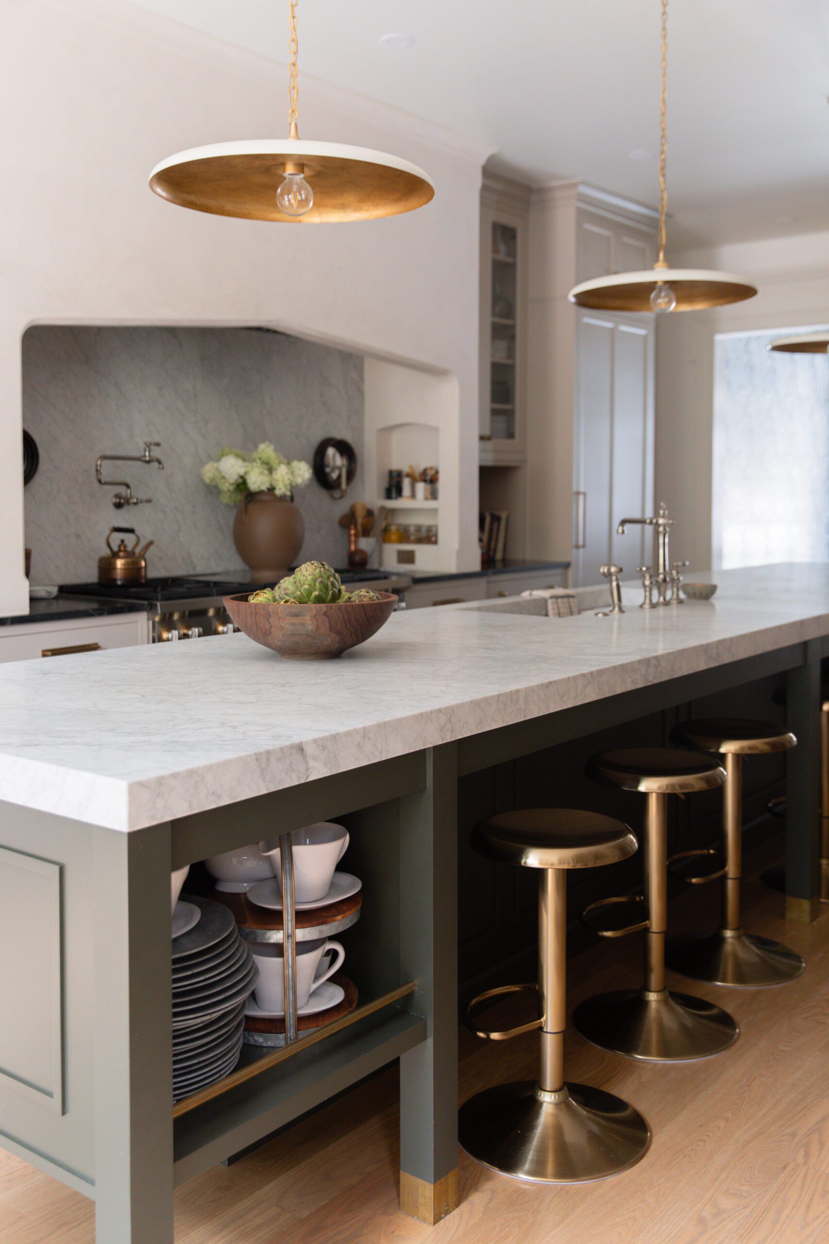
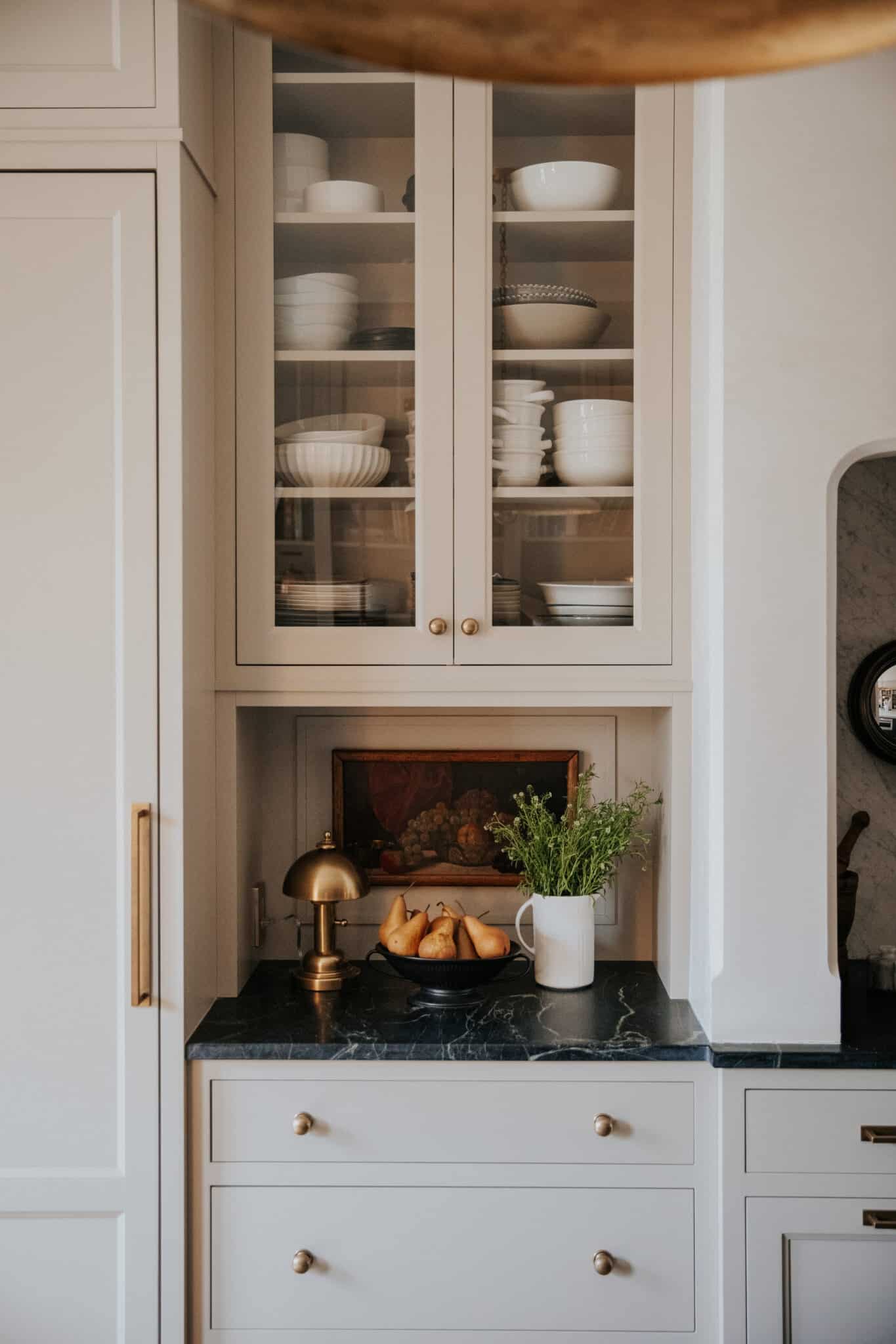
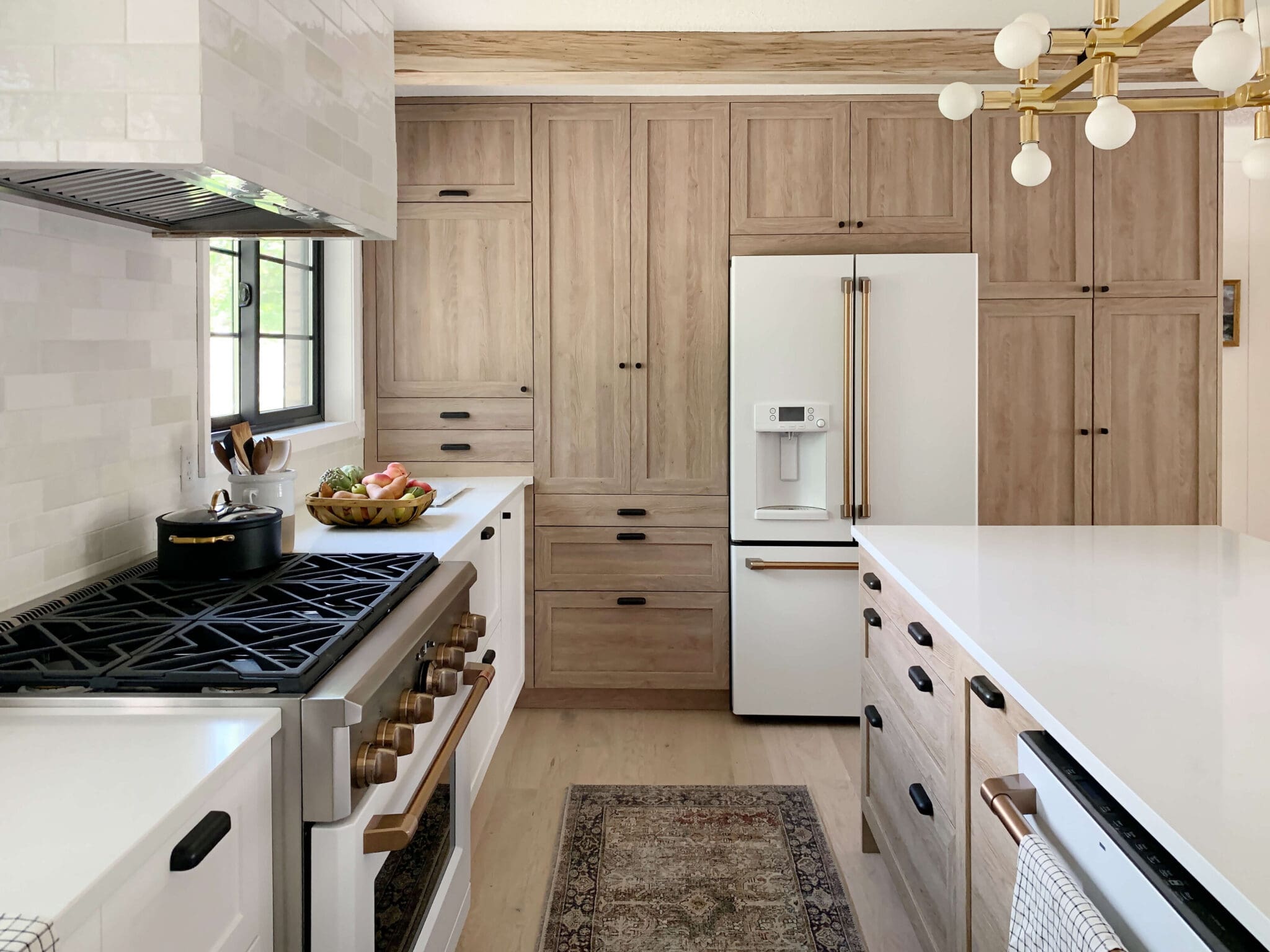
One thing I'm seeing a lot in kitchen styling is making it feel and look like another living space. That's where you see lamps coming into kitchens and a lot of wood floors being extended into kitchens. We put a whole desk in our kitchen! There's art on the wall, picture lights, candles. Because it's a place that people spend a lot of time in, people are opting into decor they usually wouldn't have in the kitchen.
Something else I've seen recently that is blowing my mind is actually is no kitchen pendants! I see these big branches in vases on their kitchen island instead! Some designers have been opting instead for miniature little flush mounts all over their ceiling, and it's a traditional English look that I've been loving.
I've always struggled with how to style the really long island in my kitchen. The answer always comes back to this: fewer, large items look better on the counter. It's easy to get lost by filling up your counters with anything you can find. Choose one area that you want to style and stick with that. There's so much beauty (and mood-stimulating calm) in clean countertops!
To give you a look into what I've saved lately, here are some Instagram posts that have me drooling:
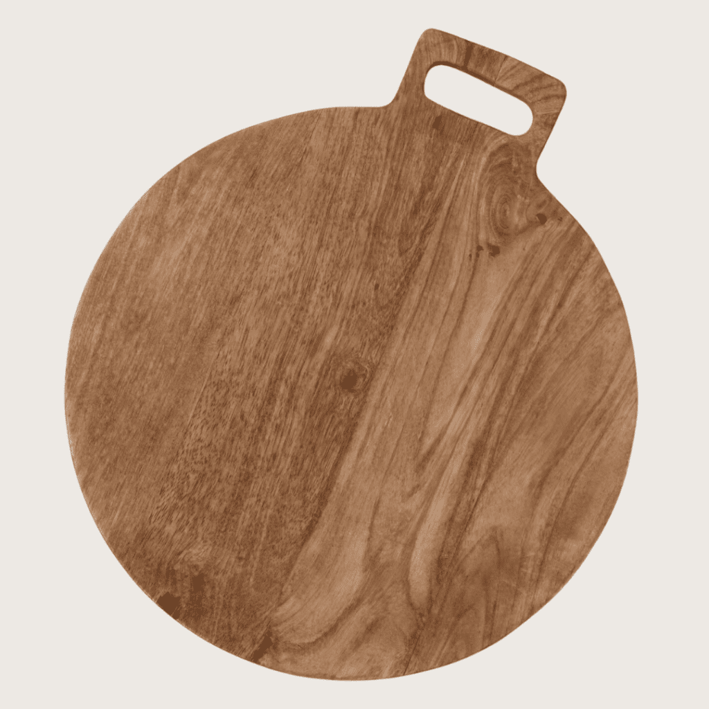
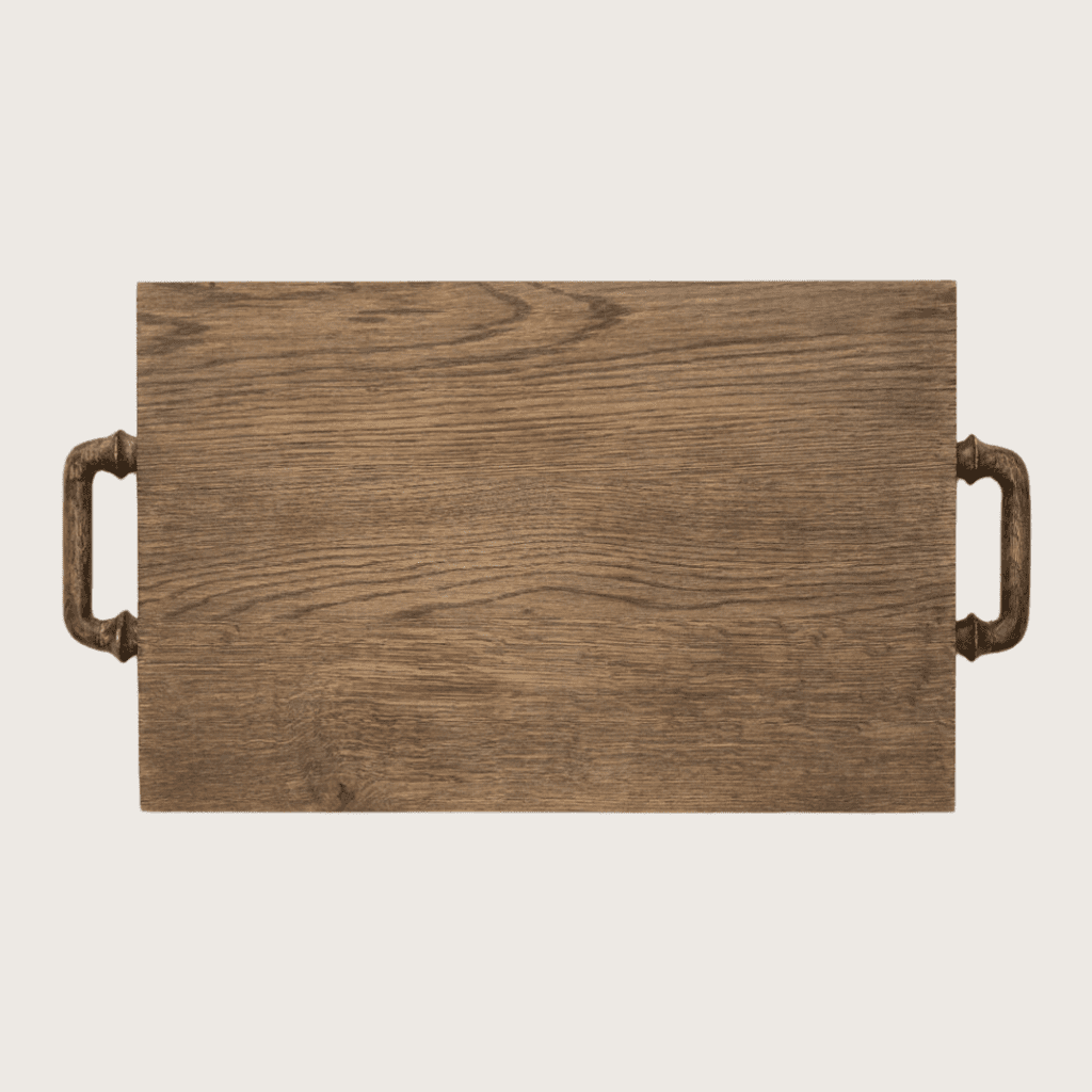
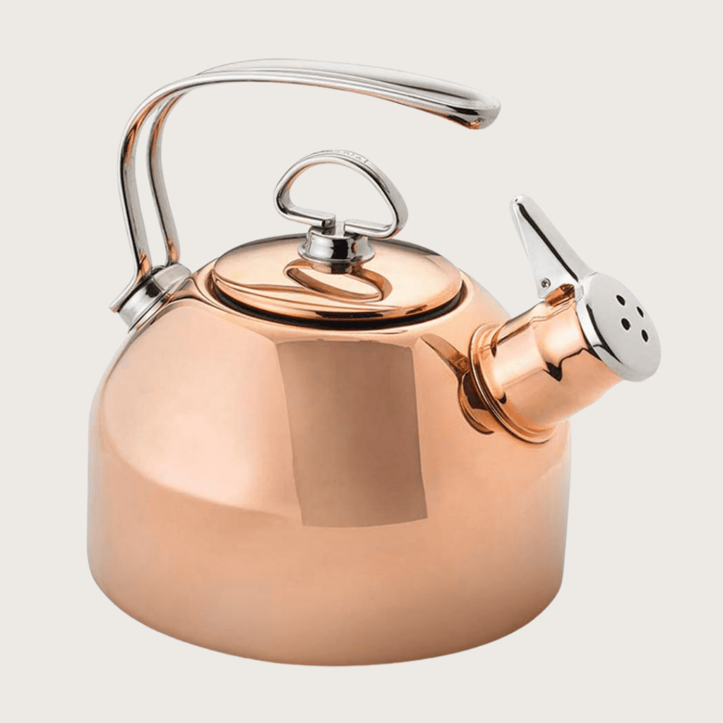
As I mentioned earlier this week, kitchen styling is about clearing the clutter and intentionally making the utilitarian workhorses of your kitchen into your most beautiful decor — whether that's the cutting board, the tea kettle, or the fruit bowl. Then you can layer in the elements that are typically found in more formal entertaining rooms, including candles, art, and stems. Those additions make a room feel "styled" in a way that so many kitchens miss.
Since the kitchen ends up being the place where my friends and family love to hang out a lot of the time, I want it to feel like a welcoming place. And that means it incorporates scents and decor that make me happy, even (or especially) if I'm by the sink washing dishes!
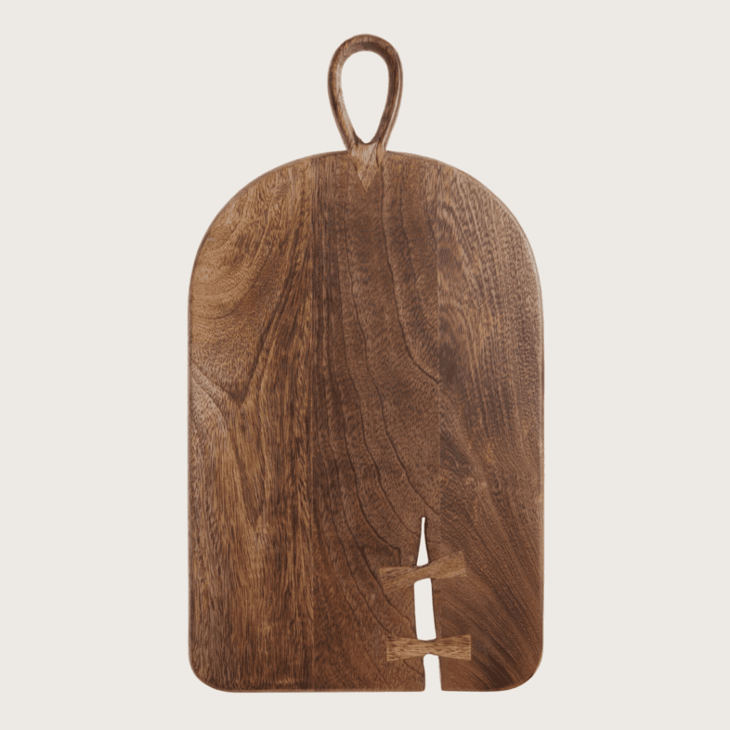
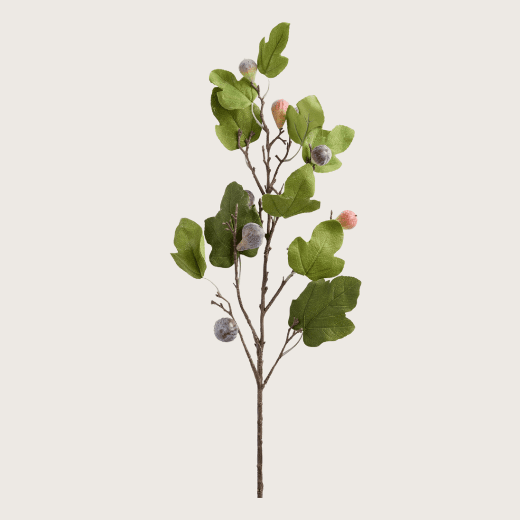
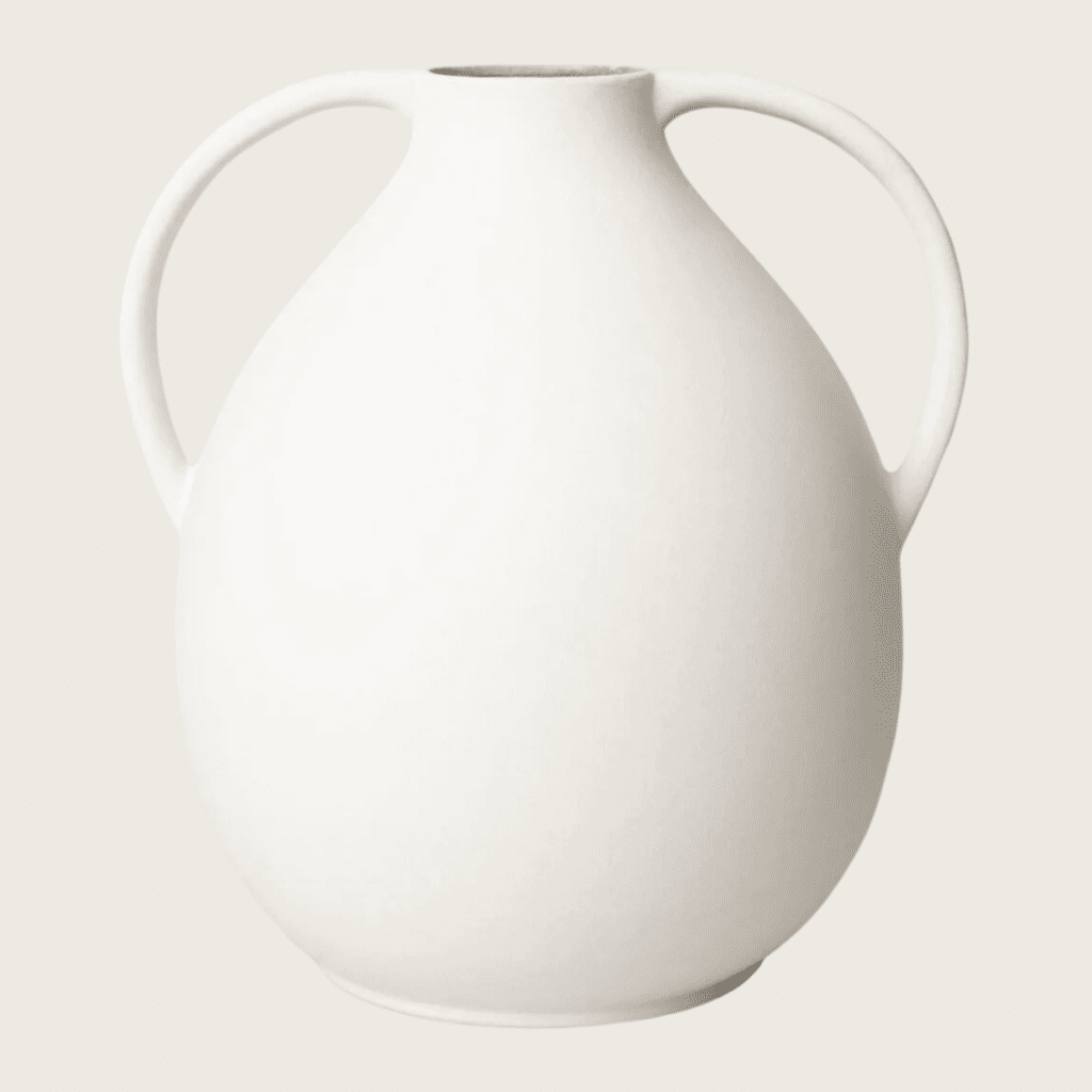
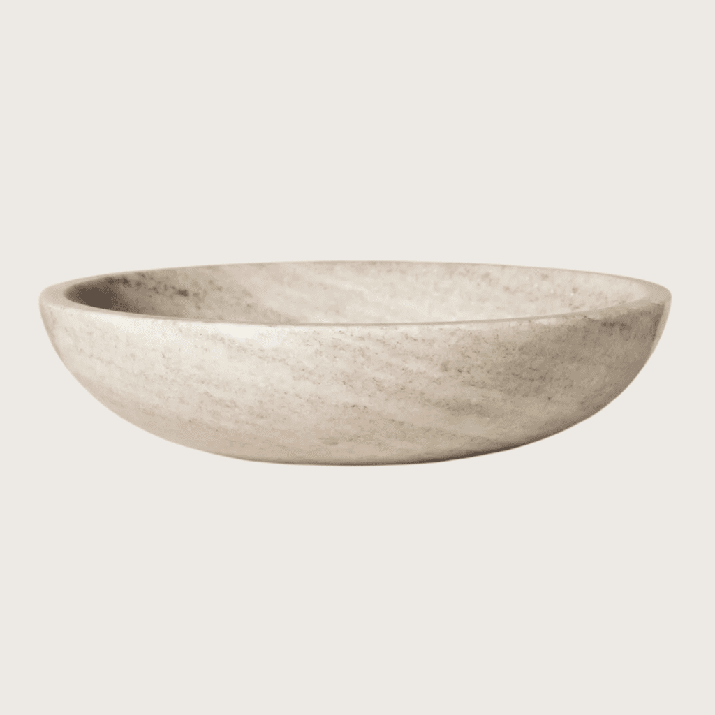
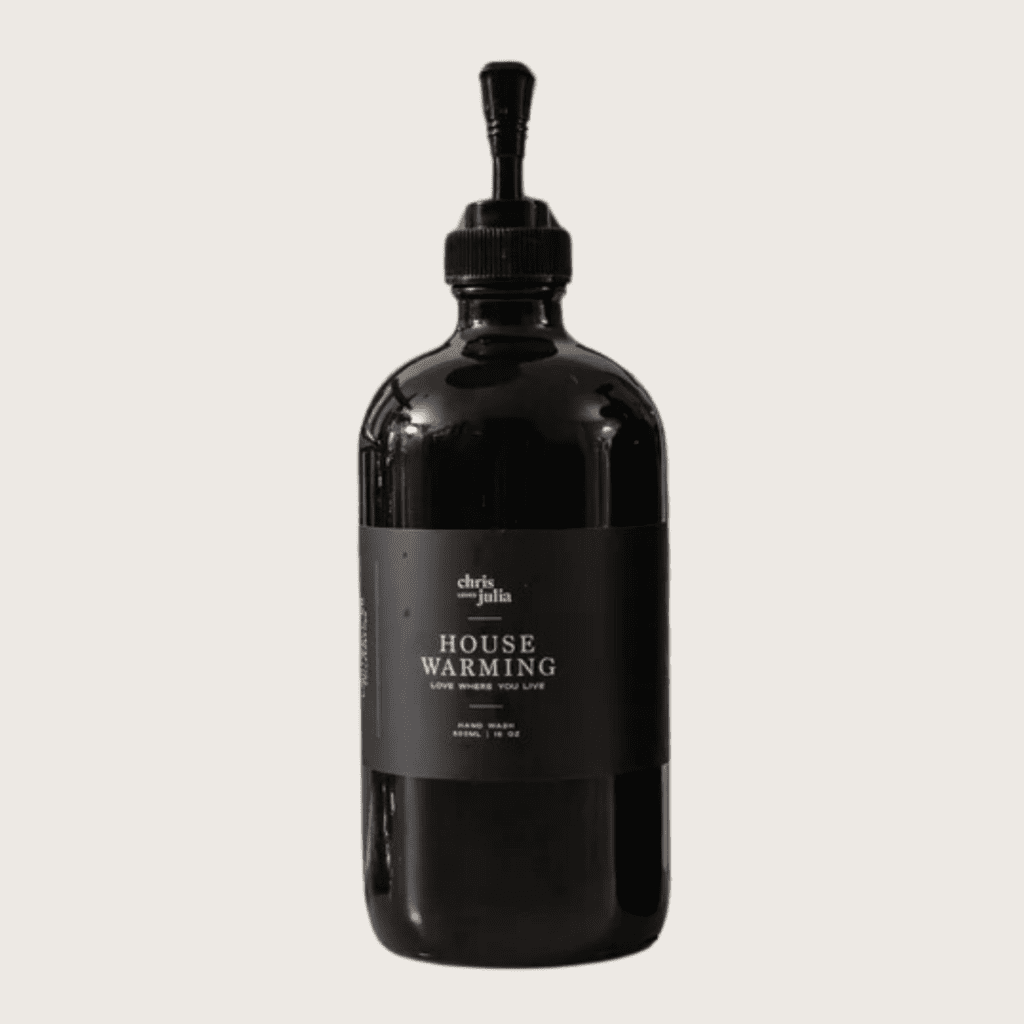
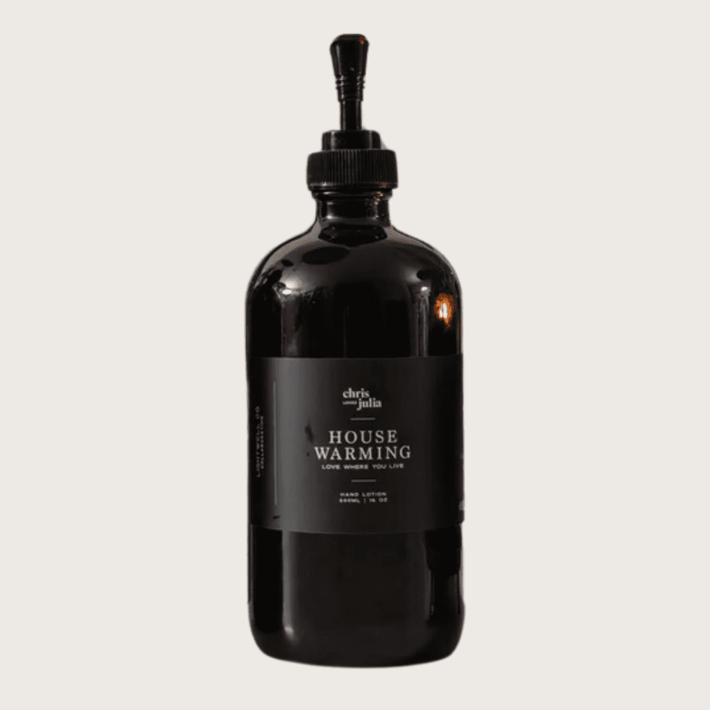
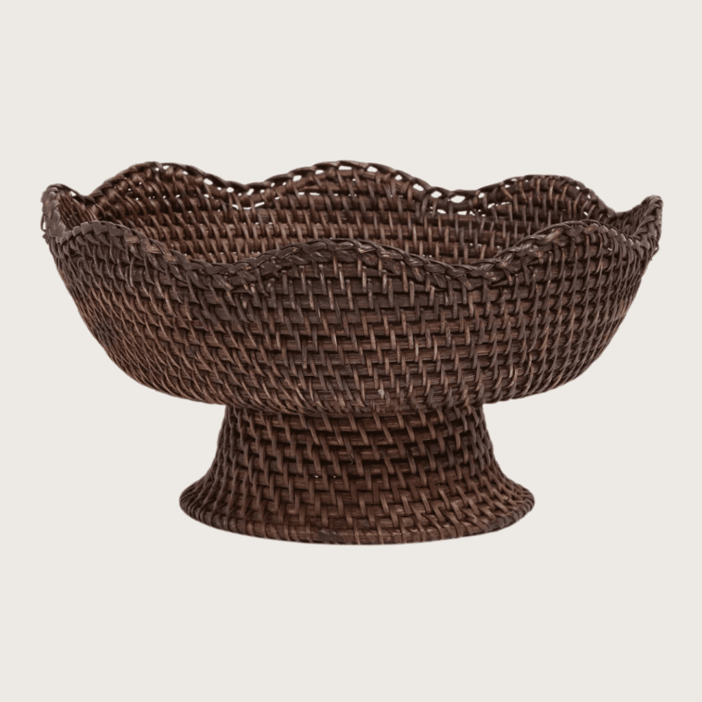
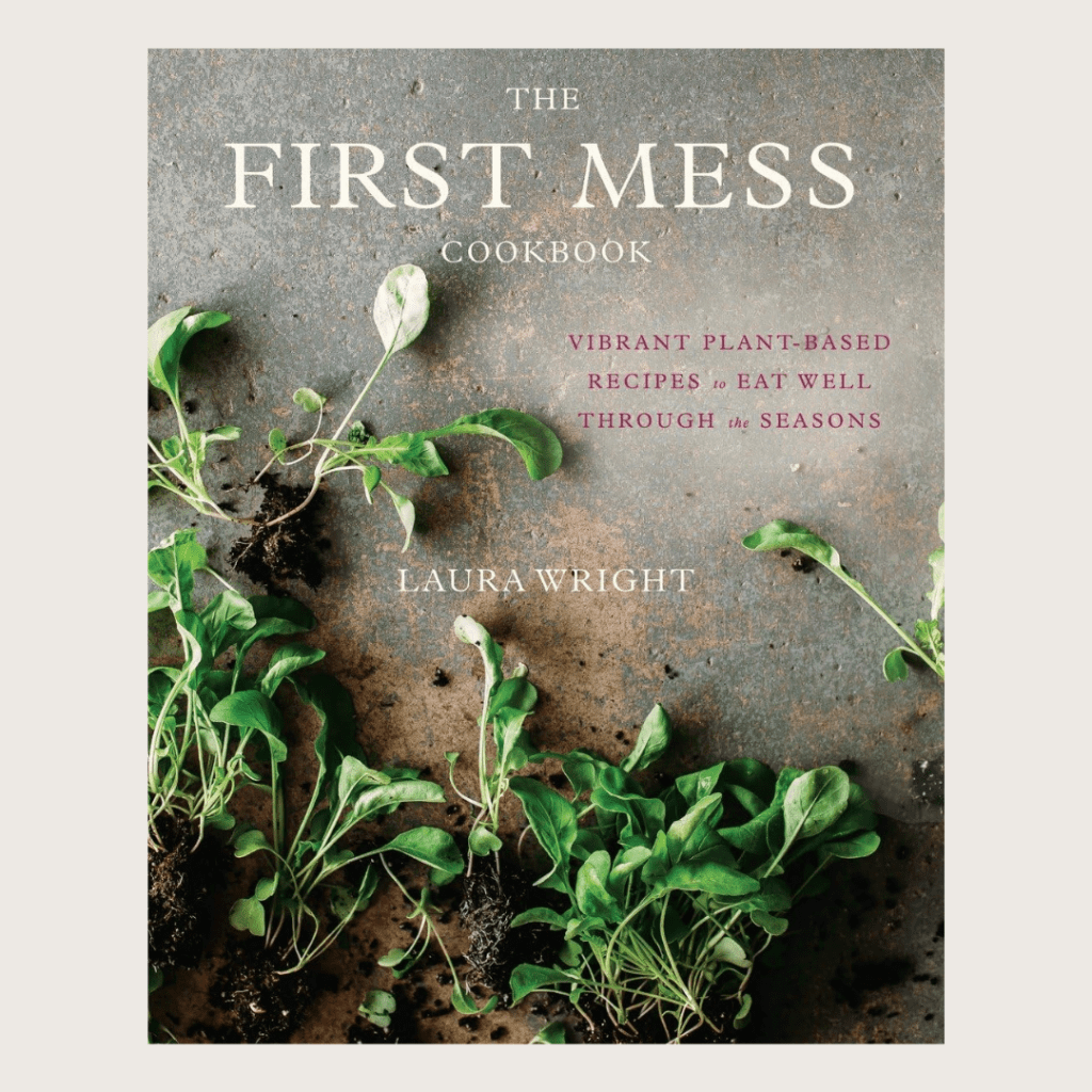
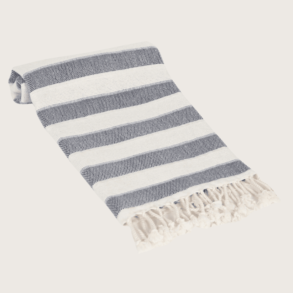
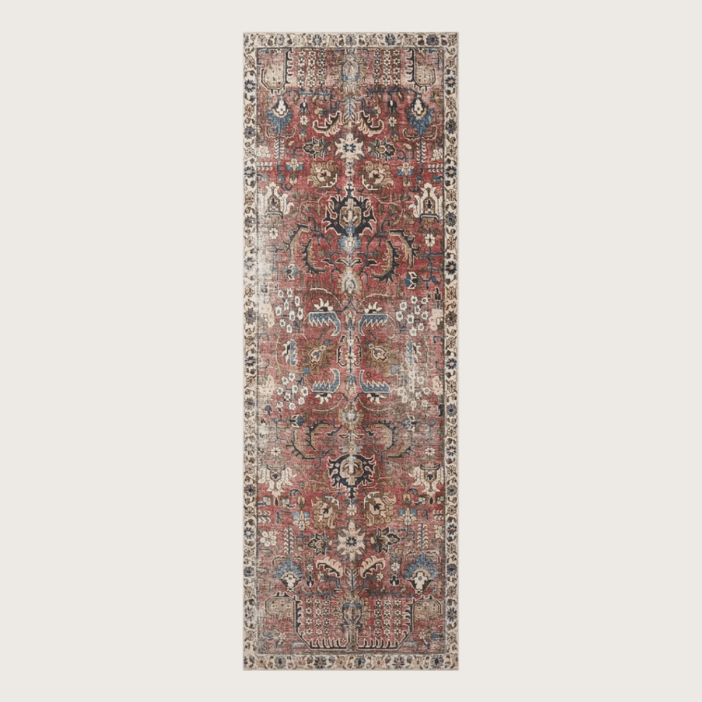
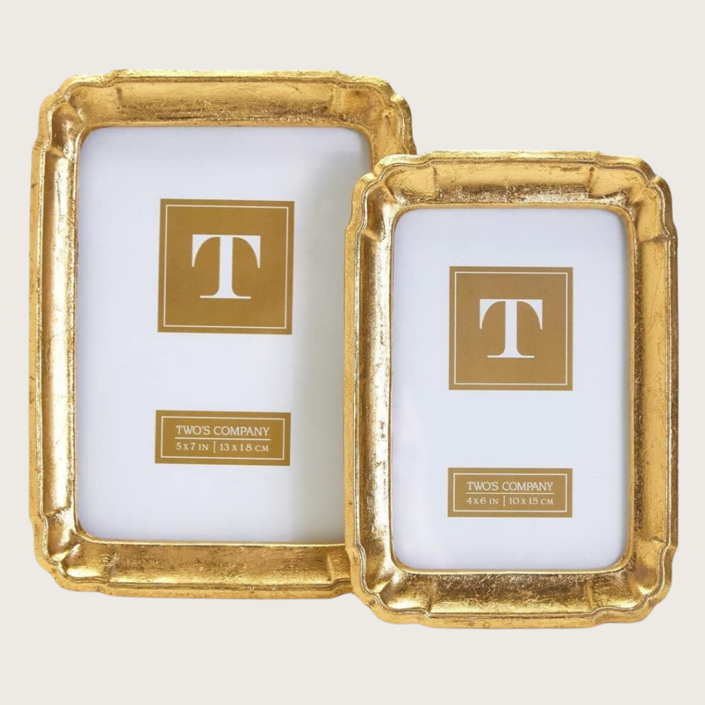
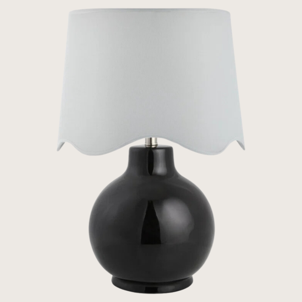
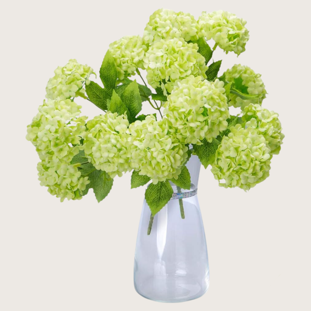
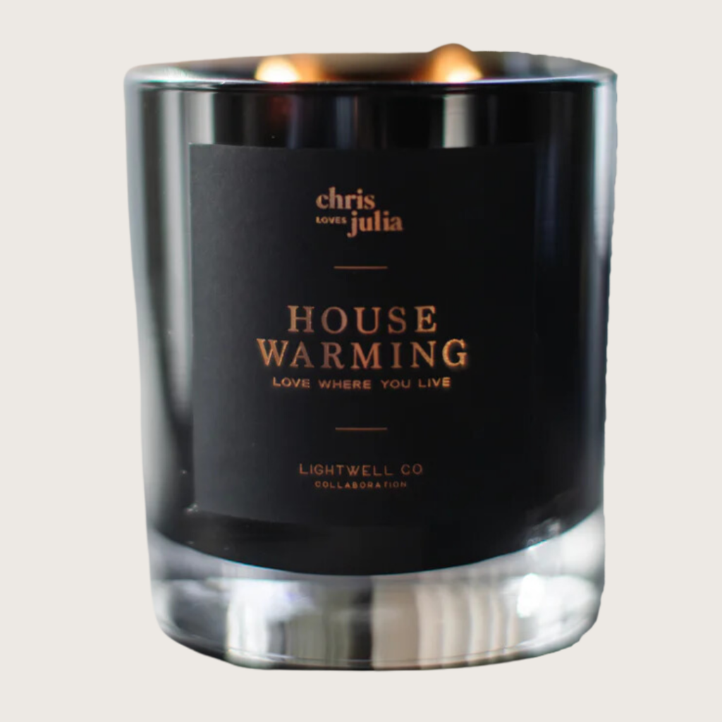
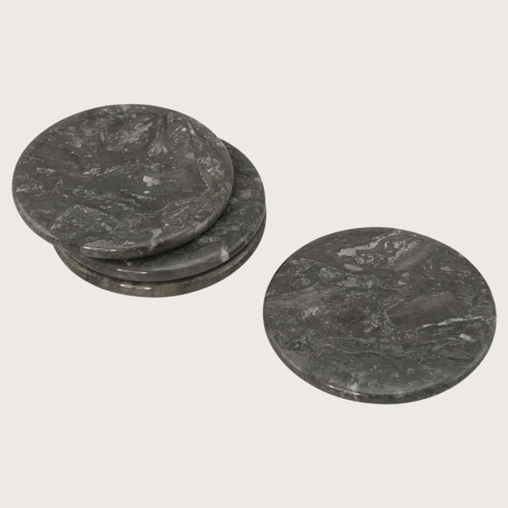
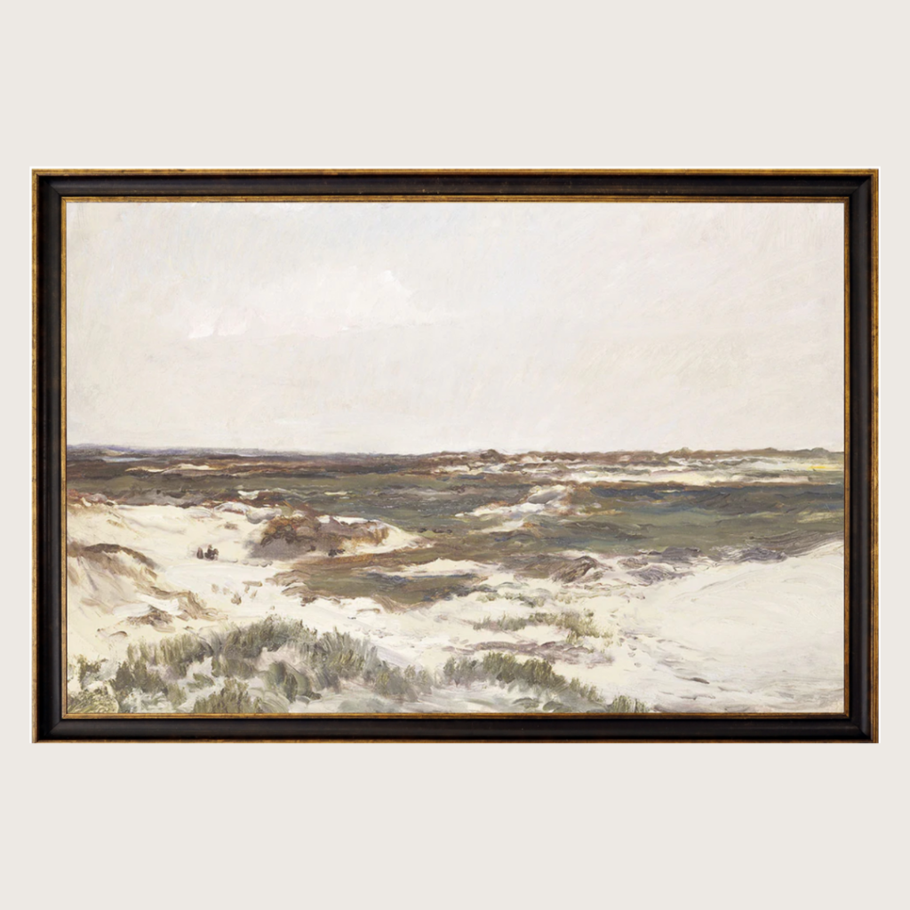
Here are some gorgeous styling bundles at three price points that I hope inspire you to create a space that's not just for preparing meals, but a place you can't wait to spend time in.
Style Your Kitchen for $150
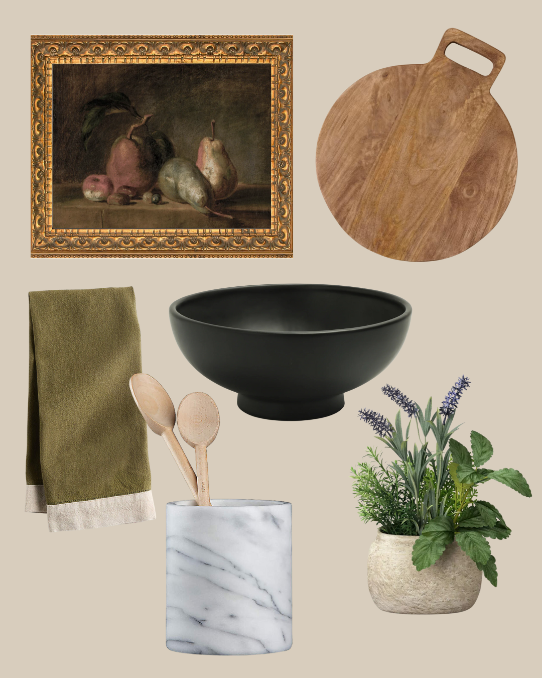
Style Your Kitchen for $350
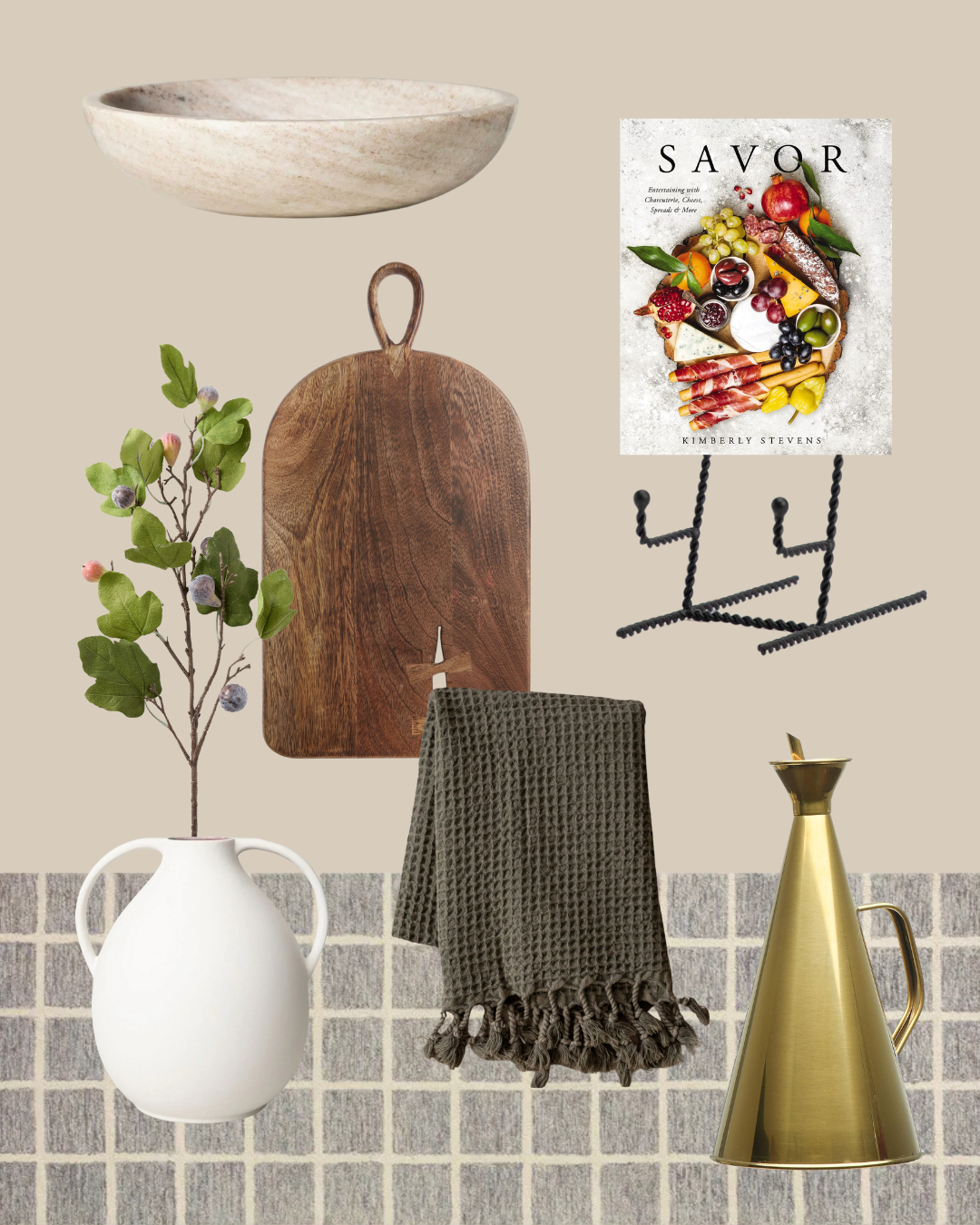
Style Your Kitchen for $750
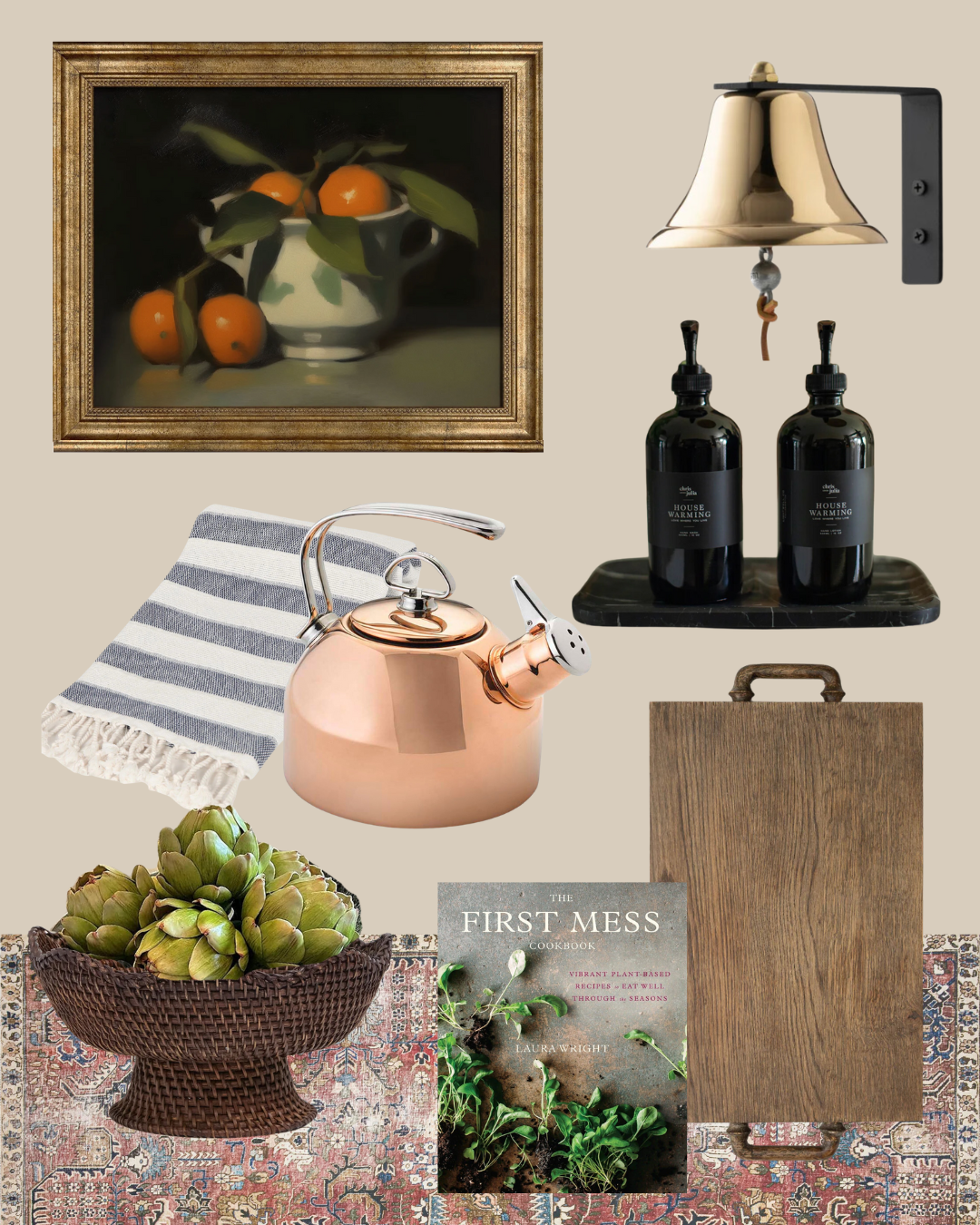
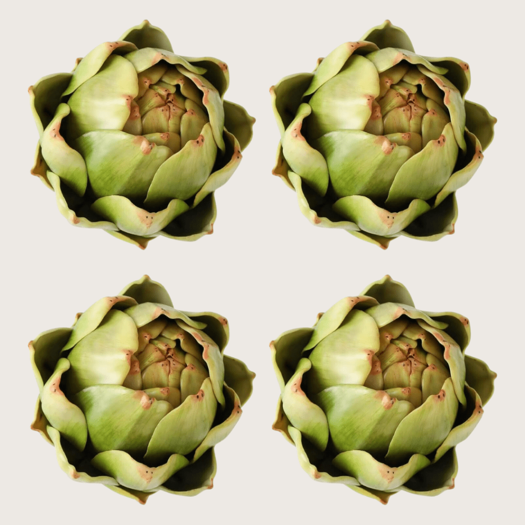
Faux Artichokes $25
Shop The Kitchen
Welcome to the last week of Summer School! We've talked all things styling the past few weeks, from how to style an entry, to how to style a bedroom, to how to style a living room. And here we are on week four, tackling perhaps the most unexpected room to style: the kitchen!
In the past, kitchens have been tucked away as more private spaces, but now most kitchens become the natural hangouts of the home. It's a meeting place where friends often gather to catch up with you during dinner prep, a site to chat with in-laws while washing dishes, and a spot to share a snack with your kids during homework time. I believe that kitchens are one of the most personal areas of the house, where you can show off your love of cooking or your collection of English tea plates.
Since the kickoff of this series, I'm emphasized that we're styling your home for you, at the end of the day. This isn’t about how you make your kitchen shine for anyone else but you. The kitchen is often a well-loved part of the home, so let's make it more beautiful and inviting for every day!
Collecting Pieces with Form AND Function
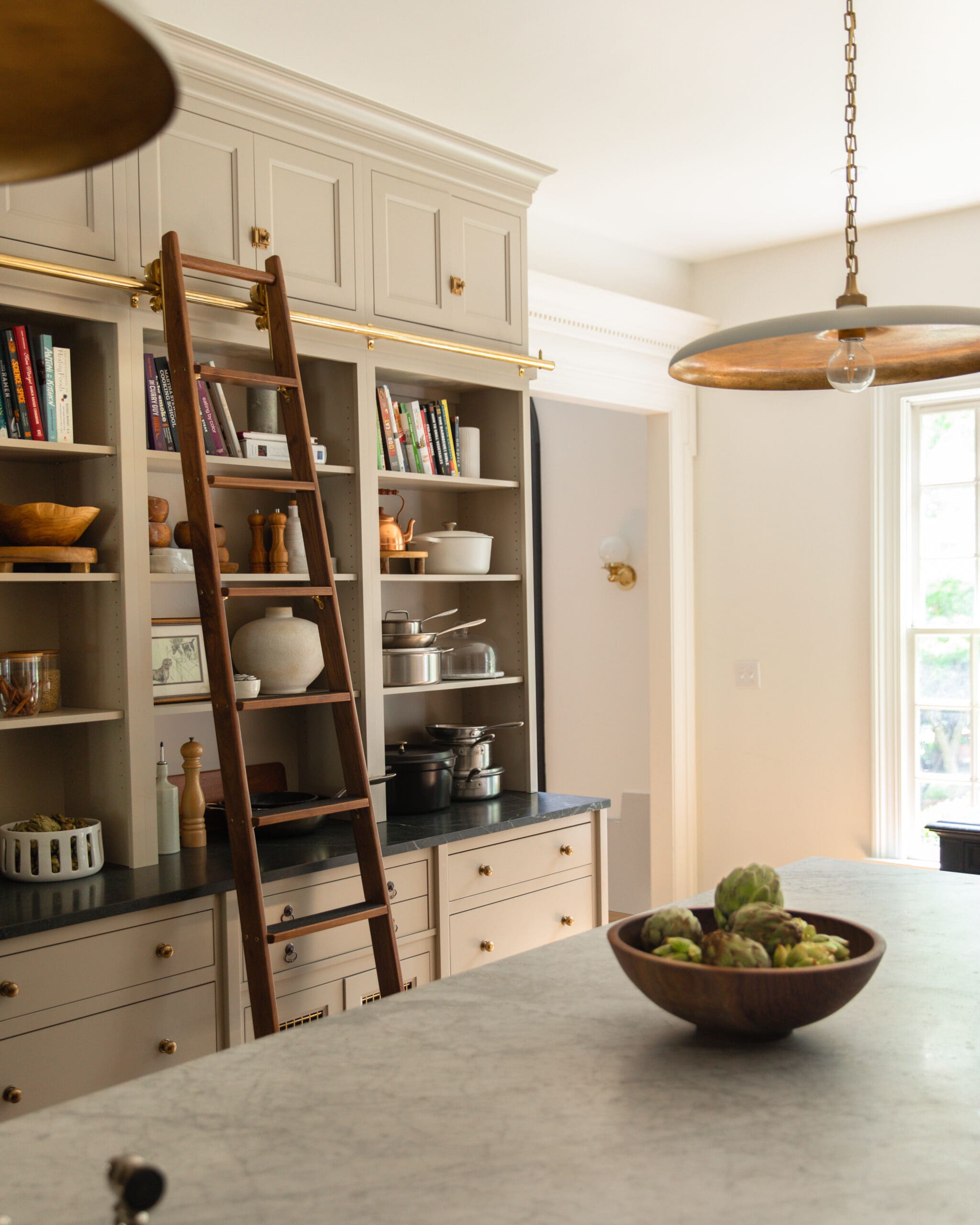
Pendant Light | Cabinet Hardware | Wood Bowl | Faux Artichokes | Cookbooks | Wood Pedestal | Glass Canisters | Small Wooden Bowls | Vase | Copper Kettle | White Dutch Oven | Glass & Marble Cloche | Black Dutch Oven | Wall Sconce
The best thing is that you can style an entire kitchen with beautiful versions of necessary things as functional decor. Everything from fruits and vegetables to pots and kettles. Yes there are a few added things that aren't exactly functional for cooking, like stems or flowers and candles or art, but they bring me joy.
And this is my key lesson for kitchen styling: If it's out in sight, make it pretty. You won't be spending additional money styling your kitchen with things you maybe don't need. And all the things you actually use, you won't have to put away.
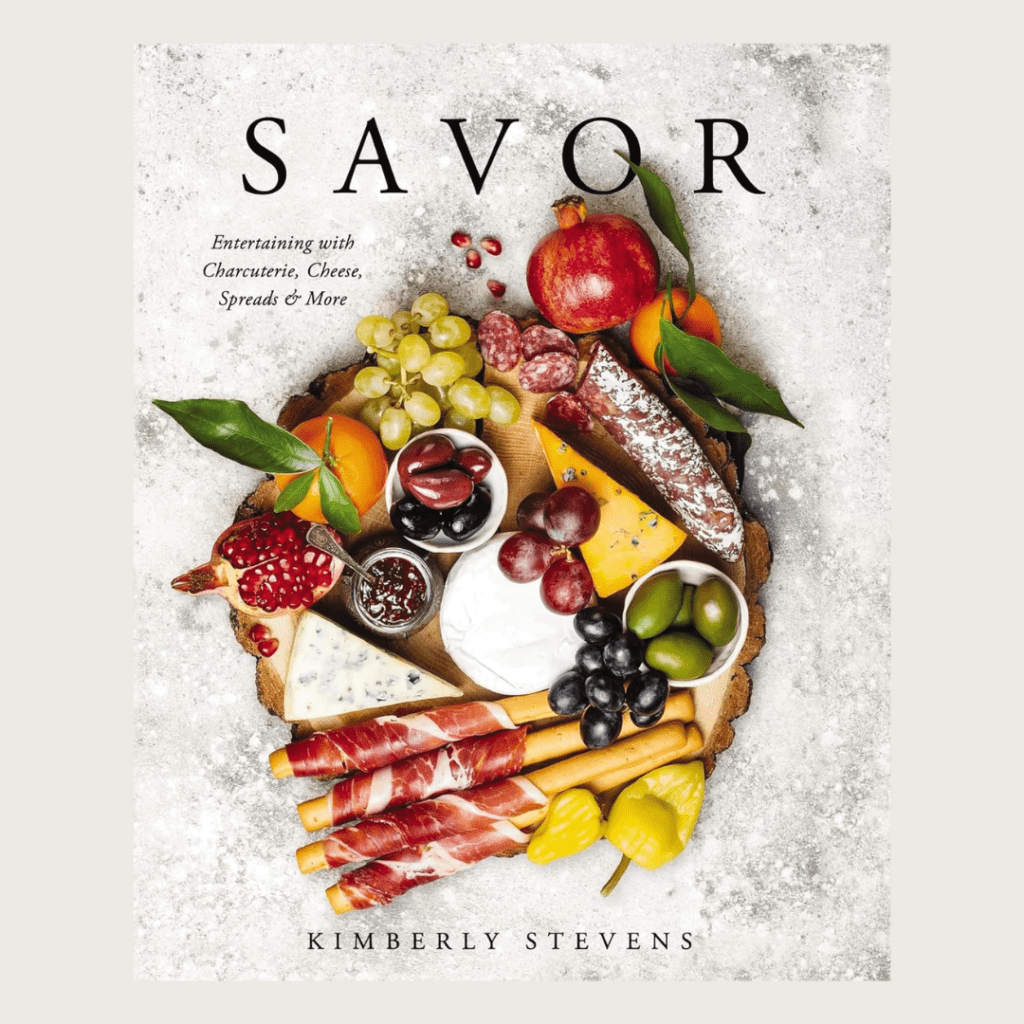
I love the idea of books in every room, and the kitchen is obviously a great spot for cookbooks, if that's something that you love to collect. That's actually the main reason we put the bookshelves in our kitchen: In previous homes, we didn't have a spot for them, and they were often mixed with other books and not reached for as much. When we were designing this kitchen, we really went through the thought process, "What do we have and what do we want on display? What do we need stored away?"
The Styling Pieces I Love
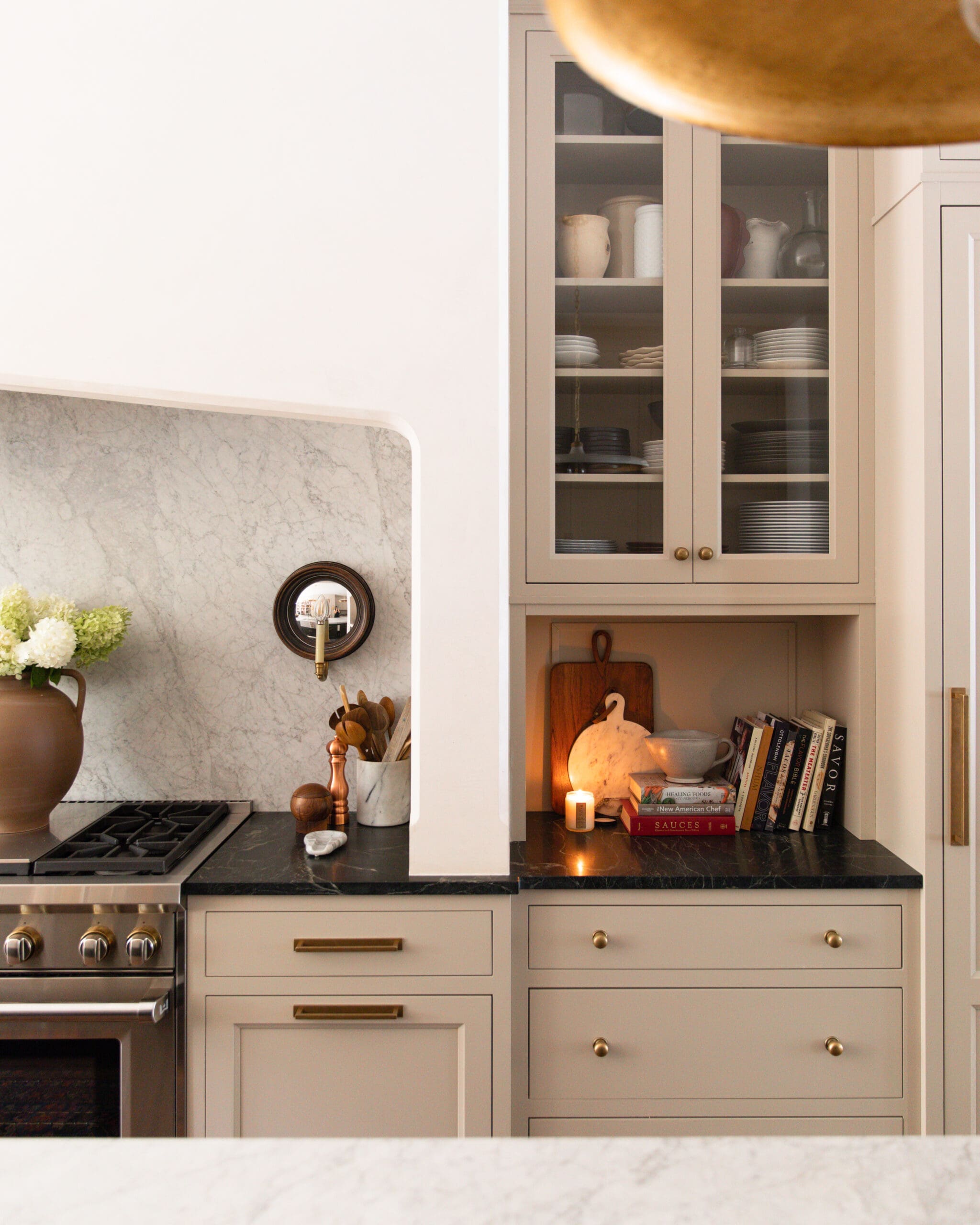
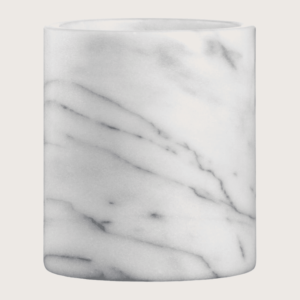
Handled Vase | Faux Hydrangeas | Salt Mill | Copper Pepper Mill | Marble Spoon Rest | Marble Utensil Crock | Wood Bread Board | Marble Cheese Board | Cookbooks
A lot of the things we use everyday, we put on display. We made little nooks in our range hood for frequently used spices and little wooden spoons that Chris uses for seasoning as well as a mortar and pestle. Another item that most people have out is a crock for their utensils. You're only going to buy one of those, so make sure it's one that you really want!
Lamps count as another item that doesn't help you whip up salads, but they really create a vibe! I love a kitchen lamp, any sort of flower or stem, art, and candles are things that I bring into my kitchen to add to the functional decor. When we're buying things for the kitchen like pans or another bowl or even spice jars, I always think it’s worth getting the one that is easy in the eyes, the one we wouldn't mind seeing out and, yes, the one that meshes well with our kitchen! There’s no shame in getting a pretty set of measuring cups or passing on the bright purple spatula that would stick out like a sore thumb—even in a drawer. Once, a set of neon green washcloths appeared in our towel drawer and they only lasted a couple days before I said, THESE SIMPLY WILL NOT DO! I can’t look at them! Our kitchen shelves are filled with pots and pans, and serving dishes and bowls and copper canisters—all things we use day to day and all things we cherish. Even a cloche for baked goods can be so pretty on display, even if it's empty!
Mixing Metals and Colors
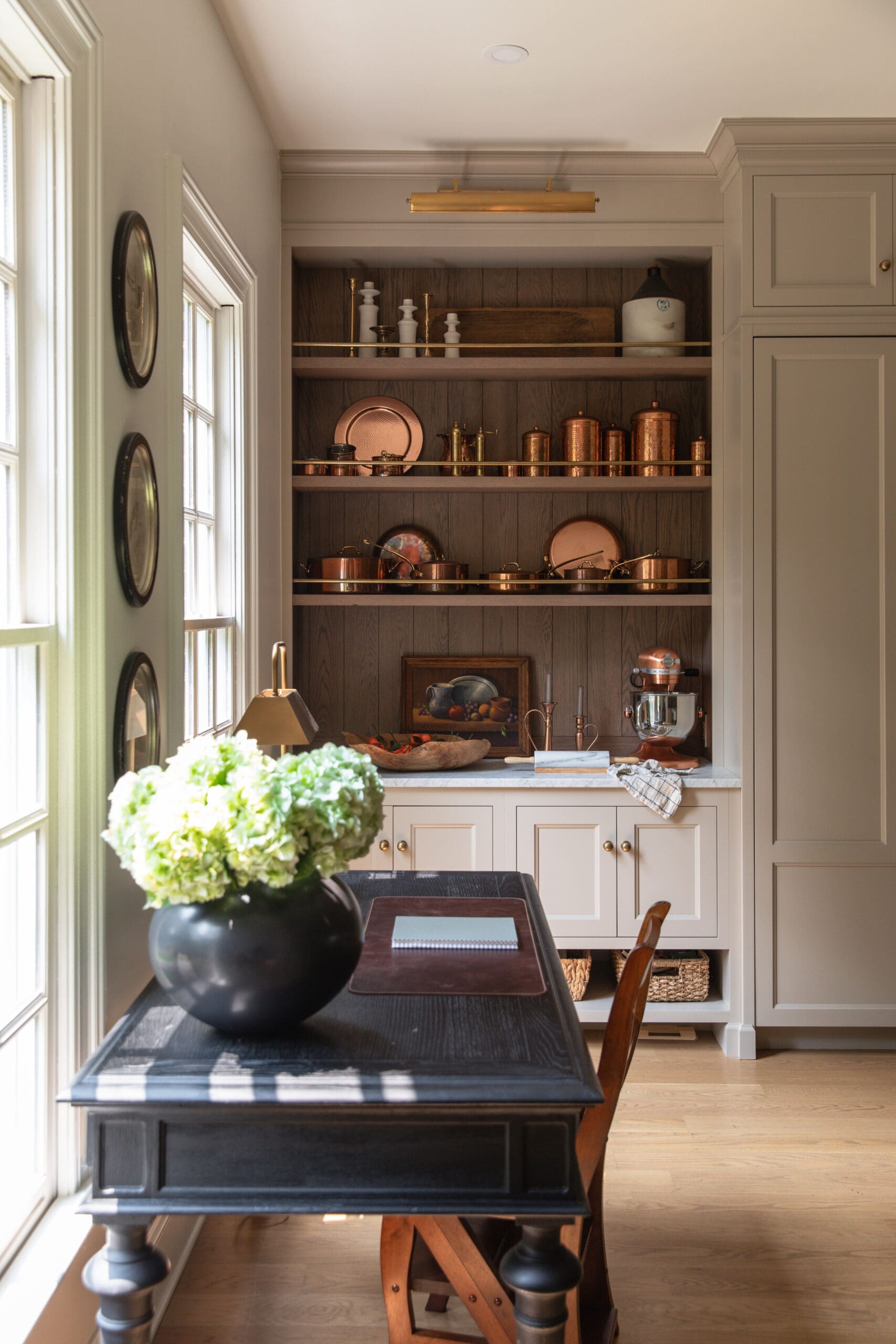
Kitchen Desk (similar) | Vase (similar) | Faux Hydrangeas | Leather Desk Mat | Table Lamp | Wood Bowl (similar) | Marble Rolling Pin | Copper Cookware | Copper Canisters | Brass Salt & Pepper Mill | Picture Light
My piece of advice when it comes to mixing metals? Mix them freely! The very first time you bring a new metal in to the kitchen, you're going to be like, "This doesn't match!" But you're going to add to it. Our kitchen has copper pots on shelves with brass rods in front of them and a brass picture light overhead. We have stainless steel appliances. Our faucet is polished nickel. Maybe that first piece is going to feel out of place, but then as long as there are two representations of the same metal, then you're fine.
The tricky thing is when you start bringing in different colors that aren't metals, like a mixer or a dutch oven. I would say think about those purchases in the realm of your whole kitchen. If you already have a really colorful KitchenAid Mixer and you want to leave that out, that will dictate the color scheme of your kitchen. You can bring the color in again in a little print on a cafe curtain or a lamp.
I tend to stick with metallics or a neutral color for things that will be left out. We have a lot of cast iron pots on display, and almost all of them are a white, cream, or black.
The All-White Kitchen Conundrum
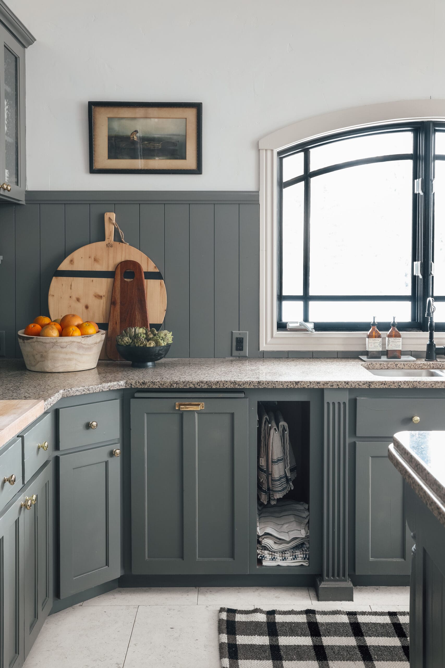
Cabinet Knobs | Cabinet Pulls | Wooden Bowl | Striped Cheese Board (similar)
I've heard a lot of people ask, "How can I bring color into my kitchen in a sophisticated way?" Let's say you're starting with an all-white kitchen (a very popular choice that can be beautiful!). If you want to bring some character to it, I would add art, I would add some wood butcher blocks you can keep on the island or counter, I would add a vintage rug or one that has some vintage tones in it, and a really beautiful flat bowl that you can keep out. I also love the idea of adding a cute cafe curtain with a small pattern on it.
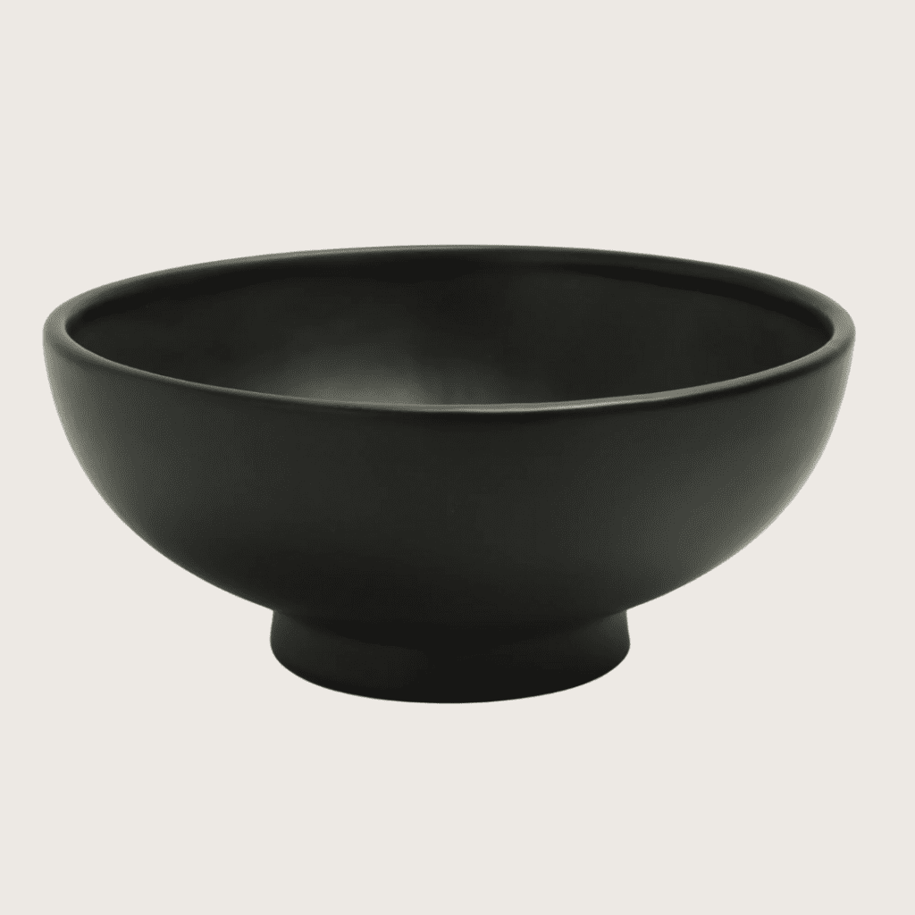
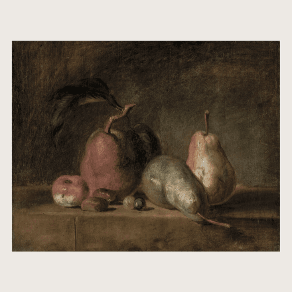
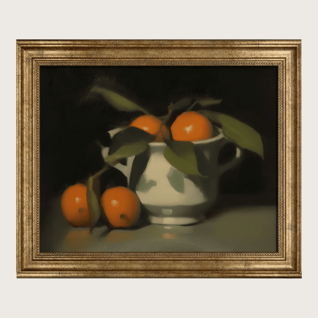
When I'm purchasing fruit or vegetables to use as a styling piece (that we're also going to eat, mind you), I focus on one piece of fruit at a time. I'm guilty of this myself: I thought I was supposed to have a fruit bowl filled with all sorts of fruit to style a kitchen. Now I've learned to stick to one type of fruit or vegetable in a bowl and it will increase the appeal. My go-tos are a bowl of apples, oranges, artichokes, mangoes, or pears. I think pears are one of the most beautiful fruit to have on display — plus they're just delicious to eat. Just stick with one of those, and you'll have a beautiful setup with a pop of color!
Scents and Sensibility
I love to have a candle in the kitchen as well — it can help mask strong cooking odors and add a cozy vibe. Now, there are scents that tend to go in a kitchen and wouldn't necessarily go anywhere else. I've seen tomato leaf candles and then there's a salt candle that smells good anywhere. MadeIn makes a Kitchen Candle Set - the Tear of Basil scent that is sooo great for a kitchen, but I wouldn't necessarily use somewhere else in my house. I feel the same way about any sort of lemon, sweet cookie, or pumpkin pie aromas. Yes, I love them in seasonally in the kitchen, but I don't want to smell them anywhere else. Or you can get a candle that's more "evergreen" so to speak, meaning it can go from the kitchen to another room with ease (I like scent notes like figs, amber, or bergamot).
There are so many things you probably already have that you can use to style your kitchen. Here are some of the things that I use to set a welcoming scene:
Things I Use To Style Kitchens:
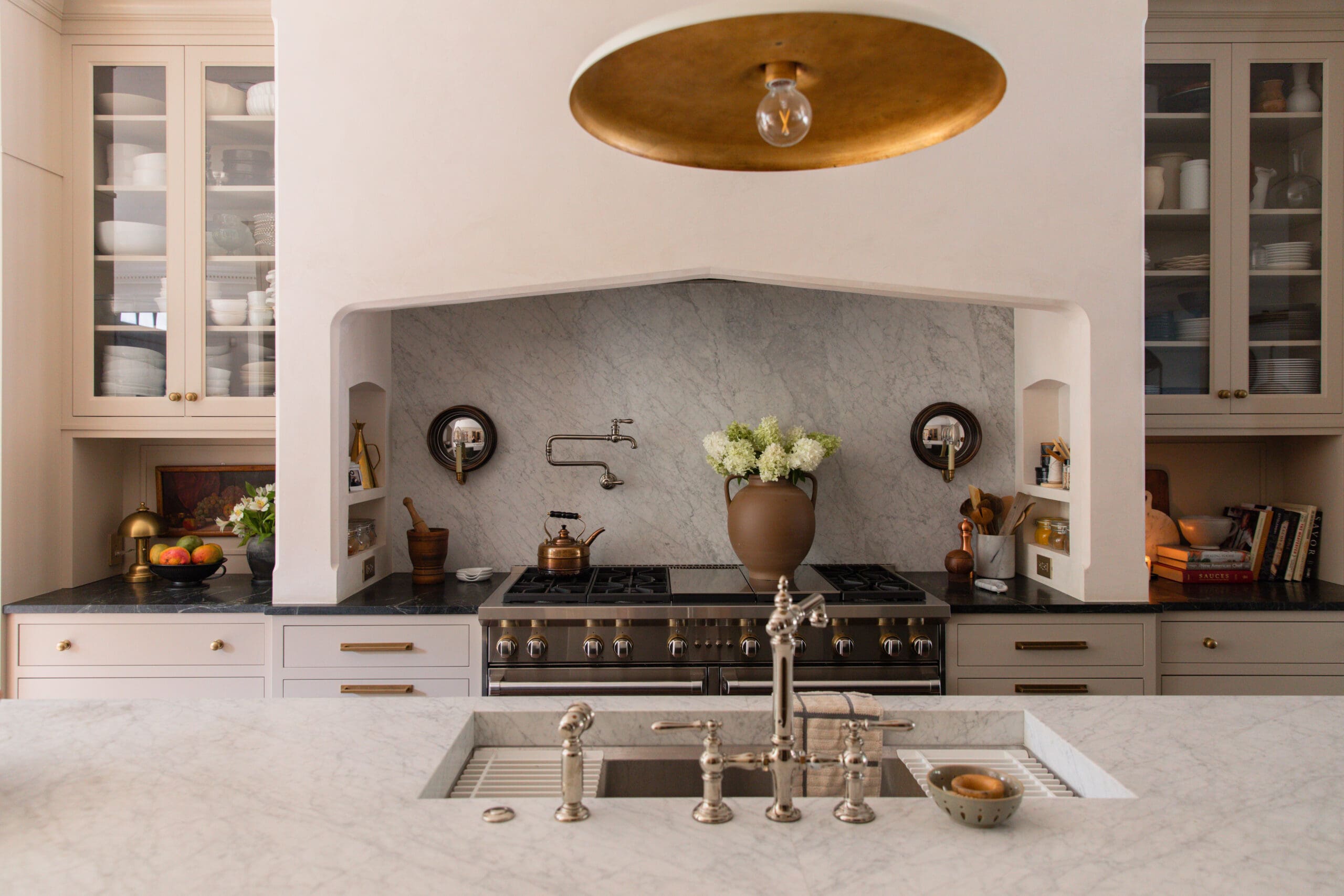
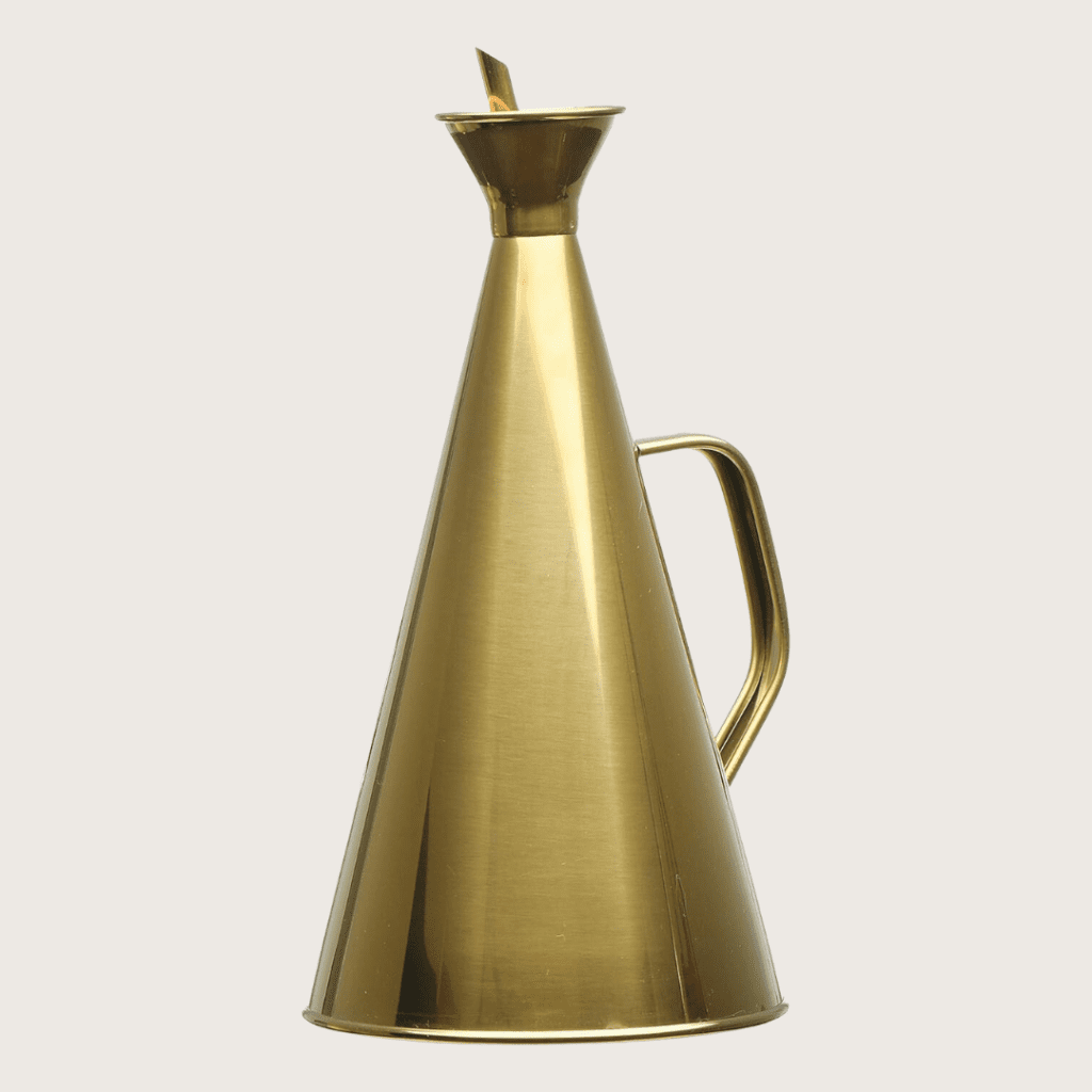
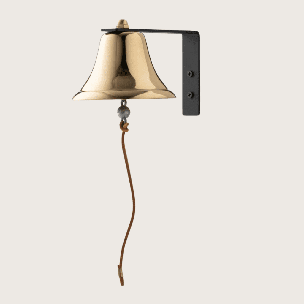
- Shiny: brass oil cruet, kettle, pots/pans, cabinet hardware, dinner bell, candlesticks
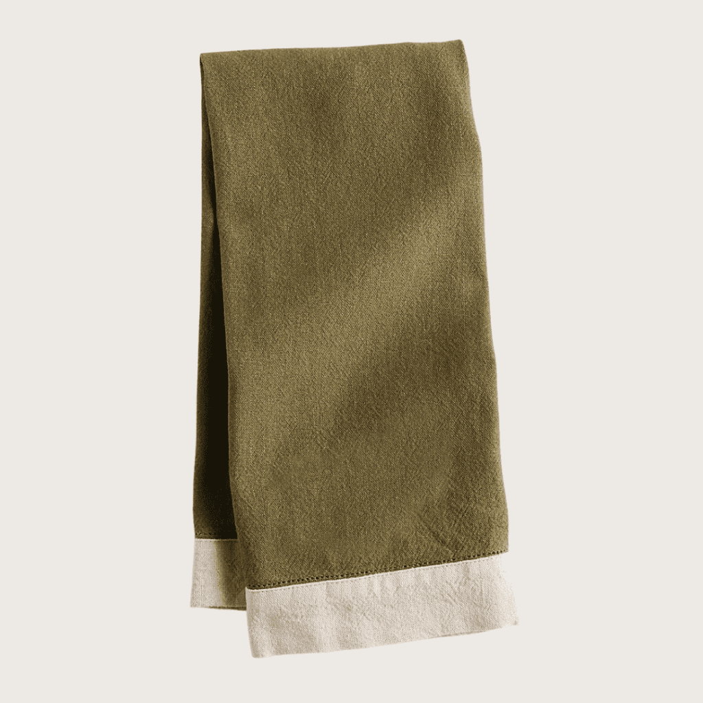
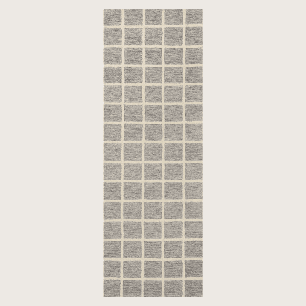
- Texture: dish towels, vases, cafe curtain, runner, wooden spoons, cutting boards, mortar & pestle
- You: small art, recipes, cookbooks, calendar, framed photos
- Lighting: pendant lights, sconces, picture light, table lamps
- Inviting: bowl with fruit or vegetables (real or faux), candle, soap/lotion, music speaker
- Necessary: chopping board, salt/pepper shaker, crock for wooden spoons/spatulas, pretty (and useful) appliances, clock
- Greenery: stems, small plant
I hope this empowers you to make small changes to help you enjoy your kitchen more than before. It's the heart of the home, after all!
We're coming to the end of Week 3 of Summer School: Home Styling 101! Today I want to share some living room interiors that have stopped my scroll with their use of color, texture, and styling.
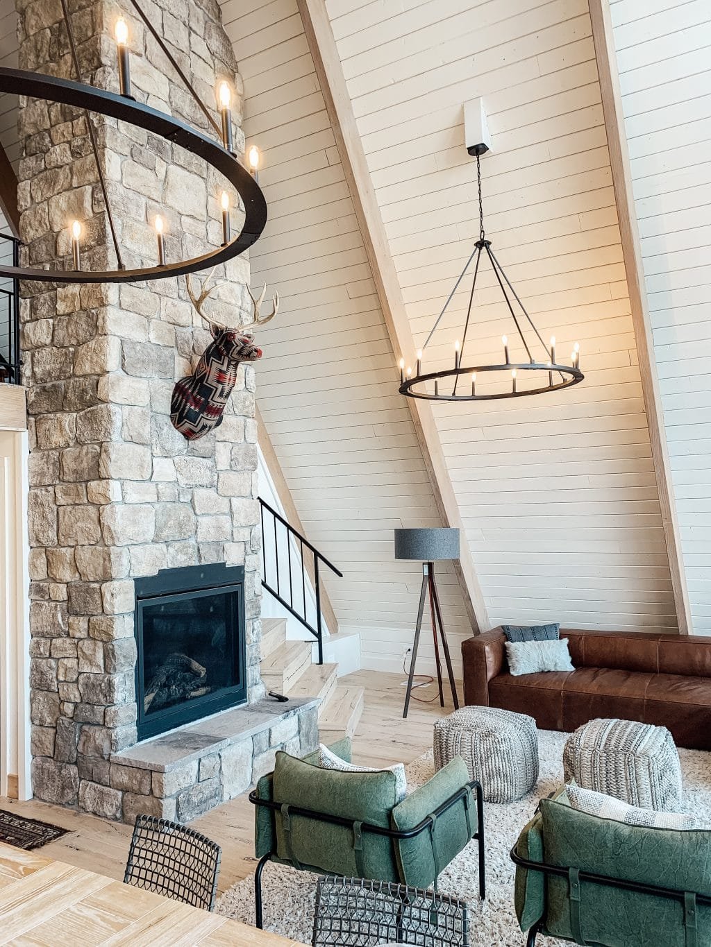
This is somewhat beyond the realm of what conventionally falls under styling, but something I've been really looking for when I save other people's living rooms right now is ceilings! Living room ceilings are usually not accentuated too much because we want the room to feel expansive, like there's no top on it.
We have a vaulted living room ceiling now, which we didn't always have, and I'm just not really sure what to do with it. I painted my ceiling and walls all the same color to color drench it, but now I'm wondering what else I might do? Skylights, beams (are people still doing beams?), millwork — show me all of it!
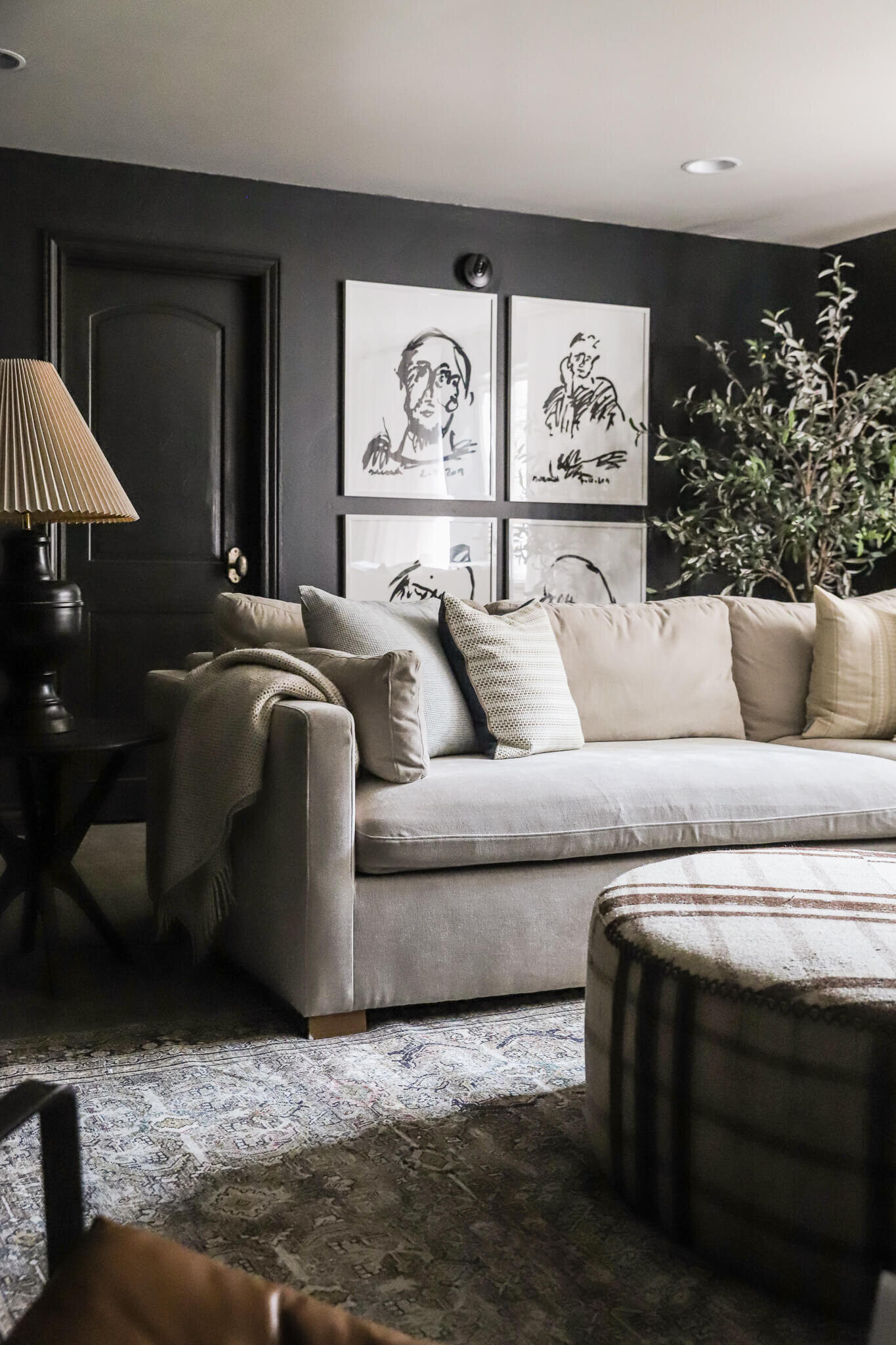
Here are some of the moody, modern, and traditional rooms that have caught my eye on Instagram lately:
This week, we're styling living rooms, which is a place where you can really shine! Earlier in the week, I talked about the opportunities you have to style a lot of surfaces, from coffee tables and couches to shelves and mantles. Today I want to share some of my go-to styling products that can make any living room feel more inviting.
I'm sure you've heard me say this before: I love to add multiple sources of light — I rarely turn on my overhead lights! Let other sources of light infuse the space like candles, floor lamps, and table lamps: these can really create a cozy feeling in your room. It's always fun to have something interactive too, whether that's some coffee table books, a glass box filled with Polaroid photos, or a pretty set of tic-tac-toe or checkers.
For more inspiration, check out these styling bundles below at three price points!
Style a Living Room for $150

Style a Living Room for $350


Pharmacy Table Lamp $101
Style a Living Room for $750


Shop The Living Room
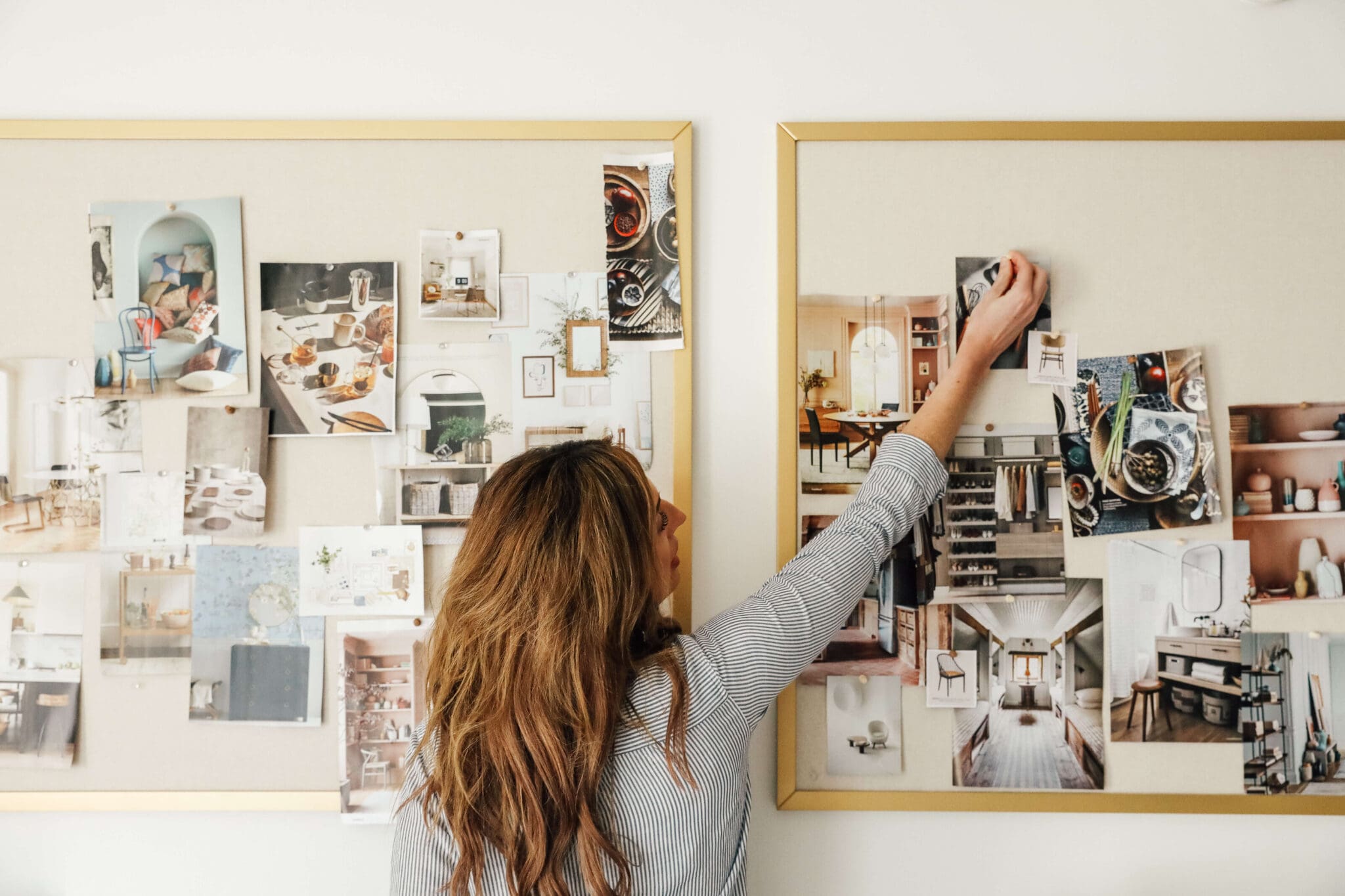
Here's the honest truth: Beauty is in the eye of the beholder. Something that looks beautiful to me is going to look different from something that looks beautiful to you. We all have our own tastes. And early on, I realized that it's not enough for me to look at something and say "I like this." I want to learn why I like this. Whether it's on Instagram, in movies, in coffee table books, on Pinterest or in hotels, I save a lot of images. And I don't just save them because I like the image, but I'm studying them.
The lesson is: Write down or make a mental note of the things that you don't know how to style, because those things will start materializing in front of you as you're looking for them.
Research Your Problem Areas

I remember once I had a round coffee table. They're a bit tricky to style. I thought, "How am I supposed to do this?" Well, I studied a lot of images on Instagram and Pinterest. As soon as you start focusing on your trouble areas, like my round coffee table, almost every picture that you see from that day on will have a round coffee table. That phenomenon is actually a cognitive bias called the frequency illusion.
Seeing those styled round coffee tables helped me put together the elements that I wanted to include on my own round coffee table, such as something green (a faux succulent), something for height (candlesticks), something layered (coffee table books), and then something fun or meaningful (a little white elephant statue). Having an intentional assortment of things made that coffee table feel finished, not cluttered.
Think About Surface Area and Flow

Leather Sling Chairs | Blue Velvet Sofa | Linen Sofa | Coffee Table (similar) | Jules Lagoon/Brick Rug | Double Arm Floor Lamp (similar) | Table Lamp | Floor Lamp | Tree Art Prints | Leather Ottomans
Truth be told: The above was my favorite living room we’ve had! When it comes to styling living rooms, think of the surfaces available to you. That includes coffee tables, as I mentioned, but also bookcases, mantles, ottomans, couches, or chairs. And it also includes rearranging, which is a part of styling.
Is your furniture set up in the best way to encourage conversation? Sometimes you may have a living room with a couch facing a TV. What if you had just one chair in a corner facing the sofa? That can create an inviting circular flow to the room. Leave enough room for a path around an ottoman or a bench. And also make sure you're using the right size rug for your space.
Turn Private Storage Public

Arched Cabinet | Boucle Swivel Armchairs | Linen Sofa | Double Arm Floor Lamp (similar) | Polly Slate/Ivory Rug | Migration Art Print | White Vase | Wooden Pedestal | Candlesticks | Large Grey Vase
You can also consider showcasing items you may have previously been storing. My cabinet in my living room right now holds all my vases. I used to carry them all the way up to the attic for storage when I was done with them, but one day I realized, these are pretty! I'm storing them right here! I can take them out, use them, and put them back in.
That's one of those styling wins where something functional becomes something beautiful as well. Look around to see how you can try that in your own home.
Think Seasonally (Year-Round!)
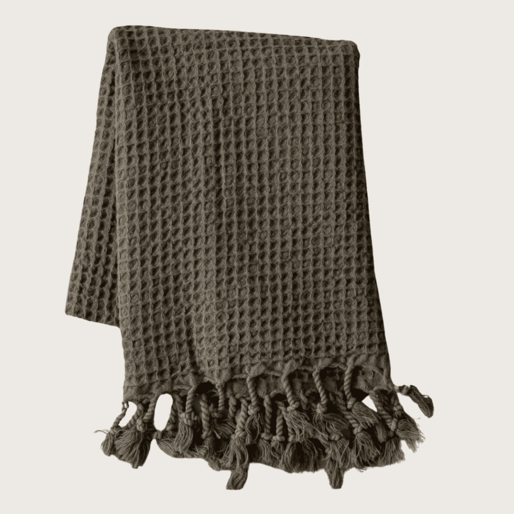
I think we see a lot of styled living rooms in fall and winter. but for spring and summer you want it to feel light and airy. We have a dark velvet couch that can feel very "cooler months", but you're not going to buy a new couch just to match a season! So how do I style it? I'll usually put away throw blankets in the summer or switch to a thin lightweight tassel one, almost like a turkish towel. Even in other areas, I tend to pull up a lot of textiles in the summer months and simplify in that way. I'll also have fewer pillows or lighter pillows.
For the surfaces, I love doing floral stems for the summer with more focus on coffee table books instead of pillows and textiles. Mantles and fireplaces are great opportunities for styling around the seasons. I like to simplify my mantle — I have candlesticks on it that feel year-round. but then I'll put one singular green leafy stem in a vase instead of something with a more rich color.
Don't forget that a scent like a candle or diffuser can really help a space seasonally!
In terms of our outline for today using our STYLING formula, here are the elements I use to style a living room.

Things I Use to Style Living Rooms:
- Shiny: candlesticks, mirror, gilded frame, objets d'art
- Texture: area rug, pillows, throws, lampshade, ottoman, curtains, coffee table books
- You: art, tabletop frames, collectibles (e.g. matchboxes, a vintage nutcracker)
- Lighting: lamp, lantern, sconces, candlesticks, picture lights
- Inviting: candles, record player or speakers, chairs
- Necessary (storage): coasters, baskets, ottoman, storage cabinet/drawer
- Greenery: a large vase of stems or tree (faux or real), garland
Be sure to sign up for our emails to hear about the thing I love most in my living room that makes a great (and unique!) gift for others!
Here's the crazy thing about me and inspiration: If you were to go into my bathroom inspiration board on Pinterest, there are bathrooms for sure, but there are also kitchens, there are closets, there are mudrooms, and there are hallways of houses! I'm not looking to copy and paste an inspirational image. I'm taking notes on what elements of each picture I like — such as the color of the door or the moldings on the wall — and save them, regardless of the room! So when you're looking at inspiration photos of a space you want to revamp, look for how someone is mixing patterns in a room, how they're playing with scale, or what they do with lighting. Then save the ones you love!
On the other hand, narrowing down to a room when searching for inspiration is a great exercise to find your own style and solve issues you may have in styling your house. Do you have a problem with where to put your throw pillows when you take them off the bed at night? Look through bedroom images and see if there's a trunk, bench, or chair in the corner that you could replicate. Does the nightstand have open shelving? See what people stack or style by the bed to create the look and feel you're going for.
Here are some rooms that I've been saving to my collection:
This week we're talking all things bedrooms! In yesterday's post, How to Style a Bedroom, I talked about the surfaces that are available to layer onto, including the bed, dresser, and nightstand. Today we will layer on the styling tools that will make the room feel more put together.
This is the room to think big! Instead of tons of little trinkets, pillows or books, be more thoughtful and find the one perfect thing that exudes a confident style. One of my go-to styling pieces for a bedroom is a velvet lumbar pillow on the bed. It adds texture, it adds color, it feels inviting. It's just one item but it goes a lot further than if you just made your bed with shams.
If you need help getting started with styling your bedroom, I curated some bundles for you that refer back to the principles we talked about in Home Styling 101!
Style a Bedroom for $150

Style a Bedroom for $350

Style a Bedroom for $750

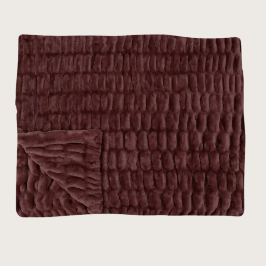
CLJ x Lola Blanket in Raisin $194 with code CLJ35

Shop The Primary Bedroom
Welcome to a new week of summer school as we continue our Home Styling 101 course! Last week we talked about how to style entryways — from front porches to mudrooms — and now we're going to tackle one of the most "inward-facing" rooms of the house: the bedroom.
I want to share my approach to decorating bedrooms because it's something that most people skip when they think of styling. That's often because we're in the mindset to only "style the places where you'll be entertaining guests." But let's talk facts: the average American will spend nearly half of their life in bed! This space deserves some love, friends!
Remember, we're styling for you at the end of the day. We want to create a place where you feel the most yourself, the most at home, the most balanced. And that can happen when you purposefully decorate your bedroom with things that are beautiful, functional, and inviting.
What Not to Have in the Bedroom
So the first thing I do when styling my own bedroom? Look for things I can take away. Styling is as much about negative space as it is about the things in the room. Is your nightstand or bedside table covered with knick-knacks, books, and chargers? Do you have clothes strewn on the bed? Too many pieces of decor or exercise equipment? Listen, I've been there. But less can often be more. It's hard to feel like you're in a calming, relaxing environment before bed when there's clutter around.
While we're not going to be talking about purging here (I covered that in a previous Summer School!), it's a good starting point for styling any room. Check out the Bedroom Tell-All post for more advice on what doesn't work in a bedroom.
Play Up Textures

Judy Natural/Ivory Rug | Wallpaper | Chandelier | Velvet Upholstered Bed | Boucle Throw | Bedding (similar) | Dollhouse Bookcase | Plush Bunny Head | Nightstand | Plush Bunny
You may not think about bedding as styling, but your bed is a major focal point of the room! While it goes without saying that making your bed is step 1 in the hierarchy, the next step is the linens. From the texture and pattern on your duvet cover to the throw pillows, textiles can make a big impact in any size space. I always recommend starting at the ground level and that means a luxurious set of sheets!
Then I love a big cloud-like comforter and a layered quilt or throw blanket to give your room the hotel room feel. Adding a large lumbar pillow can be an easy way to make a bed feel "finished" without using dozens of throw pillows. Try a velvet one for instant luxury! If you like a moody look like I do, choose a darker textile for curtains, and you'll feel more enveloped in the comfort of your room.
Swap Out More for Less (Just Go Bigger!)

Nightstand (similar) | Table Lamp (similar) | Coffee Table Books | Canopy Bed
I prefer to have fewer things on my walls or tabletops in the bedroom, so often I'll focus on just one larger item. Just remember, the fewer items you need for a space, the more thoughtful they need to be. Make them count! Instead of a gallery wall, consider one oversized piece of art (yes, even if the room is small!). And instead of petite lamps, get a larger one for the nightstand or a set of scones that adds height beside the bed. This is a trick that a lot of hotels will do, and it's amazing how much it elevates a space.
Storage is key in a bedroom, especially if things tend to collect on your nightstand. I like to say, "Storage is a retail product!" If your nightstand is cluttered with essentials and you only have one drawer, swap it out for one that has three drawers instead. You can always turn to Facebook Marketplace or eBay to sell off what you do have to make it more cost-efficient.
Make It Feel Welcoming

Judy Natural/Sky Rug | Spindle Bed (similar) | Faux Fur Plush Chair (similar) | Poe Pillow | Knot Pillow | Nightstands | Lamps | Rattan Lamp Shades | Cloud Art | Dinah Pillow | Striped Curtains | Dresser
Another thing to consider is what makes a bedroom more welcoming, and sometimes that means extra seating. If you can fit it, a bench can be a place to take off your shoes (or put on your slippers), or a comfy accent chair can give you an instant reading nook. And if the space doesn't accommodate more furniture, turn to sensory additions like luxurious blankets, soft throw pillows, or scent diffusers instead.
Whether you have carpets in your bedroom or not, I encourage you to consider layering on a rug. There's something so cozy about framing a bed with a soft rug. It helps to define zones in the room too, so that's why I recommend choosing a rug that contrasts with what you have on the floor. This is a great tip for renters who can't add paint or wallpaper or change overhead lighting. The rug is the place you get to play designer!
Think About Bedroom Lighting

The bedroom — probably more than any other room in the house — is best served by ambient lighting. I rarely turn on my overhead light! I have a floor lamp by our sitting nook and a pair of oversized table lamps on either dresser. Plus, we added a picture light over the art hanging above the headboard which makes the whole room feel more elevated.
My favorite trick is to get smart wall outlets for each of these lamps and connect them to the same room in Alexa. That way I can tell Amazon Echo to turn on the lights in the same amount of time it would take me to turn on the overhead lighting switch! You can also install a dimmer to your overhead lighting.
When it comes to bedroom decor, it's easy to use our STYLING acronym to improve the look of your bed, nightstand, and dresser. These things can give your bedroom the designer treatment with very little effort!
Things I Use to Style Bedrooms:

Floor Mirror | Floor Lamp | Velvet Bench (similar) | Polly Smoke/Sand Rug | CLJ x Lola Lakefront Blanket | Vintage Arm Chair (similar) | Linen Blackout Curtains | Blackout Roller Shades
- Shiny: tray, light fixture, floor mirror, jewelry box/decorative box, nightstand hardware
- Texture: bedding, throw blankets, quilts, throw pillows, rug, curtains, vase, upholstered bench
- You: large art, vintage books, tabletop frame with picture
- Lighting: large lamp, sconces, picture light, floor lamp next to a chair
- Inviting: candle, chair or bench, diffuser, water decanter
- Necessary: clock, coaster, stylish tech tray
- Greenery: stems, plant, tree
It's important to pick the items that serve you and your space, and leave the rest behind (or it can get back to cluttered really fast!) Stay tuned for more inspiration on Wednesday as I curate specific style-forward product bundles that can create an instant upgrade for bedrooms.
This is the check-in point in the week where you can see how far you've come with our Home Styling 101 summer school course! How are you feeling? Maybe you've moved some items around in your mudroom or ordered something new for your front porch. Or you've added an inviting scent to your entry and a fresh bud vase to your powder room. It's all designed to make you feel more at home, and if styling can do that, then it's time well spent.
Today I'm sharing some inspiration for entries, powder rooms, front porches, and mudrooms that I've been loving on Instagram lately. It's fun to see how different our styles can be, but some of the same principles remain true. Give these 10 rooms a look and share your final rooms with hashtag #cljsummerschool so we can see what you've been working on!
Which ones are catching your eye?
This week, we kicked off our summer school with How to Style an Entry, and now we want to give you the tools to do so! I always advocate shopping your own house first, and hopefully, you'll find some things you can use there. But I also love to add something fresh which can give you new eyes for seeing your space. Sometimes it's hard to know how to put things together. I assembled these bundles at various budget levels so you have a curated solution to style your entry. I hope this gives you some inspiration as you are working on styling spaces in your home!
Style Your Entry for $150

Style Your Entry for $350

Style Your Entry for $750

Yesterday I kicked off our Summer School with an introduction to how I approach styling every space in my home. If you missed that post, be sure to go back and get the foundations so you are ready to tackle one of the most important — yet often neglected — areas of the home.
This week, I'm talking all things front of the house. That can mean a front porch or stoop, it can mean a mudroom or entryway, and it often includes a powder room. These are spaces that make a first impression — on both others and you!

Shop The Entry
A lot of times I see people put more effort into styling an entryway during the holidays. However, it's worthwhile to consider how they set the mood for your home every day of the year. Does your door open to a table of mail and clutter? Is your front porch mat looking ragged? Discipline your eye to see the space like you're seeing it for the first time, and you may notice some things that need to be removed to get the more aesthetically pleasing look you want when you come home.
So what home decor tips do I have for styling an entryway? Using our new STYLING acronym, I've listed out each entry category below with some ideas of the things I would add to make your space feel more complete:
How to Style an Entry or Mudroom

Vase (similar) | Faux Sage Leaf Branch | Bistro Table | Marble Plate (similar) | Small Framed Artwork | Two-Tier Chandelier

Two-Tier Chandelier | CLJ x Loloi Bradley Rug | Velvet Bench | Ceramic Vase (similar) | Faux Leaf Branch | Sconce
- Shiny: candlesticks, mirror, gilded frame, coat rack
- Texture: area rug, bench with pillow or two, lampshade, coffee table book
- You: art, tabletop frames
- Lighting: lamp, lantern, sconces
- Inviting: rugs, diffuser, flowers
- Necessary: catchall tray, hooks, closed shoe organizer, lockers (mudroom)
- Greenery: a large vase of stems or a faux tree
How to Style a Front Porch or Stoop

Urn Planters | Boxwood Topiaries | Monogrammed Door Mat
- Shiny: door knocker, kick plate, house numbers, hardware
- Texture: entry mat, planters, wreath ribbons, outdoor rug under a doormat for additional pattern
- You: monogrammed welcome mat, vintage door knocker
- Lighting: flush-mount lanterns, chandelier
- Inviting: seating (if you have space)
- Necessary: doorbell and/or door knocker
- Greenery: topiaries, wreath
How to Style a Powder Room

- Shiny: mirror, sconces, little silver vase or tray, knobs
- Texture: hand towel, soap vessels
- You: art, travel souvenir
- Lighting: candle, sconce, dimmer switch
- Inviting: diffuser, luxurious hand soap and lotion
- Necessary: vanity, wastebasket, apothecary jars
- Greenery: bud vase with one stem
We all have different front porches, entries, and powder rooms, but I hope I've inspired you to consider this formula no matter what kind of entry space you're working with. You might say, "Well I have a dresser in my entry, so how do I style that?" Don't feel discouraged! If something doesn't work for you in this list, then feel free to seek out your own inspiration. In fact, I'll share a variety of these spaces that are inspiring me on Friday, so stay tuned!

Kitchen Desk (similar) | Glossy Ceramic Vase | Faux Snowball Flowers | Chair Stool | Laptop Cover | Copper Cookware
Sharpen those No. 2 pencils and open those pretty notebooks, it's time to kick off Summer School 2024! Recently, we started diving deep into design principles during the month of July and calling it Summer School. Last year, we focused on Color! Color theory, incorporating color into your home, and more. It. was....INCREDIBLE! (start here!) And before that, Summer School was focused on falling in love with your home over the course of 4 lessons and countless quizzes, inspiration and worksheets. (start here for that one!)
This month, we're going to cover an area that tends to be hard for a lot of us: styling spaces in your home. It doesn't matter what design style you love, the same principles can apply. You'll learn an acronym below that will help you think through what every room needs to feel like a designed space.
I'll start off each week with some guidelines for styling that you may never have considered before. On Tuesdays, I'll send some bonus tips over email (exclusive to subscribers, so sign up here!). Each Wednesday, I'm going to assemble three bundles of products at different price points to give you inspiration for how I'd style a space. And every Friday, I'll share some spaces on Instagram that are inspiring me. I'm so excited to kick off this month of projects that will hopefully empower you to work within the spaces you have to make them feel more "finished"!
How I Approach Styling (and a Handy Formula to Follow)

Reeded Glass and Wood Cabinet | Lamp | Large Wooden Trough (vintage) | Forba Pot | Wine Glasses
I think a lot of times when we're styling our homes, the majority of people are doing so for other people when they come over. It's easy to think, "Oh, I want it to look nice when so-and-so comes over." That's not what this Summer School is about for me. For me, it's about how to enjoy your home for you. You know how you've heard, "Don't wait to wear the dress for a special occasion, just wear it"? I feel like we do kind of the same things with our homes. We wait to style a room and make it look its best until someone's coming over. But how wonderful would it be to just do that for ourselves?! Let's do that this month...and forevermore.
This is not about styling your home for a magazine shoot, it's about styling your home for your own personal fulfillment. Every one of us deserves that and I don't think it's entirely obvious how to do that. So I want to create a little formula for you to remember, and we were able to finagle it into an acronym to make it easier to remember. So, let's break down the idea of STYLING!
S for Shiny

Ball Cabinet Knobs | Rectangle Metal Framed Mirror | Sconces | Clouds Wall Art | Brass Towel Bar
Every space can benefit from something shiny. This is where mirrors come in, alongside hardware, sconces, light fixtures, trays — anything that reflects light around a room. I also think it's important to not only bring in metals, but mix metals so that the room doesn't feel one-note. For example, I tend to go with antique brass and polished nickel in a lot of my spaces, because they both lend themselves to a traditional, yet modern space.
T for Texture

Shop The Primary Bedroom
I like a juxtaposition of textures and textiles in almost every room. If your entry has a jute rug, I love the idea of pairing it with a velvet bench. If there's a leather chair in our bedroom, then I love bringing that soft velvet bench into our bedroom. If there's no pattern in your room, styling is a great place to bring in patterns. Many people shy away from patterns on larger pieces like furniture, bedding and drapes because they are afraid of committing to a pattern long-term. So add in some stripes, waves or geometric patterns in your pillows, throws, and area rugs.
Y for You

Dining Table | Chairs (vintage) | Vase (similar) | Dinner Plates (similar) | Gallery Frames | CLJ x Shades of Light Chandelier | Wallpaper | CLJ x Loloi Briggs Mist/Ivory Rug
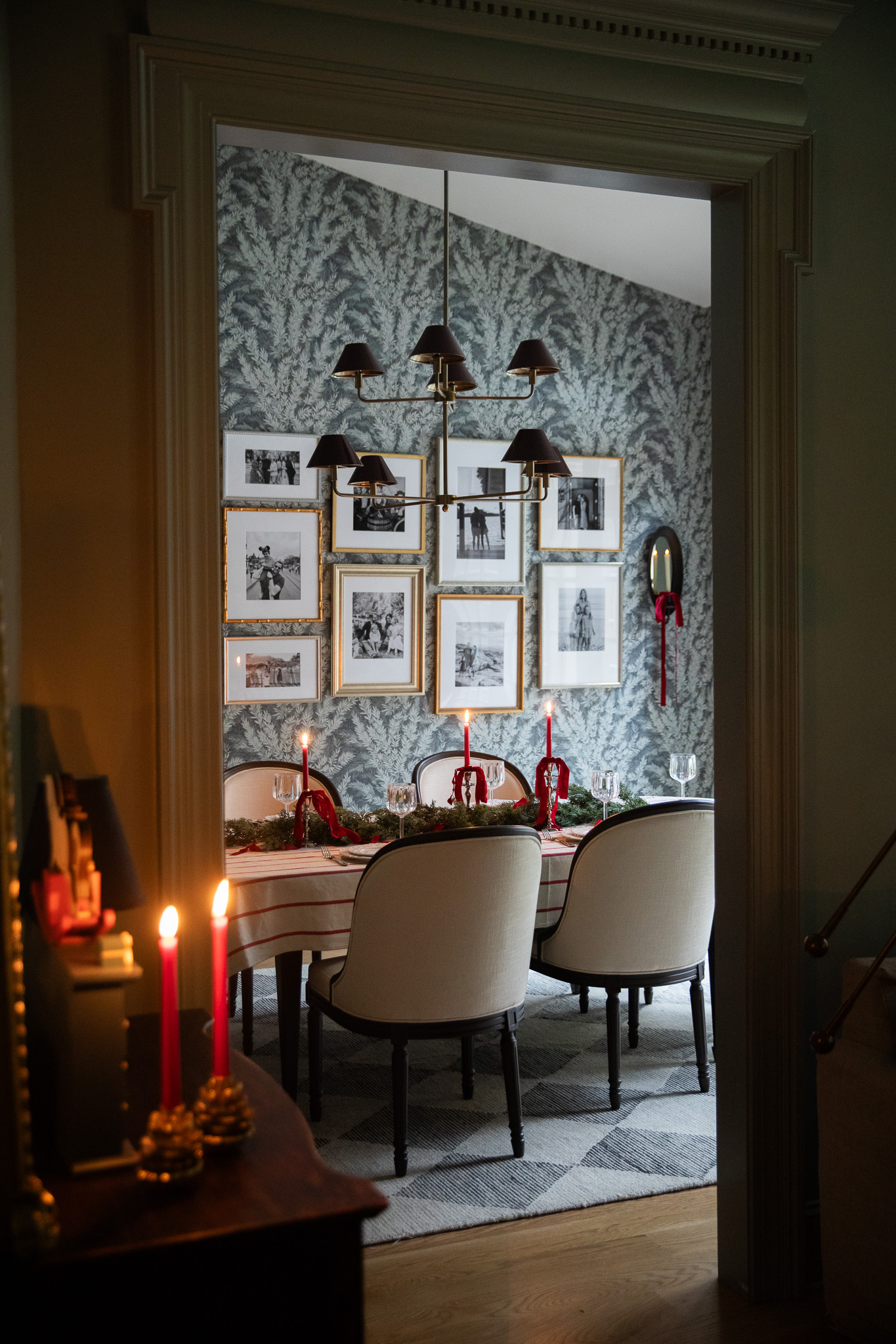
Our homes should reflect us, and the best way to make your home feel unique is to bring your own taste and personality into your home. It's going to be unique from person to person. Adding a little something sentimental, nostalgic, or quirky into our spaces makes each space uniquely ours. A lot of times people think "you" means a family photo and it can — look at our dining room! We have a whole wall of family photos in our dining room and it makes that room feels personal. But it can also be a souvenir from a trip, a small framed picture that's meaningful, or it can be a collection that you have. Like if your grandma had copper pots so you collect copper pots because they remind you of her. Someone looking at that collection may not know that story they may just think it's beautiful, and that's ok, because that's what makes your home yours. You can even have sentimental art that was gifted, like little houses, name or number plaques above hooks. What little personal touch can you add that makes it unique for you and your family? These things they don't have to spell out "Me! I live here!", but these pieces really create stories and make it feel personal everywhere YOU look.
L for Lighting

When we're talking about lighting as styling, it comes down to setting a mood. Which means choosing bulbs that are functional for the space — whether you're trying to achieve a level of brightness or you're trying to soften the look. Choosing the right color and brightness of bulbs enhances the features of the space and creates the mood that I want it to have. I'm also going to throw dimmers into styling because they can really make a space. I rarely have the living room light all the way on! While some spaces lend themselves better to a lamp than others, I always try to add multiple sources of light in just about every room. Whether that's an overhead lantern and a picture light in a mudroom or a chandelier and an oversized lamp in a bedroom, it's important to have options to layer light if at all possible. It really makes the space feel dynamic and more interesting.
I for Inviting

Shop The Bonus Room
This can mean different things depending on the space, but you always want to think about what's inviting. This can mean layers of blankets or rugs to create a soft feel. Candles (real or electric) can feel inviting too. A place to set things down such as a coat rack or catchall tray often makes it feel welcoming. Think of what makes your life easier and what feels good to guests. Perhaps you need to add a vase of flowers to brighten your mood. Or maybe you have a favorite scent going in your diffuser. It's all about what makes you feel happy to be at home.
N for Necessary

Think about what's necessary in the space you're styling. Most of the time, that means storage! For the entry that could be a little tray for shoes or catchall dish. Storage doesn't have to be closed necessarily, it's something that can corral the less beautiful things (keys, sunglasses). A credenza is great for an entry to wrangle stuff that tends to gather there. Every space needs stylish storage. Also, every space needs a stack of something to create a sense of visual order. In the kitchen that could be footed pedestal with a cruet and candle on it. Or a bookcase that has a stack of books with a weighted sculpture. It's about creating height and balance in your styled space.
G for Greenery

Shop The Living Room
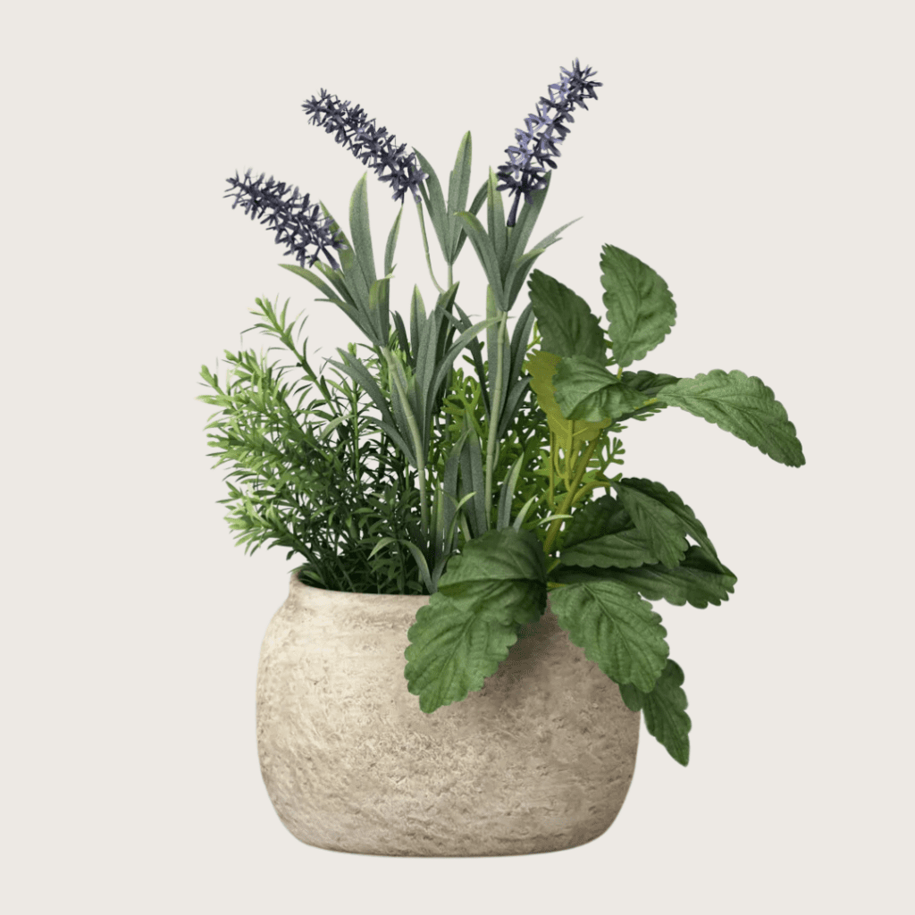
I do think that you need something green in almost every space. Greenery just relaxes the mind and provides a connection to the natural world, even if it's through a faux plant or vase of stems. Don't be afraid to mix faux and real plants, if that's your style. I tend to go for neutral stems in whites and greens so they are more of a background element and not the focal point. This makes the space feel more open.
You can learn how I apply these principles to the spaces in your home with each of the lessons below:
Week 1
- How To Style An Entryway (Including The Front Porch & Powder Room!)
- Transform Your Entry At $150, $350, Or $750
- Peer Review: Inspiration For Styling An Entry, Front Porch, And Powder Room
Week 2
- How To Style A Bedroom
- Transform Your Bedroom At $150, $350, Or $750
- Peer Review: Inspiration For Styling A Bedroom
Week 3
- How To Style A Living Room
- Transform Your Living Room At $150, $350, Or $750
- Peer Review: Inspiration For Styling A Living Room
Week 4
- How to Style a Kitchen
- Transform Your Kitchen At $150, $350, Or $750
- Peer Review: Inspiration For Styling A Kitchen
Class dismissed!
If you'd like some "extra credit", check out our past sessions including Color School and Fall in Love with Your Home.

WE'RE CHRIS + JULIA
Portfolio
Projects
