Every once in a while, amidst several projects going on around here, I like to reach out and help a friend solve some design problems going on in their casas. I received an email from Tanya wanting some advice on the layout and vibe of her space. She writes:
Jules,
Thanks so much!!! There's a couple things that are throwing me off. Do you see the shape of the wall where the couch is? The couch fits perfect there, but I don't know if that is the best piece of furniture to be there. I put the TV across from the couch, which is off center between the windows. The chair that I have will probably be going to goodwill soon. I want to replace it with something not as oversized (because it doesn't seem to fit). Also, there is a light fixture to go over a table. I use to have a dining room table under it, but sold it. I'm not sure if I should go with a round table, pub table, or nothing at all.. just bar stools at the counter. Right now the oversized chair has been pushed into the dining area. I have the hardware to hang the flat screen on the wall.. but where should it go?? Some other DIY projects I plan on doing (just to keep in mind) The curtains are going to get a trim on the top and a piece of fabric along the bottom (something so they don't blend with the wall). I was also thinking of raising them to the ceiling. Also, I think the rug is too small. I was thinking of getting a large piece of canvas and painting it a bold color/print using a wallpaper stencil. Any thoughts on those projects would be great too ;)
Thanks! Can't wait to hear your ideas :)
Tanya
And here is Tanya's room in it's current state:
I had so much fun dreaming up ideas for this space. First, I would definitely move a few things around. Starting by swapping the placement of the TV and couch. I know I know, the couch fits perfectly back in that nook, the only problem is (as you can see from the center photo) your beautiful couch and the awesome art work above it, basically doesn't exist. So do a swapperoo there. Since the art will replace the clock, put the clock where that picture is on the right of the couch. As for that picture, it needs a new home. Making a duo of frames right by the barstools (you may need to move your existing one up) will look polished. And that chair--as comfy as it looks--needs to go stat. It is too big for the space. I'd say put it on the online classifieds (along with your area rug) and sell it to help finance some of the other changes that I have planned for this room. Onward to those ideas:
From reading your email, I got the idea that you are looking to punch up your space a little bit with color and pattern. I ran with those ideas and tweaked a few things.
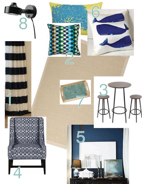
1. You were right, your curtains need some help and it seems like you are willing to do a little bit of work. First things first. Move your curtain rod up until it is nearly at the ceiling and buy some white or creamy fabric that will reach all the way to the floor. That might be a lot of fabric, but plain white fabric you can get for really cheap in the clearance section. Horizontal stripes are real hot right now in a lot of contexts, and I love the idea of you painting on your own curtains. Choose a gray-beige fabric paint and tape off thick horizontal lines and go nuts. You will be left with custom, contemporary, stunning curtains. And p.s. I am already thinking of where I can do this in my house. (Here's a tutorial on how to paint curtains.)
2. You mentioned that you wanted to paint an area rug--but I think something plain and neutral like this 5'x7' from Ikea (just $30!) would draw less attention to your floors while still providing some eye candy if you happen to look down.
3. Once that oversized chair is sold, there will be space under that dining light for a little table. When you mentioned a pub table, I was immediately sold on that idea. I'd go for something small and minimalistic like this one I found on overstock for $91. It won't take up a ton of space, but it definitely belongs there. I would love to see some flowers mimicking the ones in the art on top of the table in a clear vase--but what girl wouldn't.
4. Next thing I'd die to see in this room is an accent chair--or two. :) Where? Right in front of the sliding doors. I used to think that you couldn't put stuff in front of sliding glass doors, until I did at my mom's house and it worked really well! 6 inches away from the door and you're golden. I don't expect you to go out and buy the chair I have pictured here, let alone 2 of them at a whopping $899/piece. But when you are looking for chairs, look for a patterned piece in navy and white.
5. I noticed you have a beautiful light blue theme going on with the art, pillows and even the paint under the bar area. I love it and commend you! This dark blue accent wall would look h-o-t on the wall where I have the TV now going. It would be a great anchor and compliment to all of the lighter blues, too.
6. Speaking of those lighter blue throw pillows, let's get them some friends with spunk. Keep all of your pillows but add some more with fun prints, pictures, and colors. A multi-colored one with a mix of light blues a dark blues. A white one with a dark blue print. And a punchy green one would be perfect.
7. If you are going to store things on top of your ottoman, go with a tray that goes with your decor. Target sells this one that would be a fun and functional little accessory to have on display.
8. Lastly, lets talk lighting. The overhead lighting in this room seems harsh. I would love to see a floor lamp in the corner next the couch and your new chairs. But even more importantly, lets spotlight that art and couch. Lining up three of these above your art and the couch will not only draw eyes to the most beautiful part of your room, but it will make the entire space feel more cozy and inviting.
Psst...missed some of my other dilemmas solved? Check out Andi's, Meagan's, and Jenessa's.
Leave a Reply

WE'RE CHRIS + JULIA
Portfolio
Projects








i love the whale pillows! and the bold curtains. nice work!!
The wall lights are incredible! Great room design, and great blog!
The wall lights are incredible! Great room design, and great blog!
That is AWESOME!!!!
You need to be on HGTV... lol