Shop Greta's Room
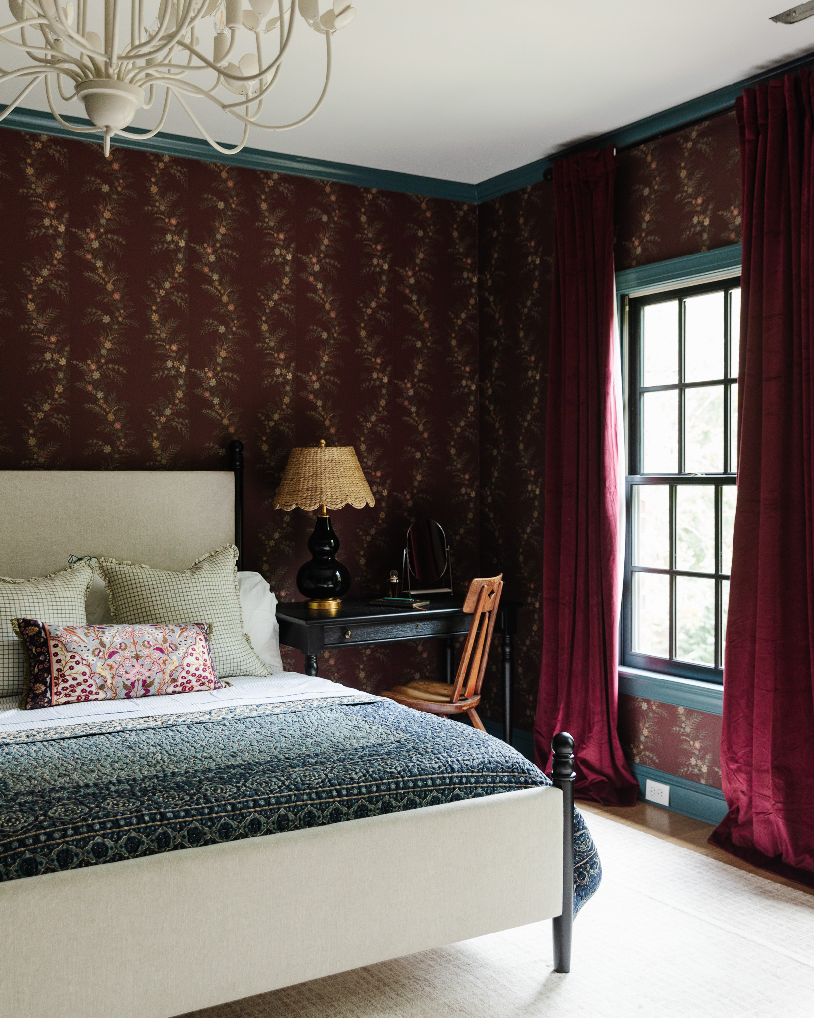
This year has brought big transformation to Greta's room. She really wanted to move away from the baby pink into a more sophisticated, teen-girl room, and she gave me pretty much free reign to redesign it for her. It's been so much fun picking out wallpaper, trim color, and lighting to change the backdrop of the room. We were just waiting on some furniture pieces and drapes...and last weekend, we knocked off a few more elements to her room!
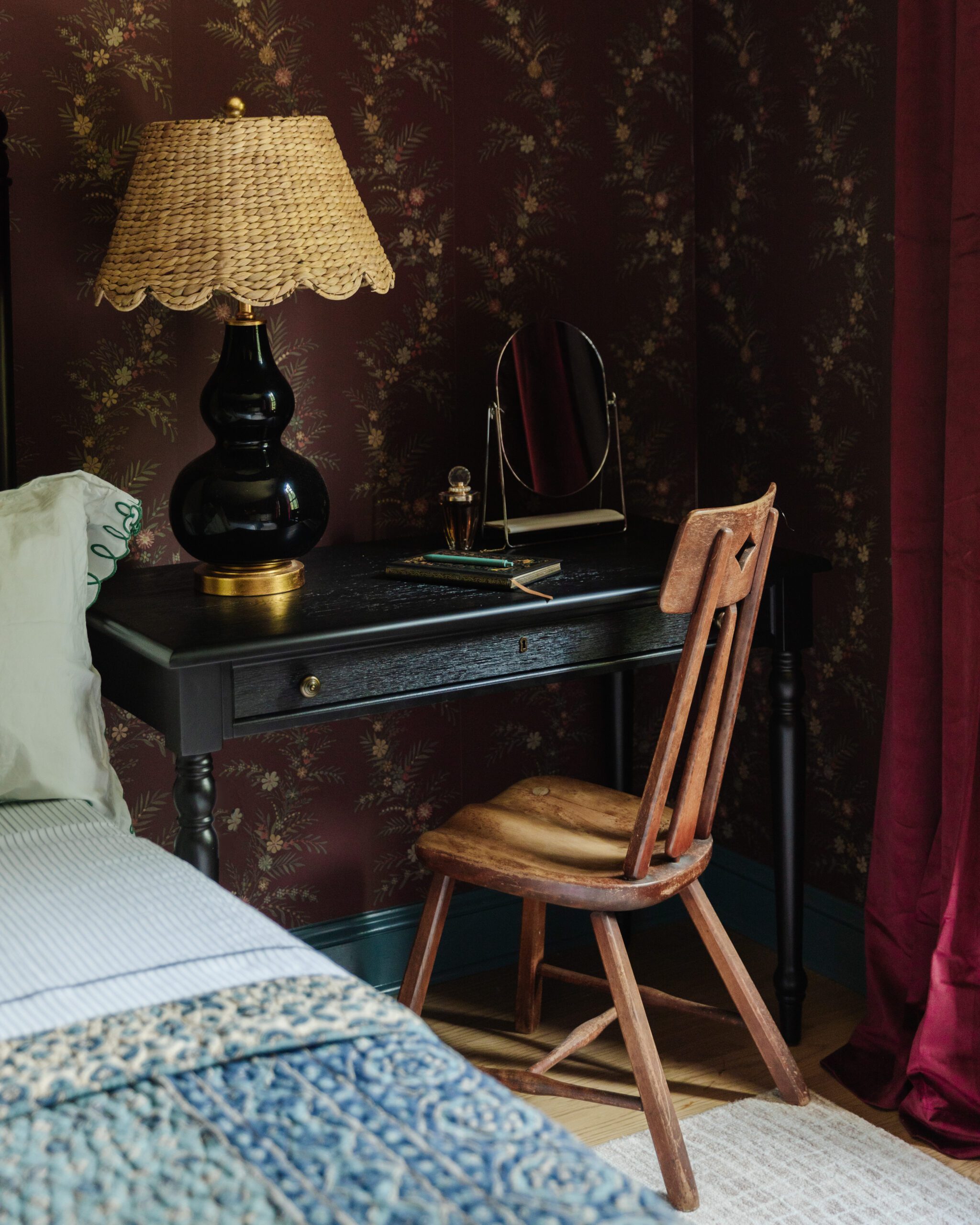
Writing Desk | Chair (vintage) | Lamp | Scalloped Lamp Shade | Vanity Mirror | Wallpaper | Velvet Curtains
First, the writing desk. It's from our new collection with Pottery Barn, and we designed it with our home in mind! The onyx finish is so modern, yet timeless. The turned wood legs are even more stunning in person, if that's possible! Greta loves to draw art in her room, and this piece has a drawer that could be used for her tools and trinkets. I love thinking outside of the box with furniture, so to maximize space, we placed this piece like a nightstand on one side of her bed.
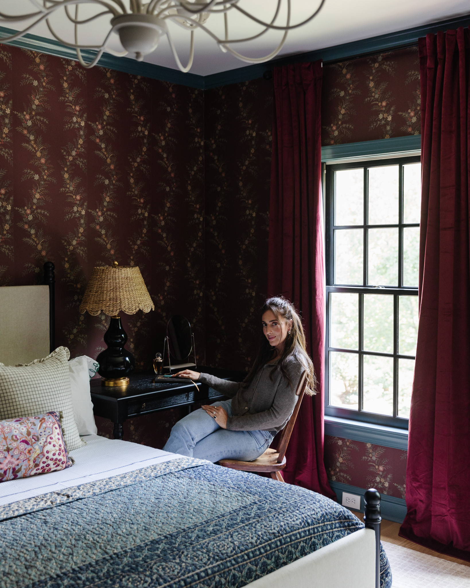
Second, the drapes! They can be really expensive and beautiful (it's a lot of fabric after all), but they can also *look* expensive and beautiful. These velvet curtains totally fit the latter—they add so much warmth to the room with a tone-on-tone effect. I was considering some golden-hued velvet curtains for the room, but it was too much "hey, look at me I'm a curtain!". Not really the vibe I was going for in the room. But these burgundy drapes really provide the perfect light-blocking quality and cozy feel without calling too much attention to themselves. I got the 108" length so I could hang them high to the ceiling and elevate the eye to the room's height.
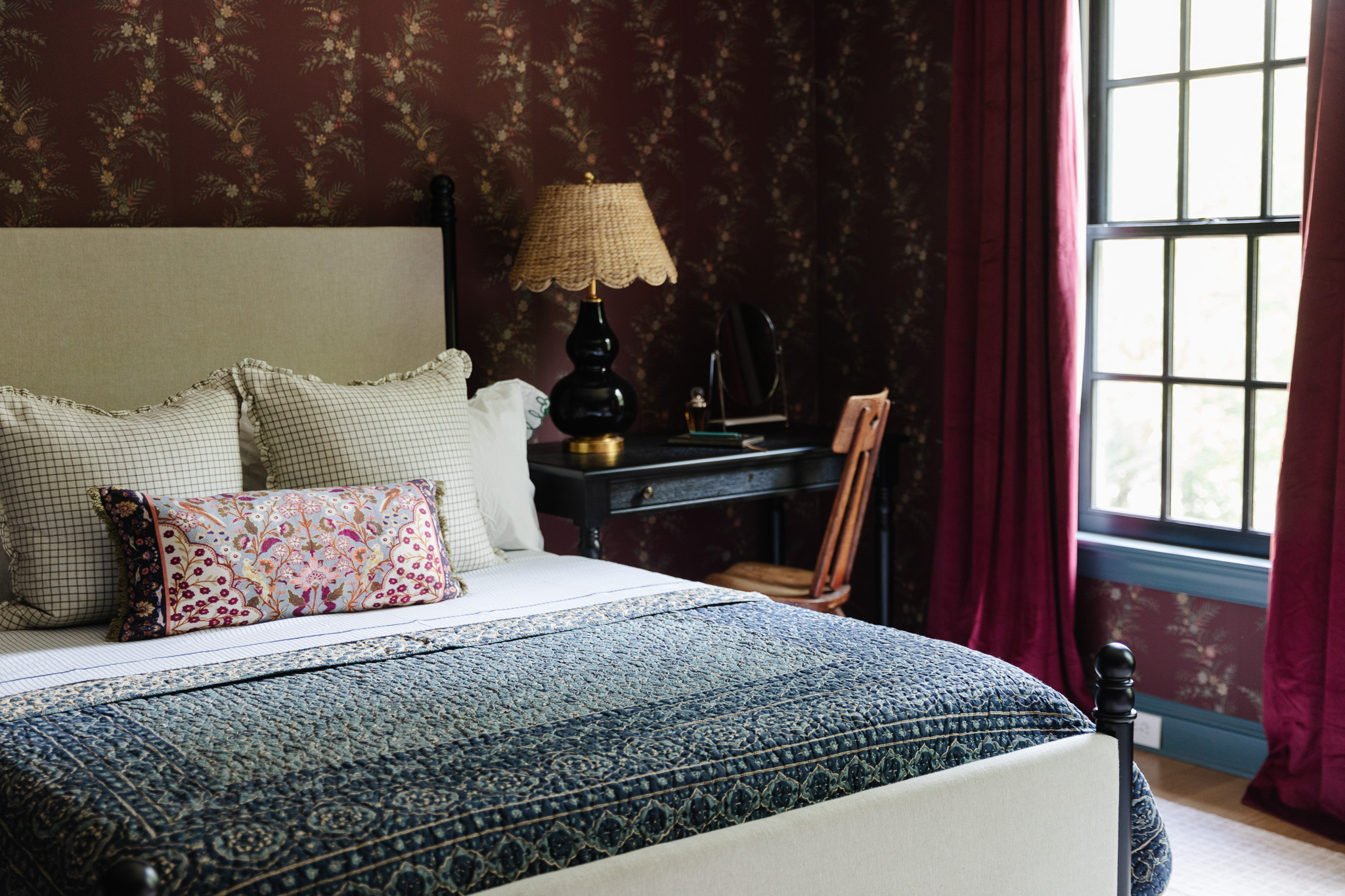
Modern Traditional Bed | Quilt (similar) | Lumbar Pillow | Dinah Pillow | Looped Pillow Sham | Briggs Blush/Ivory Rug
And at last! We outfitted her space with the crowning jewel, the bed. In designing this with Pottery Barn, we took a traditional bed silhouette and added a modern touch of black with ball finial accents and a rich wood finish in onyx. The linen headboard and footboard are just so inviting and pair perfectly with other patterns on the bed. It feels meant to be to complete the room!!
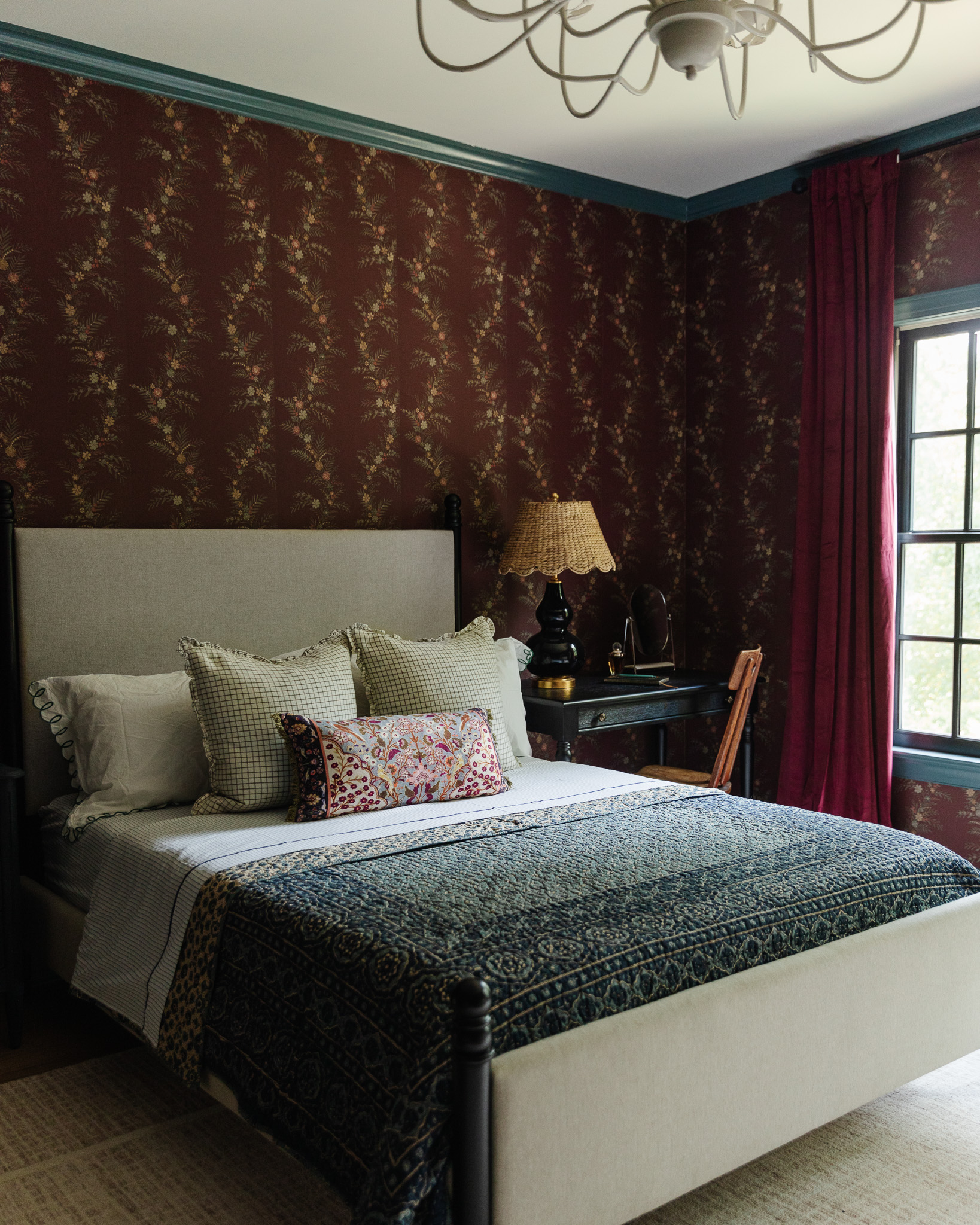
Minutes after we added these touches to the bedroom, Greta said she thinks her room is cool now. Uhh, are there any words more meaningful to a home renovator/mom's ears than those!?! I love treating my first little girl to a room that makes her proud.
Go back to see how it's changed over the years!
Leave a Reply

WE'RE CHRIS + JULIA
Portfolio
Projects







The finishing touches are so chic—love how each piece reflects Greta’s style while keeping it cozy and functional!
The nice thing about style, is everyone can have their own! In my mind, design accounts are here for people to find inspiration. Look for things you might not have thought of, develop your own style, and yes, even to identify “don’ts” for your own house. But I don’t see the point of negative comments. Take what you like, leave what you don’t. It’s that simple. Greta’s room is lovely, and if she’s happy with it, that’s all that matters. Now what I REALLY want to know is, does she keep it that clean?!! 😉
Your design here reminds me of the whimsigoth craze.
I think the original transition of this room with the new wallpaper looked best. The room did not feel cluttered or overwhelmed by too many patterns and the windows looked beautiful by themselves without any window treatments at all. In this case, I think the long red curtains overwhelm the windows and that a window shade would compliment them much better. Also, the old braided style bed flowed perfectly with the room because the bars allowed for an unobstructed view of the wallpaper. Although the new bed is beautiful, it has now become the focal point and distracts too much from the beauty of the rest of the room. Lastly, those original blue throw pillows were such a wonderful accent to the bluish trim.
Greta has had some pretty amazing bedrooms over the years. I still remember her bunk room from the Idaho Rambler house. What a lucky girl.