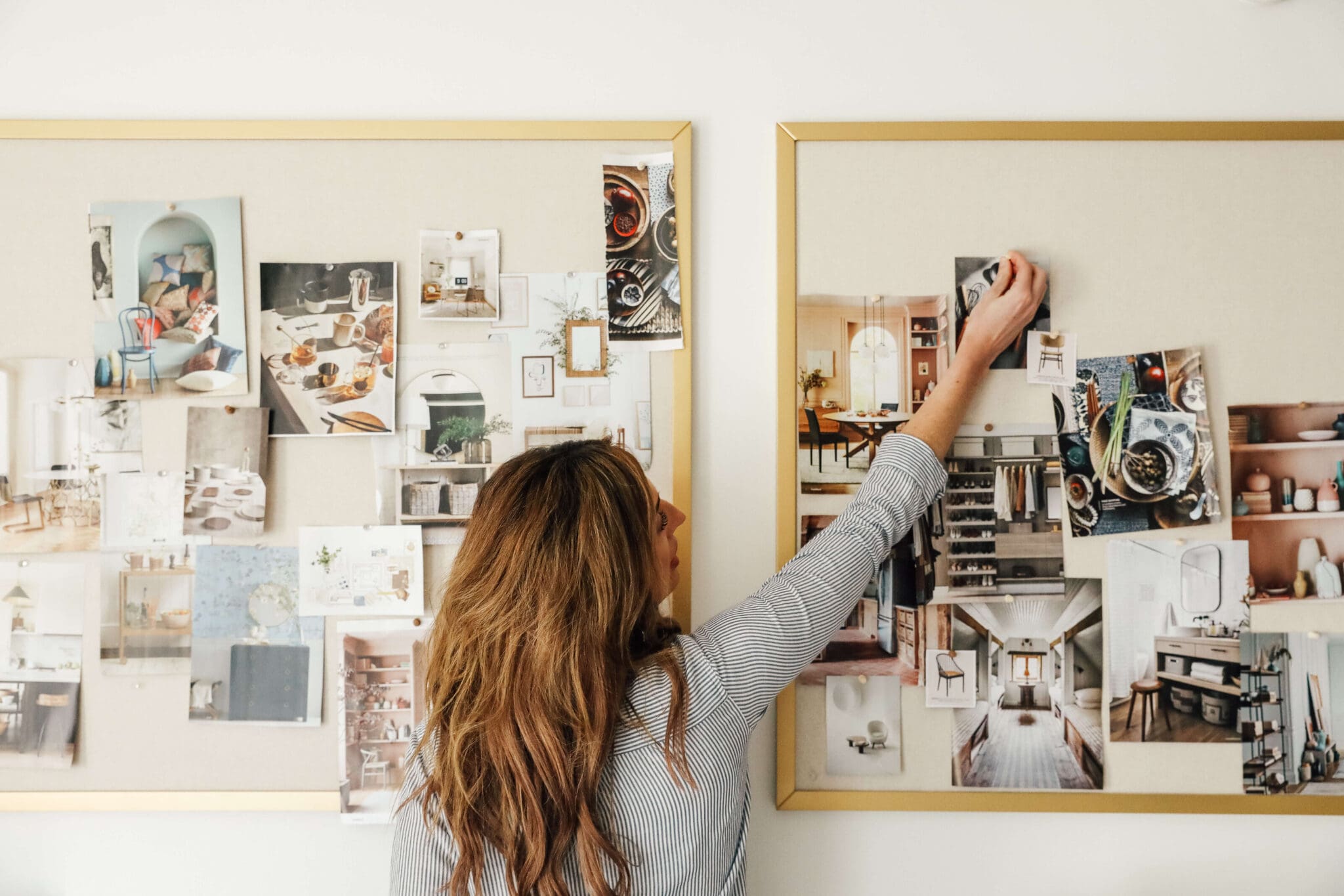
It feels like a big day around here. After so much planning and preparation and mulling over photos and looking at samples and making so many decisions (and going back and forth on those decision)--we finally have the mood board for the master bathroom! And 99% of of it has been ordered and is on its way, too. Demo starts in 12 days. It's really happening! And this is what it's going to look like:
1. Floor Tile
2. Art
3. Mirrors
4. Countertop
5. Vanity Color
6. Wall Sconces
7. Cabinet Hardware
8. Water Closet Wallpaper
9. Flushmount Light
10. Toilet
11. Shower Floor Tile
12. Shower head
13. Valve Handle
14. Shower Wall & Ceiling Tile
15. Sink Faucet
16. Rain Shower head
When I'm designing a space, there's usually one thing that I base the whole room off of, or that really helps the room come together. And for a long time while planning this bathroom, I was missing that thing. I was basing it on compilations of things I liked, but nothing felt like me or our home until I thought, "What if the shower wasn't marble tile. What if it was something deeper and moodier?" Within 15 minutes, I was excited about the direction of our bathroom as a whole, (probably because it had a direction) for the first time. After I found that pretty, deep, greenish, varied tile (Loch Ness from Fireclay Tile--the second one from the left in the screen shot below)--it all came together.
And then we learned that Fireclay has two clay body types--white and recycled. The white clay bodies (which Loch Ness is made on) is not suitable for steam showers (or pools) and recycled clay bodies are. I've never been on team must-have-a-steam shower (we're already having two shower heads and a rain shower for goodness sakes), but it was in our plan because Chris was absolutely on board with it. To my surprise, Chris said he actually would rather give up the steam shower to have that tile because he loved it so much (music to my ears!), but then we learned that Fireclay could use the recycled clay body, add an engobe layer and then the Loch Ness Glaze. It would change the appearance only slightly, but it would add a few weeks on to the lead time. I'm leaving it up to Chris. I'm fine with either. A couple extra weeks to finish our bathroom that we have waited 4 years to do is insignificant in the grand scheme of things.
As for the other areas of the bathroom needing designed, there were three main areas to tackle.
1. The shower area. This really came together after we decided on the 3x9 tile that will be laid in an off-set pattern and how pretty is that Chain Homme pattern going to be on the shower floor?! We decided on polished nickel as the main metal for the bathroom (with brass as an accent metal) and I can't wait to see all three (!!) shower heads pop off that moody tile.
2. The vanity area. This has been the focus of a lot of our initial planning. Once we figured out the design (see that here), and decided on the color (black), and the countertop (check out that here), all that was left was lighting--where we can't wait to hang 3 of these, hardware, mirrors (love this walnut one that will add some warmth) and faucets (where the polished nickel comes in again).
3. Toilet Closet. The last area that took some brain power was the water closet where our toilet will be. We knew we were going to add a cabinet above the toilet for toiletry storage and it will have a window and...a toilet...and a trash can. It's going to be a tiny room, similar to the one above (via) but when I thought about the bare walls, it made me sad. I told Chris, "It would be fun to add wallpaper in there down the line." And he said, "It will be 100x easier to do that before we add a toilet and cabinet." We agreed on the smoky floral wallpaper pretty quickly once we plugged it into the rest of the mood board. (It's always helpful to plug things into a spot where you can see everything together so you can more easily visualize if they'll compliment each other or not.) This flush mount is well-priced and giving me all the heart eyes--I'll probably get another for our clothes closet when the time comes.
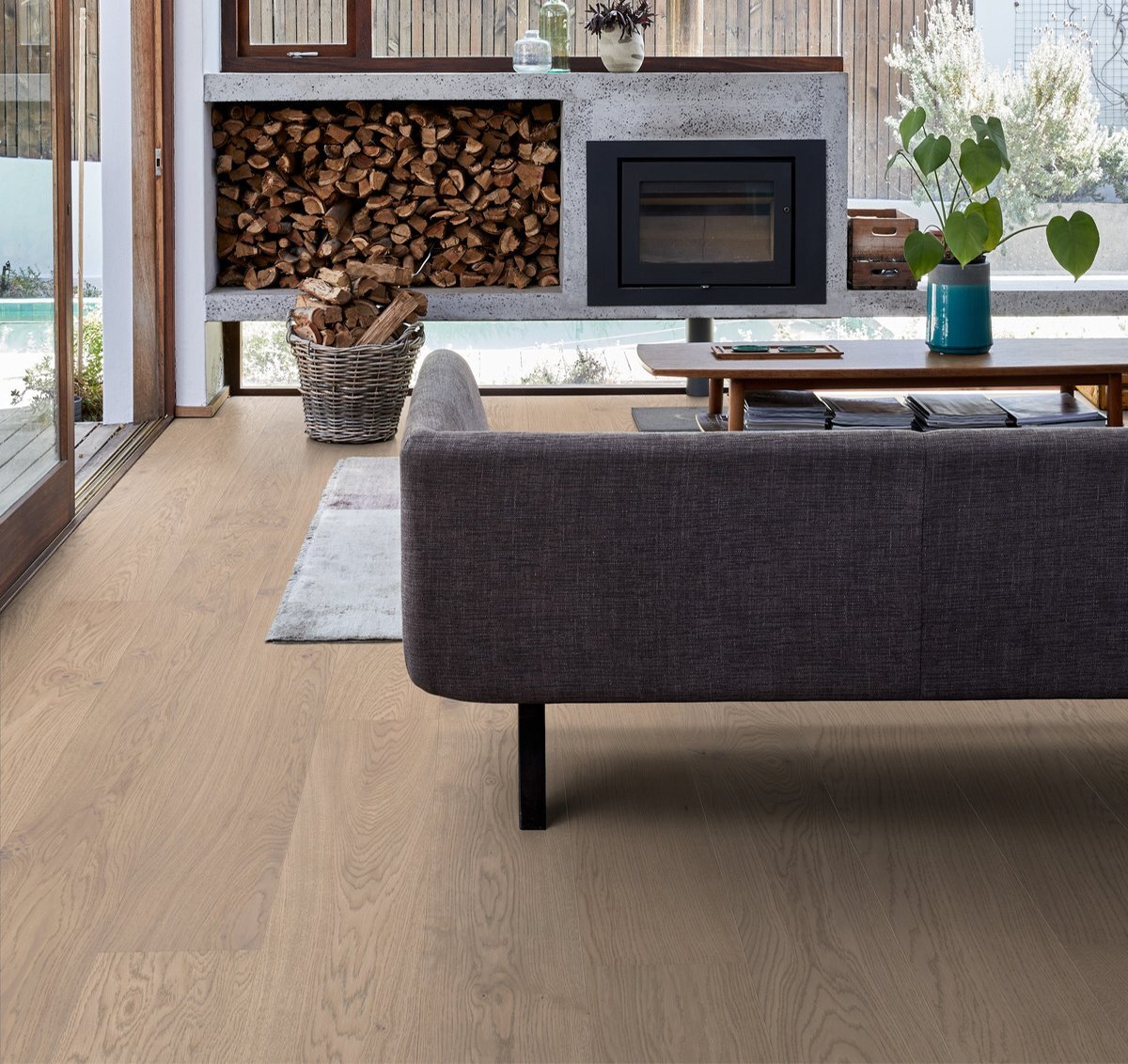
We're thinking (but haven't ordered) these marble floors for the entire bathroom (they'll be heated) and into our closet. And while there are sure to be a lot of accessories, the first I purchased was this vintage painting I found from this Etsy shop. I love a good waterscape painting in the bathroom.
( To save you a scroll )
So that's it. I'm excited and feel so good about the direction. There's still a few more decisions to make but once you have the general design, it's so much easier to know what's right for the rest of it. It feels so much like our home--and yet just different enough to be its own space.
Leave a Reply
WE'RE CHRIS + JULIA
Portfolio
Projects






I’m starting to build a house and I’m curious how you picked your toilet. It’s not something I’ve ever thought about but looking at your master bath remodel you obviously had to pick one- was it random or are you looking for specific things?
Our plan was to have the toilet closet as small as possible, so we were looking for a toilet with a 12in rough in (meaning the hole could be 12in from the wall). From there we just picked one that had great reviews and looked good. Turns out we had to move the toilet out a little anyway because of a floor joist, but we still like the toilet! :)
Hey Julia! I was wondering if you had any suggestions for a bathroom vent fan? I'm having a terrible time trying to find one that is quality, stylish and not dingy off white. Any suggestions? Thanks!!
We got one from Lowe's that looks like a recessed light but it has an integrated fan! We've used it 3 times now!!
What program do you use to put together your mood board, or is it just Photoshop? I need to upgrade from Microsoft Word. :)
photoshop!
When I first saw your print of the girl in the boat, I freaked out for a minute thinking: “Whoah! I have that original painting that print is made from!” Before my grandma died, she gave me that painting which I have always loved. After I saw the print on your moodboard I started down a rabbit hole of researching the painting and it looks like the original artist may be unknown, and many people have “originals” of this painting which was apparently copied a lot and has a different signature on each painting. Do you know anything about the print or did you just stumble across it online and like it? Regardless, it’s such a beautiful piece!
Hi! I was listening to your stories last night and a follower question prompted a question I had...
My husband and I are looking to buy new bedroom furniture (Currently our two dressers are the same furnish but do not technically match, or are not part of a "Set'). We have an upholstered bed and different nightstands that do not match each other (on purpose). Nothing is a set and looks great and works well. However when we purchase dressers (will probably buy two), do we get matching ones, or opt for two different dressers? I was originally thinking the same.. but now not so sure. I don't want it all to look like it was thrown together, but purposely curated :)
Thank you!!
Annie
Ideally, I'd look for one large one or even Ikea PAX wardrobes. Or put two together. I'm kind of with you in that I love mismatched nightstands and the collected look but maybe unmatched dressers would be too much?
Hi, I follow you guys all the time. Don't know if you have sponsorship with McGhee and Co or not, but if you are looking for the EXACT SAME light sconce in a more affordable version, it is here:
https://www.shadesoflight.com/products/mixed-metal-globe-sconce?via=57e1331269702d78ae0000a7%2C58fe650e6170700c00006079
I don't work for Shades of Light AT ALL, just order from them quite often and the quality is amazing. Just thought I'd offer my 2cents if you wanted to save some coin.
I wish it had the white globe!
Saw this gorgeous paper and thought of you! It's a similar price point to the rose, but much less sweet. But who knows, maybe that's exactly why you wanted it, to contrast with the edginess of the rest of the bathroom...
https://jujupapers.com/collections/big-moon
I love all the finishes! That moody tile will look gorgeous in the shower and I love the Purist fixtures. Are you doing a hand shower at all? This is probably going to seem like an odd comment but be picky with the shower arm that you get with your shower head (most places can sell them separately)! I work for a builder and I've noticed a lot of large showers recently with the 5ish inch shower arm and the more modern heads, and the heads look kind of squatty compared to everything else. They just feel too close to the wall even though I'm sure they function fine. The 8" shower arm looks way more proportional to the rest of the space. Can't wait to see how everything turns out!
Great Tip!
This is going to be beautiful. I love all your choices.
This mood board is bananas!! I LOVE every single detail. I would move into this bathroom if it were in my house, and my husband would no longer be the one who takes his time in there ;-). I now need to go rethink everything I thought I wanted for our master remodel(next year, but I take along time to nail down the details). Your eye is always so inspiring and I love seeing how you have developed as a designer over the years. Basically you rock! And I love your appreciation of polished nickel too!
Long time reader, maybe only commented once before.
Xoxo
P.S. totally unrelated but I started following Body by Whitney bc of your recommendation and she is also so inspiring, and her body is beyond! A lot of talent in Idaho!
L o v e the mood board and choices!! I’m getting ready to remodel our master bathroom/closets too. Do you use a general contractor or hire subs on your own, if you don’t mind me asking? :-) Curious about how big is your space? It’s going to be beautiful!!
We usually do all of our own work, but are going the contractor route this time. We hired a general contractor and I'm playing the role of designer.
I feel like this is a knock off version of Mandy Moore’s house. I can’t help but think most of the ideas are from her home and the beautiful work Sarah Sherman did.
Do you think you feel that way because of the green tile used? That's the only similarity I can pull from it (although ours is much darker and varied and will be laid completely different)?
No. Much more. I think it’s the mirrors, the tile, the lighting, the counter, the faucet. Resembles much of the bathrooms. Still looks fab!!!!!! Can’t wait to see it all come together.
Maybe I'm thinking of a different bathroom than you are. The one in my mind Sarah did is really different than how I see ours coming together--although there's no way for you to read my mind either. Haha. Time will tell!
It’s remindinv me of MM too. The dark green tile, floating vanity, rounded rectangle dual-mirror, wall-mounted faucets, three wall sconces... nothing wrong with it just agree with Marlene.
Thank you, Lo.
REally love SSS but I don’t see it either. We’ll have to compare when they’re finished. Love the tile. I can see why it inspured you.
I am so confused! I looked all through Mandi's house that Sarah Sherman is renovating, it indeed is beautiful, it reminded me more of Emily Henderson than Julia. And the only similarity is that there is a green, not the same green, tile in the bathroom. The mirrors from another bathroom (not the green one) are similar, but I've seen them everywhere. And the green was on the wall behind the vanity, not the shower. The lighting, floors, fixtures and overall look are all different. Or maybe it's just me and my cold meds talking, which would explain why I'm commenting (which I never do) and have all this time on my hand.
Either way, can't to see it done!! It has inspired my planning our house build this summer. I too will have no bathtub :)
NAILED IT. So glad you didn't settle on a marble shower. I'm sure it would have been beautiful either way but this design is so inspiring!
SO happy to hear about the Loch Ness tile, I fell in love the second you shared on your stories. Can’t wait to see how it turns out!
I LOVE the shower floor tile! You find such creative and unique items!!
I love all of your choices. I especially like the color of your tile and how it relates to your artwork and the frame to your vanity. The "H" shaped shower floor tile, love it! It's gonna look fantastic, can't wait to see it.
I love the H shaped tile too. I also loved it when Orlando Soria put it in his kitchen and Emily Henderson put it in her bathroom (both about 2 years ago).
Loves this moody bathroom. It feels very true to the Chris loves Julia style and different from the white and bright bathrooms that seem to be everywhere. Thanks for providing some inspiration!
I LOVE HOW YOU’RE NOT AFRAID OF MIXING METALS. It really makes me frustrated when my clients “think” all the metals need to match. Looks amazing!!
I have had my eye on that wall paper for my bathroom and/or bedroom for months now. Can't wait to see how it looks in your water closet!
Now your bedroom refresh makes a lot more sense! The master bed/bath will compliment each other really well! Can't wait to see the end result.
Very much in love with this!! Would you consider creating a "look for less" moodboard for the master bath? Not to steal ideas...but I love how Emily Henderson will do budget moodboard posts that hit different price points. I'd love new lighting in our bathroom, but my budget isn't quite McGee & Co level (yet!).
I'd love to work on that!
I'd like to second this request! I don't quite have your budget, but would love to see a look for less- like you did with Polly's nursery!
I third the request. I love McGee & Co too but just bought these (Christo Sconces from Wayfair) similar lights. https://www.wayfair.com/lighting/pdp/langley-street-christo-1-light-wall-sconce-lgly3668.html
I forgot she did that with Polly's nursery!! <3
Arizona tile has a color called Pearl in their H-Line series that is very affordable and would be a good value option for your wall tiles. It’s got a varied glaze in real life (though you can’t tell from their pics online!) and I’ve used it a couple of times and Just love it. It’s got more of a brown base than a blue base (though still totally reads as green overall). Worth a look, at least!
High Street Market has a nearly identical sconce to the one you featured at half the price. I used them on my bath renovation and they are super high quality! https://www.highstreetmarket.com/collections/wall-sconces/products/french-bistro-single-sconce-with-white-glass-antique-brass-and-bronze
Gorgeous! Did I miss somewhere what color the walls will be (other than the wallpapered wc)?
I usually choose a paint color last. It's the easiest thing to adapt in a room. We'll probably go with something similar to our bedroom color, but not 100% nailed down yet.
Love that you guys are sticking with your moody style that we all know and love!!! So excited to see it come together!
Love it all! I have a heated ceramic tile floor in bath with no probs. Have wallpaper in bath, no probs. My only thought is soap scum and water drops showing so well on dark tile. I lived with that issue for awhile with older tile and it made me unhappyt. My bff currently is now living with that problem in her recently made over bath with brand new dark tile. So just wondering about that. It all is beautiful!
It's something we're definitely aware of and prepared for and will definitely keep everyone posted as we live with it.
Did you ever think that that moody green color on the tile has a lot of the same notes as the original wall color in the master bedroom? Now that you've painted the bedroom lighter, you must have subconsciously been missing the moody green tones of color!
It reminds me more of the green reading room in our house!
I LOVE your mood board! It looks great and I think I may steal some ideas from you! I wanted to mention a few things to you, since you haven't started your construction and haven't bought the floor tile. My best friend has a heated floor and her some of her marble tiles have cracked and quite a bit of her grout has cracked as well. Probably due to the heating factor and possibly the wrong adhesive and grout. I am sure there is some type of adhesive and grout that should be used under a heated floor, so make sure you look into that! I have marble in one of my bathrooms, and it is VERY slippery. I'm not sure if that will be a concern of yours or not. Mine is in a second bathroom that doesn't get used as much, but someone always slips in there! Last, think about an exhaust fan for humidity and odors! Esp in the toilet area! Ha ha! Looks great and love you on instagram too!
With the general level of humidity in a bathroom are you concerned at all about the long term condition of the wallpaper?
The wallpaper will only be in the toilet closet, so we're not concerned.
Love it! So moody! Can't wait to see the finished product. When do you think you'll have the bathroom complete? Curious how long a renovation like this takes with a Contractor. Thanks for sharing your plans with us!
Right now, April 19th is the scheduled end date--but it may change if we decide to do the egobe tile.
First, let me say how much I love your plan. But I wanted to say that you won’t regret your toilet choice. We have one that’s very similar and it’s made keeping the bathroom clean so much easier. You’re going to love it!
I hate ~95% of flush mount lights, but need to replace some of them in my house...thank you for sharing one that is actually gorgeous! I'm excited now!
I love the mood board, but just want to warn you - you're going to need A LOT of light to not make it feel dark and closed in. We redid our master bath several years ago and used peacock slate for a huge shower - 8' wide x 4' deep or something crazy like that. Tiled up to and included the ceiling and the header on the outside (in other words, it could be a steam shower if a future owner were to choose to do so). We also used dark cabinetry, but did use light flooring and counters in the bathroom itself (some type of limestone that the name of is long forgotten). I totally regret it now, because it is like the dark hole of a shower (and this is with THREE can lights IN the shower). We have three light fixtures outside the shower also, and pretty light colored walls and the shower just seems to suck the light in. I will say our bathroom only has one window, so that will make a difference, but I just wanted to give you a heads up that it will be really easy for it to feel dark and closed in.
Our shower has a huge window in it, and the water closet. That was a concern of mine, too.
I love everything about this! What color will be on the walls?
Probably the same as our bedroom.
Very nice! I had to double check the mood board. I thought #5 was a flatscreen TV. :D
Hahaha!
It's just so good! Question: does the shower wall tower have a bullnose? If not, what is your plan for the edges? I'm facing a similar dilemma in our upcoming bathroom reno and am desperate for suggestions!
We're leaning bullnose but exploring other edge types too!
I’ve done Schluter edge pieces in my kitchen and bathroom in lieu of bullnose pieces and LOVE that the tile extends the whole span and there’s no new pattern.
We're looking into that option, too!! I need more Schluter inspiration!
Love it all! Do you think polished marble on Thebes floor will be slippery?
Loving all the selections! In the shower, are you thinking of doing a contrasting grout or a similar color to the tile?
Very low contrast
We have a dark gray slate mosaic shower floor with a charcoal grout - we wanted the grout lines to add texture, not pattern, if that makes sense. But soap suds dry and emphasize the grout lines with white streaks. You’ll need a daily effort to rinse all soap completely down the drain if you want to avoid this.
I still love our shower floor and much prefer this problem to dingy white grout lines, but still. . . Just an FYI.
Ohhhhh, I'm excited about this. Can't wait to see it come together!
The mood board is gorgeous. It's going to be a really special room. Odd question: Weren't you planning to use a different tile before (blue green instead of grey)?
It's a blue-green gray.
Gotcha. My phone tends to skew colors a little (or a lot). Best of luck with the reno. I hope all goes well.
This is just stunning! I can't wait to see it all come together!
As usual, gorgeous! So excited to see it all come together! I love that moody tile, so much nicer than black marble.
This is gorgeous! So luxe! Have you considered continuing your wood-look tile into the bathroom and closet? I noticed there aren't any wood tones on the mood board; continuing the current tile would definitely bring some continuity into the bathroom and would warm it up a ton!
We did think about that, but just didn't love the look. The mirrors are actually walnut and there will be some basket tones, too.
Are you putting a fan in the toilet closet?
yes
It's not going to be a "pretty " bathroom, but more on the "handsome" side of the spectrum. Walks the line between masculine and feminine in a very classic / modern way. I'm excited for you. You've put a lot of thought into this and pushed the pencil around a floorplan or three. I'm hoping this all comes together and makes you happy for as long as you own your house.
Love love love ❤️ Can’t wait to see it!
Spectacular tiles! And a flush mount that's actually pretty?! This is going to be smashing.