
When I tell you my jaw hit the floor when we rolled out the mural wallpaper...I mean I squealed out loud!
The music room in our last house was kind of a pass-through room. It was small, and the only thing that could really fit in it was a piano and guitars, so we added in our record player and some swivel chairs and it became this all-encompassing music room. It was located at the heart of the home, and music radiated from that jewelry box of a room.
This room, in our new house, is right off the entry had been given the title of "music room," but the more we adjust to living here, I imagine this room having more function and purpose to it. Yes it's where our pianos and guitars will likely stay, but I also imagine it being a great place to work from home, meditate, journal–a study if you will. This calls for a desk!
It's also probably the only room in our house that's not a pass-through room. It's tucked into its own corner right off the entry, but I don't want it to become a room that no one's allowed to touch, or that no one uses. So the music room is getting a bit of a re-branding and will now be referred to as the study (i think!), which feels very fitting.
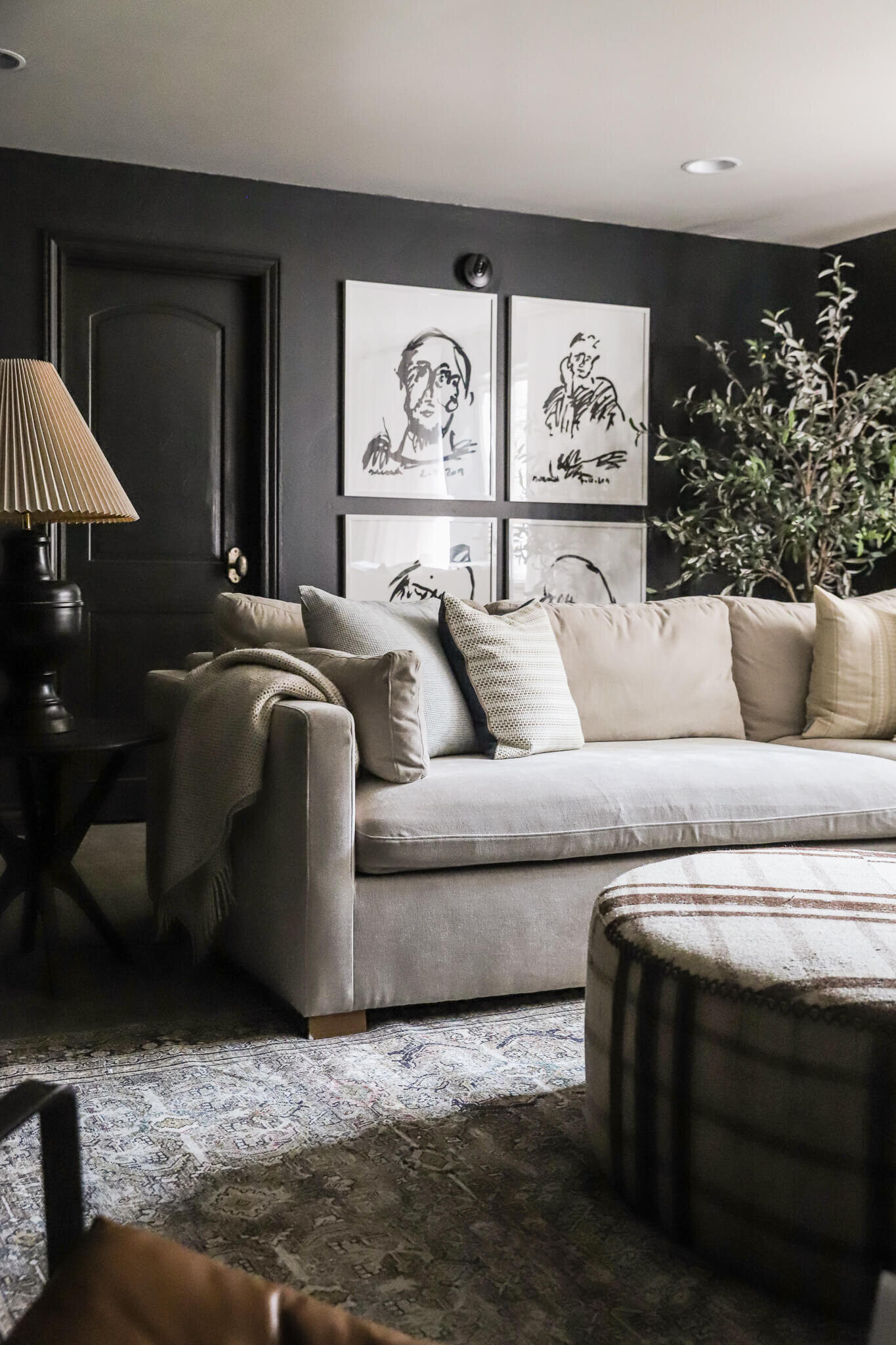
Here's a reminder of how the room looked before we started wainscoting and wallpaper install.
A Before Look
Rug | Ottoman | Lounge Chair | Throw Pillow | Upholstered Chair
Before Before
If we rewind to just after we bought the house, this is how it looked! I sometimes forget this room used to have an entrance into the primary bedroom! We closed off the door and our bed is on the other side of that wall now.
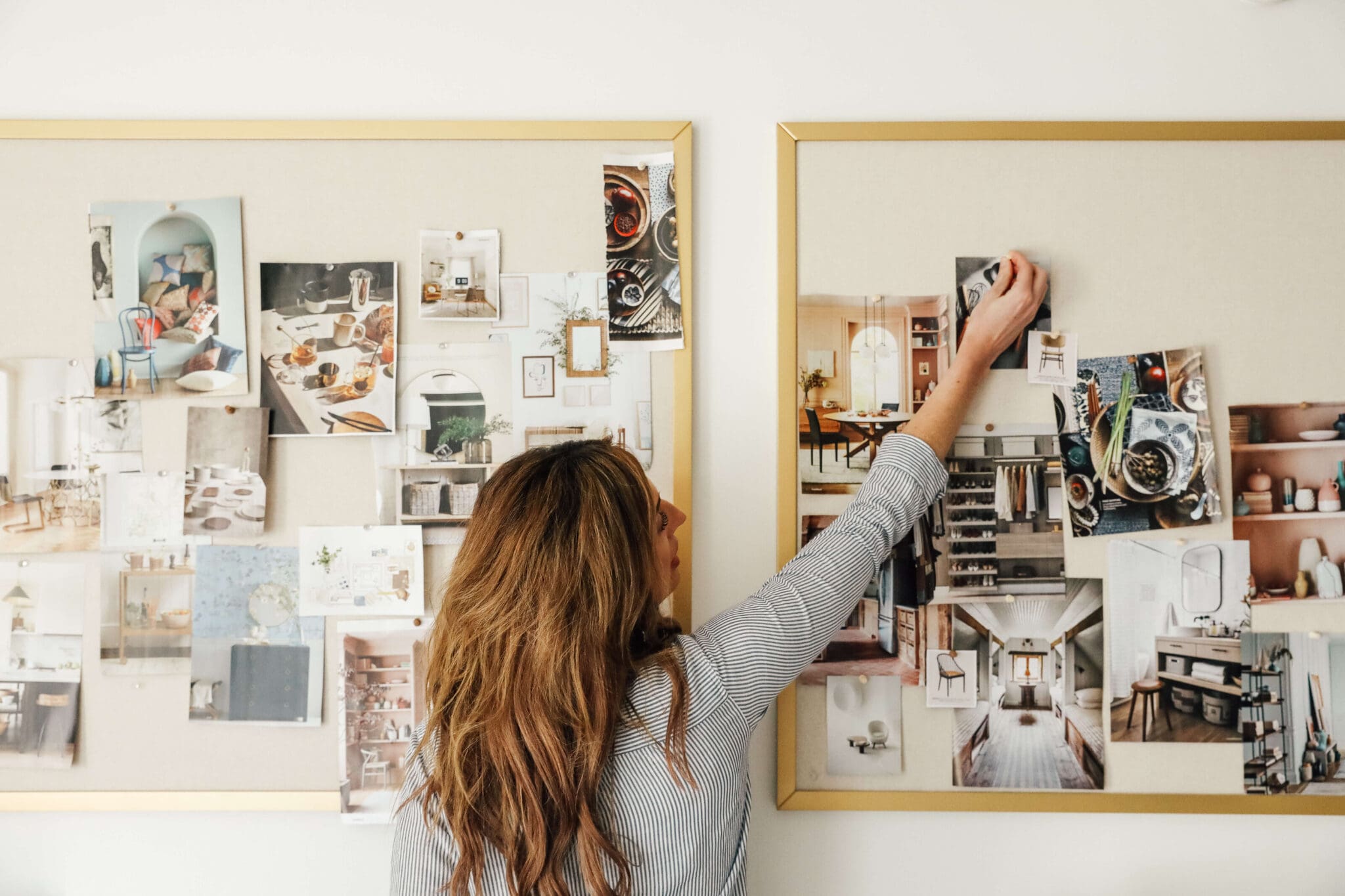
If you have been following on Instagram stories, you've probably seen the wainscoting installation taking place, a peek at the wallpaper, even a peak at the paint color, but I wanted to share more of my vision for the space here! I love making these mood boards to piece together my overall vision, and to share a visual of my plans with you all.
A Mood Board for The Study
Mural | Chandelier | Desk | Table Lamp | Chair | Marble Side Table | Scrunch Lamp | Rug | Leather Chairs | Fringe Stools
Paint Color: Sheraton Sage by Sherwin Williams
Sometimes when I'm creating a mood board, I like to put every item that's going to be in the room on the board. And sometimes I put in a few key elements, wait to see how the room comes together, and go from there. I have found the rooms I'm most happy and content with come from detailed mood boards. This mood board is somewhere in between!
I really wanted to include something vintage, and I found a pair of vintage chairs on Chairish and checked out so fast! I've also had my eye on these fringe stools from McGee & Co. for some time. They're still out of stock so this is kind of a "one day" thing–which I'm fine about. We originally got this chandelier for the dining room actually, but once I found the mural, I had to put them together. It feels like a cloud in the sky which feels fitting with the mural, so I pivoted and I still get to use my dream chandelier!
One thing that I wanted to do but didn't (yet) was put sconces on the wall. I was thinking of doing that before the mural, but I was so afraid they would end up in a really weird spot with the wallpaper. I decided to wait until the mural's up and see how the room felt without sconces. Maybe table lamps will suffice. And if I still want to place some, seeing where it would land on the mural will be really helpful.
It's fun for me to look at this and see where we're headed. It's also okay to me that it might be a little bit 'till we get there. The main elements are in place–the wallpaper, the paint, the rug, the chandelier. Can't wait to see it come together!!!
Leave a Reply

WE'RE CHRIS + JULIA
Portfolio
Projects










I can't get past the chairs, they're so western rustic with the distressed peeling leather and the nails/studs. Love the light
Another option for your room could be The Front Room. Cambridge Dictionary defines it as "a living room (room in a house used for relaxing, but not for eating in) that faces the road". The Front Room has a traditional feel to it, which goes along with your home. :)
Wondering if you take in to consideration the type of arms chairs have for a room where guitars are played? My husband and one of our sons play guitar and the arms of our furniture always get in the way! :)
This is going to be so gorgeous. I love seeing you embrace this more traditional design style that complements your beautiful home.
That desk! Love!
Can't stop looking at this room design. The mood board is wonderfully stimulating! Missed the link though on the desk dupe.
Can't wait to see it come together!
Are you moving the CLJ office out of your home? It seemed like you hinted at that, but wasn't sure if I missed a more formal declaration.
Yes! Haven't formally announced it yet because there are SO MANY DETAILS to share and nail down. Lots has happened behind the scenes. Working on a big BIG post about that soon.
Love the transition of this space. Your home is truly representing a modern colonial look and I love it. The 360 tutorial you gave us last week really put it in to perspective. I see it!! And I love it! I tell all my friends if I could pick one person to design my entire house it would be the Marcum’s.
A shout-out to partner desks. We inherited a gorgeous two-drawer desk with embossed leather top, and it is the versatile workhorse of our study. Beautiful from any angle so it can sit anywhere in a space. And now that I’ve seen RH’s price for a new one, I love it even more! Hope you enjoy yours. Cheers.
Julia, this room is going to be exquisite! It's the perfect balance of colonial and modern. LOVE those Ralph Lauren inspired chairs and that chandelier will be lovely in this space. I do have one design question - when painting the upstairs family room and this room, you also painted the inside window trim the same color. Is this because they are older windows or is this a design choice? In other words, if you replaced the windows later, would you also repaint them the same color as the walls?
This new room always reminds me of the dark green/teal room from your (two ago last) house. The placement right off the entry, the lounge function - so I just figured it would always have a desk I guess ha. I like that it's also incorporating the music room element from the last house too - kind of like an evolved design (and function) mash up between the two. Excited to see it come together!