Our brainstorming brought us to Ikea on Saturday for some inspiration. We love browsing their showroom and seeing different solutions for every size space. When we saw this layout, it clicked (well, after Chris explained how we could adapt it to our home). And the wall oven and built wall microwave. Mmm!!:
Instead of a long peninsula separating the living room and kitchen, there would be an island perpendicular to the living room and adjacent to the dining room. Could it work? We came home and measured some more and made another 3D mockup--this time using Ikea's kitchen planner.
While we really loved the kitchen on display at Ikea, we used it as inspiration and added elements from other kitchens we love, too. Also, Ikea's kitchen planner (unlike floorplanner.com that we used in our previous kitchen mock up) only has kitchen building blocks, so I couldn't layout our living room, etc.
From the dining room, it would look like this (only much closer):
And from the living room, it would look like this:
Of course the island counter would extend so there would be a small, casual eating area where the two stools now are, much like the photo from Ikea's showroom, but the software was giving us a hard time. We really loved the idea of cleaning off the wall where the window is since we would have an enormous amount of storage. We are even toying with the idea of making our current window much larger. And because we absolutely love having our everyday plates and glasses handy, keeping our open shelving was definitely on our wishlist. By wrapping the counters around the corner, we had the perfect place to put our open shelving and a cool, corner cabinet.
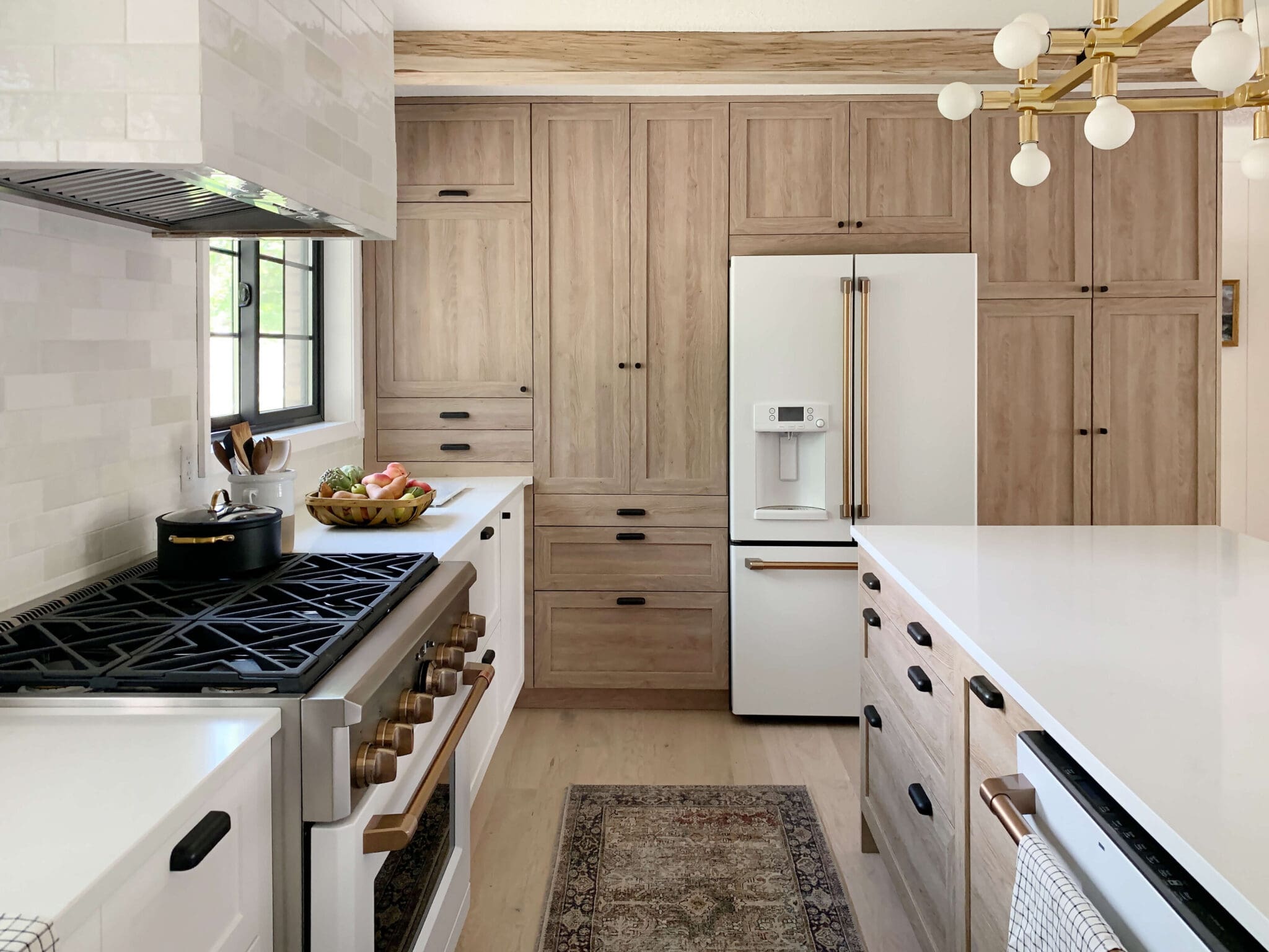
And now for the finishes. We contemplated the medium wood cabinets that we saw in the showroom, but in the end, I feel like white is more classic. So the same style cabinets in white are winning at this point. As for the island, Ikea's super glossy gray fronts have stolen my heart. And if I didn't love them before, this kitchen from Chezerbey has sealed the deal:
White white cabinets and a glossy gray island and stainless steel appliance, the kitchen plans were seriously lacking some warmth--which we are solving by bringing in butcher block counters. Originally, we had never really considered them, but after seeing so many great examples and hearing other's testimonials--we kinda dig them now. We especially love what the folks over at This and That did with theirs:
They stained them a beautiful Walnut and then sealed it--like 12 times with Waterlox and even give a step by step on installing an undermount sink. Where would we be without blogs?! We are definitely going to be following in their footsteps.
So what do you think of the revised plans? Any concerns? Any thoughts? Anything we forgot? You better tell us now. Lots-o-money is on the line.
Leave a Reply

WE'RE CHRIS + JULIA
Portfolio
Projects









My husband and I are in the early planning stages for a kitchen, too. It can really give you a headache if you think too hard about it!
One thing we plan to do is talk to our realtor or one who knows the neighborhood to make sure that we're making good choices (materials, layout, etc) for our location.
Your original plan would work better for resale, I'd imagine. Then again, if you're going to be there for a while (and put the money into a full reno), you should do it to your liking.
Good luck, and I look forward to seeing your progress!
The dining room will still be where it is now and we are still loving a round table. The measuring tape came out again last night, so an island in a different place is still very possible.
Thanks Sarah! We are definitely contemplating each comment and suggestion. They are all so helpful!
Good point, Allison! We'll see where we end up. The measuring tape came out again last night.
That sounds so wonderful, Rachel! I think we are definitely looking for the kitchen to be a place where people (kids and guests) can gather, sit, eat and relax.
The high gloss cabinets are practically fingerprint proof. We tested this out thoroughly because we already deal with fingerprints with our fridge. Stainless steel is definitely high maintenance, but ever since I found Gleen cloths, it definitely makes the job easier. Check out those in this post: http://chrislovesjulia.blogspot.com/2011/09/giveaway-gold-life-is-definitely.html
In the plans, we have 3 ft between the wall oven and the island. We are definitely revisiting the plans and seeing if this is the right one. Or maybe we haven't found the perfect solution yet. Thanks for your input, Shellie!
Wow, there's so much to consider with a kitchen remodel isn't there? It's great to be able to explore a lot of options before you commit, so hopefully you and Chris will really love what you choose. I think this plan looks great, but other commenters have some good constructive criticism. I hope all these different perspectives help you hone your priorities.
I'm a big fan of the butcher block counters. Are you going to have a round table in the same place as the original plan or will that be open?
I love islands. My parents have one and it's basically where everyone always ends of gathering. Did you guys consider making the island adjacent to the living room (there would be more surface area for seats and you could just turn around and be at the sink)?
I love the layout and the finishes you have selected. I work in the granite industry and the one thing I have about it is that it's cold. Butcher block is a nice warm surface that you can lean on without shivering.
-Diana
To make our island more family friendly we made the cabinets or cupboards facing out of the kitchen half depth so our boys could sit and eat breakfast while we were in the kitchen. We had to redo them as half depth does not fit our dinner plates and had to get them remade but the overhang means that our stools can sit under a small overhang and yet are out of the way when walking past the kitchen to our back hallway and back door. The storage is still excellent as we have full depth pot drawers on the kitchen side andcthe false panel door cupboards store extra plates n platters n bowls when we entertain. Day to day bothboys sit and eat or help cook or do homework. Just think of having a couple of kids sit n watch you busy in the kitchen chatting to you while you work or as a perfect serving area when friends and family visit. The number of friends who like to sit and visit while we are in thd kitchen made it all worthwhile keep the island clear of all hotplates or sinks because the area it allows to roll dough chop slice and prepare meals is so luxurious. Enjoy the next renovation its going to change your life.
When I was looking at this I was thinking EXACTLY what Shellie posted. I do like the new idea of the island, but I think the peninsula is more functional and I much prefer how it gives the kitchen a more defined space. Plus in the new layout most of the counter space is going to leave your chef facing away from guests.
I'm liking what I'm seeing. And I LOVE the butcher block. It looks so great and gives you lots of warmth. (not to mention cutting space!)
High gloss cabinets, stainless steel appliances and little people = lots and lots of fingerprints to wipe off. I love my stainless steel, but it is definitely high maintenance. I can't imagine having an entire kitchen island to keep clean also. Love the plans, but it will be high maintenance for you.
I think you'll be so happy with that plan! Can't wait to see the progress!
You are going to love a big island... I think the new more open plan is going to be great!
Yes, I love the butcher block and "sunk-in-sink", I put a heart on that in Pinterest : ) Looking forward to seeing your house in person for the first time this summer!
Hmm....personally I like the flow and astethics of your last idea better, but it did create a counter space problem.
This one seems almost TOO open, like you are in a studio apartment. But with your step down family room and the staircase it could work nicely.
However- how much space is between the island and fridge/oven wall? Could Chris be standing at the stove and you still go behind him to get in the fridge or use the microwave? That could be an issue when making big meals.
I loooooooove the butcher block!!!!! Sooooo delish. I love Ikea anything, as you know...but the kitchens are so sleek and gorgeous!!! I love walking Through the showrooms there.
So far I love the idea! I guess I'm a bit curious of how the living room, kitchen and dining room will all flow together cauSe it is going to be so open. Definitely cut off your private living room feel. But im all about an open floor plan. Go girl!