The study project is almost a wrap, and we're itching to get another project going–something that's a bit of a lighter lift and possibly more in our hands. So we referred to our 2023 project list, and we're excited to get started on Faye's room next!

Shop Faye's Bedroom
We've spent some time in both Polly and Greta's rooms, but Faye (who's nine years old) has been patiently waiting for her turn. Her room has remained mostly untouched, aside from a new bed and rolling out a rug. Oh, and we installed new flooring throughout the house before moving in. Faye is my kid who's most interested in design, so I'm going to lean into her childlike creative genius throughout this process as much as possible.
Here's what the room looked like before moving in!
Before

The other day, Chris and I put our heads together and talked through the current layout of her room, which is a little awkward with the closet and window situation. When we do this brainstorming together, no idea is off the table. No idea is bad. We say every idea we're thinking about and talk through the pros and cons to help us land on the best possible idea. Chris took measurements of the room and drew up three possible layouts that we're considering.

With this option, we would keep the current closet and bed placement but downsize from a queen-size to a twin. This would allow us to put a small dresser along the smaller wall, which is a huge request from Faye. This isn't my favorite option because although we would get more floor space to add a dresser and nightstands, the closet placement is still odd and cuts into the symmetry of the windows. I also don't love the idea of going backward in bed size.

The second option is to move the closet over to the small wall and move the bed over to the window wall. Then we would have room for a dresser and maybe even some nightstands on either side of the bed. Moving the closet is going to make the windows more symmetrical, although there's still a bit more wall space on that left side. But we can make it work! Pssst, we already moved the bed to this window wall, and we're trying it out! The new closet would be standard depth, all trimmed out, and flush with the opening into the bathroom.

The third option we're considering is to do something similar to the built-in wardrobes we did a couple of houses ago. When we lived in Rexburg, Greta and Faye shared a basement bunk room, and we built in some IKEA Pax wardrobes for them to use instead of closets. I think this would make a great solution in Faye's room! I envision two wardrobes with a mirror or vanity in between, and since there was already more wall space to the left of the window, the window wall stays fairly symmetrical.
As of right now, nothing's off the table! Does having a bed in front of the windows scare me? There were a lot of reasons why it didn't work in our room, but I think it could be the most practical solution in Faye's room! When I wrote the post, "Where does the bed even go?" here's what I said about beds on window walls.
"Two rules of thumb that I’ve picked up in my under-window positioning and Pinning: 1. Choose a low-profile headboard or one with an open frame so you don’t obstruct the window too much. 2. Pull the bed out about nine inches from the window-wall to allow curtains to hang behind."
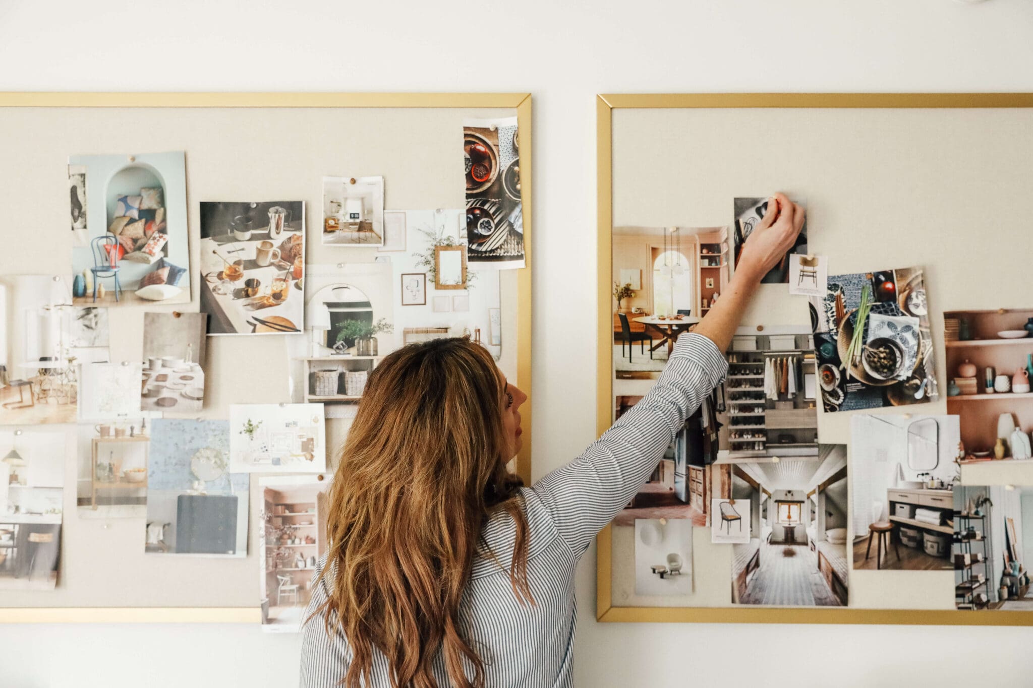
As far as making design decisions for this room, all I know right now is that I'm really interested in doing some wallpaper along with some contrast-colored trim. I ordered 27 wallpaper samples and together with Faye, we'll narrow them down. Here's a peek at what I'm considering!
Sneak Peek of The Wallpaper Samples
Leave a Reply

WE'RE CHRIS + JULIA
Portfolio
Projects










So forgive me for asking but under option 1 does the bed *have* to be centered? Is it for symmetry or simply because you have two nightstands? If it’s because of the nightstands couldn’t you do away with one, push the (Queen) bed closer to the window, to where it’s about 12-18” from that (window) wall? Then on the left side of the bed (if you’re facing it), place the one nightstand? We’ve done this in a few bedrooms and it doesn’t look at all off to me personally. You could the keep the closet where it’s at, with the bed across from it, or swap the closet and dresser locations to where the dresser is just across from the bed.
Why not a bed facing a wardrobe wall with a desk at the window? Then no need for a dresser… could have the wardrobes on the current closet wall. Just more efficient :).
I like option 3 but with the bed facing the wardrobes. I think having the bed on the 14 1/2 wall gives more options for the other walls
I like the vanity Pax ‘closet’ option bc it also leaves her w/an in room writing / drawing area especially if she had a trinket light there (sooo cute❣️) but I’d also love to see that amazing chair next to her bed on the ‘closet’ side of the room for reading or friends visiting … Queen bed for sleep overs & guest options is good. My only bed caveat is no cloth materials as they are dust/mite etc collectors(😂) IMHO, allergy avoiding here ; tho YOU make everything work! Plus the symetry of this room works so nicely🙌🏼👏🏼👍🏼.
Faye Room will look great with the 3rd Plan, But instead of 2 wardrobes you can consider one on the side of the bed. In place of 2nd wardrobe you can add some sitting plan and a personal TV or wall hanging book shelves. Which will look great if you go with the contras of room interior. Its better if you take guidance of some professional interior designer or read my blog https://www.transeptia.com/own-interior-designer
My vote is putting built ins on the window wall! It would look so pretty with window seats.
What about wardrobes on the outside of the windows with a window seat connecting them. You could even put drawers under the long window seat. Keep the bed where it is. As a kid I loved gazing out of my windows.
Kind of wanting to see an option 4, like wall to wall on bathroom and room entry side, where you create almost hallway into room but access closets like a walk in into bathroom. Would square off room and balance. Can’t wait to see what you land on!
love all the wallpaper swatches above. you mentioned on Thursday or Friday that you discovered a new wallpaper company and I love quite a few from there - however I forgot the name. Kindly forward it to me.
thank you
Follow the 3rd layout. However, in regards the original closet area , remove the doors and in that space place the dresser. Viola, more floor space.
Option one BUT swap the closet and dresser. In Feng Shui, the command position is the bset-and that's with a headboard that has a solid wall behind where you can see clearly to the door and anyone that would be entering. I've done away with dressers by kitting out closets to fit all the things in there, and then she can have a great sitting area/chair/table/desk etc where the dresser is now in that plan.
I agree! The Best position for the bed is as it is.
So option 2 BUT keeping a queen size bed (or a double bed)
Number 2!! 2 has the best symmetry and flow for the room. And it still gives her plenty of floor space to play and wall space to decorate later. And if she wants to play designer and rearrange her bedroom furniture when shes a teen like i used to do, 2 is the best option for that. Cant wait to see the design!
I like option one- but- do a queen size and make the night stand a small dresser. I think it would fit and provide extra storage. Honestly I know this is one of your smaller bedrooms, but you’re lucky to have such generous size bedrooms. I have 2 kids in a room this size and it’s tricky!
What about keeping the bed where it is, moving the closet over like option 2 and putting the dresser under/in between the windows???
I love the current bed where it’s at. I’m a big fan of entering a room, the bed facing the doorway, and the windows not being obstructed.
What about keeping everything as-is except get smaller nightstands so a dresser can fit on the 6’ wall? Or, maybe some unique “hanging side tables” that hang from the ceiling and don’t take up floor space. Might be fun to incorporate something quirky like that for a teenage gal?
OR, instead of a dresser, give her a really awesome custom closet organization system.
Why not just try option one with the queen bed she already has. Seems like it would be the simplest- just get a dresser and see how it goes! Maybe give her some shelves on the window for all for her treasures. Seems like there is plenary of room to at least try this without getting overly complicated
My vote would be leave bed where it is! But remove closet ! And add dresser on that wall!Hang some statement curtains on those windows! I’m sure it will be gorgeous whatever you do!
Definitely option 3 I think! Have the 2 closets, dressing table/desk in the middle. I’m sure whatever you guys decide on will be something she can grow into!
What about a dresser “nook” in the current closet, or a reading nook!
Option three is *chef’s kiss* for me!!! I love that there is lots of great walking room around the whole bed. It also feels the most intentional, as if it was always meant to be that way. And a vanity in between or a nice full length mirror in between would be wonderful as she’s growing up for fashion shows or makeup! Can’t wait to watch Faye’s decision process again with her wallpaper choices!! I loved her room most at your #cljmoderncottage!!
I like both two and 3, but love that 3 could have space for a little desk!
The vent blowing down on the bed might be a concern. Otherwise I like #2
These are all great options! I think there should maybe be some more options where her bed isn’t in front of the window only because it would be nice for her to be able to enjoy the view vs always having her back towards it.
What about option 3 with the built ins where you have it drawn on the left wall, but moving the bed to the right side wall centered where the old closet is and then putting a taller dresser in between the two windows.
Another option that I think could work beautifully is leaving her big bed with nightstands where it is now on the right side wall, and doing built ins all around the windows so she can have tons of storage and a window bench! This would eliminate her little stack of items, and then you can put a small dresser on the current closet wall that gets removed.
For the second option I proposed I meant “leaving her bed where it currently is on the LEFT side wall”
Eek. I don’t like any of these options. I don’t love bed in front of the window or downsizing the bed.
Faye really seemed to love that neon heart. Why not design the room around that? :) that’d be fun!
I agree with other commenters - built ins on the window wall with a reading book.
I really like the options you gave! If I had to pick personally, I love option 3 so that she could fit more clothes in her wardrobe! I love how much more space she would have in option 2 though! I am a little bias about those 2 options because I think having a queen bed is so much better than a twin! :)
Maybe do option two but with the bed where the dresser goes and the dresser across from it so the windows are unobstructed? Otherwise I like option 3 best! No matter what, its going to be beautiful. I can’t wait to see what you do!
I like option 3 now that you mentioned that side where you would put the built ins has more space thus allowing the windows to still look pretty symmetrical. I also like the idea of having more closet space because you mentioned she had a lot of things and liked little piles. This may give her a place to hide some of that and still have room for clothing. Can’t wait to see what you decide.
I hate not being able to look the the window from my bed and always curse the air bnbs that put the bed in front of the window. Glare on my screen from bed etc. Center the closet on the wall across from where it is now with a dresser and/or desk on each side. Headboard against the wall where closet is now.
Have you considered closets with sliding doors? I think it will help save some space
Won’t option 3 also make the windows not centered on the wall? I would do option 2 but maybe wrap the corner to get more storage - I’ve seen some lovely built in corner wardrobes on Pinterest. That was the bed and windows remain centered on the wall.
Have you considered wardrobes and built-ins around the windows, with bed along the 13' wall and dresser directly opposite?
Oh this could be nice! I envision little window seats under the windows between the built outs.
Please do #3. We moved into an old farmhouse and the master bedroom is super small with a small bathroom. There’s also a boiler in the room so there’s only one option for a layout. After living there for 4 years and not having enough room to function, I’m realizing I need to build that exact layout on the wall of our bedroom. I have to have a vanity in between though because right now, all I have it the back of the toilet for my curling iron! 🤦🏻♀️ Ideally I could find two four drawer dressers and get a counter of some sort to go on top of everything across. We’re not super handy and have to learn everything as we go. Not afraid of learning though. 🤷🏻♀️
Wait - there is a better place than the back of the toilet for curling iron? lol
You’re both so creative with options. Is there room to incorporate bed with closets on option 3? Small desk at window? Always like option of looking out window from bed-
I agree with some of the commenters here saying you should consider doing the built-ins on the window wall! Just think how lovely two window seats and a vanity between would be! The closet can still come out and be where the dresser would go. My dad configured my room this way as a kid & it is still my favorite bedroom I’ve ever had (and I’ve lived a dozen places since).
I like #3 the best. The only question is this: Is she a child who likes looking out the windows and wants lots of light? that was me, as a kid. If so, bed placement in front of the windows means she can't do that. I wondered if you considered putting the headboard against the current closet wall in a variation on #2. Still room for a closet or wardrobe and a dresser, leaving space in front of the windows for dreamy gazing outside. : )
Is there enough room on either side of the bed to do a dresser as a nightstand? I’ve seen desks and vanities. But if it’s low enough I feel like it could be a cool solution to keep the floor plan more open. Although it would take away symmetry.
I like option 3 best! I know you said on Instagram that she specifically wanted a dresser. Have you thought about doing a built in dresser in the middle section of the wardrobes, with a mirror above?
What about doing built-ins on the wall with the windows? That way everything could be centered on every wall :)
Ohhh I love this idea! And then you can make tall wardrobes on either side of the window with a window seat below the windows and keep the bed in approx the same position it was originally, with a dresser where the old closet was. Yeah!!
Among these three options, I liked the second option the most. but it would be perfect to be able to move the windows to the corners of the room
This bed area on Pinterest with a wardrobe on either side where the bed originally was is perfect. At least in my opinion.
https://pin.it/DG9QPmx
I LOVE THIS! Chris, we need one more mock up! Lol
This is so charming & cozy! Love it!
I love the idea of the built-in wardrobes. In option three can you move the bed to where the dresser currently is and put a tall dresser between the windows.
I’d love to see a layout with what you suggested - I think it sounds great if it would fit well (size).
:)
Have you considered moving the windows to either side of her bed? Of course this may not be possible, or just cost prohibitive. Love watching your process 😊
It's a wonderful idea, but would it look nice from the outside?
How do you get samples of wallpaper from Wayfair?
What is the software you use to create the room layouts? Thanks!!
For the narrow pax system you wont be able to use hangers. is that a concern? it will strictly be folded space..
i definitely love that option the most but when you mentioned it yesterday in stories i questioned the need of it.