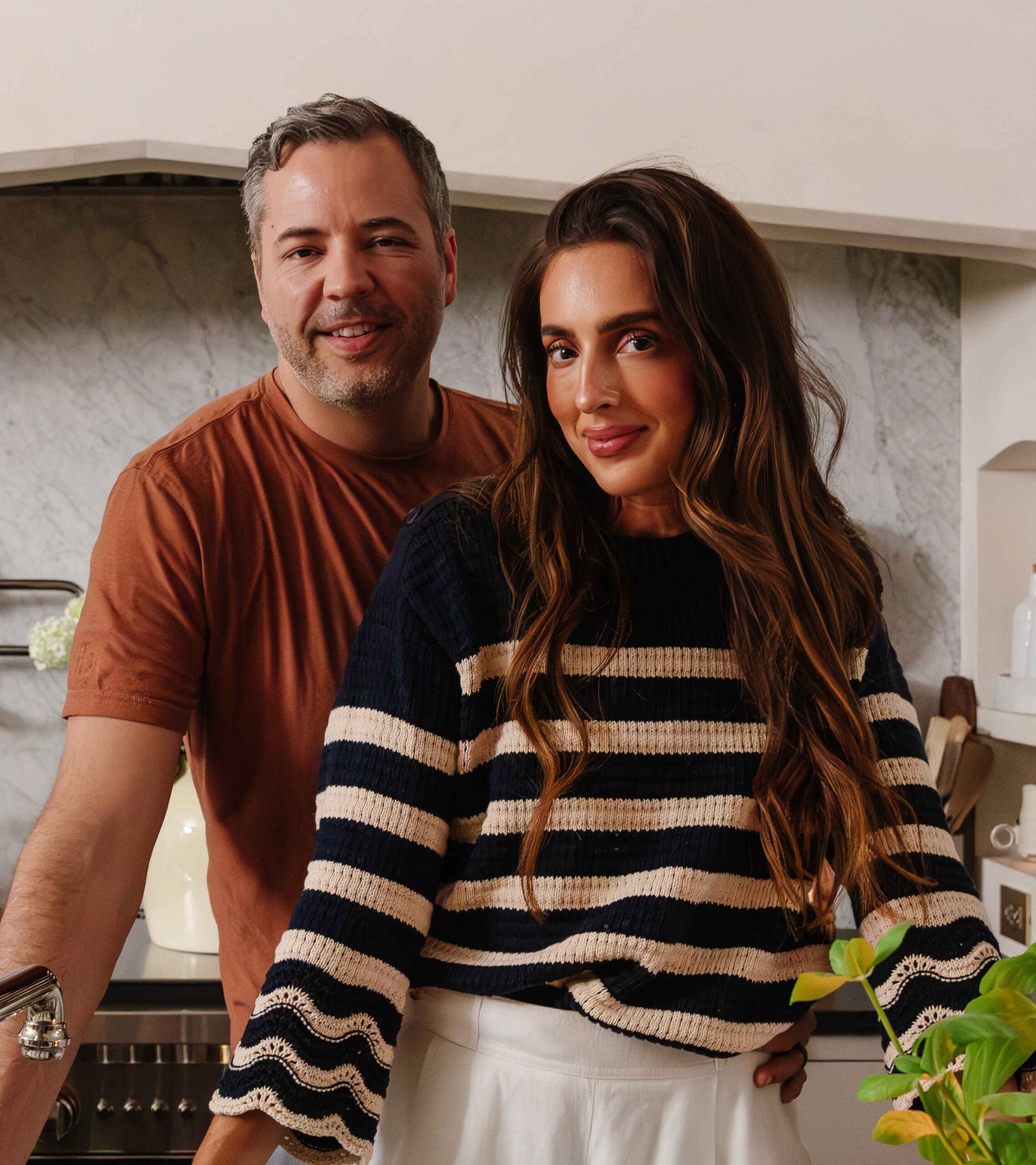
Do we look enthused or what?! Chris? Hon? And although I think my hand was resting on my shoulder--it is coming across as a "gee golly here we go!" sort of gesture which doesn't match our expressions at. all. This must have been when Andi told us we're "looking a little dead," which made us laugh and the photo on our about us page was taken. Does that mean our half-dead selves got the assist? Nice.
Kids, avert your eyes.
As if our blog name wasn't mushy enough. Yeesh! After we took a few sitting in our respective chairs, we were directed to take a few standing shots. Hmm, standing shots are not our forte. Like, what do we do?! Stand here and what? Apparently I really struggle what to do with my leg:
I panicked. For the record, that is my favorite picture of Chris smiling ever. He looks so proud. After a few more frames of not knowing what to do, we pulled out our best crazy we could.
So flattering and totally appropriate for our blog profile, right? To round out the standing positions--we got all prom pose for the camera.
Chris's suggestion. After that 10 minutes of giving our best awkward standing poses, we scooted a bench in the shot and a few paint cans, a roller and a laptop and we got our front page profile photo.
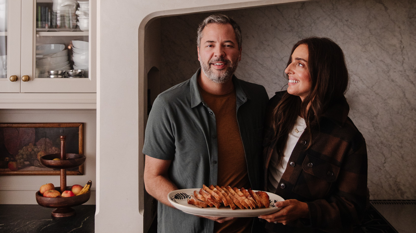
Have you ever been professionally photographed in your home? This was our first time and it felt so comfortable and relaxed and us, even with all of the equipment and lights set up. Plus, way down the road we'll be able to laugh and reminisce about our furniture and paint colors, I'm sure.
Psst. Check out more of Andi's magazine-ready work on her blog, Doublclik.
Leave a Reply
WE'RE CHRIS + JULIA
Portfolio
Projects





i love these pics and your blog.
The new look for your blog is outstanding Julia!!! So easy on the eyes. Over Christmas break my husband and I gave my blog a "face lift" as well. Its like getting a new wardrobe isn't it?! Again, I love the new look!
<3
Tabbitha
You guys!!!!!! adore. YOUR LEG in that picture is so cute. I am so not photogenic. I am awkward every single time when a picture is forced and I need to look my best! Love that shirt color and the wall in your living room is sooooo amazing.
Really, really love the new look! Great job!
Really, really love the new look! Great job!
So enjoy your blog! Always great fun/inspiring to see your projects. Question -not a criticism - is the new font a lot smaller or is it just me?
It's the same size. 11pt I believe. Hard to read?
Love the new look! And your outtake shots are hilarious! :)
Such cute photos! I love the way it looks against your fun wall :)
These are so fun. :) I love the outtakes! So cute.
Soooo cute! Loving the ones you chose!
I like the one with your tongue out : P
You look funny and cute together.
It looks like you guys had a lot of fun! I love how they all turned out, even the awkward outtakes. Love the his'n'hers chair setup especially.
HAhaha. i LOVE this. the first outtake is my favorite. i love the set up for this photo...great wall, love the his/her chairs, and you two beautiful people.
Thanks Jane! You are so kind to us crazies. Can you believe the first photo was legit? Like, we were "ready" for the camera.
These totally made me giggle! Love the new blog look and the photos. So fab!! :)
Thanks Gemma.
I do need a visual of the people I am ready about.
That picture of you with your "flamingo leg" cracks me up. My husband always laughs at me when I do that or other funny things with my legs. Must be a tall person thing :-). Love your blog and the new design.
Flamingo leg!! Hahahahaha. Let's just say it is a tall person thing. I sleep like that. Seriously. Not standing, of course.
First of all, I totally need a picture of who I am reading about. I always look for the authors picture when I am reading a memoir.
Secondly, and I apologize if you have already discussed this (I'm new to your blog), but I am thinking of ordering 2 of those ikat chairs. Did you get yours from Target? Do you like it?
It is actually from Joss & Main, but you can order it from Wayfair. There are three almost-the-same version of this chair and they vary in quality and price. The cheapest, smallest is from Target. Wayfair's version is right in the middle and Urban Outfitters has (or had, not sure) a version that was wider and even more expensive. So you can pick! I put all the links in this post: https://chrislovesjulia.com/2012/08/the-her-chair.htmlIt looks like the Wayfair one is currently on sale!
Thank you - this was a huge help! I'm going crazy looking for chairs.
Love the outtakes. You never really think how hard it is to get the perfect shot.