We really thought our kitchen could use a touch of robin egg's blue.
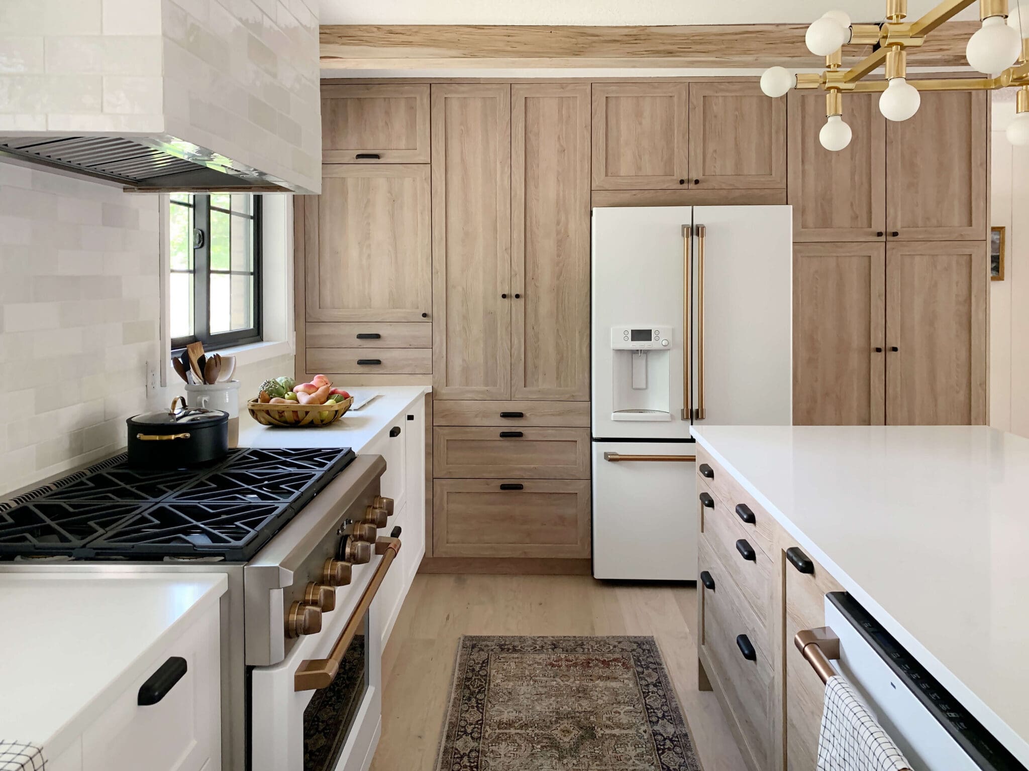
Jokes. I just quickly photoshopped all of the area that we're planning on tiling so you can get a visual. The whole backsplash area and around the pantry. And, of course, the other side of the fridge as well.
We have always planned on doing a classic white subway tile, but we are still deciding on exactly which one. We are partnering with The Tile Shop for this project and have narrowed it down to our four favorites from their collection.
 The first is a glossy, ceramic white tile in the most common size. It is classic and we love that--but might want to branch out? The second is a marble subway tile--so, swoon! The third and fourth are also white subway tiles but in less common sizes, which could be an unexpected twist on the classic.
 We're still deciding--but feel free to venture a guess.
What do you think?
Leave a Reply
Previous Post
Next Post
all the latest

WE'RE CHRIS + JULIA
We believe we should all love where we live.
We’re a couple of homebodies, working to uncover the home our home wants to be. And we’re so happy to have you here.
read morePopular Posts
Top Categories
01
Portfolio
Befores, afters, mood boards, plans, failures, wins. We’ve done a lot of projects, and they’re all here.
browse all
02
Projects
We have a long-standing relationship with DIY, and love rolling our sleeves up and making it happen.
browse all
03
Design
Even when you don’t want to rip down a wall, you can make that space in your home better. Right now.
browse all











i am guessing 1. or 3. maybe. but 1.
can't wait to see! i am sure it will be gorgeous!
I love marble subway tile, but I don't think it fits. I can really see #1 in your kitchen! I hope you go with #1. It's classic. Your kitchen is small so you don't need the larger size, and the smaller size might look busy.
3 all the way
#2 seems like a no brainer in my book! I loooove Carrera countertops.... But if you can't have it in countertop form, a backsplash would suffice... That way the kitchen still gets that Carrera look. + with those walnut countertops?? Done & done! Also, the real estate agent/developer in me thinks bringing marble into the kitchen is a great selling point as well... Seems much more high end that way!
If the Tile Shop is covering the expenses, why WOULDN'T you go with number 2?! :)
#2 gets my vote
Tiles #1 and #3 are my favs for the moment.
Wait... they WERE different? This isn't my strong point, sis.
Love subway tile! When I own, it will be subway tile without a doubt. I didn't realize there would be so much choice! Like a lot of readers, I vote number 3. I like that its classic, but still unique.
{lamourcheznous.wordpress.com}
The second is my fave!
I've been following your blog for a few months now. When I saw the first picture of the kitchen, I panicked! Thank good ness you were joking! I think the third is very nice, bit it might look busy if you're tiling so much. I like the first, but it depends how long you plan to stay in this house. If its a forever, then timeless is best, but if it's more like 5-10 years, then maybe the fourth, with darker grout? Just some ideas. Good luck deciding!
have you ever thought of doing some sort of molding at the top of your cabinets/ pantry? seems like just a small amount of space between the ceiling/cabinets. or, is it just how we see it? maybe different in person... ?
i pick #4! :)
Ugh. Yes! There is a small amount of space up there that creates a visual tangent and drives me crazy. All. The. Time. The only problem is, adding molding only makes the space even more small and we can't go up too high, or you'll be able to see the molding from the living room. We haven't solved that one yet.
I loooove the marble, but it's so expensive. Sad face. Using so much of #1 everywhere might start to look like a subway station, haha. And I like fewer grout lines for #4 but in the smaller area it might look out of scale...so I'm guessing #3! :)
I love all four options. I was searching high and low for the 2x6 white tile when we re-did our kitchen a couple of years ago and I would have loved to do that size. We ended up using the more common 3x6. So I just have to put my money on that one (2x6), although I am also crazy about the 4x8... Can't wait to see what you choose.
I am thinking #4. More streamlined and modern!!
I'm sort of loving option #3 because it's so different. I'm excited to see what you come up with!
I love the marble! Might be more expensive probably? So second choice is #3! Can't wait to see what you choose!
When I first looked at the post I thought you actually painted it light blue!!
Hmmm... I'm guessing... since you are tiling such a large area... that you'll go for #4. The larger tile will look less busy in such a big area.
I was just in the Tile Store on Sunday petting all the samples. I had my heart set on #1when I started but #2 is so striking in person. I think #3 looks too busy in large quantities. I just really like the standard size. But thats just my unsolicited opinions!!! I'm sure what you pick will be perfect for your kitchen!!
I LOVE #2 and #3
I like 3 and 4, but my guess is that you'll go with 3!
I love the third: long and lean, but you won't go wrong any way!
Ooh! I love all of them. Maybe #3. I like that its a different size while still being white. I also like the marble, but I don't know I'm definitely leaning to #3.
I like 4! I feel like the bigger scale is very modern but in a traditional shape. I love it.