This post is sponsored by Kirkland's. Use my code “CLJ15” to get 15% off regular priced items now until 4/13.
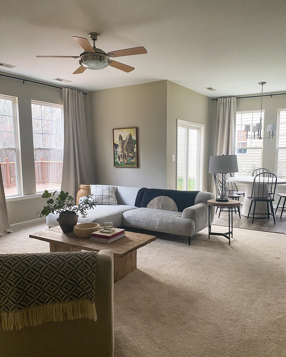
My sister Andrea (also our Visual Media Producer) had a really tricky living room in an open-concept floor plan that she wanted help with. I'm talking about a corner fireplace, too high TV, and a slab of wall-to-wall carpet disjointed from rest of the main level flooring. There was also a little walkthrough "hallway" that connects to a half bathroom that any guests would use. Honestly it's a cluster of design challenges that I couldn't help but take on so I hijacked this project, pulled in a few favors from Kirkland's to outfit the space and present a living room my sis would be happy to throw a party in. Let's take a look at the before layout!
Before
See what I mean with the awkward carpet slab? I think it really minimizes the living room space, and the layout options! It also makes the living room feel like an awkward tangent to the kitchen and breakfast nook! I'm sure we could have figured out this layout without removing the carpet, but Andi had said from the first time she set eyes on her living room (her and her husband bought this home last summer) that she wanted it gone at some point! So she hired somebody to tear it out, and while they were at it, just replace all of the LVP with something she actually LOVED vs tolerated. Voila!
With the new flooring in place, we turned to Kirkland's as a one-stop shop for all the furnishings and decor we needed! They've done an incredible job at curating designs at an amazing value, and there's something for everybody, no matter your style or taste. Andrea prefers more of a collected, timeless look, while her husband David prefers more modern design, and I went to work trying to blend their styles seamlessly. Okay fine, I'll show you already...
Here's the before
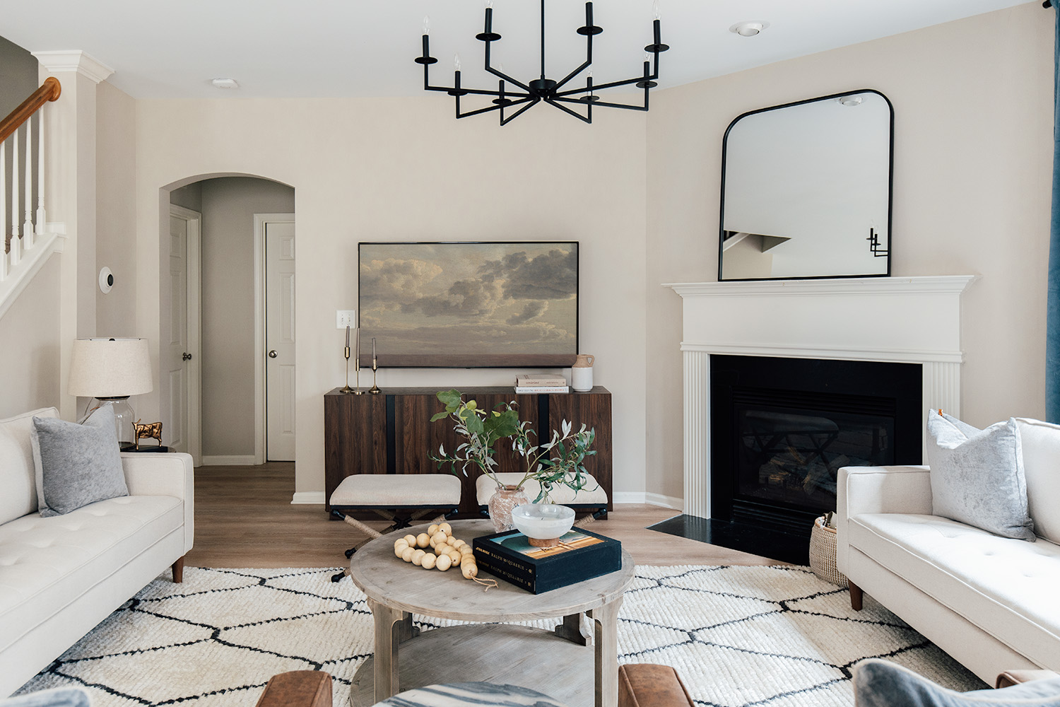
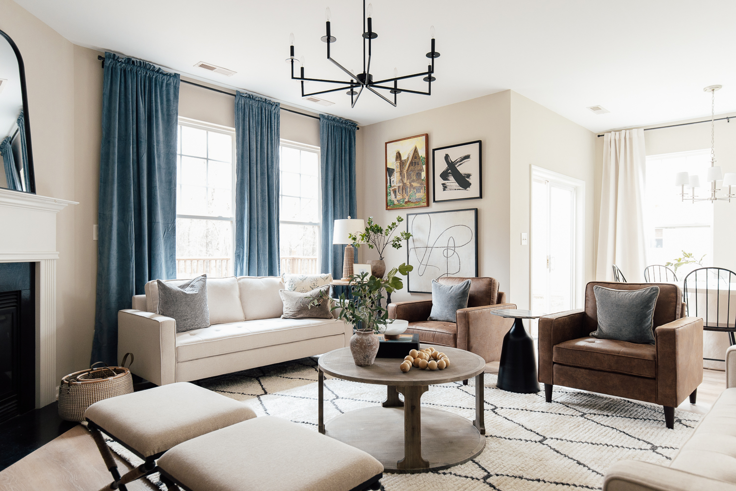
And after!
I can't even describe to you how much larger it feels and hopefully the pictures illustrate that! From this angle, we're actually standing in the kitchen, and what used to feel like a disjointed living room, now feels maximized and very lived in. Here's a second angle if you're walking in from the front entry, with the kitchen and breakfast nook on the right.
Sofas | Accent Chairs | Chandelier | Accent Table | Curtains | Rug
This living room was like a layout puzzle that took some figuring out, but I'm so so happy to share what we learned and how we did it! Everything you see in this room is Kirkland's, other than the rug from the Alice line in our Loloi collection, the curtains (which I had in my decor closet), and just a couple of decor pieces Andi has collected. Kirkland's had everything else we needed, and all of these pieces together make a major impact!
1. Think Outside of the Box
When you have an odd-shaped space like Andi's, I would recommend trying out all the layout possibilities! If you have a corner fireplace, you do NOT have to make that the focal point of the room. Of course you can, but in Andi and David's case, they didn't want the TV above the fireplace anymore because it wasn't at a very comfortable angle to watch. Instead, we hung the TV on the neighboring wall and grounded it with this incredible wood media stand with black metal accents.
Before
After
Mirror | Media Stand | Coffee Table | Wood Beads | Vase
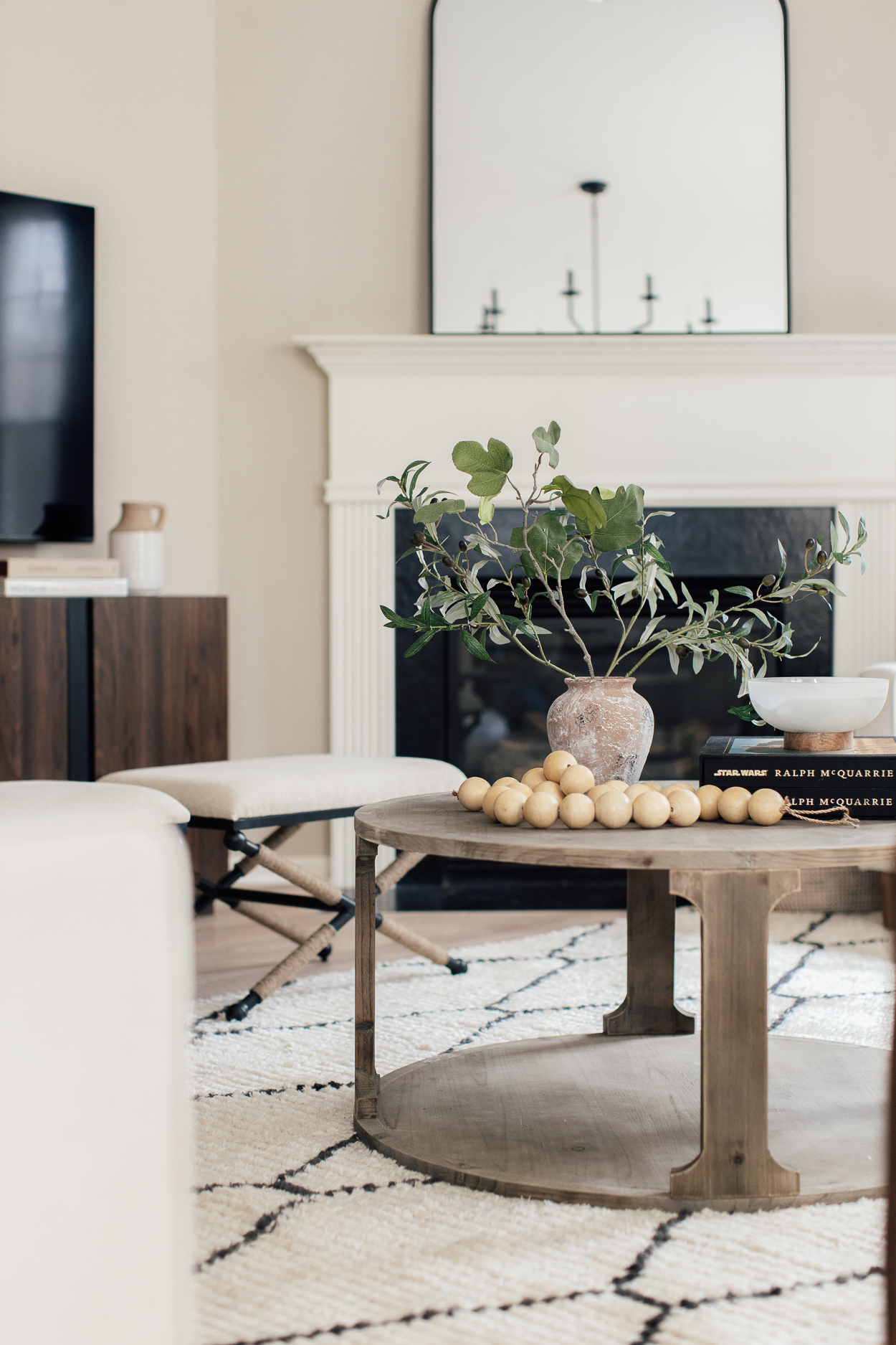
We squared off the furniture and oriented it with the TV in the center, letting the fireplace recede as a secondary focal point. Leaning this gorgeous, arched framed mirror above the fireplace rather than art was very intentional! Art would have been too competing with the TV, but the mirror reflects the focus away and bounces light around the room--not to mention, it reflects the gorgeous chandelier we added and shows off their 9' ceilings. We also kept the mantle simple and clean for David, who prefers more modern design. Sometimes when there's a pain point in a room (like this fireplace) you address it and other times you ignore and just design around it.
Another layout choice we made in this room was to push the sofa back by the staircase wall, rather than floating it into the room and leaving a walkway BEHIND the sofa. Beyond the archway is a home office, a powder bath, and laundry space. The problem with scooting the furniture into the room is that we would lose so much footprint in an already small living room. So we're extending it by mirroring the two sofas across from each other and there's still PLENTY of space to walk through the room, to the archway.
Before
After
Stools | Side Table | Table Lamp | Gold Steer
2. More is More
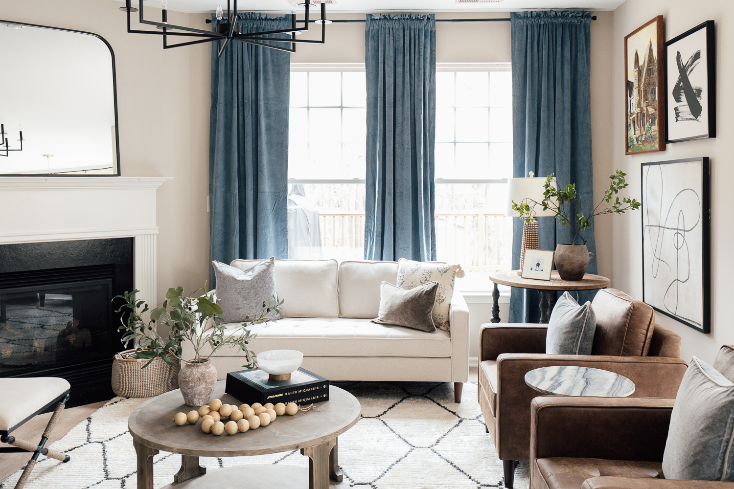
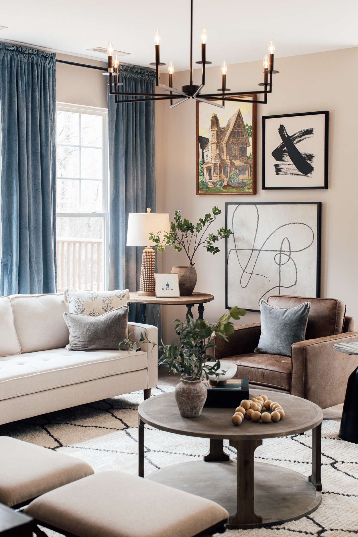
For a small shaped living room (or any living room for that matter), I would say that more is more. More furniture, more decor, more layers can make a space feel very collected and lived in AND expansive! Kirkland's really helped us achieve this look by having so many readily available options in on-trend styles and finishes. Their spring collection is especially what we shopped from because of their fresh finishes and textures! We placed the two sofas across from each other, and the two brown leather chairs across from the brown media stand. Also across from the leather chairs are two stools for additional seating around the coffee table. The Ahedos especially love hosting game nights, so I wanted to maximize their seating for this! In a multi-functional living space, not everything has to be pointed towards the TV folks!
Before
After
X Art | Juxtaposing Art | Pedestal Table | Baskets
Talking about more, I dare you to count how many tables are in this room... There's one taller table in the corner that bridges the height gap between the tall curtains and the seating and I'm obsessed with the black turned legs. Between the two softest leather chairs is a side table with the sexiest black base and stone top. We wanted to keep that one empty so it would be an easy spot to set a drink and also not obstruct the view from the entry. Of course, the round coffee table which sort of mirrors the round chandelier up above. And there's another end table to the side of the other sofa. I think most living spaces could benefit from having more surfaces for setting down drinks, or snacks or books or candles. Not only are Andi and David now equipped with plenty of seating, they now have have ample surfaces for hosting and game nights.
Wood Beads | Vase | Candle
We layered in stacks of books, these incredible chunky wooden beads, vases galore, and woven baskets throughout the room. I promise you it's the little things that make such an impact!
3. Adding Color and Height With Curtains
Andi was worried her living room would be very beige if we didn't paint the walls. As much as she loves the SW Accessible Beige walls (painted before she bought the house), I get it because it's an open floor plan and it's actually everywhere. I always advise against painting a couple walls in an open floor plan where there's no molding to start and stop the paint color. It looks choppy. But, BUT!!! Painting your walls is NOT the only way to add color to a room! We hung three of these velvety blue, floor length curtains high and wide for some height and color and what a difference this makes! If I hadn’t already had these in my décor closet, Kirkland’s also had a very similar look we could have used. Also, fun fact: you don't have to center your sofa with a wall ;). We also brought in some color with the pillows and greenery, not to mention the heirloom painting of the house done by our uncle that used to hang in my Grandma and Pap Pap's home.
Hanging the art from low to high also adds some height to the room, and this was no mistake! Not every art piece needs to be eye level, in fact I encourage you to switch it up. I love how the abstract black and white pieces bring in that modern touch that David hoped to see. I also think the black pieces give the contrast this otherwise beige room needed–the frames, the furniture legs, the black chandelier, the curtain rod!
4. Lighting is Everything
I'm going to guess you don't have enough lighting sources in your living room. I could be wrong, but I'm telling you, one overhead fixture is not enough. Swapping out the dusty ceiling fan that they didn't use once since moving in for classic, modern chandelier was the perfect start. Then we placed a couple lamps on the side tables which adds some much needed warmth!
5. Rug Size Matters
Okay, I'll preach this as many times as I have to, but rug size matters! Refer to this post as a guide, but for a living room I would either get a big enough rug to put all major furniture legs on the rug, or at least the front two legs. For Andi's living room, we had to be careful about the rug butting up against the fireplace, so we got a 9x12 which couldn't be more perfect!
It was so fun and refreshing to do a room install all before lunch, and Kirkland's made this so effortless for us. Everything we used from them is shop-able online, or they have stores all around the U.S. if you want to see for yourself. The best thing about them is that there's always something new to be found, and I think that's part of the fun.
Kirkland’s always has curated designs at an amazing value! Use my code CLJ15 to get 15% off regular priced items now until 4/13.
Sources:
Sofas
Accent Chairs
Pedestal Table
Accent Table
Table Lamp
Vase
X Art
Juxtaposing Art
Coffee Table
Vase
Wood Beads
Candle
Mirror
Stools
Baskets
Media Stand
Jug
Side Table
Gold Steer
Table Lamp
Curtains
Rug
Chandelier
Lumbar Pillow
Floral Tassel Pillow
Striped Throw Pillow
Leave a Reply

WE'RE CHRIS + JULIA
Portfolio
Projects














I loved how you tackled Andi's living room dilemma! The color choices really bring warmth to the space. Can't wait to see how the final reveal turns out!
I never would have figured out a good layout for this room. Taking the focus from the fireplace to the console/tv wall was genius. Pushing the sofa up against the stair railing would have been a design no in my mind but it works to expand the room and make space for extra seating. Your sister must love her new living room, a room she can be proud to entertain in.
I love this post. I'd love more of these! Maybe the primary bedroom? or the family room?
Such a great post.
This transformation is gorgeous! My one quibble is that coffee table- it’s not useful and it’s just in the way in the middle of the floor. That’s the only element I’d really re think in terms of size and placement.
This looks great and now I have SO MANY ideas for my corner fireplace. Thank you!
This transformation really is unbelievable! I love the colors (I bought the curtains so quickly 😂) and the media stand really balances the room! One link I couldn’t find was for the soft blue (velvet?) pillows on the faux leather chairs! Love all of this!
Yes, where are the soft blue pillows from. They work well with the blue in the curtains:)
Pillows are from Kirkland's and linked in the post!
Okay, Julia - talk to us about rod pocket drapes! I used to think these were a design "don't", but seeing them in this room, they look great! What are your thoughts?
I'd say I don't really play by any specific rule book and I think they add drama and height in this space!
This is one of my favorite posts ever. I love seeing what an impactful transformation this is with mostly rearranging furniture and not full scale renovations. We're a military family, move regularly, and often rent a home, so this kind of post is so helpful! I'm very impressed- beautiful work!
This is one of the most informative room arrangement posts I have seen. I love that you show the view from all different angles. Its amazing how much furniture you were able to make work in the space.
In the before photos, where is your sister’s couch with the chaise from ?
What an excellent result with so many seating options!
The breakfast nook reminds me of your Utah breakfast nook. What a nice area.
It's from Article!
Yup, gorgeous!
I have a similar room with corner fireplace. Would you do two different sofas? I am leaning toward this but unsure with a smaller room.
It depends! In Andi's case I really tried to bring symmetry to the space by mirroring the same sofas opposite to each other. I think the symmetry is key to making this odd-shaped space work!
I’m shocked that having the sofa stick out pat the stair wall actually works! I can see how important the rug is because of that. I probably would have assumed it couldn’t work and swapped the chairs (or maybe just one if they both didnt fit) for the sofa under the stairs. Did you consider that or would that not have worked? I love it this way, adds so much function and flow.
I had no idea that Kirkland’s sold chandeliers! Love this room so much!
Wow, what a difference in an awkward room. I never could figure out what was where but the room turned out so so well! Love the leather chairs especially …
Perfect! Could you please tell me where she got her kitchen chairs? I spotted those too lol
Here's a link to the chairs!
I think this is one of my favorite posts! Our last apartment had such a similar layout, and I would have loved these suggestions back then! Lots of newer build houses nowadays seem to have these similar quirks.
Would love to know how you would have approached this without changing the flooring!
I wouldn't have changed a thing, honestly. I would have just ignored that.
This looks incredible and I cannot wait to use these tips in my own awkward carpet slab living room! Question about the flooring... I think Andi changed direction on the planking. Is there a reason? Is there a typical direction to choose when laying flooring?
I don't think she changed the direction. She laid it so the planks go long way down the hall.
The typical way to lay wood/wood looking flooring on a slab is vertical from the front door to the back of the house. It makes the house look longer. You really don't want to lay them parallel to the front door.
I came here to ask the question as I also noticed that the new flooring changed direction--& also wanted strategies for how to know how to decide which way to lay flooring.!
Hi Kate,
From a structural standpoint on a crawlspace foundation, you want to lay the floor planks perpendicular to the floor joists, for added strength. If the foundation is a concrete slab, this is not an issue and can run them whichever direction looks better.
So many great teachings in this post! Also, I've been looking for an inexpensive, large-scale mirror for over my fireplace forever and I would've NEVER thought of Kirkland's. ** adds to cart **
This was a great post!! I learned a lot from it! We currently don't have ceiling lights in our living room,
and the room is large so the furniture placement is more in the middle of the room, so problem being
lamps, as the cords would always be showing?? There is carpet in the room, so not sure a rug would lay nice over that??? Any suggestions for this?
Yes! Don't be afraid to lay a rug over carpet. It's going to not only hide those cords, but really ground your living room!
I have a corner fireplace in my family room. I’ve tried several different room arrangements, and none really worked. You NAILED it! I will work on a similar arrangement, but I think my room might be slightly more narrow. What is the distance between the two sofas?
I can't tell you how excited I was to read this post!! My husband and I are under contract on our first house, and already I've been trying to figure out how to arrange the living room. This has helped SO much. I don't know how often you can answer a question in a comment here, but what if a living room has TWO ceiling fans? :| Would you suggest two chandeliers? Two semi-flush mounts? I hate the fans but don't know what to do instead. Help! :)
It sounds like you have a really large space? It's hard to know without seeing it, but it depends on the ceiling height and size of room. I've seen living rooms with two chandeliers, though!
Looks amazing! Do you use a program or app to visualize the furniture arrangement?
I don't!
This turned out so great! It really was an awkward set of limitations but you created balance, function, and upped the decor level too! I appreciate how it’s not as aspirational as your current home- would love to see more makeovers in modest homes with imperfect architectural design.
Wow! You're good at this, you ought to make it your career. Oh wait, you do! Stunning transformation. They had great furniture before. Are they moving to another room in the house?
So very beautiful! Do you have a link please to the LVP flooring? I’m looking for similar to install in our shore house. I looked, but didn’t notice any info on it, so appreciate it!
Here's a link for her flooring! It's Lifeproof in Dusk Cherry. Gorgeous color.
This layout is so appealing to me and I like that you encourage adding more furniture! We have a living room that is on the small side, but we also have friends and family over frequently. We have an oversized loveseat, couch, chair, and bench in our room and every single piece gets used! At times, I've worried that we stuffed the room with too much furniture, mostly thanks to ultra sleek minimalistic design trends. You've put my worries to rest! The room functions just the way we need it too. Thanks for confirming.
I love this. It reminds me of your former Rexburg house in the best nostalgic way.
It turned out beautifully! I'm curious about the TV - is the artwork photoshopped in, or is it a Frame TV, or a regular one with art on it somehow? It's interesting how much of a difference having some soft artwork instead of a black box makes - another great way to bring color into the room as well, and just make it feel more complete.
I wonder if there's a way to mimic the Frame on a non-Frame TV, or a way to "camouflage" the dreaded black box for those of us who either don't have the budget or don't *want* to have the budget for a Frame, for whatever reason.
This is not a frame TV, but most TVs now you can actually display art work as your screensaver!!
I wish I could show a picture but, my husband recently bought a *huge* (to me) tv and I was also not thrilled about staring at a giant black rectangle. We ended up painting that wall a deep gray/navy (Sherwin Williams Cyberspace - its so pretty) and the TV just disappears when not in use. Easy and inexpensive!
I love how this turned out! Having a fireplace in my living room that isn’t the focus point is my dream layout as i love a fireplace but don’t want to hang my TV above it either. This gives me good ideas! I normally wouldn’t be in favor of having the second sofa in the middle of the walkway like that, but since you mentioned it does not lead to a primary part of the house like the kitchen or bedrooms, I think it works well!
I'm amazed by the transformation!!! It was such an awkward layout and you nailed it!!!
Where did Andi get her dining table by chance? It doesn’t seem to be the Studio McGee one you have at home?
It's from Create & Barrel! Here's a link
Runs to move sofa against the stair wall 🤷🏾♀️😆
My parents have an awkward corner fireplace so I was curious to see your reveal. I loudly responded with an “Ahhhhhhhhh” when I saw the after pictures. Great job!! It looks comfortable, cozy and spacious. I love the blue curtains, brown armchairs, and all the tables and decor. Bravo!
This turned out so great! It’s incredible how you created balance even though there was no natural symmetry in the room.
This transformation is so good! Love the cozy collected look.
I seriously love what you've done with this room. It all looks so natural and effortless and it *may* be one of my favorite rooms you've designed! It really is a gorgeous space- thanks for sharing the behind the scenes on your IG stories and the final reveal on the blog :)
I love the end result in this room. I would never mix some of the colors you guys did because I would have been afraid to, but it has shown me an example how these combinations can work.
Thank you so much for showing a corner fireplace design. I’ve struggled with mine and now I have inspiration!
You did a beautiful job, Julia! I loved that you tackled an awkward layout and make it work! Also the rug … wouldn’t have thought to lay it out the way you did with the fireplace in the corner but it works so well there it’s like the rug was made for the space! Please tackle more dysfunctional layouts! I learned so much from this post!
I love posts like this and this room feels so achievable and is honestly so common to see when house hunting too! It looks cozy, homey, lived in and clean and neat at the same time. Well done and beautiful products!
This is so gorgeous! I will be trying to copy this entire layout in our new home. It’s light yet has personality. Bravo! 👏🏼👏🏼
Love it! Classic but modern. It reminds me of your living room from your old home (the one before modern cottage.)
Amazing what you can do with accessories - the absolute heart and soul of a space! Great job!
This looks amazing!! I wouldn’t have thought that much furniture would work, but it does!!! Living close to sisters is such a gift! ❤️
Such a beautiful transformation! And so functional too! Julia I really appreciate how you have used budget friendly items. You have wonderfully demonstrated how one can achieve a gorgeous room on any budget. Thank you!💕