This post is sponsored by Clayton Homes.
We love a good, fast makeover project. Throw in a small budget, and I’m practically in heaven. A couple of weeks ago, we had the fun opportunity to decorate a master bedroom and bathroom at a Clayton home located in beautiful Tetonia, about an hour and fifteen minutes from us. (Literally, the Teton mountains were RIGHT outside the master bedroom. If you haven’t heard of Clayton Homes, they are a national home builder that builds both on-site and off-site and we were excited to partner with them on this project. (Off-site homes are built production line style and transported by truck to the property lot, where construction is finished).
They offer a variety of home designs with incredible amenities at an attainable price. You can choose from a dream menu of open floor plans, large kitchens, sliding barn doors, wide plank floors, shiplap walls, rustic wood ceiling beams, stand-alone soaking tubs, and walk-in closets. Clayton is able to keep homes so affordable (starting around $79,000 – or less without land and land improvements, depending on the market) by buying materials (including name-brand appliances) in bulk and distributing through a national network of builders. It’s a great option for anyone wanting to get into a new beautiful home that’s affordable. There are home options for every style, and everyone on our team had fun taking a quiz on which Clayton home would be perfect for us. (We embedded the quiz below!)
`
So back to the master bedroom and bathroom in a Clayton Built® home in Tetonia. This custom home is (for sale!) and 1,904 square feet, with four bedrooms and two bathrooms. We loved the double vanity sinks and walk-in closet — and were inspired by the blank slate.
Here's where we started:
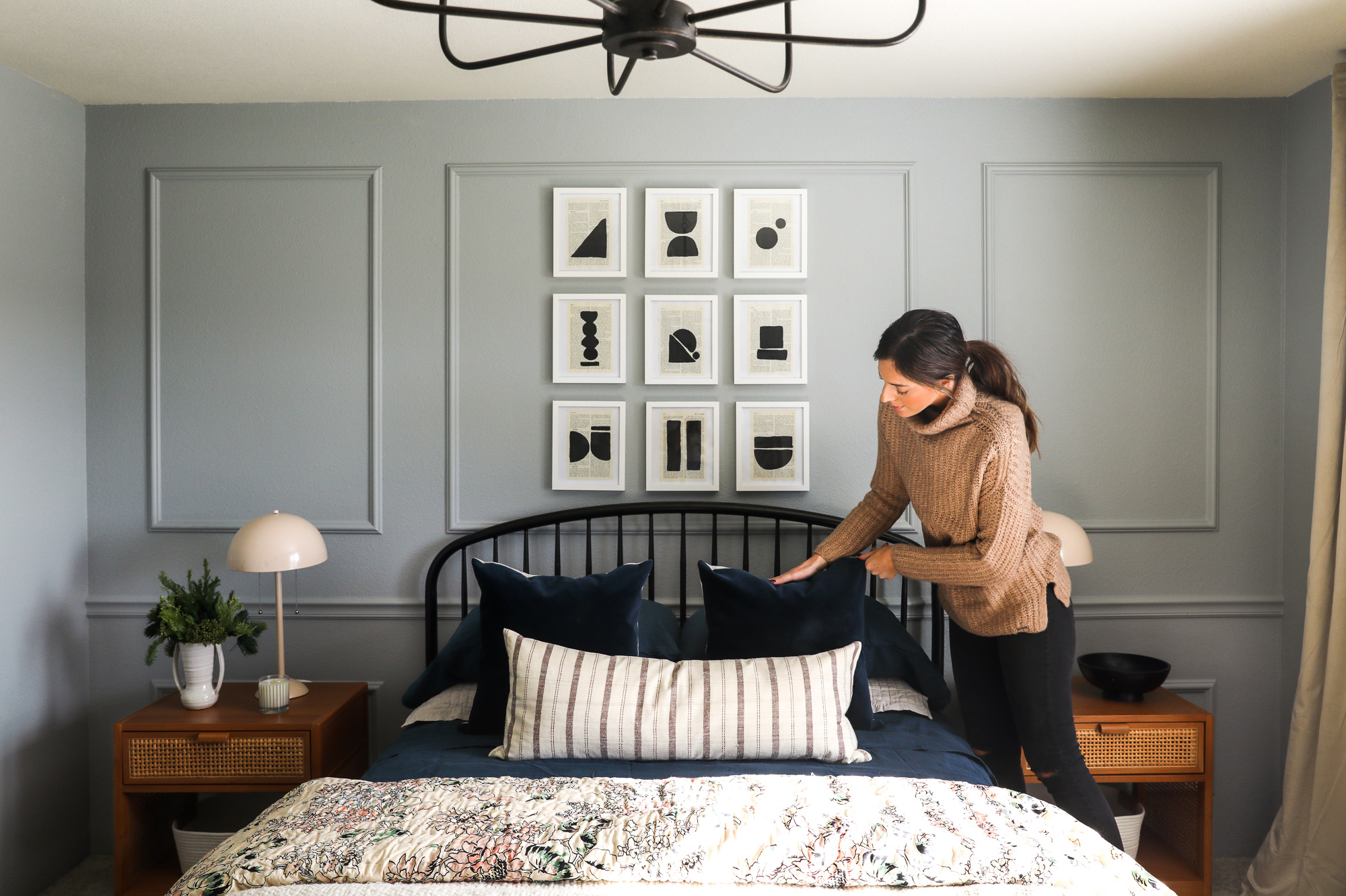
And when we finished!:
Despite what it may look like, we rarely just walk into a room and start painting it. I mood-board every room before even ordering anything (here’s a great post on how to make a mood board)! Because this home was way out in the country and in the most quaint mountain-town you’ve ever seen, I really wanted it to feel cozy and familiar and very fresh and traditional. Ever since our post on the best blue-gray paint colors, I’ve wanted to try one out in a bedroom. And so, for the first time maybe ever, I chose a paint color without being in the room. I opted for Boothbay Gray, a warm, light gray-blue. It ended up being the perfect backdrop to the more traditional elements in the room because it feels classic — but modern, too.
We put this short video together that chronicles how the whole room came together over 2.5 days:
As I mentioned, we kept the budget small, and we really had about two days to work on the room, so we had to keep our visions of grandeur in check. Instead, we focused on a few things that would really take the space from neutral to wow on a budget and the good news is these five things are things ANYONE can do to elevate their room:
-
We added box trim and a chair rail on the feature wall.
We decided where we wanted the chair rail to be by holding the headboard up to the wall where it was going to sit. We didn’t want to create any tangents with the moldings, and determined 32” to the center of the chair rail would get us exactly where we wanted.
We decided on three boxes, with the two on the outside being half the size of the one in the center, leaving 8” between all the mouldings. No room in the home had baseboards, so we decided to keep that continuity, and this solution really brings the eyes up! Plus, it only costs about $100 with trim from a home improvement store. Painting it all the same color really elevated the whole room.
If you’ve been reading this blog for awhile you hopefully know by now (I hope!) that you should hang your curtains high and wide in your space. I’m talking a couple inches from the ceiling and at least a foot wider than your windows on either side. It really makes your room look so much taller and more grand. However! One mistake I keep seeing is people using drapes that aren’t wide enough to actually close and cover their windows. Extra wide drapes add so much luxe with all those ripples, and you don’t have to spend a fortune to get the look. I love these ones that are about $100/panel, but $200 will go SO far. This makes a significant difference in spaces that feel luxe and finished and those that you can’t quite pinpoint what’s not working.
-
Swapped out the ceiling fan for a chandelier over the bed.
Many people live in a climate where a ceiling fan is a necessity in the bedroom (in that case, let me direct you to this post of stylish ceiling fans), but if you don’t, then this is your chance to make a statement with a chandelier over your bed. How romantic, right?
Even if you have 8’ ceilings, like this room had, a bed is kind of like a dining table—no one is going to be walking under it so you have a little more room to hang a light. It makes the whole room feel special.
-
Layer an area rug over the carpet
I get so many questions if you should layer an area rug over wall to wall carpet. I think the question usually goes something like, “How do you feel about area rugs over carpet?” I feel enthusiastic about it. I feel like it can define and change a whole room for the better. It can take an ordinary room and make it feel really special. You should ABSOLUTELY layer an area rug.
There are some caveats. It works best with a low-pile wall to wall carpet. If yours is thicker, then layering a thicker rug on top will work better and give you less puckering. However if you do have a more plush wall to wall, or even if you don’t, this rug pad specifically for rugs over carpet will keep your area rug in place and prevent bunching!
-
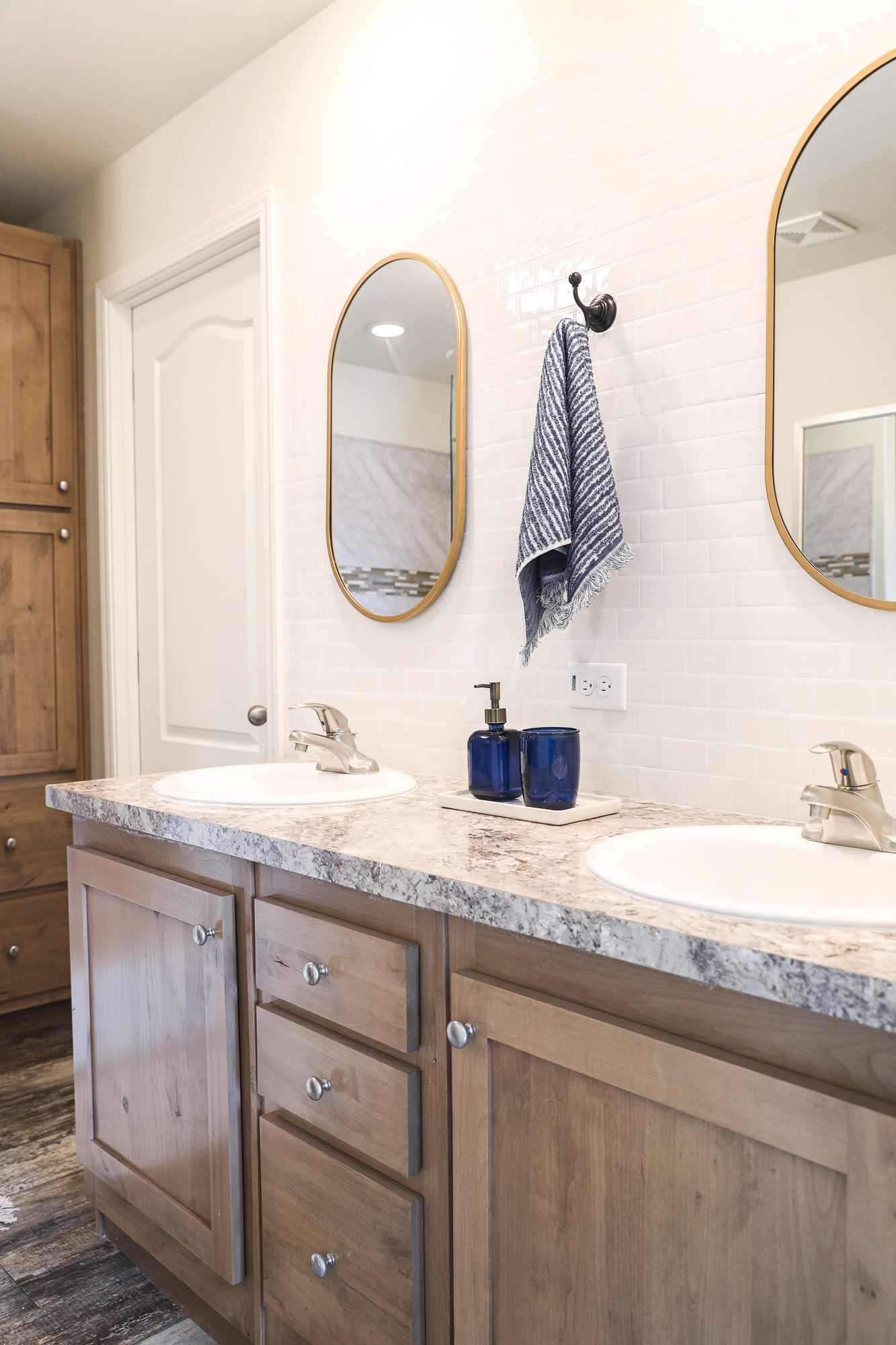
Swap out the basic full mirror for two separate mirrors in a bathroom.
The last upgrade we made to make this space feel extra special was swapping the large mirror in the bathroom for two separate mirrors. One large mirror of a cool shape would also do the trick! When I was sharing that we did this in Stories in real time, so many of you seemed like it was something HIGH on your list but you weren’t sure how to remove the mirror without breaking it. This one was just clipped in so we were able to unclip it. (I’m sorry that’s not more helpful!)
We had such a great time dreaming up a place for someone that might live here in the future. (Like I said earlier, the home is for sale!) And we love that Clayton is creating affordable housing for anyone to snatch up. We have never lived in a new build, but this whole makeover definitely taught me that it doesn’t matter how old or new your home is — you can make your mark on it. Sources below!
Area Rug: Red/Navy 9x12 $378
Queen Bed: $549
Navy Belgian Flax Linen Beed Sheet Set: $121
Quilt: $119
Navy Velvet Throw Pillow: $39.99
Caned Nightstands: $107/each
Decorative Coiled Rope Basket: $12.99
Dome Lamps: $60/each
Black Pedestal Bowl (similar): $59.95
Candle $34
Homemade Art Inspiration (Frames--Ikea)
Chandelier : $129
Wall Color: Boothbay Gray
Curtains: Cool Beige, $113/panel
Curtain Rod: $30
Blue Storage Bench (similar): $169
Women's Felt Floppy Hat: $22.99
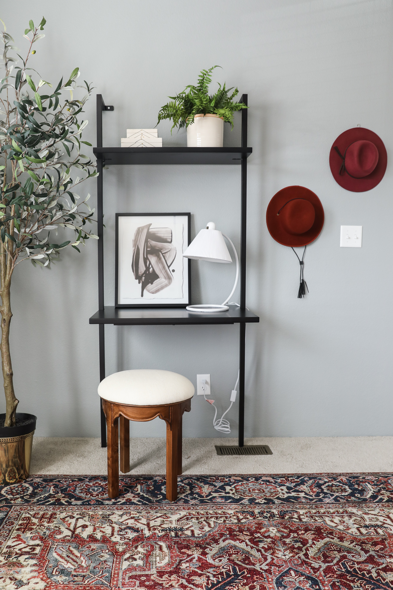
Desk/Vanity: $349
Stool: $149
Curved Desk Lamp: $59
Brass Planter $39
Faux Olive Tree: $399
Blank Ink Framed Print: $27.99
Potted Artificial Boston Fern: $24.99
Decorative Box (similar): $29.95
Women's Felt Boater Hat: $19.99
Women's Felt Fedora (similar): $19.99
Bathroom:
Textured Stripe Bath Towels: $12
Faux Fiddle Leaf Fig Plant: $39.99
Stamped Metal Mirror Brass: $49.99
Artifical Arrowhead Arrangement: $4.99
Recycled Glass Soap Pump: $9.99
Recycled Glass Tumbler: $7.99
Tile Backsplash: $29.99/sheet
Oiled Bronze Towel Hook: $21.48
Cute article from Clayton: How to Decorate Your House as a Couple
Leave a Reply

WE'RE CHRIS + JULIA
Portfolio
Projects















Hi Chris and Julia,
I absolutely love everything you do ! I specially loved the DIY art that I remember you did for this room, I would love to try it! Could you share how do you prepare the book pages , what kind of paint do you use and on what kind of paper did you glued the book pages? thank you so much.
regards from Mexico!
I love this room, and it's the inspiration for our Master Bedroom Makeover. I painted our walls, window trim, and baseboards a very similar color, but I am stuck on the door color. I'm conflicted whether to leave the door white, paint it the same as the wall color/trim, or go bold. I was wondering if you left the door white in this room?
I love everything about it, the quilt, the rug, walls and richness of it all. I’m doing my version in our guest room. So Beautiful!
I love this room, it feels so cozy and homey to me.
Really love the floral quilt! Unfortunately UO is sold out. Any suggestions for something incredibly similar or selling that one?
How about this one from Pottery Barn?
https://rstyle.me/+EWmobcYVv103pnrryUtgug
Thank you so much ????
Hi! This is gorgeous. Thank you for sharing it. Could you please link the stool that's in the bathroom with the plant on it. Thank you.
Certainly! It's this little cutie from Target: https://rstyle.me/+tt97YphU0b14jOWEVk9SSw
Is this home still for sale?
I'm not sure!
I finally found this post again via Pinterest! Not sure why it’s not available on your homepage? Seems like others are having this issue as well!
What did you think of the peel and stick tile backsplash in the bathroom? Would you recommend them in areas outside a bathroom? I’m considering covering up my kitchen backsplash with peel and stick, but am nervous about the tiles yellowing and looking cheap. Would love to know your thoughts since I don’t believe you have really posted about peel and stick since your first house when you did your bathroom and laundry floors! Love everything you guys do!
Hi, The wall is so simple, but yet so beautiful! Do you happen to have the link for the exact chair molding that you have used here? Thinking of doing the same, but there are so many different types of chair moldings available in the market.
LOVING the moldings on the wall and hoping to recreate in my master. Do you recall the dimensions of the boxes you made?
I just ordered a couple of these curtain panels, but the total weight will end up being almost 20 lbs...the Umbra curtain rod I purchased claims it's a 5 lb max. Do you pay attention to these things, or just add anchors??
OH SHOOT! I just use heavy duty anchors.
What happened to the post? The images and writing are all gone and all I can see are the comments. I was trying to come back to pin more images :(
That's so strange!! I still see it?
It doesn't show up on the main blog page as a post for me either. Very strange.
I don't see it either!
I'm also not seeing any images/writing in this post and I figured out why: my ad blocker is blocking all of the content. Usually it only blocks pop-up and sidebar ads on your blog, but it's flagged this entire post as an ad. When I pause my ad blocker, I'm able to see the photos and text again!
That is SO strange! Why would that be?!
It's beautiful.
Hi Did you leave the info for the wall mounted shelving unit? Couldn't see a list of stockists so would really love to know where it's from?
I didn't like the contrasting patterns in the early stages of the project, but now I see it. I love it!!
I love what you did with this space. The patterns, and colours go really well together.
The bathroom mirrors look so tiny, is there a reason you went so small in that area??
They needed to be centered over the sinks and those were small
Did you stain the caned nightstands at all? I actually ordered them for a project and haven't gotten to open them yet! It looks like a richer wood tone than online. Love this entire space! The trim work and the curtains are gorgeous.
Didn’t touch them!
Thank you! Can’t wait to open mine now! Leaving things in boxes while waiting on construction is testing my patience! :-)
I ordered the same nightstands and unfortunately the color looks nothing like the ones you got :(. Such a shame because it looks so beautiful in these photos.
Love!
Can you please post the link for the stylish ceiling fans? The link isn’t there (in the first sentence under #3). Thanks so much!
Here ya go!
Did I miss the link for the stylish ceiling fans ? Love this design on a budget!
We took the ceiling fan out. So I'm not sure where it was from.
No, you have a sentence "in that case, let me direct you to this post of stylish ceiling fans" but there isn't a link. Is this the post you're referring to, Julia? https://chrislovesjulia.com/ceiling-portable-fans-dont-sacrifice-style/
She means that you said there is a link to a post on ceiling fans but there is not
Here ya go https://chrislovesjulia.com/ceiling-portable-fans-dont-sacrifice-style/
FYI: there's no link to the ceiling fan post.
This is such a fun post, thank you for taking on a quick but high-impact makeover!
I am also practically in heaven with small budgets :) ...ok, I would be in heaven with LARGE budgets, but I'm in heaven when you flex your gorgeous design muscles with small budgets! That color had the potential to look dated and 80s but looks so fresh and modern. Love it! This bedroom color scheme is actually pretty similar to mine, so now you have me thinking I should bring in a colorful rug and more black accents!
Chris and Julia, you've nailed it again! Could you source the three globe semi flushmount we saw briefly in the video please?
Found that at our local LOWE'S!
Hi! What pillow coverings did you use besides normal sheets and the velvet throw pillows? I bought this quilt but I am struggling with making the bed look “nice” and not half done. The double stacked pillows make it look more welcoming but I am not sure what to cover them with.
This turned out so great! A fabulous example of putting together a room on a very small budget! I've said it before, but you have a way of picking individual items I would never go for and turning it into magic! Love the not-white bedding and the pattern play.
Also, where is the throw blanket on the end of the bed from?
I had that in my stash. From Rejuvenation a few years ago.
I love the wall with box trim and chair rail, especially with that paint color. It looks both modern and timeless at once, which is quite a feat. I'd love to hear more about the decision to put the box trim and chair rail on only one wall. Was that purely a cost-saving measure? I think it has the potential to look incomplete, or weirdly abrupt at the corner, in person or in photos that aren't so beautifully styled and shot. I also wonder if that incomplete, abrupt effect would be amplified in rooms that aren't as well-designed overall (ie, if I were to do this in my own home).
I work in a building where lots of lovely old rooms have been divided into plainer, smaller ones, so we ended up with rooms that have a few walls with old trim that runs straight into the completely blank new wall. It feels like a hodgepodge. To me, it has the potential to have that vibe.
The other walls all had so much going on with doorways and windows that it actually looks really intentional. I think also it being a smaller room works to its advantage.
I know the bathroom walls were textured. Are the bedroom walls textured? I love the trim but I always hesitate bc our walls are textured!
Yup! Same texture.
I really love including manufactured homes as a reasonable and normal option in the “interior home blogging” space or something like that lol :) . My husband is from England where you cannot even get a mortgage for a manufactured or prefab home because people think so little of them and I think it’s such an important affordable option .
I agree. Seems like so many design bloggers have teamed up with McMansion home builders to create fancy, unattainable staged spaces. So it's refreshing to see C&J do a budget friendly makeover for a truly affordable housing type.
This bedroom makeover looks so achievable and turned out lovely. I love seeing your posts on IG and can relate to your style. Can you share the source of the white tray on the bathroom vanity? Looking forward to seeing many more makeovers.
Thank you so much! That's from Target!
Thank you so much! I have a counter top that is similar and haven't been able to find a decorative tray I actually liked (until now).
I was in the camp of "not sure about the rug and blanket patterns together" but of course I'm sold. Well done!
Looks great! I love the box trim and chair rail combo. Do you think that could work on a long wall that has a ladder shelf in front of it on one end, and a tall hutch in front of it on the other end? 2 boxes on the sides would essentially be covered up so not sure it makes sense to do it on that wall.
Hmmmm, I don't see why not!
What a fabulous quick makeover! You made adding the trim look so simple in the stories that I'm definitely going to try it in my bedroom also. Love the way the colors from the bedding/rug bounce off each other and your wall art turned out great.
One note about your love letter, similar to another commenter, good for you for being so honest about the stress behind the scenes of a renovation. We ended up living in a hotel for 4 months while waiting for the sale of our house to go through, plus a toddler and 3 dogs :) and all in all, it really was a better plan than trying to move in too quickly and the time went quicker than you think and you get inventive about things to go and do as a family. Hope you get some peace over the holidays!
Great job! You have really blossomed since I first started reading your blog. I really like your artwork.
This room turned out so cute! That wall of paneling really makes the space!
Whoa Nelly! You did so much with this space! The molding added so much, the chandelier too. I love how you play with shapes to create a beautiful room.
Everytime I see one of your rooms, I think "ooh, this is the one I need!". This is no exception. I adore this space.
Hi! I love the way the room turned out. I think I might have to purchase some blue sheets now.
Did you tape down the rug to the carpet at all? Every time I put a rug under a bed and over carpet it gets wavy or bunched up and it becomes a tripping hazard.
This one I didn’t, but they make specific rug over rug pads that help with that! I linked one on this post.
Amber - I ordered this rug pad for the rug in my bedroom (goes partly under the bed and is over carpet) and it works like a charm. I've had it for maybe two months now and I don't know how I went for six months without it because the rug never moves now!
Oh no - I forgot the link! Here it is: https://www.amazon.com/gp/product/B01HDL4R7U/ref=ppx_yo_dt_b_asin_title_o01_s01?ie=UTF8&psc=1
Oh my goodness, Christine! And it doesn’t indent too badly where the feet of the bed are? I wish I had known about this before I sold the pretty rug I had in my room. I also kind of want a pic of your rug over carpet combo :)
I think it so cozy. Love that you do your own thing! The love you put in designing really shows. Question...Have you been taking inspiration from Downton Abbey? I am loving it!
I take inspiration from everywhere!
Loved everything about this bedroom & bathroom...wall color, rug, bedding, tile (wowza!) and especially how the molding transformed the room to look higher end. I have those curtains in my shopping cart and was trying to decide between the regular 50" width or 100" and you have sold me on the wider width. Can't wait!
Speaking of curtains. Chris did a tutorial on how to mend sheetrock with smalls holes to large ones. I have referred back to that several times. It's great! My biggest frustration is the right screws, anchors (mostly) to use when hanging curtain rods, towel bars, or heavy objects. We've had curtain rods to come out of the wall in our kid's rooms. We used the plastic ones supplied so wondering if that is the problem. What are Chris' 'go-to' anchors for hanging things into sheetrock or wood? Help please!
We love the heavy duty ones that you screw in with a screwdriver/driver! They are easy to install and have never pulled out.
This room looks amazing. As you were showing how the room was coming along on your IG stories my first thought was this isn’t my taste but it was immediately followed with “but just wait till the end, they’ll convert me and I’ll love it”. Once again, I’m just sitting here impressed that anything you do and touch turns to gold!
Also, the link for the stylish fans isn’t there, FYI.
looks awesome- loveee the custom artwork.
We took one of the builder grade mirrors off in our bathroom that wasnt just clips. We had successful results using piano wire, moving it slowly and tightly back and fourth behind the mirror to loosen up the glue. took patience but really worked well.
This room turned out great!! It's always so interesting to see how you take something bland or blah and make it inviting and interesting. (The company should hire you to decide finishes etc. for their houses!)
About the thoughts in your love letter-- I could really relate. We moved to a house that turned out to be a bigger fixer-upper than we'd thought in June (in a foreign country, no less!), so we've been on a similar timeline and are still in the thick of it. I think I sort of hit my breaking point a few weeks ago (and I posted one of those HOW DO YOU DO IT?? questions-- ha), and since then, I've sort of had the realization that we DON'T need to get it done on a quick timeline. Like you, we have young kids and demanding jobs. Luckily, our jobs don't revolve around how pretty our house looks so we DO have the luxury of just slowing down, so I realize this isn't something you can do. But I can also SO relate to the feeling of just wanting to get past this horrible, messy, and loud phase 1 and to the point where you can actually start doing fun things to your house. I love the creative challenging of decorating and figuring out rooms too, and one of the frustrating parts about this LONG preliminary stage is that it involves so many tasks on the list before you can even start to get to the fun parts or the parts that are interesting to share on social media, and so many things that prevent a home from being fully livable. Anyway, I have no advice, but I'm definitely sending you guys love and support. It's nice to know that you are human too.
I miss your podcast, by the way! I started following you through your podcast and it seemed like such a good place to get to know the funny, honest, real YOU rather than the polished version we all are good at presenting to social media and the blogosphere. I am certain you don't want to have another thing added to your list right now, but just know that we all like the totally imperfect you, too. :)
I came over from Emily Henderson's blog, but I can't see the post, only the comments. I wanted to know where you got the comforter that's on your bed. The whole room is beautiful (what I can see of it:).