I feel like gray paint colors were so incredibly overused a few years ago, but then a lot of people accidentally chose cool grays to paint entire rooms and instead of a trendy living room, they got a nursery and kind of swore off the color. But now cool gray is having a resurgence. We learned from our mistakes–and these blue gray tones are showing up in the best best ways. I’m deeply inspired and wanted to share a few favorites with you.
1. Boothbay Gray by Benjamin Moore used in Rachel Parcel’s entry. The color is captivating. It has so much depth and is a welcomed surprise for a front door–right?!

2. Studio McGee used Platinum Gray by Benjamin Moore on their office cabinets and the slightly cooler tone feels light and fresh!

3. @amberinteriors used Manor House Gray by Farrow & Ball for these playroom shelves and it’s the perfect backdrop for the toys and accessories–right? I love that it feels warm and cool in areas and those chameleon paint colors stay interesting for a long time. It’s so good!

4. Mawr Design nailed the perfect grayed out greenish-blue cabinet color for this laundry area. Sherwin Williams Oyster Bay, mixed with that floor tile–I’m swooning!

5. @natashalevak brought the trend into the kitchen painting base cabinets Water’s Edge by Benjamin Moore for just a hint of color.

6. I’ve shared this image before so it’s no secret I’m a fan of @ispydiy’s use of Silver Celadon by Behr on their doors and trim. It’s sophisticated and interesting and just right.

7. Most of these examples have been on doors or trim because that’s where trends are going right now, but @benjaminmoore shared this photo of Metropolitan (their color of the year) on the walls and I’m here for it.

8. @jhinteriordesign shows how to do this light cool gray right. The cooler tones work if you’re aware of what they are and how to use them. Like playing them up as a pale, gray, blue-green with coordinating accents.
9. Francois_et_moi used International Gray by Kilz on this beadboard entry and mixed it with complementary golden colors to play up the blues! Genius!

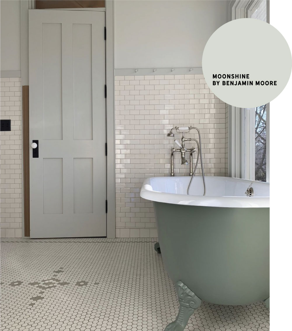
10. Room For Tuesday mixed two gray-blues in her bathroom and the tone on tone is sophisticated and sweet–but not too sweet.

Lesson learned? If you’re looking for a perfect blue–look to the grays. And if you’re looking for the perfect gray, I mean, maybe check out the cool tones. I love it especially for trim and doors!


I’m redoing my kitchen cabinets in Decorators White and Waters Edge by Benjamin Moore. I was wondering if you have a suggestion on what color O should use for the walls?
I have always loved paintings but never been good enough to do it myself. I have a major problem blending colors, the lines looks really prominent when I color spaces. Hence the reason I never really pursued paintings as a hobby, even though I enjoy touching up some of the wall paint in the house when I get the chance.
The paint by numbers has given me a chance to learn how to paint just a little bit better. It helped me with what I needed the most actually, it helped me develop a better understanding of color.
I was going for a warmer gray, although you describe it as cool. ????♀️ Anyway, all our natural light really lightens up the color; We’ve had family say we have a “white” kitchen, which is NOT what I was going for. ????♀️
Hi,
I just love the oyster bay color, especially with the mixture of tones in the fixtures. Can you tell me the name of the lights and where they are from? I am doing a kitchen and the color and finishes together are exactly what I am looking for!
Thanks!!!
I have a bar area in my basement and the cabinets need updated. The walls are revere pewter. What color should I paint the cabinets?! I’m not too picky and would love your recommendation!