It’s been quite the adventure selecting paint colors for my home! Once we decided to renovate our living room with skylights and beams, it seemed like the right time to consider making a paint change too. We’ve had Farrow & Ball Pigeon on the wall for four years, and I still love it. But I decided I wanted to try something a little warmer in there, now that there is more natural light!

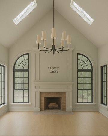
Paint Color: Pigeon by Farrow & Ball | Living Room Sources

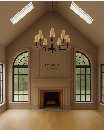
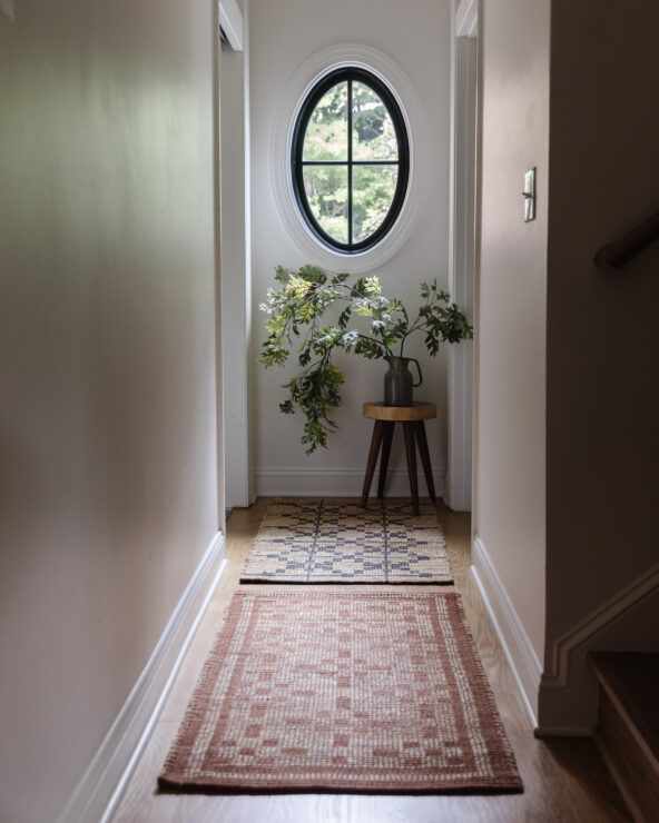
Paint Color: London Stone by Farrow & Ball | Chandelier | Mirror | Sconces | Black Shades | Picture Light | Art Prints | Art Frames | Table Lamps | Console Table | Pharmacy Lamp | Ottomans | Faux Stems | Vase | Glass Hurricanes | Flameless Candles | Coffee Table | Sofa | End Table
I decided to order sample sticker swatches so I didn’t have to paint swatches all over the walls. It was my first time trying them, and wow, I may never go back! There are a few companies out there, so shop around to find the best price. Everyone suggests putting paint samples on a white background, but I strongly advise against it. While I can discern color tones fairly well, the best method is to hold the sample up in the air. Placing it against white will make the color appear significantly darker than it truly is!
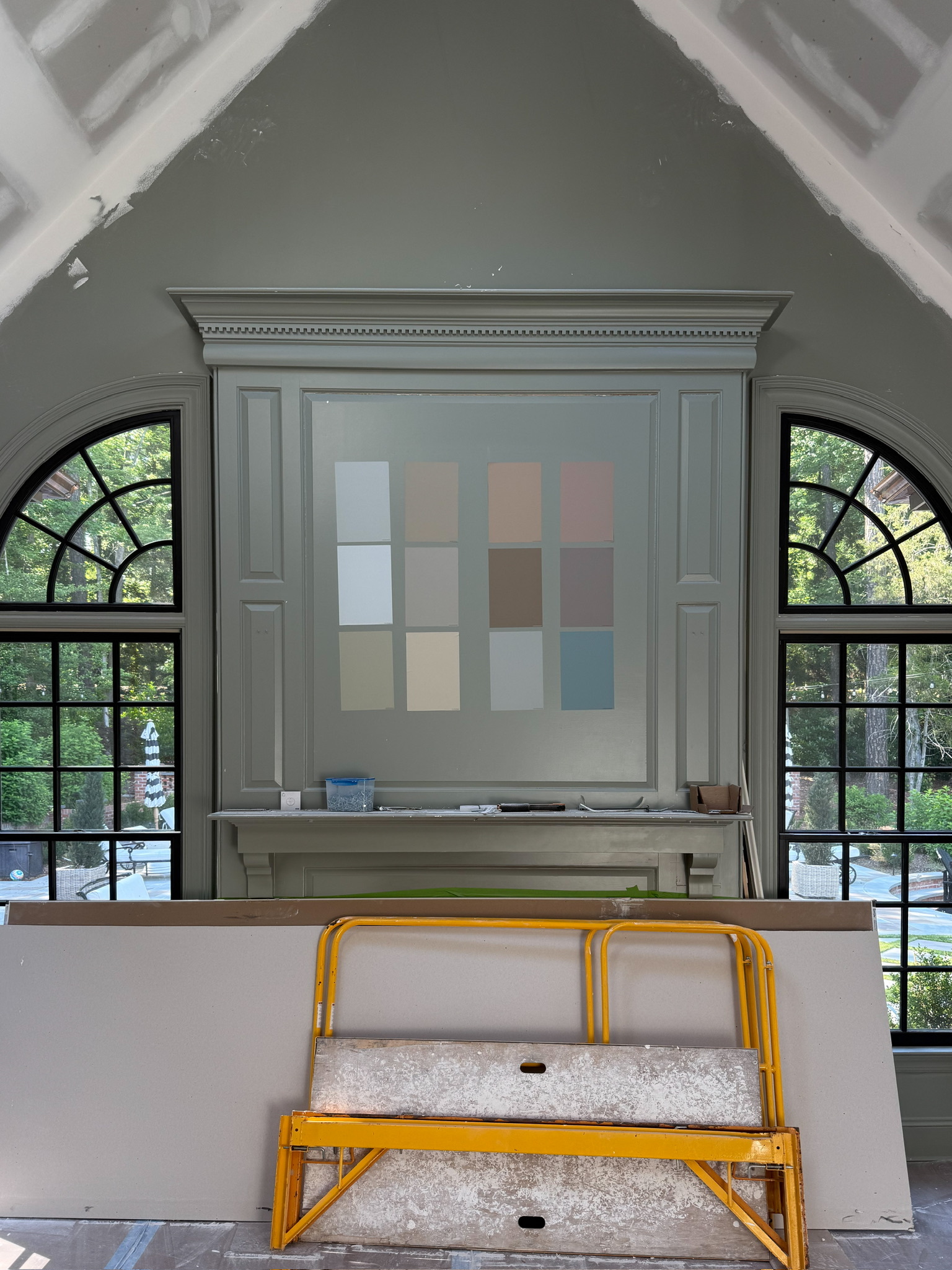
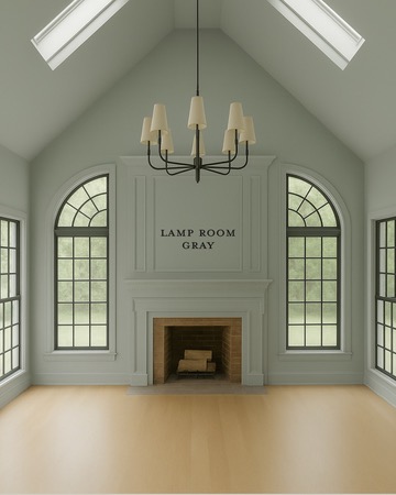
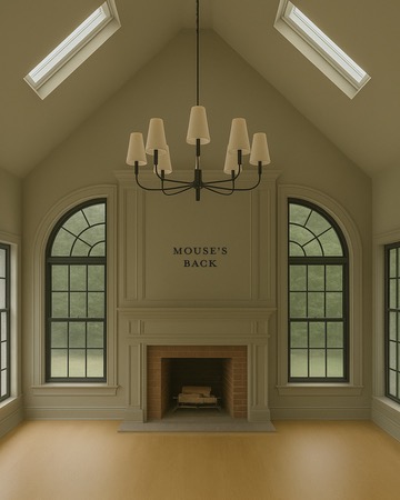
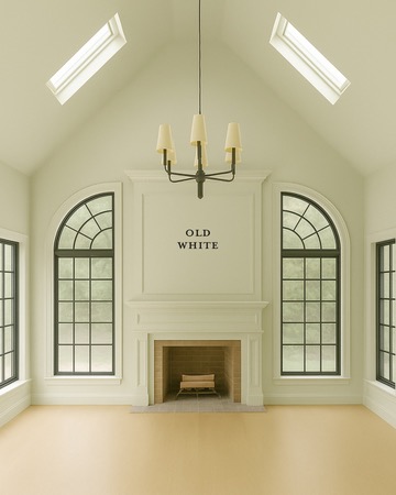
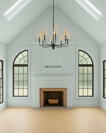
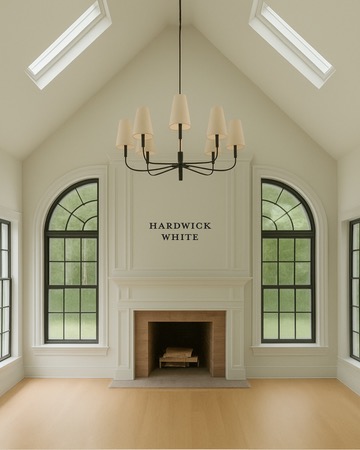
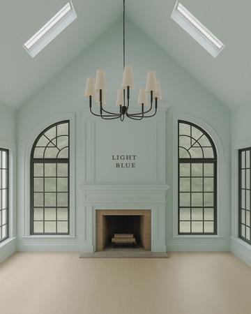
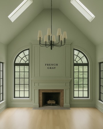
Before we committed to a color, I narrowed it down to 9 options and asked my sister and our head of media Andi if she could mock up the living room and new skylights with the colors I was considering. It was a super helpful exercise that she did via ChatGPT (not without its challenges), and I have to share how different this room could look with each color!
My Final Living Room Paint Color Decision
My initial top three were Farrow & Ball London Stone, Light Gray, and Hardwick White. Funnily enough, none of their names actually describe their true color. I was even considering one of their more conversation-starting colors, Dead Salmon. It just goes to show, the names really don’t matter – it’s all about how they look in your space!
For the living room, I craved more depth. I thought that my initial choices simply weren’t dark enough. That’s when I considered Mouse’s Back. It looked so dark on the swatch, but I had a feeling it would be perfect. My theory is that when a room is ‘color-drenched’—meaning everything is painted the same color—it appears lighter, especially with natural light. I wanted to avoid any stark contrast, particularly with the ceiling, so this approach felt right.
I thought for sure that was the one. I even sent the color to our contractors—and then called them to change it at the last minute! I just knew London Stone would be even better—it is dark, but with that warm undertone that I knew would feel more elevated.
A New Chapter: Saying Goodbye (for now) to Pigeon and Hello to London Stone!
Once I settled on London Stone, I felt a pang of sadness about not using Pigeon. It’s a color I’ve loved for four years. But sometimes, like getting bangs after a long time, you just need a change! We’re undergoing so much transformation in that room that sticking with Pigeon felt almost anti-climactic. It’s been four years; it’s time to live a little!
The good news is, I still adore Pigeon, and London Stone is such a neutral yet rich tone that they complement each other beautifully. So, I had an idea: what if I painted the trim in our entry hall with Pigeon? It’s currently a very blank space, and this would allow us to bring Pigeon back into our home in a fresh way. I’m confident it will reappear somewhere else too. However, I think I would always regret not trying a new color. After all, it’s just paint!
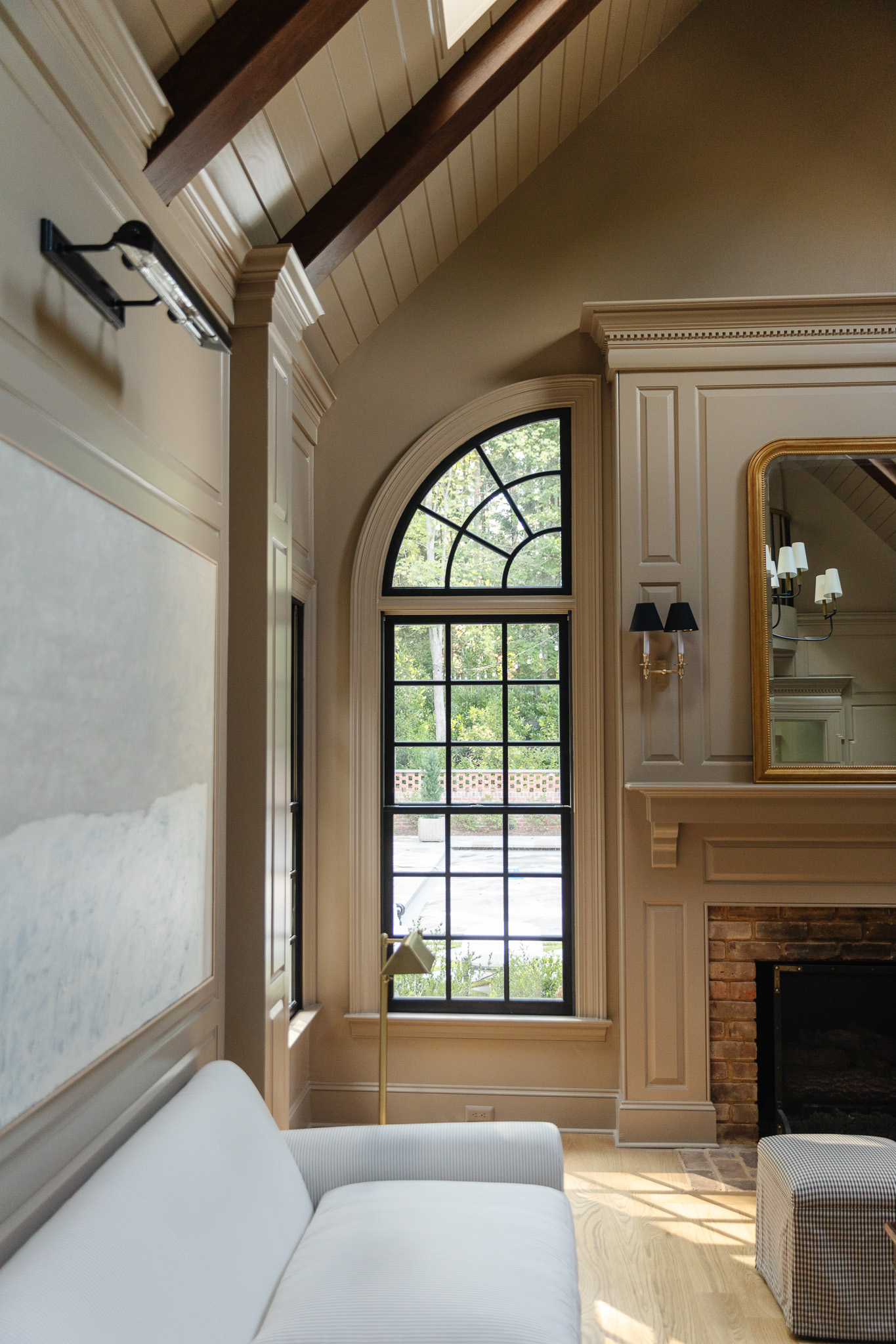
And I immediately felt like I had made the right decision after I saw the final reveal last week! First the team installed planking on the ceiling and stained the ceiling beams a walnut color, followed by adding trim and a built-in bookcase. Then they came in and painted everything, and wow, with the skylights bringing in that natural light, it feels like an entirely new room!

Paint Color: London Stone by Farrow & Ball | Picture Light | Art Prints | Art Frames | Table Lamps | Console Table | Sofa | End Table | Candle Pedestal | Brass Bowls | Coffee Table Books
We framed these original art pieces over the sofa in frames I got from Amazon (on sale for Prime Day). I’d rather invest in the art and save on the framing!

Choosing a Paint Sheen
We chose to paint the walls, trim, and ceiling in Farrow & Ball Estate Eggshell, which is a 20% sheen level. Farrow & Ball has different names for their sheens, so think of this similar to a regular eggshell. We chose something with a bit more sheen than matte or flat, because nearly every wall, nook, and cranny is trimmed out with MDF and paneling, so there is a lot of dimension that we want to highlight. Plus, this finish is scuff and stain-resistant, washable, and wipeable!!
If your walls aren’t smooth, a higher sheen is going to really show all of the texture. So a lot of times, painters will spray when using a higher sheen, so you won’t see any texture on the wall. Smooth surfaces look great more shiny (and trimwork is generally smoother). In our last house out West, our walls had some texture, so I used a lower sheen like flat or matte on the walls to minimize the view of the texture. And then I’d choose a semi-gloss or satin on the baseboards and crown molding. Smooth surfaces look great shinier, so if you’re applying trim or molding to a wall, it’s a great time to accent with some sheen!
Other Rooms on the Horizon
Our bedroom will remain the same color, London Clay (funny how I’m on an England theme here); we just needed to patch some areas. And for the bathroom? Hold onto your seats…it’s a warm pinkish beige. Can’t wait to reveal the final photos soon!


After seeing both the Farrow & Ball, “Pigeon”, and “London Stone”, in a room, I prefer the “Pigeon”, and might use this paint color in my new home living room. I love the warmth and cozier feel the “Pigeon” color gives and that will allow me to add a darker drape to give it texture. Thanks for showing both colors in a “live” setting. It really helps in deciding.
I love the living room updates especially the new paint, skylights, and built in bookshelves. The room has much more warmth now and feels less chaotic. I wonder what rug you will pick! The previous one felt too busy. However, I do miss the long velvet bench in front of the fireplace. I don’t know why but I always feel gallery walls are a bit tacky and take away from the grandeur of a room especially one next to a bookshelf (it’s just too much going on in my opinion).
I know full room design is best evolved, so I will shut my mouth now and watch with anticipation as it does.
I agree with Suzanne and Michelle. There are now too many competing elements from different styles (and in too restricted a space) for my taste. The colour is great, but I wonder if the finished effect is as you anticipated. I adore your study and love the bedrooms Your great strength is your inspiring use of pattern and colour – and there is none in this room at present.
How exciting, AND beautiful! I draw so much inspiration from your home, really appreciate you sharing so many details/sources with us. You’re so close to the end, and I cannot WAIT to see the rest. Enjoy the new space! ♥️