Since you'll be able to see the laundry room/mudroom through the sliding door (that is mostly left open) in the kitchen/dining room, we really wanted the two spaces to complement each other well. Here's a before and after floor plan as a reminder of the major changes that are happening in this area:
A few weeks ago, you may remember, we made a major dent in the progress. The walls to the former 4th bathroom came down, the room was demo'd out, the floors were patched, we vented the dryer out of the roof, and the washer and dryer hookups were moved over here.
Since then I have definitely cleaned up those floors--goodness!--but also came up with the rest of the plans for the room.
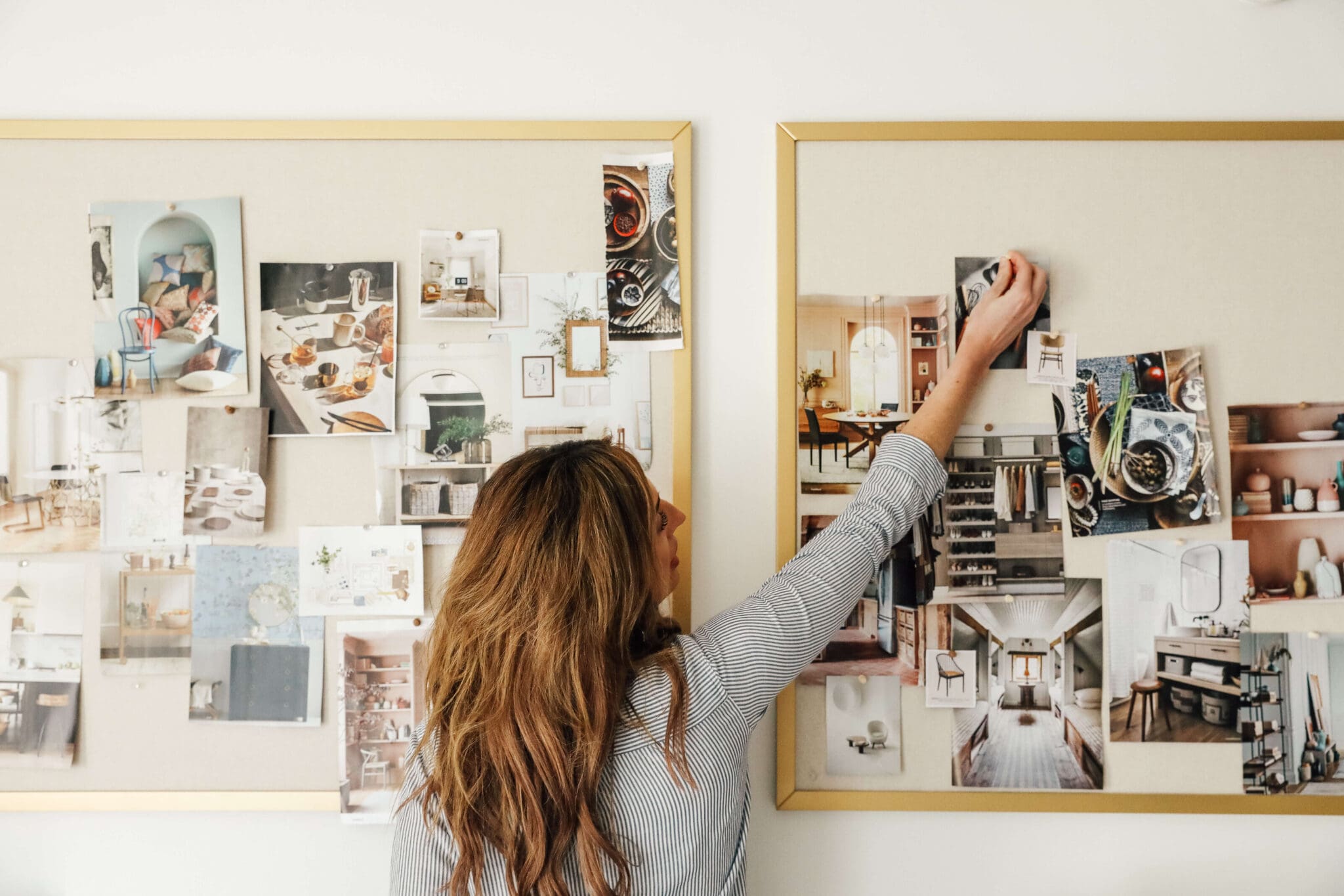
area rug | basket | canister | enamel tray | hardware | countertop + backsplash | faucet | cabinets | washer + dryer | fixture
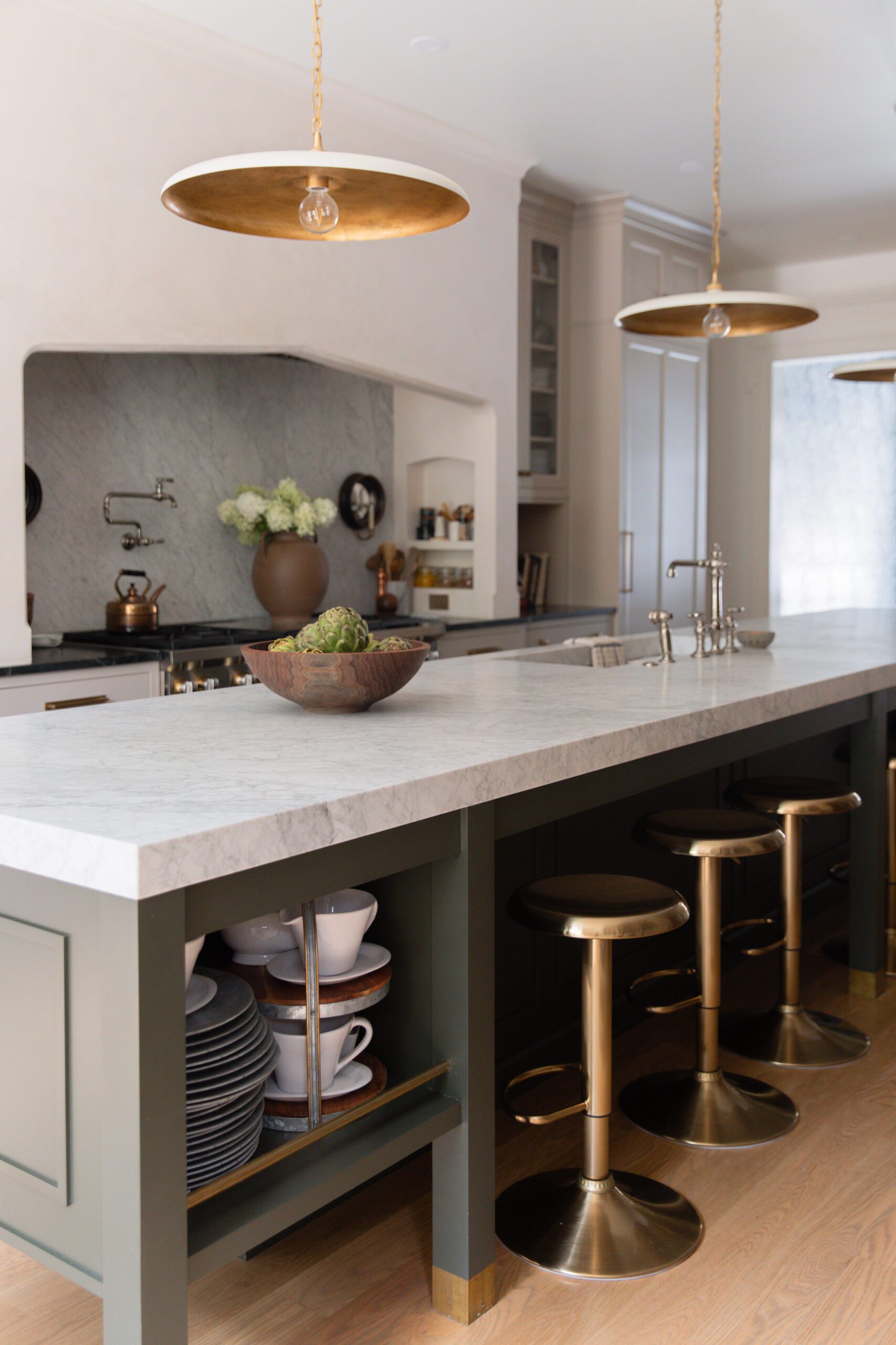
Like I mentioned previously, we wanted the kitchen and laundry room to complement each other, but not be exact replicas. You can see the kitchen plans here. While we are going for black cabinets in the kitchen, we chose this off-white cabinet option (Bodbyn white) from Ikea in a similar style for the laundry room. The cabinets in here are 40" tall, but the cabinet fronts are only 30". When we went down to Ikea a couple weeks ago to pick them up, we took our kidless time looking around the showroom and we stumbled upon this:
Okay, it might not be the prettiest picture, but we were absolutely inspired by the opened shelf space beneath closed storage for quick-grab stuff like dryer sheets and dog treats. We thought about doing full 40" glass front doors--so pretty!--but quickly realized our current laundry cabinets are stuffed with things that aren't so pretty like light bulbs and cleaning supplies. So, closed storage won, but the extra open shelf space lined with baskets will be a nice addition.
Another decision I waffled with was a backsplash. We are squeezing in a small 15" base cabinet next to our washer and dryer and with that, a small sink, too. While we never used the 4th bathroom for…bathroom stuff, we did use the sink to fill up Charly's water bowl and rinse paint brushes, etc.. So, while the sink we're eyeing is only about 13" wide, it is worth it to us to have it there. However, putting in a tiled backsplash in such a small space just felt busy in my mind. There will only be about 13.5 inches--at most-- from the top of the countertop to the bottom of the cabinets in here and throwing in another material, I just couldn't make it come out right. I went from thinking about tiling the entire room to nixing tile altogether and landing on carrying the same warm wood countertop we have planned for atop the washer and dryer up the wall to meet the cabinets. It feels like the perfect solution.
The hardware is the same we picked out for the kitchen (again, you can click here for a reminder of those plans) and the faucet we had our instagram followers vote on fits in perfectly--well done! We have a completion goal date of April 22nd for the laundry room, which is coming up! Even though this goal doesn't include the mudroom side of this, we do hope to get that all framed in the near future for floor to ceiling "lockers" like these (via):
I started putting together cabinets yesterday, but we have to patch drywall and get the room painted before we can actually hang them. I am still deciding between carrying the warm putty color we have throughout the rest of the main floor in the mudroom/laundry, too, or matching the walls to the warm white cabinets. It's a toss up! More updates soon.
Leave a Reply

WE'RE CHRIS + JULIA
Portfolio
Projects









The space is perfection!! I came across your post as I looked up the color match for the Bodbyn cabinet, so thank you for very much for posting!! I see here that it looks like you didn't use the Bodbyn front, but the shaker instead (which I'm sure has it's own name). Is that right? Or can I not see the raised panel in the picture? The space is so lovely you have me second guessing myself on the door decisions. TIA
love the inspiration. clean, but very warm and inviting!
Hi! It's great to meet you!!!
Thank you for linking to me. I am loving your blog and this project. Your laundry room will be so beautiful and original. Love that!
Do you mind letting me know what program did you use for the layout/floor plan (1st pic). Can you email me this info? I would really appreciate it.
Thank you, Julia.
Luciane from HomeBunch.com
Great furniture and fixtures! I love the insights provided....
Woah, that mood board! That rug is just the icing on the cake. Your plans look grown up and pulled together yet still totally fresh. That's not easy to do! And that's so smart to give yourselves a deadline. My projects tend to drag on and on, for years sometimes!
Those locker-like cabinets have my heart! Gorgeous!
Love the plans! What are your thoughts on the color of the ikea cabinets? We are planning an ikea kitchen right now but haven't made the 2 hour drive to check out the new line just yet (hard to do with 1 yr old twins and a 3 yr old!!). Do they read off-white or more of a true white? I remember the old Adel cabinets were said to have pink undertones. Just curious about the bodbyn and shaker style you saw.
I will say, in the store, I didn't love the color. They looked VERY off-white, but all of their white cabinet options did. I looked at a ton of examples online and as soon as I got the sample away from the show room, it looked a million times better. Lighting is everything. In our home, they look like a nice, creamy white. I am going to color match them today and will get back to you with an exact paint color match so you'll have a better idea.
Awesome. Thanks so much. I'm hoping they work for our house.
love love love what you have planned... such a better use of space. and that pantry... wonderful!