Chris Loves Julia readers will get a $50 discount off a purchase of $200 or more at Article. (Offer is valid until September 30, 2020). Discount will be automatically applied at checkout and will work for orders in both Canada and the United States.
When our friends, the Pugmires, moved into their house six years ago, they were faced with a niche. You know, those weird insets on a wall--this one was right in the middle of the living room. It was enough of a head-scratcher in a new house that they didn’t want to deal with, so they put a huge mirror over it. And then they started arranging their whole living room around this huge mirror… The design felt crammed, and it lacked flow. But they made it work for six years. Recently, Corine and Preston had us over and we started talking about the living room. They said they were READY for something new, but didn't know what to do because the NICHE. It seemed obvious to all of us, “Patching the niche would be answer to all of your problems.”
A couple of 2x4s, some drywall, and joint compound later — no more niche! Suddenly they started to imagine a living room with an entirely different arrangement!
Corine consulted with me on paint colors (I recommended Greek Villa by Sherwin-Williams), layout — the works. They were waiting for me to come up with a mood board for their living room, but simultaneously, Article had just reached out about collaborating on a room. We love Article because of how easy they make it to create a beautiful modern space. Their pieces are family-friendly, substantial, and retail at amazing price points for the quality they command. Given how much time we’re all spending at home this year, it seemed like the perfect opportunity to start from scratch and build a room from the ground up, while also doing something nice for our friends. So we started scheming a surprise makeover.
Here's the before on the day we showed up...
And the after!
The view from the front door is the long living room wall. To help break this up, we designated an entry, with a Culla Oak Bench, and a large circular mirror — hung at the perfect height for “checking yourself” before walking out of the house. The bench has storage (soft-close drawers) for shoes and bags and button-tufted seating for sitting down to put your boots on.
Designating an entry is a great way to break up a big wall like this and created a separate “room” without switching up the paint color or putting up a wall.
The front door opens into the living room, and then the room gets deeper with a nook in the front of the house. In their previous layout, the Pugmires had a couch nestled into this nook. In fact, all of the furniture was against a wall. But this made all of the pieces feel so far apart. The first thing we did was situate two Abisko Mist Gray Sofas, facing each other, at a conversational distance. Floating the furniture made it feel so much better! And BIGGER!
Opting for duel couches over, for example, a couch and two chairs works perfectly in a long but narrow living room, like this one. The seating starts to feel as ample as the conversation. The sofas also brought a really contemporary shape to this living space, and they arrived in two pieces (so they can be easily moved up tight stairways and through small doors which is a huge bonus if you’re an apartment dweller)
Preston and Corine have young kids, who really live in the living room. They famously take the couch cushions off, and it drives their parents crazy. We specifically chose these sofas for them because the cushions do not come off! The tight seats are also great because there are no cracks for things to fall into :)
The Pugmires live out in the country, so the big living room window that looks out on sprawling land is a definite focal point. However, we wanted to bring the focus to the middle of the room — or the NEW middle of the room, I should say. Because the living room was oddly shaped, we used the two couches and the Timpani Charme Tan Ottoman between them to create a new center to the room. It worked! We went with a lighter palette for the furniture because the ceilings are lower, and this helps to open up the room even more. Bringing the living room out of the dark “nook” and into a bright, airy conversational hangout was just what this young family needed.
The ottoman was a great choice, over a coffee table, because it’s sturdy — the kids can run into it (even jump on it) without hurting themselves or it, and the parents can use it as a footrest:) Whenever I’m introducing an ottoman as opposed to table, I like to bring in I like to bring in another material and another color for contrast. The full grain aniline leather on this ottoman was just what was called for. It adds warmth where the rest of the room is more neutral and airy and we know this particular leather is going to patina beautifully over time. In fact, it already arrived with a ton of gorgeous natural color variations, wrinkles, and creases in it. It looked like it had been there (and belonged there) for years.
A storage display is a must for a living room. We all need a couple of shelves to show off our treasures, store our libraries, and arrange some plant life. We ordered this beautiful Caliper White/Walnut Shelving unit because we knew it would add fresh structure to the room, while introducing a new shape — plus the A-shaped frame is solid wood. Corrine and Preston have so many vintage pieces that really warmed up these modern pieces.
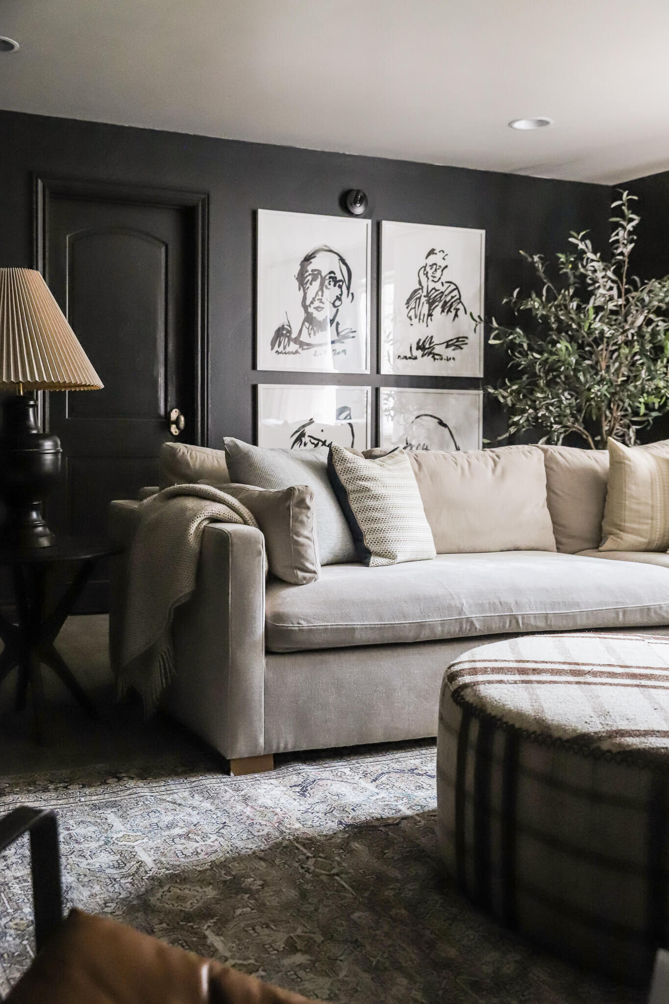
Inspired by Article's modern aesthetic, I opted to make some modern art of my own. Using a black canvas and some house paint, I applied loose, whimsical brushstrokes and quirky paint-drop squiggles. We cut the canvas and applied it directly to the cardboard backing. We spray-painted some inexpensive poster frames matte black and opted out of the layer of plexiglass for a fine-art look. I was going for an odd number, but the canvas roll proffered just enough for four pieces, and I was happy with the result.
We tossed in a couple of pillows for color and texture: The greatest standouts were the Lucca Garnet Red Pillow Set (piped edge and 100% down filling). Completely luscious. And there are ten other gorgeous velvet tones, too. This mustard gold for fall? Come on. And another lifetime ago we cherished this deep evergreen pillow set in the Forest Bedroom of the CLJ Cabin.
Even though this room is bathed in natural light, I was really excited about installing lighting. (My favorite.) We ordered the Copen Floor Lamp, with its powder-coated shade and stem and walnut accent on the back of the upper shade because it felt really industrial-chic, with warm natural accents.
The surprise went over beautifully! (Check out the reveal on our IG stories highlight). Preston and Corrine were over the moon about their new living room, and the kids seemed just as giddy! Preston sweetly said, "I didn't even know this was possible for us." Good design — that's possible for everyone. Good friends — those are harder to come by. Luckily Article makes the first part attainable and easy for everyone. Their pieces are beautiful, built to last, and they just work. Shopping the site is a breeze and you can feel confident knowing that they take the guesswork out of making a space work — their pieces, regardless of collection or style, look seamless together.
Couch | Side Table | Ottoman | Floor Lamp | Maroon Pillows | Book Shelf | Rug | Curtains | Fiddle Leaf Fig | Bench | Mirror
You can shop with Article online, and they're shipping with Contactless Delivery right now to ensure everyone stays safe. In-stock items deliver fast, with estimated times on each product page. And Article ships almost anywhere in the USA and Canada for a flat-rate of $49. Free shipping on orders above $999.
Lucky for all of you, Chris Loves Julia readers will get a $50 discount off a purchase of $200 or more. (Offer is valid until September 30, 2020). Discount will be automatically applied at checkout and will work for orders in both Canada and the United States.
Leave a Reply

WE'RE CHRIS + JULIA
Portfolio
Projects
















What a beautiful makeover! I absolutely LOVE that glass jug with the greenery! Is the greenery the Faux Green Petal Leaf Branch from Pottery Barn? And how many stems are in it?
This is actually from their yard!
I was so excited to see this makeover on insta. I started following the Pugmires on social after another makeover years ago. I’ve fallen in love with them and y’all’s friendship via y’all, your old podcast ????, and Preston’s podcast. They are so deserving.
I’m absolutely in LOVE with the makeover. I love every single bit of it. I’m so inspired and definitely will be shopping Article in the future. Thank you for this beautiful post and all of your posts. This one especially made me feel like good design is possible for everyone.
Beautiful job and what a wonderful surprise! Can you please share a link for the green windowpane pillow? Thank you!
That was from Target last year!
What about the green pillow on the couch across from it? That is green on the front and cream on the back? Thank you so much!
Hi CLJ, I love everything about this - way to go! Coincidentally I bought this exact sofa from article last week.
The link to the curtains seems to be broken, maybe b/c I'm directed to the Canadian Website?
Thanks again for the inspo!
WOW! I found myself studying the before and after on the curtains so closely- what a huge difference that made! So happy for the Pugmires :) It is beautiful!
Wow! Fabulous makeover!! You guys are amazing! I love the way you updated to a more modern but warm room by using their vintage accessories, the textured and richly colored pillows, and that beautiful ottoman. It really adds the classic style to pull the whole room together. Are those sofas as comfy as they look? I bet they are. Heart eyes all over this!
They are very comfy!
Seriously obsessed with this makeover!!! You guys nailed it, as always!!!! Do you mind sharing the links to the green pillows that aren't velvet?
Looks great, Julia! Since I don't know the lay-out of their house, I was wondering: where is their TV? Do they have a seperate room for that? Houses here (Brussels) tend to only have one living room which serves both as a family room and a place for entertaining so I can't get my head around it :'D.
I wonder the same thing, as my home sounds similar to yours.
I just love the color SW greek villa that you chose! What trim color did you accompany it with? Wonderful job!
Corine posted it on her Instagram stories (I think it's in highlights) and if I'm remembering correctly, the trim is also Greek Villa!
This is so beautiful! I love how minimal you went with your living room is. It looks so bright and clean and it makes sense because it doesn't cause so much distraction. I love the white walls, black accents, wooden pieces and plants combination. It reminds me of what we have in Forest Homes. Great work! Can't wait to see more!
What a thoughtful “pay it forward”! This ottoman is exactly what we need in our main floor living area - currently wide open so toddlers can play on the rug. Soft, stylish, no corners! I’m wondering if you could check the link for the curtains please? It’s not working for me, directing to an I’m Sorry Amazon page :)
I really loved this post as i thought you helpfully added an explanation for all the choices that were made and I have hopefully learnt lots for floor planning in the future.
Thanks for all your blogging I find your style and vision for what a room can be like totally inspiring!