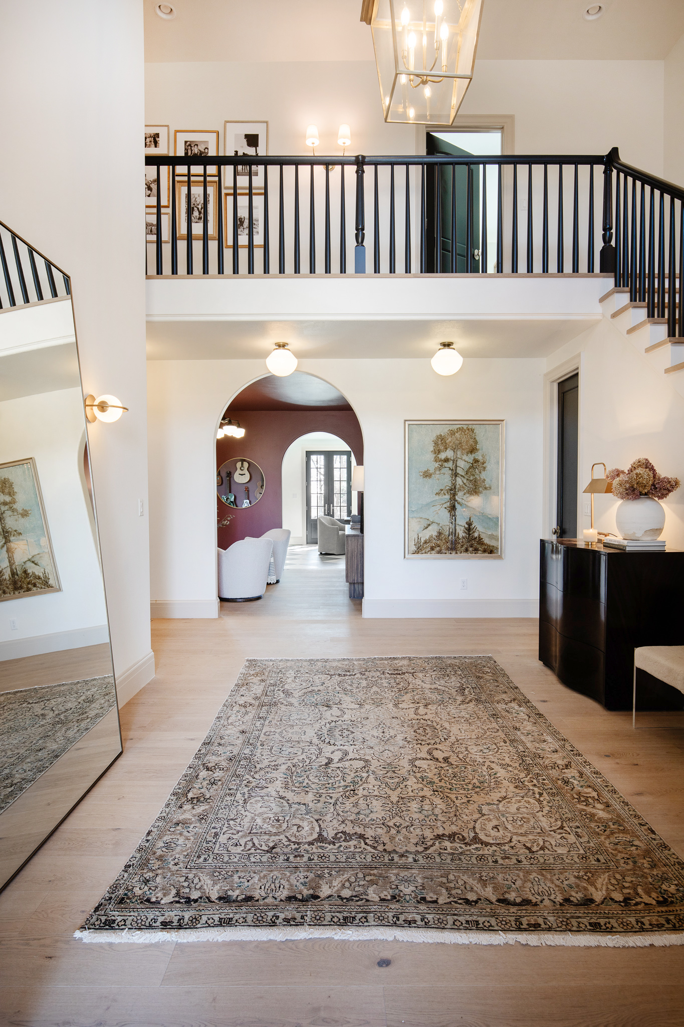
The entry is the one space in our home that has been under a constant renovation ever since we moved in. From updating the floors to the banister. The upstairs looks dramatically different thanks to a wall (that's our new closet!). It got a new (old) HUGE door that was originally on the back of our house.
A new round window when we did the exterior renovation. And early this year we decided to straighten out all the odd angles around the entrance to our office. Truthfully, we should have just DONE this when everything else was under construction, but sometimes when you're drowning in construction debris and decisions, adding on even one more thing feels like it might be THE thing to make you lose your mind.
So we waited until this year and man, wish we would have straightened it all out to begin with. What a difference that made!
In this last and final phase of the entry makeover, we flipped the closet to have access inside the office. Originally we did this because we desperately needed more office storage, but now it works because the office can technically be counted as a bedroom now!
(Above: Inside the office)
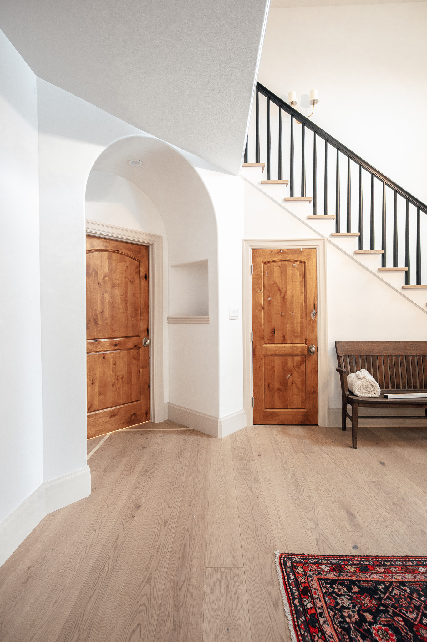
We straightened out the entry door into the office and swapped the smaller door for a large 8' one. We ordered this one, and the accompanying closet door in the office, from Simpson door. It's this one! The same style that we added to our new primary suite in the closet and the pocket doors for the bathroom (I owe you photos of those now that the hardware is on!). If we were staying, we were going to eventually swap all the doors to this style.
Back in the entry point of view, it really allowed us to clean up the odd angles and extra everything.
The other doors and doorways in this view line are all very tall so we wanted to keep the office door consistent with that. I also love that this door mimics the shape of the dining room doors. It's a grand experience to walk through, truly.
Straightening out the door meant patching floors and trim and paint. We added an extra light to the entry area. All in all the project took us about 3 months to complete, but it's COMPLETE!!!
Now to enjoy it for the next couple months.
Sources
Wall Color: Alabaster by Sherwin Williams
Trim Color: Accessible Beige by Sherwin Williams
Door Color: Tricorn Black
Floors: Ingrid by Stuga Studio
Mahogany Chest
Hide and Seek Book
The Nature of Home Book
Vase (similar)
Candle
Table Lamp (we have a dupe here!)
Boucle Stool
Coat Rack
Railings
Lantern Pendant
Rug (The Vintage Rug Shop)
Flush Mount
Two-Arm Sconce (we have a dupe here!)
Gallery Wall
Tree Art
Mirror (we have a whole round-up here!)
Sconces
Midnight Art
Art Light
Swivel Chairs (you can find dupes here!)
Music Room Light
Leave a Reply

WE'RE CHRIS + JULIA
Portfolio
Projects














So calm and welcoming in its beauty, simplicity and elegance. (Would love to have seen a picture from the angle showing the front door and round window). The one suggestion I would make is to add a potted plant/tree on the corner next to the large floor mirror. Beautifully done Julia!
I love me some..and a lot of before & afters. Your & Chris’ house is my absolute favorite on IG and the most amazing!!
I appreciate every project you have completed in this home, but the front entry embraces how I feel about your design: sophisticated, understated, softly tailored, texture and shape rich, and warm. I'll miss this home and your plans, but look forward to your new adventures and pray that your new physical location will bring much health and joy.
Looks great! Where did you put the big beautiful entry credenza that was to the left of the entry? I miss her!
It's in the music room :)
It's lovely, I wish the former owners could see what you've done. I bet their jaw would drop!
The doors are fantastic - bravo!
Are you saying that in the US, if there's no closet in a room, it can't be counted as a bedroom ?? That's so weird ! :D
It's not as if such things as dressers and wardrobes exist...
By the way your entry is so beautoful ! Bravo !
Yes, it’s weird for my European friends but here in the US wardrobes practically don’t exist unless you buy from an international store like IKEA. In this part of the US, your property taxes and other house related costs can be based on number of bedrooms combined with square footage, sometimes people prefer to have a room without a closet, an office or den, to have it not count as a bedroom for tax purposes...
*Love not livebthe haha Also autocorrect put the word 'moonwalk' in there. Should have left that one ;-)
These before and afters are so fun. Graceful and welcoming. Whoever buys your home is getting an untouchable stunner. Also, THANK YOU for taking these pics at the same angle!! It drives me nuts to see before and afters that are from other parts of the room, it takes the excitement out. :D
I will never get over this amazing transformation. I keep saying this about every part of your house, but it's true!
This looks great! I really appreciate that you acknowledged that is something that maybe "should have" been done during the big construction phase, but you drew the line for your mental health. I also love that you mentioned it took three months. I would have thought it would've been quicker, so that was a nice reality check for me. Thanks for your honesty.
My favorite pics are the ones the ones that have the guitars reflected in the music room mirror. Love!
So calm and welcoming in its tones, simplicity and elegance. (Would love to have seen a picture from the angle showing the front door and round window). The one suggestion I would make is to add a potted plant/tree on the corner, to bridge the scale between the large floor mirror and the sconces. Beautifully done Julia!
GOSH what an improvement!!!
The before and afters of your entire house are just mind-blowing!! Love how this little corner cleaned up to be so much simpler, looks beautiful!
Stunning transformation!!
Honestly at this point all I cqn say that this house was lucky yo have you guys as it owners.
So amazing. Where is the red rug in yoyr entry from?
Vintage ebay