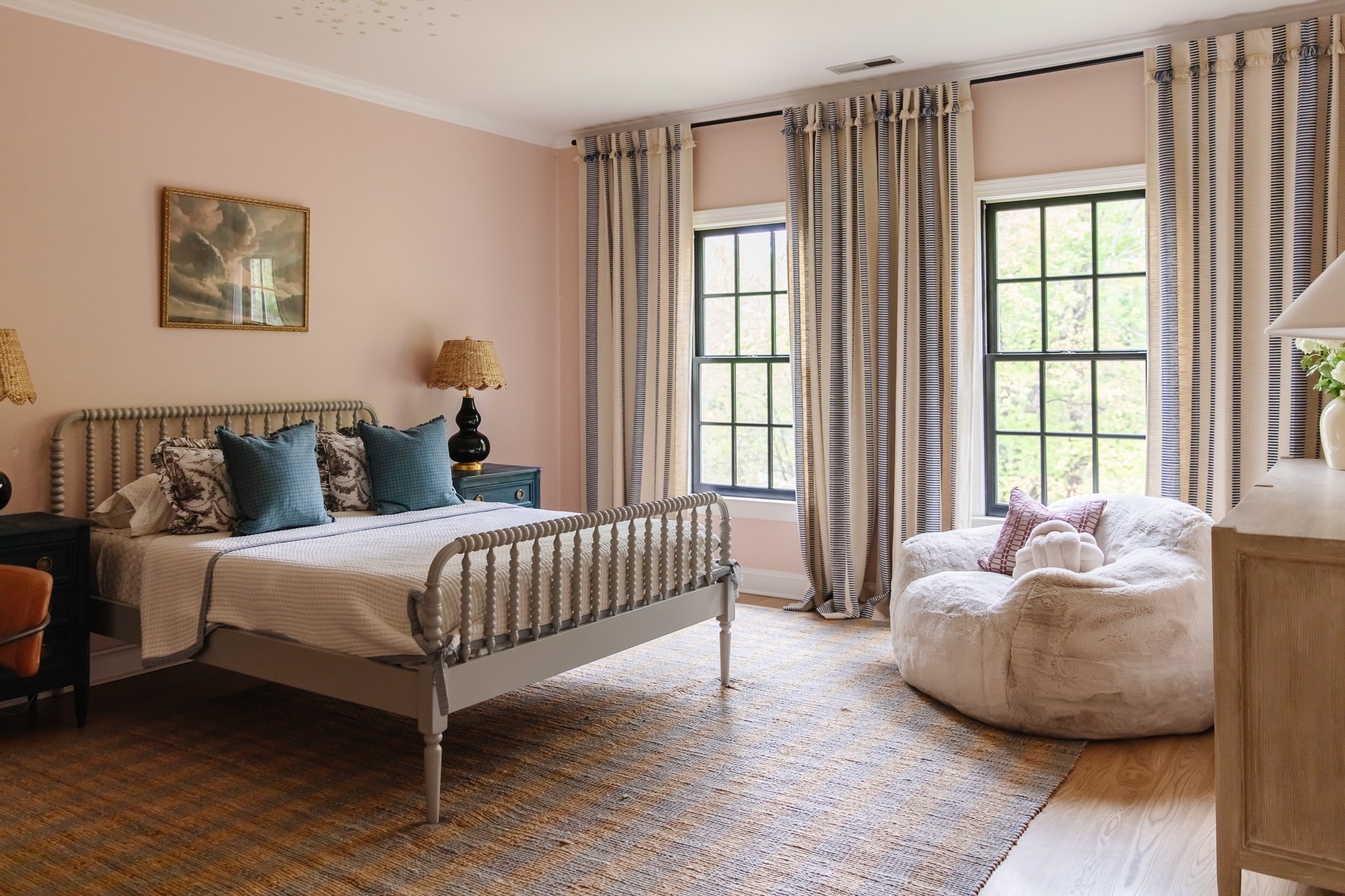
Greta’s room is the bedroom that I always knew would get another round of redesign. We did a few small updates right when we moved in, like updating the flooring and painting the walls as you can see in our last update. It’s a beautiful space. But as an official teenager, Greta is over the pink paint color. So last year I put updating her room onto the 2024 project list. And it’s time to take action!
Shop Greta’s Room

I wanted to help design a room that feels like her — that reflects her love of art. After Faye’s room and Polly’s room got wallpaper, Greta mentioned she’d like some of her own someday. We hadn’t found a wallpaper that was right yet, but then I had the opportunity to design my own with WallPops, and I was excited to show her some options. It’s funny, each of my kids has a different approach to design.
There are lots of people in this world with varying levels of care when it comes to any topic. You may love to cook or you may just want to eat healthy but not care to cook or you may not care about either of those things at all. It can be applied to any topic, including home design—you might be a person who wants to design every room in their home, you might just want it to look good but not want to design it yourself or you may not care about either of those things.We all have different passions, and Greta’s is not design at all. I was trying to choose the trim color last week and showed her four different color card strips. She told me, “I really don’t care, Mom, I just want it to look good.” Got it! So I’m taking the wheel on this one.
Choosing a Wallpaper for Greta’s Room

CLJ x Wallpops Full Collection
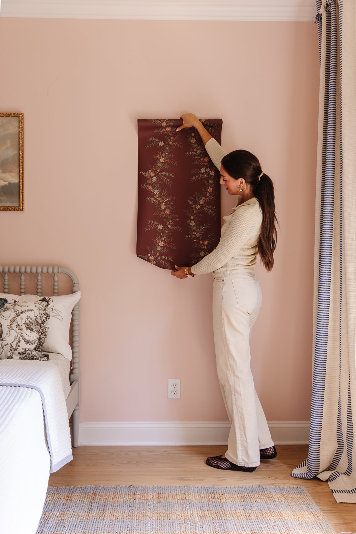
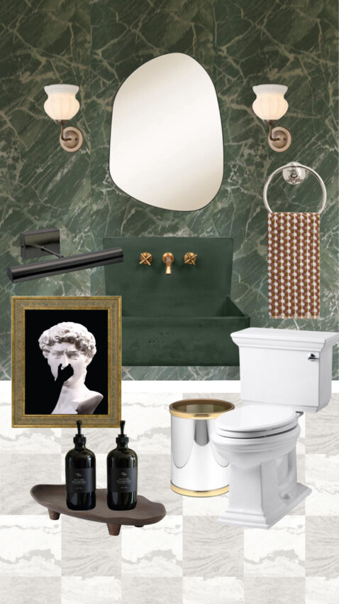
We launched 15 wallpapers (eeek!) this week in a variety of designs and colorways, and I put nine on the wall to test how they looked. The Nova collection had a repeat that felt close to Faye’s wallpaper down the hall and Polly has a mural-esque wallpaper similar to Bramble collection in her room so that vetoed those two. I really wanted to use the Melograno collection elsewhere in the house (it might be my fav) That left us with Jade and Posy, and Greta was more into the Posy.

Posy Cranberry | Posy Vanilla | Posy Spruce | Posy Midnight
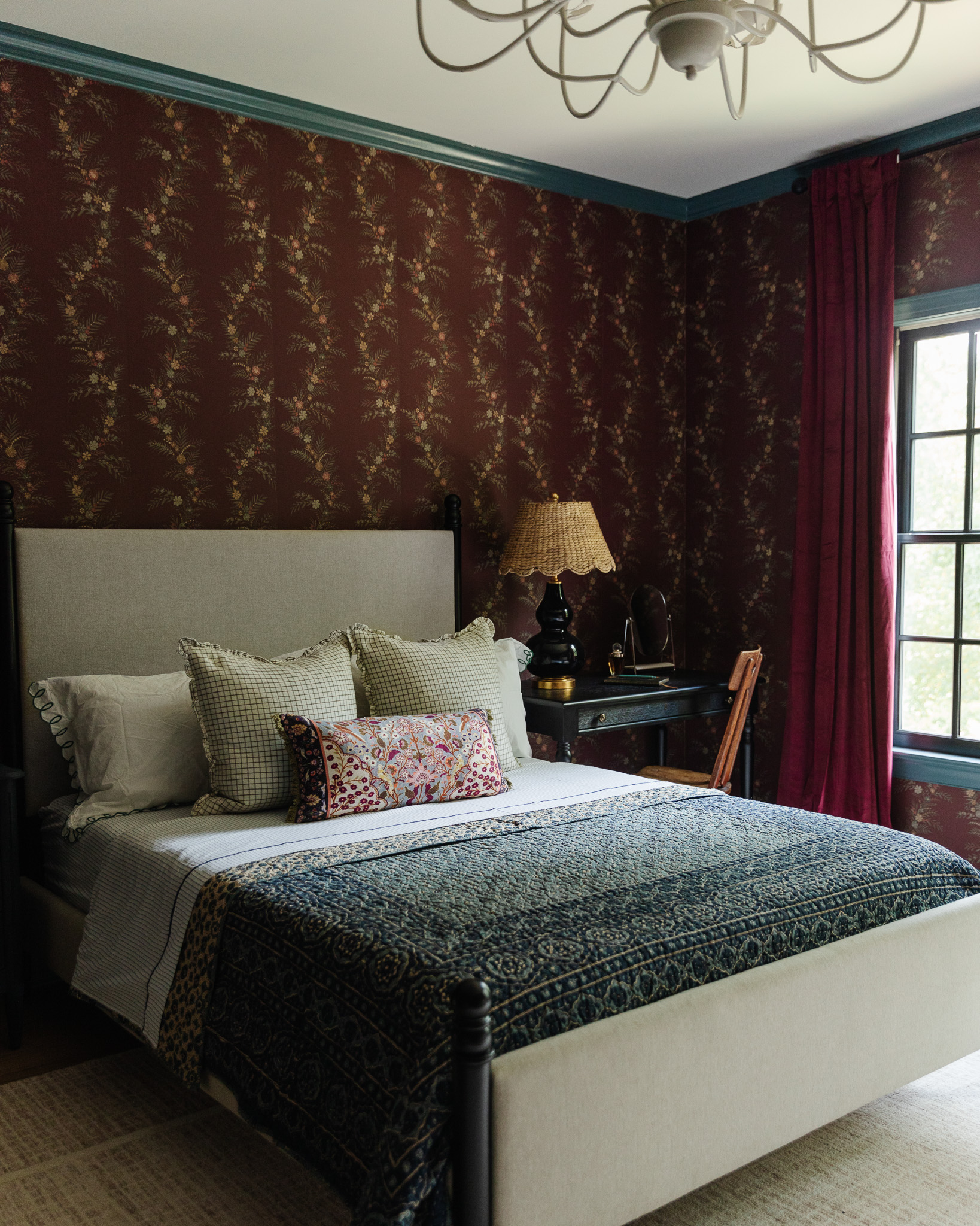
Now which color to choose? Even though I love Midnight, we have the blue bonus room right next to her room, so I didn’t want that one because I like to have a color story that moves people throughout the house. And then Greta goes to me, “Come on mom, you’re not going to choose white.” I have a style, what can I say! So that took the finalists to Spruce and Cranberry. Spruce would really tie in the dark green from downstairs and bring it upstairs. And although the mudroom is a rich cranberry color, we don’t really have it upstairs (other than the other side of the house in the upstairs powder room).
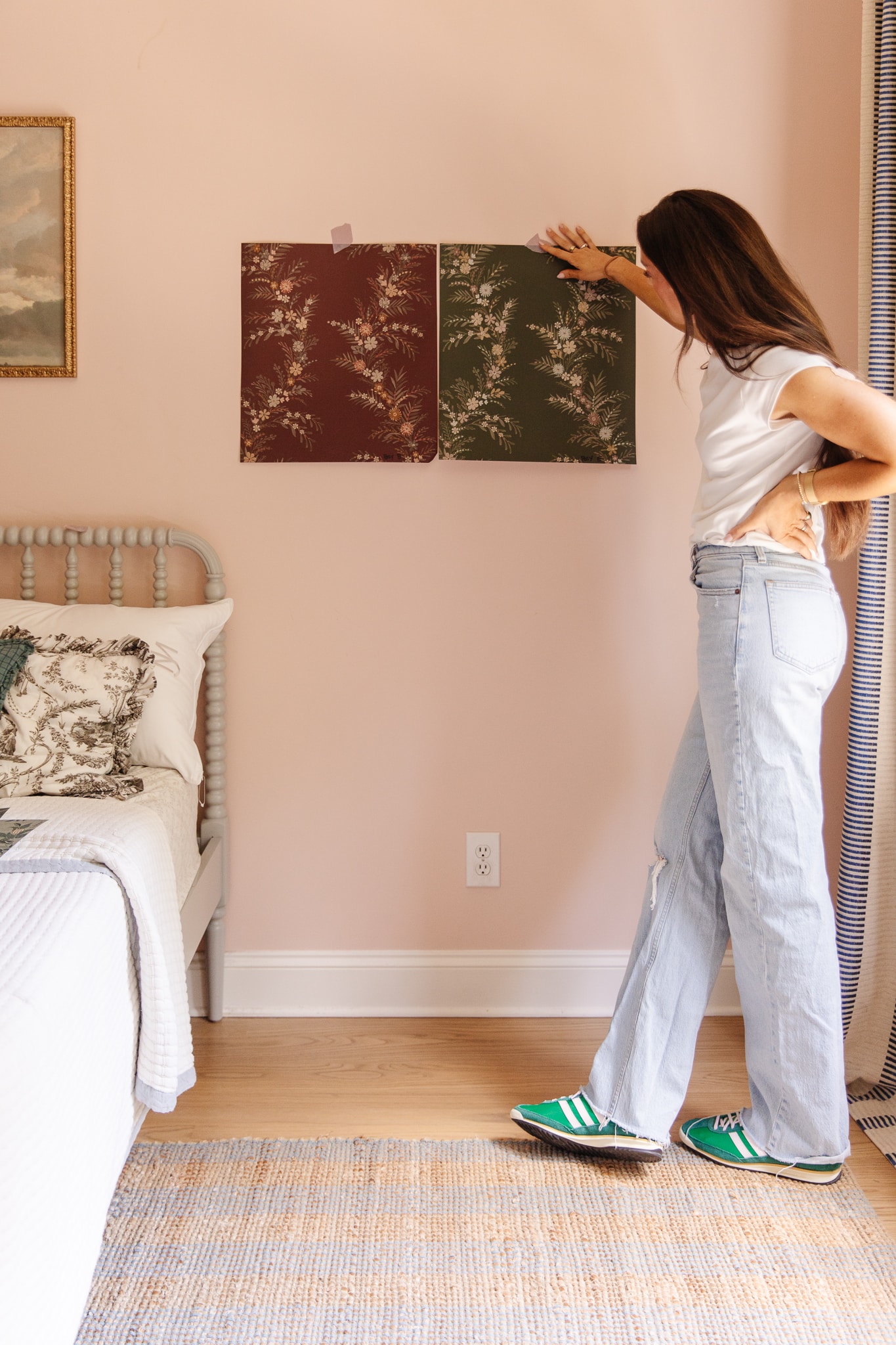
It was a toss-up between two really great options and either one would work with the trim color that I liked (more on that in a second). But I finally decided the winner is….Cranberry! Then it was time to pick a trim color.
3 Ways to Pair a Wallpaper with a Trim

When you are picking a trim paint color for your wallpaper, there are really three ways you can go. First, you can do a tonal trim color where you almost match the base color of the wallpaper, maybe in a shinier sheen. This is what we did in our dining room — we picked a gray-blue paint color that was the overall tone of the wallpaper, and it all blends really nicely together.

The second option is that you can do a coordinating trim color. Now, this is tricky because it’s not a complementary color, it’s more of a color that’s found in the wallpaper itself. For example in the study, we painted the walls a dark green, and there is a bit dark green in the mural but it’s not the primary tone. So with this approach, you choose a color from within the wallpaper and paint the trim that color.
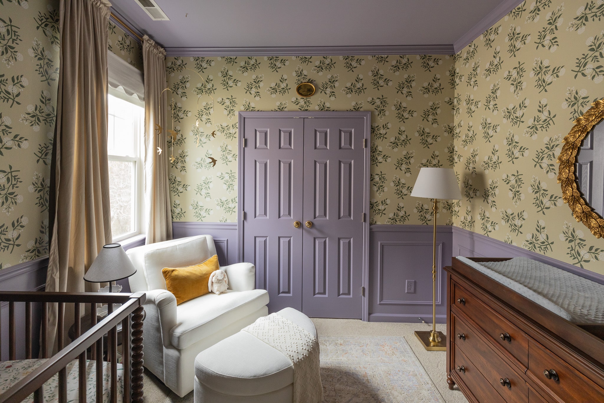
The third option is not picking a color from the wallpaper at all. You’re choosing something contrasting. It could be a complementary color on the color wheel (like what we did in Gigi’s nursery), or it could be something from a fabric pattern you’re using elsewhere in the room. In this scenario, you can think about the overall color palette of the room and not worry about whether it’s represented in the wallpaper.
The Trim We Chose for Greta’s Room
When it came to Greta’s room, I really wanted to create a color scheme in her room outside of the wallpaper. I wanted it to be more than one note, so I decided to do a contrasting color of something that’s not represented in the wallpaper, which is something I’ve wanted to do for a long time in our home.
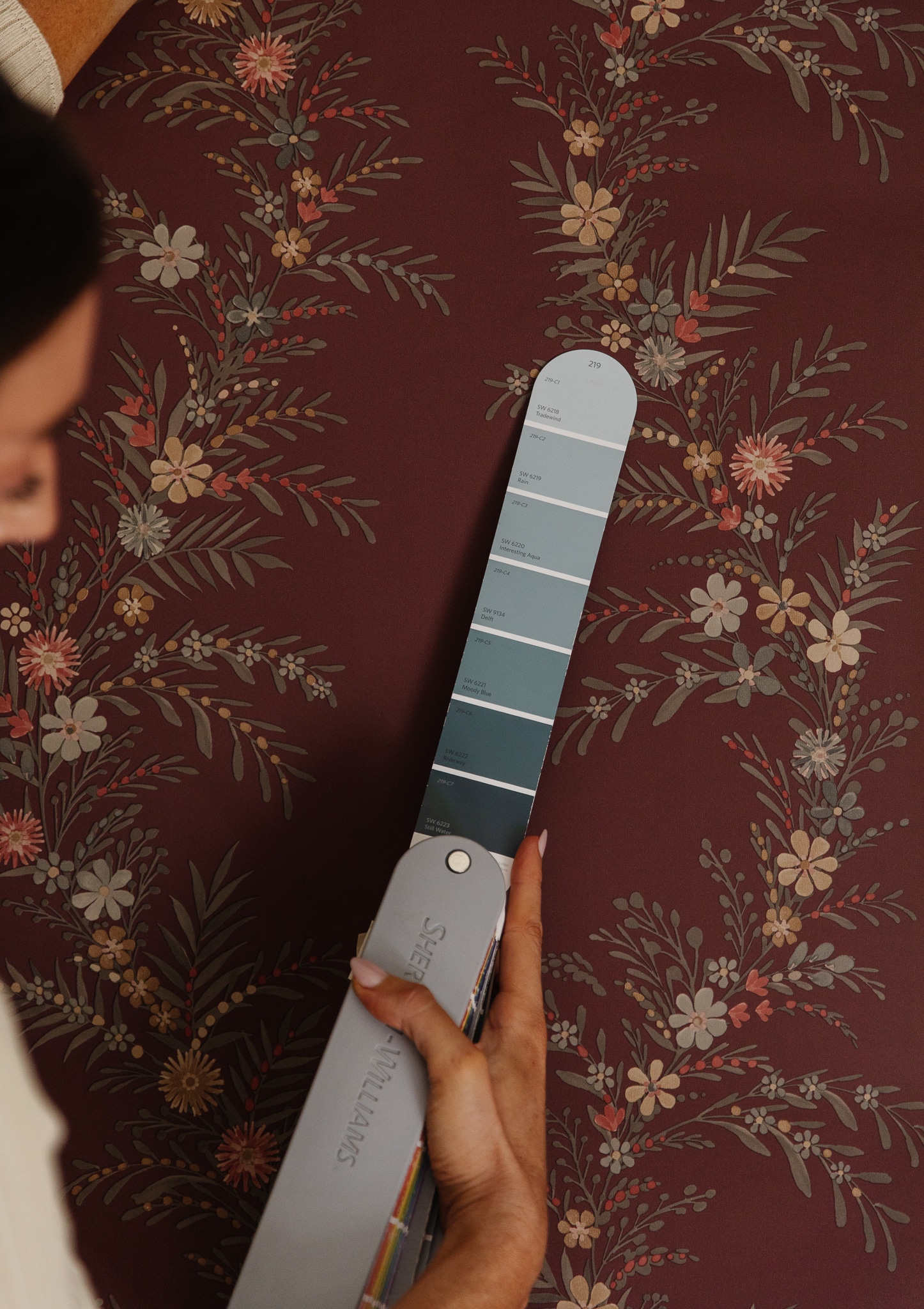
We went with a deep bluish-green — the color is called Sherwin-Williams Riverway. We’re doing semi-gloss for the trim and while I originally wanted to paint the ceiling, I’m now pivoting to a creamy eggshell color. Stay tuned…I can’t wait to share the results!

Good morning; thank you for the great tips! I love that you are doing a contrasting trim color in Greta’s room, and I cannot wait to see the final results! Best, Giselle
This is a fun process to watch unfold! I like the contrasting color for the trim and cannot wait to see the final result!
Love all your bedrooms Julia and Chris!
Can’t wait to see the end result I know it will be STUNNING!
I painted my room a moody red when I was in high school. I loved it! It was dark, which meant I got to sleep in easy. Plus, I just felt so cool channeling my Peyton from One Tree Hill vibes. Hope she loves it!
When Julia starts designing a room, I’m inspired to redecorate and try something outside of my comfort zone in my own home! Thank you for sharing the process in detail and explain why and how you make the “risky” instead of safe decisions.