Since moving to North Carolina, I've been asked if and how my home style has changed. What's really the difference between our last "modern cottage" and this "modern colonial?" That's a great question, I would love to tell you my thoughts.
Paint Color: Pigeon by Farrow & Ball
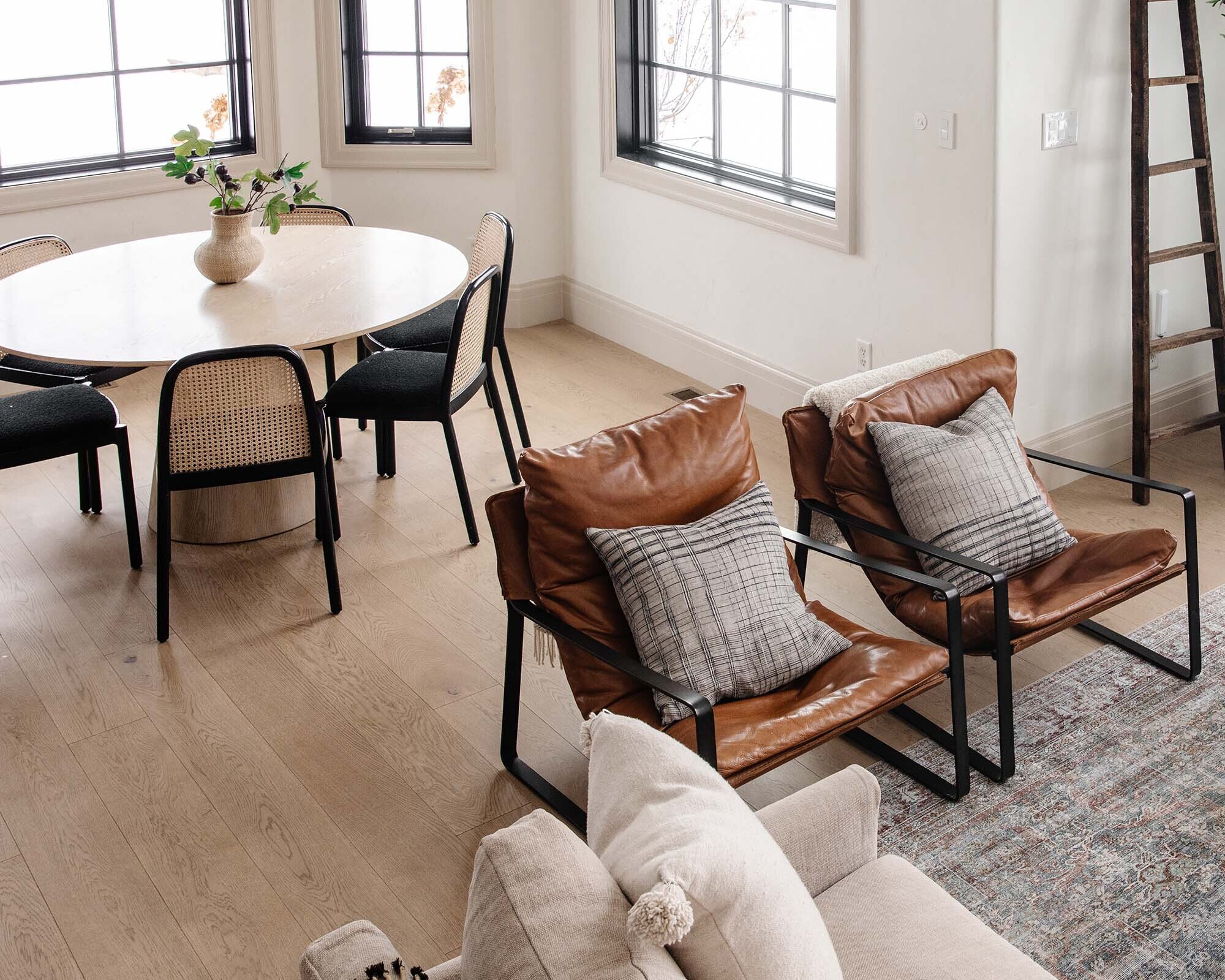
Dining Table | Vase | Stems | Pendant | Swivel Chair | Sofa | Top
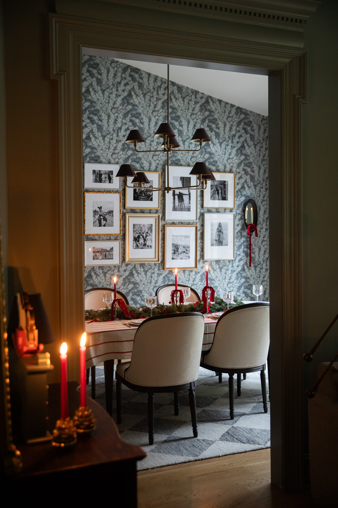
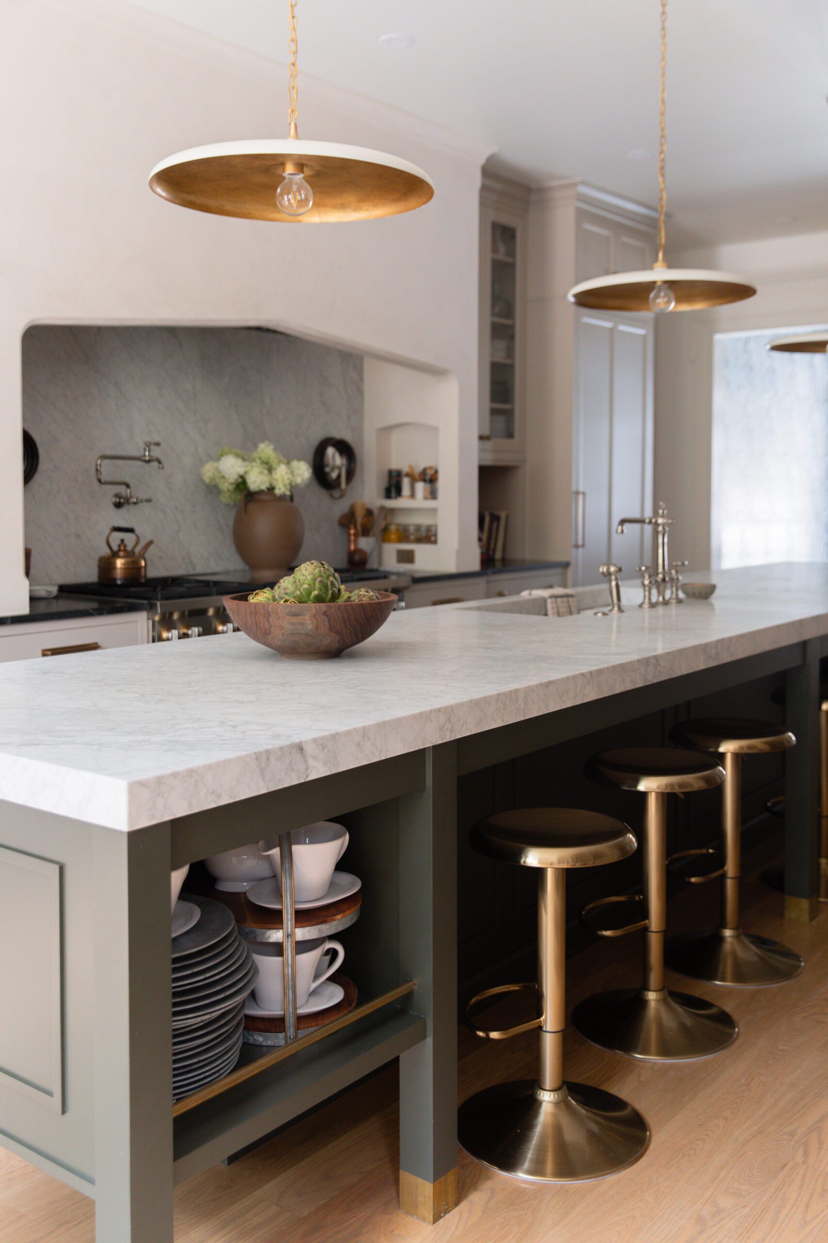
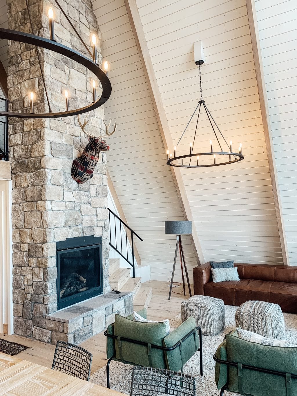
First and foremost, this colonial home is different than any other home we've had. It has a very distinct, historical feel to it with the the meticulous millwork, and classic Georgian bones. Our past homes didn't have a distinct architectural style or initial character, so I assigned a style to them and that became the style of the home and ultimately helped form my personal style. Our previous house was a mishmash of styles, with roman columns inside and scattered stone and stucco on the exterior. Over the years we lived there, we streamlined the exterior and interior for a more cottage-y feel that felt right for the expansive country setting. We drove it home by bringing in rustic woods and masonry and some modern elements, too. Let's look at some side by sides!
Primary Bedroom Now and Then
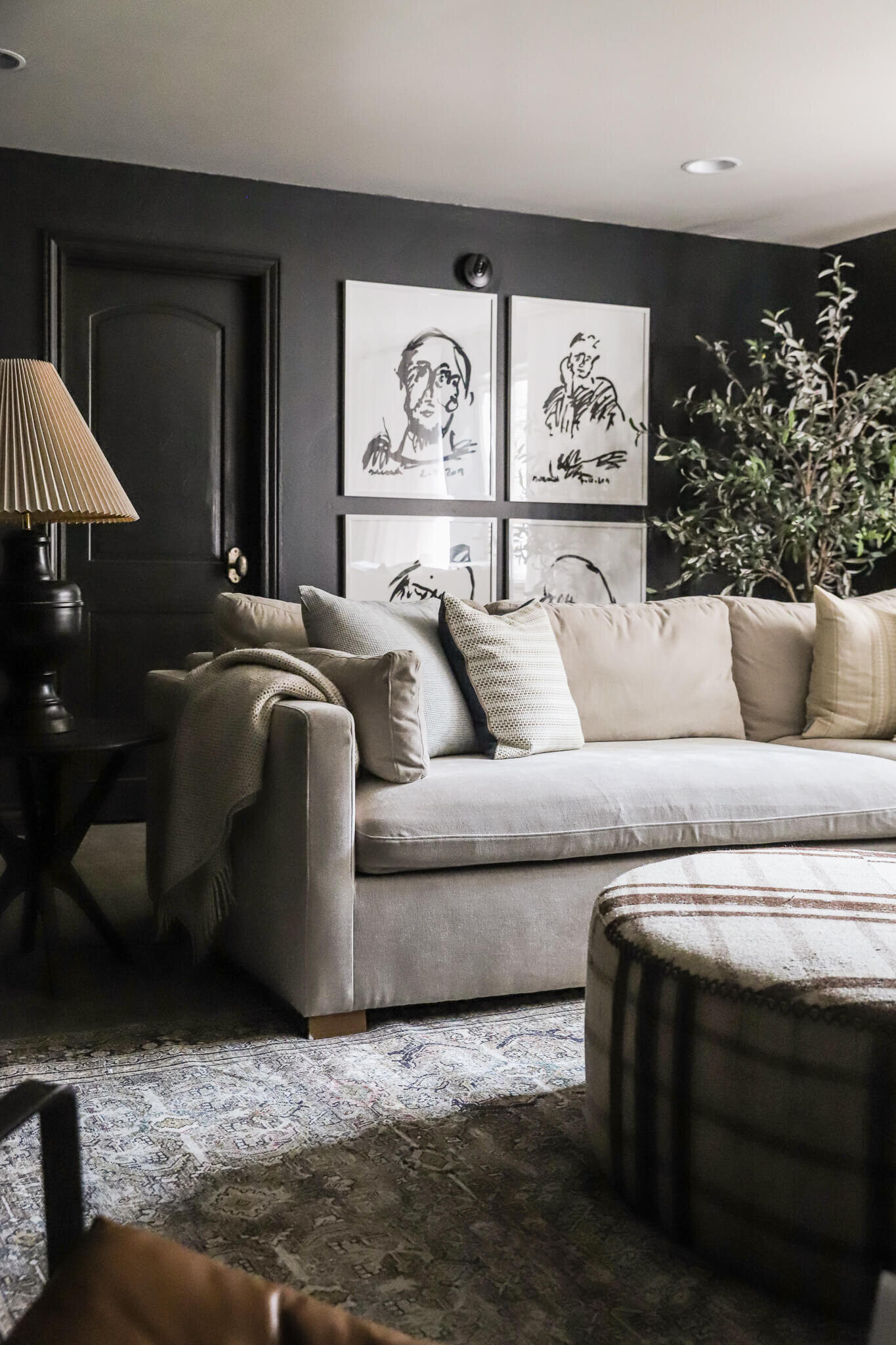
I think it's fair to say I've been taking more risks with paint and color, lol. To me these bedrooms couldn't be more different! One feels very cottage-y with the rustic canopy bed and the stone. I used to seek out rustic or raw woods, and now I'm loving more lacquered walnuts and mahogany wood tones. Also, I went from white walls and contrast trim to deep mahogany brown walls and trim in the same hue, but different sheen. Speaking of trim... the crown was already in place in our colonial home, but we added the box trim on the walls and bead board on the ceiling to enhance the historic colonial style. Our bedroom is still very much in progress, but the mix of historic and modern is coming together rather nicely.
Living Room Now and Then
Looking at our last living room, we added ALL of the architectural elements in here–the window, the beams, the fireplace, the arches... Again, our North Carolina home already had all this charm and character which we've been embracing and elevating. I also feel like the rooms in our home here are more defined so I can be bolder in my color and design choices. While in our modern cottage, the spaces were more open to each other so I relied on textiles and finishes to bring in character and warmth.
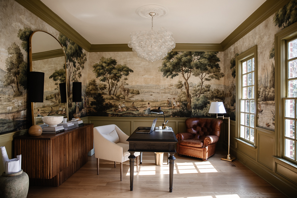
Study Now and Music Room Then
The music room in our last house was the one pop of color on the main floor and now we have color flowing freely throughout! If you subscribe to our Love Letter you know that the study isn't staying green for much longer, but don't worry we have something up our sleeves. The wainscoting and ceiling light medallion were add-ons, but don't they feel meant to be in here? Since moving I've also had antiques and collectables on the mind. The thrifting scene where we live is much more vibrant and I love seeking for pre-loved goods to bring in our home. I'm embracing the old, but still keeping it modern and fresh.
Polly's Room Now and Then
Polly's room was one of the last rooms we finished before moving and it's still one of my favorites. Add some crown moulding in here and I think it would fit in rather nicely with the rest of the colonial rooms we have here! At this point, I was settling into my personal style a bit more.
All in all, I would say that our modern cottage helped me develop my personal style and our modern colonial has the architecture that has allowed my to embrace it fully, setting the perfect backdrop for the mesh of modern and traditional that I have loved for so long. There are times that I miss the simplicity that the cottage lended itself to--but ultimately, I believe this is the one home that we have owned that i feel most at home in, while also stretching me.
I can't wait to see how my style evolves even more with time as we've settled in more!
Leave a Reply

WE'RE CHRIS + JULIA
Portfolio
Projects













Regardless of the style you knock it out of the park for my eyes every time.
Julia. You are truly gifted. Thank you for this side by side example. As someone who has nodded along for YEARS when you've said 'each house has its own needs' I realize reading this that I had no language for how to recognize what a house is saying. Like a lot of people, I have a house that has been remodeled since it was built in the 1940s, so I have a mix of styles built in so to speak). Trying to balance what I like (LOTS OF THINGS) with what makes sense for this house is a lot of why I read blogs like this one. But THIS post was the most direct in helping me connect your choices with your two lovely homes. Thank you so much. Not that it's important what a random person on the internet thinks, but I would say part of what I associate as your personal style IS the ability to recognize what a house needs to shine. Kind of reminds me of a dear friend whose personal style is best described as always appropriate for the occasion. I came to admire this so much after a few adolescent years where my creative approach to style only left me feeling awkward when my imagination of the event and reality did not align. Which I type as I stare at a 'statement chair' that I love but is not really appropriate for our house. Anyway, long winded thank you. I'll be studying this post for awhile.
It is interesting how different locations in our country lend themselves to different styles/aesthetics. Geography/strength and hue of sunlight in our homes really affect choices. I loved loved loved my brick colonial when I lived outside of Philadelphia, but here in Phoenix that would look so out of place and my styling choices had to adapt to that different aesthetic. It’s really good to see you adapt to a more traditional style when it’s clearly called for. Congrats for being flexible and doing it beautifully.
This post is fascinating me. When I look at individual rooms, I actually prefer many of the Iowa modern cottage rooms (living room, primary bedroom). However, when taken as a whole, I prefer the North Carolina home. Interesting.
I never received the love letter last week!
Just sent you an email Jodi!
Excellent post…loved it so much seeing your style evolve. Well done Julia!
I enjoyed this post and your thoughts on both homes. You have done a wonderful job of keeping with the homes' style and building upon that. I love both of your homes individual esthetics.
We are building our home and I am trying to hone in on my design style. Question, if you were to build your home would you design it to be 'open concept' or each room being defined or 'separate'? I ask because I like individual rooms and am getting lots of resistance from builders. Almost all floor plans are open concept.
Builders love open floor plans because it reduces finishing expenses for them. Well, it likely reduces expenses overall as even roughing in walls, added electrical etc. is generally going to be more in a house with more rooms. Although my understanding is that overall size of the home likely impacts rough costs most. Still finish work, all the trim, doors, flooring cuts (wood, tile or carpet all need to be managed where rooms transition.... also hallways. These all add cost. If a builder has a rate based on overall square footages then an open floor plan will be cheaper (and easier to deliver on schedule). That said, they may also feel strongly that the market prefers open concept so are advising you from a resale perspective. Ideally you could ask them why and get a feel for whether their opinion is helpful to your decision. Just some thoughts from a random person on the internet, lol. Good luck with your house! I know I lot of people who have built and its always a learning process.
I do love this question. Obviously I'm not Julia, but I am an architectural designer. What I'm noticing is a trend towards a hybrid of the two, even in Julia's home. The rooms are adjacent and open to each other, but feel more individual with the cased openings. This gives each room its own identity while still feeling like you're not shut off in one room. Another way to achieve this is with a change in the ceiling heights. A vaulted room adjacent to a lower flat ceiling gives each space a sense of separation.
This home has that feeling for me. The kitchen is in line with the living room, but the large cased opening separates the two. https://seanandersondesign.com/portfolio/vestavia-hills?itemId=8vayh60q6v32mdy6n0nsihysv0gsax
Thank you for your input. The Sean Anderson home is A M A Z I N G!!! Appreciate the example and you are right, ceiling heights add interest and separation. I saw a home in Nashville and the living room was completely separate from the kitchen and bedrooms (connected via a beautiful hallway) but in the center of the house and I fell in love with the concept.