

I recently bought a canvas print at Target based solely on the frame. I loved the ornate, traditional gold — and at $16, it was a steal (even if it was just for the frame alone). I wasn’t wild about the folksy-looking portrait within but was inspired at the thought of painting over it.
Before I get into this easy DIY (no artistic experience required), let me say this about mass-produced art: It is décor. It is worth as much as the canvas it is printed on and the frame that’s wrapped around it. It is great for tying a room together. It’s OKAY to think of a frame and a printed canvas, like this, as materials. A jumping-off point. Painting over it can arguably increase its value when the result is one-of-a-kind. We filmed the whole process if you’re more of a visual learner (watch below!) or you can keep reading for a process breakdown, including links to supplies.

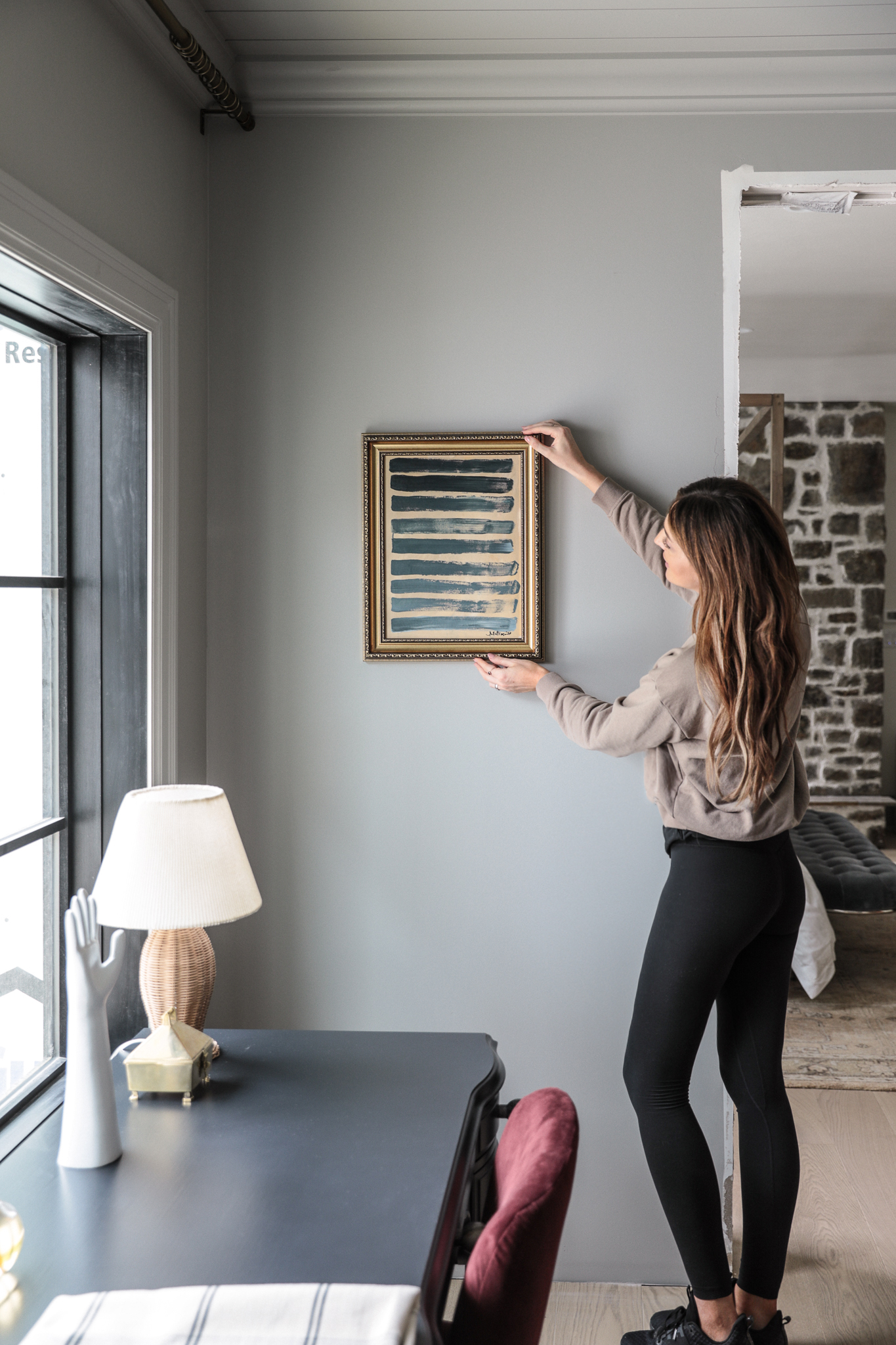
The first thing I did was hang this piece in the room where it would go. I brought it up to our almost-finished master closet, sunk a nail into the wall, and hung the framed canvas. I recommend this exercise because the room really “told” me what the painting needed. Right away, I saw that the original tan background looked great with the wall color and the area rug. I started scheming a background in this color, and I liked the idea of keeping something from the original. I took in the other colors and patterns, even from our clothing, and I knew what I wanted to do.

I taped off the frame with painter’s tape and got to work mixing that background color on a paper plate: a pretty even blending of acrylic Yellow Ochre, Burnt Umber, and Titanium White. I dappled it onto the canvas with a ¾-inch flat brush, letting tiny slivers of the original background peek through.
After the canvas was covered, I mixed a second color directly over the tawny color on my palette, blending Mars Black and Thalo Blue. Because I mixed it directly over the tan color, some of the warmth came through.
Using the same broad brush, I painted thick blue-black stripes over the canvas. I applied the paint in irregular strokes — uneven and patchy — sometimes adding a little extra water to the paint for a washed-out look. I especially liked the streaks of unblended blue, black, and ochre that came ribboning through each band. Start to finish, this took about 20 minutes and cost less than $20.

To me, the painting is a nod to my beloved blue jeans. It also reminds me of my collection of pinstriped shirts (I didn’t know I had, like, eight until I moved everything into the new closet). It’s abstract and open to interpretation, of course, but for its inspiration — it’s perfect closet art for me.
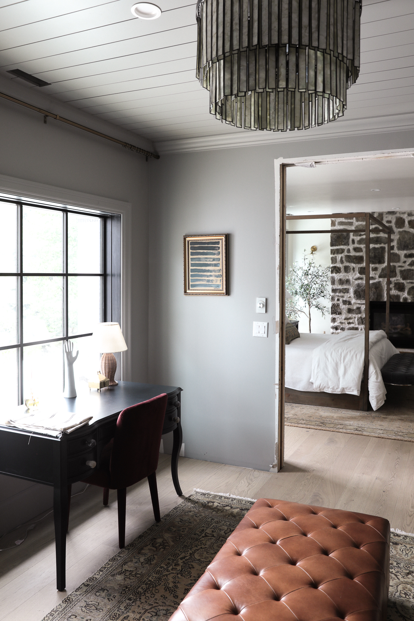
The deep blue and beige and gold look beautiful in the closet now, and I’m already inspired to do another in a different color way! This awesome framed canvas is sold out, but I’m linking a few others that would be great for this DIY. (Here is a similar one! Love this one too!) Even if you have to spring for the paint, you could be less than a half hour away from hanging inexpensive, perfect-for-your-space abstract art that you made yourself.
Tag us @chrislovesjulia if you try this! We’d love to see your version!!


Absolutely swooning over this post. So creative and well thought out, gorgeous!
I just tried some homemade art myself. But I love what you did! Definitely trying this next!
Looks beautiful, Julia! I was a little troubled by the original Target “art” that appears to kinda rip off an artist I have admired for a long time: Clare Elsaesser. You solved the problem beautifully, lol!
Why does the picture look like a fan-art of you???
In one of the pictures, I noticed the repetition of lines in the ceiling lamp, the new art, the ceiling treatment, and the bed frame. It helps to bring everything together. And yet, there are some curves in place to counterbalance the lines. Nice!
I like the chair you selected – having a small chair back is good and the color pops out.