Last week we introduced our phase 1 kitchen renovation and we wasted no time diving in. Our first item of business was removing cabinetry and trim that we really didn’t need to open up the kitchen a little bit and also rearranging a few cabinets that we did want to keep but just wanted in a different location and height. If you have staggered cabinets like we did, or just a LOT of extra cabinetry, taking some down or moving them to all be level is relatively easy–but may snowball into more projects, especially if you have a tile backsplash. Luckily, we have that on our short list for this phase 1 renovation, too.
After removing and rearranging, here’s how our kitchen looks now:

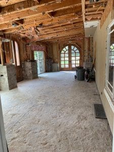
And here’s where we started:

Okay, I know, it looks worse in some ways. Haha. But it’s gotta get worse before it gets better. Before we dive into what’s left to do (ahem, a lot), here’s a recap of what we did–you can also watch it in video form in my Instagram Story highlights.

We removed all of the upper cabinets, and the dip down desk area in the kitchen. We also removed the embellished trim around the range area. We got extremely lucky here because we assumed the walls would be unfinished behind the trim but it must have been added way after the fact because the walls were in tact and painted like the original walls were. It felt like the biggest win!


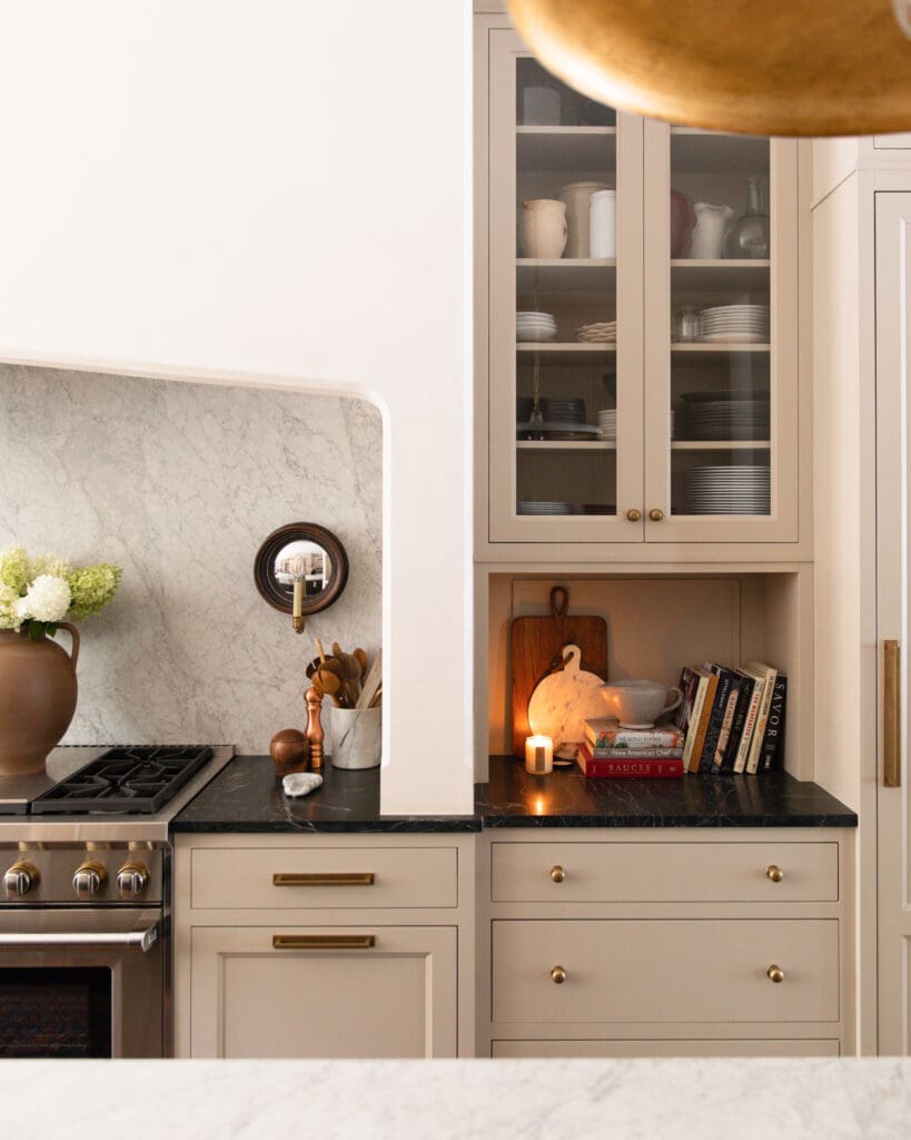
Even though we felt the glass front cabinets crowded the range a little too much over there, we loved the seeded glass and they were just about the right size to fit next to the fridge! At the last minute, we decided to hang them a smidge higher (our ceilings are a little higher than 9 feet in here) and add trim to the top of the fridge to make them all level and really take advantage of these taller ceilings. We’ll also be trimming out the cabinetry (we saved all the filler pieces!) so it will be flush from wall to wall.

Here’s what else is on our phase 1 to-do list this week:
• Trim out upper cabinetry and Refrigeratior
• Remove tile backsplash and hang beadboard. We were going to try to make this tile work, but it got damaged in a couple places when removing the cabinets (which are worth more than the tile anyway) and it kind of clashes with our new trim color. We took a note from on of our inspiration photos (below) and are going with beadboard painted the same color as the cabinets.

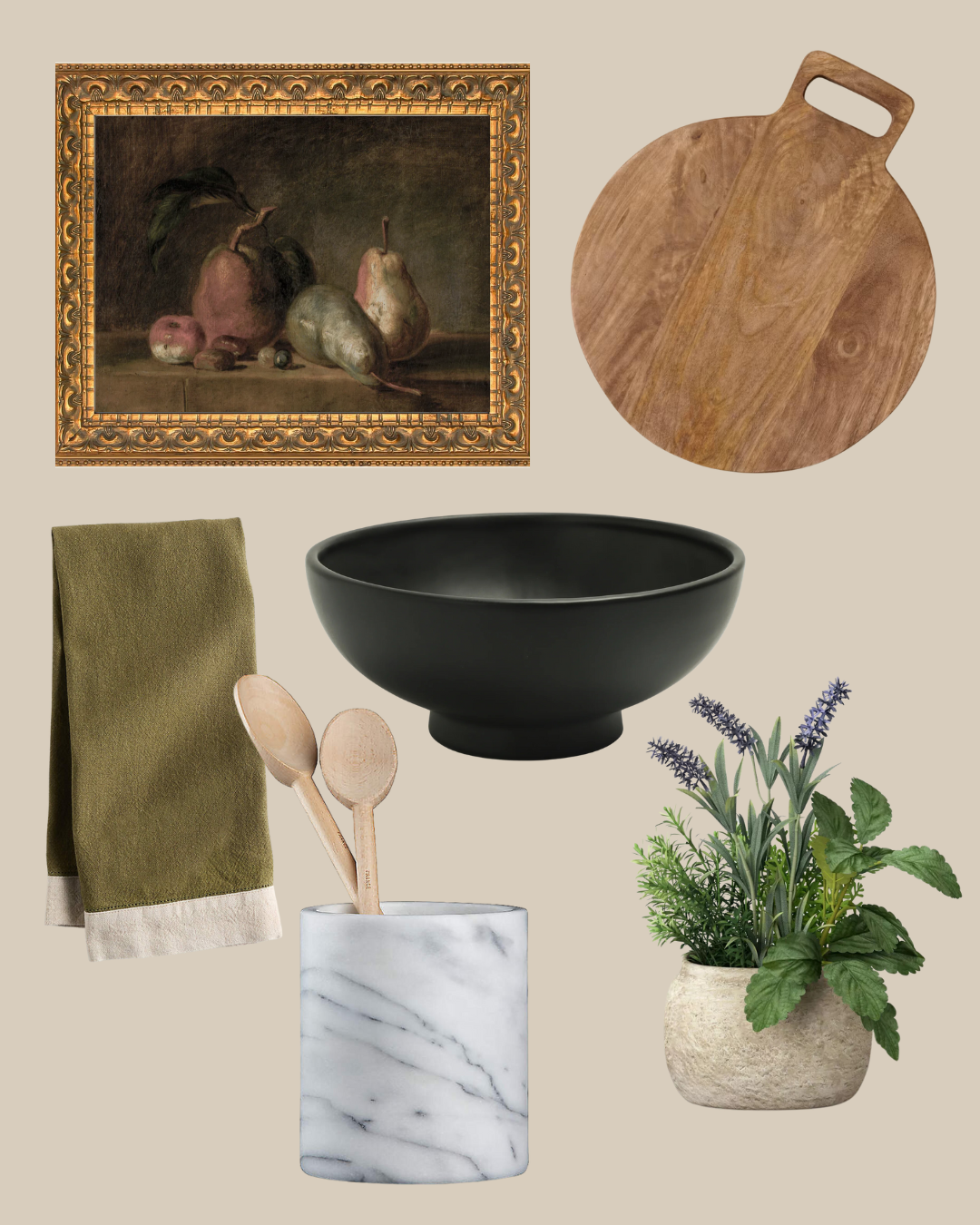
• Build a shelf under the glass front cabinets for extra pretty storage. We did this in the Baltimore kitchen and it ended up being one of my favorite little details about it, so we are excited to repeat something similar here!
• Degloss cabinets, Fill knots, Prime and Paint!
Last week I showed a bunch of examples of paint colors/vibes we’re considering for our cabinetry and over the past few days I’ve held up so many swatches in our actual kitchen and came to a conclusion. I thought it might be interesting to walk you through how I got there.
My two favorite from last week’s post were Farrow & Ball’s Mouse Back

And Sherwin William’s Pewter Green.

Which actually could not be more different. But I pulled both samples and held them up in our kitchen to see how they looked. I can’t express the importance of being inspired by something and making it your own rather than saying–Emily used Pewter Green so I’m going to use Pewter Green. Because the truth is–it will not look the same and you might be disappointed! Instead be inspired to use a green-y gray or a warm taupe/brown and find a color that works in YOUR space.
The biggest challenge (?) obstacle (?) for us are our brown granite countertops. But we’re committed to them for now so I wanted to make sure this phase 1 paint color was all about making them work. The taupe-y browns (mouse back is vertical below) I actually loved SO MUCH and it worked really well with our countertops, but it felt like a lot of brown next to our countertops, especially since we wanted to carry the color up with the beadboard.

Next I checked out Pewter green (pg 217 below) and it was much too cool for our countertops. I needed something to blend a little more. So I started looking at neighboring cards. Generally neighboring color swatch cards will gradually go one color direction. In this case–to the right went more green and to the left, blue. Right in the middle of Pewter Green and green-y greens, there was a card that contained a lot of great gray-d out warm greens and I was immediately drawn to them.

Below you can see the comparison between 217 (where Pewter Green lives) and 216 (that’s a lot more neutral but still definitely green undertones.) It’s almost like I mixed my two inspiration photos together and came out with this card. Chris and I narrowed it down to Link Gray and Thunderous pretty quick.


After holding it up on every plane and direction in the kitchen, we decided on….Thunderous! because this room gets a lot of natural light and can handle a deep color.
We’ll definitely share our whole painting process as it happens on Instagram and a full how-to here! It’s going to be an exciting week!

Can you tell me the granite used! Thanks
I’m not sure actually! This was here when we moved in!
What is that color on your island? I love it. I have tropical brown countertops and want to paint my oak cabinets to compliment them.
Hi! I love this and want to do a similar semi-kitchen update too. Have you ever painted IKEA kitchen cabinets? Do you think it would hold up or chip too much? Thanks!
I’ve scoured your site to find the trim and baseboard color…but I’m sorry I haven’t been able to find it. Can you share the color you chose for your trim?
Whenever I need advice on a decision I’m making about our house…..I google….”paint sheet Chris loves Julia” lol. ????. Anyways…..I can’t seem to find this answer. What sheen did you choose for your house for the walls and trim? (I saw cabinets were satin.)
Thanks!!!