In true renovation spirit, things in the study have gotten a bit worse before getting better. But all the pieces are getting put back together, and we're in the home stretch! To catch you up, we're in the process of narrowing the opening into the study, adding pocket doors, and building shelves and cabinets on either side of the opening! Oh, and while we're at it, we're repainting for the third time. The latest update was over a week ago, so let's look at all the progress that's been made.
During Demo

Today

- Pocket doors are in
- Drywall is finished
- Shelving boxes are installed and primed for paint (the finished color will be similar)
- Trimwork is ready to be caulked, primed, and painted
- Electrical is wired for new switches and picture lights

It's actually pretty incredible how they were able to salvage and reuse not only the trim but the wallpaper too! I'm beyond impressed.
During Demo

Today

The shelving and cabinets are only primed in a dark green, so this won't be the finished color, but it's similar. After testing a bunch of swatches, I landed on Benjamin Moore Topsoil, which is actually really close to our kitchen island color. I was back and forth on painting the ceiling the same dark green that we're painting the wainscoting, trim, and built-ins or painting it back to white. In the end, I think a white ceiling will look cleaner and will add contrast to the dark green paint, so white it is!
We actually got a lot of comments suggesting we keep just the ceiling light blue, and while I love a two-tone paint moment, this isn't where I want to do it.
The Opening Before

Shop The Study
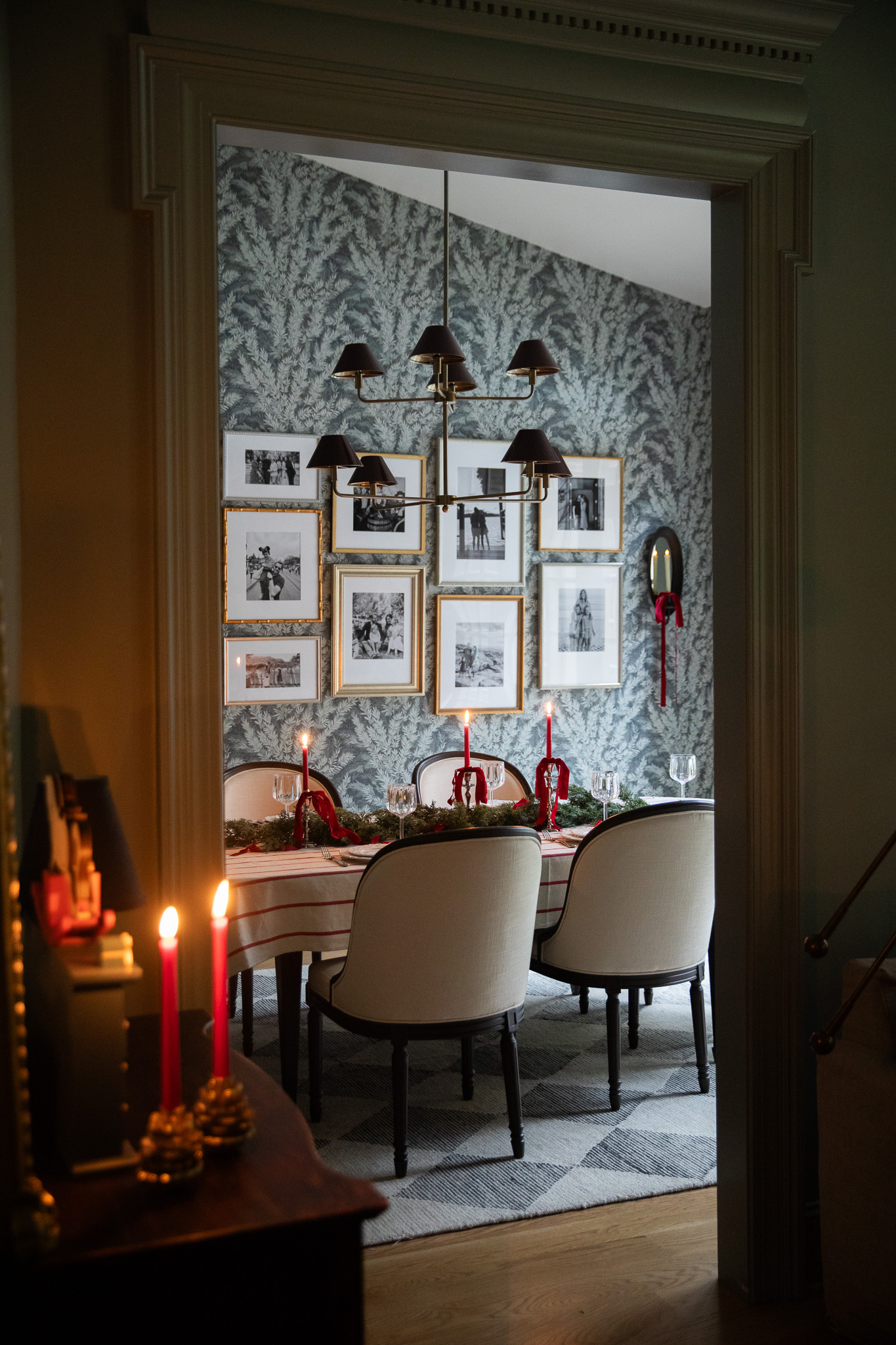
This photo was taken when we were filming our GM commercials, and it's one of the only pulled-back photos of the study entrance that we have! Here's what it looks like with the narrower opening.
The Opening After

It feels like this was always meant to be. If you read Tuesday's Love Letter then you got the first look at these custom-made walnut doors that were inspired by our pantry doors. We originally hunted for a pair of salvaged, vintage doors we could use with no luck, but in the end, I'm glad it didn't work out because I'm in love with this view!
Up next: paint!
Leave a Reply
WE'RE CHRIS + JULIA
Portfolio
Projects









OMG the view through the panel doors! You nailed it!
In search of a post about your reasoning to narrow the study opening and add the pocket doors. It looks great! And I love the new color, I’m just curious about the whys.
It is like exhaling...Just ah. I am enjoying watching the evolution of this space!!
I love the narrowed entry with the pocket doors, I feel like it makes this room infinitely more useable. Can't wait to see that high gloss finish!
I appreciate your transparency and honesty about changing the paint color 3 times. It’s real, and reminds us it may take several times before we get our homes as we want them. And that is okay- our homes evolve as do we! 🫶
I'm doing something like this now for my office! Question: are you going to keep the front door black? I love the wood tone doors with the black doors, but I don't know if I'm brave enough to have a mismatch! (and in my case, I think the office doors will be black and I'm debating wood tone for the front door)
Love it 🥰
Hi CLJ, Do these changes make this space a legal bedroom in your state? I've been wondering since you announced the new doors but I'm not on Instagram so could have missed a discussion about this. Thank you
Hmmm I don't think so because it doesn't have a closet?
I'm in MN and they don't require a closet, there's just a minimum square footage. I guess I was more curious about the doorway, doesn't matter though since I don't think you need the sleeping space. Thank you, looks beautiful.
I LOVE how you can see the beautiful mural through the doors. It looks so so nice. I will miss the blue paint, but you can't go wrong with the green you chose :)
I love the narrow opening, it makes the space much more functional! Can't wait to see once it's finished :)
Hello! Love your home! Is the dental molding piece above the library doors custom or did you buy that pre-made? Thanks!
Thanks for the update! I have up my biggest time suck (Instagram) for 2023 but love that I am still able to stay in the loop with your projects here on your blog. Most influencers gave up their websites and I’m so glad you didn’t!!
I love the continual refining. Each time results in a more and more elegant room. Are the doors stained or did you opt to seal them with a flat finish like in the kitchen? The walnut is lovely!
It is refreshing to see a room with doors. The open concept, at times, doesn’t allow for rooms that may need a time of peace, contemplating, and thought. Thank you for sharing the before, during, and after. Looks fabulous!
I love the more narrow opening so much, like this is how it should have always been. I’m obsessed with that view through the windows - including the blue ceiling that peeks through. Making notes for my future home. More blue ceilings.
Such a wow moment in the foyer now too with those pocket doors/trim. In love!!