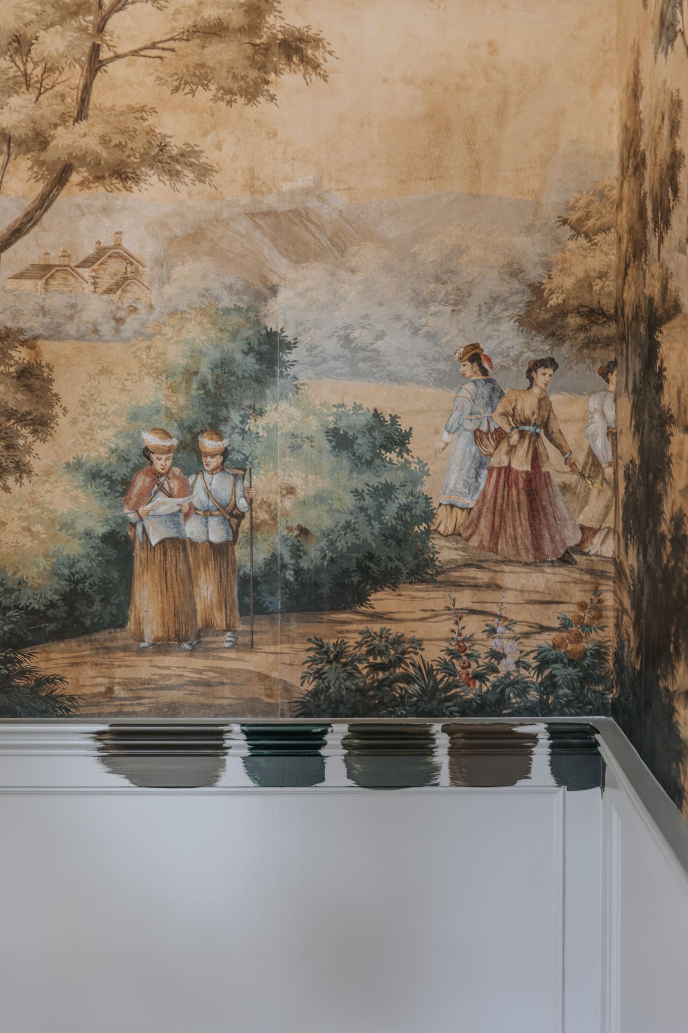
When we first painted the study, it was right after we added the trim and mural to the room. I chose a mid-tone olive that tied in nicely with the mural, but I didn’t love how the mural felt a little lost with the color.

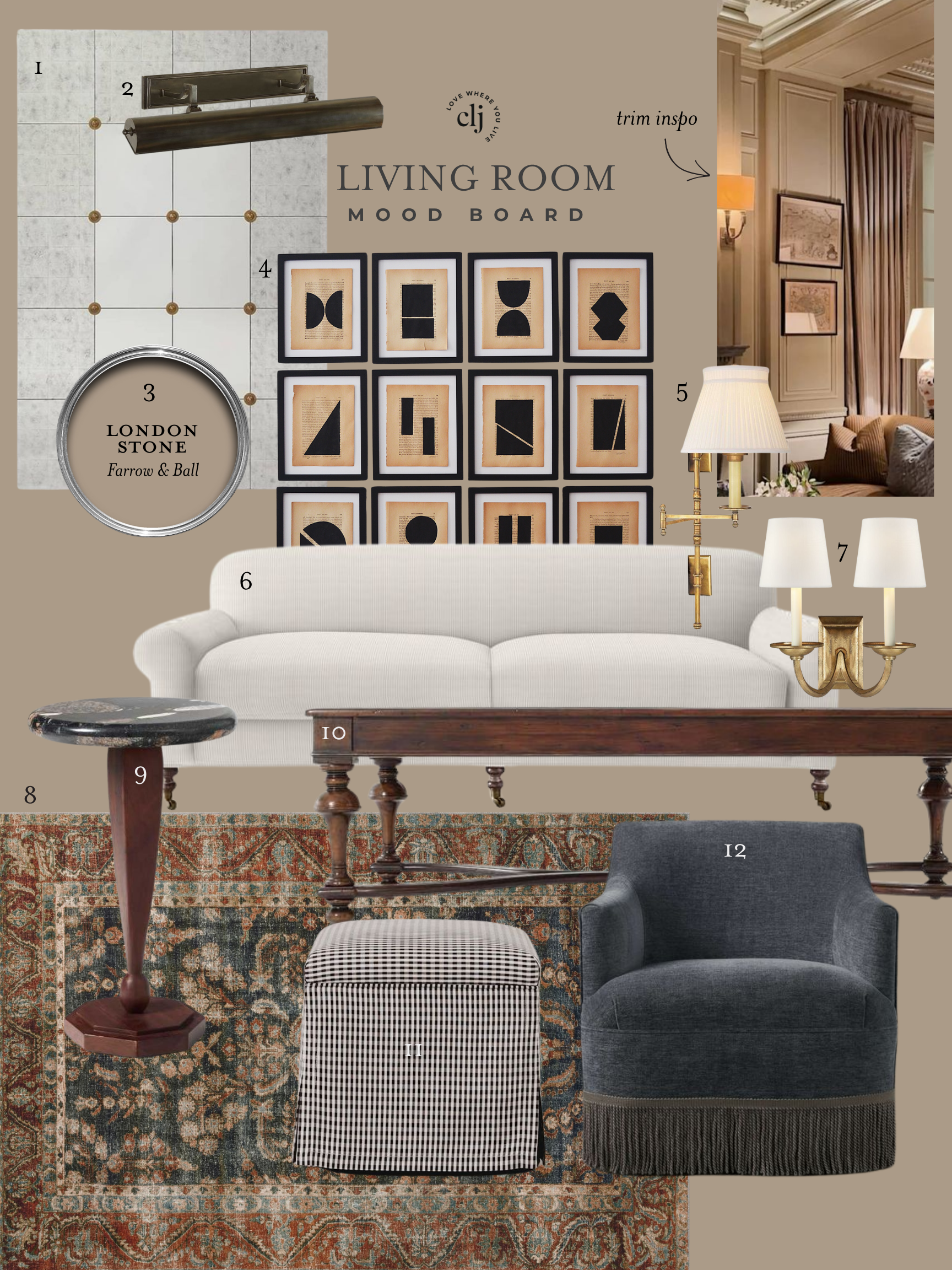
Mural | Chandelier | Desk | Chair | Vase | Peonies | Credenza (similar) | Buffet Lamps | Fluted Bowl | Marble Links | Planter
Paint is the fastest and least expensive way to transform a room, and since I didn’t love it, we eventually decided to repaint it blue.

Mural | Rug | Chandelier | Table | Desk Chair | Ottoman | Sling Chairs
The blue is softer on the eyes; and we painted the ceiling this time which lended itself so nicely to the color. I have loved the study like this! And probably would have kept it MUCH longer. It’s serene and refreshing. I think light blue is going to really be trending in the next few years. But as you know, we’re adding some built-ins and pocket doors, and when the contractor asked me what the paint color is so he can match the shelves, it felt like an opportunity to change it yet again.
And when I see an opportunity, I snatch it. I guess it’s a sign that the blue paint hasn’t quite satisfied how I wanted this room to look and feel–or I would have just gave them the paint color. (Boothbay Gray, btw)
I think I’ve wanted a moody paint color all this time, so I went back to the drawing board, painted on some swatches, and now I’m feeling much more confident.
Dark green paint colors from left to right: SW Andiron, BM Essex, SW Ripe Olive, BM Night Owl, BM Topsoil.
After much deliberation and consideration, my heart settled on Topsoil on the far right. It’s the perfect dark, moody green that my heart wanted all along, and I think it will tie in with the kitchen cabinets across the hall. I almost settled on Andiron, but I preferred the depth of Topsoil.
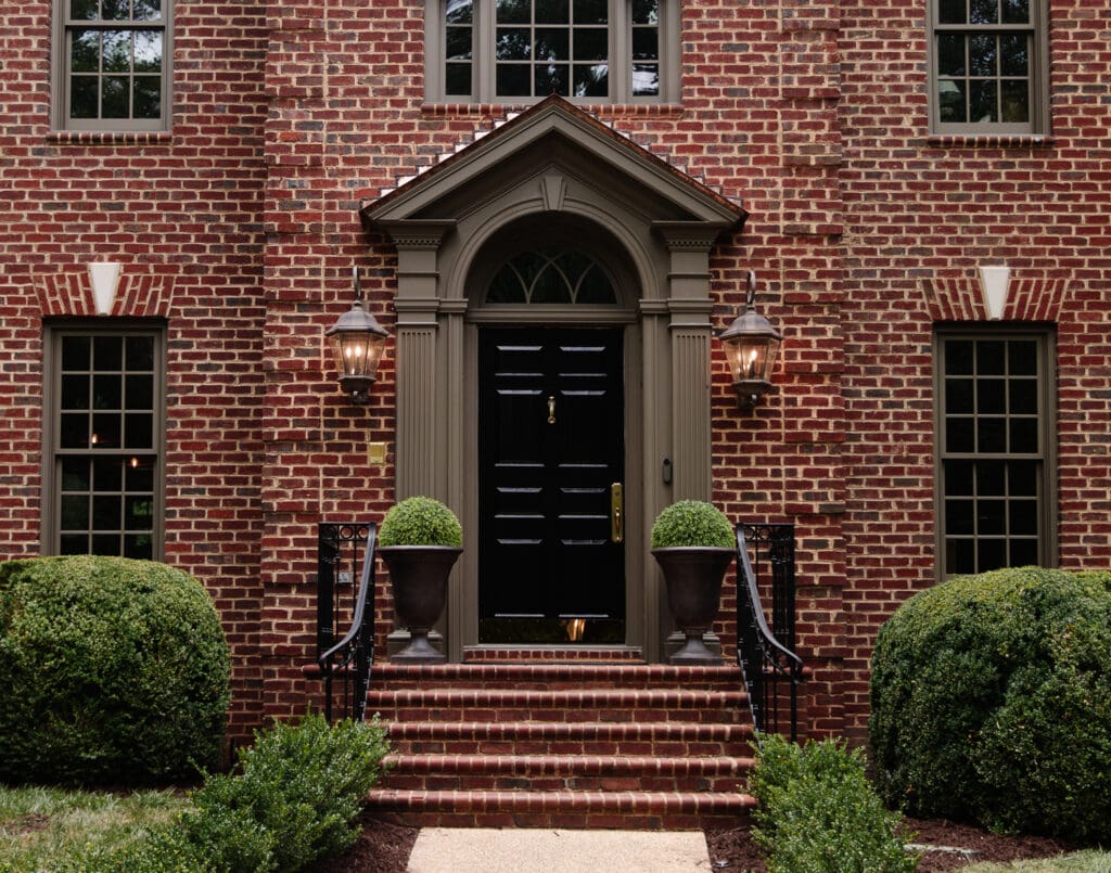
And then, I had to decide if I wanted to paint the ceiling yet again or switch it back to white. When I looked at historical photos of colonial interiors, it had both. Some ceilings were white; sometimes, they matched the walls, and sometimes the color stopped at the crown molding. At the end of the day, I think painting the ceiling in a satin White Flour would tie the room in with the front entry and would add a nice contrast to the dark green paint.
High Gloss vs. Semi-Gloss
The other change I wanted to make (since we had to paint anyway!) was making the paint more glossy for drama. Our contractor brought a cabinet sample piece with one side painted in a cabinet-grade semi-gloss and the other side painted in a cabinet-grade high gloss. Both are super pretty, and it’s fun to compare side-by-side, but I’m going with the high gloss for this space. I think it will be the perfect modern, lacquered touch, and I’m really excited because I can’t remember the last time I painted with a high-gloss paint!
High-gloss

Semi-Gloss

The wainscoting, the crown, the trim, and the built-ins will all be high-gloss, which makes me feel better about my choice to keep the ceiling white. A glossy ceiling would reflect a lot of weird light. I did get a lot of DMs worried about fingerprints showing, but I’m not too worried about it since it’s in a more secluded adult room of the house.

The thing about seeing paint colors online is you can’t always trust what you see! We try our darndest to match the photo to what it looks like in person, but there are too many variables that can make a paint color look different. I actually looked up photos of Topsoil online after choosing it and got a bit spooked, but I trust what I see in-person more. Can’t wait to show it all finished and painted!

When you love a color, does your heart pound? Mine does and that’s how I know it’s the right choice. That happens when I see an antique piece of furniture or a brand new appliance or some shoes that are just perfect.
Love all the color choices but I think a dark paint will look gorgeous with the mural. Can’t wait to see it.
I can’t even get part of my interior painted, (although it has been prepped for over a year!) and you’re on color number three for your study! I’m envious! Can’t wait to see the moodier color. We are in the midst of closet planning and looking at yours over and over is so inspiring! Thank you!
I think the Boothbay Gray is incredibly handsome and would have transitioned below chair rail to a high gloss beautifully. It carried onto the ceiling just right. Your mural is fantastic and should have all the attention – my only concern with the dark colors although I have just done ceiling and trim in a very dark eggplant to accompany a Zuber so it all boils down to what makes us happy – right?
I’m having a hard time visualizing the high gloss and look forward to seeing how that turns out! Love the color you chose!