I've painted many rooms before, and there's that moment of truth when you finally get a good look at the finished paint color, where you might question everything. You spend so much time picking the perfect paint color, and even as you're painting, you never know how it's going to look until the paint has dried, and it's too late to look back.
Repainting this study was no different. If anything, I felt a lot of pressure to really nail it since it was my third try at getting the paint color right, so as our hardworking painters were uncovering the room yesterday, I was full of butterflies and angst. Most times, I have needed some time to adjust to the change of color, and sometimes I've even immediately regretted my choice!
Not this time.
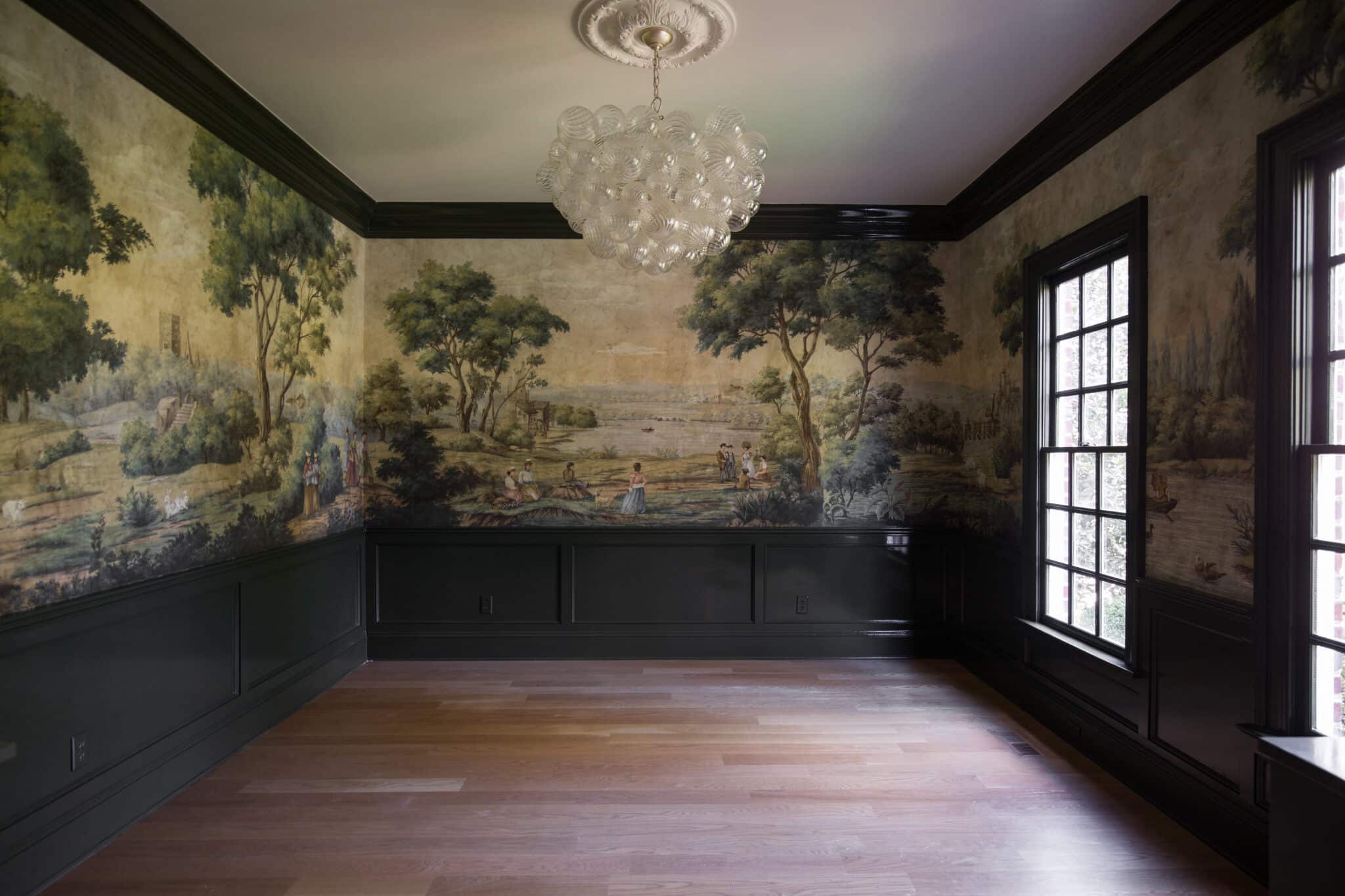
Mural | Chandelier | Ceiling Medallion
This was a love-at-first-sight moment.

We went with the paint color Topsoil by Benjamin Moore, but our incredible painters over at Hansell Painting Co color-matched the color in Milesi paint brand in a waterborne lacquer. So it's a very strong, high-glossy finish. It was their recommendation after I explained the super glossy finish I was after, and I am so in love with how it came out. It gives the perfect dark, moody green a fresh dramatic modern look, and the light bounces around all over the room.

The painters at Hansell were so incredibly thorough with prepping and painting because they knew that with high gloss, every flaw will show through. I give them an A+.
Now I know many will wonder--why didn't you paint the ceiling!? I generally do, and we actually did paint it when the trim was pale blue, but here, I really wanted the high gloss trim to shine. The crown in here is super thick--nearly 10 inches and the warm white ceiling (Sherwin Williams White Flour) ties in beautifully to the neighboring spaces. I also love the bubble light fixture coming down from a white ceiling. Its clean slate is a really calming juxtaposition to the 360 mural and glossy paint.
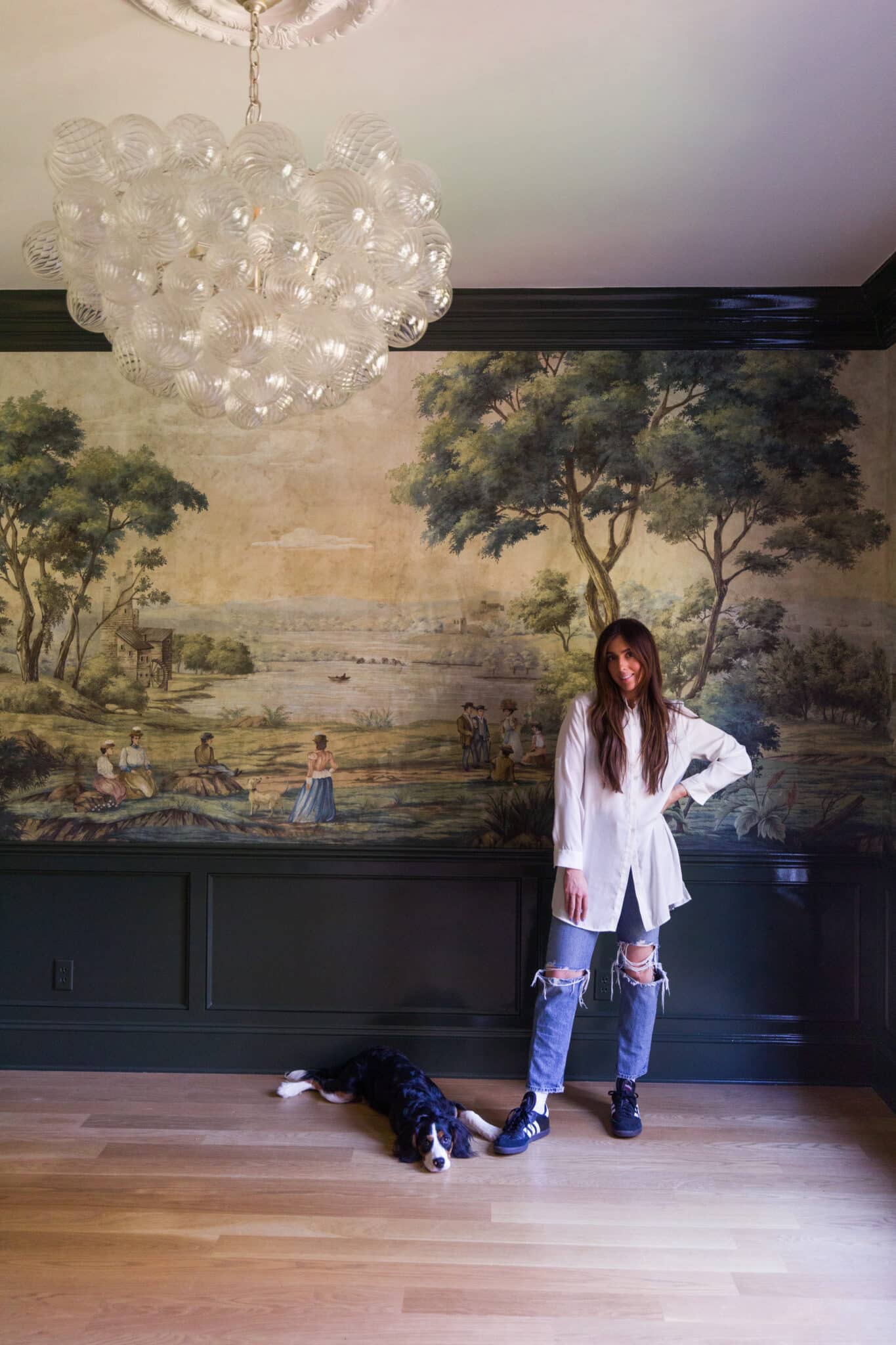
Button-down | Jeans | Sneakers
This room and I have been through a lot together, yet I feel like it's just the beginning for us. Can't wait to show you the built-ins soon and start moving some furniture in!
Leave a Reply

WE'RE CHRIS + JULIA
Portfolio
Projects













Did you add white to the paint? I’m painting samples and it keeps coming out more black.🤷♀️
We did not, but it sure depends on the amount of natural light your room gets. Ours looks very green and never black.
Love the colour! Your mural has come alive with this dark paint colour. I'm noticing so many more details.
Fantastic! It looks better than what I imagined it would and truly brings out the mural. Great pairing.
I like it!
I do think my favorite was the last color you had there. But it looks great!! Y’all’s home is gorgeous!
Amazing!! Perfection
It’s so, SO good! But even better is your honesty and transparency throughout the painting process. It allows us all to be brave enough to change our mind! Would you mind answering how you would steer someone not local to you how they would explain to a painting company how to get the high gloss finish you speak of? I want something similar to paint my stair spindles and railing because of the durability but I wouldn’t know how to achieve that on my own. Thank you!
PERFECTION!
This color makes the mural pop more than ever. For the first time this room made your post about inspiration from the MET pop into my head! It just overall has such a stronger presence than the previous versions.
Absolutely nailed it I love it!! Good for you to be brave and keep going till you’re happy. That’s very inspirational to me. I love the color and the high gloss and From a distance it looks like velvet! 👏
Anyone who thinks you can nail a perfect paint color in under 3 attempts has either a rare gift that even the best designers don't have or they aren't being honest. For me only after I completely paint a room can I start to get a sense of what any color in that range and tone is going to look like. Only then can I say, "I should have gone darker or lighter". I've always been impressed that Julia will pick a small swatch and then go have the paint mixed up and then actually like the color. For me, I have to go through 50 painted on the wall samples and still mess up. I would have had to prime the entire thing in the color I thought I wanted and sat with it for a week before pulling the plug on the gloss (and by doing that realized it wasn't right). I think it took CLJ 3 times to get a stunning, elevated, outcome that the average person would have never achieved in 30 tries.
I like the honesty of your process here. Sometimes it take multiple tries to get colors/design right (or the way you envision). Third time's a charm! Excited to see your built-ins and pocket doors. I have a similar room that I'd love to update the functionality of with a door and storage.
It is so great! I liked them all too, but this one just sits different! The white ceiling is perfect too, fresh and modern. If the ceiling was dark I think it would feel too much like a cave. So glad you are happy with it!
You nailed it! This paint color picks up on and enhances the mural’s dark green, harmonizing with the mural and enhancing it and the room size. The earlier colors fought with it. Well done!
Honestly I’ve liked all the iterations. I think it proves that there is always more than one way to be “right” when it comes to color and ultimately it’s about what you respond to in your own home. Also I was thinking how time of year influences. This final version is going to really pull in the landscaping colors, maybe more than the light blue.. in our MN winter though, that blue would have been chefs kiss. Also agree on the whole ceiling helping the mural feel more modern.
Yes, you got it right! Third time's a charm!
Absolutely perfect!
This space is SO gorgeous. Are you still considering using it as an extra dining space or is it strictly business now? ;)
It's stunning!!! It really makes the mural pop and the white ceiling makes the light shine! Love it!