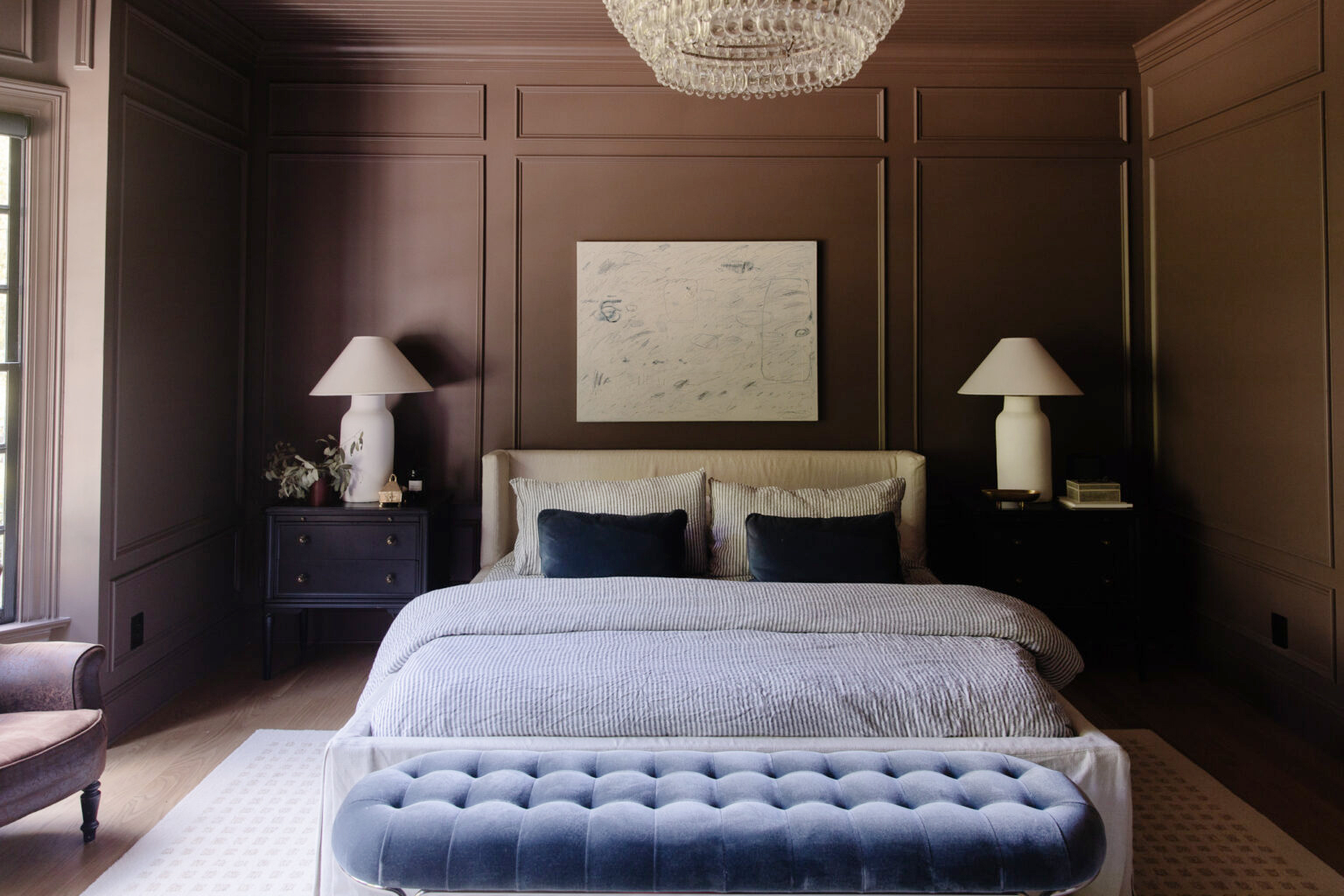
Since painting our bedroom dark brown, we've been taking our time in here. If I'm being honest, I've been in a bit of a creative lull. Which is a scary place to be as a content creator. Just like writers get writer's block, I think every creative gets creative block and I've been trying to push through, but I've come to realize it's probably not the best idea. We've had a whirlwind of projects happening all around us and I'm in desperate need of some creative down time. Every day design decisions need to be made and I think I've been experiencing a bit of decision fatigue. Rather than forcing inspiration to come, I'm trying to take a step back and let things be for a moment. So that's what I'm doing in our bedroom–giving it some breathing room. Not rushing to finish anything. But instead, adding things a little at a time as inspiration strikes.
The Bedroom Today
Bed | Bench | Chandelier | Rug | Vase | Peonies | Floor Lamp | Floor Mirror
Before
The difference is nothing short of dramatic.
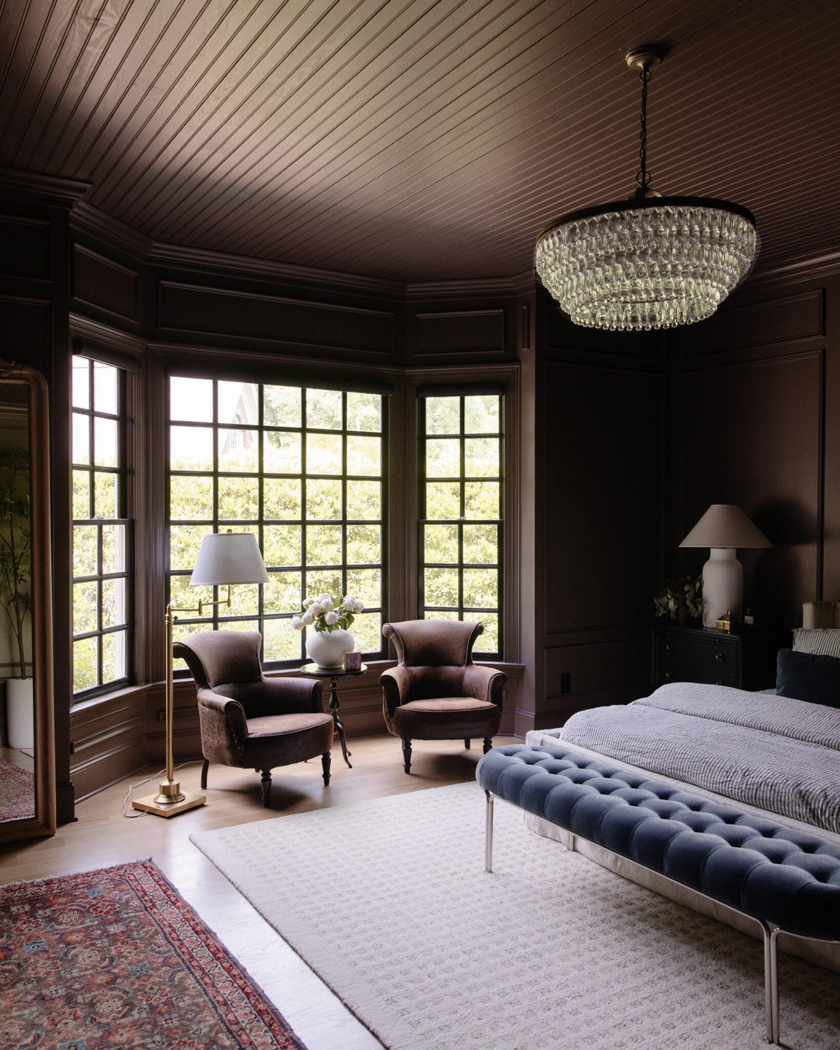
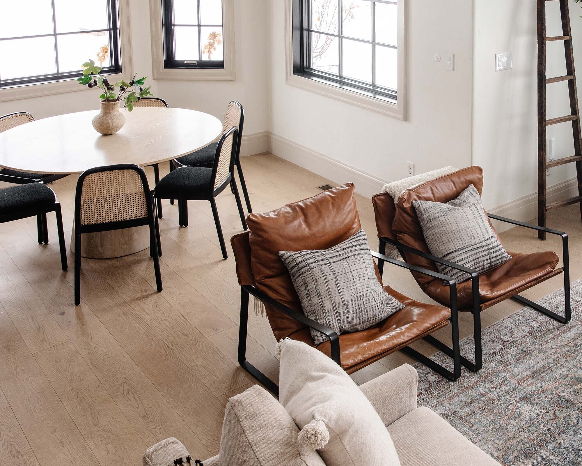
When we revealed the dark brown paint color, it was very minimally decorated (yes even more minimal than it currently is haha). Since then, we've transformed the bay window area into a little reading nook. Seeing the brown leather, vintage chairs in that window nook every day makes my heart flutter. Plus they're delightfully comfy to sit in. We added blackout roller shades, but what's missing is some curtains here!
I've also rolled out a vintage runner right in front of the mirror. I first got this idea from Yellow Brick Home years ago – laying out out a runner in front of an area rug. It feels like the perfect moment to try it out and I love the layered look it brings.
As for the art above the bed... I'm not going to lie when I first hung this piece I missed the empty space on the wall. But I've been living with it for a bit and I love the modern moment it brings here. At some point I would love to frame this canvas to add some dimension.
Today
After
When I see the befores of this room (or any room really), it actually doesn't feel slow at all. I think this is why everyone should take before photos when starting any project. Sometimes these home projects can feel never ending, but rather than seeing how much I still want to do in here, I'm feeling pretty proud of how far we've come.
Can you believe there was ever a door here that leads to the study? Not to mention a tray ceiling that made the room feel so squatty.
Shop Our Bedroom
Other Bedroom Posts
The Perfect Floor Mirror for Our Bedroom
Painting Our Bedroom Dark Brown
How We Measured and Installed Custom Box Trim in Our Bedroom
Leave a Reply

WE'RE CHRIS + JULIA
Portfolio
Projects
















You're going to do what you want to do when inspiration strikes (and I'm going to love it, like I always do!). I loved the rug you have under bed, but ever since you added the vintage runner by the mirror, I have a thought that's been nagging at me every time I see a picture of this room. I think you need something like that under the bed - more color, pattern, etc. I think it would play well with the ticking stripe of your bedding. Just a thought!
Love the white lampshade and vase - they lift the brown perfectly!
Take time off from making decisions and enjoy spring and the emergence of your new pool and terrace. I’m sure they will stimulate your creative juices and the workmen will be gone. It’s great to have people on site working, but even better when they finish and leave and you can reclaim your space.
It's really nice, Julia. I don't mind a bit of a breather at all, creatively speaking! There is no shortage of things happening so there isn't even a lull if you think about it.
I don't get why people still seem to think tray ceilings are fancy unless it's a holdover from when they first starting noticing design in the 90s? My husband goes OOOoooo tray ceilings, and I'm like tear those suckers OUT. Now I can explain - they make the room look squatty! yeah!
Despite being sceptical about the dark colour at first, I really love how the room looks now. Just the right amount of decoration, not too Busy.
I’d be interested in posts about what tasks/projects you have chosen not to do, what you have deliberately taken out of a room, or what you elected not to purchase for the sake of layering more products into a space. How do you cope with accumulation? How do you summon the rigorous editing needed to distill a room to the essence? How do you let go of pieces that no longer work for your space, your lifestyle, or your aesthetic? Many readers design to a budget and may appreciate knowing how you triage and prioritize interior selections and deletions. Best wishes!
I think the moldings add so much detail, you don't need much and am loving how simply elegant this room is. Whenever I see it, I can't help but think about how similar it feels to your last master closet with it's fully painted walls, trim, ceiling, black windows, decorative chandelier and even the brown leather ottoman has snuck in here in the chairs and the color. It seems like such a cozy space!
It looks like such a great place to sleep! Also, it is always nice to hear the truth about the creative process from you. Those of us who love to shift things in our homes and make our homes beautiful, most likely, have long pauses for financial reasons, creative reasons, time, etc. so it gives a much more realistic pacing that is healthy to read about. Thanks for being so honest!