This post is sponsored by Article

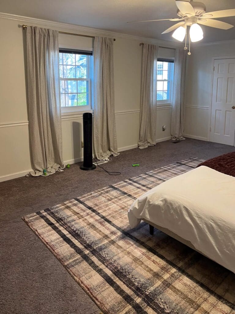
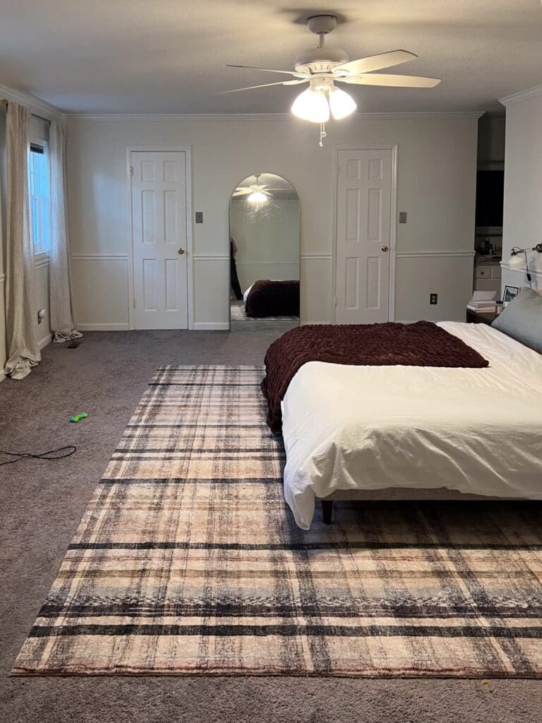
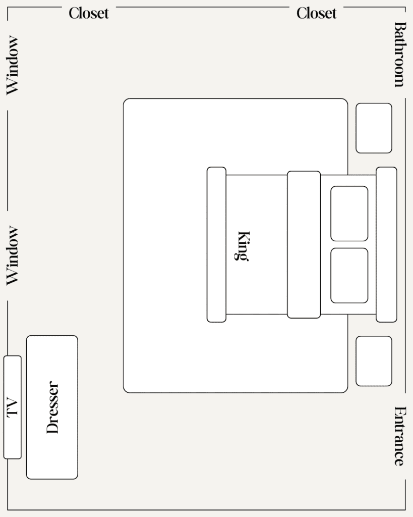
Becca, who runs our Good Influence(r) program, came to me with a dilemma: Her bedroom is very long and large — and, as a result, she's not sure about the layout. There are two windows, off center, on one wall and two closets on another wall. She originally positioned the bed to look out the windows, but the room felt awkward. Becca vented that it felt like a lot of "wasted space." Looking at pictures, I knew she needed a more furnishings to fill out the space.
Becca’s vibe is fresh and modern, so I immediately thought of Article. Their new collection of bedroom furniture is beautiful and substantial - pieces to hold onto forever. Like storage beds and stunning mid-century spindle silhouettes. I love the price tag of these pieces as much as I love the fast shipping. But what's really incredible is now Article has expanded their offerings to include bedding and mattresses to complement their original modern bedroom furniture. I love that you can get everything you need for your bedroom in one place.
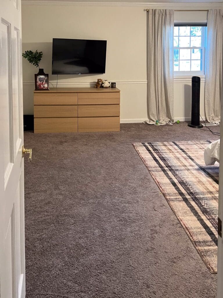
When I first walked up the stairs to Becca's bedroom, I immediately saw what she meant. When you first walk in, the first thing you see is the TV and dresser. Once you walk farther into the room, you see the bed and nightstands across from the two windows. I see the logic here. I would *also* want to wake to the view of the outdoors. But I had an idea...
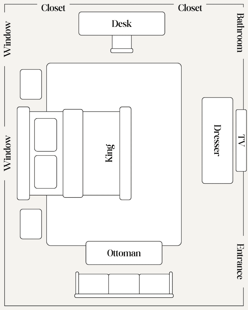
It seemed like a no-brainer to move the bed between the windows. This would be the first cozy view when you'd walk into the room, and I knew it would change the whole vibe. But because the windows are off-center, the bed would also be off-center, and the nightstand would run into a closet door... This wouldn't work. Instead, we centered her bed under ONE window and flanked that window with dramatic curtains. We let the second window serve as additional natural light, but didn't dress it with curtains. This made the curtained window + bed into a serene and sophisticated focal point for Becca's bedroom makeover. This new upholstered king bed has a lower profile, so the bed fits nicely in front of the window. Once the bed was the place, the rest of the room came together quickly.
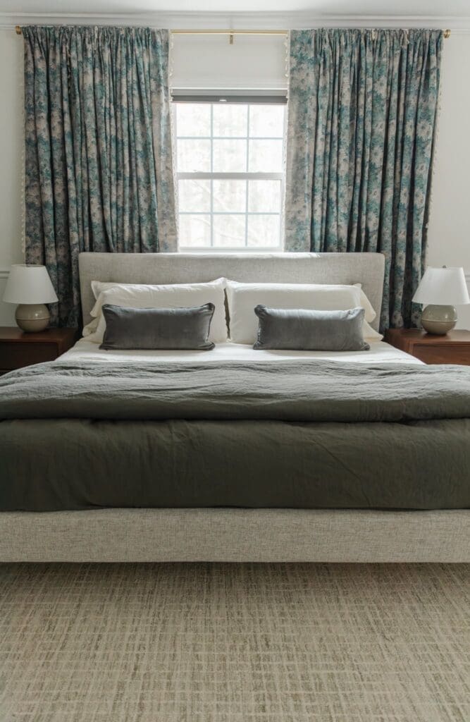
To add to their ease and convenience in shopping, Article has partnered with Leesa® mattresses, which our family loves. We have a Leesa mattress in nearly every bedroom in our house, including the guest house. I swear everyone who sleeps on it ends up buying one.
Becca's nightstands are lovely, mid-century modern pieces that I know will look handsome by her bedside for years and years to come. (Hers are sold out, but I found these beautiful walnut nightstands that are similar.)
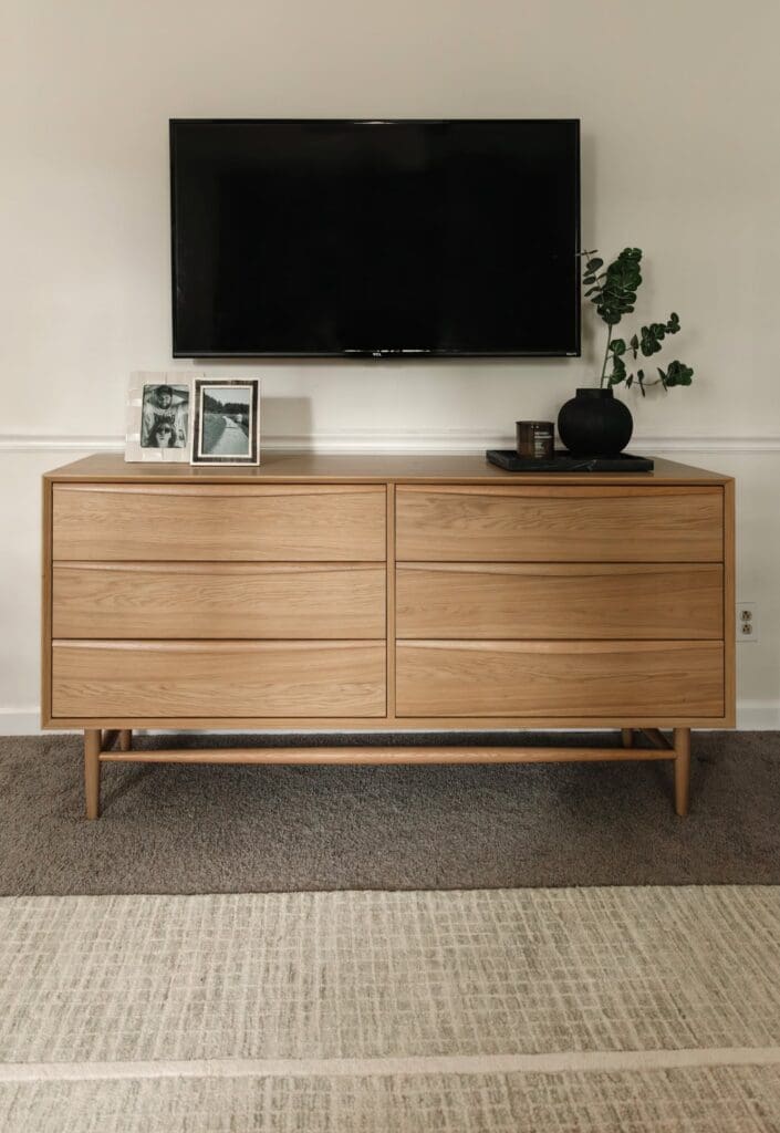
To add more storage, we installed this light white oak double dresser that has a beautiful sleek front. I love mixing wood tones to add an extra level of visual interest. My advice: Go for a layered, lived-in look, with wood tones that both complement and contrast. (For more insights on mixing wood tones, read this.) We moved the TV and its mounting to the space above this dresser, on the wall opposite of the bed. It's no longer the first thing you see when you walk into the room, but it's anchored beautifully for movie nights in bed.
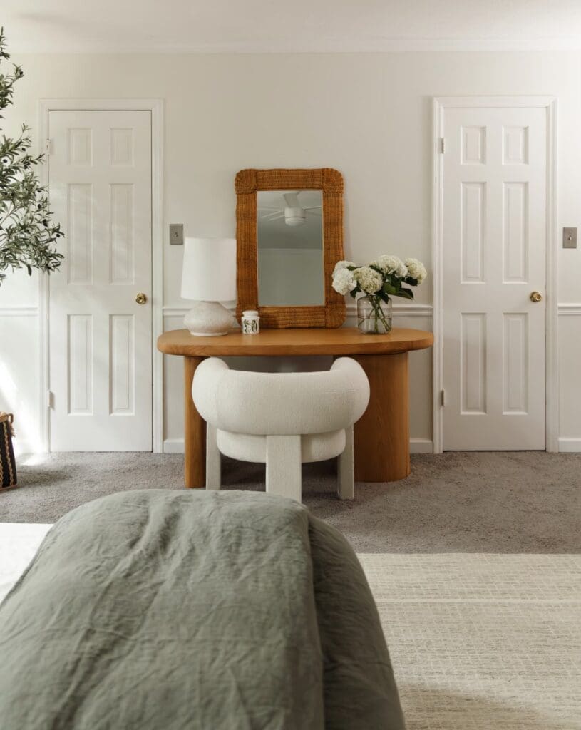
We sectioned off a portion of the room to serve as a small office — the wall between the closet doors was perfect for this. This decision was inspired by this stunning new oak desk. As I mentioned before, I don't love to have laptops in the bedroom, but this desk could be used as a vanity — or for romantically scrawling in a journal :) This geometric wool boucle lounge chair is chunky and cute and substantial—and it practically doubles as a work of art. I also brought in this ivory table lamp that has some earthy-looking speckles. It feels like a sculpture.
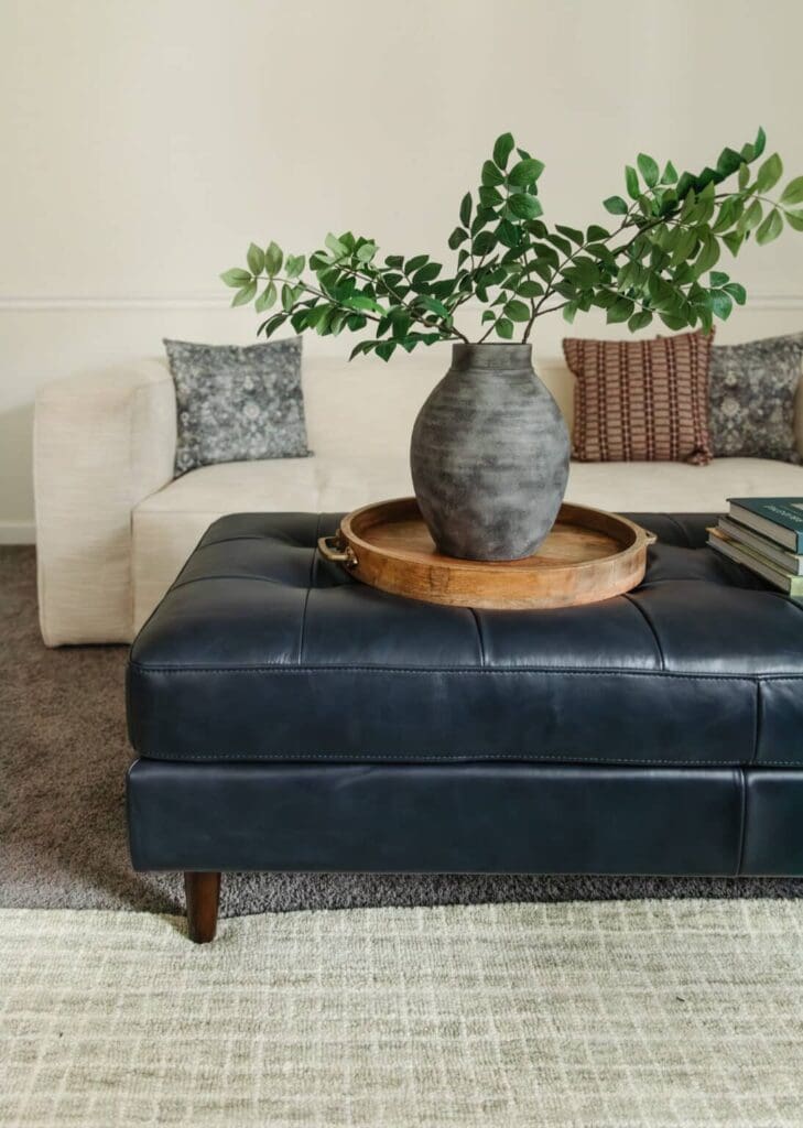
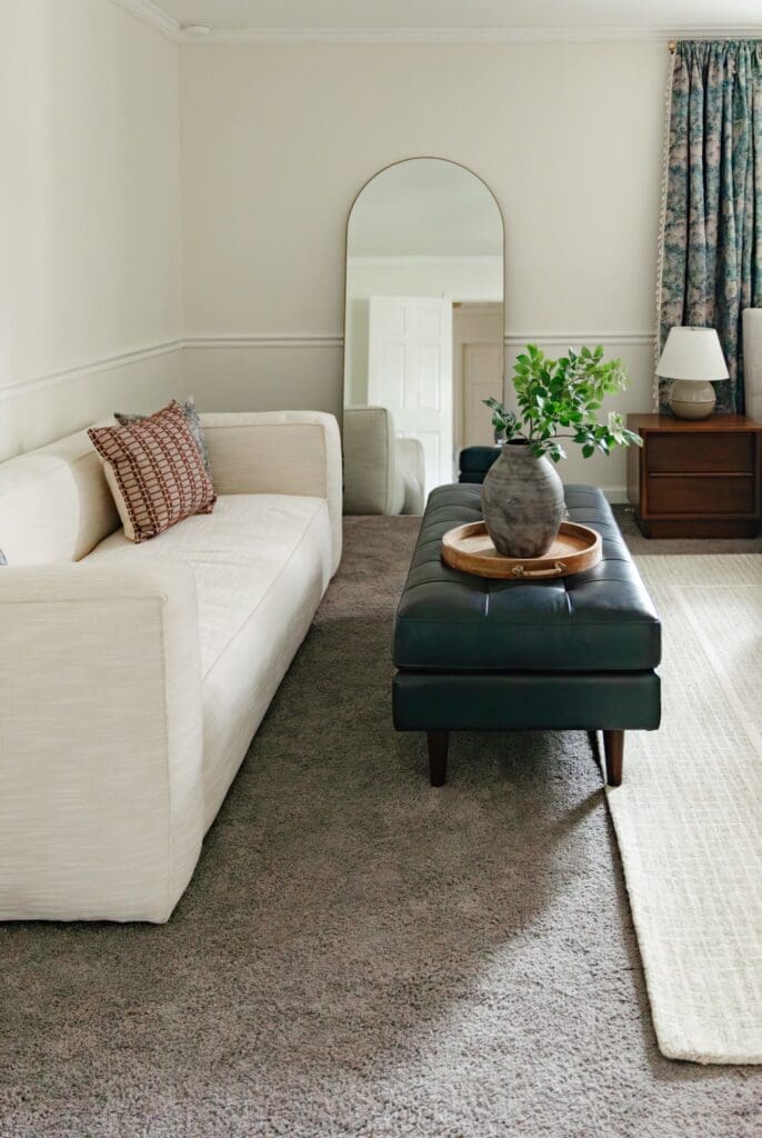
Lastly, for the new layout, we're creating an alternative seating area. It makes the room feel like a suite in a boutique hotel — with a bedroom, an office, and a living room. I got this extremely comfortable, sleek ivory sofa and paired it with a dark leather blue bench that doubles as a foot rest or coffee table. In addition to introducing some rich color, the bench has a traditional vibe that makes this room feel collected and cohesive. I love investing in a bench because this piece will serve them for years to come — It could go on tour to the foot of the bed some day. Or it could serve as a coffee table, a statement piece in a hallway, or even additional seating in a bedroom. A bench is so versatile and always a good idea.
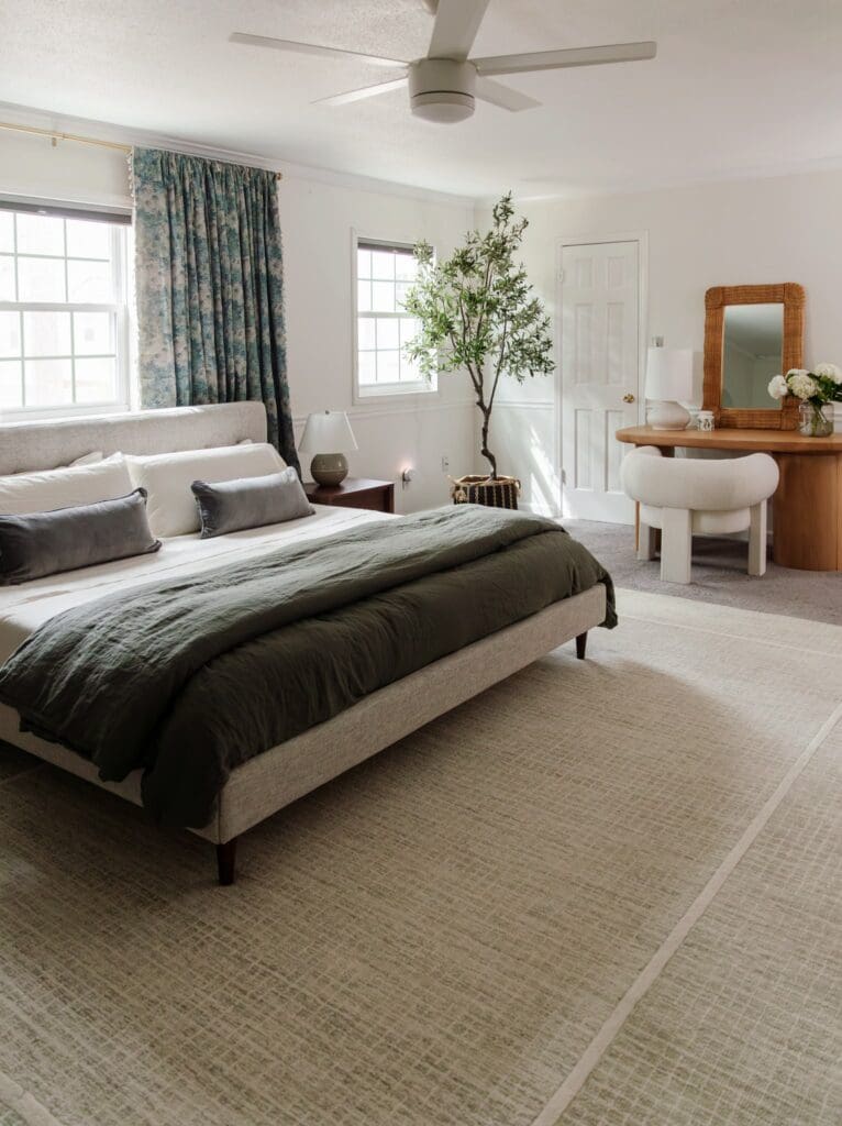
Becca and Connor are really happy with this new layout, and I am too. I love rethinking spaces like this, and rearranging furniture is a favorite pastime of mine! It's not about the size or the shape of the room — it's about how you use it.
Before:
After:
Leave a Reply

WE'RE CHRIS + JULIA
Portfolio
Projects











So good!
That is fantastic! I would not have thought to dress just one window. I have a similar issue in my bedroom. This is a solution i had not thought of!
You are magic!
I am so impressed with your vision and ingenuity. Would you ever consider making this a regular column where readers send in their layouts and design dilemmas and you give them a layout idea or options?
Thank you :) We'll keep that idea in mind!
Can you please give a link to the rug under the bed? Thanks.
Here you go! https://rstyle.me/+WxC82gRAEZI75e3rZijeAg
Beautifully pulled together!! Brining the desk in between the closet doors was unused space that now helps bring it all together. Well done.
Can you please source the beautiful check carpet
Sure! It's from our collection with Loloi: https://rstyle.me/+WxC82gRAEZI75e3rZijeAg
This is such a gorgeous solution to this space!! Looks amazing. Could you give me a link to those faux branches in the larch black vase on the ottoman? Thank you!
Thanks so much! :) They're from Target: https://rstyle.me/+hftQtmofd0OLixuIRGmCYw
Post like this one makes me wish I had an off-center window! I'd love to see a post about how you shopped the house for the music room. It's like magic! More, please!
Please give a link to the curtains.
We used these curtains: https://rivr.link/clj-blue-floral-curtain-panels
It looks so great!
Would you be willing to share the blue striped curtains?
Thank you!
Here are the curtains we used! https://rivr.link/clj-blue-floral-curtain-panels
Nice large rug! Was wondering where it’s from?
Thanks! It's our Briggs rug with Loloi: https://rstyle.me/+WxC82gRAEZI75e3rZijeAg
Leaving the one window undressed works so brilliantly!
Where are the fabulous curtains from?
They're from Amazon! Here's the link: https://rivr.link/clj-blue-floral-curtain-panels
Perfect solution!
You made the bed placement look intentional by adding more furniture and function to the room. Other than adding some art over the sofa, this room is done!
I learned so much from reading this post, and hope to apply some of these same techniques and mentalities to my own home. Thank you for making this achievable and inspirational!
I love this makeover, but quick question... is the bed on top of a floor vent now, or did you reroute it? I wonder if that would cause problems down the road.
It is, but just partially. Because of the curtains, we left some room between the bed and the wall so that we can re-route it. We might re-route it all the way under the bed to come out of the front of the bed.
Love the layout and the pieces you chose! Would you mind sharing the curtain source? They're stunning!
Thanks so much! You can find the curtains here: https://rivr.link/clj-blue-floral-curtain-panels
Love how it turned out! Would you also mind sharing a link to the ticking stripe curtains you decided not to go with please?
Thanks so much;)
Sure! Here they are: https://rivr.link/clj-ticking-stripe-curtain-panels
Genius!
the way I gasped when I saw the after! I'm so in love with the furniture and design but also REALLY love the way you walked us through this layout dilemma. Well done!
What a lovely space! I think the thing that we all fall victim to is that we try to put our rooms together one piece at a time, maybe over a long period of time. That's reality for most of us, but it never ends up feeling cohesive. I think starting with a mood board, even if it takes a long time to convert it to real space keeps you on track so the end result looks like this. Julia gives lots of great tips to achieve this!
Hi! I am wondering where the pillows on the sofa are from? Links would be great!
The new layout is extraordinary! I never would have thought of arranging it that way but it works so well!
This is really beautiful! What an improvement on the use of the space.