The reading room-turned-music room has been on our minds for a while now. It was the second room we worked on in this house (after the half bath) and it has kind of always been special to us. Greta and I (before Faye came along) used to read on the couch in here and watch out the wall of windows and wait for Chris to come home. When we inherited our piano that has been handed down for generations on Chris's side (which is, obviously, also very special to us) we moved the couch out to the living room and the piano took its place. The whole reading room changed. Not in a bad way--no--but in its function entirely. Chris plays the piano well, but only occasionally, and I am starting to teach Greta, but we overall found we rarely went in the room. Chris reads cookbooks like novels and instead of getting one of the shelves and plopping on the couch, he would grab one and head to our bedroom or the living room. No big deal, but these little things all started creeping in and we started longing to have the couch back in the reading room. Once we got the leather chair for the living room, the process all got expedited. We moved the couch back in the reading room with plans to fit the piano on the wall with the shelves surrounding it. It seemed like a perfect way for the two to coexist.
We were teetering between 1--cutting the existing bottom two shelves, sliding the piano in and then framing around the piano so the shelves had ends and the piano was enclosed, or 2--Taking down the shelves and moving them to a new location so we wouldn't have to cut them and building new bookcases around the piano. There were LOTS of opinions on Instagram, but we decided the first option was most cost effective and would be a relatively easy project only taking a Saturday. And then the Saturday came and we just couldn't bring ourselves to do it! We realized that we were trying to force something that neither of us truly wanted. And! We have a whole downstairs where the piano will fit in perfectly--eventually. For now, we rolled it into our bedroom--which is weird and strangely romantic at the same time. One morning, Chris rolled out of bed and played a song--really! We both laughed hysterically.
As soon as we get the downstairs more of a "family/media room" with a sectional and potential projector, and less "anything goes playroom" (complete with trampoline, slide and castle) we'll feel more comfortable moving the piano into place down there. There is a third bedroom (greta's room and the guest room, plus one more!) downstairs there which will likely turn into the playroom sometime next year. I've digressed.
This post was supposed to be about painting the reading room and somehow all of that slipped out of my fingers in true backstory blogger fashion. But yes, I painted the reading room. And all of you boycotting the action on Instagram (#savethegreen! haha) will be happy--it's still green. It's still green! Oh, here we go with another backstory. We originally painted the reading room green, a custom color, for a Halloween party photo background. We had just barely moved into our home and halloween parties are kind of our thing, so we scrambled. The room was empty and it seemed like the perfect place to take photos of all of our guests in costume. We chose a flat finish in a spooky green (we kept tweaking at the paint store until it was just right) so the flash wouldn't bounce off of the wall. The green was never meant to be permanent, but after the party we started building the shelves and the sconce header and it grew on us. Since then, although we still loved the green, the flat finish continually looked chalky. So, with all the potential changes happening in the reading room, I figured now would be the time to paint it in an eggshell sheen--and why not choose an actual, intentional green in the meantime.
Since there is a whole wall of windows in this room, I knew i could get away going a little darker. I have always had a color crush on Farrow & Ball's Studio Green and knew that Sherwin Williams had most of their formulas since we color matched F&B's Skylight there for use in our last bedroom with great results.
They had the formula (score!) but after I picked it up and started painting, I immediately noticed that it wasn't staying mixed. I mixed and mixed and there was always a black swirl in the can and in my paint tray.
I started this painting dance where I would mix my tray up and paint a few lines and mix it up more. It dried incredibly splotchy. I thought--maybe another coat! I thought that three times. After my results were still splotchy, I called the store and they said that maybe it was an older can of paint and they offered me a new can. I took it and tried again--with the same results.
The paint just wouldn't stay mixed. I brought my evidence back to the store and showed them the back swirls that were translating into less-than-even results on my walls and they gave me my money back and even offered to give me another free gallon if I wanted to pick a different color--since that color was just not working in their paint.
I guess I'm stubborn because I still wasn't ready to give up on Studio Green (so stubborn, Julia! Stop!) so I took the little swatch I had (you can order a free Farrow & Ball swatch book on their site) to Ace to get color matched. They explained that the swatch might be too small and it might not be an exact match since it's paper, but again, stubborn. As soon as they mixed it up, although the little dot on top of the can looked close, inside the paint was gray. VERY gray. I told them that this wasn't right, but she insisted it will dry a lot darker…and a lot greener? Stubborn. I took it home and it dried extremely gray and extremely light.
I guess it took 3 days, 4 coats and a false color match for me to finally give up on Studio Green. That is my threshold. Ha!I started looking through my swatches for a similar dark dark green and I found a Clark+Kensington one called Pine Grove. It was a smidge bluer than Studio Green, which reminded me a lot of the original green we painted the room, but nearly as dark.
Ace let me return the way-too-gray Studio Green (luckily the same girl was working that convinced me to take it home even though I was hesitant)in exchange for a gallon of Pine Grove in eggshell. And, I mean, the rest is history.
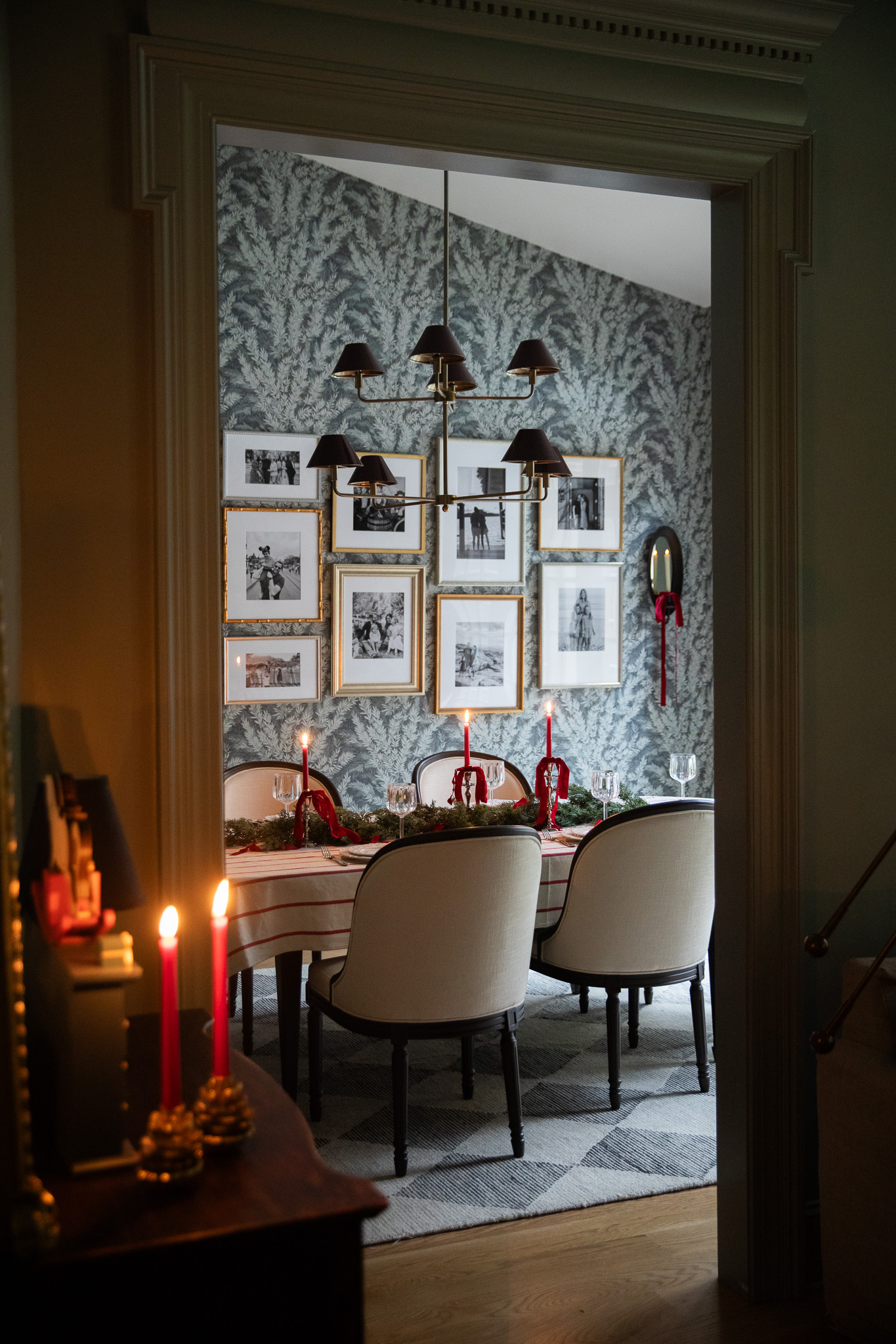
Our "reading room green" finally has an official paint color that has an actual name in a sheen we can live with. The before and after paint color isn't a huge difference, but if we liked the original color, you could say we LOVE the new color.
I am still working on putting the room back together (obviously) but I finally picked out a rug and coffee table and a few accessories for the room, too! Can't wait to share those, along with a much more pulled-together before and after, when they arrive.
Leave a Reply

WE'RE CHRIS + JULIA
Portfolio
Projects
















Can I ask why you didn’t buy the Studio Green paint from Farrow and Ball directly? I’m looking at buying this paint for our living room and wondering if there is something wrong with F&B or the color that made you want to find a workaround through these other brands.
We love Farrow & Ball and use it in many spaces in our current home! In the past we've color-matched it sometimes to save time on shipping from out of the country or to save on cost, since it's a premium paint company.
I love the green! As I looked at it, I remembered a stairway we painted green many years ago. It was impossible to finish painting it properly and it always remained “smudgy” looking. We never painted anything that color again.
And yet... here I am wishing I had something the color of your wall.
Hello, I was looking for this color and could not find it anywhere on the Ace site or the Kensington color at all? I really love the color and I wish I could replicate this.
I'd love to know the differences between paint finishes...I went to my local ace and asked for this color in eggshell and they gave me satin, said it was all they had. My walls are very textured and look a little "wet" to me. I love the color but I don't love the finish. I have a flat white everywhere else in my home.
Satin and gloss have a higher durability, but there are pretty shiny and reflect light. Whereas flat or matte soak up light and provide the most coverage. Eggshell is a mix between satin and flat.
I stumbled over here from a picture of this room shared on Little Green Notebook today -- I saw the bluey green walls and the amazing contrast with your shelving and had to find out what color it is! So so so so so beautiful! I had to laugh at your patience with all the coats of paint -- excellent result in the end! :)
I love the new green so much, it is very beautiful!
Thanks, Tom!
gorgeous! painting is so tricky!
The color looks classis and it's perfect for enjoy reading book. Nice job Julia
That new color is fabulous. I would not be happy with Sherwin Williams however. All the money and more importantly TIME wasted on their paint- they should give you something for that. I have not been pleased with Sherwin Williams paint myself. I am not a blogger or paid endorser of Home Depot's Behr paint/ primer in one paint. But I have painted my living room and dining room with Benjamin Moore color matches recently, and they have been right on. The paint goes on so easily and the coverage is so good. I suggest you partner with them and alleviate this problem. FYI.
I was sad because I love the current green but WOW! I LOVE the new green. It has such depth!
I like the pine even better than the studio green. It's so DRAMATIC!
Oh, dear. You saw that we just repainted our living room too - a color so close, I'm not sure anyone will notice! Funny enough though, our neighbors came over Saturday, and the first thing they said was, "wow, it feels so much brighter in here! But everything looks the same? Confused." Ha!
If it FEELS better, then, go, you!
You sure have been a busy bee painting lately, you have done a lot in the last 6 months. I really don't like the chore of painting. But it is a necessary evil, and makes such a difference. Nice pillow on the couch. Great choice choosing to keep the shelves as is.
I just want to curl up with a blanket and a good book in that room!! Love the new color.
The new colour looks great! It's amazing what a different sheen can do to a room. Can't wait to see the finished space!
I like the new color. Is it just me, or do the shelves look like they're bowing in the center?
It's not you…but it's not the shelves either! Haha. I took all of these photos with my phone and there is definitely some distortion happening in them. I'll pull out my tripod and actual camera for the next photos when things are all put together.
That's so funny you asked that, because I was thinking the same thing! That color is very pretty!
I felt the same and was about to comment it below but, then saw your comment here.
Overall, looks really beautiful Julia!! :)
I have to say I LOVE stories like this. I love that you showed us how easily things can go one way and how if you just keep going you WILL get through.
Love the new colour! It looks great!
The new color is great!