This post is sponsored by Valspar
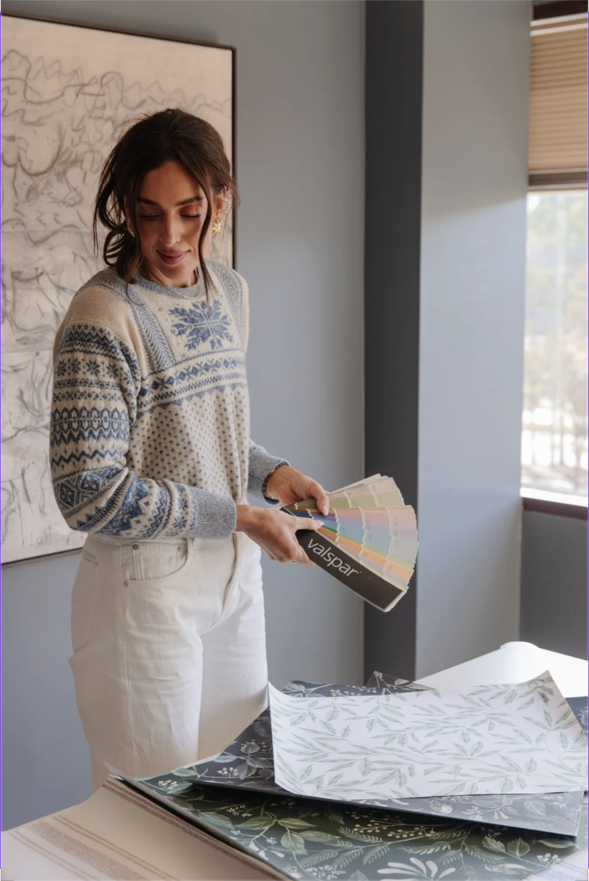
You know when you find “the one”? The paint color that just makes you swoon, it’s so perfect? I love chasing that feeling. Over the last 15 years, I’ve collected a list of paint colors that are my tried-and-true favorites. I was proud to launch a line of wallpaper this year, and the No. 1 question I get is: “What trim color would you use with this wallpaper?” The options are endless! I like to choose something unexpected and special—and Valspar makes it easy. They have so many on-trend shades as well as classic colors that have a heritage vibe. If you love moody, modern, and traditional colors like I do, you’ll love my curated paint colors to use as trim pairings for each of the Chris Loves Julia wallpapers. I’m giving you three Valspar paint color pairings for each of my wallpaper samples, all of which are available at Lowe’s. I can’t wait to see what you choose!
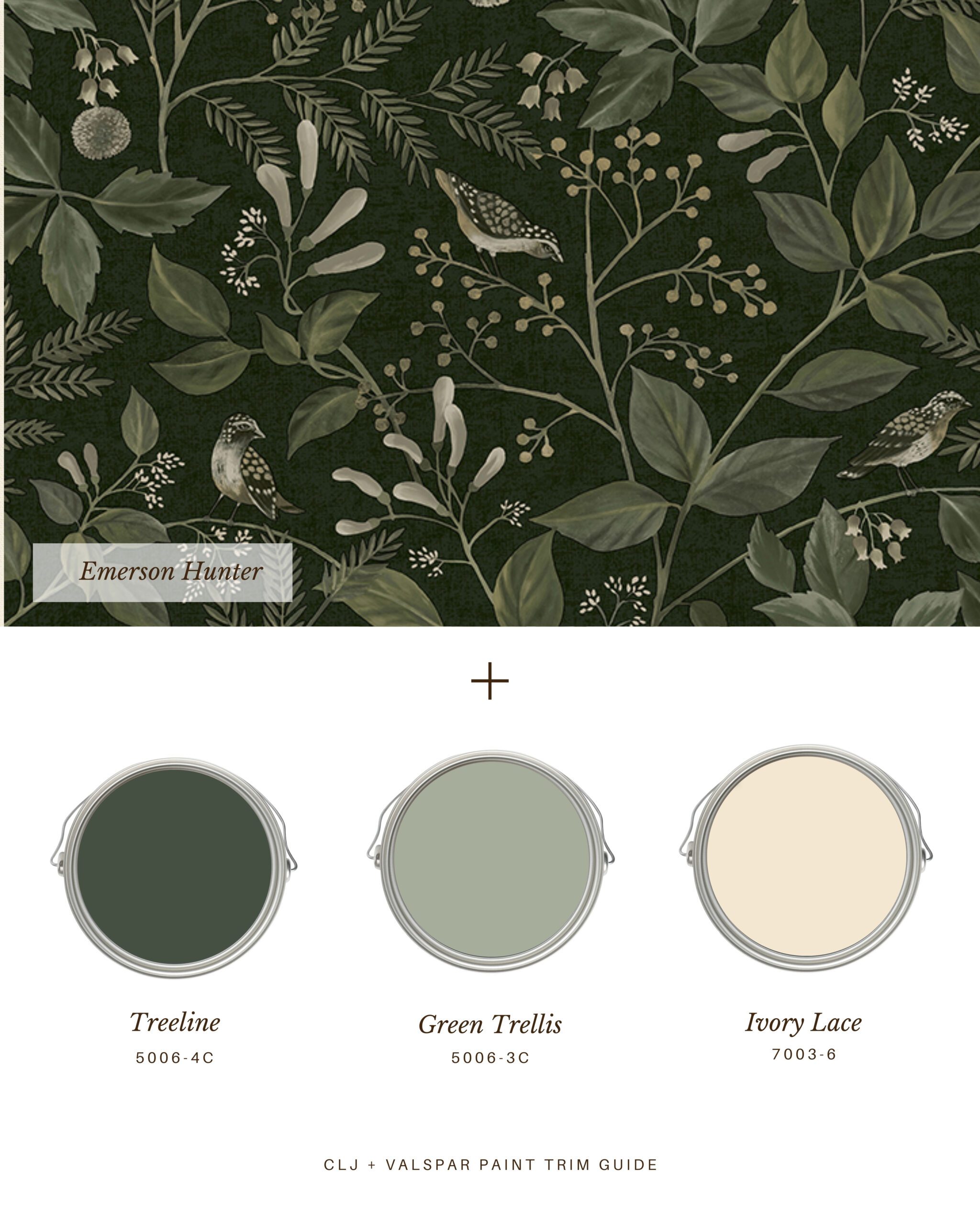
“Emerson Hunter” is a wallpaper that has a whimsical woodsy vibe. In a windowless powder bath, I’d go with Valspar’s Treeline 5006-4C for the trim — keeping things dark and moody. In a cozy bedroom, I’d lighten things up with Green Trellis 5006-3C for the trim. Ivory Lace 7003-6 would be gorgeous just about anywhere, but I especially picture this one as a pairing in a well-lit dining room.
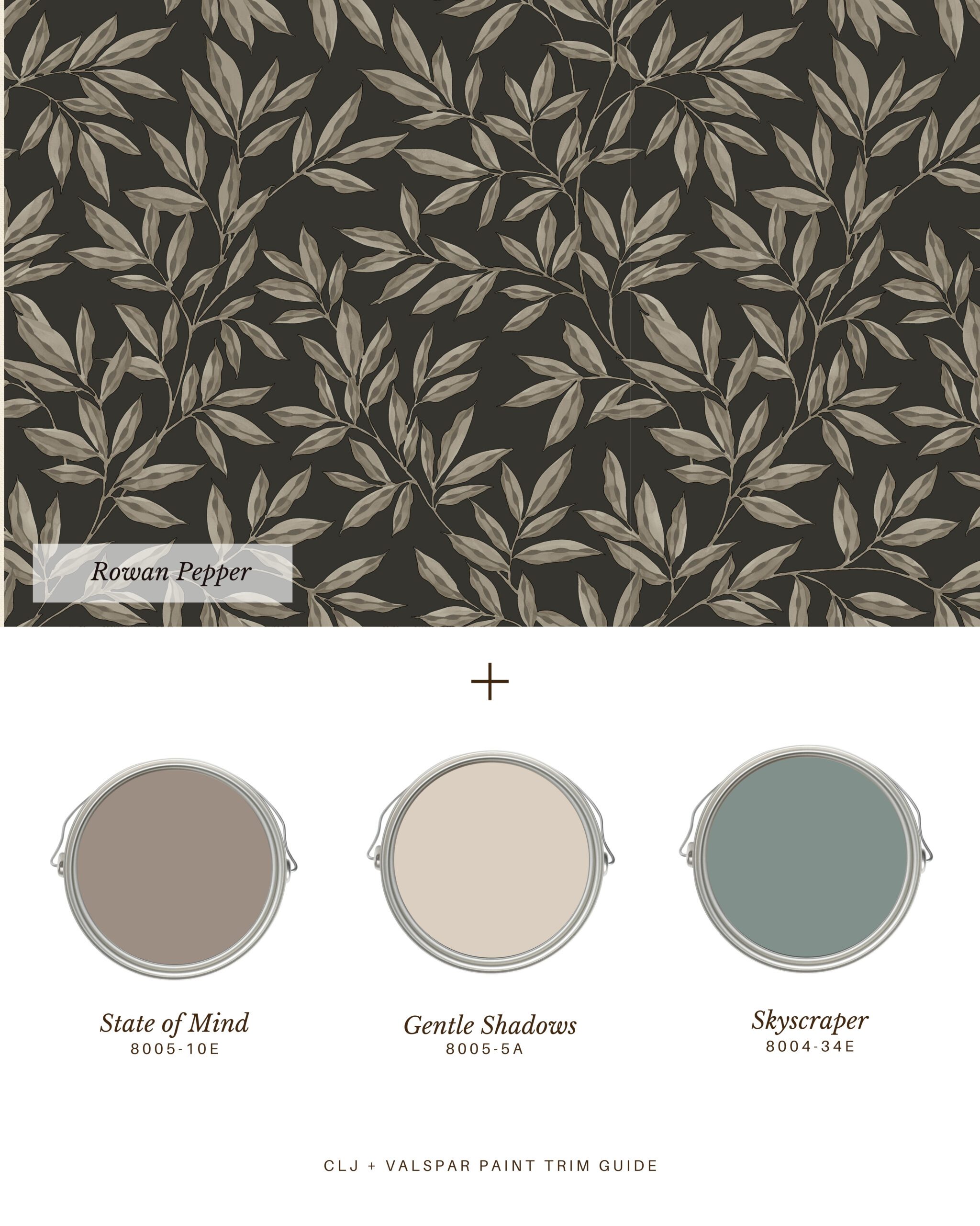
“Rowan Pepper” is a wallpaper I designed to add petaled sophistication, suited for any season. I love a dark botanical, and the black background on this makes every paint color pop in contrast. State of Mind 8005-10E is a creamy brown from Valspar, bordering on purple. This pairing would be stunning behind a headboard. Opt for Gentle Shadows 8005-5A if you’re hanging this wallpaper in your primary bath. And Skyscraper 8004-34E would make for wow-worthy trim with this wallpaper in a living room or family room.
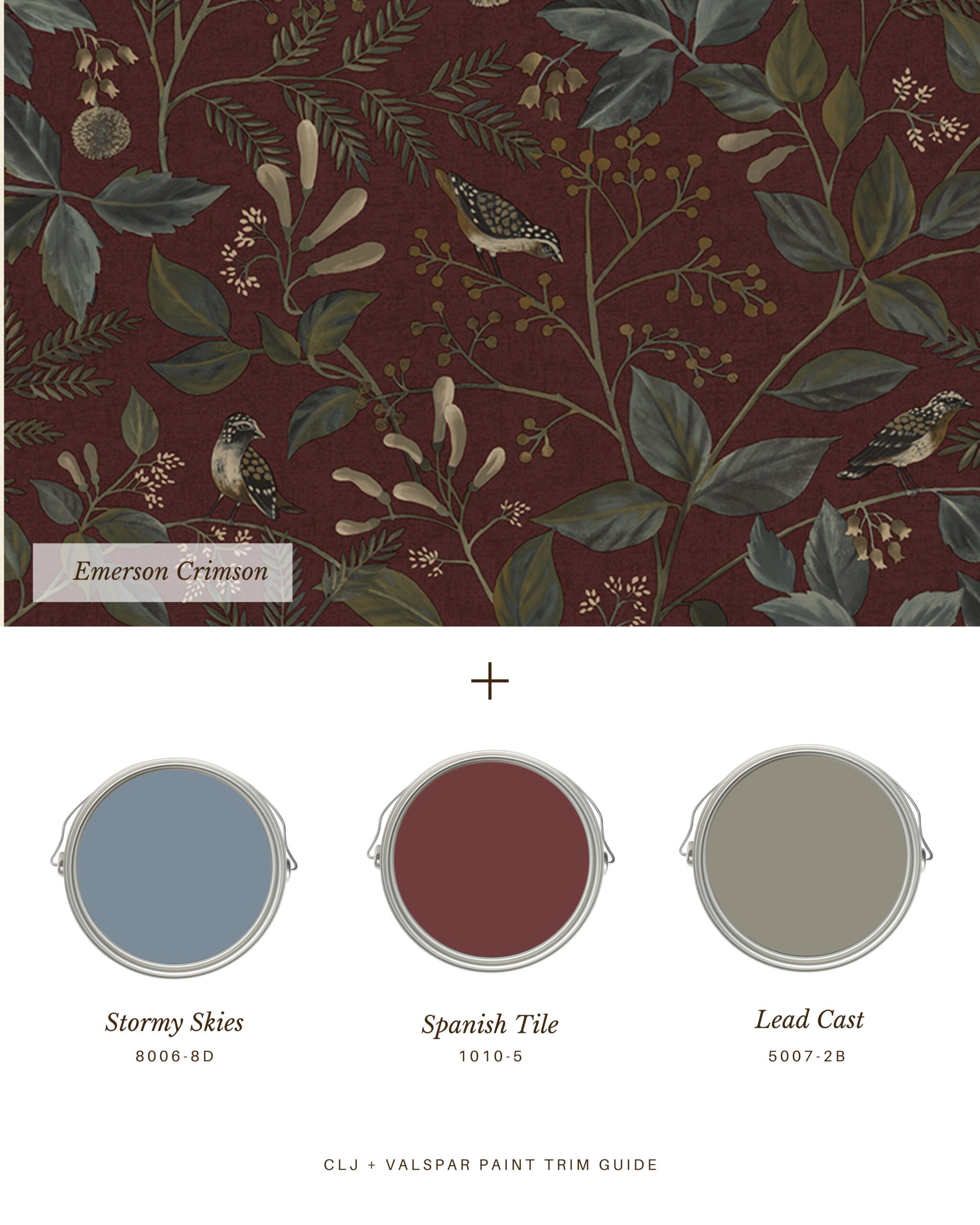
This wallpaper has a brick red background, and you might immediately gravitate toward Spanish Tile 1010-5 for the trim. I applaud this decision. This pairing would look so pretty in a kitchen nook. However, consider Stormy Skies 8006-8D for something a little more unexpected — or Lead Cast 5007-2B for that Bed & Breakfast vibe.
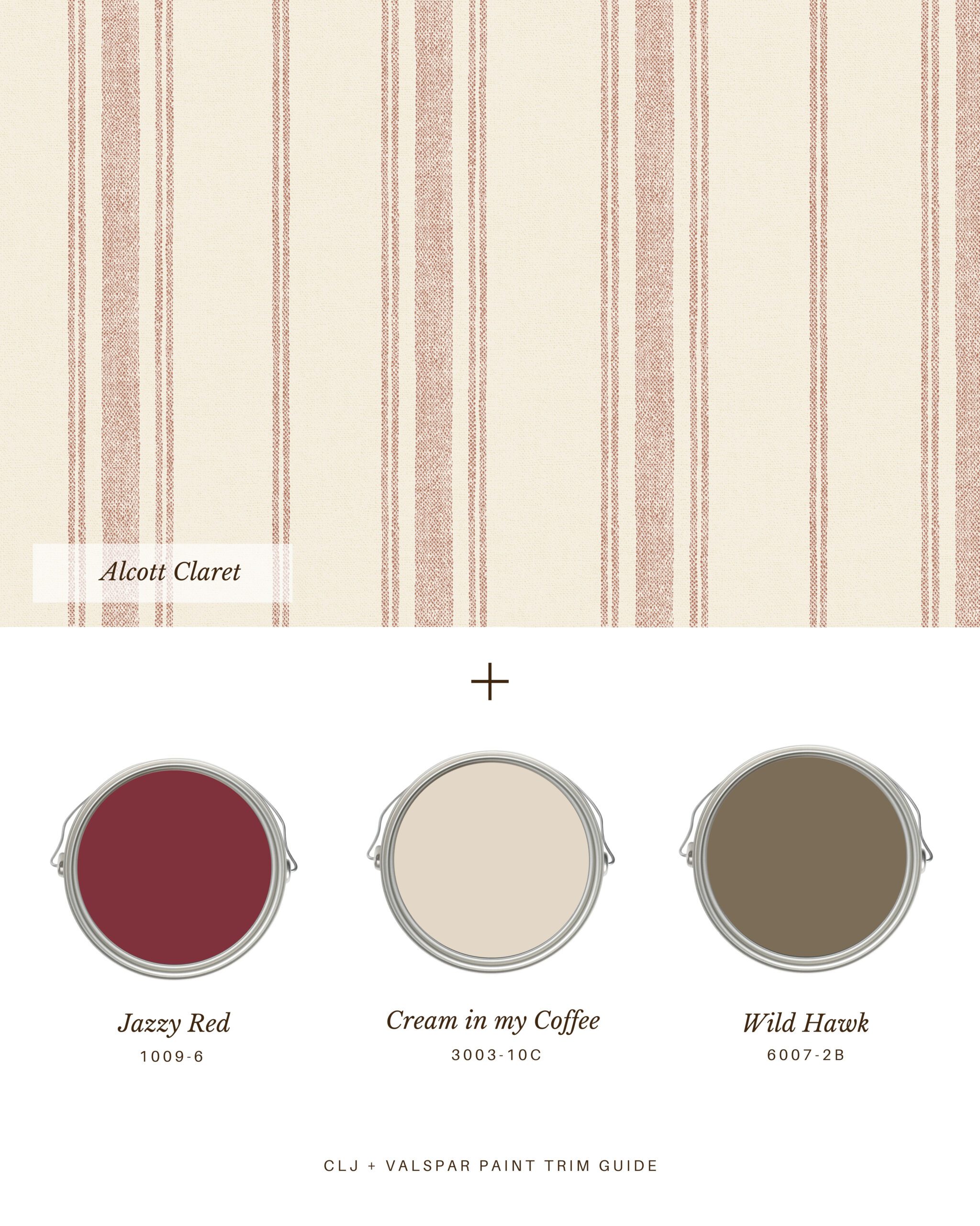
“Alcott Claret” is one of my favorite wallpapers because of the modern stripe paired with the linen look. This would be stunning in a mudroom, trimmed out with Valspar’s Jazzy Red 1009-6. I could also see this paper in a kitchen, paired with Cream in my Coffee 3003-10C. And because I love contrast — don’t shy away from a nutty green as a trim option. Wild Hawk 6007-2B is both unexpected and timeless.
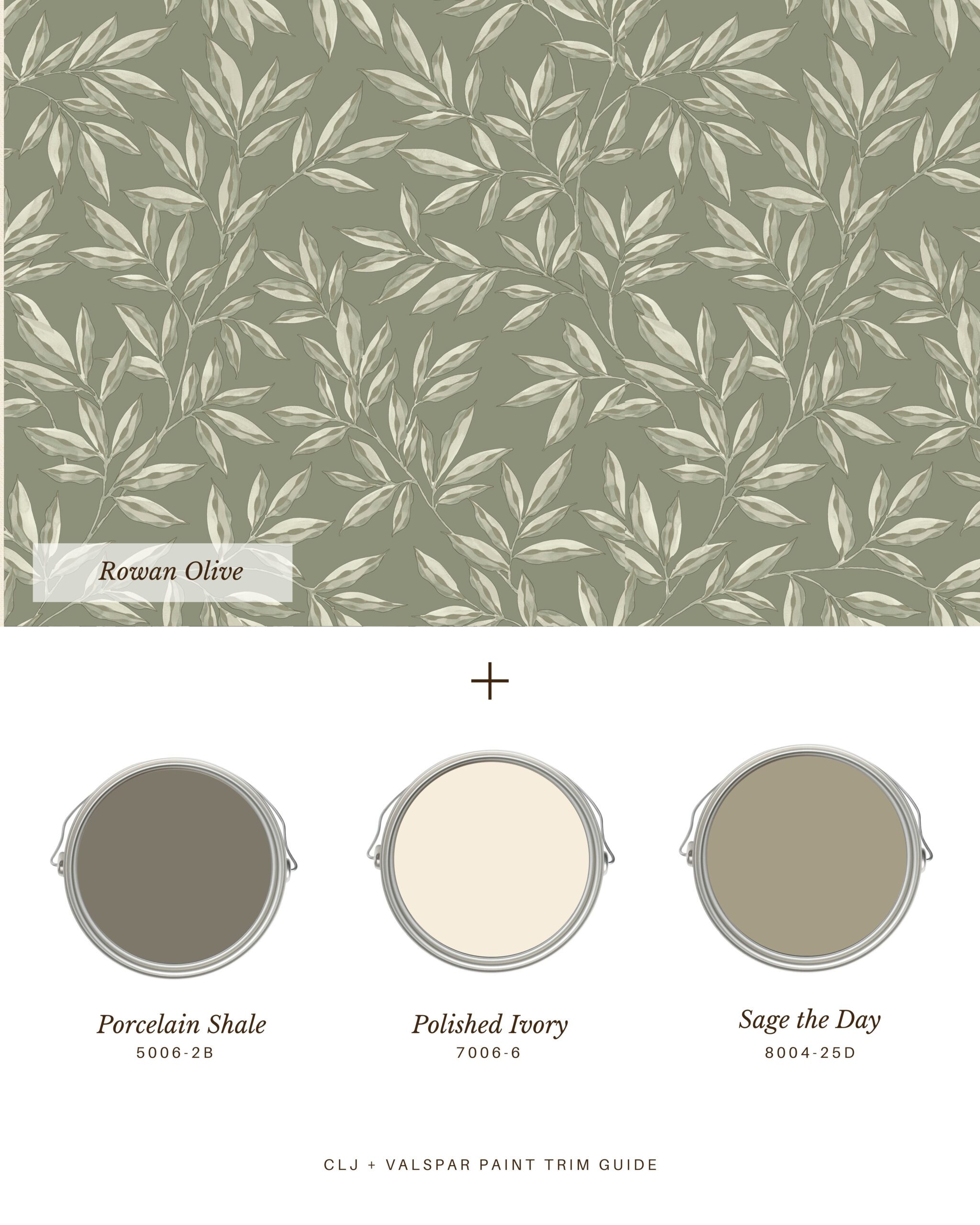
In the olive colorway, “Rowan” gives spa vibes. Adding Porcelain Shale 5006-2B as the trim color soothes any space. I imagine this in a room with Myrrh and Tonka candles burning. Polished Ivory 7006-6 is another excellent trim choice for this paper, especially if you’re painting tall wainscoting. And Sage the Day 8004-25D is anything but a safe choice — this is the trim color I’d choose for a cozy study.
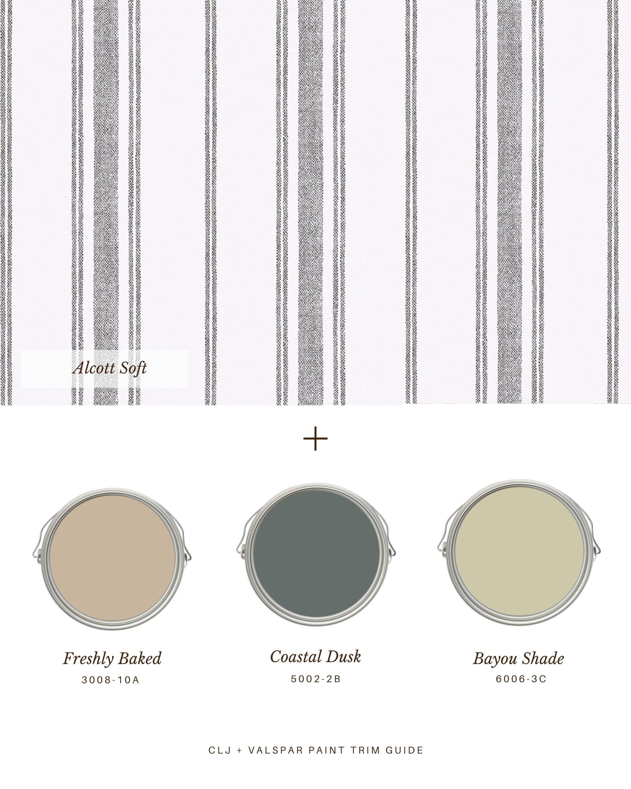
The black-and-white colorway of “Alcott Soft” is an exciting jumping-off point. Freshly Baked 3008-10A would be a lovely trim color for this wallpaper in a well-lit laundry room. I can imagine listening to an audiobook, folding clothes, and admiring this pairing. Paint the trim Coastal Dusk 5002-2B if these studious stripes are lining your hallway. And Valspar’s Bayou Shade 6006-3C is my pick if you choose to paint the ceiling as well. This creamy green is packed with personality.
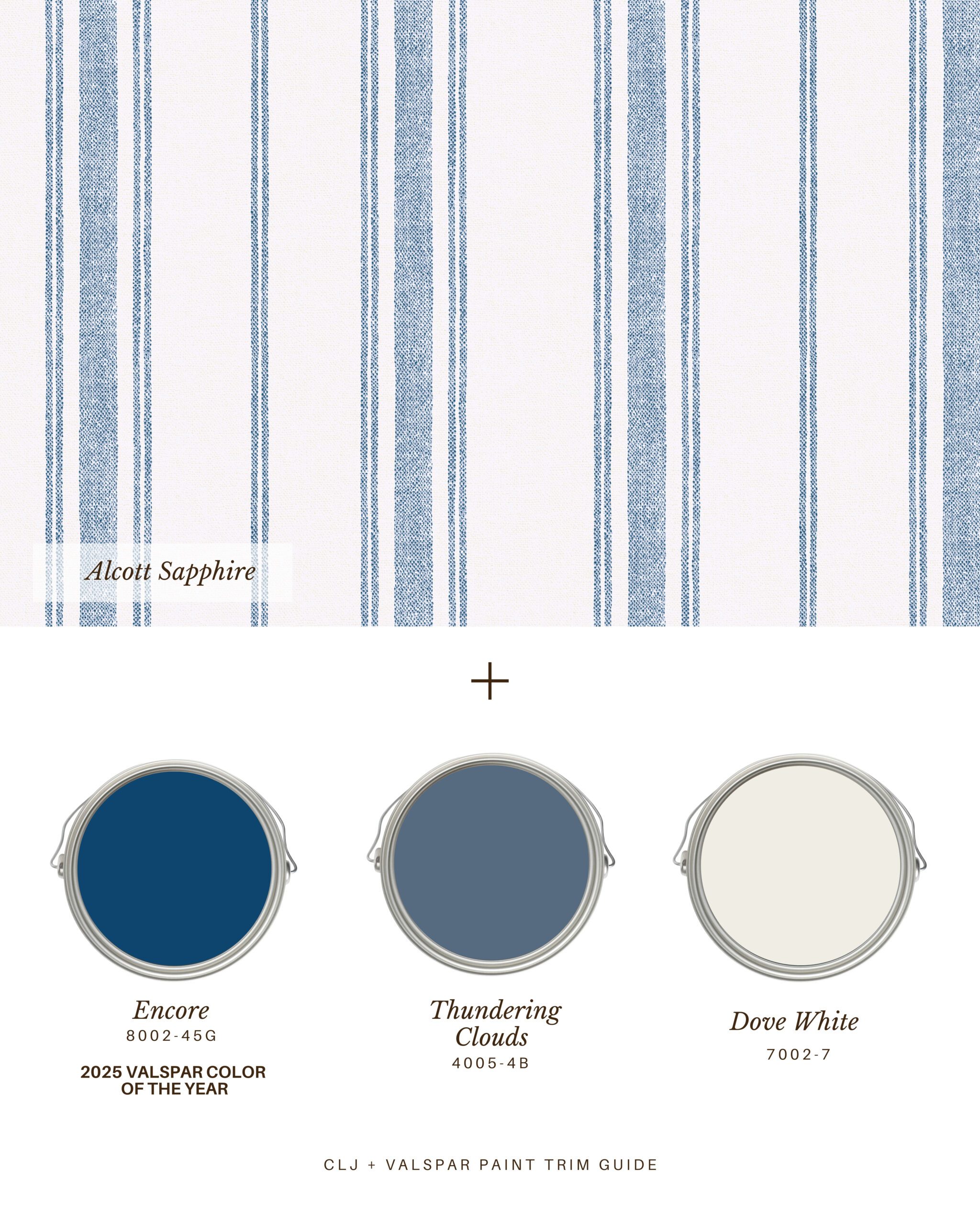
Like a well-worn pair of jeans, “Alcott Sapphire” goes with everything. It’s especially handsome with Valspar’s 2025 Color of the Year: Encore 8002-45G, a rich and royal blue. If you’re going for a softer vibe (a little boy’s room, perhaps?), paint the trim Thundering Clouds 4005-4B. Even softer? I love, love, love the warm white of Dove White 7002-7.
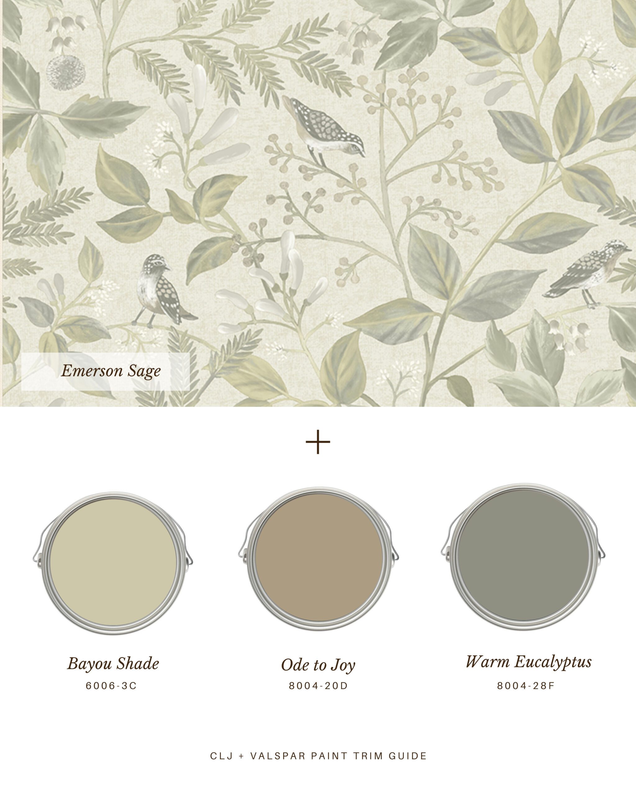
Got a little nook that could use a makeover? “Emerson Sage” is the perfect wallpaper for small spaces. Pair it with Valspar’s Bayou Shade 6006-3C to make your nook into a quaint butler’s pantry. Or trim out the space with Ode to Joy 8004-20D to make this space into your serene and cozy home office. Painting the trim Warm Eucalyptus 8004-28F immediately makes your nook into a home library.
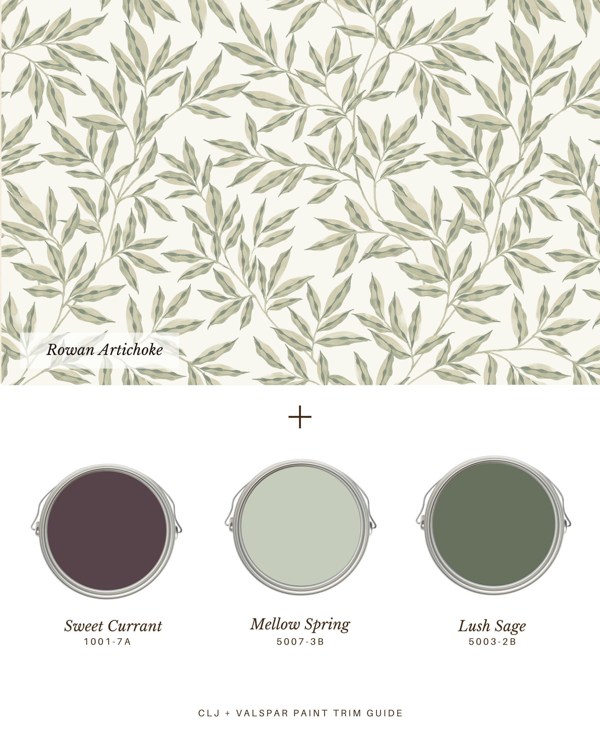
“Rowan Green” feels ethereal. I’d put this wallpaper up in my primary bedroom and trim it out with Valspar’s Sweet Currant 1001-7A for a truly moody vibe. In another direction, I could see this trimmed out with Mellow Spring 5007-3B in a guest room that’s piled high with heritage quits and antique furniture. If you painted the trim in this room Lush Sage 5003-2B, I would start a collection of landscape paintings — leaning into the green.
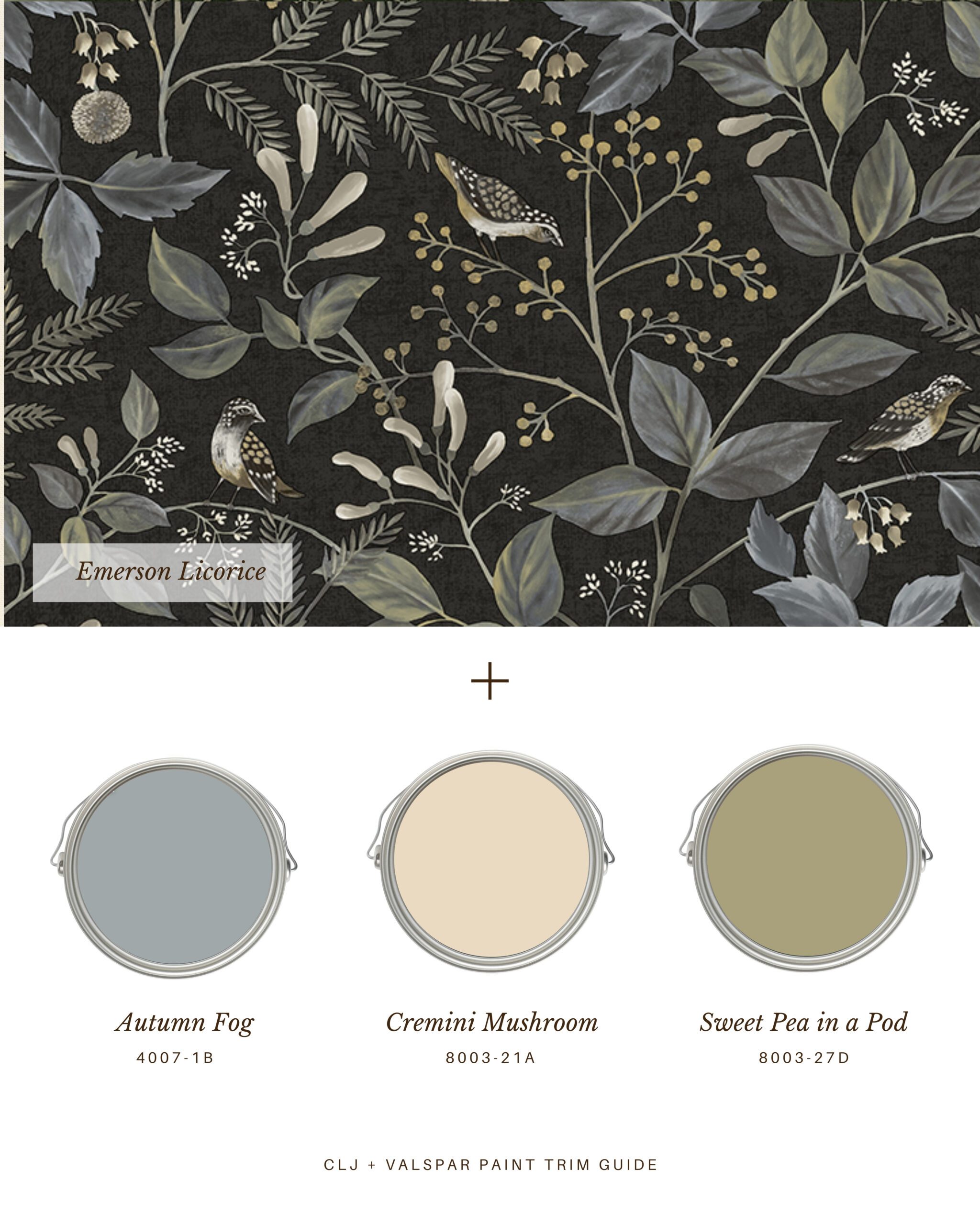
This dark wallpaper is such a chameleon: It looks great in every room and with every trim color. If I was hanging this in my home, I’d put it up in one of my daughters’ rooms with Valspar’s Autumn Fog 4007-1B for the trim — real fairytale vibes. Or I’d hang in on the back wall of built-ins, painted the prettiest Cremini Mushroom 8003-21A. Paired with Sweet Pea in a Pod 8003-27D, this wallpaper adds gravitas to any dining room.

We just finished a 3/4 wall of tongue & groove in our ‘formal’ living room-I picked up the Emerson in licorice to do above the tongue & groove paneling. Was thinking the green like on packaging photo for paneling. We’ve had bad experience with peel& stick separating-shrinking from edges. Are you going to carry this in traditional pasted wallpaper?
We haven’t had that experience with our peel-and-stick wallpaper where we’ve applied it in our house. Are your walls smooth? All peel-and-stick wallpaper will have trouble on textured walls. You could always email WallPops to see if they would recommend any extra tips for securing if you’re worried about it! We don’t carry that print in traditional, but we did just launch a line of traditional wallpaper prints with their sister brand A-Street Prints that you can find here: https://chrislovesjulia.com/collaborations/a-street-prints/
Do you think the Emerson Licorice is to bold for a back wall in a powder room – and would you paint the other wall colors in the autumn fog? My vanity will be a taupe/tan colored base with white top accented with brushed Gold fixtures
I shy away from accent walls these days, but I love a bold color in a powder room—the perfect small space to try out something fun!
This is super helpful! Thanks for all the details.
Love it! Could you do this with the CLJ line? I’m trying to figure out what goes best with the golden wheat-y color of the NuWallpaper Chris Loves Julia x Melograno Wheat Peel and Stick Wallpaper. :-)
Noted! We hope to expand this guide. :)
This is extremely helpful! Thank you for pointing out options for each wallpaper.