It can be really intimidating trying to style your bookshelves. Where do you start? Sure, putting a bunch of books on there is wonderful. But I also like for my bookshelves to look like they’ve lived a little. They’re holding treasures with storied pasts, not just hardbacks. However, there’s a fine line between curated and cluttered.
If you’re interested in styling your shelves to reflect you and your favorite things, I’ve got some tips for you. Read on to see how I display items on shelves around my home, and how each room of shelves can have different purposes!
Mastering the Art of Shelf Styling

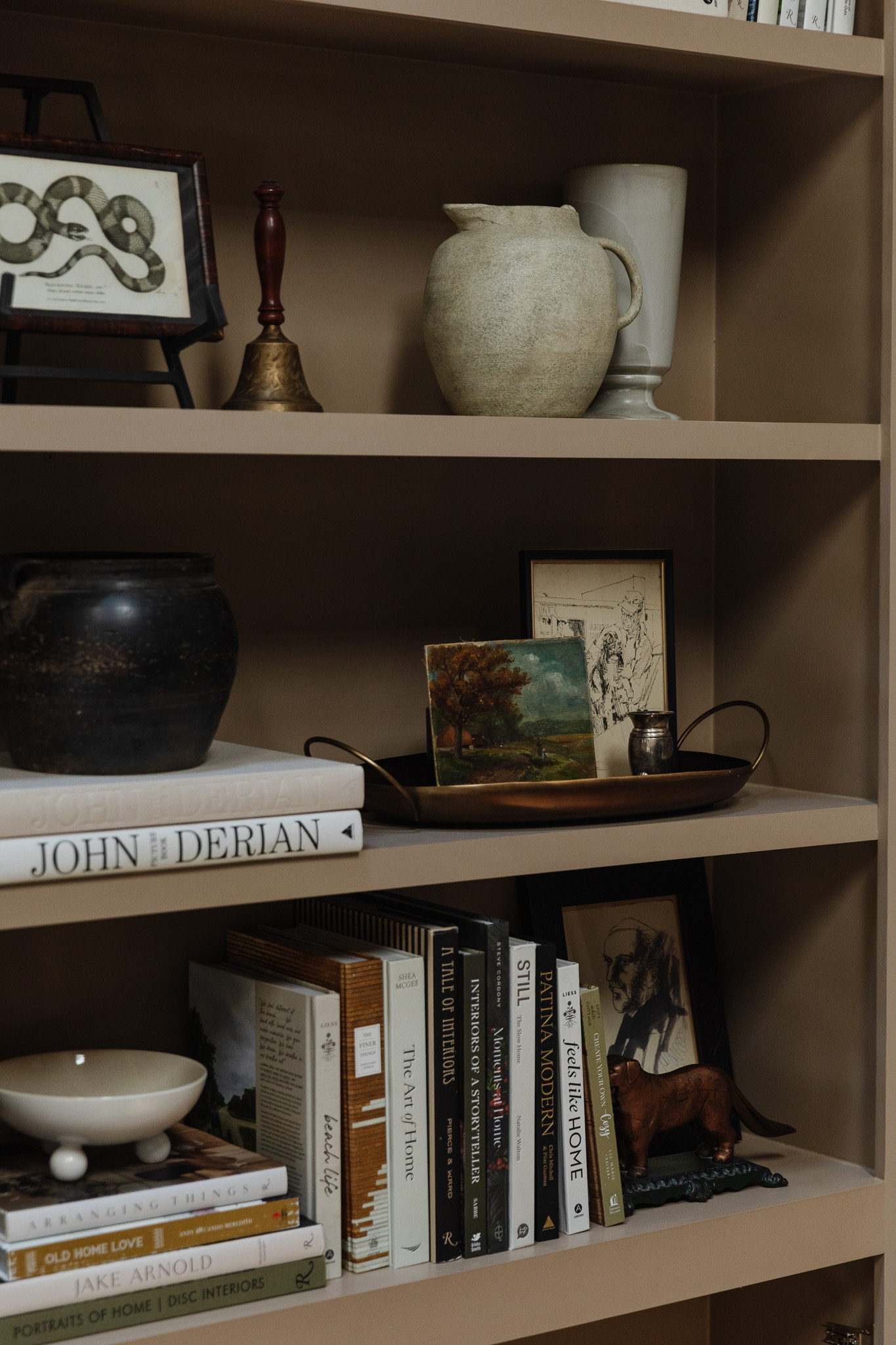
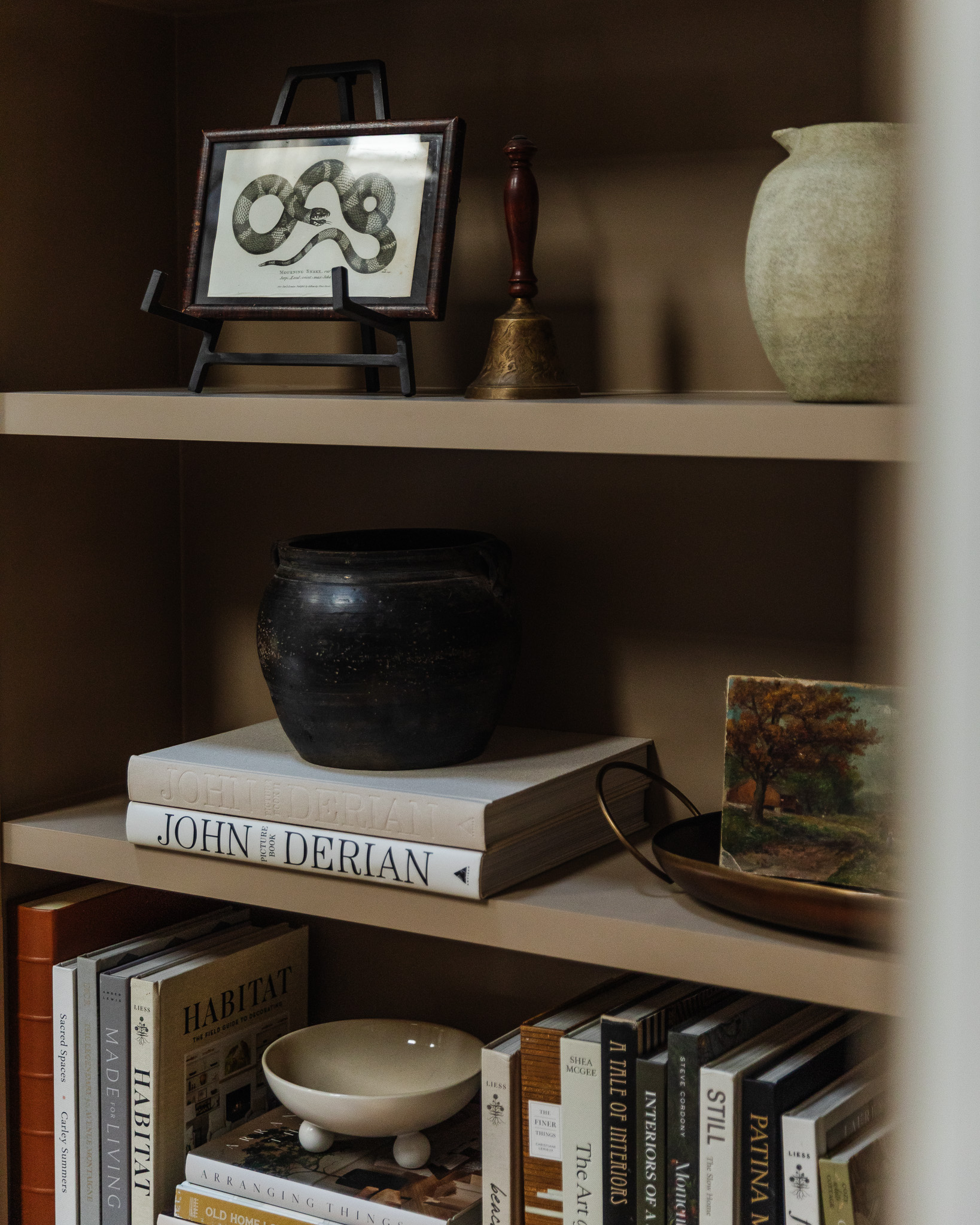
Picture Light | Peonies Art | Papier Mache Bowl | Brass Footed Bowls | Coffee Table Books | Art Easel | Snake Art – vintage (similar) | Bell (similar) | Pitcher | Tall Vase | Black Pot | Copper Tray | Silver Vase | Ball Footed Bowl
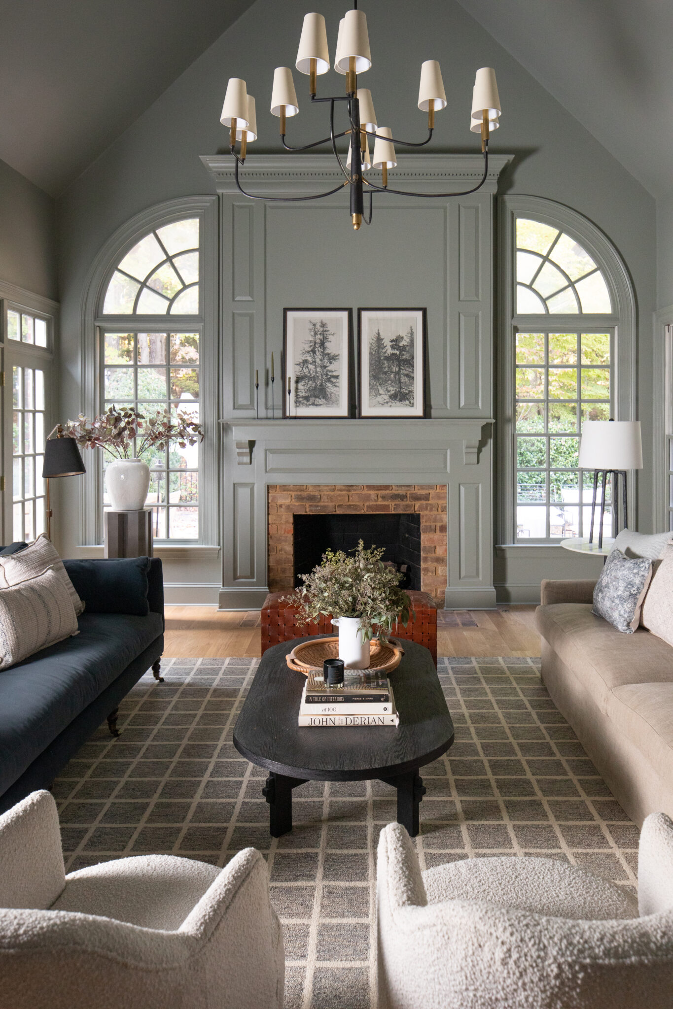
Our new living room built-ins are massive. They’re much taller than me, and I’m 6’0″!! So I gathered my largest items in a tight color palette so they all worked together effortlessly.
It’s All About the Math: Shapes, Colors, and Numbers
When styling, think of it as a mathematical equation involving shapes, colors, and numbers. The key is to incorporate a variety of sizes, from very large to very small. Don’t shy away from using smaller items, even if you have many of them. A kitchen provides a great example: measuring cups and salt crocks, though small, can be effectively incorporated.
Grouping and Layering for Impact
The main principle is to group or layer items. A small item should never stand alone. Instead, it should be:
- Grouped on a tray with other objects.
- Paired with something taller or larger.
- Layered in front of a larger object.
For instance, a tiny silver vase you adore can be placed on a tray in front of a larger item. This acts like a frame, giving the small vase more presence and making it feel intentional.
The Sum Is Greater Than Its Parts
Remember the concept that the sum is greater than its parts. A single item, like a decorative bell, often looks better when paired with something else, such as a snake print. This creates a more cohesive and impactful display.
Think of it like balancing a scale. If you have a “heavy” grouping—perhaps two large books and a dark vase—you’ll need to balance that visual weight. This might mean using a tray that isn’t too tall to contain four smaller items effectively, ensuring they don’t look overwhelming.
If something looks too short, stack something else underneath it. It could be a few coffee table books or cookbooks. Or it could be putting a miniature piece of art on a small easel instead of just leaning against something.
Adding Movement and Flow
Use Angles and Diagonal Repeats to Make It Look Well-Loved
To make a display feel cohesive and balanced, I often repeat tones and colors diagonally. For instance, if I place something brass in the upper left of a shelf, I’ll echo that brass element somewhere in the lower right. I might even bring it back to the lower left to reinforce the repetition.
Angled books feel a lot more lived-in. You don’t have to have them in a sentry line every time! You don’t want your shelves to be “perfect.” For art, try creating a diagonal zigzag all the way down. For example, you might layer two art pieces at the very top, add a piece of art on the opposite shelf below, and then layer two more on the second-to-bottom shelf on the same side as the top. This creates a dynamic visual flow.

This strategy works for shapes too. If I have a stack of books with an object on top in one spot, I’ll repeat that “stacked” look on the opposite side, perhaps with books topped by a frame. It’s all about repeating those foundational elements. You’ll find that many arrangements use the same basic shapes, just with different materials.

Picture Light | Coffee Table Books | Bust | Striped Box | Glass Box | Lidded Canister | Marble Bookends | Marble Vase | Drawer Pulls | Knobs
The bookcases in the study flank either side of the pocket doors. Because they are darker and more narrow (and part of the decor themselves!), I focused on minimal items set in pairs on each shelf.
For example, two boxes stacked together give the same visual impression as a stack of books. Sometimes, a single “block” shape could be a vertical row of books or a large basket. Even a single, large picture frame can be considered a “box shape.” The key is to recognize these fundamental forms and then repeat them throughout your display.
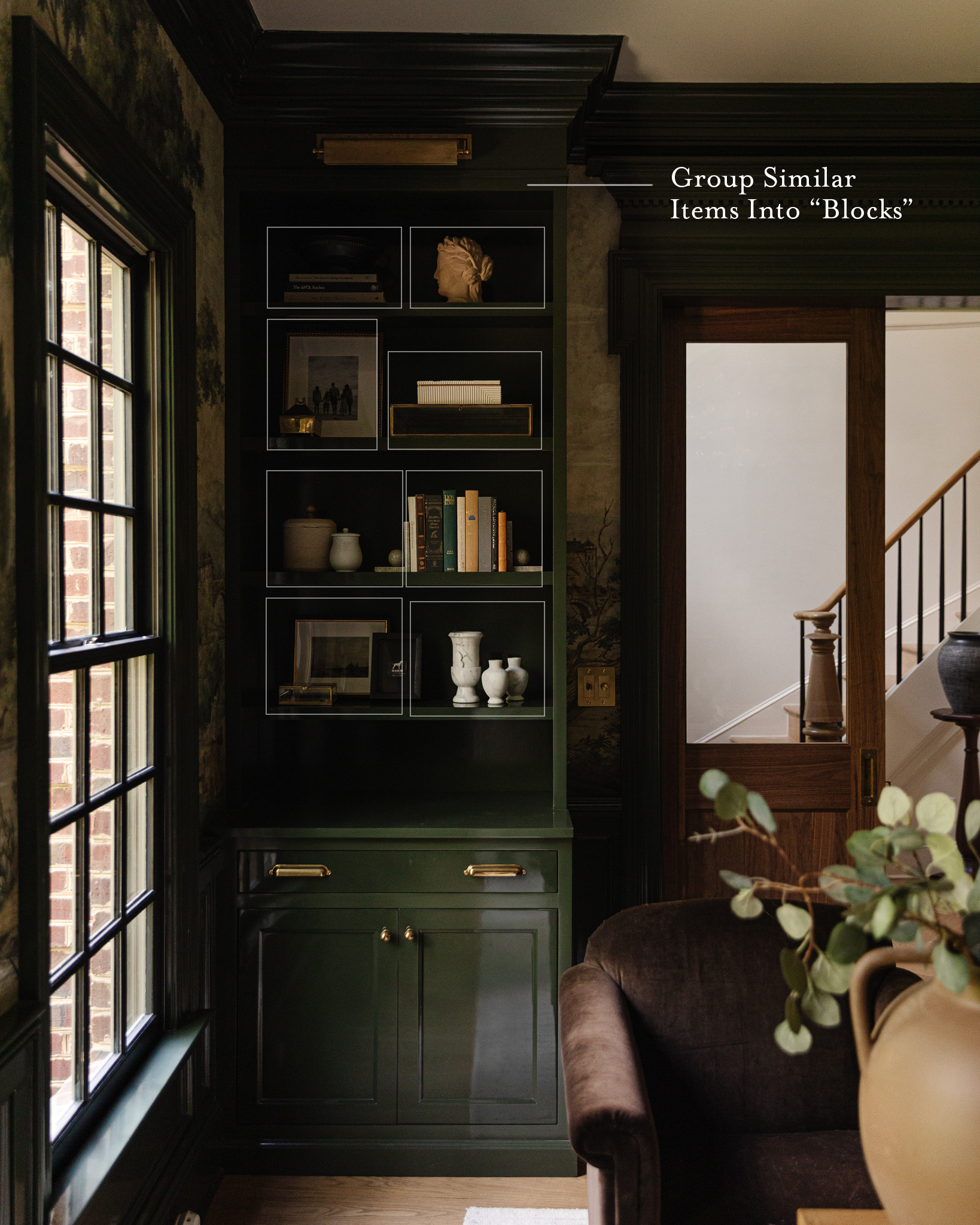
Create “Blocks” of Groupings
When styling shelves, I usually have either one long block (like a full shelf of books) or two adjacent blocks. Sometimes, these two blocks are actually made up of three smaller items—like three candlesticks that visually read as one half of that shelf. I’m always rotating things to maintain this visual rhythm.
Grouping like objects together will give the illusion that the object is larger, like 3 candlesticks or the two dark vases. This helps a shelf not feel cluttered!
Styling with Purpose
Displaying Your Collections: Beyond Just Books
For a long time, shelves were pretty much just for books. But over the last decade, we’ve realized they can hold so much more! If you have a large collection of something—anything at all—consider displaying it all together.
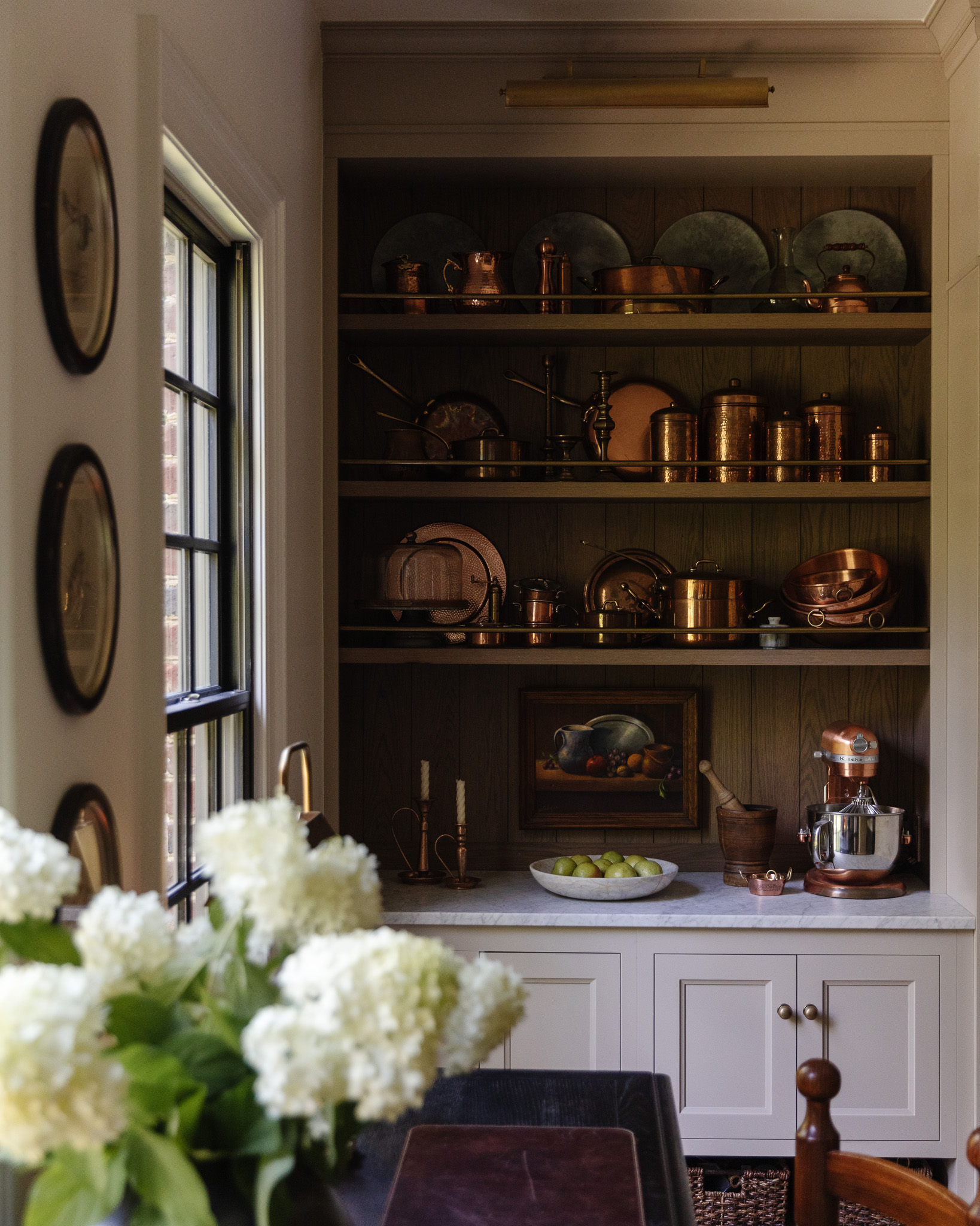
Perhaps you have a lot of vases, stoneware, copper pieces, or vintage plates. Instead of scattering them throughout your home, group them together for an impressive visual feast. Our kitchen hutch shows off my copper collection. I love that the patina is really starting to make the pieces come alive! I made sure to mix in the more lived-in pieces beside the shinier, newer pieces so it blended better together.
My parents, for example, have a large collection of mini chairs. They used to have them spread out, but now they’re all displayed together, creating a much more cohesive and interesting focal point.
You can also display baskets for collections, and while we often see this during the holidays (“Here are all my Santas!”), it’s a fantastic idea for year-round display. Grouping your collections not only looks great but also celebrates the items you love.
Balance Your Color Palette
On our kitchen hutch, we have a lot of the same metallic copper color in our collection of vintage cookware. I decided to mix in a steely gray-blue accent color that makes the copper pop even more. I anchored the display at the top with large, steely gray-blue serving chargers in the background. I then repeated this color throughout the arrangement, like with a small salt crock placed at the bottom. Even the KitchenAid silver bowl matched this palette.
Using a solid color palette like this makes your shelves look much more unified. Anything outside of this scheme would stick out like a sore thumb. The only exception here is the green fruit, which acts as a tertiary color, adding a touch of natural contrast.
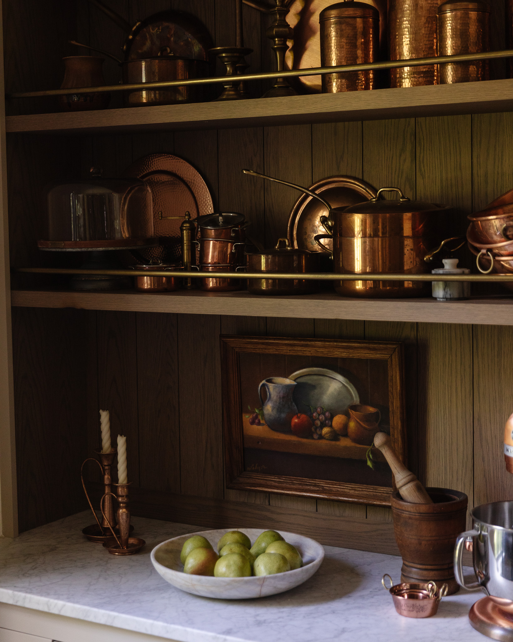
Copper Kettle | Copper Canisters | Brass Salt Mill | Copper Cookware | Marble Salt Cellar | Copper Bowls | Candlesticks | Marble Bowl
Don’t be afraid to nail a piece of art to the wall of a shelf for added height and as a backdrop!
In the living room, I also stuck to a very tight color palette to ensure a cohesive look. My go-to items are vases, books, small art, and vintage sculptures like a dog or nutcracker.

For instance, even the books I choose are specifically in shades of cream, white, gold, black, and tan. The only other color present is a small pop found in a tiny vintage painting, which adds just the right amount of contrast without disrupting the overall palette.
Displaying Functional Decor
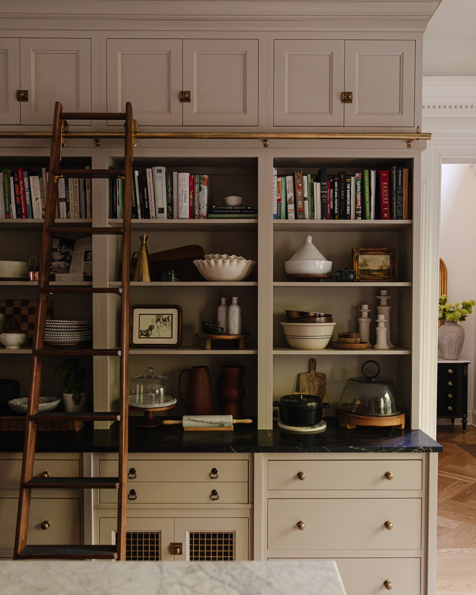
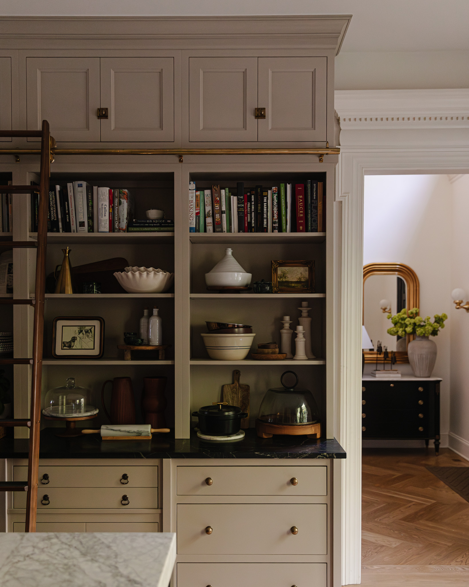
On the other side of our kitchen, we have three bookcases that display all of Chris’s cookbooks. But I also use them to hold a lot of frequently used kitchen items (vases, serving bowls, candlesticks, cake stands, etc.) with art sprinkled throughout.
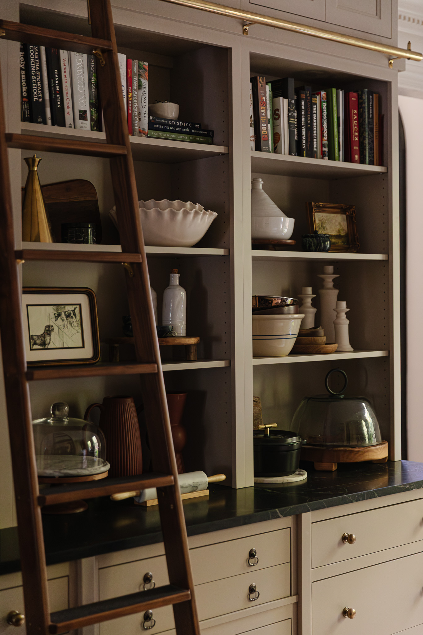
Cookbooks | Brass Oil Cruet | Ruffled Serving Bowls | Tagine (similar) | Wood Pedestal | Wood Bowls | Marble Cloche | Rolling Pin | Dutch Oven | Glass & Wood Cloche
Everyday kitchen items are my favorite kind of functional decor. A rolling pin can be so beautiful, as can an olive oil canister or a serving bowl. Displaying these utilitarian things makes our kitchen feel even more well-loved and used! I’m also mindful that if it’s out on display, I want it to be the most beautiful version of that thing. I’m not going to stack glass mixing bowls if I have copper or ceramic ones that are more intriguing to look at.
Sourcing and Starting Your Styling Journey
Where to Start Sourcing Items for Your Shelves
It’s tempting to want to buy everything for your shelves all at once. I actually tried that once in one of our first homes, giving myself a $500 budget for built-ins. The result was fine, but it just looked like a collection of all-new items. The best shelves are definitely curated over time—I bought nothing new to style any of these shelves!
The real key is to define your personal style. Once you know what you love, you’ll be able to confidently buy pieces, knowing they’ll fit seamlessly into your home. For example, I didn’t shop at all for the living room shelves; instead, I used items I’d collected over time. This approach allows you to invest in things you truly appreciate, like a new coffee table book or building a collection of vases you adore.
When you have a defined style, people around you will start to notice. This makes you an incredibly easy person to buy gifts for! My sister Victoria, for instance, knows I love small, sketchy art with a specific vibe. Because she’s picked up on my style, many of the art pieces on display are from her—she knows I’ll always find a place for them.

Ready to Begin?
If you have some shelves to fill and nothing to fill them with, I’d first give myself a budget. It can add up quickly, but if you’re too stingy, it can end up looking like an end cap at a mass-market store. Then, gather inspiration for what you like. Shop your house (the kitchen is a gold mine!) for cool bowls, vases, photographs, and frames. Hit up a vintage shop and Facebook Marketplace for old books and sculptures!
Once you have some pieces in hand and you’re ready to start putting them on the shelves, it can feel overwhelming to see a blank slate in front of you. When I styled our living room shelves recently, I had specific pieces I wanted to use. I like to start with art: I know I’m going to want to put art pieces here. Books are another easy place to start. For the living room shelves, I decided to put a row of books on the bottom, as moving them there felt more balanced and grounded, since it’s a visually “heavier” shelf.
A key item that a lot of people don’t consider is a 3D sculptural element! Whether it’s a bust, a rhino, or a vase, these are also great for stacking on top of books. Otherwise, everything can feel a little horizontal and flat. It’s nice if these add some metallic or textural appeal as well. Think about vintage bells, brass animals, or weathered pots.
Remember, it should take time. If you feel like you’ve been working on it for 20 minutes and it’s not coming together, you’re in great company. My living room shelves took me a couple of hours. My two cents? Start at the top shelf!

What color are the shelves in the first picture? Please tell!!!!
They’re Farrow & Ball London Stone!
This is super helpful! Thank you!
Super helpfull and inspiring!
I love your lived in style! It feels so cozy and relaxing! So Beautiful!!
Sorry, this house has too much clutter and tchotchkes. My mil recently died recently, she left us with shelves of crap, art and and hundreds of books. Leave your kids with less! They will thank you!!
It’s all about making a house work for you, and this works for me. :)