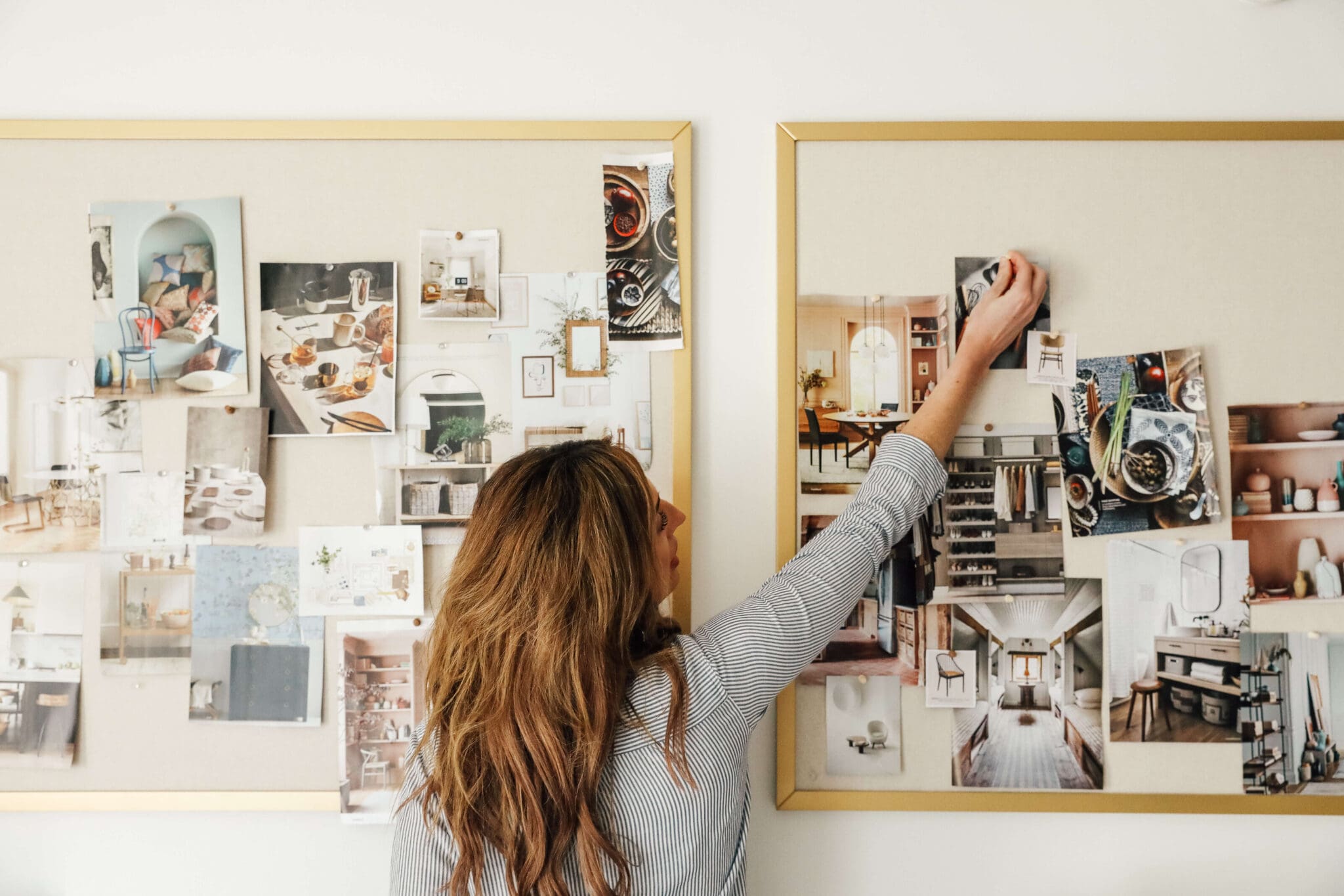
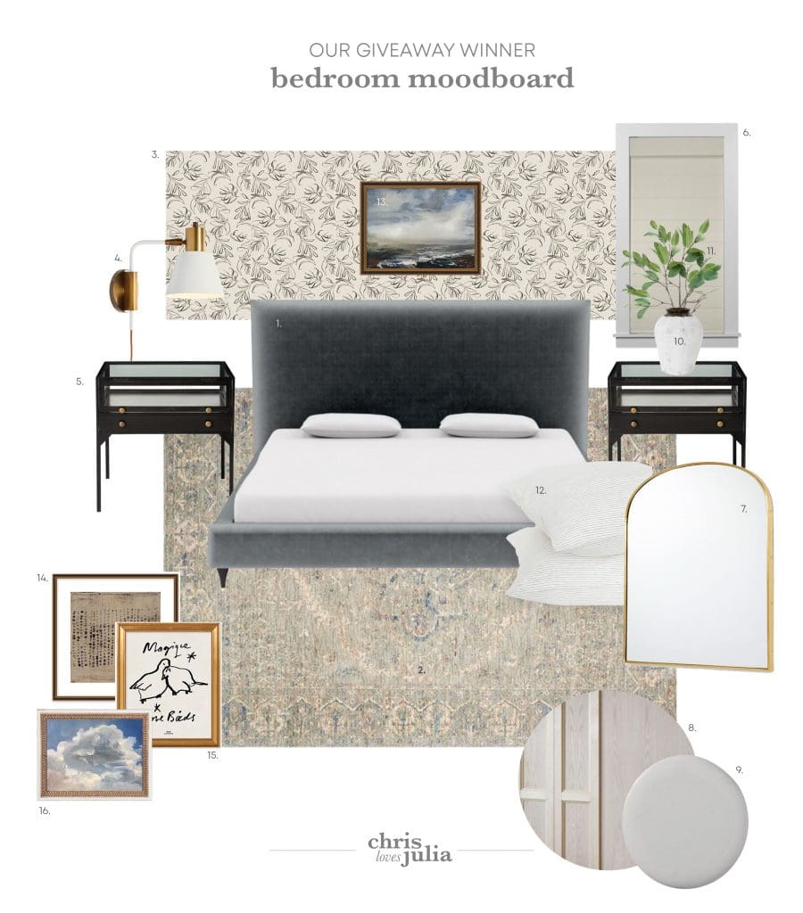
We share a mood board almost every week here and every time we do, I get asked, "How do you make these mood boards?!" I personally use Adobe Illustrator and Photoshop together, but today we wanted to break down a few other standout options available. We invited our new Visual Media Producer (and my sister), Andrea, to break it down for you.
My very first day of work at CLJ was a Monday. I was shown to my desk, told "that lamp can charge your phone" (which I am still obsessed with) and listened to the day's rundown of what needed to be done in visual media. "It's Moodboard Monday!" Jules said with a peppy smile. I went straight to Photoshop because that's just what's engrained in my veins. I hear you that you can make a birth announcement with 3 taps in your Pic Collage app, but I will do the same task in Photoshop, spend at least double the time starting from a blank canvas and building a design from the ground up every...time. I'm really not bragging, it's more of a curse. Me and Photoshop go way back to CS2, (anyone?) so there's history there! Julia mentioned she had used Illustrator in the past, which gave me a twitch, and that she just made a brand new document every. single. time. I immediately went into game plan mode: "If Moodboard Monday is a frequent feature, we gotta get a better workflow!" I mocked up a template with title design and number placeholders that could be quickly edited for future posts.
1. Photoshop
We use Photoshop for moodboards because it allows me to remove the background from images with "quick selection tool" or "magic wand" if it's a really easy cut, and gives me all the freedom to keep my designs on brand with font picks and color swatches. Real talk: I just thrive on layers and dark gray panels scattered about my screen. But moodboarding isn't about being "techie"—it's about seeing your vision come together by coupling all your great ideas on paper. And in an effort for everyone to be able to get their wheels turning and mouse scrolling in knee deep inspiration, I've rounded up 4 more fuss-free resources that will have you making perfectly mapped out moodboards in no time.
2. Milanote
Their landing page reads "Get Organized. Stay Creative." Um, if you don't have a personal mantra—now you do! Milanote feels manages to make you feel like you're leisurely making magic. It's so intuitive, and they even have "Moodboard" as one of their templates all ready for you to take over. Everything is drag-and-drop which is always music to my ears. You can add a caption to any of your images which I liked to use for a hyperlink. I also loved how the moodboard template came with a three part grid for color inspiration. You see? They get you. And if their interface didn't already feel fun and productive, they have a drag-and-drop to-do list, too! Milanote is a great tool if you want to save your inspo images from online and just place them as they are, without cutting or editing. It's also the only collaborative tool in this round up. So if you're into getting a second opinion or letting your partner get their hands on what you're cooking up, this is for you.
3. Canva
You know you've heard of it. And maybe it's even been your other go-to for that birth announcement we were talking about earlier. But it's definitely worth giving a whirl for your next moodboard. I could not believe how much is included that I wasn't even tempted to go "Canva PRO." They have an impressive and vast template gallery, (even restaurant menus, people) but I'd recommend starting fresh and just using their grid element as image placeholders. (That's those Toy Story sky and rolling hills you see!)
Canva is like the really fashionable on-trend friend that makes you look goooood. Their title gallery (above) had me nodding and say "I wouldn't change a thing." It does have some basic image editing functions like cropping, brightness/contrast, hue/sats, built in. When you're done, it's a quick download (or share) and it's yours. Well done, Canva! You're cool in my book.
4. URSTYLE
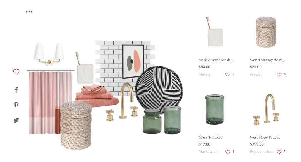
Online shopping meets the drawing board. That's URSTYLE. If you love to browse Netflix and try on trailers for size, you're going to la-hove URSTYLE. My take on it, is that it's perfect for when you think you have an idea for that next room but need to play dress-up first. URSTYLE is the new Polyvore for interior designers.
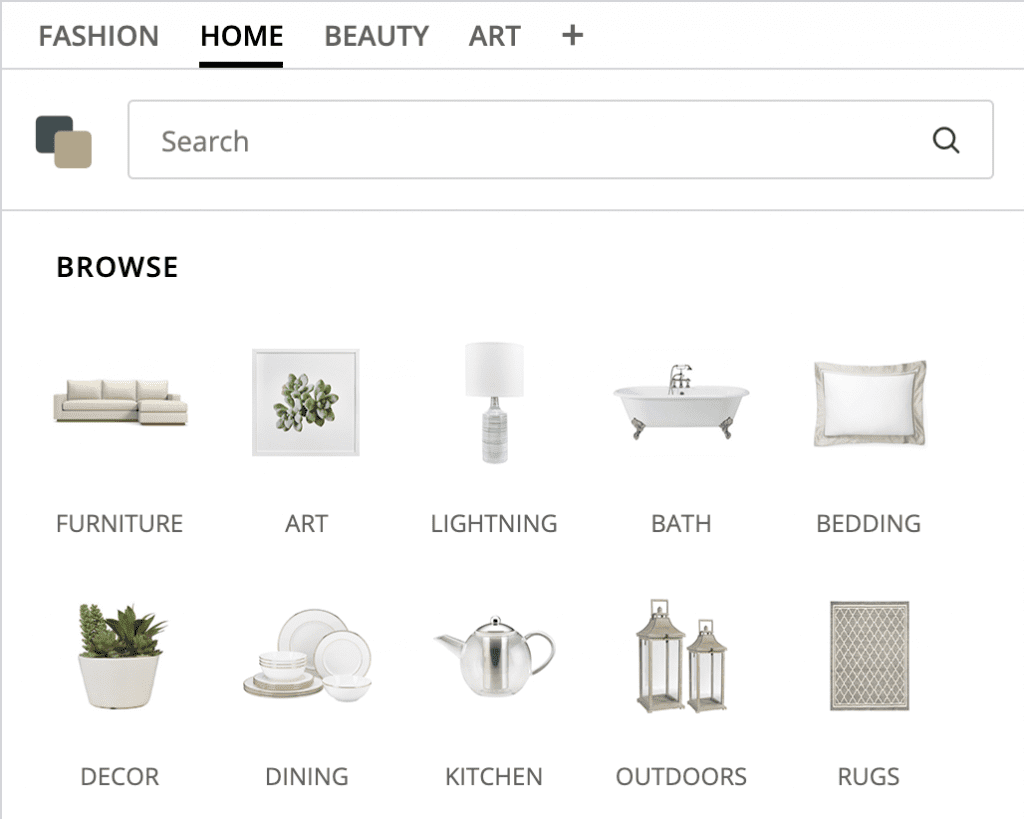
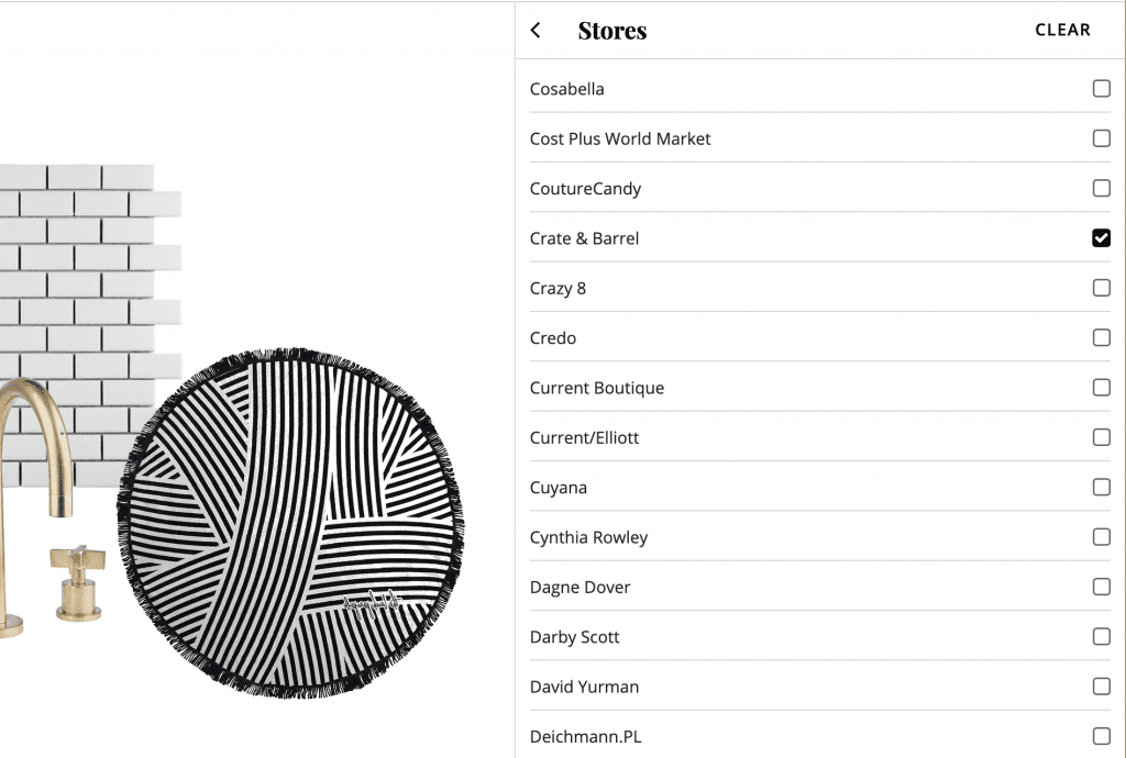
You can browse for real products by category and...wait for it, even filter which store you want to see pieces from!
URSTYLE is the only online tool that let me give an image a transparent background in one click. You guys, that's huge! It also lets you upload your images if you don't find what you're looking for in their catalog. (Which is kind of likely) Even if you see a gold kitchen faucet you like on URSTYLE, it might be out of your price range or not exactly what you want. That's why URSTYLE is so great for just getting your feet wet in the moodboard pool in general, and you know facing head-on the challenge of choosing art for your home. (They have a 342 page catalog to shop through.) URSTYLE is community based, so you'll see the word "publish" and "share" a few times. I opted to keep my moodboard private and it's under "SETS" once I'm logged in. Jules can vouch that as I was clicking around, I kept saying things like "Oh, no way!" "Look at that!" "...Genius." It was such an underground, pleasant surprise.
5. Pages (free software on Apple devices)
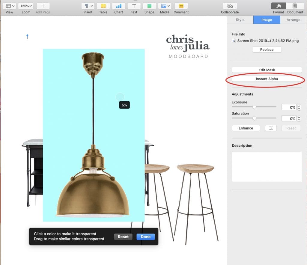
If you feel like you're not in the Photoshop ballpark but want to keep your workflow minimalist and fully customizable, I'm betting Pages is your fit. Save images from websites, and drop them onto your new document. (You knew that part) But, did you know you can also remove that white background from your images in a slick drag and click, too?
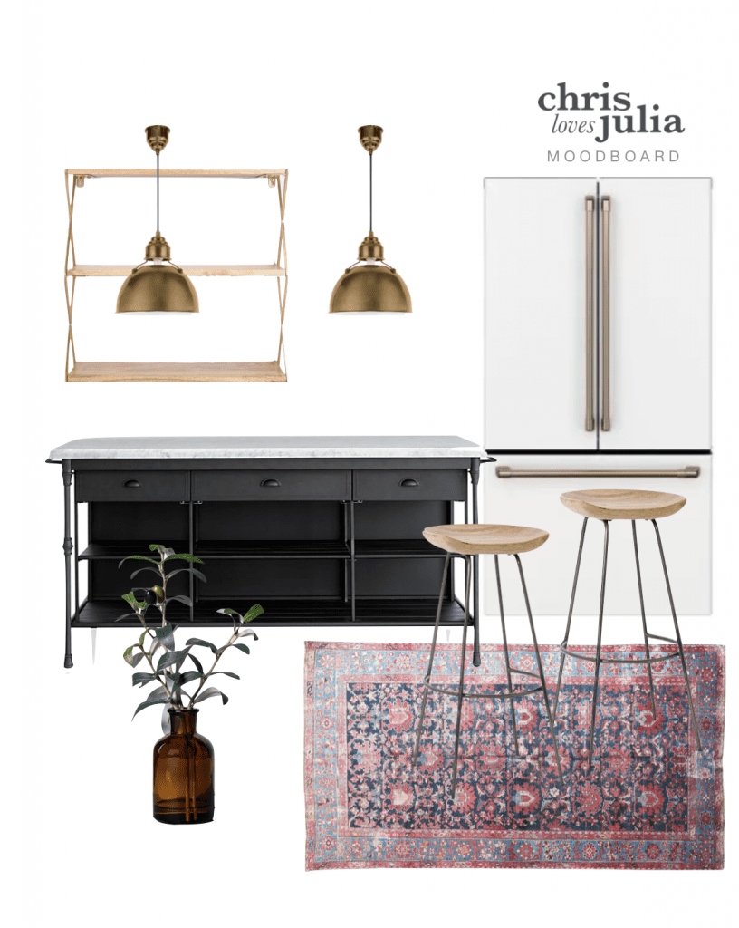
Click on "Instant Alpha" in the Images tab and place your cursor on the white background. As you hold down and drag, it'll select the entire white background, release your mouse and boom—The most satisfying transparent background. This allows you to layer up all your elements without having to deal with (Photoshop) layers at all! As you're scouting images to save online, you're going to notice it can be tricky to save images of products for sale. Sometimes they can't be dragged onto your desktop, and "Save Image As" isn't an option. Wanna know the work-around? Do a screen shot and you're good to go! (Command+Shift+4 on the Mac) After all, this is your vision, and if that is the exact pendant that stole your heart, screen grab and put that baby in. For easy layering the "Arrange" menu at the top is your friend. That'll have you placing that vintage rug under the bar stools, and kitchen shelves behind the lighting you have your eyes on. In Pages I feel like I am working fast and not breaking a sweat. So if you're a Mac lover and liver, and you haven't tried this app for your moodboarding needs yet, maybe it's time to turn the page on that chapter, if you know what I mean :)
 Andrea Bradley de Ahedo is a stylist and commercial photographer who recently moved to Idaho after living abroad in Monterrey, Mexico to be the Visual Media Producer for Chris Loves Julia. She loves foraging for unique spoons and bowls for her ever-growing prop collection, and shooting flatlays for days. She feels most at home when she is traveling with her husband and toddler son in tow. You can check her out on Instagram at @andiandreastudio.
Leave a Reply

WE'RE CHRIS + JULIA
Portfolio
Projects








This was so helpful! Thanks for thinking of people who have ability but lack "certain skills". I am so excited to try this. I have been playing with google slides but I am going to try Pages and also the Instant Alpha! Yahoo!
THANK YOU for this helpful round up of Mood Boards! I'm always on the hunt for new ways to wow my clients with great presentation mood boards! This was so helpful!
Thank you so much for these tips! I tried Pages today and had great success with minimal confusion, which is rare. :)
THANK YOU SO MUCH!!!! My creative design board heart was CRUSHED when Polyvore closed. As much as I love the Instant Alpha in pages, I use a PC for most blog and design work because it's my desktop. I am always searching for an easier program than Photoshop and Polyvore was it. I am SO GRATEFUL you told me about URSTYLE!
I love your writing style. Also this post was super helpful!
The pages info is life changing! I had already figured out the screenshot part, but using the instant alpha...wow!! Thank you!!
Wow, just learned 2 things. Thanks!
So thankful for the Instant Alpha tip!!
This is a game changer! I am a long-time Mac user and never knew the power of Pages before. Working on a bedroom refresh so this is amazingly helpful. Thank you for sharing!!
Very useful guide! Thank you for putting this together :D
This is great! I’ve been using ribbet.
I’ve been using Apple Keynote the same way. Free and easy, love it.
Great post so informative and easy to read! Thank you...been diving into this world for mood boards and the timing is perfect.
So nice that your sister moved close to you! Can you share why she left Mexico?
To come work for us!
Whaaaat? I did not know you could remove backgrounds in Pages! Thank you for that tip!! Great post!!
You should check out E-Design. It's one of the best design software to use for Mood Boards.
I absolutely love this post! I use Keynote instead of pages because I like to toggle between mood boards to make sure everything flows or quickly see something switched out. That said I LOVED Polyvore so I think I’m going to have to give URSTYLE a spin! Thanks for consistently putting out great and diverse content!
How did I not know about the "instant alpha" tool?!? I use Pages for my mood boards as well and just try to strategically layer but this is a game changer! Question- The background is not removing in sharp lines- do I just have to practice to get it to look cleaner? THANK YOU!!
I’ve been using instant alpha for years! Yes you get better the more practice you have but one trick I do is make the image big and zoom in. Then you can usually get a more accurate line.
A great resource that I've been using is this site that quickly removes the background of any image you upload! https://www.remove.bg/upload
Hi, can we please be best friends now? This is AMAZING!
With very little graphics experience, my go-to mood board is just a simple PowerPoint slide. They have a simplistic "remove background" tool and it's easy to crop pictures. I usually copy the slide a bunch of times to try out a different couch or lamp. It's definitely not a polished finish product that a blogger would want to use, but works for my novice purposes!
Me too! :)
SO my real question is where is that ISLAND FROM??? Oh my gosh I am in love with it!! Always enjoy your mood boards!
It's from right here! One of my favorites.
Another option *like* photoshop but is 100% free is a program called GIMP. It isn't quite as good as photoshop but it is quite free. Learning curve isn't as simple as these other beautiful options you included, but lots it tutorials on YouTube. I'm excited to get building moodboards!
By chance do you also have the link for those brass pendants? So beautiful!
Also, where is the shelving ABOVE the island from?