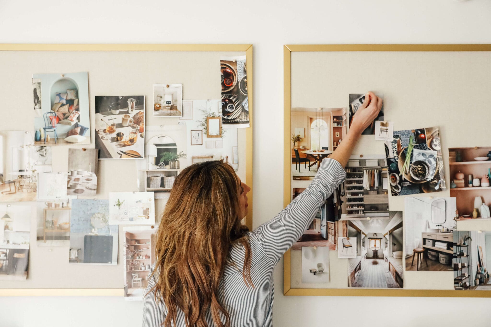
We're back with another installation of Bathroom Reno 101, where we're taking you all on an in-depth journey while we renovate our daughters' bathroom. Today I wanted to share how we came up with a design plan or "mood board" for the room. This was my first time designing a bathroom and there was a lot to consider, i.e.; mixing metal finishes, how everything will fit together in this tiny room, making sure it functioned for little children to adults (our guests will also be using this bathroom), two sinks or one. Of course, this was all after we had the general layout figured out and the plumbing moved.
The first thing I like to do is to find that one thing (or few things in this case) that serve as a jumping point to inspire the rest of the room. In the bathroom's case, it was this shower head. A handheld shower is so nice to have for little kids, so I knew we wanted that, and I loved this one from Delta Faucet that has a strong magnet that holds it in place as a stationary shower, too. Not to mention, their Champagne Bronze color felt fresh, warm and soft. I searched around their site and found a tub spout, valve trim, and faucet in the same color that worked well together (linked at the bottom of the post). I loved the repeating X shape in the valve trim and faucet and the soft curves in the collection that felt traditional, but modern.
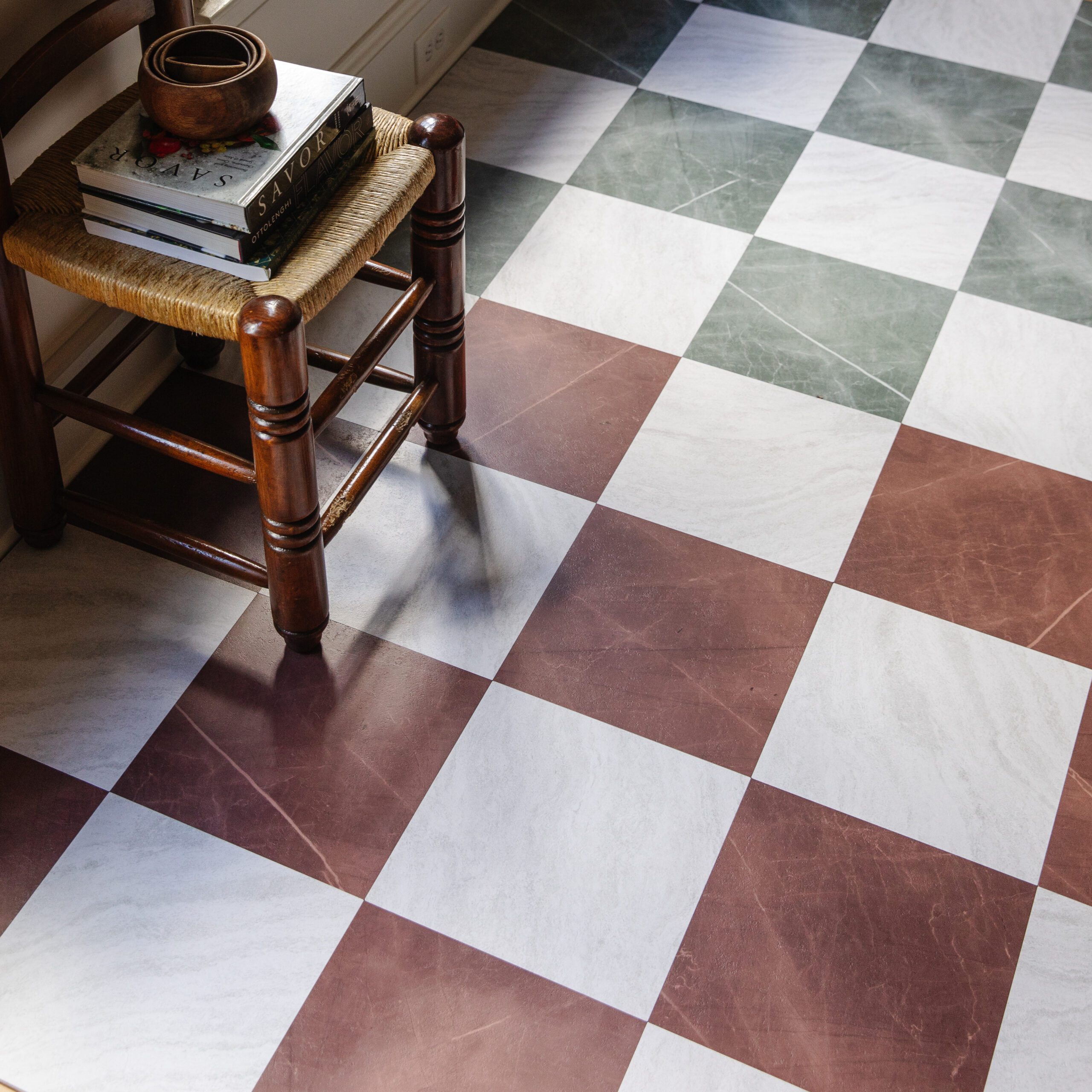
I wanted to bring in a fun, timeless pattern for the floor, and keep the walls a little more subdued, and found this plaid cement tile from Cle. It wasn't cheap, but we only needed 40 sq feet and decided the impact was worth the splurge. It went on our 1st draft along with this mask print that I've been eyeing forever that I thought would add the perfect girly touch to the walls.
Obviously, faucets, floor tile and a small art print do not a bathroom make, but together they gave us some direction and I got to work filling in the gaps. As you could tell from Friday's post, I spent too much time hunting for a vanity. I could not decide between a single sink or double sink, since both are readily available in the 60" of space that we had. We read through each of your comments (thank you!!) and Chris assured me, there is no wrong answer here. You had so many insights I hadn't thought of and I finally felt confident that a double sink vanity was the right choice for us--which narrowed our options down to several hundred. Ha!
I'll spare you the hours of narrowing down I went through before I fell for this one and its solid wood construction, inset drawers, straight lines with some curves, included sinks and real marble countertop, with plenty of storage, for a very reasonable price! This one also had a cabinet (with shelves!) under the sinks, instead of a faux drawer which leaves more room for storage and allows all the drawers to function as they are meant to. Note: It doesn't come with the faucets pictured and we have plans to swap out the hardware, too.
The next step was figuring out how the rest of this wall was going to function. We needed mirrors! And lighting! And hardware? And for all of the metals to mix effortlessly. The pro for mixed metals is everything feels a lot more layered and collected and it gives you an out when you order things from a bunch of different places (no two sources are going to have the same aged brass). The con is...it has to look effortless and no two sources' brass can be by each other or they'll likely clash.
I measured the vanity, wall and ceiling dimensions (since those were everything I had for sure at this time) and sized them proportionately on my computer. I use Illustrator for this, because I'm comfortable with it and can pull up virtual rulers to keep everything scaled correctly. I started sourcing mirrors and plugging in their dimensions with shapes only at first. In the past, it's been very difficult to pick things out online and see how everything is going to fit together, but this method has really helped me visualize.
It was about this time when I realized that the Champagne Bronze colored faucets from Delta might not work. There were too many other metals coming into place right next to each other with the faucet, hardware, mirror and lighting. Since Delta doesn't sell cabinet hardware in the same color, the hardware and faucet needed to be different finishes. The same thing went for the faucet and mirrors. Since polished nickel has warm undertones like brass, (chrome has cool undertones) I knew that they would work well together and decided the faucet would be the perfect, natural place to bring that metal in. This inspiration photo gave me the confidence it was a good choice.
After what felt like a lot of moving around puzzle pieces, the final mood board looks like this! :
Tub spout | Shower Head | Shower Curtain | Sink Faucet | Shower Valve | Mask Print | Beaded Mirror | Wall Sconce | Striped Shades | Floor Tile | Vanity | Cabinet Pulls | Drawer Knobs
With a design nailed down, I always feel like the hard part is over. And with most everything ordered and headed this way, we can barely wait to see it come together in real life. Stay tuned!
Read more about this Bathroom Renovation right here.
Leave a Reply
WE'RE CHRIS + JULIA
Portfolio
Projects










Have you ordered your shower curtain from Urban yet? I've been eyeing that one up for a while to bring some color to my bathroom however the reviews make me nervous that it won't be the blush color the picture portrays. Curious if you are aware of this or an alternative you were considering?
I really love this blog, a clean and well designed bathroom always gives an attractive look & feel and with some nice creativity, it will look amazing. Thanks for sharing the blog and sharing some bathroom ideas that we can apply during renovation.
I looooove that the sconce shades have stripes!. They really stand out when you compare the one on the mood board to the mock-up.
I HATE our polished nickel soooo much. I loved the warm glow of it, which is why I chose it, but if you don't wipe it down after every use, it looks cloudy, watermarked, and filthy.
What is the point of having that gorgeous warm shiny glow if you can never see it? I regret getting it so much and wish I had chosen something more low maintenance that might have a less beautiful baseline, but look nicer on a day-to-day basis.
I can't advise against polished nickel in a bathroom more strongly!
This is going to be amazing! And we'll be mask print twins. ????
Beautiful design! I was just looking at Cle Tile for our bathroom. Were you able to order only the 40 sq feet that you needed? I ask because the website says the minimum order is 78 sq feet and I was having the same problem with the tile I was thinking of ordering - the minimum order is a lot more than we need.
We ordered just what we needed, but I didn't look at other tile. Could it be there are minimums on some?
In stock tile usually has lower minimums while custom order has higher minimums.
Did you order off the website? It says for this tile the minimum is 78 sq feet.
I was eyeballing one but the minimum is way more than what I would need.
Ours were in stock, and a few other comments said that makes a difference.
In stock tiles you only have to order 10 sq feet, anything special order is a minimum 78 tiles. Give them a call, special order tiles sometimes come back into stock so you don't have such a high minimum!
Great tips for mixing metals! And that floor tile is dreamy!
It's very pretty and I, too, have bathrooms on my mind as we are going to re-do my oldest's bathroom this summer.
One note of caution, my husband and I have a vanity with a marble top and I am not a fan. At all. The marble has chipped just from my setting my flat iron on it and there are constantly water spots. I bought a special marble cleaner and it will not get rid of the water spots. If I had to do it over again I would skip the marble.
Good luck!
What a beautiful and sophisticated design! As usual, you have found a great way to marry a functional space for your girls with a timeless look. I can't wait to see how it comes together :) I bet the girls are excited too!
I'll cross my fingers that your Cle tile delivery goes smoothly! We recently purchased for our kitchen renovation and the first order showed up with 40% of our beautiful tile broken :(. It was awful cataloging all of the breakage... we moved around over 1,000 lbs of freight to photograph each individually for Cle to file an insurance claim. Unfortunately they refused to replace about 30 tiles, but we made some concessions with our design to ensure we have enough coverage. It's beautiful tile, I just unfortunately remember all of the stress when I look at it.
Those faucets are beautiful, but I'd be a little weary of them in a basement with kids. So often I go to our basement bathroom and wonder how long our kids have left the water running/dripping since they have a harder time turning those off. (Or they're lazy…)
Looking forward to watching it all come together!
When my parents renovated their family bathroom (for my parents, my sister and I), we decided a giant miror would be best. 2 people can use the two sinks while another one can take care of her hair or makeup. Best decision ever!
A year later and this is still my dilemma in our bath!! How do I mix metals?!? More importantly can I do a different faucet finish from my shower... literally searched till the end on Pinterest. I cannot wait to see the finished design, as always your choices are beautiful. And thanks for giving us the confidence to make those tough choices.
Jenn, I looked around a bunch about mixing metals as well for 3 recent bath renos. Studio McGee had a nice reference that metals at the same horizontal plane should be the same, which was a good starting point. For your shower, is the sink and/or other metals easily in the same view? I almost think about it as: will I see these metals together or separate? Do you want them to layer or match? I ended up doing all 1 metal in each bathroom - brass/matte black/chrome, but like Julia says its hard to get 100% matching items so there's some variation, especially between the lights, fixtures (which all match each other), and then knobs. Maybe this helps...and in the end I thought, fixtures, lights, knobs --these are all easy to change if I end up hating it and want to change them in a year or two!
I just wrote a post on mixing metals too! I always say go for it - I think it adds the best dimension. And if you're bathroom is big enough I think you can do a different finish for your faucet!
http://www.theimperfectionistblog.com/mixing-metals/
Good luck!
Kira
Can you do a post about how you did the scale on your computer to make sure things are proportional? Would love to understand the tools. Trying to do this for a closet and bedroom and very frustrating. I went to the store and bought graph paper, but don't trust my math!!
Love it! My biggest flooring advice will be to make sure to keep that floored sealed! Concrete is extremely porous and will accept a lot of things.I still thing it, like marble, looks pretty with some imperfections though! I just found a porcelain plaid tile that I'm specifying for our own home!
I absolutely love it! The cement tile has got to be my favorite. I can't wait to see how it all comes together!
It looks so lovely! And I'm obsessed with that floor tile!! I know you've already ordered everything so it may be too late, but I just wanted to add a warning. My mom and aunt own a housekeeping company and they both complain about the magnetic shower heads because they sometimes dislodge and hit them in the head while they're cleaning. Keep an eye on it so you can let the girls know to be careful.
This design is gorgeous. Very sophisticated, and I love that you're mixing different metals with the hardware.
Looks so great! We ended up going with the Cassidy faucet for our current bathroom renovation and love it. It's not installed yet, but I do think it looks even better in person than in the photo. Best of luck finishing this up!
Love how classic and grown up it looks until you add in a blush colored shower curtain and it instantly feels like a little girl's retreat! Your choices are beautiful, and loved getting a run down of how you chose to mix metals. That is one thing that's really tough for me to do, especially in a bathroom.
Looks amazing! Can't wait to see more once you start installing! I'm sure you've thought of this (because I know you think about everything!) but how do you feel about real marble in a bathroom primarily used by kids? I'm just asking because Elsie Larson from A Beautiful Mess did a post recently about her biggest regrets, and she said that using real marble for her bathroom vanities was hands down a big regret. Just wanted to pass that along in case it's not too late! Elsie doesn't have kids yet and regretted it, so I'd hate to have you disappointed with stained marble!