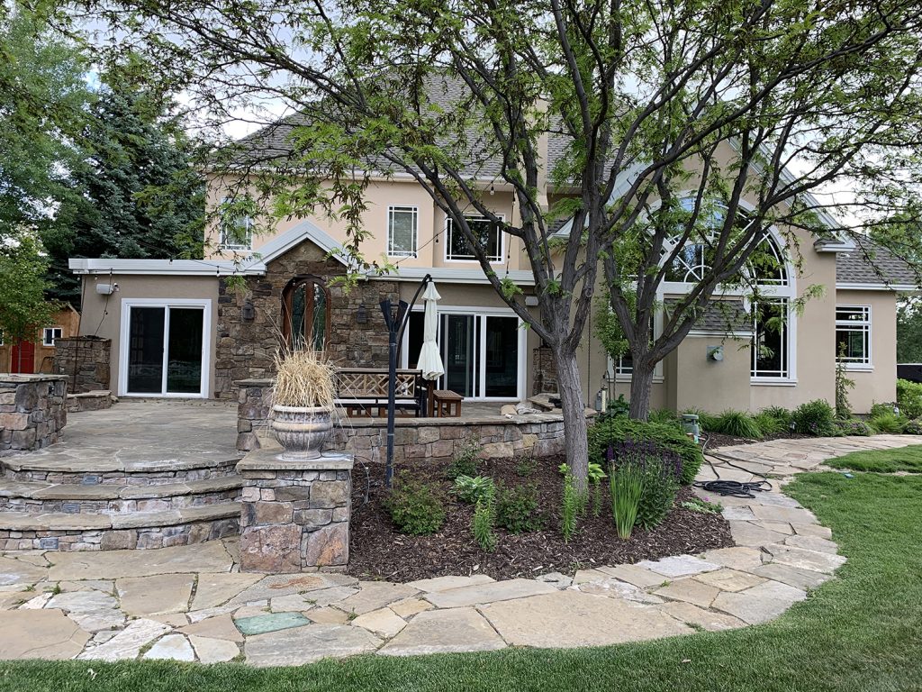
Last week, when I talked about the 6 projects we'll be tackling in the next six months, one of them was windows and the other big ones involved the living room and our new dining/entertaining space. ALL of these effect the exterior of our home. After meeting with an amazing contractor last Thursday, things are rolling. The back of the house is going to look QUITE different. We're swapping the sliding doors for windows, extending stone work, moving a fireplace to make that large arched window even cooler.
But one thing we noticed right away was the stone on the back of the house (an addition) is different than the stone on the front of our house. Gah!!! So if we extend the stone on the back of the house--which we prefer to the stone on the front--do we match it, or replace all the stone on the front of the house, too? I always preach you should never ever make a plan around something you don't love, especially permanent plans. There is a lot more stone (a LOT) on the front of the house but if we're going to be here for 25 years, maybe it would be worth it for us to replace it with something we really love.
So while updating the entire exterior facade isn't in the plans in the next six months, last Thursday we suddenly found ourselves in a pinch to plan exactly what we want to do so any work we do on the back of the house will not need to be re-done. I called on my sister, Andi, to help me photoshop some of our ideas! (Note: we will be squaring off the columns and changing the front door area as well, but this exercise is focused just on the stone, stucco and window style/color.)
And we even added a poll at the end so you can weigh in our your favorite!
Here is our house as it currently stands:
Option 1:
This would be one of the simplest upgrades. Painting the stucco a creamy white and replacing the windows (what a difference the right windows make, right??!) We also had her tone the stone we currently have a little more gray. It could also be achieved with adding some warm gray mortar to the existing stone.
Inspired by (via):
OPTION 2:
While I know for sure I want thin black windows on the interior of the house, I felt like white windows were the answer for the exterior (did you know double sided windows of different colors exist? They do!). However, we got one mocked up very similarly to the first except with black windows and I dig it!
Inspired by (via):
OPTION 3:
Black board and batten mixed with stone work and white windows. It's more of a modern take on the cottage look.
Inspired by (via):
OPTION 4:
Painting everything a creamy white and doing a tan windows, which are really chic! This would be the least expensive option (although it doesn't look it!) because mismatched stone becomes obsolete!
Inspired by (via):
OPTION 5:
What if we did a blue/gray window?
Inspired by (via):
OPTION 6:
With ALL stone?! (The front door is kind of cramping this one a bit, just squint). All stone would obviously be the most expensive but could align with our vision the most!
OPTION 7:
Here's how it looks with white windows.
OPTION 8:
And with the addition of black shutters.
Inspired by (via):
Chris and I each picked our favorites except that I have four favorites and he has 2 and none of them overlap. Haha! So while this is not a popular vote for what we WILL do to the exterior of our home, it's always fun to have you weigh in on what your favorite is! You can do so in the poll below!
Leave a Reply

WE'RE CHRIS + JULIA
Portfolio
Projects









I like the windows and trim color of option 4 best - with some stone on facade like option 1 or 2? The trim color looks to be a good compliment to the stone colors. Black windows with painted brick would also look good.
We’re in the same stages of our house… deciding on what completes the exterior. How did you get so many pictures of your house with different materials? Was it an app or did your architect do it? Thank you so much for your help!
Just used photoshop!
Maybe a silly question but what program did you use to get your different options. Was it photoshop?
yes!
I think black with black windows and leave the brick facade rather than white windows on the outside. It would give it a more modern approach. The house is lovely.
Would you please post which decision you made for your home’s exterior? Would love to know.
Check out this post!!
I would just do one portion stone. Just the big garage on the very left. Maybe even the small portion in front of that. Then white painted brick or smooth horizontal siding for the rest. Keep windows and trim like number 7.
Number 3. The beautiful windows are highlighted the best with the white trim against both the stone and black siding. The shutters add clutter and are not needed with the strong architectural elements of the roof and stone.
I think the location of the stone is throwing me off. Not to throw another option in the works, but have you thought about stoning a different portion of the front to balance it out a bit?
I voted number 4. I see i'm in the majority! What program did you use for the mock ups? Did a pro do it for you? I want to do the same thing for myself. Thanks!
I voted #2. It slightly reminds me of our home (https://www.exterpro.com/project/modern-home/). I like the neutral white, grey, and black :)
I vote for #3! Although I think it needs to have a darker roof and dark windows (like the inspiration photo) to sell the dark siding for me. This Stone Lake House is a good visual representation of what I mean: http://www.homebunch.com/stone-lake-house/
I ran across a photo of a house on Zillow that reminded me of your new house. I know you are trying to decide how to use stone on your exterior and this house seemed like some inspiration you might like. I like how they use the stone around the entryway and then on the base of the house. It also have a very cottage feel to it eventhough they used the modern black windows.
https://www.zillow.com/homedetails/2944-W-Roxboro-Rd-NE-Atlanta-GA-30324/35935623_zpid/?
I think 3 but with black windows would look awesome!! Or even 7 or 8 with black windows...
I think removing that arched part of the second floor window above and to the left of the front door would help tone down the McMansion aspect- as would removing the stone front the window area to the upper right of front door...
FRONT EXTERIOR STONE and STUCCO: #7, because the entire exterior with stone appears calming in the mock-up. The stone on the actual house has both a different and darker undertone AND would be very dark to be completely covering the front of the home. Perhaps #4 is prevailing, because it is one main light color (but too white against the stone in the mock ups), but would require painting stone and looking at painted stone is not appealing. Multiple exterior treatments on a house can easily look too busy, and that includes texture. Beautiful landscaping doesn't look as beautiful as it could when it is near a busy looking exterior. WINDOWS: If the roof was black, then it would look better with black exterior windows, otherwise, the white looks great. The small window, second from the right on the second floor appears too small, but perhaps it needs to be that size. BACK EXTERIOR: There are several different stone/cement applications on the back of the home. The stone walkway is much too busy for all the different stonework on the house and patio area. Since you already enjoy this type of endeavor, then you have a lot of fun work ahead of you..all the best!
Wow I can't believe #4 won (it's probably my least favorite) - just goes to show, different strokes for different folks. :) I voted #7 - love the all-stone!
Black shutters would look amazing on ANY of the choices (well, except maybe 3). ;-)
Agree darker roof! And remove the stone from the area near the upstairs window.
Agree with a few other comments about the roof. If the house was built around 2000, it is likely that that is original roof and it may need replacing within next 10 years. To my eye, the roof color does not complement the stone- it is too gray. It is such a large amount of space! I think instead of the gray it is now, a darker earth tone to compliment the stone would help. Also, it seems like such a waste (of money and material) to take off the stone and it will be expensive to replace with all stone. I agree with earlier comment that you might try to remove the stone (or can you aint the stone the same color as the stucco??) around the upstairs window and see if that helps the overall disjointed feel. Also agree with another commenter that the bright white might be too white. If you want a classic look, the white 8/8 windows are "it"!
Option 4, but with black window frames!
Add a darker roof color to the renderings. Even if you are not planning to replace the roof right away, a darker color would make ALL the difference. Good luck!
#6 honestly, even though it’s not polling well it’s classic but unique because of the window color choice. I know the last one is the favorite but to me it seems predictable- in North Carolina ALL the houses are brick with black shutters! ????
4 and 7 were are my favs! So many choices, I'm not sure how I'd ever pull the trigger. RESPECT. lol
Edit- I meant to say- my favorite is number three!
I like number 4 best but with black windows (inside) and white window trim. So classy looking.
#7 is my favorite, but if extending the stone is too expensive, then #5 or #1.
It’s on the way to being a gorgeous house, and toning down the eclectic choices already made will help make it more cohesive and beautiful to look at. Your new windows fit the rest of the house much better than the current prairie style ones.
Again, it’s going to be gorgeous and I really like your choices. Good luck!
My favorites are 1 and 7. I voted for 7. Although one of the most expensive to begin with, it means you will never have to paint your house again...except for the trim! But I also love # 1. The all stucco #4 in white is gorgeous but from a practical standpoint will require the most maintenance and is a little stark. I see that as of right now, I am in the minority on 1 and 7. LOL I'm always a little different from the crowd!
4
Torn between option 1 and 5, but would love to see a rendering of #1 with blue/gray shutters and black accents (lighting, house #, etc...)!
Have you seen this (see link) book, or when referencing the link peek at the others customers have also bought or considered. The stone (& the one photo with the bell) reminds me of where I grew up: Bucks County, Pennsylvania. Have you ever referenced photos of Doylestown, PA? I selected number 8, but number one was super close in my mind. How fun to be able to see this digitally first.
Stone Houses: Traditional Homes of R. Brognard Okie https://www.amazon.com/dp/0847840786/ref=cm_sw_r_sms_c_api_i_QnzcDb7KBDTRQ
I love #6! Sad to hear it’s in last place! It just looks like how the house always should have been.
I agree #6 is cottage-y but the blue windows make it unique, I didn’t think I’d like that until I saw the scheme.
I love all options but I think the reddish front door is throwing me off!?? Is it just me or should that be updated as well?? Much love to you guys, you're my fav!!
None of the above! ???? I’d ditch the shutters and paint the stucco and stone taupe, with black window trim and black windows.
I think there would be a way to blend 4 with 1 or 5. Pare down the stone a little so that it feels more intentional then how it is distributed now (which feels kind of McMansion in the suburbs). Old Tudors do used mixed materials but they use it differently (I live in one built in the 30’s ☺️). Here are a couple inspiration pictures for what I mean:
https://pin.it/4dxkwhgp43cuef
https://pin.it/hj2darfyohawir
I voted for 4 BUT option 3 feels SO CLJ Cottage. Not Studio McGee Cottage, Katie Hackworth Cottage, Pinterest Cottage.... CHRIS LOVES JULIA COTTAGE. Can’t even imagine it not being moody and cozy all rolled into one.
I’m so surprised by the results! Love 5 & 6! I think both would look spectacular! Obviously 6 is the more expensive option with the all stone. Reminds me of some of the beautiful character stone homes in and around Quebec City!
I would love to see the font, left part of the house (is that the garage?) in stone and the rest with off white stucco. It would make it look like that was the carriage house. Swoon.
Something about 8, with the white windows and black shutters, is classy and elegant. It lends cohesiveness by bringing together some disparate design elements. The lighter, greyer stone is nice, too.
Maybe I'm forgetting but I don't remember seeing a door from your kitchen to the patio. This was a game-changer in our renovation.
My two cents, I'd do number 4, but change the white tapered posts to cedar wrapped columns inset into stacked stone bases, with cedar gable accents to match along the roof line, black windows and a black front door. That would give you a really classic (yet on trend) look that would stand the test of time. Good luck! These are all very nice choices!
All of your options are beautiful! I’m sure whatever you choose will be lovely. Even just changing the stucco color and putting in different windows helps SO MUCH. Since we are pretending that money doesn’t matter—wink, wink— have you thought about just removing the portico and blending it in with the rest of the covered roof? Maybe you could do a smaller arched door under the covered porch so you don’t just have the one arched window on the front of the house. The roof line is so cut up—just like most houses built around the same time—and it takes away from the cottage feel. I don’t know if that makes sense. Like I said, no matter what you choose it will be beautiful!
What about #1 with black shutters?
I’m so surprised #6 is last place!! That was my vote and when it revealed the totals my face was stumped! I think it looks understated classy, not too trendy, but with those blue/gray windows which brings in some good creamy moody tones it’s right up your alley!!!!
I think 1, 2, and 4 stand the test of time. That's what is most important to me when choosing finishes that are permanent/long term. I also love homes that have different dimensions and mixed materials. It always feels welcoming and unique.
I noticed that number 4 is in the number one spot and I felt compelled to leave a comment. I am begging you not to paint all of the brick on your beautiful cottage!! I voted for number 8 because I LOVE the contrast of the black shutters with the brick but if you don't want the expense of adding all that brick, option number one would be beautiful with black shutters! I know I will love whatever you choose. I am loving the ride this new project takes us on!
What if you did number 4 but left some of the stone exposed and painted the rest. Like maybe leave the stone on the left side of the house (when u are facing it) and paint all the rest of the stone on the right side. Then u get a little of both.
I don't know which one I'd vote for b/c I really do love the look of each of them. However, As I scrubbed doors/window frames over the last few days...and had to repaint some exterior...Fly poop is the pits! We live with cows on the property so if you have that as an option (horse poop???), consider a not-white exterior frame...b/c unless you clean daily, you will have stains that cannot be removed.
I think #6, 7 and 8 all look cookie-cutter with all the stone. TOO MUCH STONE. The perfect balance is in #1 or #5. Please don't do all stone! Then you'll look like everyone else, and you two and SO not everyone else!!
I want to live wherever you live if EVERYONE has all stone houses? Haha, I don't know a single one!
You guys should have moved to the East coast then! Even in the Philadelphia suburbs (down into Maryland even) is all stone or all brick homes!
Maybe that's why I'm drawn to it--I grew up in Pennsylvania and moved west when I was 18! Just bringing a little East Coast charm out here.
Regarding Option #4: Last month we painted our house a creamy off-white and have tan windows! Big, big love for this color combo. I'd been considering it for about three years but was nervous about that combination considering the seemingly only acceptable modern window/house exterior combo was black/white. Do it!
OMG you sound like me!!! We have wanted to paint our green siding/tan windows house white for 2 years, but I thought the tan windows with the white siding would look horrible. I decided to finally just DO IT and I LOVE IT!! We painted it Alabaster (so not a crispy white) and it goes so nicely with the tan windows. I feel like a true trendsetter haha
This is giving me hope! I have tan windows and worried it was limiting our exterior color options. Nice to know a couple people have made it work, Thanks!
I know this is an old post but hoping you will see this and reply. We are thinking of painting our stucco house alabaster and having tan shutters and trim - what tan did you use?
I'm surprised #4 and #8 are in the top spots, those looks seem the most dated to me (1990s)
Not sure you need another option, but I'd love to see #3 with black windows like the inspiration photo.
I agree ☝️. And with dark trim like the inspiration too, I think those touches are what makes the look more modern and less 90s.
The voting results shocked me so much, 5 and 6 are my favorite!
After watching your insta stories yesterday, I have to agree, go with what makes you happy. And just because everyone likes it and everyone else is choosing it doesn't me it's the right choice for you.
I needed to be reminded of that, we are currently in the very beginning stages of planning our outside makeover, landscaping and house painting. I know what I want our house to look like but then I drive around the neighborhood and think, "But no one else has done that!" Which should make me excited rather than shy away from it.
Like all the options. #1 is my favorite and I’d make the shutters black like in #8 to make them pop a little more. You two are going to have so much fun!
Just another (probably very unhelpful comment at this point) vote for the mixed materials leaning McMansion-y with all the different rooflines/elements happening in the front. I'd also (from a sustainability perspective) vote for any option that involves making the existing stone work! It looks like it's in great shape and may just need a little tweaking rather than removing it all and replacing with new material.
Can we just talk about how important window grids are in most homes? Just adding traditional grids to your current windows would make a huge difference and I’m happy (but not surprised) that all options include them. Windows without grids look cold and unfinished. So important!
I vote Option 1 with black shutters!
It's so fun to see all the options! Your sister did a great job with the renderings. Like you mentioned, this specific project would be a long-term/permanent change. When I'm doing projects that will last a long time, I try to choose something that will look good and be in style for the long haul. I think #4 is the safest and will stand the test of time the best. But I'm really loving #8 because the stone and shutter combo is also a bit more timeless. I'm excited to see what you choose!
Looks like we're diggin' that French chateau look ; D
What about option 6, but with a darker trim color, more in line with the window color? I feel like the light trim makes the trim stand out so much and I want those windows to be more of the focus.
What about #5 with the exterior color and window color swapped? Blue/grey paint and white windows? Could be more subtle and would look so pretty with the stone!
GO WITH YOUR ❤️❤️❤️❤️❤️!
They are all beautiful....but I am OBSESSED with 5!!! I’m sad it’s not getting more votes haha. The mix of white with the stone and the blue/gray windows is so beautiful! Good luck, not an easy decision but I’m certain whatever you go with will be stunning!
Same!
I love option #3 but I’d suggest toning down the wood color of the door (maybe you plan to do this but just didn’t photoshop it). In any option, could you paint or white wash the brick vs. removing? Seems like a costly undertaking to remove. In any case, I’m sure whatever you do will be lovely????
If you go with #6, may be explore an option to paint all of the trim the same blue/grey color? And I would also recommend removing the decorative gable vents - not a super cottage-y detail :)
#2, it’s fabulous.
I want to point out that though #4 is in the lead, Team Stone is heavily outnumbering Team White House (79%!). All the no stone votes are just concentrated on the one option. I really like the gray windows. I also find that you make better design decisions than I do (I was on team wood cabin walls, haha). So I'm excited for the journey!
How about option 1 but with the addition of black shutters on every window, plus changing the pillar columns to something more cottage. I think the columns are so Mediterranean and kill the cottage vibe, while the shutters add to it.
1, 2 and 4. Just watched your story explaining that 8 is safe. I couldn’t agree more. And then also NO to the farmhouse look. It’s lovely, don’t get me wrong, but I feel like your guys style is different, and dare I say, much better than that!
I’m surprised more people aren’t voting for the dark board and batten. The all stone reminds me of the 80’s all brick but I’m sure if you do it and change the stone it will look amazing CLJ style. For sure the gray blue windows. My favorite rebuilds around here are a stone and board batten combination and usually in a gray tone but not quite as dark. They are so lovely...
#4 is my fave BUT if you a are gonna atone I li le the i simplicity pf white paint I think that’s #1? Have you thought of limewashing the stone to give it even more of that cottage vibe and neither ing it up more?
I love black windows but with the current architecture i think it’s getting lost so maybe justness on the interior of you still want them?
I voted for 4 buttttt I equally love ) and 8 (I could only choose 1 in your poll). Can’t wait to see what you choose!
I actually think the all white with black windows would look really good - at least in my head it does. ????
I love the simplicity of just the stucco. The house has so many architectural details in it's shape that I find the mixed materials with the stone and shutters distracting. I'm used to seeing simple, clean lines from you and for some reason #4 is what I'm drawn to. I love that it brings your focus to the front door instead of the stone.
Agree with a precious commenter that said that if you can remove the keystone trim on the windows it would be an improvement!
I am shocked #6 is in last place- definitely my favorite! It is reminiscent of an English countryside cottage ????
I voted for 4, but am surprised 6 is in last place - it was my close to tied with 4!
I have been travelling to Montreal for work lately, and I love to walk around old Montreal and look at the stone buildings with their blue-gray or green-gray trim. I voted for #6!!!!
Number 5, number 5!! It reminds me the most of what you’d find here in the English countryside (think Cotswolds) and it sounds like that’s the look and vibe you want to create. Can’t wait to see how it turns out!
#4 with black accents or #2 with a little less stone...maybe something like this https://www.houzz.com/photos/coastal-cottage-traditional-exterior-minneapolis-phvw-vp~137125403
#4 but with black accents or #2 with a little less stone...maybe something like this https://www.houzz.com/photos/coastal-cottage-traditional-exterior-minneapolis-phvw-vp~137125403
Hope you go with your gut on this! I think that once you decide on what you want, even if it polled low on this survey, that most everyone will come around to support it & see the genius behind it! I mean, that's why we're here to begin with: for ideas & inspiration & to see your vision come to life!
Hopefully some of the comments provide helpful insights or food for thought, though. Mine, FWIW:
-- Many of these options rely on getting the front stone grayed up. Would doing a test on your method of graying it up be helpful to see how feasible or attractive the method actually is?
-- Could your sister also Photoshop some of the interiors with windows of the pane # & size & interior grille color that you are considering? For instance, having black windows with many panes (lights?) might look busy or heavy from the interior unless the mullions are very thin. I love how interior black window frames & grilles frame the outdoor view but only when the mullions aren't too thick, heavy, or busy. Still, I know that whatever you choose will be great!
Looking forward to see how this all unfolds!
I have 3 favorites, and they are all with lighter window options. I think grey or black windows are too stark with all of the stone, and white/cream windows softens all the squares and triangles and edges. I voted for option 4, because it looks really beautiful, and classic, and just matches clj style, I think :) It doesn’t hurt that it’s the cheapest option, but - as you said - doesn’t look like it, and creamy windows with light grey roof just warms the house perfectly, and gives it a ‘quiet drama’ look.
So I changed my vote from 4 to 6 based on the photo inspiration on your story! I love it. I guess what held me from picking it the first time around was the roof color. I love the all stone with those grey windows, but the darker roof really adds that pop and makes it stand out. Well wishing you luck and I know whatever you guys pick will look amazing in the end!
Did you consider number four with black windows! I think it would modernize the look while keeping it classic. Plus as you mentioned, be a cheaper option!
I picked #6, but I also like #4 because both of these make the whole house simpler. It feels a bit busy to me with the broken up sections on this particular house. I feel like the all brick goes more with your wanting to give it more of a cottage feel, so that's why I picked that over the all white one. If you did end up going with #6, I would want to play with the trim color and see how it would look with something a little bit darker. Anyway, I'm excited to see what you end up with. You always have such a good eye and have surprised me before. For example, I really never thought I liked A-frames until I saw what you did with yours and then I realized A-frames could be super awesome!
Option 4 is so much nicer than everything else! It’s tasteful and charming. It’s also the only one that doesn’t scream suburban McMansion.
5 or 6 is where I lean but if 4 wins could you add shutters and some window boxes in maybe natural wood. classic cottage.
5 and 8 feel the closest to a dreamy European cottage to me!!! Can’t wait to see what you choose.
I voted for #5 because WOWZA! But really though I love stonework on homes, it feels so warm and inviting. I loved 5 because the white (or you can do a warmer white) helps make the beautiful stone shine & be the main attraction! I loved the blue/grey shutters best because they felt the most like a cottage vibe. I can’t wait to see what you choose!!
I love option #4, but would do black windows! :)
I voted #6 but would perhaps like to seem trim and columns match the window. It's so beautiful and calm!
I love the inspo pic of #3. One of the things I love is that the black windows blend right into the board & batten and trim. I know you don’t want black exterior windows, but I think #3 would be made even better with black windows and black soffits/fascia.
Similarly, the white for option 5 is throwing me off from liking it. If it was more muted, like the inspo pics, I think the blue grey windows would blend better.
I do love 6 but I know the cost would be outrageous! Plus a mix of material and colour would give it some depth!
All amazing options! I’m sure whatever you decide to do will turn out amazing!
No 4 but with black windows
#2
I was always a strong #6 supporter, but didn't vote because I was nervous about pushing you toward what must be a SERIOUSLY expensive option. Also, my two cents is that you should check out a lighter greyish-blue for the trim, because it's my all-time favorite and it's extremely old French Provence cottage! The darker grey/blue smacks a tiny bit trendy to me. Not a ton, and I'm probably biased, but hey, go ahead and ignore my comment! You do you!
I chose 4 because it seems like the easiest way to really elevate your home. It would give you a classic “country Tudor estate” vibe. A greige would be great on this iteration as well. It wouldn’t have to be white. I do also like the all-stone options but it seems like it could be hard to match the current stone well enough, and replacing it all seems nuts. I would definitely stay away from faux stone. Look forward to seeing what you guys come up with.
I suspect, #6 being the most expensive is what’s swaying people away from it, no one wants to vote to spend someone else’s money. ????
I love option 6 but interested to see what it would look like with a different trim color, and keeping the columns white!! Can’t wait to see what y’all do, I know it’ll be perfect!!
#6 is stunning/modern/perfect!! It was my choice this morning and can’t believe it’s in last place! People!! Go for it Chris/Julia!! ❤️????????????
I think the thing that bothers me about #6 is all of the white trim. I like the blue gray windows, just not all of the additional white trim. I looked up Stone cottages and it seems they have very little trim work aside from the windows. The white seems stark next to the stone.
Regardless, my opinion certainly doesn’t matter...I just thought I’d toss it out there. The home is beautiful now and you will just improve on that whatever you do!!
You are influencers for a reason. You do the homework and teach the masses!!! I love that you have the tact to deal with a variety of opinions and voice that SO WELL! I love where you're heading with the blue/gray windows. Whatever you decide, it's fun to watch an glean a bit of knowledge!
I love #3, but those white windows pop a little too much for me. Maybe a different color would calmly coordinate without being quite so in charge? But on the other end of the spectrum, I think the stone is too similar to gray/blue for option 5 and its relations. It all gets so muddy! The inspiration photo has a much lighter and more uniform stone, it seems. But you guys have impeccable taste and will make whatever the choice is look amazing!
What about option 4 with black shutters? What do you guys think about that?
Option 3, but with black windows!
7 all day long
OK, here are some unsolicited thoughts:
1. I don't think you need to do the whole thing in stone - it's lovely, but I think the combination of stucco/stone is so nice and you can use the money elsewhere... maybe to upgrade to the stone you love in front.
2. For the love of all things good and noble, please, I implore you, remove that fake "keystone" in the window head trim - I don't know if it's made of EFIS or wood trim, which will impact the level of difficulty, but it will really clean up the cottage detailing
3. I was between 1, 4 and 5 - I like the stone (greyed out, I agree) and am intrigued by the French grey (tan?) with the creamy white.
4. I am so excited to see this come together - it's very inspiring!
Ditto to the keystone! It's just adding fussiness to a facade that already has a lot going on.
Was #4 or #6 for me. 6 is super original and seems like it just fits!!! Whatever you do will be gorgeous and I can’t wait to see every step!
Will you change the color of the roof? I feel like that would be a HUGE deciding factor for me. I picked 3 because I love the black look, but is it something that will be appealing in 10 years?! I don’t know. But I LOVE it now!
The roof was recently replaced so not for awhile
My vote is for two or three. However, if you do number 3, I would go with black or dark windows rather than white. Also, I think number 2’s windows are deceiving in the photoshopped image. The black looks so pronounced in the rendered image, while in reality windows look dark/black-ish during the day unless there is a really amazing reflection close to sunrise or sunset. So overall, I say black windows might be the way to go, but this is coming from an architect who loves modern. ;)
#2 and #5 but maybe with Black shutters
What about creamy white with black windows?
I’m sure other readers have asked the same, but what about option #3 with black windows (similar to the inspo pic)? I like the idea of mixing textures and grounding them with black—feels old yet modern.
Love following this journey of yours, thanks for taking us along!
I voted 2 although I honestly can’t decide between 1 and 2. I like 1 in the big photo but 2 stands out more on the smaller photos. I think whatever you choose, don’t do shutters. Eliminating the shutters feels cleaner and more striking, and truer to the style of the home. Have you considered a paint color to blend more with the a toned-down version of the stone? That way it would be lower contrast than the white and stone but not quite as heavy as all stone. Potentially a gray on the stucco and a darker blue/gray on the trim? I like the mix of materials if you aren’t wrapping the whole house in stone. I don’t think the stucco would fit in on the rest of the house as well if you didn’t have a little of it on the front.
I’d love to see 1,3,4 &7 with black windows! So fun guys ????
We just put new windows in and we’re told they will fade! I was soooo sad we could not use them! What have you found that don’t fade?
Option #2
The start of a project of this magnitude reminds me of falling in love. You just can't get enough ;) I was surprised to see my fav #5 rated so low! I feel like you need to break up all that space with a mix of materials and the window color is the perfect touch of moody Julia-style and gives it a European vibe. I also love the color on #3 but feels like maybe too "modern farmhouse"-ish, maybe it's more of a homage to the A-Frame but it doesn't give me cottage feels. No matter what you decide to go with, they are all total upgrades and I know you will rock your new digs.
ps. If you want to lighten the color of the stone and make it look more worn, look into a limewash or German Smear.
I love #2. I think stone & stucco truly says cottage and the black windows show your modern personality. 4 and 8 are pretty but they are so plain for your design sense! You two have always been so great at mixing materials and making everything look moody and modern. 4 and 8 seem so simple.
Such a fun look into the design option you are working through. I voted for #4 all white exterior with he ran windows. But I would have loved to see it with black windows!
Before I sold my house that was my plan, though my dream plan was all black, windows and siding and roof...or monochromatic black and gray.
I can't wait to see what you guys do!
I chose 8 but I would have loved 1 with black shutters. I think the black shutters against the stone are beautiful. However I would prefer some off white stucco as well.
Julia!! You need to go follow Christopher AI on Instagram! They are an architecture firm that specializes in tudor/cottage-style homes and they stop me dead in my tracks every time they come across my feed. I feel like they may be a great source of inspo for the outside of your home! ????
What about all white with black windows??? It would really bring out that soft cottage vibe, but with a modern and classic punch.
White. Covered with climbing vines!
4 and 8!
#3 accentuates the architectural elements of your home. #7 and #8 are great too and visually unify all the lines. Very serene looking. Black or white windows will stand the test of time. Beautiful home ❤️
I voted #8 (in second) but #4 my second fav is currently running first. Good luck which ever way you go!
I can't tell if my comment posted so I'm trying again. Option #3 with a darker roof, black windows, and no stone on the upper right area of the house. (MAYBE extended the stone to the left and far right so that all the lower level is stone like the inspo pic but that isn't definitely needed. Just removing it from the upper right area reduces the mcmansion vibe for me.) Can't wait to see what you come up with!
#4 is my favorite option, but I'd love to see some of that beautiful stone incorporated into it. Just a little, maybe limit it to the left hand jut-out for a bit of texture.
Option #3 with a darker roof, black windows and no stone on the upper right area so that the stone is only on the lower level. (MAYBE extend the stone to the left and very far right so all the lower level is stone like the inspo pic but that isn't definitely needed. Just getting rid of it on the upper right helps minimize the mcmansion look alot.)
How about 3 with black windows? Love the black but there is a ton going on with stone, b+b, contrasting windows and large gray roof... I realy like the simplicity of 4, but I feel like black is more you.
When we were building a retaining wall to match an existing wall already on our property we had the best luck and best price from someone who bought stone directly from the quarry. The stone will be beautiful but stucco or board and baton can always be painted.
I chose 5, but I also like the modern look of 3. What about the black board with painted white stone?!? Just to throw another one out there...
All the Inspiration pics make it even harder to pick one :).
I'm not even sure if this is possible but would doing a "German schmear" type application help with the stone? Tone it down and make it appear less orange??? Maybe you could even test a section before you have to decide to all out replace it...???
I would love to see #3 and #7 with black windows.
This is not a cottage. This is a villa. I love what you guys do but every time you say cottage it makes me cringe. Your house is like 5 cottages put together on a crap ton of land.
I forgot two points - from the front view, it is not obvious, but from the side, could you straighten out the roofline above the doorway. It just goes up a bit. I keep wanting to push it back into alignment.
And I finally decided why I don't like the exterior black window (at least with so many sashings). First, it darkens the porch area whe the white windows seem to brighten up the area. Two, they look like window bars on your windows and not inviting. And I don't think that is the look you are going for in this home. You are in the wide open frontier land - make it open and welcoming!
I used to live in the east, but now I am in Oklahoma and if I can't see the horizon and open skies, I get kinda nervous. I want space!
I love options 2 & 3 and ended up voting for 3 because the inspiration was my favorite of the inspo pics you included. I will just add my two cents on the shutters. I know that these are just renderings so it may not look like this as the final look but if possible try to get shutters the same scale and dimensions as your windows. Shutters that wouldn’t cover the window if they were functioning make the entire exterior look cheaper, in my opinion. Now granted, that is my opinion but just wanted to share that input. I know all will look great in the end! Excited to follow along!
#6! Or 5. They are giving me the most 'cottage' vibe. I'm really into the way that the blue/grey color works with the stone and creates this gorgeous English-cottage moody exterior. The all-stone white feels much more traditional.
I like 3. I always fall for a deep tone and bright white mellowed out with a neutral stone. DROOL!
I also think a number 6 with the trim and the fascia being the color(iron ore) of number 3.
I'm sorry about some of the comments that you are getting about your home. A lot of people mention "McMansion", which I really didn't think your house qualified for that term. So, I looked at some "McMansion Hate" websites.
First, to me, a McM was an outsized, ornate house relative to the property and to the neighborhood. Your house is on acreage, so the size is correct. And, there are probably similar sized houses on similar lot sizes in your neighborhood. So you are not sticking out. Space wise - you mentioned that you both work at home, so the space is a home and an office. You have three daughters and a very large extended family, and family & entertaining space is important to you.
Second, the features of the exterior are important. While your house is not symmetrical, there is a balance in size and shape. In your intro video, you really cannot see the turret because of the tree and it only pops out when you are off to the side. And, it's a nice surprise that your daughters enjoy - think of the granddaughters staying in that room! There are only two textures - stone and stucco - where many McM have far more options. The entry way is one level, not a two-story monster, and the columns look like they support some weight.
Third, the windows are an issue since I can see three types, but your plan is to make them all the same (one or double width, with sashing, all opening One suggestion is to make the tiny window on the right to be the same size as the other upper level windows. With respect to shutters, it seems to be an all in or all out matter. But, don't forget the eyebrow above the window. Once you take the shutters off, the proportion changes and the brow is not above all windows.
Finally, McMs seem to have too much detail. Your home, after some of your adjustments, will be much calmer than what I saw on the web. The amount of stone that is visible is proportional and with color adjustment will be "right". When you decide to go whole stone house, it will also feel right with the environment.
Now, on the interior, yes, you do have some McMansion issues, but you seem to be dealing with them.
But, it is your home so, trust yourself! I'm looking forward to the journey.
All stone all the way! Gonna look great no matter what!
I voted for #7 because I love the all stone look, feels more cottage-like to me. But I feel like you need to inject black somewhere to make it feel more “CLJ”...what about #7 but with black windows? My second vote, more budget-friendly option, would be #2.
I think that the area that I go back to is the table to the left. I would remove in the stone from the face of the second floor gable there. Most of the images you selected have a stone base and a stucco/board and barren upper story. Also, removing the nested gable detail will be more cottage and a little less McMansion. (Known for an over abundance of gables)
I voted 8 when I woke up and read your post from bed. But I’ve been thinking about it all day as I work and I realize that my vote may change if you are increasing the size of your windows when you replace them. Do you know if you will be increasing the size of the first floor windows? I know you mentioned the possibility for the second floor in your walk through video last week.
I know that may be hard to illustrate on the mock-up variations. Any option will look lovely though. I’m loving seeing your thought process as a fellow McMansion owner in Nevada :)
I love the potential of #3 with black windows! But I’d take out the ‘floating’ stone on the second floor with batten below it - any stone should travel all the way to the ground, so I’d think about how stone vs batten works in terms of the overall massing of the house. This is a fun process, thanks for bringing us along!!
#7 all the way! It looks like an English country cottage more than any of the other options. And I would def name her Marcum Manor.
Number 4 with blue gray windows. It'll look gorgeous with your stained front door!
I'm torn between a couple:
4 - I think this is fantastic and I love the soft color on the windows. I also think this gives you the most cottage-like result.
3 - I also really, really like this one. I'm wondering what it would look like with a warmer stone, and I'd also mock it up with the black windows for kicks. I do like the white windows a lot though, it gives a nice contrast.
I would possibly be interested in one of the all-stone ones if you could get rid of the gable vents somehow. To me they really stand out against the all stone options and take away from the look. If you could get that stone up to the peak it might give it that cottage feel.
On 1, 2, and 5 I just can't get behind the stucco/stone combo, it's a safe pick, for sure, but it's also way too common a combination in cookie cutter homes.
I love #3 for you both, personally. I feel like it’s the best mix of your personal styles and keeps the feel of the house while also modernizing it and working with the climate and nature you live in. I think the true black may be throwing people off? Are you planning to do the true black or more of a charcoal color, because I think that would be stunning ass well, and maybe less of an eye shocker to people. Can’t wait to see what you pick!
I liked this one too. Maybe a really really deep blue. Like bottom of the ocean deep blue almost black. Just random thought
#4 is so chic - everyone loves an all White House and the windows are charming! Then, you can keep the stone you like on the back!
You really can’t go wrong! Also, we are wanting to change our front facade....does your sister have a price that she would be willing to work up ours for if I sent a photo?
She does! DM her @andiofandrea
4 seems so boring to me compared to the other options and far less cottage feeling.
I voted 8, but also loved 2 and 3.
I guess overall I am liking a black element somewhere for contrast
5, or maybe 4, with shutters!
Number 6 feels the most cottage-y to me! Reminds me of a rustic French cottage, especially with casement windows and no shutters. 7 and 8 feel more classic/colonial to me.
5. The unpopular opinion. I understand why the votes are high where they are. It’s the modern/trendy choice of the moment but the blue grey window in the right tone captures the cottage feel so well. The more modern options lose the cottage vibe for me.
I completely agree!!
I was torn between #4 and #8 (voted 8) and it looks like your follows are just as torn! Can’t wait to see what you decide!
4 is my favorite and 8 is my second choice, so I’m happy to see them in the top two spots!
Hi! I really like the alternatives where the entire house is one colour/material (#4,#6,#7,#8). I think the reason I like them is because right now the house exterior is pretty busy and only using one colour might make it more cohesive. :) But I honestly think all the alternatives look good!
My thoughts exactly. I love almost all of the inspiration images, but there's a LOT going on visually on your house with the architecture to start with. Am I the only one who feels like the architecture of the entry is a little incongruous with the rest of the house? Not sure if it's the curve or the columns, but something is throwing me off. But y'all have great taste. I'm sure you'll pick something and make it work wonderfully well.
I am sure you considered it, but what about number 3 with black windows and trim? I think the cohesiveness of board and batten with black windows and trim would sing.
Yep, this.
Yes!!
I would LOVE to see you use tan windows on the outside. Feels cottage-y for sure, but also a bit unexpected when all we’re seeing nowadays is black.
I voted for #3. Also love #7 but prefer the contrast in 3 - makes more of a statement.
We need the shutters! No matter the selection - must add them! :)
Hahaha, that's so funny. I feel kind of opposite about shutters.
I am very opposed to any shutters that couldn’t actually cover the window. If they’re real ones that have hinges, etc. that could add a ton of history to the facade.
If you do shutters they absolutely must be functional and properly sized. If you can't do that then just don't bother. HUGE pet peeve.
I really like 4 but with the blue gray windows and I would add stone to the tower and around the front door- only the bottom facing wall.
Second is all stone with no shutters.
If it’s kept the mixed stone and other, I really prefer the top right not to be kept stone.
I voted for #1. I think a mix of materials is always more interesting. Mix of textures, colors, etc. lends itself a more timeless, evolved look in my opinion. Can't wait to see what you pick!
Please don’t do #4. The all white takes away from the cottage character and you guys embrace character. Mind you, my husband and I just finished building an all white house with black windows for the past year, which I love, just not for this home. #3 or #8!
I love # 4 and # 8. I’d be interested to see #4 with the blue gray windows. Can’t wait to see what you all decide!
Option 2 is my favorite!
#3 is absolutely my favorite. I am curious what is the mini dormer to the top right that is above the office? I find that broken roofline so confusing to the eye - is it a separate room - is that your master closet? Is there anyway to simplify that dormer? And/or the archway carved out of the front entrance portico? Just wondering if simplifying those two would make the black board & batten & stone feel more balanced.
1 or 7 if you’re looking for stunning/charming cottage motif. SO excited! You’ll find the perfect option just for you.
I thought for SURE #3 would be the first pick, but apparently I am wrong. I LOVE a beautiful white house (I live in a white modern farmhouse!!) but some stone with a little black feels so moody and dramatic to me. Something a little different from all of the white houses that are popping up all over Idaho falls Haha. Plus, it just seems so you to me.
Any but 4!! Without the stone, it loses all cottage charm! Favorite is #2!
I love #8 & #2 - feel like the shutters are the mascara for a lot of homes, but also LOVE how black windows look from outside! :) Curious - is there any plan to redo the roof in the nearby future (i.e. <5 years) or will that be remaining the same? Felt that for my vote, the roof color was throwing off a lot of the styles I would normally be okay with.
Hi.. black windows inside & outside. I ve got them for 8years in my forever home and there are a few (a lot of) things I might do differently today, but not ever the black windows.. I love a dark grey house or black because just like in garden design black really looks stunning surrounded by green and you’ve got a very big green garden, only it would not suit your roof, so I’d go with more stone with your house & lots of beautiful black windows. Good luck.
Yes! Exactly how I feel as well.
I voted for Option 1, but, for a more timeless look, I would suggest Option 4 with black windows...I am sure zou will come up with something great. Good luck!
I voted for #2, but I'd actually like to propose a mix of 2 and 4. The black window frames are great. I like the freshness the white colour gives, but all over white could maybe a bit boring.
So how about keeping the stone on the small building part on the left? I like details that make sense, in a way that you could imagine they are an old part that the rest of the house grew out of. It would give some visual interest while also looking like there was a small stone building that was added to over time. Like this: https://imgur.com/RRSyfmF
The one with the black look to heavy for me, probably due to the size of the house (I usually like black being used that way, but here it feels a bit too much). And the ones with stone all over are kind of nice, especially with the black shutters, but since you also have a medium grey roof it's just a lot of grey going on with not enough contrast, even though the white roof lines help lift it some.
All in all it's exciting to see what you consider and what you'll come up with. I kinda wish I could take a peek into five years ahead!
All white and only black windows. Remove all stone. Very sharp.
I should probably just name my house #mcmanse because I don't see any recovering from what we've got going on here in these Houston suburbs. Hahaha!
I love the all white! Although, I think it'd kick it up a notch if you went with all white exterior with either black or teal windows. The black would give it a modern edge. The teal would give it a charming feel.
All beautiful!! But I want to vote for 2, 3, 4, and 7!! ????
I love the classic look of 7. White windows all stone. But the blue grey windows are also beautiful. Look at @mariaebeck on IG. She just restored their stone home and used navy windows. Also her grout comes so the stone is flush with the grout which is timeless too. And her kitchen is to die for. The White House with black windows is so trendy, all the homes that have been done with that color scheme are now dated 2010-2020. Paint is cheap
I voted for 6, but I would love to see option 3 with black windows!
I love #4. I'd just add ivy up the wall on the left to give it more of a cottage/European feel. Easy. Whatever you guys do will be stunning, and I can't wait to see it!
I am shocked 4 is in the lead. Shocked! I like the look, but it's too one-dimensional for a multi-dimensional house front! I like 1 and 2, and would like to see black windows on 3.
Sidenote: Shutters can really attract wasps. If you can design to go without, then that's one less thing to worry about. We have to treat ours twice a year. Hoping to ditch them when we replace the siding.
Love this!!! Can we see an option 4 with black windows or greenish blue trim? Or shutters? ????
THIS.
Can't go wrong with any of them! But gah, can you just imagine the snow-covered white house at Christmas time?!? Gorgeous!
I voted for #1, but what about something a touch warmer or darker than white? Could you mock that up? Love this!
But what about #3 with black windows? The dark feel very CLJ to me! So many good options though, I can see why it’s a tough call!
Agreed!
#4 and make the windows and shutters a different shade than tan - the blueish grey shade you picked or even better...black! So pretty!
I voted for #1 but would add black shutters!!
I'm 100% routing for 8- for some reason the all white stucco feels too much like a new build, where as anything with the stone looks like it could have been there forever.. way past 2000 at least ;)
I honestly felt that #4 was a little too plain but still a nice choice. I’m not going to lie, I dig the dark stucco.
4, fo sho. It looks modern and timeless.
I think this one suits the cottage idea best while also separating itself from the McMansion feel that some of the mixed options have. I do like the dark one (but that style is exploding in my area so I think it will become tiresome quickly).
I'd try it out with the black windows too.
I thought 4 stood out immediately over the other choices but I think black windows would be stunning with that. So I voted 4 but would love to see a black window option for the white.
I chose 2 because of the contrast with the black trim (a little more modern than black shutters) and the combination of stucco and stone is so timeless and cottage-y. For the size of your home, the combo makes it feel less massive than the all stucco or all stone options. #2 all the way! ...although I could totally see you going with 3 based on your dark color choices in the past. Not a bad option at all. Just more modern!
Surprised the all white is winning!!! Did you think about doing all White with black windows instead of tan windows??? Maybe that is too “done” or does not fit with the overall vision.
#3 so it stands out when your yard is covered in snow!
I like the inspiration photo for option 4, but not the mock up. Maybe it's too white in the mock up? Or maybe it's painted brick vs stone? Love the contrast of dark paint and the stone in option 3, and I didn't notice the board and batten until you pointed it out. I also love the all stone - I think that it really looks English cottage-y. I grew up in Austin in a stone house. There's lots of stone in the area, and therefore, lots of stone houses (not castles, as a reference to another poster)! No shutters - too busy!
Voted for #4. Excited to follow along to see final outcome.
I chose 1 but also like 4 and 7. Hard no on the shutters and I hate 3.
I don't see why you're calling it a cottage did I miss the explanation? It certainly doesn't match what we call a cottage in the U.K.
Are you planning to keep the too small shutters?
I know we're only supposed to be commenting on the windows/siding, but whatever you do, a bronze/metal roof, like your inspiration image for option 3, would look amazing on your turret and help it stand out as a focal rather than blend in to all those shingles.
I’m loving four BUT I think white board and batten would be super cute and cottage-y. I like the stone but painting it all one color would be so cute I think.
#4 with black windows and shutters!
Can you “German Schmear” stone?!?!
I like option 4 but without painting the stone. Leave the stone, paint the stucco a creamy white or beige and tan windows.
https://www.architecturaldigest.com/story/home-exterior-fails
Some interesting points that you may find relevant.
I’m excited to see what you will come up with.
#4, black windows, stone the turret looking area only and maybe pitch the roof higher there -similiar to a Tudor. Plant ivy climbing up the walls in certain areas including the wall behind the birch trees.
I agree! Julia keeps saying white with black windows is too farmhousey and while I know what she means, I think the architecture of the house will still read cottage/Tudor so long as they still emphasize certain architectural features.
Some of those options do not look like Tudor. I think if you’re really going for Tudor style you should have a combination of stone and stucco areas. And no shutters. Did you considering the “half-timbering” that is usually found on Tudor houses?
Reading the comments and seeing the votes, I'd say it's clear there is no "YES THAT!" option. I know not everyone will agree, but I think you need to keep brainstorming. Maybe working with a designer would help? It's such a big decision and I'm sure it won't be cheap, so I'd hate to see you do something (or prep for something) you don't totally love and doesn't reflect your overall vision for the house.
I say do all one material/one color on the front of the home for sure. Remove all of the stone, do white stucco and white windows with black shutters (I'm a fan of non-working decor) around the whole home, even in the back. The all stone option 8 with black shutters had my heart when I saw it too! One color/material does take away that new construction look of your home.
What I fun post! I chose #4, but I cannot wait to see what you decide...VERY EXCITING!
Voted for #8 but could also get on board with #1 + black shutters. :)
Whew, that "opinions are like a**holes, everyone has them" saying is coming on strong in here!
I’d love to see the all white or the all stone with the black windows. I’m currently obsessed with black windows.
So split between 1 and 8. It's those black shutters. I love the contrast between a white window and black shutters. <3
Option 8 is my favorite but Option 1 is a close runner-up!
I also can't believe 4 is the most popular!!! Feels like a missed opportunity to me. And is anybody else trying to picture the house in the background of wedding photos? Or just me?
I really love the contrast of option 3 but have you thought about doing it with dark trim and windows? I love how the dark plays off of the stone but I think I'm getting hung up on the white trim. I also love option one because it has a softness that plays off of the landscape. It feels more English countryside. Maybe option 1 with the same board and batten as number 3... I think it will be lovely no matter which you choose.
2 and 3 are my favorites for sure. I feel like 3 is a younger look, like you'd know somebody stylish lives there and 2 with the black windows is so pretty. I had linen colored windows at my last house and HATED them. I like that 2 and 3 have a really beautiful contrast with the stone and color and windows. Full stone looks like older people live there and full stuco or siding just feels like you may be missing an opportunity. (But that being said, I love contrast)
2 and 3 are my favorites for sure. I feel like 3 is a younger look, like you'd know somebody stylish lives there and 2 with the black windows is so pretty. I had linen colored windows at my last house and HATED them. I like that 2 and 3 have a really beautiful contrast with the stone and color and windows.
I voted for #8 but I really like #4. Honestly I think if the roof were a darker color it would improve all the options. I'm not a fan of non-functional shutters but the black shutters add a little more depth.
Question: if you are replacing all the windows anyway, can you make them slightly taller to get rid of that weird crown/decorative detailing that’s above so many of the windows? It’s really dating the house (hello year 2000!) and needs to GO. You could stone over it too but that seems like it would be hard to match.
They are all such different vibes! Do you know what "feeling" or vibe you want? Because I LOVE #3...which looks like a cozy, intimate cottage. But I also love #8, which looks like an elegant family estate home.
Also for black shutters on 1 :-)
SO FUN! My order = 2, then 4, then 7/8.
But but but, what if 2 with the tan windows from 4? Like, if 2 and 4 were to have a lovely baby, I think that baby would look adorable.
I'm surprised that #3 is getting so many votes. To me it's a perfect "too many notes" (to quote one of my favorite movies, Amadeus). The board & batten with the stone is very busy and distracting, texturally.
Thanks for letting us give an opinion - it's great fun, but I'm sure you'll make a great choice in the end!
I'm sure you've thought of this, but I have just replaced windows that had small panes of glass with ones that have larger panes, it has made the rooms a lot lighter. The rooms in your house look very light to start with so maybe you won't notice the reduction in light due to the smaller window panes but I just thought I'd mention it.
I agree, option 1 with black shutters. OR smash option 2 & 4, so it would really be option 4 with black windows. The black helps with the contrast it seems like you are going for...
I picked option 8, but I also like the idea of option 4 but with black windows.
I chose 4, as the least offensive, though I really wanted to vote "none of the above." Apparently, others agree with me on 4.
The all stone versions looks like you want a castle, and I don't mean that in a good way. But I suppose since you bought a mcmansion, your ideas of what is attractive aren't anything like mine.
So, ideas for working with what you have. The board and batten looks at least as ridiculous as the all-stone.
The black windows are too stark looking with the white or near-white exteriors. The blue-gray doesn't look good at all. The tan with whitish exterior looks the least offensive, if you want a "looks rich but without feature or character" as the other house in the photo inspiration for this choice looks - inoffensive, but boring - it is a look some people like. Beats castle or barn-mansion, but there are better alternatives.
My advice? Even the off-white version is too white-it needs to be more beige, or olive, or grey, or some other color - just something not so whitish. There are house color professional who consult on this - I'm thinking you need to hire one.
The black windows are too stark on this house - I would like to see medium-dark grey ones - still dark, but less stark. The shutters have to go in any event.
The amount of stone you have on the front is OK if you like it - it looks better in the grey tone, but if you like it as it as, why bother to replace it? Just find a paint color that looks good with it.
Don't add more of the same stone to the rear if you don't like what is there now - just do the rear in a stone you like. But, since no one can see both sides of the house at the same time, has it occurred to you that the stone on the front doesn't have to exactly match the stone on the back?
Oh my gosh hahahaha tell me how you really feel. Your ideas of what is tactful aren't anything like mine.
Hahaha Julia! My eyeballs bugged reading this long comment.
I think that people forget that you live in Idaho. For the price of a large estate there, you could only get a small house in some of the larger cities. I would love to have a large house and property like that. I am happy for you and all of your achievements.
... the tone is all wrong but her comments ring true!
And this is why you're awesome... Perfect response to a horribly toxic comment.
What a rude comment!!
Wow. Seriously?
Wow, rude. Why even participate in the dis cushion if you hate the house so much? Yikes ????
Holy cow- you're really rude. There are polite ways of expressing opinions without being a total wang about it. Yikes.
So rude. Go away.
I'm stunned by how rude this is. Almost wondering if it's meant as a joke?! Surely no one sits at home and writes this sort of comment?!
WOW. Seriously?
I bet you're fun at parties.
This comment is a masterpiece in condescension.
Happened to re-read a post on YBH's pink bathroom and I believe Ann also gave a long winded, tactless opinion there too.
OMG you're right! It was on the board and batten post of their little pink bathroom!
Just imagine if Ann was your mother-in-law????
I was really torn between 4 & 8 and they are running really close together! I think having the same material, or look, consistent on the front of the house really embraces the style you are going for!
So exciting. Whatever you choose will be lovely.
Can you do 4 with black windows like 2!!?
Ooh, I really like this idea! I voted for #4 but agree that black windows would look so chic!
I voted for 1, but really like 1, 2, and 5. I really like the ones that have the combination of the stucco and the stone. The ones that are all one or the other, not so much.
Will be interesting to see which way you all go! Whatever you pick is always so chic, so I am fascinated to see what it ends up being. It seems impossible to me that you don't have ANY of your favorites overlapping between the two of you!!!
I voted for 2 but not surprised 4 is popular. I love a painted brick but not a painted stone- your inspiration is all painted brick.
I really liked #1 and it was my favorite until I got to #8. I stuck with #1 for my vote because of cost.
Not sure how you will tone down the warmth of that stone facade with mortar without covering it completely especially once you have painted white and gray next to it, so don’t feel like some of these options with the stone showing are really feasible without outright replacing the stone.
Maybe paint the stucco creamy white (eider?) , blue gray windows and a German Schmear on the stone leaving some bits of the cooler stone pieces showing show a tinge? I think adding black to the facade feels like a bit too much going on.
Can’t wait to see what you ultimately decide!
Another point is the condition of the roof. Will it need to be replaced within a few years? Check out what the current colors are available for shingles. I know the color options may change in the future. It may impact the color of the stone work, the paint, etc. Or you may decide to include a roof replacement at the same time.
All stone + thin black windows = modern cottage!
#1 + black shutters = dreamy :)
Ooh. Maybe the black shutters is what I liked about #8. Now I need to see this. :)
Yes! Agree, can we see that Photoshop please, Julia's sister? ;) That vote was a fun and surprisingly tough for someone who has no skin in this game whatsoever, lol.
I like option 3, but with dark windows like in the inspiration pic.
I like the window style of Option #4 (less grids), but w/ Option #5. Also, would you replace all of the stone out front... wait, you addressed that... ugh! lol!! I was just curious if you have considered staining the stone out front to get the tones that you want, changing it from warm stone to cool stone with stain colors... I definitely think the stone on the front is too warm, but my opinion... just like a bellybutton... everyone has them haha!!! My other favorite option is #7, I think adding the black shutters is too harsh... too much contrast, maybe a mid-tone gray... once again... Bellybutton haha!!
My landscaping eye does not like the pure white with the white birch. I like option one but would love it with the dark shutters from option 8.
I did landscaping in school so that’s something my eye takes into consideration. With those white birch trees I don’t think you’d want to go with the pure white house. I like the white and stone with white windows but am wondering what it would look like with the dark shutters as well. So option one but with the dark shutters. ????
The existing roof color is too light to be up against only stone - not enough contrast. The combination of white and stone has a more cottage appeal. Have you tried putting black shutters on option 1 and 5?
I am split between 4 and 8 but voted for 8 because it is SO classic for a cottage look. #4 is gorgeous but seems more french country to me but there are lots of cottages in the french countryside!
Like you need more options but what about adding black shutters to option 1??
Wow, I surprised myself with liking #4 the best. So chic! I like the uniformity of the creamy white. The tan windows are
more subtle than the pop of the black or white (the black and white grids seem noisy against mixed finishes). I think the landscape can really be a shining star against the creamy white whereas it might get lot against the stone and/or mixed finishes.
I voted 8, but think that I would have voted for 4 if there were black windows or black shutters. In fact, I think if I were choosing for my own house, the price difference wouldn't be worth doing all stone because I love 4 almost as much! Very excited to see what you all choose! I know I'll love it - always do.
I agree!
But whatever your choice, I'm looking forward to seeing what you decide.
No all white with black windows option?
I think option 4 is lovely! To get historic cottage vibes, my thoughts tend toward simplifying and refining as much as possible. I wonder if it would be possible to remove or otherwise minimize the window headers on the windows that have them? In pretty much all of the inspo photos, there are no window headers or they recede. I can't wait to see what direction you take! I'm sure you'll land on a gorgeous combo of finishes.
Ok I looked again and now I love #2 the most! :)
Keeping the stone in the mix makes the whole design process harder, but that's where the cottage vibes live.
I would love to hear/read some of the dialogue and reasoning as you process your decision.
We’re in the midst of an exterior reno and I’ve been pleasantly surprised at how our opinions have evolved as the work is in progress.
Option 4 with black windows?
I vote #1 as phase 1, with either 7 or 8 being the end result. I think those are the most classic options if you're going to be here long term....
I was torn between 4 and 8...aka apples or oranges? The creamy white against the green and the trees looks beautiful now, but how will it translate in the Winter. The one with all the stonework!!! Wow! It makes me think of horse country, Williamsburg, quaint and cozy...
I love the number three makes the size of the house recede a bit - it feels more cozy and less in your face than the white versions. I'm also very in favor of ditching the shutters - they just look so skimpy compared to both the windows and the rest of the house!
I voted 4 but would love to see some 3 combined with it. Or black windows .org black accents
I love the look of all one material on a house. It looks so much cleaner to me. So I love either all stucco or all stone. I love #4 and #8, but #4 feels more "cottage-y" to me. #8 does too, but with all stone it feels very English countryside. But what I love most about #8 is the black shutters! Could you do #4 with black windows and shutters?
Honestly? I really dislike stone mixed with stucco. Screams McMansion.
And I was surprise how chic and elevated both all stone or all stucco option are transforming - and removing this McMansion effect.
So 4 or all stone makes them stately and gorgeous.
This observation is spot on. Uniformity of exterior finish really does elevate the design...either the solid stucco, or solid stone. Both are lovely. Mixed finishes really does communicate McMansion---I hadn't pinpointed before now what it was....excited to see you transform both interior and exterior over the years, love what you do!!
One more thought: one of the things that's detracting the most from a cottage look for me is the shape and style of the over-the-door window. Could you maybe swap it out for a straight transom? Or maybe a style of arched window that's not so 1990s?
I would say 4 or 6, 7, or 8--I don't like the ones that are a mix of materials, at least not with the layouts offered. I think it might be the squared off stones versus the natural rounded ones in your inspiration pics that's throwing it off for me. The squared off makes me think more of contemporary Texas Hill Country architecture than English cottage.
I guess I'm in the minority, but I have a STRONG preference for either 1 or 7! I think it looks more classic/old fashioned to have it all one color, whether that's white or stone, and apparently I'm digging the white window frames! Best of luck with your decision! <3
Option 3 but with black windows?
Please don't paint it all white! It just loses a little something. The different bumpouts and features seem to just disappear.
The all-stone options look amazing! To me, #7 "passes" the best for a timeless, traditional cottage look. The stone/stucco divisions as they are on your current home don't seem to me like something you see in traditional architecture. If you look at your inspiration images, the divisions between materials are more organic and logical. In one, the original house is stone; the attached wing is painted wood. In another, the top half of the building is stone; the bottom is painted wood. I feel like alternating stone and painted surfaces on your home kind of emphasizes the multiple roof lines and bump-outs of your home and makes them look even less traditional. Although it actually kind of works in #1. ¯\_(ツ)_/¯ This is getting exciting! All of the mock-ups look so much better it's hard to believe it's the same house!
I would be curious to see what #3 would look like with Black windows. I think the Black windows gives a more modern look.
Me too! Actually, i'd like to see what 3, 4 aaand 5/all stone mock-up would look like with the black windows.
I feel like the paint-it-all-white solution does a lot to tone down the McMansion look you get from lots of different masses with different materials on the front of a home. What about all white with the blue/grey/green window or a black window?
Every time I look I like a different option the best. I wish I could see a few more options. With the dark paint I would love to see the dark windows. I am also curious what a more tonal option would look like. Maybe pull a taupe color from the stone and a darker taupe for around the windows for less contrast. If I had to pick now I like either 1 or 6. ????♀️
Option 4 looks the least McMansion-y! All others are giving me McMansion vibes...sorry
I guess I'm in the minority but I like 5 the best. I wonder if those windows could go a little darker though. I LOVE dark/black windows but it doesn't feel quite right for some reason. The tricky thing with windows is that you want to go with a color that you hopefully never have to repaint (if that's even an option, we almost always use clad windows because no maintenance!) so it's hard to say what will be "timeless". Do you know what kind of windows you'll be using? There's also a lot of modulation on the house so I think it makes more sense to have at least 2 different materials to break things up and ease the overall scale. Kinda wish the wall of the front porch wasn't stone since it's in the same plane as the non-stone wall above and it'd be nice if they were the same material/color. With the windows as white, it really draws attention to the divided lites (and there's a lot) which are obviously contrasting against the darkness of the glass and it just looks really busy. Doing the windows a mid-dark tone helps with that.
Well, I guess that turned into some unsolicited advice. ;)
Amended to add, maybe the new windows don't have divided lites? That could give you more options with color maybe.
I voted 5 too! Glad I'm in good company.
Also went 5! It's by far my favourite, so understated and charming.
Agree with all of this! Also like 5 but maybe in a darker color. I was predisposed to black but it looks off with most of these designs. I think all stone is going to be way too much stone
omg, thank you for introducing me to the mcmansion hell blog. hilarioussss!
Julia, Lauren Zerbey is a reader! Kudos to you. Plus she has offered advice! I would sit up and take note.
I know! Pinch me! I love Lauren.
I liked #4 best when viewing on my iphone, but when I viewed the options again on the computer, #2 was the clear winner for me!
I haven't read all the comments, yet.
I would go in phases - I like #1 of changing the color & windows asap since this is similar to repainting the interior in that it becomes your home. Soften the stone. IF you don't like the look, then paint it as in #4. But check to see how painted stone lasts in your weather. Will the painted stone become a maintenance problem in the future?
Get rid of the shutters since they are only on one section of the home. Later, you can always add them.
If you want more stone, then the next phase is #7.
4 all the way with BLACK windows!! Many houses in our neighborhood have tan and I am just not a fan.
#4 with black windows and black shutters would look great too!
Gorgeous! HOW do you create these renderings??? Would love to do something similar to convince my husband our exterior needs a refresh :)
FUN!!! My favorite is 1, followed by 3 and 5. 3 looks SO CLJ, and 4 is actually maybe my top pick except it's looking more French country than English cottage when the stonework goes away. 8 looks super McMansion-y with the black shutters IMO, and the all stone exteriors appear too monolithic for a home this size, I think. Excited to see what YOUR pick ends up being.
I would go with option one but paint the stone section on the second level white to blend it (more cost effective then removing stone). In my opinion the upstairs stone treatment is too heavy. I think the black window moment is just about over.
So what color would the fascia and gutters be? I see in all option they are unchanged. Also any updated to the roof? Slate would be sooo beautiful :)
#4 and #8 cannot be more opposite and they are the top 2!!????????♀️
Love option 4. Would be interesting to see with black windows. I've seen a place similar to option 4 that has the black windows and a wooden lintel (close to the color of your front door ) above each window and it is beautiful.
Also, have you considered stone with a German Schmear? Would probably be $$$ but oh-so-stunning!
I am torn between 8 and 6, but I definitely like all stone. I voted for 6, then immediately wished I could change my vote to 8! ???? All stone would be beautiful in that setting.
Such a fun post! Love the thought that went into these options!
A bit of advice from someone who works in historic preservation for a living. Your house is lovely as-is, but a few things about it scream "new construction", which doesn't seem like the look you are going for. To reduce this effect, I would suggest a single exterior material (either stone or stucco not both), make all of the windows as consistent as possible (in size, style, color, etc), don't add non-functional decorative elements (like the non-working shutters), and eliminate some of the elements incongruous with the style you want (colonial columns ahem). Also, this might be WAY outside the budget at this point, but I would also recommend simplifying the roofline and reducing the scale of the highest roof peak if possible. Kate Wagner from the blog McMansion Hell calls this the "nub", which is a common move for large new construction homes.
Again, this is all to achieve the more historic look you seem to be going for. She's a beaut already ;-)
Yes yes!
Love these ideas!!!
^^^
The nub is the thing I can’t get over! But I’m guessing it’s extremely expensive to rebuild the roofline. Changing to one material would be really helpful, though. I agree.
Agree! Number 7 all the way. Number 1 could be a phase 1 if you're looking at several years to get to 7. Can't wait to witness the transformation!
I would also suggest possibly removing the covered porch area to the right of the front door. If you want an authentic stone cottage look, removing the “porch” would really help.
I love love the black board and batten look in #3 but I think for it to work the trim/gutter and maybe even the roof need to go black too to ground the house.
All cream with black windows should be an option! That would be so gorgeous.
Yes!!!! All cream with black windows for sure!!
What does #3 look like with black windows? That might be an option.
I was thinking that too! The dark seemed like their style to me.
#1 and #8 are definitely my favorites, but the dark exterior and inspiration picture of #3 totally makes me think of your style.
I love number one. I prefer a mixture of stone and paint. The white is classic and gives it that cottage charm.
I like the no stone all white option best by a considerable amount. You eliminate the mismatching stone problem and honestly it looks a lot classier. The juxtaposition of the stone veneer with the beige or white makes it look like someone ran out of stone halfway up. But all stone makes it feel too busy and less peaceful somehow. It is a lovely home regardless of what you do though!
Such a variety of options there and they’re all so beautiful! How will you ever decide?! Option 3 is my personal favorite, but I’d opt for black windows over white. Can’t wait to see what you land on!
My vote is for 7. I’d love to see it with a more English styled entry portico as well. While I loved both 7 & 8, I felt the omission of the shutters in 7 was a simpler cleaner choice, and a little more English or Belgian inspired. Option 8 feels slightly more New England inspired to me.
Voted #4 but would do black windows!
I'm a big fan of #4 but with black exterior windows
I voted for 3, 4, and 6. I think they all work. Obviously time, climate and $$$$ all factor into the decision you'll make. Knowing you, you'll research the heck out of this and then make a choice that will leave us all saying "Of course!".
Normally this would take me months to decide, but I made up my mind!
I like option 5!
I feel like 6, 7, and 8, is just a LOT of stone.
Option 3 feels too linear for your house with all the pretty arches.
4 is a good option but I know you fell in love with the stone look, so I feel like it's be a loss without it.
I love a black window but in option 2 it feels like they are too dominant. And option 1, the white is also pretty dominant because of all of the grilles. I also don't love the shutters unless they are functioning.
Option 5 has a little but of everything and I think each of the elements work well with each other.
Just my 2 cents!
WHat about option 3 with dark windows? Like the example pic has.
I voted for #1 but I also like #4 and would love it with charcoal or black windows!
I vote that you should do option #3 but black windows on interior and exterior! :)
I like your vision of all stone or all white. And black windows all the way!! Inside and out! Or maybe option 3, but with black windows/trim(like the inspiration photo). Excited to see what you pick!
I'm shocked Option 4 is winning! That one is my least favorite. Definitely between 2, 3 or 5!
I LOVE the all stone look but honestly it’s a personal preference and I’m excited to see what you guys choose.
I think you need to show Option 2 with black trim similar to how your inspo pic has the black trim (roof and chimney top). Full stone fronts are very pretty, but remind me a lot of East Coast style. though its classic, its not quite unique.
Have you considered removing the stone from the second story bump out? Having the stone only on the first story of the house would help unify it with the stone on the rear of the house and help it to look more structural.
This is an interesting idea!
I'm shocked that option 4 is winning, that is my least favorite! haha
I voted for option 8, but I also love 2!
I like number 8. The black shutters and the stone make for a super classic look. It doesn't say farmhouse, french or modern. But it could be anything you want it to be. In my opinion, tan or blue could feel outdated after a while. Black tends to ground things. Just enough on shutters and doors. What will make your spirit feel calm and happy for years to come?
I voted for #4. I just think it’s very dreamy. I would never have thought to pick number four, but for some reason with the stone options it makes it hard to focus on the whole picture. Thank you for putting this together for us. :)
Oh no!!!! Why is 4 winning I think the stone is so charming!! Can’t believe everyone is saying to get rid of it! I voted for 2 but also loved 7.
I LOVE option five, but if you did decide to do option 4, could you do the darker blue/gray windows similar to the trim color? The home will be stunning no matter which option ❤️???????? She’s in the best hands.
I like the amount of stone in option 1, but with the windows in option 8.
The all-stone look, while, yes, is a cottage style, feels way more "Hamptons" than English Countryside, because the house is so large! (Add blue hydrangeas and you're hanging with the New York elite.) Mixing finishes makes it feel more casual and approachable, and with some more wild-feeling landscaping, will get you the cottage look you're going for. I prefer a mix of stucco and brick or stone, with no shutters. Shutters only belong on coastal houses, in my opinion! :) 4 and 5 were my favorite options - lose the shutters and do either all white/stone/cream color stucco, or mix with the stone (limewashed or over-mortared.)
PS the style it seems like you're more attracted to, via your Pinterest board, is more Belgian than English! Those soft finishes and neutrals are generously mixed with color and pattern in England, where in Belgium they are more minimal.
Came back this morning to make sure I had made the right vote, and yep! Still #5! I think it has as much stone impact as your fave #7, but obviously saves money, and gives you the softer finish of the stucco. No shutters, and a non white/black window for a lower contrast gives you a more European look. Can't wait to see what you do!
I love 4 but with white windows and black shutters!
I think #7, except with black windows. Love the way the stone and black play together.
I can’t vote! They are all so good. I love how adding gray to the stone on the front makes it seem old world and the window changes modernize everything.
I would like to see 4 with black or dark shutters and see what that looks like. But it was hard choosing. I like 1,4 and 8. Chose 8
While #8 is a showstopper, it is very New England and I think leaving the shutters off will get you that more modern vibe! I have a shutter pet peeve when their proportions aren't aligned to the size of the window/door so in this case, the double window (bottom left in the photos) needs shutters double their current width.
I also think the black can be saved for the mountain house!
The blue/gray windows give that modern and calm look and will be less jarring when looking out with black on the inside.
I have a personality complex around mixed-but-not-symmetrical exterior finishes on a house, so I voted 4. I'm amazed it's the cheapest option, honestly! I just feel that with all your differently pitched rooflines and differently shaped windows and such, smoothing out the exterior visually where you can might be the way to let the shape and rest of the house sing. But you have to tell us what *your* favorites are! (I find it hilarious that you guys don't have any crossovers on favorites...haha. Sounds like me and my husband.) If you can't agree, are there more options you should consider maybe?
What does option #4 with black windows look like?
I audibly gasped when I got to the all-stone exteriors! So dramatic but cozy too—seems like what you’re going for? They have a historical feel, whereas the mixed exteriors feel more new construction. It’s not surprising that all-white is in the lead, with multiple pleas for black windows, because that clearly is popular now, but it’s also a little too expected in my opinion, and I feel like you guys go beyond the expected!
Thank you!
I love the black board and batten modern look of #3. I love your modern style, but what about all white like #4 and then black windows?! Then let the stone accents around the property work with the patio, landscaping walls, etc?
2 then 3!
What if you did all white, but with taupe (darker and a warm gray) windows instead of tan? It is less farmhouse-y than black, but looks more modern/classic than the light tan. You could also do shutters and window boxes to match the taupe to bring in more of a cottage look. Then use the stone you love in the back to make pathways/trim for flower beds, etc. But, whatever you choose, it will look great!
I'm really torn between #1 and #4! Both are lovely :)
I voted #4, but what about instead of just straight up painting the stone you did a German shmear on the stone? My parents are renovating an older home and did it to the brick exterior, and I was surprised at how much it modernized it. I think it would go with the cottage vibe???
Option r but with blue gray windows!!!
My favorites are 4,2,1 in that order. All of them are great options. I can’t wait to see what you guys choose.
I think through everything with a contingency plan. So if you paint the stone (cheapest) and end up hating it, you can always replace the stone to match the back. If you replace the stone to match the back and decide down the line you want to paint it all anyway - then you're out a lot more money.
Julia, would you be painting the stone in option 4 or removing the stone veneer all together and replacing it with stucco? I'm assuming that is a veneer and not somehow structural stone?
With your current roof color I’d say 4 or 8. Not sure if there are plans to change that but I love 2, 3, and 5 with a darker roof! All good choices though!
I just need option 2 with black shutters ????????????
2, 3 and 4. I love the black windows and the dimension. The all white looks amazing as well
I feel like I really need to see Options #3 and #4 with black windows!
I voted 2 because I like the contrast of black windows on the white and stone. But looking better at the other options: have you thought about option 8 but with black windows and black shutters, or white windows and white shutters?
Drooling over #7, the all-stone options look so cozy and European-homey! Classic and timeless.
My faves are 1 and 5. I think doing all stone is just too much stone. I like the creamy stucco with the stone and I wonder what adding stone to the Turret would do. I feel like that would help complete the look. I mean can you have a cottage with a turret and not have it be in stone? I don't think so.
4 is my favorite with 1 a close second. Love the black too but think it does not match the style of this house and maybe you can save it for your cabin redo. The black cabin was magnificent.
How about painting it creamywhite and adding sitters?
I voted for #1 but really I'm undecided on #1 and #8!
So beautiful. One thing I'm really picky on (I'm a buyer for a window manufacturing company) is I'm dead set on white or black windows. I really don't care for any other colour (and there are a lot of them)!
I like number 4 the best for multiple reasons: I have a soft spot for painted masonry. I think the colored windows with that squared off trim and white textured facade make it modern while still nodding to historic architecture and the UK definition of cottage that you're going for, whereas the others look a little forced (especially number 3). It reminds me a lot of the historic homes in my area of Virginia.
I have to admit that I have a bit of an emotional reaction to ripping out stone to replace it with different stone which also makes me choose #4, but if you're going for new stone, my favorites are 2 and 8... although they still lean more towards the ambiguous architectural style of the late 90's/2000's than number 4.
Curious which ones are your favorite and chris's favorites! Hope you share them in the comments!
Try the black option with black windows.
Stone hater here ????????♀️. It looks like there are a lot of us so I wanted to make a proper argument for nixing the stone veneer altogether. The facade of the house has a lot going on as far plains, angles and rooflines and so uniting the house with one (less busy) material really allows the house to support the beautiful details I know you will want to showcase. I would love to see stone used in the landscaping, perhaps low fieldstone walls to give it that cottage look. The benefit to using stone accents is that you can use real stones as opposed to a veneer. The only time I really love stone is when it’s structural.
Option 7 all the way, could lean towards black shutters look.
What about Option 4 with black windows?
Ooh! I like that!
Four in my opinion is the one that says come in and stay Awhile. The others not so much - the exteriors being more of a statement than an invitation. But would go gray windows, not tan. Tan dates quickly.
So I like 3 the best but what if you added the blue/grey windows to that option???
I was between 4 & 8 so it is funny to see that they were the top two votes!! I am very impressed with your sisters Photoshop skills, this is so helpful for a major decision like this one. Do you have any favorite apps or websites for us to be able to do this on our own homes?
I like #1 with black shutters.
Please, do not paint it all white! I think you will lose the character and the charm of your home.
Totally agree!! I think having a house that size, in all white, could end up looking more like a building than a house. My vote is for 8!
Agree!!
HOW WILL YOU EVER CHOOSE?!! I think for me, the one part that is throwing it off is the left side with the upstairs window and the curved out part being a different colour than the section behind it. I think having the entire upstairs the same make it look a bit more cohesive. Then the dining room area ( i think that is what that large A shape is?) could be a different material.
So fun! I voted all stone but all white is so chic too! My thoughts are since your house is a modern build with lots of angles, keeping your materials simple or grouped together might help give it a more authentic look. Mixing them like the first few options keeps the house looking more contemporary, in my mind!
Can’t wait to see what you choose!
what about #3 with black windows?
What about WHITE board and batten?? With the black trim windows...????????
Like the poll results so far suggest, I LOVE both 4 and 8!! (Though I voted 4 because ahhh, the chic tan windows). Can’t wait to see what you guys decide!!
I came here to say #4 with blue/gray windows and see a few others beat me to it!!
What about painting it all white with black windows? Tan windows tend to look dated very quickly, and black and white is a bit more classic.
That feels a little farmhouse-y to us.
4 - with black board and batten and black window frames :)
I love the cottage vibes with the stone but this house has a busy shape and lacks a bit of drama and "extra-ness".
But that's just me!! You do you. And everything you'll do will be amazing... each option is beautiful!
I want to see how #4 looks with black windows.
I really loved #3 as well, but in all the mixed material options I wanted the second floor on the right to not be stone.
Regardless of what you choose (which I know will be amazing), seeing options and voting is so much fun!
Love them all...but #8 is my favorite. Those black shutters with the stone ❤️❤️❤️ If you didn’t want shutters what about all stone with black windows?
Hi Julia!
Love the trim on 4! 4 is a clean and unique look.
I appreciate the style you're going for with the all stone on the front, but it doesn't have the same charm as stone thats been there for centuries. It resemble other new builds I've seen before. Probably because of the original architect's design.
You could always go stone heavy on the back patio, it would look beautiful surrounded by greenery :)
I love option 4 - but I'm not a fan of tan windows, to me they always seem a little dated on houses. Maybe with the blue-grey windows or black windows for some contrast?
Totally agree! All white w/ black windows seems classic to me!
I like 4 but with the blue/grey windows! Or #5 :)
Option 1 with the black shutters from option 8. Beautiful house. I love the color of the brick you have in your options.
I voted for 1. It look so like there's some blue/grey shutters on some of the windows in mockup 1 and I like it! What if you did a white board and batten look on mockup 1 to modernize the cottage look? The Black board and batten or the Black windows are too much in my opinion for this house. Same with going with an all stone look. I think your house has some nice roof lines and going with the two tone look helps accentuate them.
All the mock ups are nicely done and really does help visualize some great ideas!
Would definitely love to see a white board and batten look! Agree black is too busy with the stonework and angles of the house, but white might do the trick.
I feel like Number 4 needs a 4A - white stucco with black windows! That would be my pick. But love number 7 too.
Me too! All white with the black windows instead of tan! I really dig the black windows in #2!
I love the first one but i'll add black shutters
I love 4, but with black windows- it’s very much the traditional Tudor look! I think the black windows get lost in the stone in #2.
It would be interesting to see option 4 with black windows!
Option 3 but with black windows!
option 4. mixing the brick and stucco is tricky to get right
Without seeing the mock-ups I would have said do new brick all over.
But, I do really like Option 2. The white stucco with black windows really pops.
I love the colors in Option 3 with the black board. But, I think the black board is too much on the left side.
If I was going with an all brick option, then I'd choose option 7; white windows, no shutters.
I really think it is strange to have shutters on windows that would never work if they were functional because the window is so much wider that the shutters. In your case, this would be the lower left window.
If this was me, I'd choose Option 2. Looks great, saves a ton of money.
I love the shutters! And I agree that the front looks better with all one surface.
I love the look of all stone!
The mixed fronts look very McMansion-y to me. I like all stone or all stucco best.
Agreed.
Number 4 wasn’t my choice but it’s trending right now... clearly an influence of John and Sherry’s recent outdoor upgrade! :D
I feel like option 4 makes it look the least McMansion-y, but ditch the tan windows and do the gray-ish with black shutters (sorry, I think you mentioned somewhere that the house was build it early 2000's, and it looks it. All stone just intensifies that loom) John and Sherry's house has no influence on my opinion specifically because, while going all white on the brink was the better choice, rheir house looks unfinished without any contrast right now. The same will happen to this house it if were all white with tan windows. Just my opinion :-) but you should do what feels right for you guys
LOOOOOOOVE option 4!!! It feels so timeless, and so different from typical houses. Feels like a European estate!
I love the black b&b but I’d do black windows!!
I like the contemporary look of three for a more economic choice and that’s what I voted for but now I think the last option is timeless and less trendy. Definitely not the gray window option 5 , though.
I feel like the answers might be very different if we were allowed to pick more than one favorite! I definitely have 3 favs ????.
Hahaha I feel you
1 is my personal favorite because it's interesting, clean, and classic, same for 7 & 8. Fun options for sure!
Ditto -- exactly!
I notoriously never ever pick the least expensive option - even when I don't know the price tags! But I just love number 4 and 1 for you guys! the painted stone would add such texture and warmth and give such a nice focus on the amazing property/landscaping! Whatever you guys pick will be stunning though!
4 or 8. Go for it!
Love option 3, but perhaps with black windows? We’re also mocking up exteriors right now, so much fun!
I voted for #7 but I also like #4. I really don’t like the addition of shutters, especially shutters that aren’t the right size to actually cover the windows. One of my favorite pet peeves.
Option 9: Black board + batten with black windows!
I was thinking the same!
I LOVE this post! I am SOOOOO excited to watch you transform this house. I freaking love the stuff you do. eeeee! Cannnot wait to see what you pick!
So fun! What about number 1 with shutters?
Fun post! Love seeing how the inspiration pictures translate on your house.
I prefer version 4 but with blue gray windows
Another choice!
I agree!